Few pieces carry the quiet presence of a mid-century chair. With their sculpted arms, pitched angles, and careful balance between structure and lightness, these forms continue to shape how modern interiors come together.
What sets them apart today isn’t just the silhouette—it’s how that silhouette interacts with space, light, material, and rhythm. In contemporary living rooms, one chair can shift how the whole composition feels.
Whether it sits in tension with a blocky table, floats beside a low bench, or casts a soft shadow under focused lighting, the effect extends beyond style. Placement, contrast, and alignment all respond to that single object’s form.
The enduring appeal of these chairs lies in their ability to adapt without losing character. They remain unmistakable but never rigid.
They sit comfortably between tradition and modern restraint, able to hold space with proportion, absorb texture through surface choice, and introduce small asymmetries that break visual repetition. This article looks closely at how mid-century chairs continue to shape interiors—not as symbols of the past, but as active tools in modern composition.
Through material echoes, scale shifts, and subtle positioning, these seats carry more than a look. They help write the logic of the room.
Sculptural anchors that reset proportion
Mid-century chairs—those with assertive curves, upward gestures, or winged backs—quietly reset how a space is read. In many contemporary interiors filled with long low forms, such as floor-hugging sectionals or slab coffee tables, these chairs shift the weight of attention.
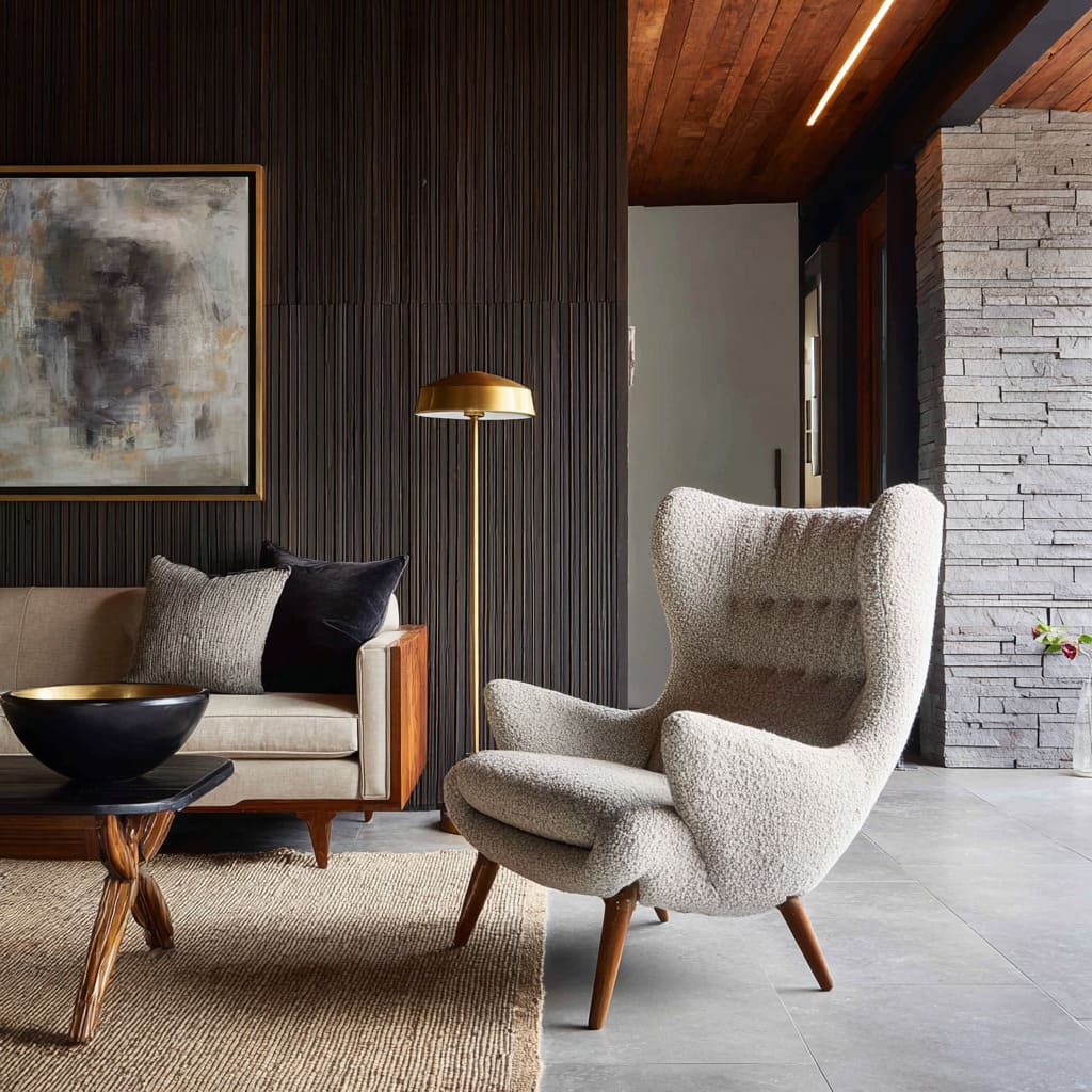
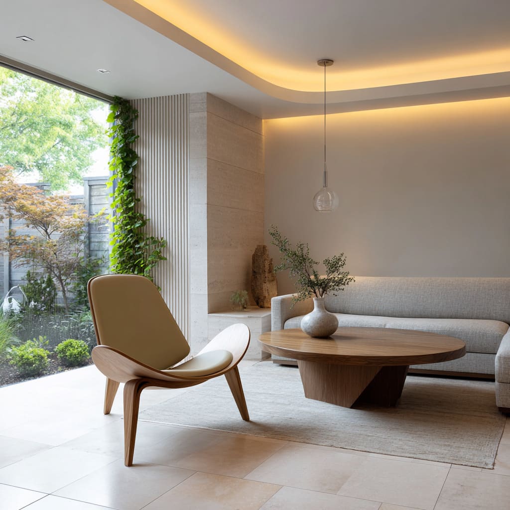
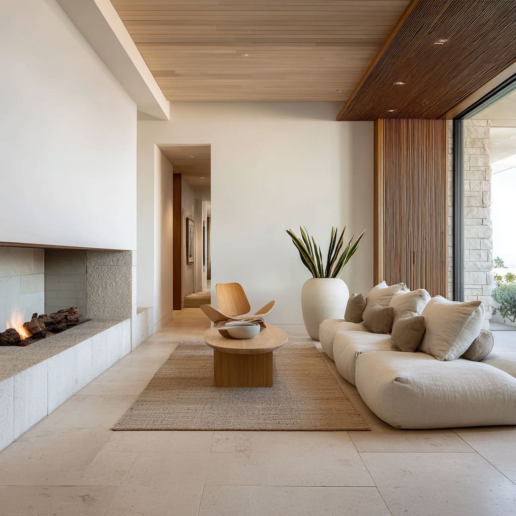
Whether it’s a Papa Bear with its bold arm stretch, a Shell Chair floating lightly on three legs, or a Womb Chair wrapped in boucle, the effect is visual punctuation. They stand taller, curve deeper, or angle more sharply than anything else in the room, breaking the dominance of horizontal lines.
Rather than reinforcing symmetry or alignment with the television wall, these chairs tend to pivot—literally and compositionally. A Shell Chair slightly rotated, a Butterfly chair angled inward from a corner—these placements redirect how the eye reads the entire layout.
In rooms where the fireplace sits centered, or where sofas stretch wall to wall, a chair placed off-axis or closer to the foreground creates a new point of entry. Suddenly, the space becomes structured from the chair, outward.
This is what sets many standout MCM living room ideas apart—they know how to use just one sculptural shape to shift the gravity of the whole room.
Planned asymmetry that keeps symmetry honest
At first glance, some interiors seem organized around perfect mirroring: identical side tables, evenly flanked fireplaces, balanced lighting. But a subtle offset—a lounge chair nudged toward a window, or rotated slightly away from the center—adds human imperfection without disrupting cohesion.
That’s the kind of move that gives a room quiet confidence. A mid-century spindle-back chair pulled a few inches from alignment can dissolve the stiffness of a too-orderly space.
A walnut-armed seat set at a diagonal to a square rug brings contrast without clutter. These choices aren’t about randomness—they serve as visual reminders that the space is for living, not display.
Asymmetry is allowed, but never loud. It’s the quiet interruption that keeps symmetry from becoming stiff.
In many modern interiors inspired by mid century modern living room ideas, this is what brings comfort into focus: objects aren’t forced to perform in pairs. They’re given room to shift, breathe, and speak on their own terms—creating rooms that feel less like arrangements and more like environments with memory and motion.
Mass-to-void dialogue
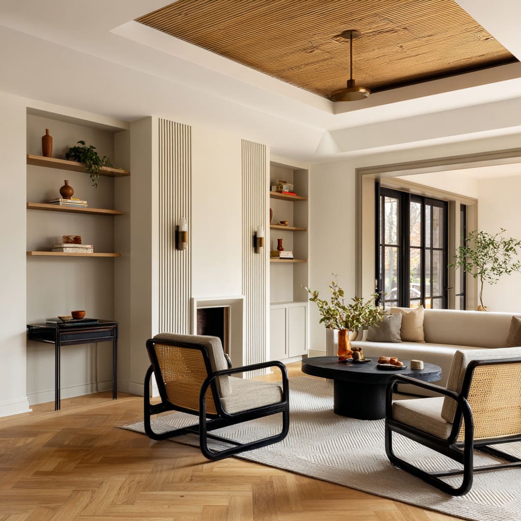
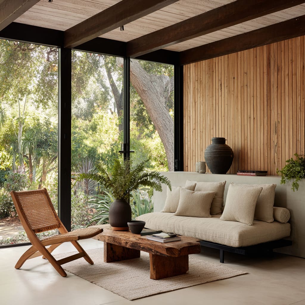
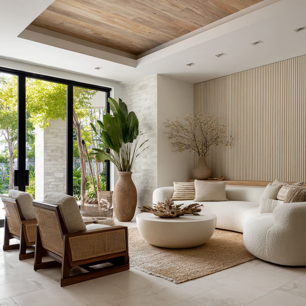
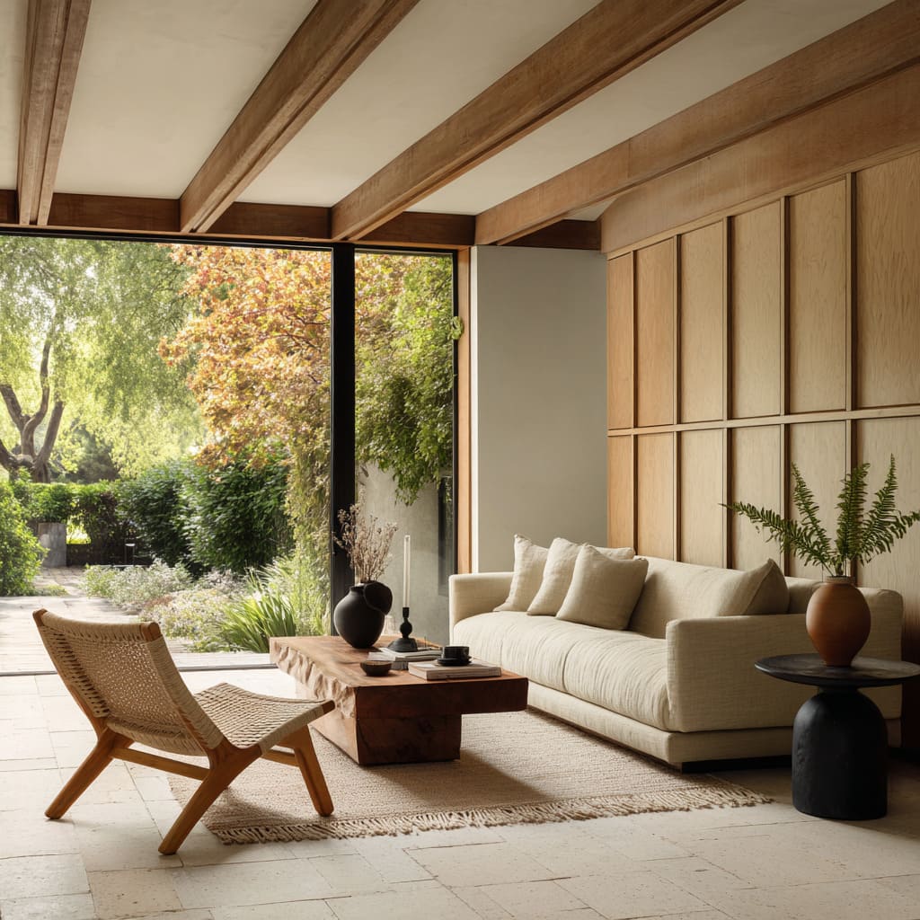
One of the quiet strengths in many mid-century living room ideas is how volume and lightness are placed in direct tension. Chairs with open spindles, cane backs, or woven cord inserts introduce a break in density.
Their construction lets light pass through—not as decoration, but as a counterweight to the weightier objects nearby. A low walnut slab coffee table, a charcoal sofa grounded almost flush with the rug—these pieces carry visual weight.
The chair, by contrast, lets the room breathe.
Even when the seat itself leans into plushness—bouclé upholstery, enveloping forms, heavy wool textures—something around it pulls back. Nearby tables are often thin-framed or float visually.
Shelving may be open, spaced sparsely, or built in without shadow lines. Rugs stay in pale shades and minimal textures, receding to the floor.
The result is a kind of visual economy. No one piece shouts.
Instead, space is shaped by how solid meets open—mass balanced by void.
This contrast lets even the heaviest volumes feel composed. It’s not about symmetry, but about offsetting density with pause, shadow with air.
A woven backrest might sit across from a blocky coffee table; a closed chair form finds balance in a nearby transparent planter or bench with negative space beneath. This play of weight and openness creates scenes that look calm without being plain.
Surface rhythm echo
Texture speaks louder when it repeats with variation. That’s where many mid-century modern living room inspo ideas find their depth—not in obvious matching sets, but in faint echoes.
The materials of a chair often find their answer across the room, but in unexpected ways. Take cane.
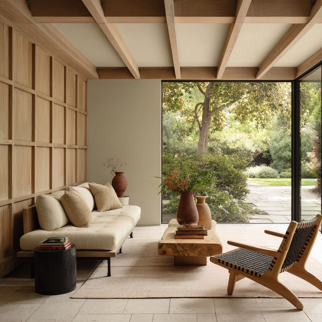
It might show up in a lounge chair’s backrest, but reappear as the tonal match to a ceiling recess or a natural fiber rug underfoot. Cord webbing in a seat may quietly mirror the crosshatch of a paneled wall, or the recessed squares of a ceiling grid.
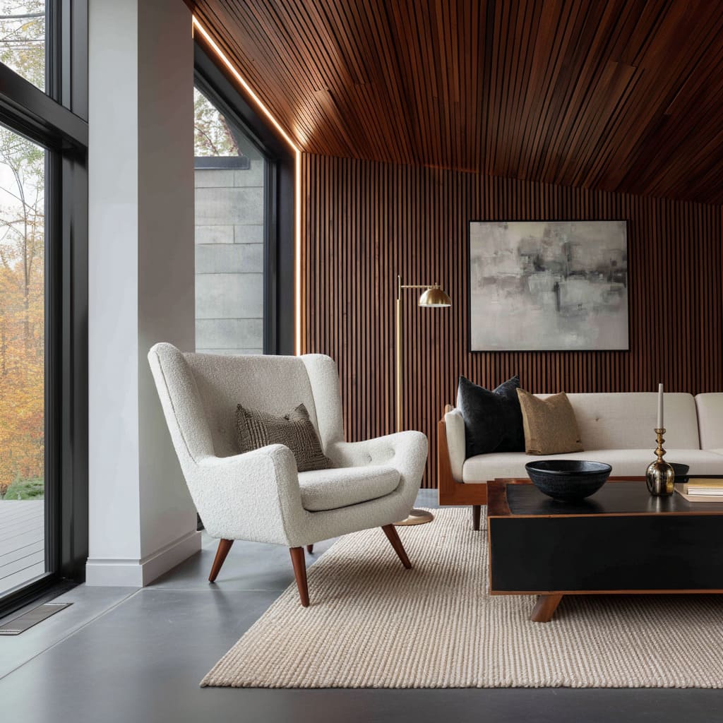
Even polished walnut arms won’t necessarily match the coffee table—they might reflect instead in thin horizontal light slots or slim shadow lines on nearby cabinetry.
These parallels aren’t loud. They happen beneath the surface of perception, linking parts of the room across sightlines without forcing the viewer to decode them.
It’s this surface-to-surface rhythm that gives a space cohesion without falling into repetition. Materials travel across objects but shift their form and placement.
In some interiors, even the grain direction of the ceiling lines up with the wood in the chair frame—not by coincidence, but by an eye trained on alignment. The effect is quiet but binding.
This layered repetition helps a single material feel generous and fluid across the room, holding everything together by tone, texture, and rhythm rather than uniformity.
Light as a secondary frame
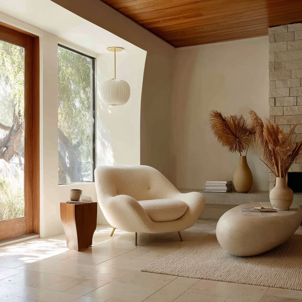
Lighting often speaks in quiet gestures, but in a mid-century modern living room design, it’s the precision of where that light lands that changes how the room feels. A chair, already sculptural in form, becomes the visual center not because it’s bold, but because light has been choreographed around it.
Think of a brass arc lamp curving not above a table, but just grazing the shoulder of a lounge seat. Or a recessed slot tucked into the ceiling that lines up with the chair’s backrest, creating a wash that separates it from the wall like a shadowed silhouette on stage.
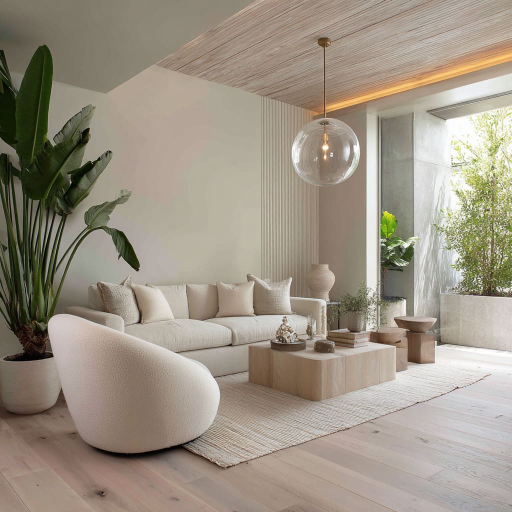
This isn’t general illumination—it’s focused presence. A globe pendant hangs low, slightly off-center, casting a soft highlight onto the upholstery and defining its volume without making the entire space brighter.
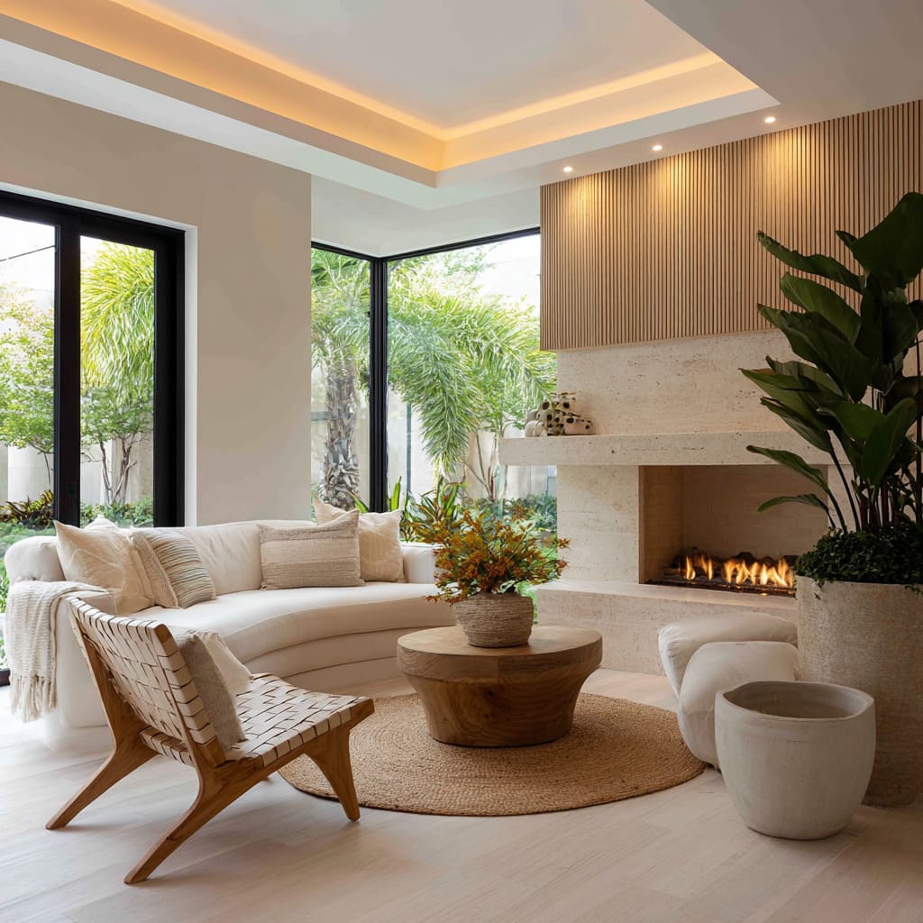
A wall-washing uplight along a ribbed slat panel behind the seat subtly increases contrast, giving depth to what would otherwise be a flat backdrop. In these moments, the chair isn’t just for sitting—it’s composed like an object, framed by light, not placed under it.
These effects are felt more than seen. Even in rooms where the ambient tone stays neutral and calm, one glance at the chair tells you where attention was placed.
And that attention—through shadow, highlight, and glow—gives the seat a role beyond furniture. It acts as a visual sentence-ender.
Not loud, but final.
Tactical contrasts in leg language
In many mid-century inspired living room ideas, the chair legs often do more storytelling than the upholstery. Their shape, angle, and relationship to the floor subtly pull the room in different visual directions.
Tapered wooden legs, like those on a Risom or Papa Bear model, lean outward and downward, extending the footprint of the seat and pushing energy toward the floor. These pair naturally with low-slung sofas or modular sectionals that seem to hover, making the leggy frame feel steady, not slight.
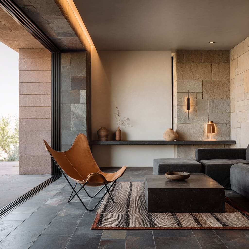
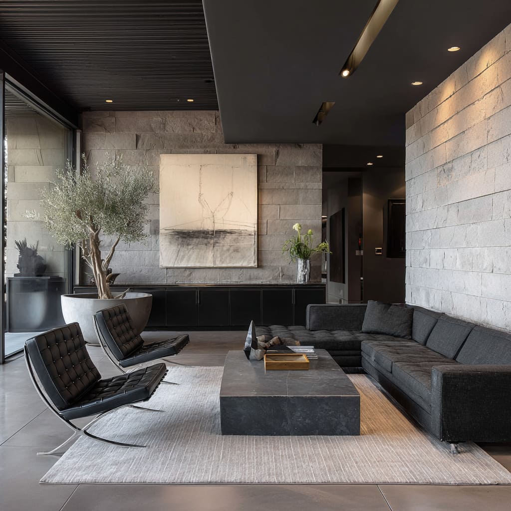
Contrast this with the X-shaped steel bases of Barcelona or Butterfly chairs. Here, the diagonals interrupt the room’s square logic.
Where rugs, walls, and cabinetry align in straight edges, these chairs cut across—breaking up gridwork, throwing in just enough irregularity to keep the room from falling into repetition. That slash of metal beneath the seat draws a line through softness and introduces a sharper visual pace.
Then come the sled legs—thick, grounded, unbroken wood forms found in Mushroom-style silhouettes or low curved chairs. These bases sit almost flush with the floor.
They feel architectural, echoing bench seating, floating stone hearths, or wide platform sofas. They don’t elevate the chair—they root it.
It’s a different kind of presence: heavy without being stiff. By mixing these leg types within a single room, visual weight is adjusted without shifting palette or layout.
The tension isn’t in color—it’s in stance. Each leg choice contributes to how grounded, how light, or how directional the seating feels.
It’s this quiet calibration of form and footprint that gives the whole space rhythm, without relying on decoration.
Colour restraint, texture depth
Mid-century chairs often lean on neutral tones—black leather, ivory bouclé, soft camel, or sand-toned hides. Yet in rooms shaped by mid-century modern living room decorating ideas, these chairs never feel like repeats.
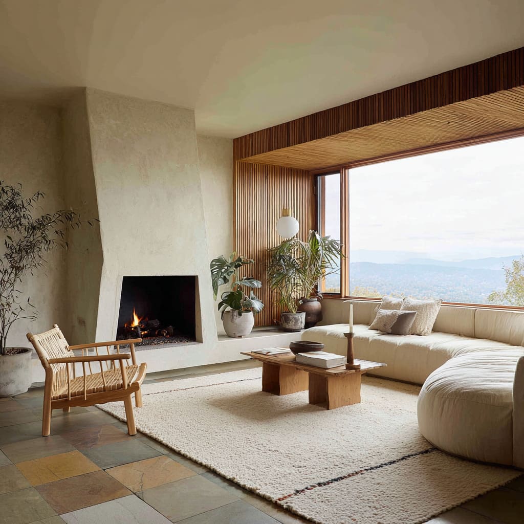
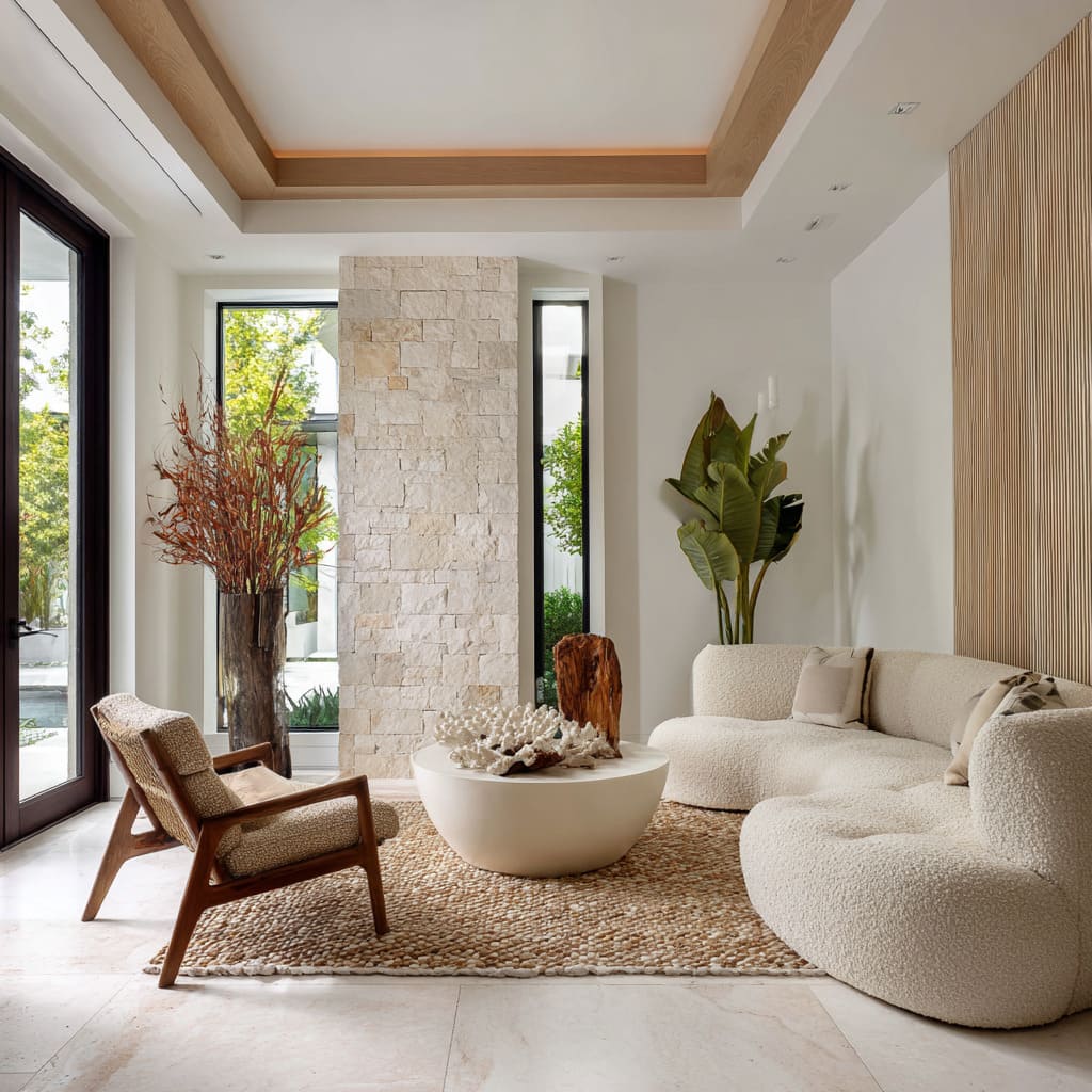
What changes is not the color, but everything that surrounds it. A boucle-covered chair doesn’t blend into silence when it’s backed by a ribbed plaster wall or placed over a knotted jute rug.
Texture steps in where color pulls back. This balance becomes even more precise in spaces with layered surfaces.
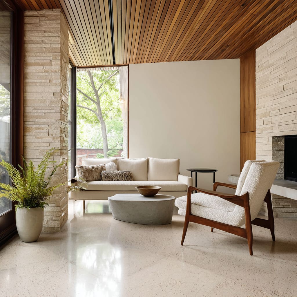
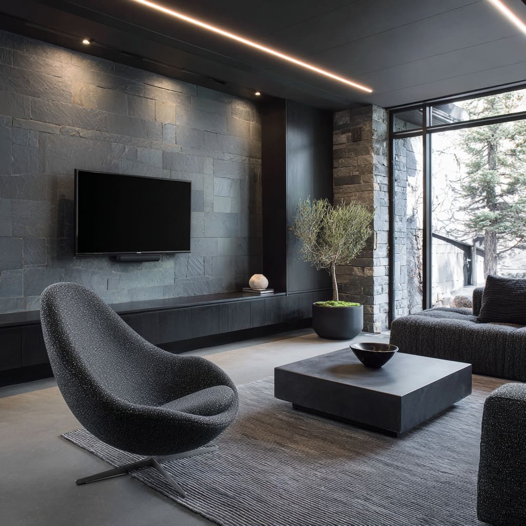
A coarse split-faced stone wall, a ceiling of slim wood slats, or a limestone bench with softened edges—these all set the stage for a chair that doesn’t need to shout. Its tone may be quiet, but its presence depends on contrast.
Smooth leather framed by grainy travertine, or a wooly seat beside a polished stone cube, brings out tension between materials without overwhelming the room.
Even chairs finished in the same shade as the walls manage to stand apart when surface texture takes the lead. The upholstery absorbs light differently than matte plaster.
The seat casts a heavier shadow than the wood it sits on. These differences are subtle, but they make the room feel assembled, not matched.
Neutral doesn’t mean blank; it becomes a translator between sharp and soft, matte and textured, structured and raw.
Dialogues with landscape
Placement can shift the purpose of a chair without moving it far. In living rooms with full-height glazing or wide sliding doors, a common instinct is to aim every piece of seating directly at the view.
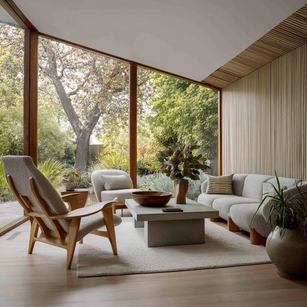
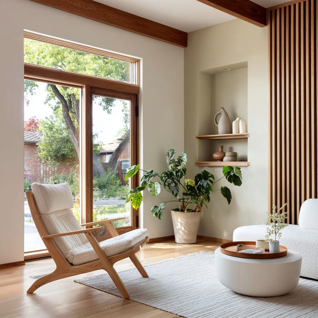
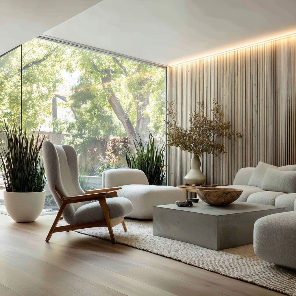
But mid-century shapes often work better at an angle. A lounge chair turned slightly off-axis—neither facing the sofa fully nor pointing straight to the outdoors—creates a new kind of relationship with the space.
This positioning makes the chair feel aware of both zones. It catches enough of the daylight and garden to feel connected, while still sitting in conversation with the rest of the interior.
The result is neither inward nor outward. It allows the chair to bridge two rhythms: the structured layout of the room, and the organic softness of leaves moving beyond the glass.
That slight twist also holds visual energy. A chair turned just a few degrees can break the grid of the rug, the lines of the tile, or the rectangular frame of the window.
It introduces motion without clutter. In homes where indoor and outdoor textures speak to each other—stone, timber, plant forms—a chair placed this way doesn’t separate the zones; it listens to both.
It acts as a point of pause that belongs to the whole, not just the view.
Scale games: low profile versus high back
Balance in a room often comes from contrast—not from symmetry, but from how one shape plays against another in scale. In many living rooms shaped by mid-century modern inspired living room designs, seating doesn’t settle into uniform heights.
Instead, a tall-backed chair—like a Womb or high-winged variant—rises beside coffee tables cut barely above shin level, or sofas so deep and low they barely break the plane of the rug.
This difference is visual as much as physical. A tall backrest reads like punctuation against a flat expanse.
It lifts the sightline without pulling the weight of the composition upward. The height gives contrast to blocky horizontal furniture without requiring bulk.
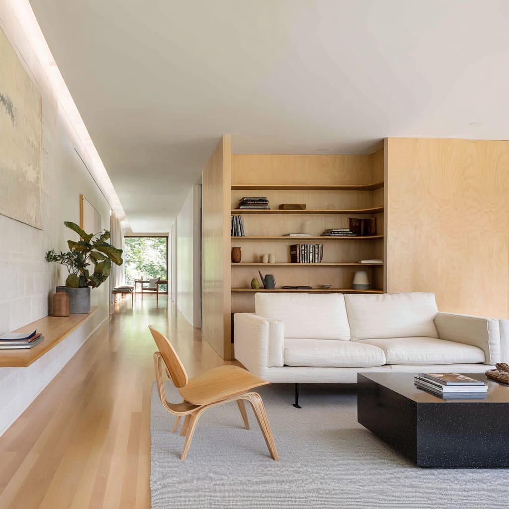
In the reverse situation, when a room leans into chunkier or thicker silhouettes—like a dense oak table or a sectional with oversized arms—a Shell or Butterfly chair, with its light lift and lower seat, acts as a visual recess. It brings the eye down, letting the heavier forms feel grounded without becoming overwhelming.
These opposites sharpen one another. The room doesn’t rely on exaggerated forms—it relies on juxtaposition.
Low beside tall, airy next to solid. A chair’s height becomes more than comfort—it becomes the hinge between quiet grounding and vertical movement.
Subtle disruptions of orientation
Straight lines guide most layouts—rugs align with walls, sofas face the television, coffee tables sit square to the hearth. But in rooms where the geometry starts to curve or skew, the first clue is often in the chair.
A lounge seat twisted just slightly—angled out of alignment with the rug or turned a few degrees away from the expected axis—sets the room off rhythm in the best way. That single deviation lets other elements follow.
A diagonal rug doesn’t look misaligned when it mirrors the direction of the chair. An angled ceiling panel feels less architectural and more connected when it echoes the lean of the seat below.
Even a stone column placed off-grid picks up context when a piece of furniture near it does the same. These moves don’t shout—they tilt the layout just enough to catch the eye, adding variation without visual disruption.
The trick is letting the chair lead. One rotation, one shift in orientation, can carry a thread through textiles, lighting lines, or even built-in volumes.
It’s a way of breaking the grid without breaking the calm. Instead of full asymmetry, it’s a quiet deviation that gives structure a sense of movement.
And in a space where every other form plays straight, that small twist becomes the most memorable line in the room.
Key ideas shaping the modern look
- A single chair can shift the center of gravity in a space. Rather than reinforcing symmetry, it sets a quiet offset—placing weight where none was expected and allowing the room to organize itself around that decision. Slightly off-axis placement introduces rhythm, drawing sightlines away from formulaic arrangements.
- Transparency and mass play against each other. Open cane backs, spindled frames, or webbed seats are often positioned beside dense stone tables, monolithic sofas, or blocky cabinetry. The contrast lets heavy objects stay grounded without overpowering the space. The chair doesn’t copy its surroundings—it balances them.
- Materials travel quietly across surfaces, but not through direct matching. A wood frame may echo in the slatted ceiling, not the table legs. Cane backs repeat in a wall panel, not in a second chair. This creates coherence that feels internal rather than styled.
- Lighting finds the chair, not just the room. Pendants, arcs, or ceiling slots highlight the shape of the seat without flooding the space. The glow outlines the form, making it feel sculptural—readable even when everything else fades.
- Scale contrast sharpens presence. Low chairs against tall bookshelves. High backs beside barely-there tables. These deliberate mismatches in size define zones and relationships without relying on volume or visual noise.
Each of these moves—placement shifts, material echoes, contrast in scale—lends new clarity to vintage silhouettes. In today’s interiors, the mid-century chair no longer serves as nostalgia.
It works as a live component, bridging texture with restraint, form with motion, and stillness with just enough tension to hold a room together.

