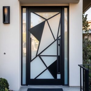
Doors are more than functional—they’re opportunities to elevate your home’s personality and style. The right color can set the mood for a room, tie together design elements, and even change how a space feels.
Whether you’re aiming to brighten a compact laundry room, add warmth to a living area, or make a bold statement in a modern kitchen, carefully chosen door color ideas can bring your vision to life. From muted tones to vibrant accents, the possibilities are endless, and with the right combinations of paint, hardware, and surrounding decor, doors can become standout features that blend beauty and practicality in any home. A carefully chosen tone on an entrance door can make the transition into the home feel more deliberate, helping the whole design feel more connected from the start.
Observing Color Nuances and Room Dynamics
The color of a door does more than enhance a room’s visual appeal—it has the power to influence how a space feels and functions. The same thinking matters when choosing entrance door colors, since the first door people see often sets the tone for the mood and palette carried through the rest of the home. Thoughtful door paint ideas can subtly shape perceptions, such as making a room appear more open, intimate, or vibrant.
Soft shades like terracotta or sage create a welcoming atmosphere, seamlessly complementing natural wood furniture and textured details like woven baskets or rugs. In contrast, deeper tones such as navy or charcoal make a bold statement, defining the room’s personality.
These rich hues shine even brighter when paired with neutral walls or accented by metallic hardware, offering a sense of balance and sophistication. By considering the interplay between color and surrounding elements, you can craft spaces that feel harmonious and intentional, no matter the style. Similar color logic can also guide a garage door, helping exterior elements feel more connected to the palette introduced inside the home.
Warm Earth Tones
Warm earth tones like terracotta, clay pink, dusty coral, and mustard yellow bring an inviting sense of coziness to any interior. These shades carry a natural, grounded appeal that feels soft and approachable while nodding to the hues of baked earth and sun-kissed landscapes.
The beauty of this palette lies in its versatility; it can warm up a minimal space or add depth to a room with layered textures. Unlike brighter shades that can dominate, these tones create a balance between richness and subtlety, offering a timeless charm.
For the best results, finishes play a crucial role. Matte and satin options enhance these colors by introducing a soft, tactile quality that complements their organic nature.
A door in clay pink with a satin sheen, for example, gently catches the light, while a terracotta shade in matte brings a rustic, understated warmth. Pairing these finishes with natural elements like exposed wooden beams, woven rattan furniture, or soft linen textiles helps amplify the earthy feel without overwhelming the space.
Colorful painted doors in mustard yellow or dusty coral also serve as a perfect bridge between functional design and aesthetics. These hues work beautifully alongside brass or bronze hardware, where the warm metallic tones create subtle highlights against the richness of the paint.
The hardware doesn’t overpower but instead adds depth, providing just the right amount of shine to accentuate the door’s unique character.

In spaces with features like leather furniture, patterned rugs, or stone accents, these earth-toned doors act as cohesive elements. They tie together the organic details of the room, making it feel more unified while still leaving room for individuality.
Whether used in a farmhouse-inspired kitchen or a cozy modern living room, these shades exude a relaxed charm that feels right at home. By leaning into the warmth of these tones, you can craft interiors that feel welcoming and thoughtfully composed.

Relaxing Pastels and Subtle Greens
Soft, muted shades like sage green, butter yellow, and pale pink introduce an understated charm to functional spaces such as laundry rooms, mudrooms, and smaller kitchens. These tones help make these areas feel less utilitarian and more like thoughtfully designed extensions of the home.
Their subtle nature not only softens the space visually but also creates a sense of calm that complements their practical purpose. Pastel-colored doors are an effortless way to brighten compact spaces without overwhelming them. This is especially helpful in sliding door designs, where the door often stays in view even when open and therefore needs to sit comfortably within the room’s full palette.

Sage green is a particularly versatile choice, balancing earthy undertones with a gentle vibrancy. This shade pairs effortlessly with white shiplap walls, offering a classic yet fresh look that feels grounded in natural inspiration. That same pairing is also a useful reference for farmhouse interior door design, where quiet paint colors and simple paneling often work best beside natural textures.
Butter yellow adds a touch of light and optimism to spaces, making it perfect for areas that need a little warmth, especially if natural light is limited. Meanwhile, pale pink lends a playful and welcoming quality without leaning too heavily into boldness, making it a subtle yet striking option.
When it comes to creating harmony in these spaces, pastel doors shine when complemented by neutral cabinetry, wicker storage baskets, or light countertops. These elements allow the doors to stand out as focal points without clashing with the rest of the decor.
For example, a butter-yellow door with a matte finish surrounded by white cabinetry can create a bright yet cohesive aesthetic, perfect for a mudroom or pantry.

To keep the look balanced, hardware choices play an essential role. Black or silver hardware can provide a modern contrast, adding a touch of structure to the softness of pastel tones. It also works well for inside barn door ideas, where visible tracks and simple hardware benefit from colors that soften their stronger lines.
A sage green door fitted with sleek black handles brings a contemporary edge, while silver accents on a pale pink door add a polished and refined feel. These metallic details don’t overshadow the paint but rather enhance the overall design by introducing a subtle highlight.
For anyone exploring ideas to paint interior doors, pastel shades offer a versatile and stylish solution that works well in smaller or task-oriented rooms. By choosing finishes like satin or semi-gloss, these colors can reflect light gently, making compact spaces feel larger and more open.
Whether you’re redesigning a laundry room with soft sage or brightening a mudroom with butter yellow, these tones deliver a clean and welcoming aesthetic that effortlessly combines functionality with style.

Vibrant Accents with a Modern Twist
Deep, bold tones like navy and charcoal have the unique ability to transform interior spaces into visually striking, cohesive designs. These colors serve as dramatic accents, adding depth and richness to rooms while grounding the overall aesthetic.
Particularly effective in open-concept spaces and kitchens, these shades bring a sense of structure and refinement that complements other design elements like metallic fixtures and marble surfaces. When selecting navy or charcoal for doors, the finish plays a pivotal role in determining the overall effect.
In open-plan rooms, the same depth can also give a modern barn door a stronger architectural role, helping it feel intentional rather than purely practical.
A matte or satin finish enhances the richness of these colors, allowing them to appear sophisticated and understated while absorbing light softly. On the other hand, a semi-gloss finish introduces a reflective quality that aligns with modern design trends, adding a crisp, polished edge to the boldness of the color.
For example, a navy-painted door with a semi-gloss finish might catch subtle light from surrounding metallic accents, further enhancing its contemporary appeal.
The choice of hardware can elevate these bold tones into something truly distinctive. Gold or brass handles, knobs, or hinges create a warm contrast against the cool depth of navy or charcoal, striking a balance that feels both luxurious and approachable.
For instance, pairing a charcoal door with brushed brass hardware creates a sleek look that feels well-suited for transitional or modern styles. In kitchens, where metallic fixtures are often featured prominently, coordinating these details can tie the entire room together seamlessly.
Navy doors, in particular, pair beautifully with white or light gray walls, providing a clean yet dramatic focal point. When set against marble countertops or backsplashes, this color combination can create a high-end, timeless feel.
Charcoal doors, meanwhile, bring a grounding effect, making them ideal for open spaces where a darker accent can help delineate areas without requiring physical dividers.

For those exploring interior door color ideas, navy and charcoal offer a way to introduce boldness without overwhelming the space. These deeper hues can adapt to various interior styles, from classic to ultra-modern, depending on the finish and accompanying accents.
A navy door with sleek black hardware can lean toward a contemporary aesthetic, while a charcoal door with aged brass details might evoke a more traditional or vintage-inspired look. Ultimately, these vibrant accent doors do more than provide a pop of color—they anchor the room by adding contrast and depth, creating a sense of balance and sophistication that resonates throughout the space.
By thoughtfully combining finishes, hardware, and complementary design elements, navy and charcoal doors become functional yet stunning features in any interior.

Patterns and Paneling: Adding Depth and Dimension
When it comes to elevating interior design, incorporating textured patterns and thoughtful paneling into your doors can introduce a whole new layer of style. Chevron grooves, diagonal lines, and intricate geometric paneling are no longer just functional—they become focal points, subtly directing the eye and enhancing the flow of a room.
These designs don’t merely serve as structural details; they create energy and motion, leading the gaze upward along a tall door or down the length of a corridor, making the space feel dynamic and connected. Chevron and diagonal grooves, for example, are ideal for modern or transitional interiors.
These patterns lend a sense of movement to doors, making them perfect for hallways, bedrooms, or living spaces where a subtle sense of motion can enliven the room. A bold, single-color finish—perhaps in muted teal or deep charcoal—paired with a chevron pattern provides both elegance and vibrancy without overwhelming the surroundings.

Doors with geometric paneling or two-tone contrasts are another effective way to bring personality into a space. A panel design that alternates between wooden planks and lighter painted sections balances boldness with softness.
For instance, a door painted in rich navy blue with pale cream inlays can offer a striking yet versatile aesthetic. This pairing creates a harmonious contrast that works in various settings, from traditional interiors with vintage-inspired accents to modern homes with clean, minimalist lines.
The use of louvers introduces not only texture but also practicality. These slatted designs are an excellent choice for areas that require ventilation, such as laundry rooms, pantries, or closets.
Painted louvers in a soft sage green or light gray can complement natural wood furniture, wicker baskets, or neutral textiles in utility spaces, ensuring that even the most functional areas maintain a stylish, cohesive look.

Another striking door paint design idea is incorporating mixed materials. A door framed in rich walnut with panels painted in emerald green, for instance, combines the warmth of natural wood with the boldness of color.
The result is a piece that feels both contemporary and timeless, serving as a centerpiece rather than a background element in the room. For smaller rooms or tighter spaces, textured paneling and patterns can have a transformative effect.
Vertical grooves or diagonal planks painted in light pastel shades—such as butter yellow or blush pink—can visually elongate a space, making it feel more open. These details not only elevate the aesthetic of the door but also enhance the room’s overall ambiance by adding depth and variety.

Hardware selection further complements the patterned door’s impact. Matte black or brushed brass handles can enhance geometric designs, while sleek silver hardware provides a modern edge to louvers or diagonal grooves.
For two-tone designs, coordinating the hardware with the secondary color can subtly tie the whole look together, creating a cohesive and polished effect. Doors with patterns and paneling go beyond their functional purpose—they actively contribute to a room’s character and energy.
Whether you’re aiming to add texture, define spaces, or bring in a bold design statement, these thoughtful touches transform doors into a key component of interior decor. By experimenting with shapes, finishes, and complementary accents, you can create a door that stands out while harmonizing seamlessly with the rest of your home.

Coordinating Frames and Hardware: The Essential Finishing Touch
When designing an interior, the details matter, and the interplay between frames, hardware, and color is an opportunity to make a bold or subtle statement. Metal frames in finishes like bronze or black can create a striking outline, giving the door a sense of structure and purpose.
These frames not only complement creative door paint designs but also add an architectural feel to the space, ensuring the door becomes more than a functional element—it’s part of the decor’s narrative. Trim color plays an equally important role.
Opting for stark white trim can highlight a bold door color, such as navy blue or mustard yellow, creating a crisp and clean border that draws the eye directly to the door. On the other hand, muted tones like olive green or soft beige can provide a more seamless, understated look.
This approach works well in rooms where you want the door to blend harmoniously with the walls or surrounding elements, subtly enhancing the room without dominating it.

Handles, knobs, and hinges are the unsung heroes of door design. These small yet impactful pieces can dramatically change the door’s overall appearance.
For a cohesive and polished look, matching hardware with the door’s color or finish can create a streamlined effect. For instance, a matte black handle on a charcoal-painted door feels modern and understated, perfect for a minimalist aesthetic.
Conversely, choosing hardware that contrasts with the door’s color, such as a brass handle on a deep blue door, can make a purposeful design statement. This strategy works particularly well when aiming for a sophisticated or eclectic style, as the metallic tones add warmth and shine.
The type of hardware also contributes to the door’s overall vibe. Sleek, modern handles pair beautifully with geometric or paneled designs, emphasizing clean lines and a contemporary feel.
Meanwhile, more ornate knobs or antique brass finishes can enhance a traditional or vintage-inspired look, creating a sense of character and charm.

Hinges, while often overlooked, are another opportunity to play with color and finish. Visible hinges in a matching or complementary metal can act as subtle accents, tying the door’s design together.
For example, bronze hinges can bring out the earthy warmth in a terracotta or clay pink door, while brushed nickel hinges add a touch of coolness to pastel greens or blues.

The coordination between frames, hardware, and paint can influence the door’s role in the room. A door framed in bold black metal with contrasting gold hardware exudes confidence and commands attention, making it a focal point in the space.
Alternatively, a door with white trim and silver hardware feels cohesive and integrated, perfect for areas where subtlety is key, such as bedrooms or quiet corners of the home. Ultimately, these finishing touches allow you to personalize your space while tying together the various design elements.
Whether you’re leaning toward bold contrasts or quiet harmony, the combination of frames, trim, and hardware offers endless possibilities to refine your interior. By paying attention to these details, you’ll not only enhance your door’s appearance but also elevate the overall look and feel of your room.

Linking to Surrounding Decor: Creating a Harmonious Flow
Doors play a vital role in tying a room together, acting as bridges between architectural elements and decor. They are rarely standalone features; instead, their design and color should complement the surrounding environment.
Thoughtful coordination ensures the door becomes a seamless yet impactful part of the overall aesthetic. By selecting the right door color ideas, you can subtly link the door to other design elements, creating a cohesive and visually pleasing interior.

One effective strategy is to echo the door’s hue in nearby furnishings or accents. A clay pink door, for example, can beautifully resonate with wooden furniture, enhancing the warm tones of oak or walnut.
The subtle pink undertones harmonize with brass lighting fixtures, creating a welcoming glow that feels natural and cohesive. Similarly, a pastel blue door might tie into the soft shades of coastal-inspired artwork or the delicate glaze of decorative vases on a nearby console table.
These connections, while understated, add layers of sophistication to the space.

For a more dynamic effect, doors can reflect or balance bold decor choices. A mustard yellow door might complement the earthy tones of a leather sofa or the golden hues of throw pillows.
This approach not only highlights the door but also brings together diverse elements within the room. In kitchens, a sage green door can mirror the veining of marble countertops or the natural texture of woven baskets, reinforcing an organic, calming vibe.

The finish of the door also plays a key role in linking to surrounding decor. A matte or satin finish works well with softer elements like fabric upholstery or natural fibers, maintaining a relaxed and inviting feel.
Meanwhile, a semi-gloss finish can mimic the shine of metallic fixtures, such as a chandelier or cabinet hardware, enhancing the room’s polished and modern appeal. When choosing door colors, consider the overall theme of the room.
For a modern, minimalistic interior, a navy or charcoal door can anchor the space while echoing the dark tones of metallic or stone surfaces. In contrast, lighter colors like butter yellow or pale pink work best in rooms where airiness and softness are prioritized, complementing light-toned rugs, neutral walls, or white shiplap.

It’s not just about color; textures and materials also play an important role. A paneled door with grooves might pair well with striped or patterned textiles, such as a woven rug or a quilted throw.
Louvers, often used for functional spaces like laundry rooms, can find a visual connection in wicker storage baskets or rattan light fixtures, bringing a sense of texture and continuity. Hardware finishes, too, offer opportunities for connection.
Black handles or hinges can mimic the frames of wall art or shelving units, while brushed nickel or bronze finishes echo table lamps or decorative trays. The interplay between these smaller details and the larger elements of the room can elevate the door’s role from practical necessity to thoughtful design feature.
By thoughtfully linking the door to its surroundings, you ensure that every element in the room contributes to a unified aesthetic. This approach fosters balance and creates a dialogue between the door and other design elements, making the entire space feel intentional and well-composed.
Whether it’s a bold statement color or a subtle pastel, the door becomes a key player in shaping the room’s identity.

Functional Considerations: Practicality Meets Design
Doors aren’t just about style; their functionality plays a pivotal role in enhancing the experience of a space. When selecting the perfect door, its movement, space-saving properties, and ability to contribute to the room’s flow should be just as significant as its color or material.
A well-thought-out door design can marry aesthetics with practicality, ensuring that each room feels both beautiful and usable. Pivot doors, for example, make a bold statement with their smooth, architectural rotation.
These doors excel in modern interiors where openness and flow are key. Their seamless movement lends an air of sophistication, especially in spaces where traditional hinged doors might feel restrictive.
Painted in deeper tones like navy or muted charcoal, a pivot door can serve as an anchor in open-plan spaces, tying together areas without interrupting the room’s fluidity.

Dutch doors bring an element of charm, perfectly suiting homes with farmhouse-inspired decor or areas requiring a practical solution. By splitting the door horizontally, they allow natural light and airflow while maintaining separation—ideal for mudrooms or kitchens where functionality is a priority.
Adding a coat of sage green or clay pink enhances their rustic appeal, while brass or matte black hardware provides a contemporary twist. The combination of color and practicality ensures these doors are as stylish as they are useful.
For compact spaces, bifold and pocket doors are lifesavers. Bifold doors, with their folding panels, are a go-to for closets or laundry rooms where maximizing every inch matters.
Painted in lighter tones such as butter yellow or soft blue, these doors visually expand smaller rooms, creating an airy and open atmosphere. Pocket doors, which slide into the wall, are a brilliant option for tighter hallways or connecting en suite bathrooms.
A frosted glass insert can add a contemporary touch, maintaining privacy while letting light travel through the space.

Glass doors, whether featuring frosted or fluted inserts, strike a balance between style and utility. These doors work particularly well in dining rooms or home offices, where natural light is desired without sacrificing privacy.
A frosted panel, paired with a muted color like teal or sage, creates a calming visual effect while diffusing light softly across the room. Fluted glass adds texture and depth, making the door a subtle focal point.
These inserts also work well with metallic hardware, such as brushed nickel or bronze, for a polished finish.

When considering inside door color ideas, it’s important to think about how the hue interacts with the door’s function and surrounding environment. For example, a pocket door painted in warm mustard yellow can echo tones in nearby furniture, creating continuity in transitional spaces.
Similarly, a Dutch door in pastel green can highlight natural textures like wooden floors or wicker storage baskets, blending practicality with aesthetic harmony. Hardware choices play an equally important role in the overall design.
Sleek, minimalist handles on a pivot door emphasize its modernity, while ornate knobs on a Dutch door enhance its rustic charm. Matte finishes on hardware can complement the softness of pastel-colored doors, whereas polished metal provides contrast and shine on darker tones.

Ultimately, the right functional design, paired with thoughtful color and hardware choices, ensures that every door feels purposeful. Whether it’s enhancing light with glass inserts or saving space with bifold panels, functional doors contribute far more than practicality—they elevate the way a room feels and works, creating a balance that’s as beautiful as it is intentional.

Blending Traditional and Contemporary Influences: Creating a Timeless Balance
One of the most compelling aspects of interior design is its ability to merge traditional and modern elements, resulting in a look that feels both grounded and fresh. This principle is especially true when it comes to choosing door colors and finishes.
The careful interplay between heritage-inspired details, such as shiplap or wainscoting, and contemporary pigments and finishes allows doors to become focal points that adapt seamlessly across design styles. Consider a bright mustard yellow door within a room adorned with classic wainscoting.
The bold color injects a lively, contemporary touch while respecting the room’s timeless architectural structure. The juxtaposition of the crisp, clean wainscoting lines with the vibrant door color creates a dynamic visual that feels neither overly traditional nor aggressively modern.
This balance not only updates the space but also ensures it remains approachable and warm.

Similarly, a dusty rose door can elegantly complement heritage materials like marble or gilded frames. The soft, muted tone harmonizes with traditional textures while subtly bringing a fresh and modern element to the room.
For example, placing a dusty rose door within a dining room featuring ornate crown moldings and marble surfaces allows the door to bridge the gap between vintage charm and contemporary appeal. The result is a space that feels personal and reflective of evolving tastes.

The success of these designs often lies in the thoughtful pairing of colors and materials. A sage green door, for instance, can be paired with rustic wooden beams and neutral plaster walls for a look that’s both rooted in tradition and adaptable to modern aesthetics.
By adding matte black or bronze hardware, the door gains a minimalist accent that brings it firmly into the present. Such combinations demonstrate how heritage-inspired design can embrace subtle updates while maintaining its timeless qualities.

Choosing complementary colors for the trim is equally essential in ensuring harmony between the traditional and modern elements. For those exploring interior door and trim color ideas, a cohesive palette is key.
For instance, a door painted in deep navy or charcoal can be framed with off-white or pale gray trim to highlight the contrast and modernity of the door itself. On the other hand, using a matching color for both the door and trim—such as muted teal—creates a monochromatic effect that feels understated yet sophisticated, perfect for blending old and new influences.
Paneling and shiplap walls also work beautifully with bold door colors, allowing for layered textures and contrasts. A chevron-patterned door painted in warm clay pink can sit effortlessly in a room with shiplap walls, balancing the softness of the panels with the door’s subtle vibrancy.
Likewise, louvers or geometric paneling on a door can add texture, enhancing the relationship between classic architectural details and contemporary pigments.

The finishes chosen for both the door and hardware further solidify the fusion of styles. Matte or satin finishes tend to soften bold colors, ensuring they don’t overpower the space.
For example, a mustard yellow door with a matte finish can feel subdued yet impactful, especially when paired with aged bronze handles that nod to a traditional aesthetic. Meanwhile, semi-gloss finishes add a modern sheen to deeper colors like navy or charcoal, creating a sleek and polished effect.
Incorporating these blended styles allows homeowners to create spaces that feel tailored to their individual tastes while offering longevity. Doors painted in thoughtful colors with well-matched trims and finishes become versatile design features that tie together traditional and modern influences.
This adaptability ensures that the design remains relevant over time, reflecting both the history of the space and the personality of those living in it.

Final Thoughts on Color Selection
Doors serve a purpose far beyond dividing one space from another—they shape the atmosphere, enhance functionality, and tie together the overall design of a home. By selecting thoughtful hues and finishes, doors can transform into powerful design features that reflect your personal style while enhancing the surrounding decor.
Whether you’re drawn to subtle, neutral tones or prefer to make a statement with bold, vibrant colors, the choices you make in door design can set the tone for each room. The key to making doors a standout feature lies in balancing color with finish, hardware, and the textures in the surrounding space.
For example, a matte finish paired with brass hardware can add warmth and sophistication, while a semi-gloss coat with sleek black accents offers a modern and striking look. This interplay creates an opportunity for doors to move beyond their functional purpose and become a central part of the room’s identity.

Considering cool door paint ideas, like sage green, clay pink, or deep navy, can inspire fresh ways to elevate a space. These colors not only highlight the door itself but also bring out the best in nearby elements, such as natural wood floors, metallic fixtures, or woven accents.
A well-chosen color and finish can provide depth and texture, giving even the most utilitarian spaces a sense of thoughtfulness and care.
Ultimately, the beauty of door design lies in its ability to balance aesthetics with practicality. Whether coordinating a subtle tone with neutral surroundings or contrasting a bold hue against lighter walls, a carefully chosen door color can make every transition from one space to another feel intentional and welcoming.
By approaching door design with creativity and attention to detail, you’ll ensure that this often-overlooked feature becomes an integral and cherished part of your home’s overall aesthetic.