This article takes a close look at the design details that make accent red front doors stand out—especially those subtleties that often go unnoticed. From the way materials are chosen and paired, to how lighting is integrated and how these entrances fit into different architectural styles, each aspect plays a role in shaping the overall impression.
Whether you’re considering bold finishes or subtle craftsmanship, these doors offer plenty of inspiration for those seeking fresh red front door ideas that feel thoughtful and refined.
Interplay of Color and Material
Layering of Tones
Many red doors are far more complex than they seem at first glance. A deep oxblood or chili red finish, for example, can do more than provide a striking color—it can bring out the texture of the wood underneath.
Instead of covering the grain, satin or matte finishes allow the natural patterns to stay visible. Mahogany often reveals a tight, almost fine-grit look, while white oak might offer a looser, more open grain.
The result is a surface that changes depending on light and angle, adding unexpected depth to what initially seems like a single, bold shade.

Contrast Through Secondary Wood or Metal Bands
Another trick often used is breaking up the solid red with a contrasting material. Strips of walnut, reclaimed barn wood, teak, or mesquite are common choices.
These sections add warmth or a subtle cool tone that shifts how the red is perceived. A darker wood, like black-stained oak, can make a vibrant red look sharper and more modern, while a lighter insert, such as brushed white oak, can soften the boldness, giving it a rustic or organic feel.

Material Honesty and Texture
Designs that embrace natural texture—whether through rough-sawn timber or reclaimed wood—add another layer of interest. You’ll see knots, visible saw marks, and weathering that tell a story.
These imperfections work with the boldness of the red, grounding it and making the door feel more approachable. The way light hits these uneven surfaces throughout the day changes how the door appears, giving it life and dimension that might be missed at first glance.

Integration of House Numbers and Lighting
Number Placement as a Design Element
The placement of house numbers on these red front doors goes beyond function. Instead of being fixed on the surface as an afterthought, the numbers are often worked directly into the door’s design.
You’ll find them embedded into wood or metal panels, perfectly sized and aligned to suit the style of the home. Sometimes they’re arranged vertically to draw the eye upward, making the entrance feel taller and more striking.
Other times, they run horizontally across a contrasting material band, creating a visual pause that breaks up the expanse of color in an intentional way. These small moves add structure and balance without shouting for attention.

Recessed and Backlit Detailing
Lighting plays a quiet but important role in highlighting these details. Instead of using harsh spotlights, many designs rely on soft, integrated LED strips tucked behind metal or acrylic layers.
These lights create a gentle halo that outlines the house numbers after dark. This kind of glow doesn’t overpower the entryway—it complements the natural grain of the wood or the sleekness of the metal, making the entire door look considered from day to night.
It’s a practical move for visibility, but it also gives the entryway a welcoming warmth that works with the architecture instead of competing with it.

Material-Based Typography
The style of the numbers is carefully chosen to match the house’s overall theme. On mid-century inspired homes, you’ll often see simple, geometric fonts like Futura, which pair well with the clean lines of the era.
In contrast, homes with an Art Deco influence might feature numerals that have more stylized shapes, bringing in a sense of rhythm and pattern. The materials—brushed stainless steel, warm bronze, or matte powder-coated finishes—add another layer to the story, reflecting light differently and giving each door a unique character.
These details aren’t always obvious at first glance, but they play a big role in creating an entry that feels complete.

Relationship with Surrounding Architecture
References to Broader Design Periods
Many red front doors take their cues from the style of the house itself. You’ll see strong horizontal bands or warm wood details on homes with mid-century roots.
On homes with Art Deco elements, you might spot rich metals and more geometric forms in the detailing. In both cases, the door becomes an extension of the overall design, not an isolated statement.
It’s a focal point that pulls from key elements found elsewhere in the structure, whether that’s through material, color, or line.

Architectural Framing and Overhangs
Framing plays a big role in how these doors are experienced. A well-chosen canopy or overhang—whether it’s made from cedar, steel, or ipe wood—does more than offer protection from the elements.
It also shapes the lighting and defines the entrance. Linear LED strips or recessed lights built into these structures wash soft light across the door’s surface, enhancing textures and highlighting material contrasts.
This lighting approach adds drama without being flashy and keeps the entry inviting well into the evening.

Climatic Responses and Regional Touches
In areas known for intense sun and dry conditions, designers often reach for materials that can handle heat and UV exposure. Corten steel panels or special glass inserts add durability without sacrificing style.
In wetter, cooler climates like the Pacific Northwest or parts of the Midwest, different choices come into play. Wood species that resist moisture and finishes that protect against weathering keep the door looking sharp while supporting long-term function.
These decisions aren’t only practical—they’re part of the larger design strategy that makes the entrance work for its location.

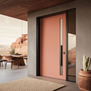
Subtle Techniques in Glass Work
Diffused Privacy Solutions
Glass inserts aren’t always about adding transparency. Many red front doors feature glass that’s been treated to provide privacy while still welcoming in natural light.
Reeded glass, frosted panes, and acid-etched finishes are common options, giving a soft diffusion effect that blocks a direct view inside. These textures are easy to overlook, but they play an important role—especially on homes where privacy is a priority.

Some designs take things further by incorporating subtle patterns or metallic leaf details within laminated glass layers. These extras turn the glass into more than just a functional feature; they add an artistic quality that works well with bolder red door paint ideas, creating a cohesive and eye-catching entry.

Technology and Effects
Smart glass has made its way into a few high-end entries. This technology allows the panel to switch from clear to frosted with a control switch, adding flexibility depending on the time of day or how much privacy is needed.
To a passerby, it looks like any other glass insert—until it shifts. It’s a sleek solution that combines practicality with clean design.
Homes that lean toward modern or minimal styles often incorporate this feature, pairing it with streamlined door hardware and minimalist finishes for a polished look.

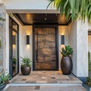
Planters and Landscaping as Visual Anchors
Framing the Entry
Planters placed around the entry are more than decorative; they frame the doorway and complete the scene. Whether they’re positioned symmetrically for a classic look or asymmetrically for a more relaxed feel, they create a boundary that makes the door stand out.
Different shapes—like tall cylinders, squat rectangles, or oversized urns—set the tone for the space.

For example, boxwoods clipped into spheres might be found flanking a traditional door, while architectural succulents and ornamental grasses work well with a sleek, modern design. This strategy can easily be used when exploring front yard or front porch styling, especially for anyone considering red house door color ideas that need just the right finishing touch.

Color Coordination with the Door
The materials used for planters often connect to the door itself. Black powder-coated steel, corten metal, or even galvanized finishes can mirror the tones found in door hardware, house numbers, or metal inlays.
This subtle coordination enhances the red door’s impact, whether the goal is to make a chili red pop brighter or to balance a deep oxblood tone with muted, earthy accents. While these choices might seem small, they are key in creating a well-composed entry.
Thoughtful planter selection can either heighten the contrast or soften the look, depending on how bold the red is and how much drama you want from your front door.

Structural and Technical Considerations
Engineered vs Solid Wood
When looking at different red front door designs, you’ll often come across mentions of engineered woods like mahogany or quarter-sawn white oak. These aren’t just chosen for their grain patterns.
Engineered woods bring better stability, especially in areas with changing weather. Sun, rain, and temperature swings can cause solid wood to warp over time, while engineered panels hold their shape.
Quarter-sawn white oak, in particular, gives you that consistent linear grain that works beautifully with clean, modern door styles. While most people notice the color first, the hidden advantage is in the long-term durability these materials offer.

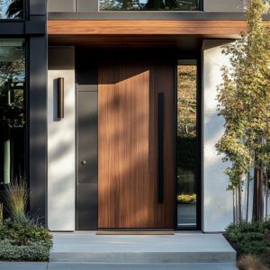
Pivot vs Hinged Mechanisms
Some red doors swing open on traditional hinges, but many modern designs use pivot systems. A pivot door supports more weight, which allows for a larger, heavier door without strain.
The hardware is tucked into the top and bottom of the frame, leaving the door surface uninterrupted by visible hinges. This creates a seamless look, which isn’t immediately obvious until you notice how the door moves—pivoting from a point several inches in from the side rather than swinging from the edge.
It’s a subtle detail that makes a big impact, especially for those aiming for clean lines and a strong entrance.

Metal Finishes and Aging
Bronze, raw steel, and other untreated metals are sometimes left exposed so they can develop a patina over time. This slow change in color adds character.
It tells a story as the door ages and reacts to the environment. Some homeowners want that effect—rather than sealing the metal to lock in a factory-new look, they let it shift naturally.
This approach adds another layer of interest, giving the door a sense of history even when the house is contemporary in style.

Symbolic and Cultural Nuances
Red as a Universal Signal
The color red carries deep meanings across different cultures. In some places, a red door is thought to bring luck or protect the home from negative energy.
In others, it’s a sign of hospitality—an open invitation to visitors. Even today, a red door suggests warmth and energy.
Whether used on a traditional farmhouse or a sleek modern home, this color makes a strong first impression while connecting to those long-held ideas of welcome and protection. One of the most iconic uses of red in American architecture was by Frank Lloyd Wright, who frequently chose his signature Cherokee Red for doors and architectural details.
This earthy red tone became a hallmark of his designs. You can learn more about the origins and meaning of Wright’s Cherokee Red here.

Artful Showpiece vs. Traditional Welcome
Some red front doors act as sculptural pieces, featuring hand-forged metalwork or glass inserts that feel more like gallery pieces than practical doors. Others keep things familiar—classic wood grains, clean lines, and subtle detailing.
Either way, the color red ties these styles together. Whether you lean modern or rustic, this color brings a sense of warmth and hospitality to the entrance.
If you’re exploring red front door decor ideas, you’ll find options that range from art-focused pieces with bold materials to more traditional looks that nod to history without feeling outdated. The key is finding a style that works for your home while making the door a clear focal point.

Lighting Design and Evening Ambiance
Indirect Nighttime Effects
Many red front doors take on a different character after dark, thanks to the way lighting is handled. Rather than relying on obvious spotlights, the focus is often on concealed LED strips and soft uplighting.
These subtle sources of illumination highlight the texture of the wood grain or the finish on metal inlays without being overpowering.

The glow often comes from hidden channels along the doorframe or behind inlaid panels, casting a quiet light that makes the door stand out without competing with the rest of the house. During the day, this lighting setup stays out of sight, but at night, it creates a warm and inviting entryway that draws the eye in a more understated way.

Relationship to Interior Lighting
Another detail that plays a key role in how these entrances look at night is the relationship between exterior and interior lighting. Glass inserts—whether they’re clear, frosted, or tinted—become part of the lighting plan as they allow interior light to filter through.
This adds another layer of depth to the front entrance. You might notice soft silhouettes or a muted glow spilling outward through the glass panels.
On homes where lighting has been carefully coordinated, the inside and outside flow together, giving the doorway a complete and cohesive look once the sun goes down.

Broader Design Cohesion
Dialogue with Facade Elements
A thoughtfully designed red door rarely stands alone. The materials and finishes found elsewhere on the house often repeat at the entry.
Maybe it’s blackened steel around the windows echoed in the door’s hardware, or the same cedar used on the porch ceiling showing up in an inlay. These repeated elements help tie everything together, making the door feel like a natural extension of the house rather than a standalone accent.
This approach works well for both modern and traditional styles, whether the home is in an area known for sleek contemporary builds or more rustic farmhouses.

Scale and Proportion
Many of these doors are designed to make a statement simply through their size. Oversized slabs or pivot designs can change the feel of a home’s entrance, giving it a bold and grounded presence.
The larger scale makes the red finish even more impactful, often becoming the focal point of the entire facade. In these cases, the rest of the home’s exterior tends to be pared back—think smooth stucco, natural stone, or simple siding—to let the door take center stage without competing elements.
The balance of bold color and scale against a quieter backdrop is what makes these entrances work so well.

Final Thoughts
What makes these red front doors stand out goes far beyond their bold color. While the rich reds often catch attention first, it’s the smaller, thoughtful details that hold it.
Whether it’s the way wood grain is carefully positioned, or how metal accents are allowed to develop a natural patina, each element plays its part. Subtle lighting tucked into frames or behind house numbers adds another layer, giving these doors a different character at night.
The balance between materials—wood, metal, glass—and the use of scale and proportion creates entries that feel complete and intentional.

Across all these examples, there’s a clear sense that every choice has been made with purpose. From the type of red used—whether deep oxblood or bright vermillion—to the style of house numbers or the texture of a glass panel, it all works together.
These front entrances manage to combine strong visual appeal with lasting function, providing interest in daylight and after dark. Whether you’re looking for inspiration for a modern home, a farmhouse, or something in between, these designs offer ideas that show how red front doors can be both eye-catching and thoughtful.