Taupe kitchens have been steadily gaining ground in recent years—not through bold statements, but through their subtlety. This article takes a close look at how taupe works across a wide spectrum of kitchen designs, revealing how its undertones and textures react to materials, layout, and light.
From soft clay tones to cooler greige shades, taupe colored kitchen cabinets offer a quiet kind of richness that adapts beautifully to both traditional and modern layouts.
What makes taupe so interesting isn’t its neutrality—it’s how it shifts and adapts. Depending on the finish, a taupe surface can warm up next to oak beams or cool down beside dark metals.
Some kitchens use taupe as a foundation, letting it support layers of texture through reeded panels, stone backsplashes, or even slatted ceilings. Others use it to bring out finer details—finger-pull grooves, brass hardware, and understated symmetry that might go unnoticed in bolder palettes.

The kitchens featured in this article highlight the depth possible with this color—whether through subtle lighting from a skylight, the reflective softness of matte cabinets, or the earthy calm of tone-on-tone woodwork. These spaces aren’t styled to impress with flash; they draw you in with the kind of detail that only becomes clear when you slow down and look closely.

Whether you’re exploring taupe kitchen ideas for a full renovation or just curious how this color works in different layouts, this deep dive shows how much there is to learn from surfaces that might at first seem quiet.

Taupe’s Chameleon Nature: Shifts in Warmth or Coolness
Even within a single space, taupe can read differently depending on natural light, adjacent materials, and surface sheen. Some kitchens use a mushroom-like taupe veering into gray, while others pivot toward sandy beige or even subtle olive undertones.
This wide range means taupe can effortlessly merge with either cool metals (stainless steel, brushed nickel) or warmer metals (brass, bronze) simply by adjusting the underlying color temperature.

- Warm Taupe: Seen in farmhouse or cottage-style rooms, it can have a slight beige or clay note. This is why certain spaces with rattan stools, woven pendants, and rustic textures often feel relaxed and inviting; the warmer taupe finishes harmonize with natural fibers.
- Cool Taupe: Often leans closer to gray. These kitchens, particularly those featuring slab or high-gloss cabinetry, pair well with minimal black accents and streamlined shapes, enhancing a more contemporary, crisp quality.

Matte vs. Gloss: Reflection as a Design Tool
The level of gloss on taupe cabinetry significantly alters how the color reads and how the kitchen feels.
Matte or Satin Finishes
Under moderate daylight or soft ambient lighting, matte and satin taupe surfaces appear more solid and grounded. Such finishes often occur in transitional or farmhouse-inspired kitchens, providing a balanced look with subtle reflection.
This approach pairs nicely with textured materials like light brick, fluted wood, or herringbone tile because the cabinets won’t compete with those textures.

High-Gloss Surfaces
Reflective taupe cabinets bounce natural and artificial light, making smaller spaces feel less constrained. In compact galley setups or split-level homes, glossy taupe finishes open up the room.
However, designers must be precise with lighting to avoid glaring reflections. Where a skylight or angled ceiling is involved, these reflections become an intentional design element—turning light patterns into a decorative asset.

Textural Variety: Fluting, Reeded Panels, and Vertical Grains
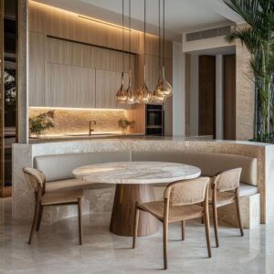
A rising trend is the use of reeded or fluted paneling on taupe cabinetry. The subtle shadows cast by vertical grooves bring dimension and break up what would otherwise be uninterrupted slab doors.
- Fluted/Slatted Islands and Cabinetry: The repetitive lines can inject a contemporary architectural feel without the need for stark color contrast. Taupe’s neutral quality keeps the look cohesive, while the shadows formed by fluting create depth.
- Wood Grain Direction: Whether horizontal or vertical, designers exploit directionality to shape the kitchen’s feeling of height or width. Vertical grain is often used on tall panels to draw the eye upward, especially in kitchens with lofty ceilings or skylights, emphasizing a sense of spaciousness.

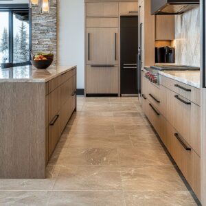
Pairing Taupe with Metal Hardware: Brass, Nickel, and Black Accents
Because taupe naturally sits between gray and brown, it plays nicely with a broad spectrum of metals. However, the specific undertone of the taupe often guides which metal finishes look most balanced.
- Brass and Bronze: Warmer taupe tones, or those with a hint of beige or light brown, often match best with brass or oil-rubbed bronze, underlining a slightly traditional or transitional flair. Pendant lights, faucets, or drawer pulls in brushed brass can bring out the taupe’s warmer side.
- Nickel or Stainless Steel: Cooler taupe shades or those edging into gray align well with brushed nickel or stainless hardware. This combination appears in more modern or minimal kitchens, highlighting crisp lines and architectural edges.
- Matte Black: Offers bold contrast, especially when used as slender pulls or linear beams. Black frames or mullions in windows also coordinate neatly with taupe, creating a purposeful outline around each elevation.

Layering Wood Tones and Taupe
Wood floors, ceiling beams, and open shelving often amplify the effect of taupe cabinetry—either by complementing it with similar earthy notes or by creating contrast if the wood is distinctly darker or lighter.
- Light Oak and Light Taupe: Produces an airy environment. If the cabinetry is a warm greige taupe, matching it with pale oak floors can make the space feel open yet cozy.
- Dark Walnut or Ebonized Wood: Anchors the design. Kitchens with darker wood on the ceiling or floors work well when the taupe cabinetry is lighter, ensuring a balanced overall palette. This approach can emphasize vertical planes and lead the eye upward or downward.

Balanced Contrast: Taupe + White or Taupe + Black Counters
Neutral countertops, especially in white or charcoal, often stabilize taupe tones.
- White/Off-White Counters: Keep the space bright and highlight the taupe color without washing it out. Subtle veining in stone counters can create a more transitional vibe, while solid, seamless surfaces appear contemporary.
- Dark Gray/Black Counters: Provide a bolder backdrop. If the cabinetry is a soft taupe, the interplay of light and dark can bring sculptural clarity to the kitchen. This pairing is particularly effective in kitchens leaning toward a farmhouse-industrial blend or those that use black hardware.

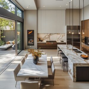
Strategic Use of Glass, Skylights, and Large Windows
Many taupe kitchen designs rely on abundant daylight, whether from oversized windows, sliding doors, or strategically placed skylights. Taupe—being sensitive to color shifts—responds strongly to changing light conditions.

- Skylights: They are common in narrow galley layouts or homes with angled ceilings. Taupe cabinetry can lighten or deepen under direct overhead light, giving a subtle shift in hue through the day.
- Arched Windows or Industrial Frames: Frame the taupe cabinetry as a canvas. The reflective qualities of the cabinetry (especially if semi-gloss) can bounce incoming light around, generating a subdued glow that picks up on taupe’s warm or cool undertones.

Textured Backsplashes and Subtle Tiling Choices
Taupe kitchen cabinets often coexists with tactile backsplashes—like glossy subway tiles, brick patterns, or stone slabs—to avoid monotony in a neutral-toned kitchen.
- Brick or Stacked Stone: Adds rustic or industrial flavor. The soft warmth of taupe feels organic next to brick or natural stone. In a bright setting, the masonry joints and varied surfaces keep the palette from seeming flat.
- Herringbone, Mosaic, or Glossy Tiles: These patterns and finishes bring in a hint of shimmer or movement. Subtle color variation within tiles can echo the depth in taupe’s tone, ensuring harmony rather than a jarring contrast.

Island as a Focal Point: Contrasting or Matching Taupe
Many designers single out the kitchen island as a place to accentuate or deviate from the main cabinetry color.
- Contrasting Island: Painting the island in a deeper or slightly different taupe can center the room, especially if the perimeter cabinets are white or ivory. This strategy grounds the design and avoids an overly uniform appearance.
- Matching Island: In spaces that emphasize minimalism or a monolithic block effect, the island often continues the same exact taupe color. Textured details like fluting, reeded wood, or a dramatic stone waterfall edge then become the main visual highlight.

Mild Historical References Within a Contemporary Setting
Taupe is popular in kitchens that combine a sense of tradition with modern layouts. Shaker doors, fluted columns, or apron sinks set a classic tone, while the neutral color and simplified hardware choices maintain a fresh look.

Designers often use taupe as a middle ground that ties together old and new—especially in kitchens that lean on structure without going too ornate. The quiet character of taupe brings out the shape and form of traditional detailing without making it feel heavy-handed.
It works particularly well in homes where the architecture hints at the past but the interiors are meant to feel fresh and functional. Think of homes in older neighborhoods that have been updated without stripping out their charm—taupe bridges that gap easily.

In these cases, taupe kitchen cabinet ideas usually come to life through finishes that emphasize shape over color. You’ll often find wider rails on cabinet doors, subtly profiled edges, or column bases built into islands—all made more noticeable thanks to the softness of the color.
It’s the kind of palette that respects the house’s roots while still feeling current, especially when paired with warm wood flooring, brass accents, or soft white countertops.

- Farmhouse Meets Modern: Taupe anchors farmhouse elements (like ceramic aprons, open shelves, or rustic stools) without veering overly country. The lack of intense color ensures the result is balanced rather than theme-heavy.
- Transitional Detailing: Slightly stepped moldings on cabinet doors or base skirting can highlight historical influences, but rendered in an understated taupe, it all remains cohesive and relevant for contemporary tastes.

Advanced Custom Work and Precision Details
Many of kitchens highlight matching of grain or continuous patterning. When taupe color cabinets have a wood veneer, designers often line up the grain across drawer fronts, refrigerator panels, and even hood vent enclosures.
This level of detail goes beyond the obvious color story—showing the value of precise craftsmanship in making taupe look truly refined.

- Continuous Grain Matching: Achieved by selecting veneers from the same flitch (sequence of wood sheets) and carefully installing them so the grain flows uninterrupted across multiple surfaces.
- Bookmatched Stone: Some backsplashes or countertops have matched veining that extends across corners, ensuring no visual breaks. Taupe serves as a neutral background that won’t clash with stone patterns.

Overarching Trend: Taupe as a Bridge Between Classic and Modern
Taken collectively, these examples illustrate how taupe rarely feels dated or overly edgy. It can inhabit a spectrum of styles—streamlined modern, farmhouse-influenced, or transitional—without appearing out of place.
Designers frequently rely on it to unify varying influences, from rustic brick to sleek quartz, or from decorative lantern pendants to handle-free slab doors.

Why It Works So Well
- Mellow Backdrop: Taupe’s inherent softness avoids the starkness of pure gray or the heaviness of brown, yet still adds a sense of dimension.
- Flexible Undertones: Small shifts in undertone (more beige, more gray, or even a faint olive cast) allow it to adapt to different decors and hardware styles.
- Texture-Friendly: It neither overpowers intricate tile or stone nor gets lost when combined with elaborate woodwork.
- Timeless Appeal: While other color trends may swing from bold jewel tones to stark whites, taupe remains stable and comforting.

In short, taupe balances two extremes: it’s robust enough to hold its own as the primary hue of a kitchen, yet neutral enough to serve as a tranquil base for a wide mix of materials and design gestures. Through variations in finish, texture, and metal accents, each project harnesses taupe in ways that feel unique, refined, and resonant with both classic and modern sensibilities.