Bedrooms are changing. What used to be treated as quiet, neutral spaces now often carry more personality—and in many cases, more color.
This shift is especially noticeable in homes where designers have introduced subtle structure, layered materials, and a refined mix of tones without overwhelming the space. These are not loud rooms, but they aren’t shy either.
They show how color can be calm or bold, soft or sharp, depending on how it’s used and what it’s paired with.
In this article, we’re taking a closer look at colorful bedrooms that balance thoughtful composition with expressive decorating choices. From refined coastal areas to trend-forward neighborhoods across the country, there’s a noticeable pattern: soft palettes made interesting through contrast, clean furniture lines used as anchors, and small design choices that end up having big visual impact.
Instead of relying on obvious statement pieces, these rooms often shine through coordination—how the headboard matches the curtain edging, how the artwork lines up with the nightstand, or how natural daylight moves across different surfaces throughout the day.

Each example shows a different angle of how to use color and shape with purpose. These spaces feel intentional without being overworked, giving the room quiet structure and comfort while keeping it visually engaging.
Whether you’re looking for inspiration for your own space or want to understand what makes certain rooms feel balanced and current, these examples offer plenty to study—and even more to borrow.

Color Strategy That Goes Beyond Simple Matching
Tone-on-Tone Layering
Bedroom color schemes can be built on close variants of one or two central hues (for example, coral-apricot walls with peach-beige fabrics). This approach prevents color overload while introducing complexity through small shifts in tone—just enough to create visual depth.
By using variations of a single color family, the rooms avoid monotony yet still feel calming.

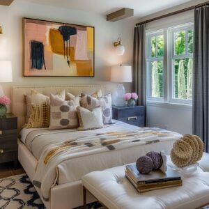
Contrast Through Accents
Almost every colorful bedroom incorporates one or two accent tones (rust-orange pillows, mustard blankets, forest green cushions) to break up a largely unified color palette. These pops of color usually appear in small items like pillows, blankets, or art.
Because these items are portable and easy to replace, it also signals a move toward flexibility—one can swap out a throw pillow to freshen the look without changing the entire design.
Unexpected Combinations
Designers integrate contrasting tones—like sage and peach, or teal and rust—to balance warmth and coolness. This is especially apparent in midcentury-inspired spaces where color blocking is used as a statement.
The distinctive mixes suggest a growing acceptance of more daring color choices, rather than sticking to strictly neutral or traditional pairings.

Innovative Uses of Texture and Tactile Elements
Layered Textiles and Subtle Fabrics
Seersucker or matelassé bedding, crinkled cotton blankets, boucle headboards, and velvet accents keep surfaces from looking flat. The interplay of smooth surfaces (white cotton sheets) with more pronounced textures (woven throws, plush velvets) adds dimension.
This tactic achieves variety in a gentle way and avoids busy prints.
Subdued Rug Presence
Your colorful bedroom can opt for low-pile or flat-weave rugs in soft, neutral colors. These rugs ground the furniture without hogging attention.
Fine striations or faintly mottled patterns gently echo other design details, such as channel-tufted headboards or subtle stripes on walls.

Geometry, Lines, and Balanced Proportions
Vertical or Horizontal Stripe Emphasis
Exploring colorful bedroom ideas, you can see options that feature color-blocked walls in stripes that align with the bed’s headboard height or nightstand tops. This not only adds strong graphical presence but also visually expands or compresses the sense of height.
Repeating vertical lines appear in trim, headboard upholstery, or wall paneling to accentuate upward flow.

Symmetrical Placement
Centered beds, aligned pendant lights, and matching nightstands suggest a keen sense of order. Such symmetry frames the bed as the focal point without clutter.
In some examples, asymmetry is introduced in smaller ways—like two different lamps on each side—to keep the arrangement interesting but not unbalanced.
Floating Shelves and Minimal Furniture
In colorful modern bedroom designs, shelves and nightstands are either floating or stand on very slender legs. This lifts everything off the floor, generating a lighter feel.
It also helps small bedrooms feel more open by showing more of the floor area and reducing visual bulk.

Use of Architectural Features as Decor
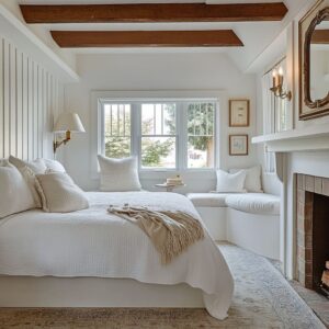
Ceilings as a Visual Anchor
Rooms with vaulted or beamed ceilings frequently employ paint or wood detailing that elevates the entire design. Instead of letting the ceiling remain white, some designers choose coral or pale sage for the infill and keep the beams a contrasting color.
By turning the ceiling into an intentional feature, the room gains another layer of style without additional furniture.

Integrated Millwork and Wainscoting
The walls can feature paneling, wainscoting, or built-in shelving that doubles as decor. Rather than adding decorative items to the walls, the walls themselves become decorative.
This can appear as box moldings painted in two tones or built-in niches with curated items. The key is measured restraint, using each panel or shelf for a minimal collection.
Exposed Textures (Brick, Concrete, Wood Grain)
Whitewashed brick, polished concrete floors, and knotty pine ceilings are highlighted rather than hidden. These textures introduce an organic dimension.
Designers typically pair raw textures with clean modern furnishings or refined palettes to keep the look balanced, never too rustic or too industrial.

Furniture and Accessories with Refined Simplicity
Midcentury References
Tapered legs, low profiles, and minimal hardware are common in nightstands and bed frames. This nods to a midcentury style that feels both classic and current.
Wooden frames in ash, maple, or walnut often appear with pale mint or peach drawer fronts, echoing vintage forms but with updated colors.

Thoughtful Headboard Choices
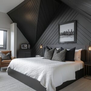
From channel-tufted velvet to simple upholstered arcs and scalloped silhouettes, headboards are often the showpiece. They anchor the entire color concept by repeating a hue from the walls or the accent pillows.
In some cases, the headboard shape—vertical channels, curved arcs—echoes other lines in the room, like the shape of a pendant light or an arched sconce.
Bench or Ottoman at the Foot of the Bed
A bench or ottoman can serve as a transitional element, bridging bedding and the rest of the floor. Designers regularly match it to accent colors (such as deep navy velvet or mint upholstery) to tie the palette together.
This piece also provides function without adding clutter.

Lighting Nuances That Set the Atmosphere
Layered Light Sources
Most colorful bedrooms show a combination of overhead lighting (often recessed or a statement pendant) and smaller fixtures (wall sconces, pendant lights over nightstands, or table lamps). This creates flexibility in lighting levels, from soft glow at night to brighter daylight in the mornings.
Sculptural Pendants and Sconces
Spherical bulbs, flared metal cones, and organic ceramic bases appear frequently giving an extra color to the bedroom interior. Each fixture is selected to either seamlessly blend with the room’s palette or introduce a tiny contrast.
For example, black cords on white globe pendants highlight the floating effect, while brass sconces add a gentle gleam against neutral walls.
Strategic Placement
Lights often align precisely with architectural lines—centered with the bed, lined up with panel edges, or matched to nightstand outer edges. This deliberate positioning enhances the sense of organization and flow, while avoiding the space from becoming overloaded.

Window Treatments that Support the Overall Concept
Full-Drop Drapes for Height
Floor-to-ceiling curtains help elongate rooms, even in smaller spaces. Soft neutral curtains often blend with wall colors, while bolder drapes (lavender, peach, or pale green) become an accent in otherwise minimal spaces.
Curtain rods are often simple and in a darker metal, highlighting the linear aspect at the top edge of the room.
Layering Shades or Blinds
Often, sheer or semi-opaque layers lie behind heavier drapery. This way, daylight can be diffused for a gentle wash, or the room can be darkened for rest.
Inside-mounted Roman shades that match wall paint or trim help keep the window area uncluttered.

Accessory Placement that Shows Discipline
Minimalism, But With Purpose
Objects on surfaces (nightstands, dressers) are chosen to create visual calm. Rather than crowding surfaces of the colorful bedroom, designers select one or two items—a small vase, a single potted succulent, a stack of books.
This helps highlight the few items present while maintaining an uncluttered look.

Art and Mirrors Used as Subtle Focal Points
Wall art is typically large in scale or grouped in symmetrical sets. Mirrors are often round or in shapes that counterbalance the linear forms of the furniture.
When a wall features dramatic paint or wallpaper, artwork is kept simpler, often minimal color fields or line drawings that don’t compete.
Coordinated Details
Small details repeat across the room: a color from the accent pillows might match a piece of pottery on the dresser or the edging on curtains. These small echoes create a sense of cohesion, revealing the high level of intention behind what might appear effortless.

Emerging Directions and Less-Obvious Observations
In the most current colorful modern bedroom designs, there’s a noticeable move away from overly decorative themes and into more thoughtful spatial cues that only trained eyes tend to pick up. These aren’t loud choices—they’re quiet, confident shifts that influence how a room feels without needing to shout.
Ceiling Color with Purpose
A ceiling used to be the last surface anyone thought about. Now, it’s a conversation starter.
Whether it’s a coral-painted vault, soft sage beams, or pale knotty wood with natural grain left visible, the top plane of a bedroom is gaining attention as part of the design—not just a default white surface. Designers are using color and texture above to balance verticality, set mood, and echo tones from textiles or flooring below.
These ceilings act like a soft continuation of the palette, rather than an abrupt stop.

Furniture That Floats and Breathes
Designers are leaning heavily into open-air furniture—beds and nightstands on slim legs, or wall-mounted pieces that show floor underneath. These decisions create more visible negative space, giving small bedrooms a lift without needing square footage.
It also introduces rhythm: repeated lines from leg spacing or wall gaps act as quiet geometry. This kind of furniture works especially well in bedrooms with complex layering of light, where shadows and floor patterns add to the feeling of movement.

A Hint of the Past, Loosely Placed
There’s a subtle nod to vintage aesthetics, but without leaning too hard into nostalgia. Instead of full retro replicas, designers might introduce a single carved wooden stool, a rust-colored ikat cushion, or a ceramic vase shaped like something from a Japanese flea market.
These small hints of story give the room character while keeping the overall style modern. It’s about tension between styles, not full-blown theme rooms.

Patterns with Limits
Pattern now has rules. Large-scale wallpaper, botanical murals, or textiles are usually limited to one location per room.
That single surface does the visual work while everything else supports it through texture or solid color. This prevents overload and keeps the eye from pinging around the space too fast.
It’s a technique that makes bold elements feel more refined.
Texture Taking the Lead
There’s no mistaking the emphasis on tactile choices. Rooms are filled with layers of velvet, raw brick, soft boucle, quilted linens, and looped wool rugs.
Instead of grabbing attention through print, designers are using texture changes to build richness. These shifts show up best under natural light and indirect lighting, making the room shift as the sun moves.

Everything in Its Place—Literally
Designers are paying closer attention to lines, alignments, and visual balance. Whether it’s the edge of a throw blanket meeting the seam of a bed bench, or a pendant cord running exactly along the edge of wall paneling, there’s a sense that every object is working with the space around it.
You won’t find casual placements here—each lamp, artwork piece, or shelf is aligned with something structural.
Light with Layers, Not Overhead Drama
One of the more subtle but effective techniques is layering light through sheers, Roman shades, and directionally placed lamps. These setups let filtered daylight hit walls and fabrics in soft angles, rather than depending on a single harsh overhead source.
The natural shifts in daylight help peach walls glow warmer by afternoon, or make sage ceilings feel deeper in the evening.

Headboards as Centerpieces
Beds have become the anchor point again—not with loud bedding, but with headboards that carry visual weight. Velvet channels, fan shapes, or scalloped forms pull the eye without needing busy prints.
These pieces are often where the strongest color sits, giving the entire space something to hold on to. In most of these spaces, the headboard does the job of a feature wall without needing paint or paper behind it.

Thoughtful Groupings of Objects
Shelves and dressers now often feature tightly controlled clusters of objects—ceramics in pale clay, a couple of stacked books, a bowl, or dried floral stems. These items reflect the room’s palette, chosen for shape and tone rather than story or trend.
This curated restraint creates more impact than trying to fill space. Together, these subtle design choices mark a shift in how colorful bedroom ideas for adults are approached.
It’s less about being flashy and more about using quiet cues—through material, light, and alignment—to create depth. The result is a space that doesn’t try too hard but still feels completely considered.

Concluding Observations
Across the wide range of examples covered, a few themes keep repeating—not loudly, but with quiet consistency. These bedrooms show how today’s colorful bedroom design isn’t built on flashy elements or loud statements.
Instead, it’s about subtle layering and a steady hand. The most striking results often come from restraint—allowing space for color, texture, and form to work together without clashing.

One thing is clear: color is used with purpose. Whether through tone-on-tone walls, ceiling accents, or thoughtfully placed pillows, contrast shows up where it counts and rests where it doesn’t.
Nothing is random. Accent pieces are chosen to either echo or gently challenge the main palette, never shouting for attention but still drawing the eye.

Furniture plays a big role here too. Clean silhouettes—whether midcentury or contemporary—offer structure without weight.
These pieces are often chosen for their lines, not just their materials. A bench leg that mirrors a sconce’s curve, or a headboard shape that repeats in a rug pattern, adds subtle depth.
Lighting, likewise, isn’t overcomplicated. Pendant cords, lamp bases, even bulb warmth are all part of the visual balance.

Layering stands out as one of the strongest undercurrents. From how drapes interact with wall color, to the way throw textures sit over a bedspread, these rooms depend on how materials stack and touch.
Nothing feels over-decorated. Everything sits with purpose.
Above all, what gives these bedrooms their designer quality is how each layer—paint, furniture, textile, lighting, accessories—lines up both visually and emotionally. They feel comfortable, finished, and built with attention that doesn’t ask to be noticed.
It just works. The takeaway is simple: design doesn’t need to be loud to be strong.
It needs clarity, control, and a sense that every choice supports the next. That’s where the power of truly thoughtful interiors shows up.