There’s a reason the most admired mid-century modern living rooms today don’t feel overly styled—they feel built into the architecture. You can sense it in the way materials connect, how furniture floats with intention, and how light works with the room instead of competing against it.
This isn’t about vintage nostalgia or copying old layouts. It’s about understanding the quiet choices that shape how a space feels when everything is doing its job in the background.
From flush TV walls and floating hearths to exact lighting layers and invisible storage, the latest wave of mid-century interiors is more measured than it is decorative. Designers are using rhythm, alignment, texture, and proportion to fine-tune these rooms—not to impress, but to let them breathe.
The most effective moves are often the most overlooked. And that’s exactly where the interest lies.
This article breaks down those details: the hidden grids, the material shifts, the acoustic tricks, and the thoughtful light placement that define today’s most refined interiors inspired by mid-century principles. Whether you’re building new or updating, these insights can shape rooms that feel grounded, complete, and long-lasting.

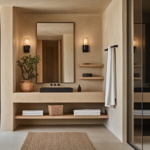
Material Synchronicity & Tactile Hierarchies
In many high-end mid-modern century living rooms, the star of the palette continues to be walnut—warm, structured, and unmistakably rich in grain. But designers aren’t leaving it to dominate the space unfiltered.
Instead, they’re pairing it with fine brass lines, soft LED strip lighting, or neighboring pale stone. This thoughtful approach doesn’t just lighten the visual load—it allows the walnut to sit comfortably in the background while still shaping the room’s tone.

Ribbed, fluted, or narrow slatted wood paneling is now doing more than adding a decorative feature—it’s taking on sound control without showing its hand. These linear patterns bring texture and rhythm to walls while quietly softening the acoustics.
The gaps between slats throw tiny shadows that shift with daylight and give the wall a subtle sense of movement. In a calm space with minimal color changes, those shadows end up doing much of the visual work.

And it’s not just wood surfaces that are getting this treatment. Travertine, limestone, and even slate are being milled like fine cabinetry.
Designers are cutting these stones into wide, plank-like pieces, book-matching them to maintain veining flow, and wrapping them around corners so they behave more like crafted millwork than rough cladding. On fireplace walls especially, this move delivers a clean, sculptural effect without breaking the material’s natural line.
It’s precision and weight, working together in balance.

Fire Feature Re-Thinking
The traditional fireplace as a central, raised feature has taken a backseat in today’s refined mid-century lounge room designs. Instead of big stone surrounds or protruding hearths, rooms now often feature a slim, horizontal flame insert that’s recessed into a long wall of stone or plaster.
Right below, a floating hearth or concrete ledge extends outward, blending utility with visual lightness. This setup gives a soft flame presence without blocking sightlines or interrupting low-profile furniture groupings.

More interesting still is how many designers are shifting away from perfect symmetry. Instead of centering the fireplace and flanking it with built-ins, they’re offsetting it—nudging it slightly to one side and counterbalancing it with shelving, cabinetry, or open space.
This sidestep from symmetry isn’t accidental. It recalls early prairie-style design where function and form shared space without rigid balance, but with today’s cleaner lines and leaner shapes, the effect feels current and intentional.
These two changes—lower fire features and asymmetrical placement—aren’t about flash. They’re about giving the fire a quiet presence that supports the room rather than steals from it.
And when paired with natural textures and carefully controlled lighting, the entire setup feels like part of the architecture rather than an add-on.

Lighting as Architecture, Not Accessory
One of the clearest signals that you’re in a thoughtfully planned mid-century contemporary living room today is the way lighting is layered into the structure rather than added on afterward. Instead of relying on floor lamps or decorative fixtures that clutter up corners, designers are building the lighting plan into the bones of the room itself.
And that structure is almost always built on a three-part approach.

First, there’s the soft perimeter glow. Cove or LED strip lighting runs behind ceiling drops, along the upper edge of slat walls, or tucked under soffits.
It creates a gentle wash of light that shapes the volume of the room without spotlighting any one item. Second, tiny deep-set pin lights are dropped precisely where task lighting is needed—usually near reading areas, over dining tables, or angled onto textured walls.
They’re nearly invisible, but exact in placement. Third, one bold pendant light is introduced as a central feature—usually sculptural, often a modern globe or reworked sputnik form, placed to draw attention without flooding the space with glare.

This method keeps the ceiling line clean—especially in rooms where natural light does most of the heavy lifting during the day. But the quiet brilliance is in the way hidden lighting replaces traditional lamps altogether.
Shelving, hearths, benches, and cabinetry now often include their own backlighting or toe-kick glow. Side tables stay uncluttered.
Living areas feel open, unblocked, and softly lit from surfaces rather than objects. The result isn’t decorative lighting—it’s structural clarity made visible.

Upholstery Scale & Fabric Strategy
| Attribute | Recurring Choice | Why It Matters |
|---|---|---|
| Sectional height | 28‑32cm seat; backs below shoulder height | Keeps sight‑lines clear to glazing and beams |
| Preferred fabric | Ivory or oat boucle (12 rooms) | Texture gives visual weight without color noise |
| Accent leather tone | Caramel/Rust/Mustard | Links to walnut & brass, avoids hard contrast |
| Chair archetype | Danish teak frame or armless Saarinen offshoot | Slim legs + sculpted seat relieve the bulk of sectionals |

Color–Temperature Bandwidth
Color in today’s high-end mid-century modern lounge room isn’t loud or contrasting—it’s tuned. Designers are working within a spectrum that stays mostly in the LRV 40 to 80 range, meaning materials are chosen for their mid-to-light reflectivity instead of saturation.
Instead of relying on bold accents or high contrast, they let warmth and coolness do the talking.

For example, you might see warm walnut panels set against pale gray limestone, or a caramel-toned leather chair offset by a wall in cool sage plaster. These pairings don’t rely on brightness—they rely on temperature shift.
That’s the trick: the colors are all subdued, but their interaction creates depth, variation, and movement. By layering textures in this tonal range, designers can stretch the feeling of openness while still maintaining intimacy.
You’ll notice how the entire palette flows: nothing feels cut off, and every surface picks up a cue from the next. Whether you’re looking at a ceiling beam, a rug’s undertone, or a piece of furniture, the room speaks in gradients—not shouts.

Spatial Weaving & Built‑in Culture
One of the strongest design cues across top-tier interiors is how built-in elements now define not just the storage, but the shape of the living space itself. In many rooms, seat-height bands stretch under windows, run across fireplace walls, or extend into low cabinetry, all in one continuous move.
This blurs the line between architecture and furniture—everything feels like it belongs to the structure.

This tactic also serves a quiet function: it anchors the room. Instead of scattered objects, you get a horizontal thread that ties the layout together.
And with that built-in logic comes a new respect for space itself. Rugs are no longer wall-to-wall; they often float within the room, leaving a visible gap at the edge that exposes flooring material—be it stone, concrete, or wide plank wood.
These spaces of “non-use” give the design room to breathe.

Shelves are another example of this. They’re rarely overstuffed or used for bold color.
Instead, styling is restrained—just enough texture to show care, but never enough to feel staged. Negative space isn’t wasted space here.
It allows each object, each material, to read more clearly. And when everything feels intentional without being forced, the room starts to work on a deeper level.

Trendy Mid-Century Modern Moves
In today’s refined mid-century interiors, the standout moves aren’t loud. They’re precise.
And often, they’re hiding in plain sight. One of the most subtle yet powerful tools used across high-end spaces is the shadow gap—a 6 mm recessed line, usually formed in plaster, that runs along panel edges, baseboards, or ceiling transitions.
These tiny breaks create invisible alignment points that give the eye a quiet structure to follow. It’s the modern grid—only softer.

Another move that often goes unnoticed by casual observers: the relationship between fireplace flame height and coffee table elevation. Designers are setting the top of the table either right in line with or slightly below the firebox, which reduces glare on reflective surfaces and keeps the flame from bouncing light into guests’ faces.
It’s one of those mid-century modern living room ideas that’s all about control—not decoration.

Grain direction is also playing a bigger role in shaping how people move through a space. Rift-sawn wood boards are being laid parallel to primary walking paths.
This alignment subtly guides the foot and elongates narrower rooms. It’s a move you’ll see often in mid-century spaces influenced by gallery layouts, particularly in homes inspired by West Coast modernism.

Sound quality, often overlooked, gets fine-tuned through materials, too. Designers are pairing high-pile textiles like bouclé and thick rugs with hard ceilings to help control echo.
In rooms with wood-slatted ceilings, they’re switching to flatter, tighter fabrics. There’s no visible acoustic treatment—just intelligent textural matching.
The result is quieter spaces without adding panels or foam.

And outdoor connections? Those are no longer handled with clunky thresholds.
A few of the most forward-thinking homes now mirror their indoor and outdoor materials to the millimeter. Fireplace stone slabs and patio pavers are cut in matching widths.
When sliding doors open, the effect is seamless—not visually, but architecturally grounded. These transitions help the layout breathe without drawing attention.
In terms of tech integration, designers are now embedding TVs into wall seams—never centered on the wall. These screens slip into the join lines between wood panels or plaster reveals so they barely register unless turned on.
It’s an updated take on the old “disappearing wall unit” that feels more natural and less gadget-driven.

A few other sharp observations:
- Accessory clustering is no longer symmetrical. Especially in rooms with pitched ceilings, like those in Denver or parts of the Northeast, placing decor like vases or bowls off-center can visually pull weight back down toward the lower eaves, giving the peak less visual dominance.

These aren’t flashy tricks. They’re signs of thoughtful design work happening at every scale.
They give the mid-century modern lounge room a sense of completeness that doesn’t need to explain itself—and that’s what makes these spaces feel quietly exceptional.

Design Insights
There’s a reason walnut continues to be a go-to in refined mid-century interiors—it brings warmth, texture, and a strong visual anchor. But without contrast, it can drag the room down.
That’s why pairing a walnut feature wall with thin brass insets or grounding it against a concrete floor makes all the difference. Those counterpoints give the wood a chance to breathe instead of weighing on the space.
TV walls, too, are being treated more thoughtfully. Rather than using plain drywall, designers are turning to fluted plaster or ribbed MDF around media zones.
These micro-grooves pull in shadows that reduce glare and give the TV a visual frame that feels integrated—not stuck on. It’s a small detail, but it reshapes how the technology sits in the room.

Fireplace design has also gotten much more exact. Ribbon-style fireboxes now typically sit between 430 and 460mm above the floor.
That range works—low enough to catch from a relaxed seat, high enough to keep reflections from bouncing off nearby tables. It’s the kind of measurement that speaks to long-form use, not just initial impact.

Lighting discipline has become a defining feature. One sculptural pendant—often placed in the geometric center of the space—is usually all that’s visible.
All other light is hidden: under shelving, behind cabinetry, or inside coves. This approach keeps the ceiling line free, echoing the clarity found in postwar homes where ceiling noise was avoided completely.

Textiles are being handled with the same care. Designers aren’t just matching color—they’re matching texture depth.
Boucle seating often gets paired with flatweave cushions. Velvet finds its match in smoother leather.
This layered feel is what gives neutral palettes enough variation to stay engaging.

And even rug placement has its rules. Letting rugs stop about 150mm before reaching a built-in hearth or bench gives the floor some breathing room.
That visible strip of concrete or wood echoes how furniture floated in original 1950s layouts—one of those small tricks that makes a room feel instantly rooted in its style. If you’re collecting mid-century modern living room decorating ideas, pay close attention to these quiet construction-level details.
They’re what actually define the mood once the bigger pieces are in place.

Where the Trend Is Heading Next
What’s ahead isn’t louder—it’s sharper. Designers are doubling down on material clarity and doing more with less.
Expect to see stone handled the same way fine cabinetry has been treated: full walls in book-matched marble or travertine, with seams that align so perfectly they almost disappear. These stone volumes are even being engineered to open—concealed storage hiding behind monolithic slabs.

Another shift? Ceiling continuity.
Instead of relying on floor materials to blur indoor and outdoor zones, more projects now run tongue-and-groove cedar ceilings straight through to patio covers. That unbroken canopy does more to carry the eye outward than matching tile ever could.
Furniture layouts are changing, too. Symmetrical sectionals are giving way to looser, multi-directional seating zones.
These pods let conversation rotate—TV, fireplace, landscape view—all without dragging furniture into new positions. It’s less about centering the room, more about letting it pivot.
All of this points to a mature phase in mid-century revival. Rooms aren’t relying on retro shapes or color pops.
Instead, they’re being built on surface accuracy, smart acoustics, and texture-rich neutrals. You don’t need a dozen elements fighting for attention.
If the ratios are balanced—say, 3 parts warm wood, 2 parts cool stone, 5 parts soft texture—you’ve already done the heavy lifting. Add one standout pendant or a well-cut coffee table, and the room feels confident without trying hard.