Good layout is easy to recognize in large homes. But in small master en-suites—where every centimeter has to do more than one thing—it’s the quiet design decisions that matter most.
Across today’s most refined small layouts, there’s a clear shift away from crowded styling and toward control: fewer materials, clearer alignments, and lighting that’s placed with intent. The goal isn’t to make the bathroom look bigger—it’s to make it feel considered.
That means storage built into walls instead of hung on them, vanities that float instead of sit, and mirrors that do more than reflect.
What’s consistent across these rooms is the way each element is chosen to solve more than one need. Lighting adds structure.
Flooring connects zones. Glass doesn’t just divide space—it guides sightlines.
These are not showpieces. They’re functional, grounded layouts that feel generous without being loud.
This article takes a close look at the design moves that make small en-suites work well—and the details that separate average from exceptional. From layout tricks and tile orientation to finish choices and subtle lighting, every section breaks down how comfort and clarity are built into compact spaces one decision at a time.

Bed‑to‑Bath Continuity Is the New Luxury
In today’s most thoughtful small en suite designs, the old rule of separating bedroom and bath is giving way to something far more fluid. Designers are now erasing visual and physical boundaries to make both zones feel part of a continuous living space—without sacrificing privacy or comfort.
The most effective trick? Let the flooring run unbroken.
Whether it’s pale oak, wide-format porcelain, or soft terrazzo, allowing one surface to flow from bedroom into bathroom instantly stretches the space. It reduces the mental “room switch” and sets a calmer tone.
No thresholds, no seams—just a smooth extension that brings unity and ease to everyday use.

Color and texture also play a big role. If the bedroom features bleached timber or soft herringbone, echoing that same material or grain direction in the en-suite helps link the rooms quietly.
Even a mirrored cabinet finish or a matching drawer pull can anchor the design without drawing attention.

One of the most refined tactics is using aligned views. A narrow slot window or corner glazing is placed not for dramatic effect, but for strategic reflection.
When positioned across from the vanity mirror, that small window can pull in garden views or tree silhouettes, doubling depth and bringing outdoor calm into the center of the home—without needing a larger footprint. It’s not about making the bathroom feel like a bedroom.
It’s about avoiding the jarring shift that often makes small suites feel tighter than they are. The less contrast between zones, the more connected—and livable—the entire layout becomes.

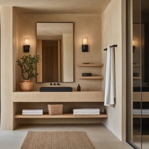
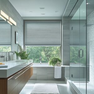
Warm Minimalism Beats High Contrast
A growing number of the best small en suite bathroom ideas are stepping away from the old black-and-white formula. Instead, designers are leaning into softer materials, warmer hues, and a reduced palette that favors lightness without sterility.
The focus is on warmth through subtle moves. Vanities in pale wood—whether oak, ash, or whitewashed finishes—bring a grounded quality without slipping into overly rustic territory.
These wood tones do more than soften the look; they reflect natural daylight gently and provide a calm foundation for other materials to layer on top.

Stone choices follow a similar logic. Rather than high-gloss white or aggressive veining, you’ll see creams, warm taupes, and soft-textured limestone.
These materials are forgiving under direct light, hide water spots, and avoid bouncing glare—making them practical as well as calming.

When darker tones are introduced, they rarely dominate. Instead, they show up as base framing or accent edges—brushed metal fixtures, recessed mirror borders, or slim door frames.
These details help outline the space and provide structure without overwhelming the scale. Together, these elements work as a quiet counterpoint to the overload often found in small baths.
They create rooms that feel clean without being cold, structured without being stark, and finished without needing strong contrast. In small footprints, that balance is key.

Vertical Tactics for Visual Height
In narrow bathrooms where floor space is limited, the smartest move isn’t to try and spread things out—it’s to build upward. The best small en suite ideas today rely on vertical design strategies that help stretch the eye and shift focus from width to height.
One of the most effective tools is the use of tall, integrated LED columns placed on either side of the mirror. Unlike traditional ceiling cans that create hotspots and shadows, these vertical light strips provide even illumination while visually pulling the ceiling upward.
This framing effect makes the mirror feel taller, and by extension, the room itself feels more open and composed.

Tile layout also plays a subtle but powerful role. Running tiles horizontally across the dry zone and then flipping them vertically inside the shower creates a clear spatial rhythm without switching materials.
This method divides zones gently while making the wet area feel taller and more private. The effect is even stronger when long-format tiles are used, turning simple surfaces into architectural cues.

And then there are curved ceilings or soft arches, especially over showers or vanity alcoves. Instead of chopping space with harsh right angles, these forms guide the eye along a smoother visual path.
Even a slight radius at the top of a shower opening can help a tight room feel taller and less confined. It’s not about adding more space—it’s about allowing the space to breathe upward.
These moves aren’t flashy. They’re subtle enough to go unnoticed on first glance, but they completely change how a small room feels when you’re standing inside it.

Integrated Storage Disguised as Architecture
In the most refined small en suites, storage doesn’t look like storage. It hides in plain sight—seamless, flush, and often invisible unless you know where to look.
This approach removes clutter without interrupting the visual calm that small spaces depend on. One of the smartest moves is replacing traditional medicine cabinets with full mirror panels that double as hidden doors.
These mirrors stretch wall-to-wall, giving depth and bounce to the light, while concealing shelves behind. There’s no visible frame, no hinges—just a clean surface that expands the room both visually and functionally.

Linen storage, when needed, follows the same low-profile playbook. Recessed niches are set directly into the drywall, using the full cavity depth without protruding into the room.
Instead of open shelves or heavy doors, fabric bins or folded towels are placed neatly into the cavity, with everything color-coordinated to the surrounding materials. This lets texture show while keeping noise to a minimum.

Vanities take the quiet approach too. Finger grooves or push-latch drawers replace hardware, so nothing interrupts the horizontal lines.
This doesn’t just make cleaning easier—it preserves the rhythm of the cabinetry, especially when it runs full wall length. These kinds of moves give the room a built-in feel.
Nothing looks added on. It’s all part of a single, continuous composition where every line has a reason to be there—and nothing competes for attention.

Asymmetry That Reads Balanced
In many standout small ensuite bathroom designs, symmetry is no longer the default. Designers are moving toward layouts that appear off-center at first glance but are actually finely tuned.
This shift toward controlled asymmetry brings energy into compact spaces without disrupting balance. A common move is placing lighting slightly to one side of the mirror—either a single vertical sconce or an LED strip that hugs just one edge.
These offsets could feel uneven, but they don’t. Why?
Because other elements like panel width, cabinetry proportions, or mirror placement are adjusted to rebalance the whole scene. The visual center shifts, but the room stays composed.

Another smart tactic is using negative space with intent—especially in rooms with a sloped or vaulted ceiling. Instead of forcing mirrors to follow the peak or reach all the way up, many designers deliberately stop the mirror below the full ceiling height.
This breathing room above the mirror keeps the architecture visible and avoids filling every plane with glass. That pause in material draws the eye upward and makes the volume of the room feel more open, even if the square footage is tight.

These asymmetrical moves don’t feel accidental. They rely on quiet corrections—thicker side panels, aligned towel bars, or recessed cabinetry—that rebalance the space without calling attention to themselves.
It’s a technique that shows up again and again in the best compact layouts.

Color Restraint, Singular Accents
In nearly every refined example of compact ensuite bathroom ideas, color is used with extreme precision. Most rooms commit fully to a soft, monochrome base—off-whites, warm beiges, soft wood tones—and introduce contrast through just one element, never more.
Green is the most consistent accent. It might appear as a stem in a vase, a single leaf in a glass cylinder, a sea-foam tile on the shower floor, or a band of sage-toned wall planks.
But always just one. This approach lets that small moment of color stand out without shifting the whole palette.
It acts as a visual anchor, not decoration.

Metals follow the same thinking. Brass or brushed nickel fixtures are used only if they repeat at least once elsewhere—often through barn door hardware, lighting arms, or drawer pulls.
The idea is to create echo, not noise. Random mix-and-match finishes don’t appear in these rooms because they break the rhythm.
Instead, every tone is placed like part of a sentence: quiet, deliberate, and clearly linked to something else in the room. This control of contrast, whether through color or material, is what helps these compact bathrooms feel clear and grounded.
Nothing distracts. The eye knows exactly where to land.

Conclusion: Subtle Structure Builds Spaciousness
In the best small bathroom suites, success doesn’t come from layering more in—it comes from removing everything that doesn’t earn its place. These spaces rely on clarity in layout, logic in alignment, and quiet material choices that carry the room without shouting.
One recurring move across top examples is mirror storage that doubles as depth. Instead of bulky wall cabinets or protruding shelves, recessed mirrors with hidden shelving expand both the field of view and the usable footprint—critical in layouts under 6 square meters.

Lighting plays a structural role too. Whether it’s a skylight or a slim LED strip, placing light where the water falls—along the drain axis or inside the shower niche—naturally draws the eye along that line, helping the room feel longer and more open.
Tile direction does more than add texture. When a single material flips orientation across zones—horizontal for dry areas, vertical in wet zones—it gives the space quiet visual boundaries without needing trim, color shifts, or extra material types.

Every room benefits from having one tactile anchor—whether that’s reeded glass, a ribbed wall tile, or hand-cut limestone. Choosing just one of these elements lets the room build rhythm without falling into competition between surfaces.
And finally, consistency in hardware is key. Just like a typeface set, finishes need to stay in the same “family.
” Mixing metal tones might seem small, but it quickly adds visual dissonance in compact spaces. The cleanest layouts treat metal like punctuation: one tone, one weight, one voice throughout.
Together, these small design choices shape rooms that feel balanced, composed, and surprisingly open. They prove that you don’t need more square footage to gain calm—you need sharper decisions, fewer distractions, and materials that speak softly but carry the whole space.