No color shifts a room’s energy quite like yellow. But making it feel grounded, livable, and refined takes more than just picking the right shade.
What separates a standout yellow living room from one that feels overdone comes down to structure—where the color is placed, how much of it is used, and what surrounds it. In today’s interiors, yellow is being treated with much more care than in past trends.
It’s not scattered across random throw pillows or painted in neon blocks. Instead, it shows up in full-height built-ins, sculptural seating, tiled fireplaces, and layered textures that carry its warmth without shouting.
Designers are pairing yellow with toned-down greens, deep charcoal walls, muted blues, and a wide range of natural textures—sisal, oak, brushed stone, and ceramic finishes. Each decision shapes how yellow behaves: whether it bounces light, absorbs it, or fades softly into the palette.
This article break down how yellow is working today. You’ll see how color ratios play a role, how shape and placement matter more than quantity, and why even one carefully placed yellow object can change the rhythm of an entire room.
In the sections that follow, you’ll find grounded ideas and subtle design strategies that show how yellow can carry weight, clarity, and atmosphere—without overwhelming the space it lives in.

Where, How, and How Much Yellow Shows Up
| Usage mode | Typical carriers | Core intent |
| Dominant surface (wall, shelving, fireplace-face) | matte paint, ceramic tile, built-ins | Turns yellow into architecture; fixes the palette before furniture arrives |
| Major furniture anchor | sofas, sectionals, sculptural lounge chairs | Places yellow at eye-level and seat-height, letting light model the fabric pile |
| Triangulated accent (art + soft goods + vessel) | canvases, pillows, ceramic pieces | Keeps the hue active yet sparing; the spacing prevents visual fatigue |
| Micro-pulse only (single vase or floral hit) | glass or glazed pottery, botanical stems | Treats yellow like daylight—present but fleeting, good for rooms already rich in texture |
Key takeaway: modern designs rarely hover in the middle ground. They either commit fully (wrap a wall or a velvet sofa) or reduce to pinpoint sparks; mid-sized “sprinkles everywhere” are almost absent, revealing a preference for decisive placement.

Pairing Palettes—What Sits Beside Yellow
A well-built yellow color combination for a living room isn’t made by stacking as many contrasting shades as possible—it’s crafted through relationships that let yellow hold its place without needing to fight for attention. The supporting colors chosen in high-end interiors are far from random; they shape how yellow behaves and how long it can stay in a room without tiring the eyes.

Charcoal and graphite tones are especially common in structured interiors with architectural lines. These deeper shades don’t brighten the space on their own, but they allow yellow to feel brighter by contrast.
In darker living rooms—especially in Northwest homes or spaces with heavy millwork—yellow stands out almost like a built-in light source when set against these inky tones. It becomes sharper, more sculptural, and much more defined.

Sage, olive, and other grounded greens come into play in homes that pull inspiration from natural surroundings—think Northern California, Oregon, or the softer light zones of the Midwest. These greens are not decorative—they function as filters.
Their low saturation reduces glare from yellow fabrics or walls, and they build a quiet connection to the outdoors, especially when paired with open windows or views into leafy gardens.

In homes with a touch of vintage structure or New England tradition, powder blue or muted periwinkle makes an appearance. These cooler blues don’t wrestle with yellow for attention—they lean into the contrast, but with restraint.
What’s important here is the temperature balance: blue cools the field, yellow warms it. Together, they recreate the sense of a morning-lit room, even in homes that don’t receive much sun.

Textural neutrals take up the bulk of the background in almost every space where yellow works. Raw wood tones, sisal rugs, brushed limestone, and off-white textiles do a specific job: they absorb visual noise.
These surfaces have tone, but not color in the usual sense. They bring out the yellows through balance rather than reflection.
It’s why so many living rooms pair bright pillows or art with oatmeal rugs and pale wood cabinetry—there’s no competing undertone.

One of the most surprising things found across many of these interiors is how rarely true white is used. Instead, designers lean into ivory, bone, and creamy oat.
These shades shift slightly as the daylight changes, and that movement makes yellow feel more natural. It’s a subtle design trick—by softening the white next to it, the yellow stops feeling artificial and begins to blend, shadow, and shift with the space.
There’s a rhythm in how all of this plays out—not just in color contrast, but in texture, finish, and light control. The best spaces using yellow never treat it as a separate moment—they embed it.

Texture and Sheen Tactics
| Texture choice | Purpose in yellow schemes |
|---|---|
| Matte paint & boucle | Soaks up glare; lets color register as depth, not shine |
| Velvet or channel-tufted corduroy | Gives highlights on folds, creating tonal variety inside one fabric |
| Glossy ceramic or glass | Used sparingly—usually one or two items—to echo window sparkle and stop heavy fabrics from feeling dull |
| Natural stone, fluted plaster, live-edge timber | Breaks up large yellow fields by adding grey-taupe interruptions that reset the eye |
Designs rely on sheen modulation more than adding secondary hues to keep yellow lively.

Shape, Grid, and Geometry
Some of the most striking interiors using yellow don’t rely on large amounts of it—they rely on how it’s shaped and where it sits. There’s a pattern emerging across many high-end living room designs: it’s not only the color that draws the eye, but how that color aligns with the structure of the room.

A common move in these rooms is what could be called visual echoing. That might mean a fireplace tiled in a strict rectangular grid, then matched across the room by an art piece with a thin yellow border following the same proportions.
Or it shows up in how a linear rug underfoot mimics the spacing of shelf compartments along a media wall. These geometric repetitions aren’t loud, but they create a steady rhythm that keeps the room cohesive without looking overly planned.
It’s especially effective in open layouts, where one pattern can carry the eye from one function area to the next without hard breaks.

Curves are another key part of the visual equation—especially when yellow is involved. Designers often apply yellow to arc-shaped sofas, low-slung barrel chairs, or sculptural benches.
These rounded forms soften the usual lines of doorways, windows, and furniture legs. They also reflect light in more fluid ways—no sharp shadows, just quiet tonal shifts across a velvet or boucle surface.
A yellow sofa combination with a rounded back or gently sloped arms brings a sculptural layer into rooms that might otherwise feel boxed-in by rectangular features. The contrast between curve and grid builds a kind of visual balance that feels settled, not staged.

Another method that repeatedly shows up is spatial triangulation. In practice, this looks like one yellow object at floor level (a vase or a rug pattern), another at seat height (like a cushion or chair), and a third elevated (on shelving or as framed art).
When these three points form a loose triangle across the room, it subtly directs the eye upward and sideways, giving the impression that yellow is threaded through the space rather than clustered in one place. This creates flow.
It keeps yellow from being a block and turns it into a line—a quiet movement through the room.

In some regional styles—especially California’s indoor-outdoor homes and minimalist Midwest renovations—this alignment between shape and tone is used as a layout tool. Not everything has to match, but forms tend to repeat.
A loop in a throw pillow might show up again in the shape of a chair leg or light fixture curve. A tile grid might carry its proportions into a coffee table inlay.
These patterns work like visual anchors. And when yellow is handled this way—through structured shapes, soft arcs, and thoughtful placement—its role expands.
It’s not just a pop of color anymore. It becomes part of the room’s rhythm, tied not to quantity but to how well it’s mapped into the space.

Material Partnerships
| Material | Relationship with yellow |
|---|---|
| Warm walnut & honey oak | Shares undertone, so yellow feels grounded rather than floating |
| Brushed brass & antique bronze | Reflects yellow subtly, enlarging its reach without adding glare |
| Blackened metal & matte charcoal | Provides crisp negative space that makes yellow edges read sharper |
| Limestone & pale marble | Cools the palette slightly, controlling warmth in sun-belt homes |

Design Moves Worth Borrowing
Some of the strongest rooms built around yellow work not through color layering alone, but through highly controlled moves that shape how that color shows up and behaves. These moves aren’t meant to repeat in every room—but the ideas behind them offer useful clarity in how to control visual pace and emphasis.
One standout approach is using full-height built-in shelving painted in matte ochre. This isn’t a background—it becomes a major surface, especially when paired with carefully chosen objects.
What works here is tone control: placing neutral items like bone-hued ceramics, rough terracotta, and matte black books or vases onto the shelf breaks the yellow without fighting it. The palette becomes less about brightness and more about balance.

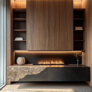
Another smart move? The mustard-glazed fireplace set against charcoal walls.
Instead of treating the fireplace as a background utility, this combo makes it a center feature—sculptural without needing a single accessory. The tile catches light differently throughout the day, shifting tone and shine, while the surrounding paint keeps it grounded.
It turns heat into a visual event, especially in homes with darker interiors or open layouts needing a central focal point. In homes with large or multifunction layouts, designers have split attention with two-tone sectionals—one side in amber, the other in deep teal.
The split usually follows the light: the amber side catching the sunlight, the teal side pulling toward the shaded or anchored part of the room. It’s a smart way to map color based on natural light, especially in open-plan layouts where clear zoning is helpful without walls.

One of the smallest but most striking gestures is the use of a single lemon-toned glass vessel on a dark surface, often a matte black coffee table. There’s no clutter—just one translucent object, catching light from nearby windows and echoing other soft tones in the room.
In spaces where surrounding fabrics stay neutral (think beige, ash, or tan), this one move activates the whole composition. Another favorite layout tactic appears in darker-toned reading rooms or libraries, where a yellow rug with a clean-lined grid pattern sits inside a charcoal shell.
This kind of flooring becomes more than texture—it gives structure underfoot. The rest of the room stays quiet (deep paint, soft upholstery, minimal pattern), while the rug’s pattern acts as the unspoken guide for movement and layout.
Each of these ideas proves that in a thoughtful yellow combination for a living room, it’s often structure—not volume—that gives color its strength.

Practical Color-Ratio Ideas
If there’s one thing consistent in successful layouts with yellow, it’s control over how much of it fills the room. The most satisfying colour combination with yellow living room tones keep the balance between brightness and restfulness.
The goal isn’t to limit yellow—it’s to let it hold space without overpowering the surroundings. Here’s what keeps the palette feeling grounded:.
- Dominant yellow surfaces—walls, sofas, tiled fireplaces, or shelving—tend to stay around 45% of the visible space. This amount creates impact, but leaves room to breathe.
- Secondary tones like olive, sage, powder blue, or pale mushroom neutrals make up another 35%. These aren’t the stars, but they carry the light and deepen the tone story.
- Natural materials—warm wood grains, jute rugs, limestone, and stone-finish tile—often take about 15%. Their subtle shifts in texture add visual pause points.
- Glossy elements or metal accents in yellow, such as ceramic vases or brass fixtures, sit below 5%. These are the punctuation marks—the final touches that add a flicker of energy.
A thoughtful living room color combination with yellow walls rarely crosses the 50% line. Even in bright rooms, restraint matters.
Saturated colors can fatigue the eye if they’re not supported by texture shifts or neutrals. In homes that use yellow confidently, the secret is often this invisible math—a room where boldness is held in check by thoughtful, proportional groundwork.

Concluding Insights
The most successful yellow interiors never treat color as an afterthought. They use it with intent, but also with restraint—whether that means committing to a tiled fireplace in deep mustard, painting an entire wall in buttery matte, or placing just one glazed lemon vase on a blackened surface.
Every tone of yellow used becomes part of a larger conversation happening in the room—between surface texture, natural light, and the surrounding neutrals. In rooms where yellow takes a leading role, its strength comes from how it’s supported.
That support often appears in the form of quiet textures: a boucle chair that softens the tone, a brushed wood panel that brings down the brightness, or a stone surface that keeps the color grounded. These shifts in surface aren’t visual noise—they’re structure.
They give yellow room to breathe, and in turn, allow the rest of the palette to stretch out without losing shape.

Designers are also highly deliberate about rhythm and placement. Repeating a tone once or twice across height levels—floor, seat, shelf—helps guide the eye without creating clutter.
This discipline prevents yellow from becoming static or overpowering. It feels placed, not scattered.
Whether it’s through the slow transition of sunlight across a velvet sofa or the way a yellow cushion reflects softly in a nearby glass door, the palette builds with care. The effect is that even a bold tone like yellow can feel completely at home in quiet, structured spaces.
With the right pairings, the right surfaces, and the right repetition, yellow doesn’t just brighten—it becomes part of the room’s layout logic. It’s in the lines, in the edges, in the spaces between tones.
In homes across the US—from coastal ranches to Midwestern bungalows—this approach to color is showing up more and more. And each one offers a new way to think about the colour combination with a yellow living room: not as a trend, but as a series of small, intentional choices that come together with balance and depth.