
A dining room gallery wall holds more potential than simply filling a blank spot behind the table. In many current interiors, these walls act like tuned instruments—shaped by scale, light, surface, and placement—responding directly to the furniture, architecture, and daily movement around them.
While some settings lean on symmetry and grid patterns, others shift frames ever so slightly or break up repetition with changes in depth, texture, or spacing.
In a wide range of ideas, certain patterns emerge. The best gallery walls often echo tones already found in the room, keeping things cohesive without needing strong contrast.
Others rely on material pairings—plaster, fabric, ink, ceramic—to build a dialogue that plays out in layers. Even subtle details, like the decision to stop a frame short of a window edge or to align a bottom row with a buffet surface, change how the wall reads.

This article looks closely at the less obvious moves—those small, thoughtful shifts that give a dining room its visual rhythm. Whether the wall holds a single bold canvas or a carefully spaced matrix, its success often lies in what’s not immediately seen—but fully felt.

Tonal Echo & Micro‑Contrast
In many contemporary dining interiors, what draws the eye is not bold color but the quiet repetition of values. A fine example appears in several dining room gallery wall ideas, where grayscale artworks echo the black finishes of chair frames and lighting fixtures.
This triangle—floor to table to ceiling—works like a silent scaffold that holds the space in balance. The strategy doesn’t rely on matching everything exactly, but on aligning tonal steps with care.
Black frames may mirror architectural mullions; white mats might fall in sync with pale wall paint.

The result is a gallery wall that appears embedded, as if it belonged there before the furniture arrived. It speaks in gradients, not contrast, and shows how even a reduced palette can feel layered when every element belongs to the same tonal family.
This kind of harmony carries especially well in natural daylight, when the room’s materials share the light instead of competing for it.

Rhythmic Grids with Humanised Drift
A grid, when too precise, can start to feel like it was stamped in rather than placed. But in many of the most considered dining room wall gallery setups, small breaks in the pattern keep the display lively.
A cushion slumped against a bench, a frame that leans a fraction off center, or a composition that traces a rising diagonal—these are the visual cues that tell the eye someone built the wall with their hands, not software. One frame may shift while the others hold still, and that single deviation does more than disrupt symmetry—it brings motion to stillness.
These details aren’t mistakes; they’re what make the installation feel lived-in. In some arrangements, such as those using corner benches or vertical stacking, the geometry is tightened even further, but a single softened edge or unexpected angle prevents the whole display from becoming stiff.
The best picture wall ideas for dining room settings often include one such moment of quiet deviation—a deliberate irregularity that makes everything else feel more alive.

Texture as Primary Content
Some dining room galleries do away with imagery altogether, letting material take center stage. Textured panels, relief surfaces, and sculpted forms mounted in frames shift the focus from what’s inside the border to how it catches the light.
These aren’t just visual objects—they’re tactile records of surface and shadow. The work is subtle: soft curves of plaster or dense lines pressed into ceramic change minute by minute as the sun moves or a pendant casts a new shadow.
What seemed flat at breakfast might ripple by dusk.

In certain rooms, especially those with restrained color palettes, this kind of wall becomes a slow performance of texture. A viewer may not notice each difference at once, but the sense of variation builds with time.
These dining room gallery wall ideas don’t rely on storytelling through image—they create depth through light and structure alone, turning the wall into a quiet sculptural field that shifts without ever needing to move.

Scale Negotiation: One Giant vs Many Small
Deciding between a large statement piece and a group of smaller works isn’t just about preference—it’s a calculation of how negative space behaves in a room. A single oversized canvas, nearly brushing the floor and ceiling, can hold a room’s focus entirely, asking everything else—the chairs, the vase, the pendant—to orbit around its mass.
In contrast, a narrow vertical stack of six artworks builds a quieter rhythm, especially when placed beside tall windows or between structural interruptions. Both options demonstrate a shared sensitivity to volume and proportion.

This thinking is particularly clear in a gallery wall behind dining table arrangements, where every inch of verticality counts. A taller grouping might temper an overly wide wall, while one bold canvas can compress height and draw the gaze inward.
Whether sliced into visual beats or poured into one sweeping form, the decision controls the energy in the room and sets the tone for how other objects relate to the walls.

Light Choreography as a Design Layer
What often separates average from exceptional is how the wall interacts with light across the day—and night. Some dining rooms embed small directional spotlights above their art, softly revealing mat edges and paper fibers with a clean backlit glow.
Others opt for a continuous brass rail casting uniform warmth across textured surfaces, allowing plaster reliefs or raised panels to speak through shadow instead of pigment.

There are also more sculptural installations, where every frame gets its own pinpoint sconce, so the artwork unfolds like a row of stills frozen in motion. This technique creates pacing—not just along the wall, but in the entire space.
It gives the gallery the same dynamic presence as a mobile or fireplace. Especially in gallery wall ideas for dining room setups that involve evening use, this kind of lighting turns the wall into something active and responsive, not passive.
Shadows, highlights, and the objects that catch them change by the hour, creating layers of atmosphere far beyond what frames alone could offer.

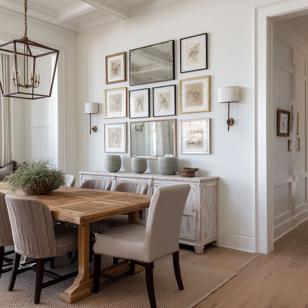
Aligning Art with Architecture
A photo wall in a dining room gains far more presence when it listens to the architecture around it. Some gallery walls begin not with artwork, but with the lines already drawn by arches, windows, or built-in shelving.
When the edge of a grid lines up with the curve of a doorway or the contour of a ceiling recess, it becomes harder to tell where the structure ends and the art begins.

In one case, twin artworks mirror the pattern of a window across the room—not through imagery, but through the repetition of vertical scoring that mimics muntins. In another, the top line of a framed group precisely follows the shelf height of a neighboring alcove, making the entire display feel anchored by the room’s framework.
This approach doesn’t compete with the architecture—it amplifies it. The room begins to read as one continuous visual composition, where materials, shapes, and alignments reinforce each other and build a rhythm that’s more about cohesion than decoration.

Furniture as Visual Pedestal
Beneath many gallery walls, the furniture does more than fill space—it holds visual weight and defines the lower edge of the display above. A worn buffet with a chalky finish might reflect the dry tones of graphite sketches hanging overhead, forming a soft visual echo from surface to surface.
In other examples, a low console stretches exactly as wide as the gallery arrangement, creating a long horizontal band that ties the entire wall together. This kind of alignment doesn’t shout, but it shapes how the eye reads the full elevation.

The dining table and chairs no longer float in front of a decorative backdrop—they become part of a composed field of objects, where scale, material, and spacing respond to one another. Especially in a photo gallery wall in a dining room, this lower anchor keeps the wall from feeling like it was added after the fact.
Instead, everything rests on a common visual foundation, giving the room both structure and flow.

Frame Language & Quiet Hierarchy
In many gallery walls, it’s the framing—not the art—that defines the rhythm. Varying finish or thickness can create soft shifts in visual weight without disturbing the balance.
A row of frames might alternate between white, black, natural wood, and gold, avoiding repetition while keeping to a shared palette. That contrast in sequence encourages the eye to move rather than settle.

Some configurations insert one heavier frame among slimmer ones—a dark profile right at the center of a vertical column, for instance—which creates a gentle anchor and prevents the layout from drifting visually. What’s key is restraint.
Instead of changing frame material, shape, and width all at once, the strongest compositions tweak only one quality at a time. This quiet control of variation sets up a visual hierarchy that works in the background, helping the art breathe while avoiding visual clutter.

Negative Margins and “Breathing” Gaps
Spacing can matter as much as the content inside the frame. Many of the most effective layouts leave room where alignment might seem expected.
A few centimeters of unfilled wall between the edge of the art and the next architectural element—like a window frame or arch—can prevent the wall from feeling boxed in. Other gallery walls play with format: switching between vertical and horizontal pieces within the same grid, while generous matting provides pause between visual elements.

These small pockets of stillness act like rests in music—they give rhythm to what’s around them. The result is a display that feels more composed than crowded.
By allowing for quiet between the visual statements, the entire wall becomes easier to read, more engaging to revisit, and better tuned to the proportions of the space around it.

Soft‑Hard Material Dialogue
Texture contrast adds a subtle layer of visual interest that doesn’t rely on color or composition. In several dining room gallery settings, pairings of opposites are built directly into the wall.
Woven textile panels hang beside tight ink studies, creating a rhythm between soft and sharp. Elsewhere, smooth reliefs sit near open shelves where dried branches or raw ceramics rest, forming a quiet contrast between organic irregularity and framed precision.

The strength of this approach lies in how it reaches beyond the art. Dining chairs, for instance, carry the conversation forward—rope seats echo handwoven wall pieces, and stitched leather picks up on drawn lines or framed fabric.
Even without color variation, the surface relationships keep the eye moving. This kind of pairing doesn’t follow a theme—it builds atmosphere.
Each material informs the next, and their placement across a shared wall allows the viewer to read texture almost as if it were a language. The entire space becomes more readable when hard meets soft in deliberate, measured ways.

Key Takeaways
- Tone first, color later: Subtle shifts across similar shades can link wood, fabric, and wall without relying on bold contrast.
- One perfect misalignment humanises rigor: A tilted frame, an offset bench pillow, or an unexpected angle makes the layout feel placed, not printed.
- Treat light as movable ink: Shadows and highlights do the visual work in spaces with textured artwork, creating movement without motion.
- Anchor height to furniture mass: A buffet, bench, or table edge can form the visual base of a gallery wall, stabilizing everything above.
- Let architecture lead: Align artworks with windows, beams, or built-ins, so the wall responds to the room’s own structure.
- Vary only one frame attribute at a time: Change color, depth, or width—just one—so the differences stay legible and balanced.
- Use silence as a design tool: Leave margins where alignment might be expected; let spacing shape how the viewer pauses and reads.
Each of these approaches appeared across the most refined examples of photo gallery wall in a dining room interiors. They don’t announce themselves—but they do shape how the room behaves.
These tactics turn decoration into structure, letting the gallery take part in the space rather than sit apart from it.