Cottagecore interiors have always leaned into comfort, but recent interpretations shift the focus from sentiment to structure. Instead of relying on floral prints or antique clutter, today’s spaces build their mood through texture, proportion, and restraint.
The result isn’t themed nostalgia—it’s a quiet composition made of soft materials, edited forms, and subtle historic cues. This aesthetic doesn’t depend on surface decoration.
It finds strength in how spaces are shaped, how materials meet, and how daylight softens each edge. The styling avoids display for the sake of it.
Every shelf, niche, and textile speaks to use over styling, atmosphere over accent.
What defines this new take on cottagecore is the balance it holds. Rawness sits beside precision.
Old references are filtered through pared-down lines. Textures repeat but shift slightly in depth and scale.
Warmth doesn’t come from visual noise, but from how thoughtfully one element responds to another. Throughout this approach, each move holds a kind of quiet confidence.
There’s a softness, but it’s not loose. There’s history, but it doesn’t dominate.
The details feel grounded, shaped by hand rather than styled for effect. This article reads into the deeper logic behind this look—tracing not just what these rooms use, but how and why they use it.

Texture as Low-Volume Storytelling
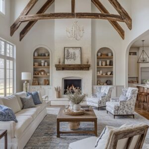
In a cottagecore living room, texture doesn’t raise its voice—but it never stays silent. Surfaces speak through the lightest inflections: a plaster wall with barely-there trowel marks, wood that’s brushed just enough to reveal the grain without exaggeration, or stone left dry so its sandy skin can catch a slow shadow across the day.
This kind of finish doesn’t need gloss; it finds its character in restraint. What appears calm from a distance is layered with quiet detail up close.
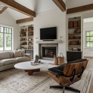
Beams finished in a pale wash melt into matte ceilings and walls, removing hard transitions and reading almost as if they were made in the same pass. Fireplaces follow the same logic—stucco softly blends into surrounding surfaces, creating a feeling of volume without separation.
The space begins to feel shaped rather than built.

Color variation remains minimal, but touch becomes the real contrast. A boucle-covered chair beside a coarse hearth stone doesn’t clash visually, but the materials push gently against one another through their feel.
This subtle pairing—granular against nubby, chalky next to brushed—keeps the room from slipping into flatness, even when everything stays within a narrow range of tones. What makes these textures so effective is their humility.
They ask nothing of the viewer, but their depth is there for anyone who chooses to notice.

Managed Imperfection
One of the most telling signs of an aesthetic cottagecore room idea done with quiet intention is how imperfection is placed—not erased. Irregularities are not scattered across the room in a nostalgic blur.
Instead, they appear as individual statements: a coffee table with an uneven live edge, a mantel beam that dips slightly at the center, or a stone base that holds its natural asymmetry with quiet authority. These organic quirks work because they are surrounded by restraint.
A reclaimed beam keeps its knotted lines and fine splits, but the wall it spans is smooth and unbroken. A firebox holds the story of past flames with faint soot at its arch, while the plaster surround is pale, clean, and perfectly drawn.
These rooms don’t pretend age isn’t present—they let it show, but only where it counts. What emerges is a controlled softness.
Instead of layering patina everywhere, designers make space for it to breathe. That decision—knowing where to stop—creates balance between the familiar and the fresh.
It keeps the room from tipping into cluttered nostalgia or cold minimalism. It’s not perfection that carries the room, but a thoughtful edit of imperfection—well-framed, softly spoken, and never ornamental.

Built-In Furniture as Architecture
In many modern interpretations of an aesthetic cottagecore living room, the distinction between structure and furnishing becomes deliberately unclear. Seating and shelving aren’t simply placed into a room—they grow from its surfaces.
Window benches are set into recesses with thick cushions that rise seamlessly from plaster or wood cladding. These built-in pieces often double as spatial dividers, replacing the need for bulkier freestanding furniture and allowing the architecture itself to carry weight with grace.
Banquettes curve into corners, sometimes under windows, sometimes extending along walls, becoming part of the structure’s rhythm. Their forms stay squared or softened just enough to echo comfort, while their materials—washed linen, thick canvas—keep the tone close to natural.
These features aren’t decorative extras. They’re spatial tools, quiet but deliberate, carving zones for reading, tea, or conversation directly from the envelope.

Shelves follow the same logic—designed to vanish at their edges. Niche-style book ledges merge into fireplaces, walls, or between structural columns, making even functional storage appear as part of the surface.
The absence of visible brackets or trim prevents visual fragmentation. Objects float.
Shadow lines dissolve. And the result is a room that feels considered without feeling filled.
This approach—sculpting from within rather than furnishing from outside—gives a cottagecore style room the stillness and rhythm that sets it apart from more decorative traditions. It turns mass into softness and makes space feel quiet without feeling empty.

The Quiet Palette—But Not Monochrome
Color in a cottagecore style room rarely seeks attention. Instead of contrast, it builds mood through shifts so subtle they seem to hover beneath the surface.
Chalk-dry greige next to an off-white plastered chimney. A boucle slipcover beside brushed oak flooring.
These combinations live within the same tonal register, but their textures and temperatures fluctuate gently—one leaning warm, another slightly cool, always without obvious break. The success of this palette lies in its tonal movement.
You’ll find ivory that pulls toward blush near soft midday light, oat-colored rugs with hints of beige-gray, and linen that reads bone or parchment depending on the wall behind it. These aren’t showy layers—they’re tonal inflections that make the space feel built from light and time, not paint swatches.

Even restraint needs release, though. And so, every room introduces one or two herbaceous notes—a single cushion in sage, a branch with butterscotch leaves, a thread of rust in a woven rug.
These touches don’t compete with the palette. They breathe inside it.
Their muted presence is enough to break uniformity and keep the eye gently moving. What appears calm is, in fact, carefully tiered.
Every shift in shade is doing quiet work, and the result is a palette that behaves more like light through linen than paint on walls. This is where the soul of a cottagecore aesthetic truly lives—in how one color fades into the next, never loudly, but always intentionally.

Soft Geometry: Curves Temper the Grid
Most cottagecore rooms begin with straight lines—boards, beams, shelving, and ceiling spans set a rhythm of clear alignment. But this geometry doesn’t go unchecked.
To keep it from becoming rigid, a few key curves are introduced, and their impact is far more significant than their count. A single arch or oval in a room can quiet the grid.
Think of a fireplace with a curved opening, or a coffee table that gently rounds at the corners rather than squaring off. These are not gestures meant to anchor a motif.
They’re moments of pause in an otherwise orderly layout—like a soft breath between sentences. The control is in the number.
One rounded ottoman, one archway, or one elliptical table is enough to bring movement. Their shape softens, but doesn’t override, making the space feel quietly balanced instead of styled.

Beneath the surface calm, a careful use of sub-symmetry keeps the eye curious. At first glance, a space may seem perfectly mirrored—matching sconces, balanced shelves, centered hearth.
But stay a moment longer, and tension reveals itself: an off-center object on the mantel, a shelf deeper than its twin, a side chair with a slightly different leg. These are not mistakes.
They’re small shifts that stop the room from feeling frozen. They let the space feel lived, not laid out.
That gentle irregularity, placed with intent, is a core element in many cottage core living room ideas. The structure stays grounded.
The styling keeps it from feeling locked.

Mass & Float: A Game of Visual Weight
Aesthetic comfort in a cottagecore room often depends not on how full a space is, but how the elements push and pull against gravity. Visual weight is managed like a quiet conversation between grounded anchors and lifted accents.
Heavy tables lead the floorplan. Thick wood slabs, squat silhouettes, and block-legged coffee tables make the room feel stable.
These pieces often wear their mass openly—unpolished wood grain, broad surfaces, minimal shaping. They hold the layout still.
Around them, lightness moves in. Chairs with spindle legs, woven cane backs, or loose slipcovers in pale fabrics bring contrast without color.
Seating feels comfortable but not bulky, and even larger items sit with space around them—never crowded.

On the floor, low-pile rugs lock arrangements into place. They create islands of texture and give furniture something to grip visually.
But above that layer, curtains fall in sheer columns, pooling just enough to soften vertical edges. This blend—grounded base, weightless boundary—gives the room a sense of volume without density.
Each element has been placed with a quiet understanding of mass. The room doesn’t shout for attention.
It draws it by holding tension between solid and soft, grounded and lifted.

Historic Touchstones, Re-Scaled
Cottagecore doesn’t always mean antique-filled. In a cottagecore inspired room, history is referenced—but never copied outright.
Instead, older shapes are filtered through modern scale and proportion, reintroducing tradition in quiet and deliberate ways. Fireplaces become structural markers.
Rather than simply warming a wall, the hearth often extends as a vertical column that anchors the entire floor plan. In some cases, it separates living and dining zones—a subtle nod to medieval screens passages, where hearths once broke up open interiors without hard partitions.
The gesture brings visual rhythm and spatial clarity without boxing anything in.

Seating nooks draw from the past but land in the present. Built-in benches resemble the deep settles of old English pubs, but here they wear fresh geometry.
Lines are sharper. Angles are simplified.
Cushions are covered in washed linen rather than embroidered tapestry. The mood is grounded but never overly referential.
Classic English roll-arm sofas remain familiar—yet refined. The curves are there, but their skirts are shorter, the pleats shallower, and the legs more visible.
This pared-back interpretation keeps the comfort intact while allowing the piece to sit light within the room. It’s form as memory, not replica.
These pieces connect to a past without feeling stuck in it. Their presence is subtle, giving the space depth instead of drama.

Styling Restraint—Objects as Tone, Not Decoration
One of the most defining qualities in a cottagecore aesthetic living room is what isn’t present. There is no overload of display.
No forced styling. Instead, objects become an extension of the surface they rest on, and styling serves as tone-setting more than storytelling.
Surfaces stay within a single material family. A fireplace mantel might hold only three pieces: matte clay vessels, unglazed and tonal.
Shelves line up books that fade into the background—spines in oatmeal, parchment, and muted straw. Nothing competes.
This limited vocabulary of material and tone allows shadow, curve, and negative space to do the visual work.

Blank areas are left undisturbed, and that choice is deliberate. A wide wall with no artwork.
A mantle with a single branch off-center. These aren’t empty gestures.
They’re pauses that let texture breathe. By not filling every surface, the eye is free to rest.
Space becomes part of the composition. This quiet kind of styling gives the room a sense of being settled without being staged.
No object looks placed for effect. Each element seems to belong where it is, doing its job not by standing out—but by fitting in.

Daylight as Finish
In many homes, daylight is treated as a background element. But in a refined cottagecore room design, light is part of the decor.
It doesn’t simply fill the space—it shapes it. The way it’s framed, filtered, and allowed to drift becomes a defining feature.
Curtains are placed high and wide—not to block the view, but to stretch the architecture. Rods extend beyond the window trim, and panels hang just short of the ceiling.
This move allows sunlight to wrap the wall edges with a soft halo. Light leaks in at the sides, turning fabric into a quiet glow source.
It brightens corners, warms transitions, and takes the place of a second lamp without ever appearing intentional.

Window frames, when darkened, become outlines. In some spaces, black sashes draw the perimeter like a thin charcoal line around a pale sketch.
They don’t dominate, but they mark a shift—a subtle contrast that echoes other quiet details like iron curtain rods, oil-rubbed sconces, or aged cabinet pulls. What results is a room that feels lit from the bones rather than the fixtures.
Light doesn’t decorate—it shapes. It marks boundaries.
It softens mass. And it holds everything together without a single spotlight.

Material Humility Meets Precision
What separates a thoughtful cottagecore themed room from a rustic replica is not its palette or styling—it’s how the materials behave. Every surface appears relaxed, but every corner knows where it ends.
The balance is quiet but exacting. Raw finishes carry a subtle discipline.
A lime-washed beam still shows its grain. A sandblasted wood panel holds texture without weight.
A wire-brushed truss appears untouched but has been worked to a point of exact balance—never overdone, never too clean. These are surfaces with history, yet they’re controlled, measured.

Edges, joints, and seams tell the real story. You’ll see boards that meet without misalignment.
A niche in plaster whose shadow line is sharp even though the wall itself is soft. A shelf that floats without brackets, carrying its load with perfect stillness.
Craft here doesn’t shine—it stays quiet. But its precision is what keeps the room from slipping into something overly themed.
This is how true refinement appears in a cottagecore space: not in shine or ornament, but in how raw materials are given shape and order without removing their voice.

Cottagecore Aesthetic Ideas Coded in the Look
The strongest rooms often speak in quiet code—drawing from history, but never quoting it too closely. This is where the appeal of cottagecore interiors finds clarity: in their ability to simplify, reduce, and focus.
One or two traditional signals is enough. A chair with a bowed leg.
An arched recess. These touches root the space, but the surroundings stay spare.
The rest relies on clean lines and calm finishes, allowing the familiar to stand out without overwhelming.

Material richness arrives not through layering, but through subtle variation. One texture leads the room—say, lime-washed wood or dry plaster—and small shifts in tone or grain keep it alive.
No need for a wall of stone and a competing wall of tile. One surface, carefully handled, holds more atmosphere than contrast ever could.
Built-ins play double duty. They divide space and support daily life, all while allowing materials to continue uninterrupted.
A bench that emerges from the wall. A shelf that folds into a fireplace column.
Furniture and structure blur, making the room feel both intentional and grounded.

The color palette stays within a narrow band. Rather than jumping across the spectrum, these rooms lean into warmth shifts: ivory, oat, chalk, and bone, with an occasional whisper of sage or dusted rust.
Depth is handled through tone—not saturation. Visual weight is balanced with intention.
One blocky table or hearth base gives anchor. Around it, lighter elements—chairs with open backs, gauzy curtains, floating shelves—create softness.
The contrast isn’t loud. It’s structural.
Why These Moves Feel Fresh
What holds all of this together is a quiet kind of discipline. These rooms respect the hand-built feel of early cottages—raw finishes, modest shapes, hearth-centered layouts—but they edit, align, and refine.
Surfaces are honest but exact. Objects are chosen for tone, not trend.
Symmetry is broken just enough to keep the space from stalling. Every element is given breathing room.
And so the result doesn’t feel stuck in time, or overly quaint. It feels grounded, clear, and quietly current.
Cottagecore, in its most thoughtful form, leaves behind the clutter and keeps the soul.