Some kitchens rely on bold contrasts. Others aim for subtle rhythm.
But in spaces where white cabinets with black countertop and stylish backsplash ideas come together, what stands out most isn’t the color difference—it’s the balance between elements. These kitchens don’t lean on sharp contrast alone.
Instead, they build atmosphere through texture, direction, reflection, and tone.
The backsplash plays a quiet but defining role. It can shift the entire perception of the layout—whether by stretching vertical lines, casting gloss into matte surroundings, or softening high-contrast pairings with a single muted accent.
What appears simple at first glance often unfolds into a layered visual logic: where every surface, fixture, and finish contributes to how the room feels and behaves.

This article explores how small design decisions—like repeated tones, surface continuation, and light interaction—quietly shape the success of these compositions. Rather than focus on loud moves, it breaks down how kitchens gain character from restraint, and how textures and direction guide the eye more than color ever could.
In kitchens where white, black, and deep tones meet, the most thoughtful choices are rarely the loudest.

Chromatic Echo Loops
In thoughtfully balanced kitchens, color rarely stands alone. What appears at first to be a single statement backsplash often holds threads that quietly connect to other materials in the space.
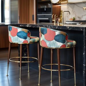
This is especially true in kitchens with white cabinets and dark countertops, where contrast is strong but needs tuning. One of the more refined backsplash ideas with white cabinets and dark countertops involves embedding faint secondary tones—like a deep blue reflected in pendant lighting, or the soft glint of bronze picked up again in drawer pulls.
These subtle echoes don’t compete for attention. Instead, they link vertical and horizontal planes in a way the eye naturally reads as cohesive, even if not consciously.

Another often unnoticed move: infusing warmth into cool-toned schemes. A deep backsplash can feel stark when set against bright white cabinets and solid black counters.
But slip in warm wood shelving, or let oak floors peek out beneath, and the overall palette gains softness. Sometimes it’s the rust undertone in a veined stone, or the golden flicker of a brushed fixture that tips the balance.
These additions act like threads pulled through the space—not dominant, but crucial in blending materials into a comfortable visual rhythm. The most compelling designs don’t rely on shock value—they guide the eye gently, pulling color cues across surfaces that might otherwise feel isolated.

Scale & Seamlessness
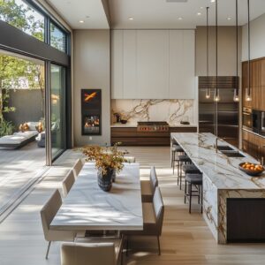
In kitchens that lean minimalist but want depth, the backsplash wall often becomes the canvas for scale. Large-format materials like plaster, microcement, and porcelain slab are favored for their ability to eliminate seams.
Without grout lines or visual breaks, the wall surface becomes more like a single expression of material, not a covering. This technique shifts the backsplash from being a utility zone into something spatial—it behaves more like part of the architecture than a decorative layer.

An especially precise variation of this is bookmatched stone. Here, the veins in the slab run in mirrored patterns, usually starting from the center line and fanning outward in symmetry.
It doesn’t shout for attention—but viewers often sense something organized and restful about the space, even if they can’t immediately explain why. This mirrored grain establishes a kind of subconscious visual alignment, especially when it flows from counter to wall.
The effect isn’t loud—it’s quiet control. And in a space where white cabinets already simplify the perimeter, and dark counters add contrast below, that kind of visual structure becomes the stabilizing force in the room.

Whether the slab mimics marble or relies on smooth cement-like surface treatments, the absence of joints and the scale of the material give the wall a sense of permanence. It doesn’t feel inserted; it feels built-in, part of the room’s bones.
These techniques reflect a deeper interest in material presence—not through color alone, but through surface and form.

Directional Rhythm
Some kitchens don’t speak through color or contrast—but through direction. Surface patterns, grooves, and placement create a kind of movement, helping the space feel more dynamic or more settled depending on what’s used and where.
One of the most effective techniques is vertical texture, especially with fluted or ribbed backsplash tile. These slim, repeated ridges act like visual guide lines.
They draw the eye upward, giving the impression that the upper cabinets are taller than they are. Even if the room’s dimensions stay the same, the ceiling reads higher, the wall feels lighter, and the dark countertop beneath takes on the role of a base line, not a heavy anchor.

Equally important is the use of horizontal elements—thin, uninterrupted lines that seem to stretch the room from left to right. These come in the form of slim metal shelves, LED light strips, or tile veining that runs along the width of the backsplash.
That single stripe of brightness, running clean beneath upper cabinetry or across a stone slab, works as a stabilizer. It cuts across strong vertical textures or tall appliances, helping to balance out taller wall compositions.
In this way, the backsplash becomes a tool for spatial rhythm, using direction to shift how the room is read. These visual patterns form a quiet grid that brings order—without needing symmetry or heavy framing.

Sheen Choreography
One of the more subtle elements in backsplash ideas for white cabinets and dark countertops isn’t a color at all—it’s the way surfaces reflect or absorb light. This visual play between gloss and matte adds depth and texture without needing decoration.
A dark blue acrylic panel or oxblood-colored tile, for example, takes on the look of polished glass under daylight or LED strips. Its high-gloss face catches light like water—shifting and shimmering as the angle of light moves.
Right below, a honed countertop remains soft and quiet, holding no glare. The eye naturally jumps between the two surfaces, tracing their difference in sheen.
This contrast creates tension and interest without changing the actual palette.

Meanwhile, in kitchens that favor more color saturation—like soft mauves, forest greens, or mossy tones—the choice is often a satin finish. This middle-ground sheen allows color to show fully but avoids glare.
It keeps strong tones from feeling overly bold or theatrical. The surface feels grounded, not showy.
These finishes often go unnoticed at first, but they play a major role in how the backsplash works with cabinetry and counter surfaces. It’s not only about how light enters the room—but how each material chooses to respond to it.
Matching surface texture to color strength becomes a silent part of the overall composition. And it’s that careful balance between dull and shine, between reflection and softness, that gives many of these kitchens their depth.

Hardware & Fixture Dialogue
In kitchens where the visual story is built on contrast and restraint, hardware and fixtures don’t simply serve a function—they reinforce design cues. Their finish, shape, and placement often echo features already introduced through the backsplash.
A backsplash with aged bronze inlay finds its match in cabinet pulls with the same mellow gleam. Forest-green tile with a soft sheen feels more grounded once brushed brass handles enter the mix, bringing a golden warmth that plays off the backsplash without overpowering it.
And in some of the boldest setups, black fixtures quietly blend into dark countertops, stepping aside to let wall surfaces take the lead. The decision isn’t about making every element match—it’s about finding echoes that tie things together.

Beyond finish, form plays a quiet role. A vertical cabinet pull can mirror the direction of fluted tile ribs, creating a visual thread between cabinetry and backsplash.
Floating shelves mounted horizontally may align with grout lines, stone veins, or lighting strips—subtle decisions that keep the visual structure coherent. These small alignments often go unnoticed at first glance but help the kitchen feel intuitively right.
They stabilize the overall composition, ensuring that materials, textures, and forms speak in the same language even across separate planes. It’s in these quiet, repeatable forms that visual rhythm takes hold.

Tonal Layering vs. High Contrast
Not every design leans into stark opposition. While high-contrast kitchens with white cabinets and dark countertops can look sharp and graphic, many of the most refined spaces opt for tonal depth instead.
Rather than jumping straight to black, they explore shades like graphite blue, dusty mauve, soft slate, or muted lilac—tones that hold color while remaining deep enough to anchor the cabinetry. These alternatives sidestep the expected black-and-white contrast and instead build atmosphere through quiet saturation.
The result isn’t harsh, but layered.

Where tone is consistent, texture carries the weight. A flat wall of color comes alive when surface treatment adds variation: leathered stone, troweled microcement, or even faint veining in a solid slab.
These aren’t obvious patterns—they’re subtle irregularities that catch light differently throughout the day. In kitchens that use this approach, the richness isn’t in pigment—it’s in the material’s ability to shift with light and proximity.
Even near-black walls or charcoal backsplashes avoid feeling flat because their micro-texture holds movement, adding a layer of visual interest without relying on color changes. It’s this balance of quiet tone and careful surface play that gives these kitchens their depth and longevity.

Nature References Without Literal Motifs
Some of the most compelling kitchens draw from nature without copying it outright. Instead of florals or direct images, the influence shows up in color choice and surface movement.
Deep navy or graphite blue backsplashes hint at overcast ocean skies, especially in areas where coastal weather leaves a lasting visual impression. These tones don’t try to illustrate—they suggest.
In other cases, rich forest greens carry the feeling of Northwest woodland without showing a single leaf, while slabs with rust and ochre veining echo the warmth of sun-baked terrain in drier climates.

These references remain abstract and atmospheric, which is why they work. There’s no forced theme—just a tone or texture that reminds the viewer of something natural without spelling it out.
That’s where many thoughtful backsplash ideas succeed: they lean on a visual memory of place, translated into material and color. The effect is layered, grounded, and quiet.
Rather than drawing attention to itself, the surface becomes part of the room’s emotional texture, creating a setting that feels familiar without feeling decorative.

Spatial Psychology
In kitchens that use darker materials for the backsplash, there’s a shift in how space is perceived. A dark backsplash becomes the background, not a spotlight.
That may sound counterintuitive—after all, many assume that darker walls make a room feel smaller. But what actually happens is the opposite.
By receding visually, the backsplash creates a deep field that allows lighter elements in the foreground—like white cabinetry, open shelving, or decor—to stand out clearly. The overall result is a sharper spatial hierarchy.
Items don’t compete; they sit against a calm, receding backdrop that defines them.

This is a type of quiet theatricality. The wall holds depth while the working elements—stools, cookware, lighting—gain presence.
Even in compact layouts, this treatment gives the room clarity. The backsplash isn’t acting as a feature wall; it’s acting as a shadow line that sharpens everything around it.
The kitchen feels larger, more deliberate. And this is especially effective in layouts where open shelving or floating elements appear in front of the dark surface—because it gives the illusion that those pieces float in space.
In the end, it’s a spatial decision as much as an aesthetic one, and it’s often what separates high-impact design from something more conventional.

Conclusion
A dark backsplash paired with white cabinets and dark countertops might seem like a simple format at first glance, but it reveals much more when observed closely. The effect isn’t driven by contrast alone—it builds on the way surfaces behave, how light interacts across materials, and how each component responds to the others nearby.

One of the most quietly powerful techniques is the balance between reflection and absorption. When gloss and matte are placed near each other, they create a shifting play of light that adds depth without needing extra decoration.
It mimics a lighting plan even before any fixtures are turned on, giving the space a layered quality that feels controlled and atmospheric. Another feature that adds richness is continuity in surface treatment.
Whether it’s a single slab of porcelain or a long stretch of polished plaster, these uninterrupted walls do more than protect from splashes—they act like part of the architecture. The space stops feeling like a set of boxes and begins to read as a unified composition.

Details are where the design is quietly locked in. Repeating a backsplash tone in other materials, like seat upholstery or shelving, might seem small, but it holds the color story together.
These repeats bind the palette more strongly than large, sweeping gestures. Texture direction adds spatial clarity.
Vertical lines stretch the visual height of the room; horizontal details widen it. Even the angle of a stone vein or the slat of a light fixture influences how large or sculpted a kitchen feels.
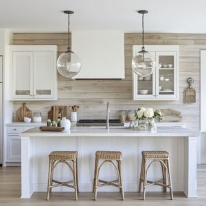
And in all of this, soft earthy accents ground the scheme. A single oak ledge, a walnut stool, or a muted brass handle makes even the darkest surface feel balanced.
These moves don’t call attention to themselves—but they prevent the design from going cold or flat. Taken together, these quiet choices shape how kitchens with white cabinetry and dark finishes achieve their lasting appeal.
It’s a matter of how carefully materials are aligned—not only in color but in reflection, shape, and rhythm. And it’s these layered qualities that give the most timeless backsplash ideas their depth.