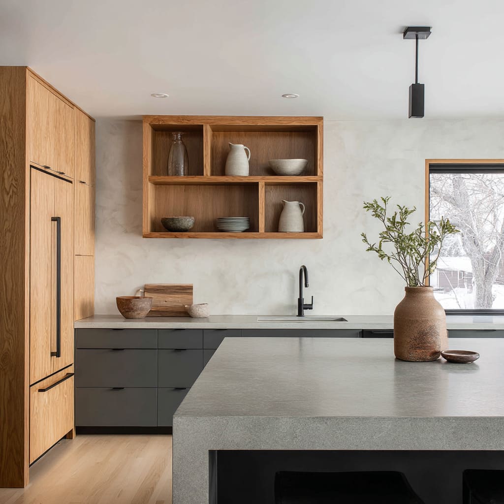
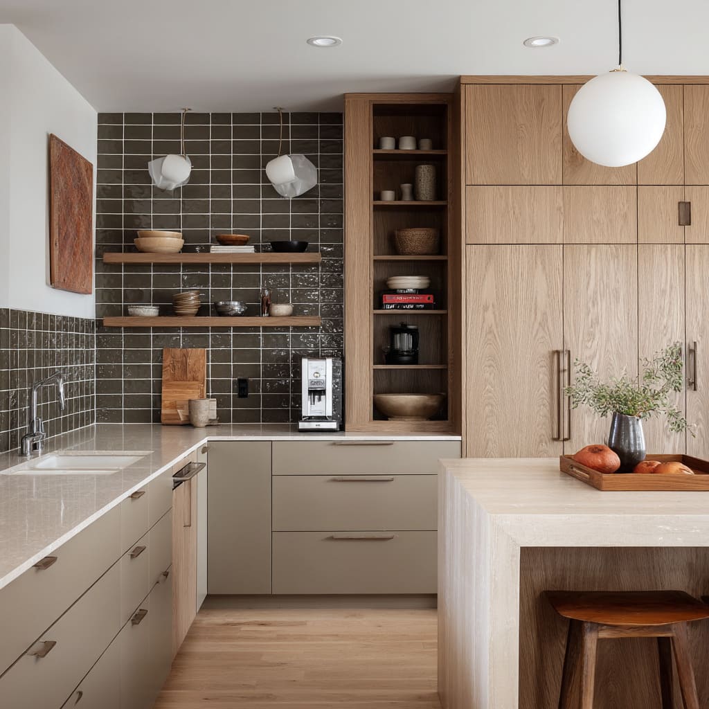
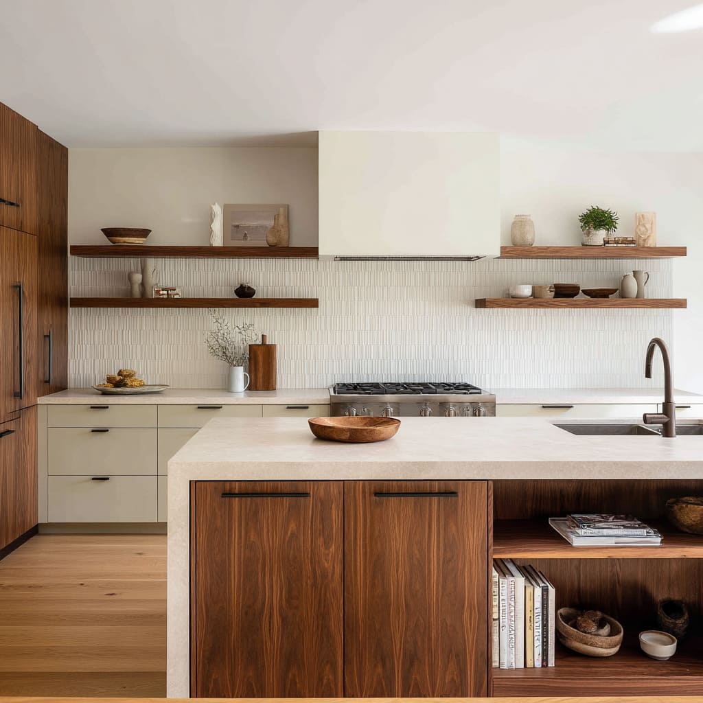
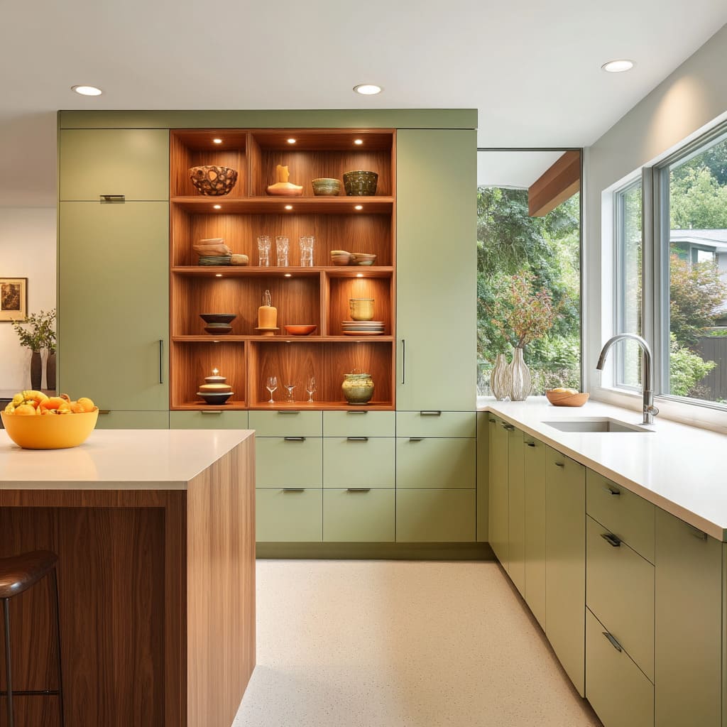
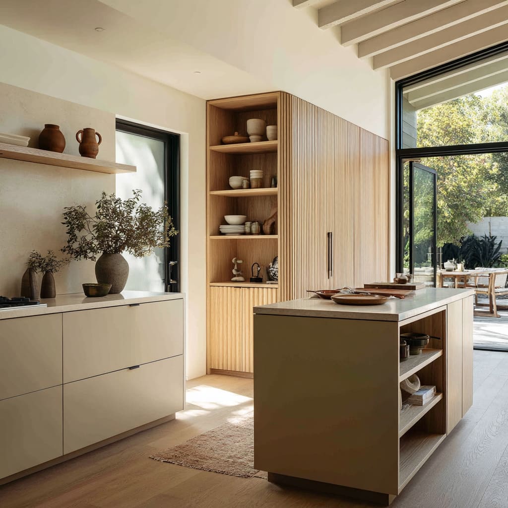
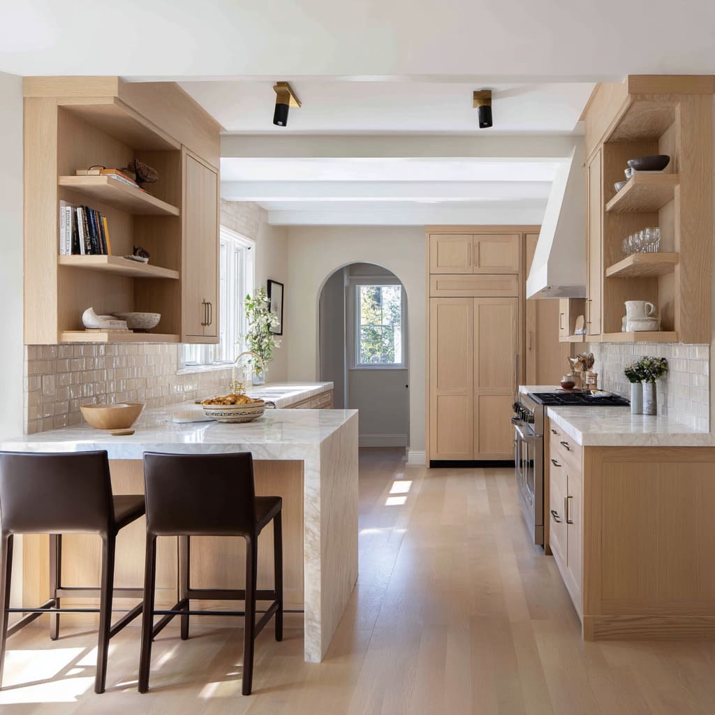
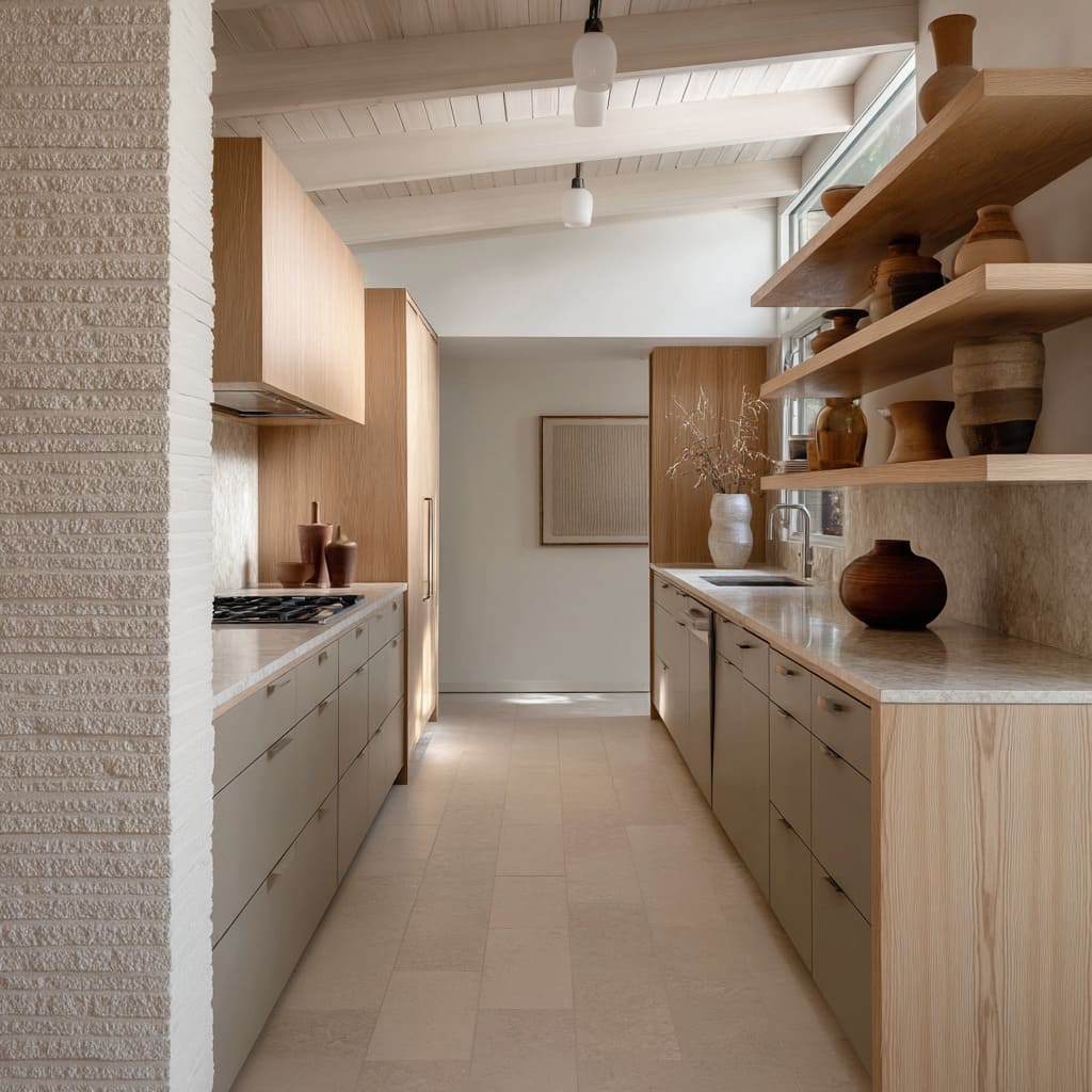
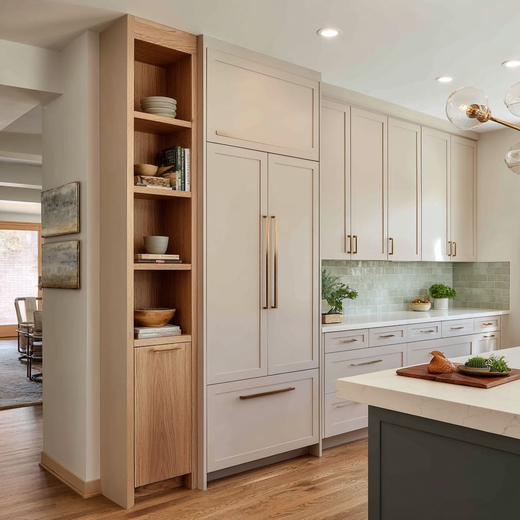
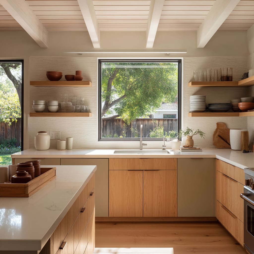
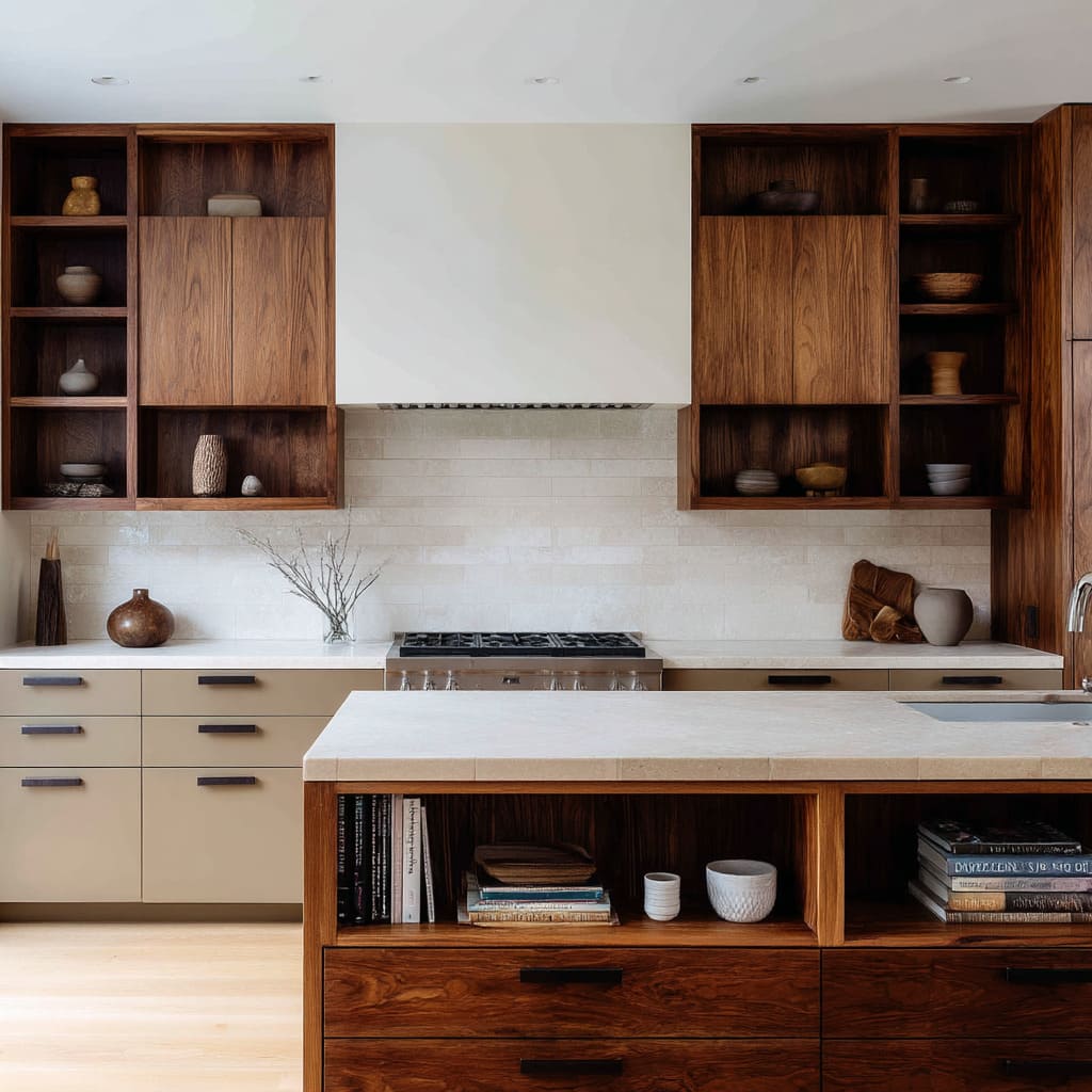
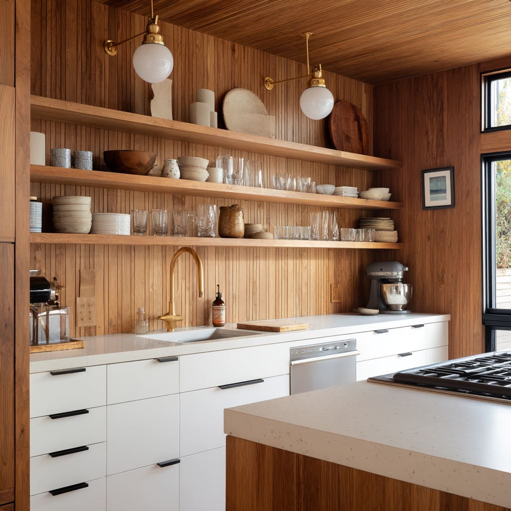
Open shelving isn’t about putting things on display—it’s about reshaping the room around what stays visible. The rise of open cabinet design has brought a shift in how kitchens feel, look, and function.
Walls once lined with identical doors now hold a mix of wood planks, recessed cubbies, and grid-like niches. What was once closed away is now part of the design surface.
These layouts trade visual weight for air. They play with rhythm instead of repetition.
Shelves may stretch across a wall like a line of thought, or break that line into pauses. They invite texture through bowls and jars, but just as often, they invite space between things.
This creates kitchens that feel quiet but grounded—spaces where materials and arrangement carry more importance than size or symmetry.
There’s no single rule in a kitchen with open shelves and cabinets. The look can range from soft minimalism to framed tradition, from sculptural installations to casually layered display.
But across the board, there’s a shared move away from bulk and a growing attention to how open surfaces guide the eye. Whether floating, recessed, or built as vertical breaks, these features let kitchens shift between practical use and visual calm—without forcing separation between the two.
The Silent Geometry Behind Every Open Cabinet
Open kitchen cabinets ideas often begin with a question of storage—but the real story is told in how the lines move. Open shelves, inset cubbies, and vertical recesses aren’t just filling gaps between walls.
They shape how the wall is read, and how stillness or rhythm moves through the kitchen space.
Negative-space rhythm plays a quiet but firm role. Shelves are spaced not just for what fits, but for how the wall breathes around them.
The air above a mug, the margin between a wood bowl and the shelf above—it all works like spacing in typography. In some layouts, the distance between each shelf echoes other nearby measurements: grout lines between tiles, or the slim rail of a cabinet door.
This repetition gives the wall a kind of measured beat, where eyes move gently from one zone to the next without being pulled in too fast.
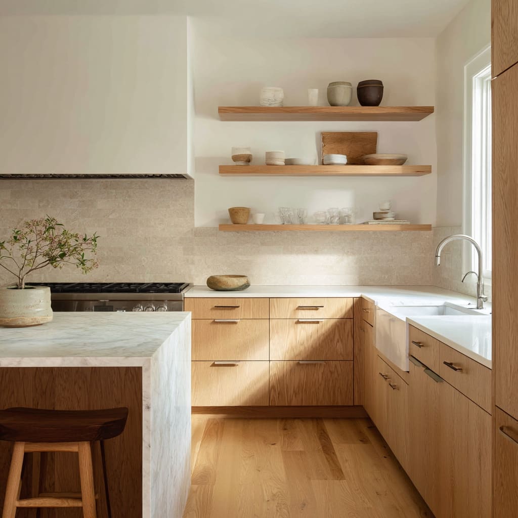
Weight illusion is another visual shift few recognize. Thick floating planks, especially in oak or ash, can feel surprisingly light.
This is because they extend without visible support, letting them hover rather than anchor. In contrast, narrow walnut cubbies, when framed by darker cabinetry, can feel visually heavier despite their smaller size.
That contrast—between thickness and perceived weight—flips expectations. What looks dense feels airy.
What seems minimal feels dense.
Counter-height echoes create a kind of visual handshake between the working area and the display above. In some kitchens, the shelves begin or end exactly where the backsplash stops.
That alignment makes the wall read as a single surface system, rather than upper and lower halves stitched together. It’s a subtle gesture, but one that gives the kitchen a stacked, grounded shape—almost like a layered sculpture of wood, tile, and negative space.
In the best open kitchen design examples, this kind of structural rhythm often goes unnoticed by the casual viewer—but it’s exactly what gives the room its quiet confidence.
Objects as Texture, Not Decoration
On open shelving, items aren’t just placed—they are composed. The objects selected do more than fill space; they bring surface texture, tone control, and gentle contrast into play.
This is one of the understated benefits often missed in open kitchen cabinets ideas, where visual clarity works harder than style.
- Soft-matte clusters vs. single statement pieces is a useful lens. Some kitchens use repetition—stacks of low bowls or a row of handled mugs—to bring texture that mimics natural grain. This repetition can make the shelf feel warm and purposeful without looking styled. In contrast, other kitchens isolate a single object per niche. One dark ceramic bowl centered in a cubby lets shadow take over as the primary element, making the object secondary to its silhouette.
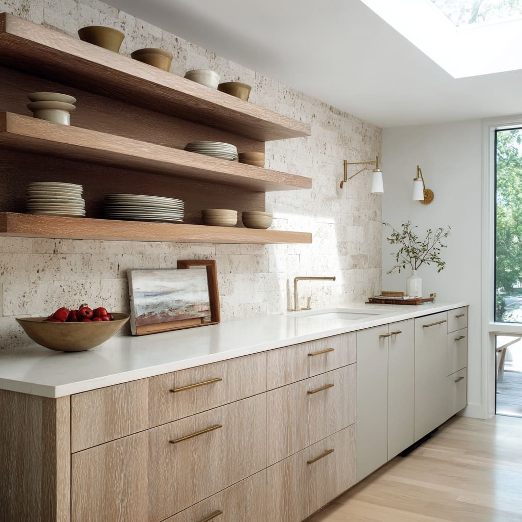
- Tone-on-tone camouflage is another refined visual tool. Placing cream dishes on an ivory background, or sandy pottery against limestone tile, creates an effect where forms seem to dissolve until light hits just right. This isn’t an absence of contrast—it’s contrast hidden in plain sight. The items almost disappear, but in doing so, they let the shelf itself carry the shape. That effect quiets the wall, while still allowing it to hold personality.
- Color pinpoints bring the eye exactly where it needs to pause. A single item in a distinct hue—burnt orange, crisp green, or deep red—can shift the energy of the whole composition. A bright teapot placed among beige bowls suddenly tells a story, anchoring the kitchen not in neutrality, but in human presence. It’s a quiet signal: this shelf isn’t staged. It’s lived with.
The success of these arrangements depends less on matching styles and more on knowing how shadow, color, and repetition speak to one another. Each shelf becomes its own micro-surface of light and material dialogue, playing off the textures around it—wood grain, tile finish, stone edge.
And in doing so, they bring a tactile stillness that gives the kitchen both warmth and control.
Shadow Play as the New Ornament
In kitchens where the upper cabinet with doors has been replaced by open shelves, light takes on a more active role. Without solid fronts to block or reflect, every object becomes part of a shifting composition—defined as much by shadow as by shape.
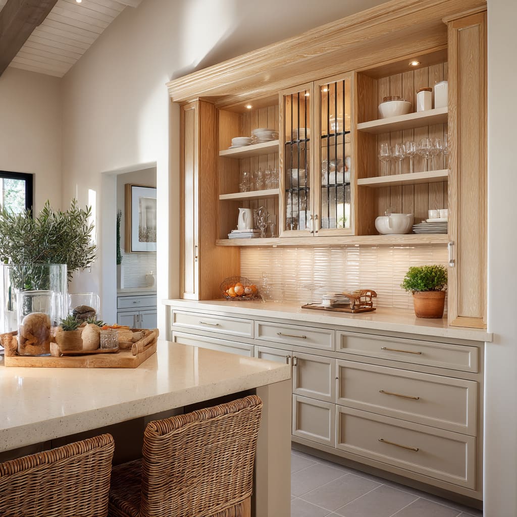
Built-in pin spots can introduce a gentle kind of precision. When recessed into the frame above a niche or cubby, they send down a soft cone of light that marks out the shelf almost like a display alcove.
This approach gives depth without glare, and brings out details in textured glassware, matte ceramics, and even the grain of wood vessels. It’s less about spotlighting and more about tracing the presence of each object.
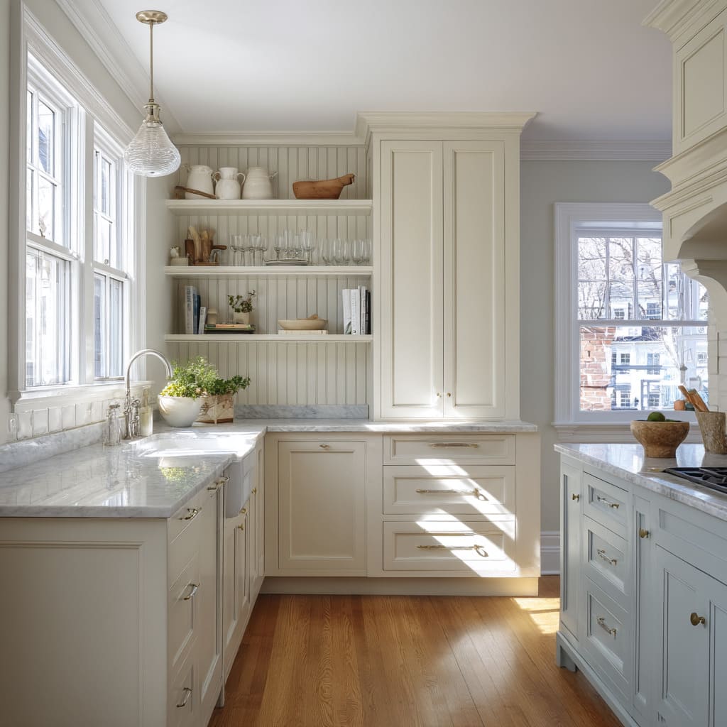
Indirect daylight is often used in subtle but striking ways. Shelves placed near tall windows, or under a skylight, change tone throughout the day.
When sun moves across a slatted oak surface, for example, it casts narrow moving bands of shadow that animate the entire kitchen wall—without a single switch being flipped. These interactions make the space feel slower and more connected to the natural flow of light.
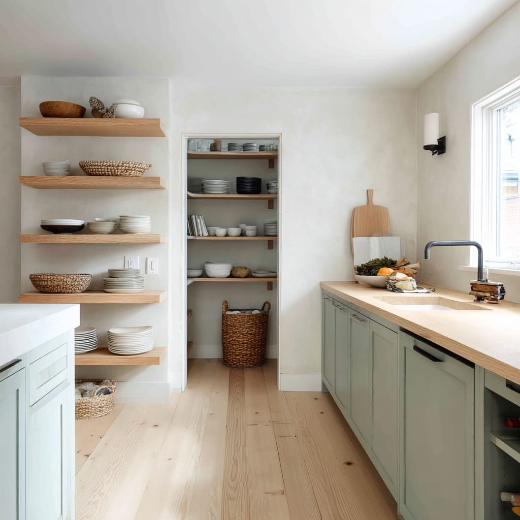
Shadow framing happens when open shelving is built into surfaces like lime-washed plaster or hand-troweled clay walls. These finishes aren’t flat—they catch and scatter light unpredictably.
When a shelf is set inside such a surface, the roughness around the opening deepens the corners and outlines the recess like it’s been drawn in charcoal. This makes the shelf feel intentional and quiet—a visual pocket rather than a simple plank on a wall.
With open kitchen cabinets, the absence of doors isn’t a subtraction—it’s an invitation for light to behave differently. And that behavior isn’t about brightness.
It’s about tone, edge, and movement—qualities that make open shelving feel part of the space rather than added onto it. Many of the most thoughtful open shelving kitchen ideas begin not with materials, but with how shadow will fall across them.
4. Material Conversations the Eye May Miss
| Pairing | Subtle Result |
|---|---|
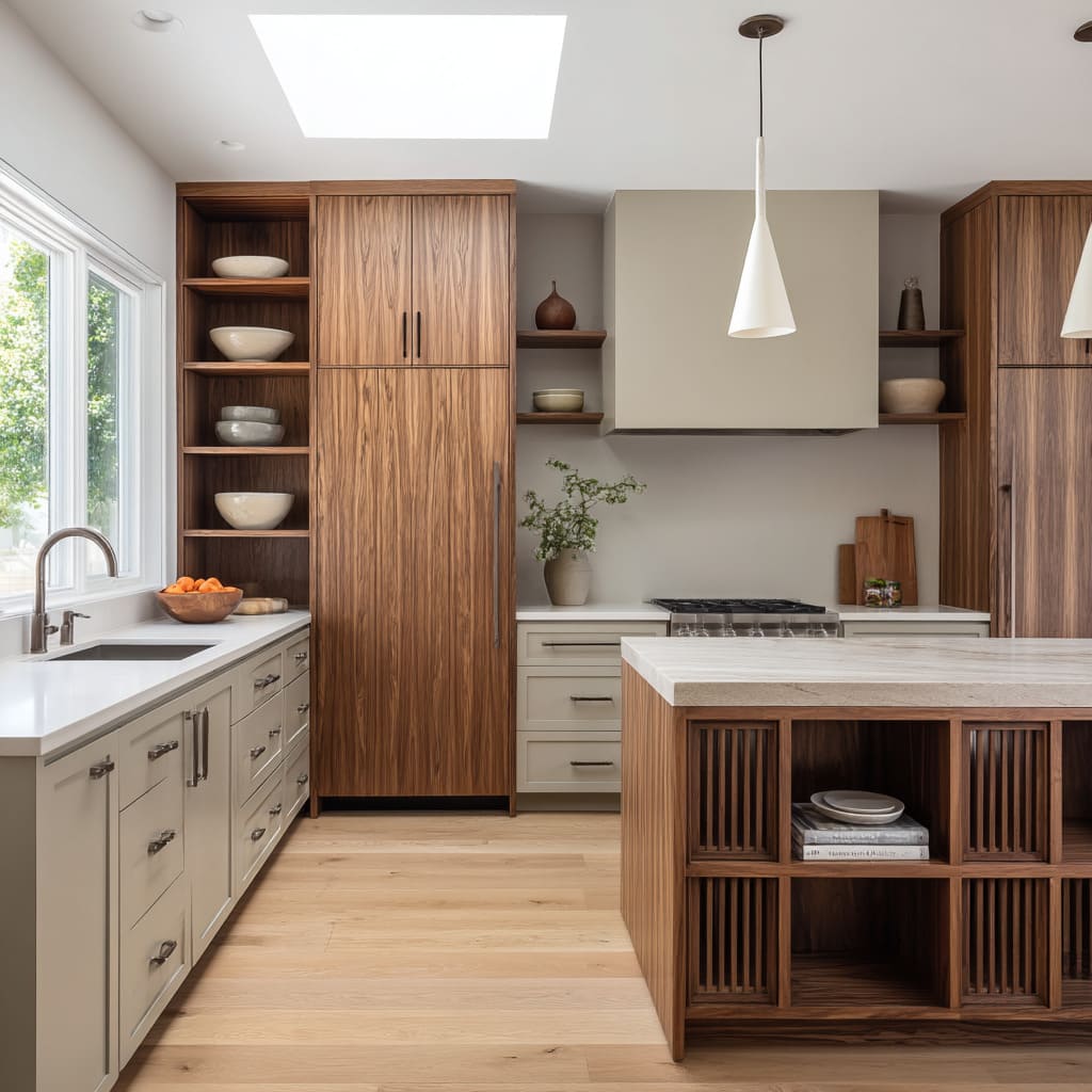
| Walnut inside greige cabinets | Dark interior absorbs glare, so even glossy ceramics look velvety. |
| Olive tile under warm wood | Green reads deeper when capped by amber grain, adding quiet drama rather than bright contrast. |
Vertical slats beside smooth plasterThe slats jitter in light while plaster stays calm, letting the recessed shelf feel like a pause in motion. Weathered crate cubbies above sleek quartzRough edges amplify the polish of the counter without adding shine elsewhere.
Shelf Typologies and the Feel They Impart
Just like seating or lighting, shelves come in types—and each has a distinct way of shaping the mood of a kitchen. The variety of open shelves in today’s interiors proves that open kitchen cabinets are no longer a one-style-fits-all feature.
They form a visual grammar, and each version speaks a slightly different dialect.
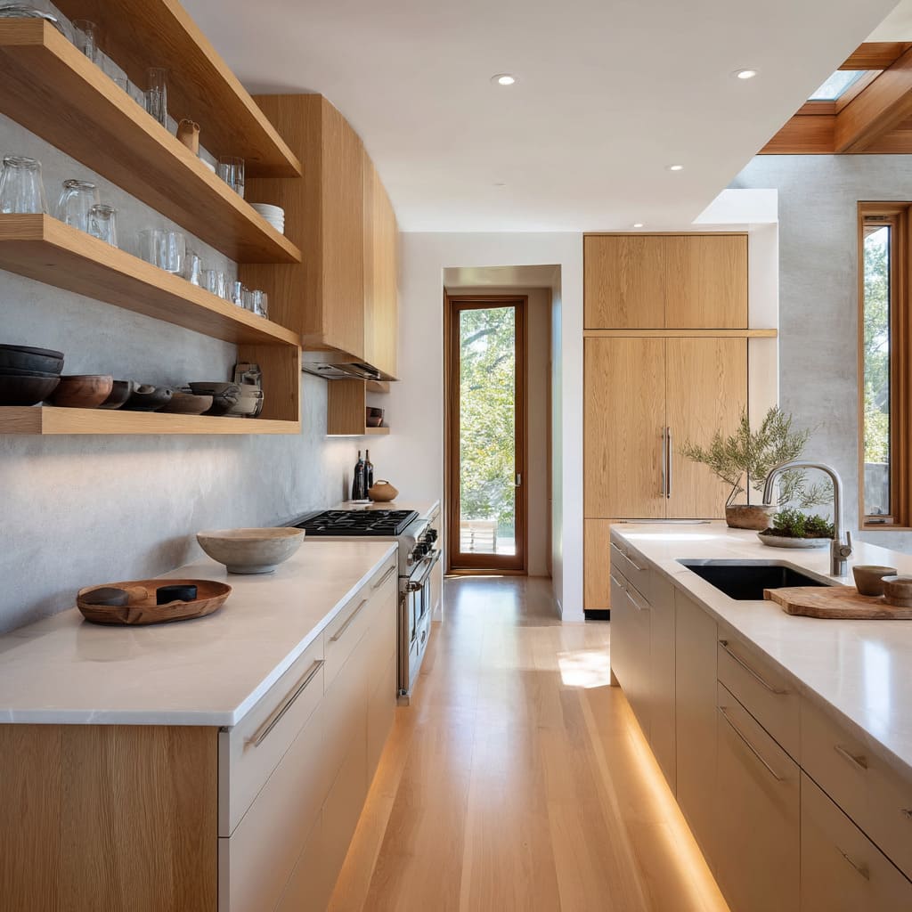
- Floating planks stretch across walls without visible brackets. They feel casual, steady, and horizon-like. In narrow kitchens, they visually widen the space; in tall rooms, they draw attention sideways instead of up. Their weightless look gives an impression of ease—almost like the shelves are resting midair, even though they’re securely fastened.
- Grid cubes bring order in a different way. They divide wall space into evenly spaced boxes, turning storage into a kind of visual system. While each cubby may hold only one or two items, the grid as a whole adds structure. It’s architectural in tone—more like built-in furniture than wall décor.
- Vertical columns offer a slim, upright gesture in kitchens dominated by horizontal lines. These narrow shelf towers can sit at the edge of a fridge wall or between tall pantry units, where they provide pause and direction. Their height draws the eye upward, giving balance to spaces where most features run flat across the wall.
- Recessed hutches evoke the feeling of furniture placed within the kitchen shell. These are open shelves set back into a wall niche or framed zone, often paired with beadboard or painted panels. The effect is timeless—not old-fashioned, but deeply grounded. This kind of shelving nods to earlier kitchen traditions while staying visually open.
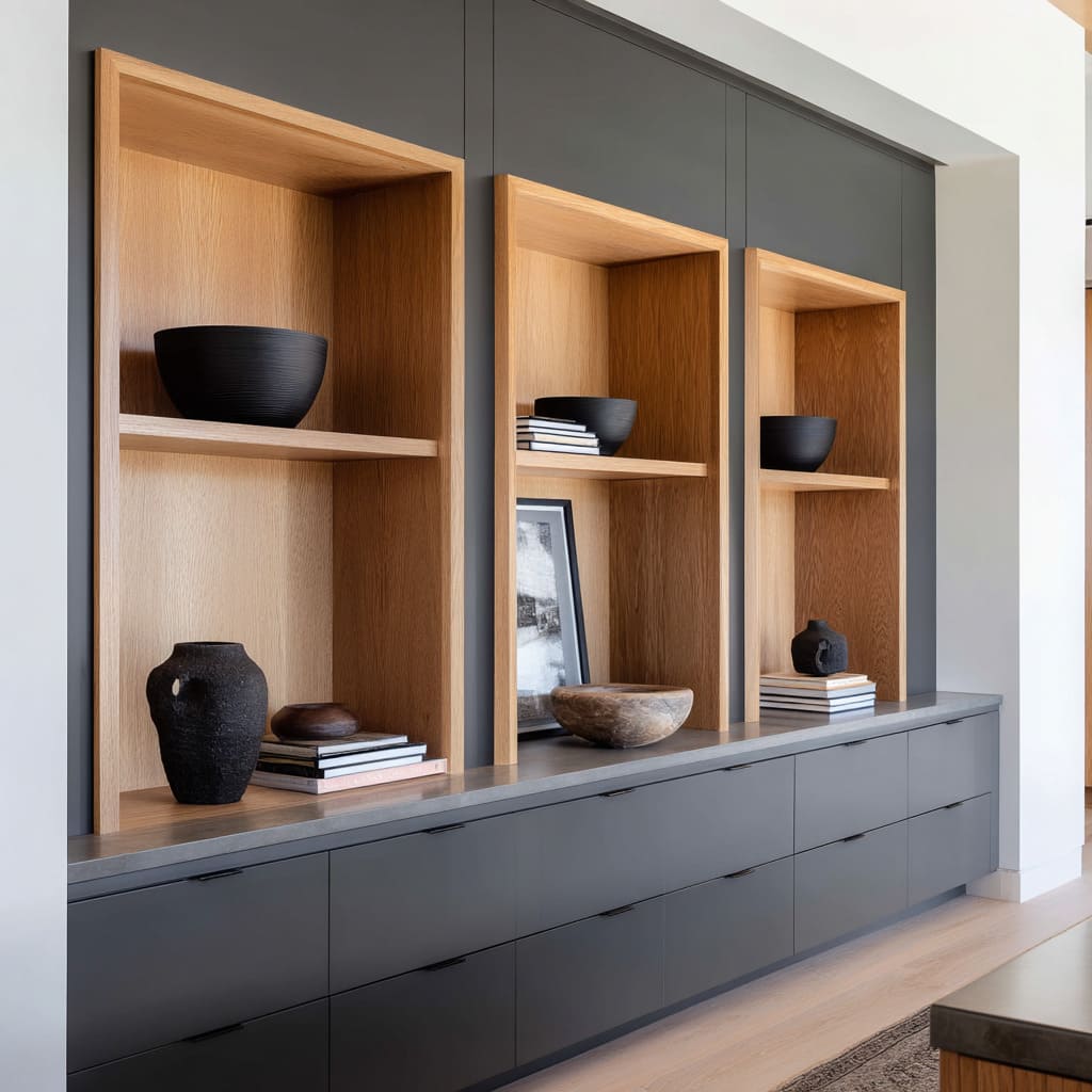
- Shadow-box niches lean sculptural. Instead of blending into the background, they push objects forward—spotlighting a single bowl, a stack of plates, or even an art piece. Their thick framing and moody lighting make them feel closer to gallery alcoves than pantry shelves. They ask for restraint but reward it with focus.
Each of these styles holds a different atmosphere. A floating plank invites calm utility.
A cubby grid suggests precision. A tall niche opens vertical space.
And taken together, they show that shelves are never just shelves—they’re decisions about how space should feel, how light should move, and how objects should be seen.
Why the Look Resonates Right Now
The appeal of a kitchen with open shelves and cabinets isn’t built on a trend cycle—it stems from a shift in how kitchens are understood. These are no longer back-of-house zones.
They’ve moved forward, taking on the character of public rooms while staying deeply tied to personal habits.
Kitchen-as-living-room thinking has changed what’s expected of wall space. Today, it’s common to see clay vessels next to mixing bowls, or stacks of handmade plates sitting beside art prints.
Shelves remove the visual barrier that solid fronts impose. Instead of breaking a room into function zones, they let cooking blend quietly with gathering.
No added furniture is needed for a space to feel livable—just the right visual openness.
Evidence of making is another reason these rooms feel relevant. The materials people use—reclaimed wood, imperfect clay, hand-troweled walls—aren’t polished to hide their history.
They show it. That visible process contrasts against the smooth screens and seamless digital surfaces that define daily life.
These kitchens restore texture where other spaces erase it.
Selective display over mass storage is another defining factor. Open shelving encourages people to keep only what they value and to rotate it regularly.
There’s a parallel to how capsule wardrobes work—fewer, better things, intentionally arranged. Unlike deep drawers filled with extras, these shelves show a lifestyle where restraint is part of the atmosphere.
Soft daylight as a design tool also explains the shift. Without a bank of shiny uppers reflecting overhead light, natural light moves sideways, tracing tile edges and brushing softly across ceramics.
It creates a diffused brightness that flatters skin tones and food textures, especially in kitchens with matte surfaces and soft palettes. This atmosphere can’t be replicated in traditional layouts.
That’s why open kitchen ideas have become more than a styling choice—they represent a different way of thinking about space, light, and the things people choose to live with.
How Open Cabinets Feel in the Room
| Visual Trait | Emotional Reading |
|---|---|
| Long, unbroken shelf lines | Room feels wider; cooking zone merges with gathering space. |
| Deep cubbies with spotlight | Walls read like private gallery corners—quietly luxurious without glossy finishes. |
Matching wood shelf + cabinet grainSpace feels wrapped in one material, similar to a bespoke box—safe yet modern. Contrasting shelf frame inside dark wallInstant focal point; guests look there first, sensing intention rather than clutter.
Final Insights Few Notice
Look closely at kitchens that use kitchen shelves instead of cabinets, and small design choices reveal bigger intentions. These details often go unspoken, but they’re part of what makes the entire composition feel resolved.
Ceiling height tricks are a quiet visual move. By allowing the backsplash to stop at the shelf base and continuing with plaster above, the upper wall gives the illusion of taller ceilings.
The shift between tile and plain wall makes the eye believe there’s more headroom than the actual structure provides.
Shelf thickness sends signals that people might not consciously read, but absolutely respond to. Thick floating planks often indicate solid lumber or custom milling.
In contrast, thin shelves can feel lighter but often point to metal support brackets or ready-made components. The thicker the cut, the more intentional the shelf feels—signaling craftsmanship without labels.
Empty space as a sign of ease is another layer to consider. Sparse arrangements don’t just reflect taste—they show that the owner doesn’t need every shelf filled.
There’s a kind of luxury in having fewer things, and in being able to leave space open. It’s not about what’s there—it’s about what was allowed to stay.
Controlled disorder adds credibility. Slight asymmetry—a stack of glasses off-center, a bowl not perfectly aligned—keeps a kitchen from looking staged.
These tiny imperfections signal real use and real personality. They don’t disrupt the room’s calm.
They ground it.
These small gestures reveal the mindset behind the layout. A shelf might seem like a simple plank of wood.
But its placement, contents, proportion, and texture all feed into something larger: a kitchen that speaks through restraint, materials, and visual rhythm.


