Rugs in dining rooms have quietly shifted from being background elements to taking on active roles in how space feels and functions. While the idea of placing a rug beneath a table isn’t new, the way rugs are being used has changed—shapes, textures, and layouts are no longer just supportive.
They’re part of the structure.
Today’s interiors lean into softer geometry, tone-on-tone palettes, and materials that speak through rhythm instead of volume. This shift has made rugs a kind of visual hinge between furniture, floor, and architecture.
In many of the most thoughtful layouts, the rug doesn’t just sit there—it defines movement, settles contrast, and anchors composition. Patterns are used sparingly.
Borders are intentional. Even the size of the rug carries weight—some stretch generously to include chair movement; others stop just short to signal transitions without drawing hard lines.

What stands out in current design isn’t the loudness of a rug but the subtle cues it sends: a stitched grid that matches shelving rhythm, a border that frames the furniture like a matte around art, or a carved pile that holds and shapes shadow throughout the day. These moves might look quiet, but together, they build a dining space that feels complete—structured, balanced, and clear without relying on excess.
This article breaks down the visual strategies behind these rugs: how they echo architecture, how they play with light, how they balance strong contrasts, and how slight imperfections can make an entire room feel more grounded. Whether flatwoven or sculpted, round or rectangular, each rug becomes more than surface—it becomes the silent framework that holds the room together.

Rugs as Silent Cartographers
Instead of treating the floor as blank ground, the rug can be as a map that lays out traffic, sightlines, and pause points at first glance.
| Observation | Why It Matters Visually |
|---|---|
| Edge-to-Edge Framing – rug borders align with architectural cues (door frames, stair treads, arches) to “draw” an exact island for eating | The eye reads those crisp limits before anything else, so the dining zone feels planned rather than dropped into a walkway |
| Path Guidance – long narrow rugs run parallel to corridors yet remain full dining carpets | Visitors sense a clear path on either side of the carpet even if no walls exist |
| Center-Point Offsets – placing a pedestal exactly on a colour split or on a carved sunburst origin sets a tiny but powerful axis that orders the whole room | Subtle asymmetry keeps the scene lively while still balanced |

Dialogue Between Floor Pattern and Vertical Lines
In carefully considered interiors, something subtle often happens underfoot—a quiet back-and-forth between horizontal rug textures and upright elements like fluted walls, built-in shelving, or vertical furniture components. This isn’t decoration for its own sake; it’s structural rhythm translated into textiles.
Some of the most visually cohesive dining area rug ideas don’t rely on bold pattern or color at all, but instead on the way their grooves and stitching echo architectural gestures already present in the room.

Groove Echo stands out in rooms where rugs with loop-pile channels or ribbed textures pick up the rhythm set by wood slats or fluted walls. These lines act like visual continuations—what starts on the wall quietly repeats itself across the floor.
It’s not dramatic, but the effect adds a sense of internal alignment. The rug almost breathes in sync with the structure around it.
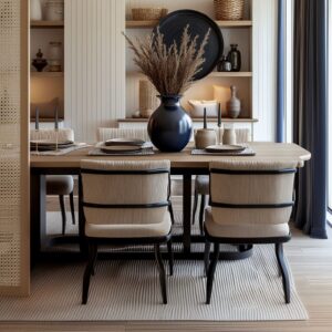
Grid Synchrony becomes noticeable in rooms where rugs are overlaid with stitched or woven grids that happen to align with the layout of furniture. For instance, when the back legs of a dining bench or chair land exactly on a rug’s grid line, that minor alignment sharpens the composition.
It might be missed at a glance, but these small alignments organize the visual field in a way that feels stable without feeling static.

Then there’s the subtler effect of Fluted Leg Repetition. When cylindrical or ribbed dining table legs repeat the groove language of the rug—whether in carved pile or woven ridges—it builds a textural echo.
Likewise, fluted cabinets or consoles nearby may mirror a rug’s chevron weave, reinforcing a rhythm across materials. This isn’t color matching—it’s about how one surface answers another in tone and structure, forming a quiet conversation that gives the room depth.
In these cases, the rug doesn’t scream for attention, but it holds the room together by echoing what’s already there, only lower and softer.

Shape Mirroring as a Soft Form of Zoning
Shape is one of the most overlooked strategies in defining spaces inside open layouts. Rugs do more than just mark territory—they shape how the eye reads function, flow, and cohesion.
In many of the strongest dining room rug ideas, the geometry of the rug responds directly to what surrounds it, especially furniture shapes, architectural lines, or ceiling features.

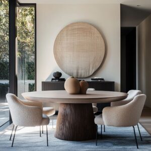
Round-Meets-Round is one of the most effective uses of soft geometry. A circular seagrass rug under a pedestal table, or a scalloped-edge flatweave placed in a curved bay window, reinforces the furniture’s contours.
These pairings don’t introduce new lines—they repeat the ones already present. This subtle mirroring reduces tension from nearby stair angles or corner transitions, and instead lets the dining nook feel shaped, not just placed.

Then there’s the Oval Overlay strategy. In rooms with architectural softness—arched ceilings, curved molding, or wide doorways—a softly shaped rug like a loop-edged oval can serve as a bridge.
The rounded rug contours help tie ceiling arcs and wall transitions down to the floor, turning separate curves into a single visual system. Even without contrast, this layered geometry builds harmony.

Perhaps the most graphic use of shape comes from the Vertical Split approach. A rug that’s divided cleanly into two colors—like off-white and deep green—sets up a strong visual gesture.
Place the dining table at the center of the split, and each chair slightly overlaps both sides, and suddenly the rug becomes more than background. It becomes composition.
This strategy introduces an art-like quality without hanging anything on the walls. The split commands attention without pulling weight from the furniture or finishes.
Used with precision, shape in a rug can zone a space, echo a table, or mirror the room’s architecture—not with loud pattern, but with quiet structure. These visual links are what keep the room feeling settled even in the absence of walls.

Colour as Mediator Rather Than Accent
Hue can be used to settle contrasts, not simply to “pop”.
| Tactic | Example | Result |
|---|---|---|
| Soft Warm Rug vs Dark Furniture | apricot/coral rug under black Windsor chairs | Black feels grounded, not heavy; the room avoids stark drama |
| Deep Floor to Catch Light Walls | ink-blue watercolor rug | Strong colour sits low, anchoring airy architecture and stopping glare |
| Bold Border as Frame | navy edge on jute | Colour reads as a line drawing around the dining still-life; no artwork needed |

Texture Used as Optical Depth
In refined interiors, rugs do more than provide comfort—they shape how light travels, how shadows move, and how the surface underfoot feels even before it’s touched. Texture isn’t just felt by foot; it’s read by the eye.
Many of the strongest dining room area rug ideas rely on this quality, where the rug behaves almost like a low-relief sculpture, bringing quiet dimension into a flat room.
- Carved Motifs are a subtle way to introduce this depth. Rugs etched with sunburst patterns or large leaf-like forms shift in tone depending on the daylight angle. These aren’t printed designs—they’re carved by changing pile height. The result is a moving field of shadows that plays off the surrounding furniture, adding detail without relying on bold color or complex pattern. As the day progresses, light slices across the surface and animates the space in gentle rhythms
- Chunky Flatweaves offer another kind of movement, especially those in off-white wool or speckled oatmeal blends. These surfaces rise and dip in subtle ways that catch sidelight from a nearby window. On pale floors, this interaction makes the rug appear slightly lifted in some places, like soft terrain. The effect keeps the floor from reading as empty or static, adding texture that feels almost hand-touched
- Coarse vs. Smooth Dialogue introduces a layered contrast that doesn’t require pattern or color at all. A raw sisal rug placed under a clean leather bench, or a jute weave paired with velvet cushions, invites a visual tension—sharp texture sitting beneath softness. Without ever needing to step into the room, this kind of pairing signals contrast. It’s not showy, but the eye picks up on the grain, the weight, and the temperature difference between materials, and the room feels full even with minimal decoration
These textured approaches shape how rugs behave in space—not only as floor coverings, but as subtle three-dimensional surfaces that bring light, softness, and tone together in one quiet visual instrument.

Rugs as Colour Bridges
In many interiors, the floor is where all the contrasting elements meet—walls in pale plaster, wood furniture in rich tones, accents in brass or metal. And the rug becomes the unifier.
The best modern dining room rugs solve these visual contrasts without relying on exact matches. Instead, they use undertones—soft hints of related hues—to tie everything together.
An irregular grid in grey, stitched into a subtle flatweave, can act like a neutral thread connecting caramel-toned leather chairs, pale maple floors, and the warm glint of brass lighting. The rug doesn’t mirror any of these directly, but it settles somewhere between them, stabilizing the palette and making the mix feel calm and intentional.
In another approach, a washed Persian rug—with worn edges in burgundy and a faded medallion in blue-gray—blends into a dark wood floor while echoing the coolness of nearby upholstery. It gives history and softness to a room that might otherwise feel dominated by hard lines and high contrast.
The wear in the rug isn’t a flaw—it’s what makes the palette believable.

Then there’s the speckled neutral field, which quietly unites sandy baskets, white plaster walls, and oak furniture. The tones float between oatmeal and light taupe, never settling into one identity but always supporting the rest.
This kind of rug doesn’t ask to be noticed—it succeeds by making everything else around it more comfortable to the eye. What all these examples show is that the most effective color work often happens in the middle.
Rugs that don’t pick a side—but instead pull softly from all directions—become the visual balance point in the room. They let the furniture and architecture speak clearly without noise or tension.
And this is where color works hardest—without ever shouting.

Intentional Imperfection
In rooms where everything is measured, fitted, and controlled, the slightest irregularity becomes meaningful. Some of the most memorable modern dining room rug ideas don’t aim for perfection—they lean into variation.
That soft glitch, whether in the form of a frayed edge or uneven stitch, becomes the feature that makes the space feel human. Hand-drawn grids, stitched or printed into rugs, create a loose visual framework that looks almost sketched in.
The lines don’t match up perfectly, and they aren’t supposed to. When paired with precisely constructed furniture—think slab tables, steel legs, or flush cabinetry—the irregularity makes the whole room feel less rigid.
The rug acts like a grounding sketch, as though someone had drawn the layout and then left the lines behind.

Pixel-like squares and asymmetrical woven patterns create a rhythm that’s more intuitive than mathematical. Each block of tone might shift slightly from the next, and the spacing might tighten or loosen without warning.
This kind of texture slows the eye. The viewer stops scanning for symmetry and instead starts noticing material, weight, tone.
The precision of the architecture gives these imperfections room to speak.

Rough fringe edges, especially on natural fiber rugs, finish the composition without closing it. These ends aren’t hemmed to match—they’re left raw, sometimes uneven.
That softness at the border is what keeps the room from feeling boxed in. It lets the floor feel more like a lived-in textile and less like a graphic layer.
The most refined rooms often find balance not in matching, but in contrast. By letting the rug carry signs of hand-making—intentional flaws, soft breaks, human rhythm—the room gets warmth without clutter.
It feels thoughtful, not sterile.

Light–Rug–Shadow Triangulation
Texture alone doesn’t make a rug interesting. What defines its shape, mood, and movement across the day is light.
Many of the most thoughtful area rugs for dining room ideas use fiber and pattern as a way to trap, bend, and reflect daylight. The rug doesn’t stand alone—it becomes a soft screen for natural light to perform on.
Raised spirals—seen in rugs placed within curved bay windows or rounded breakfast nooks—create a soft ripple effect. As morning light slides across them, the ridges glow, and the rest falls into shadow.
These patterns aren’t printed or colored—they emerge from pile depth and spacing. And the effect is almost like water—shifting, glinting, changing with every hour.

Looped borders, especially scalloped ones, interact with sunbeams in subtle ways. In afternoon light, each loop throws a short, curved shadow that stretches and shifts.
These shadows animate the floor, creating gentle movement even when no one’s in the room. A simple set of chairs sitting on such a rug can feel like part of a larger, slower dance of light and shadow.
Ribbed stripes stitched into wool or flatweave rugs draw the eye toward distant features. In narrow layouts, these ridges become lines of motion that pull attention toward a fireplace, an arched doorway, or an exterior view.
As the light hits from the side, the texture casts faint shadows that deepen the grooves and make the path feel deliberate. The key is subtlety.
No color is needed for this kind of depth—only structure, material, and a room built to catch the sun. These quiet plays of light turn a rug into a changing surface, something that shifts throughout the day without being touched.
The floor becomes not just a backdrop, but an active part of the atmosphere.

Scale Games That Control Proportion
Rug placement can look effortless—but behind the quiet effect is often a series of deliberate decisions about scale. The difference between a rug that feels anchored and one that looks adrift usually comes down to how its boundaries interact with the furniture.
In many modern dining room area rugs, precision isn’t loud—it hides in the way the rug fits under every leg or how it steps back from nearby walls just enough to make the room breathe.

Full Chair Movement Zones are one of the clearest signs of smart rug sizing. Whether it’s a vintage medallion rug or an overdyed Persian pattern, the rug is often cut wide and long enough to keep every chair leg on the textile—even when pulled out.
That means the visual rhythm of the rug never breaks, and the dining area remains unified. Pattern, color, and texture stay consistent, even as people shift positions around the table.
Intentional Inset sizing is another technique, especially in tighter spaces. A navy geometric rug might stop just shy of adjacent cabinets or walls—not because the rug is too small, but because this short offset creates a margin for movement.
That strip of exposed floor acts as a breathing line, softening what could be a cramped corridor. The rug still defines the dining zone, but it respects the room’s flow.

And then there’s the Tight Diameter Echo, which turns a simple round rug into a spatial tool. A scalloped rug placed under a circular table in a square or angular room draws attention to the dining area by contrast.
Its edge stops just before nearby furniture begins, and the result is a sense of visual lift—like the table and chairs are floating in formation, perfectly centered, but never stiff. These size-based decisions aren’t always visible.
But their effect is powerful—they control how space is read, how movement feels, and how the dining zone connects to its surroundings without any architectural boundaries.

Key Concepts for Eye-Catching Dining Rugs
A successful rug doesn’t just sit beneath a table—it connects the entire space. Across the best dining table area rug ideas, a few recurring tactics stand out.
These aren’t trends; they’re quiet structuring tools that make the design feel settled without trying too hard.
- Echoing a Line or Groove Already in the Architecture. Rugs with subtle ribs, channels, or stitched bands can mirror the fluting of a nearby cabinet, the spacing of floating shelves, or even the grain of wood paneling. These echoes pull surfaces together without needing decoration
- Using Shape to Soften or Formalise. In rooms with hard lines or corner-heavy layouts, round rugs introduce visual ease. Conversely, split-color rectangles sharpen soft surroundings and inject clarity—especially in open plans
- Letting Shadow Do the Ornamentation. Rugs with carved or raised motifs allow sunlight to draw the pattern. In soft light, a rug reads neutral. As light moves across it, dimension appears. It’s a performance of texture, not pigment
- Framing the Scene Rather Than Pop a Colour. Bold borders, stitched edges, or banded outlines turn rugs into frames. The dining table becomes a centerpiece inside a quiet field, organized and balanced by the rug’s subtle perimeter
- Inviting Irregularity on Purpose. Soft-grid weaves, hand-frayed edges, or uneven block patterns introduce a small amount of human imperfection. This softens the polish of high-end furniture and brings a lived-in quality without any clutter
- Sizing With Chair Movement in Mind but Don’t Fear Negative Space. Oversized rugs can cocoon a dining set. Undersized rugs—if framed correctly—can allow for edge breathing space and emphasize movement zones. Both approaches work when scale is deliberate
- Bridging Contrasts Through Undertone, Not Matchy-Matchy Color. A rug doesn’t need to match the floor, table, or chairs. What matters more is the tone between them—a mid-range neutral, a muted blue-gray, a sand-washed jute—that settles the extremes
Each of these ideas helps explain why the rug isn’t just a surface—it’s the base layer of structure. It links the vertical and horizontal, softens bold contrasts, guides how the room is used, and sets the tone before any other object is even noticed.
In the context of interior flow, the rug is often the first thing that feels right—even if most people can’t explain why.