Accent walls in dining spaces have shifted from being decorative extras to becoming quiet organizers of everything around them. They shape how the room is read, how light behaves across surfaces, and how furniture settles into its place.
These walls no longer rely on bold color to make a point—instead, they work through depth, repetition, tone balance, and texture layering. Across a wide range of styles, you’ll find accent walls used as sculptural volumes, as reflective tools, as visual anchors, or as material transitions between layout zones.
Sometimes they carry shelving or lighting. Other times, they use plaster or timber slats to guide the gaze without distraction.
Many current ideas don’t ask the wall to stand out—they let it hold the visual rhythm quietly, allowing space to feel composed without force.
This article explores the many ways dining room accent walls are being used today—not just for decoration, but to influence form, flow, and proportion. Through repeated design moves seen across recent interiors, a set of patterns has emerged.
These aren’t trends that shout; they’re design habits that carry subtle intent. From layout pacing to material contrast, from light blending to soft tonal echoes, these walls now shape far more than one side of a room—they influence how the whole space feels.

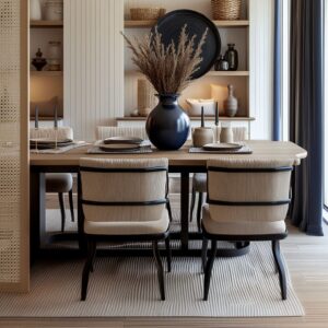
Surfaces That Behave Like Objects
In today’s refined dining spaces, the accent wall no longer acts like a flat boundary—it behaves like a sculptural element with its own physical presence. It isn’t trying to disappear into the background.
Instead, it stands in the room with intention, much like a built-in furnishing. You see this most clearly when walls are recessed just enough to allow soft lighting to glow from behind, or when smooth plaster lines frame the top and bottom, making the surface feel inserted rather than structural.
What happens next is key: once the wall starts reading like an object, it changes how everything else is arranged. Thin cabinetry, often in matte black or deep charcoal, fits snugly beneath.
Shelving elements slice through the surface, giving the composition layers without disrupting its quiet order. Dining tables can remain visually grounded and clean-lined, while chairs become lighter in structure—open frames, woven seats, sculptural legs.
The wall holds the visual weight, freeing the foreground to remain understated. This sculptural approach has become one of the most defining dining room accent wall ideas in modern interiors.
It shifts the sense of proportion. The wall isn’t filler—it’s an anchor.
And because the wall acts more like a standalone volume, it allows the rest of the room to breathe.

Texture as the Quiet Power Move
The most commanding walls rely on texture far more than on pattern or bright colour. Three recurring tactics appear:
| Tactic | How It Works in the Room | Subtle Bonus |
|---|---|---|
| Hand-Altered Masonry (whitewashed brick, Zellige tiles) | Light skims the bumps, making the surface shimmer or glow without fixtures | Each imperfection produces a moving shadow-grid that softens strict furniture lines |
| Fluted or Slatted Timber | Tall, evenly spaced ribs stretch sight-lines and drizzle soft shadows down the wall | The vertical rhythm quietly pairs with chair legs, table bases, even pendant cords |
| Trowelled or Clay-Textured Plaster | Shifts tone through the day, like a matte lens for sunlight | Niches carved from the same material feel embedded rather than applied |
The non-obvious angle: texture replaces contrast.
A clay wall next to leather chairs needs no accent colour; the micro-shadows supply all the depth the eye craves.

Light Treated as Material, Not Decoration
Light isn’t being added to accent walls just for brightness anymore—it’s used as part of the wall’s composition, manipulated with precision to create contrast, rhythm, and form. It’s handled like a physical ingredient.
- One of the quietest and most effective methods is the perimeter glow—LED strips hidden behind a slightly recessed edge, giving the entire wall a lifted appearance. The material, often pale oak or softly fluted timber, seems to float in place, with light pooling around the sides like a soft halo. This isn’t about spotlighting; it’s about edge definition.
- Another approach uses a back-lit grid, especially in mirror-clad walls that have been aged or oxidized. The light isn’t harsh—it filters through the surface with a fragmented shimmer, causing soft distortions that make the room feel deeper without demanding attention. These antique-style mirror walls carry shadows and reflections in the same breath.
- Then come the shadow sconces—simple glass or brass forms mounted directly on textured plaster. These fixtures are chosen not just for shape, but for the curved shadows they cast on the wall, which shift slowly throughout the day. In these cases, the wall becomes a quiet stage for light to perform.
- And finally, the ambient ripple—seen most clearly on gloss lacquer finishes or segmented mirror panels. In these surfaces, every pendant and every window frame is caught in reflection. The accent wall becomes part of the light circulation in the space, bouncing subtle views across the room and blurring the line between source and surface.
One detail often missed: the glow is rarely focused at the center. Edges are where the depth is built.
By brightening the wall’s outline instead of its face, designers reduce its perceived thickness. The result is a wall that feels lighter and more dimensional—without needing physical space to achieve it.
This nuanced use of illumination is central to many current dining room feature wall ideas, where form and atmosphere are shaped through controlled softness rather than intensity. Here, light doesn’t just touch the wall—it sculpts it.

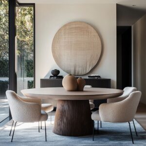
Geometry Echoed, Not Repeated
In carefully composed interiors, geometry isn’t loud—it’s layered. The best modern dining room accent wall doesn’t rely on standing alone.
Instead, it finds subtle ways to link itself with the furniture and surroundings by echoing their shapes—not duplicating them. A wall clad in grid-style moulding speaks directly to the dining table without saying it out loud.
The seams in table planks, the border of a wool rug, or the outline of boxy pendant lights quietly repeat that grid’s right angles, building up visual rhythm without adding noise.

Vertical lines tell a similar story. Fluted panel walls establish a rising texture, one that aligns not only with the room’s height but with upright details like slim chair legs or lean console tables.
The effect is more of a conversation than a pattern match—one vertical shape answering another, gently. Then there’s the diagonal energy of chevron or herringbone walls.
These pull the eye upward or sideways, and when paired with something like a woven pendant or angled table legs, they produce momentum. But they do it without mimicry.
The pendant doesn’t copy the wall—it joins in, softly matching the mood.

In contrast, curves serve as a reset. A round mirror mounted onto a slatted wall slices across the verticals, softening the line and bringing pause.
Or, in more playful rooms, a wire pendant hung in front of an abstract mural adds circular balance to an otherwise angular field. What keeps these combinations from becoming too literal is the use of materials.
Fluted oak might sit near wool boucle. Lacquered squares can play off velvety chair backs.
It’s this thoughtful offset—matching shape but shifting surface—that allows feature walls for dining rooms to feel rich without ever tipping into repetition.

Reflection Used to Bend Space
Mirrored surfaces in dining rooms aren’t just decorative—they reshape how the room behaves. Certain finishes—bronze-tinted, slightly aged, or purposefully segmented—give accent walls a reflective quality that expands the space in quiet but effective ways.
The first effect is depth illusion. When a wall is clad in mirrored squares or antique panels, the boundaries of the room loosen.
The reflection doesn’t create a perfect copy. Instead, it folds the room into itself.
This is especially useful in compact layouts where space is limited but the view is meant to feel broad. Next comes light control.
A warm-toned mirror plays with daylight in a subtle sequence: it diffuses harsh midday sun and amplifies the golden notes at dusk. This passive adjustment acts like a built-in dimmer—without wiring or switches.
The glow shifts through the day, giving the wall a quiet pulse.

What most people miss is the importance of imperfection. Perfect flat mirrors can reflect too much—flattening everything in front of them.
But when mirrors have aged patina or are broken into panels with soft seams, they create scatter. That scattered light keeps the furnishings sharp and readable, avoiding the blown-out glare that polished glass can cause.
The mirror wall doesn’t perform alone—it collects and redirects what’s around it. A low sideboard in matte black grounds it.
Brass lighting reflects within it. Dining chairs in soft velvet or suede subtly echo its warmth without gloss.
What matters most is how the mirror alters perception—stretching lines, catching shadows, and making the entire composition feel lighter than its materials suggest.

Colour as Weight, Not Decoration
In many refined interiors, colour takes on a structural role. Deep tones like matte navy, mocha brown, dark olive, and charcoal aren’t used to shout—they’re used to steady.
These colours function more like visual anchors than accents, and their effect is felt across the full atmosphere of the space. A dark wall in a dining area does more than define—it grounds.
When the rest of the space features light furniture, pale textiles, and natural wood, a saturated backdrop keeps it from floating off the floor. That heavier colour base gives the entire setup structure, like visual ballast.
It doesn’t need bold prints or texture to hold attention; its depth carries the room’s tone quietly.

Then there’s the contrast effect—an ivory chair, brass sconce, or linen runner appears more luminous against a matte black or deep navy wall. The room gets contrast without shouting.
There’s no need for high-shine metals or lacquered finishes. A muted surface with enough depth in tone will pull out the glow in surrounding elements through proximity alone.
A more subtle approach is found in tone-on-tone combinations. Here, the wall colour stretches across mouldings, trim, and even built-ins.
This monochromatic treatment keeps the eye moving without interruption. It removes harsh borders and replaces them with soft transitions, where shadow outlines the panel grid more than colour does.
The wall becomes a single field of rhythm and depth. The finish matters, too.
These deep tones nearly always appear in matte. The lack of shine prevents glare and allows the colour to behave consistently throughout the day.
There’s no gloss to shift the tone or reflect distractions—only a clean field that steadies everything placed in front of it. This approach is especially impactful in ideas for accent walls in a dining room where structure is needed but space is tight.
Deep colour provides calm, weight, and shape without filling the room with objects.

Art & Object Curation That Serves the Wall
What hangs on or sits in front of a dining room wall plays a quiet but essential role in defining the wall’s pace. These items don’t just decorate—they adjust how the eye moves across the space.
When carefully placed, they act like punctuation: some speed the gaze, others slow it down. A tightly arranged gallery grid, where identical frames carry variations of tone or texture, builds tempo.
The pattern encourages the eye to scan, especially when aligned with a rug’s weave, table legs, or window mullions. This effect is especially useful for walls that might otherwise feel too static or heavy.

On the other hand, a large-format artwork, especially one framed in pale wood and set slightly off the surface, brings relief. Its shadow gap creates depth and contrast, while its scale slows the visual flow.
A pair of artworks hung as a loose diptych can even bend the gaze sideways, looping it gently back through the space. Everyday objects—stacked plates, a ceramic bowl, citrus in a tray—can mirror the temperature of the wall’s tone.
If the wall leans warm, the vessels do too. If the wall is cool, the shapes nearby will echo that mood through finish or texture.
This tactic works quietly but effectively, making daily utility feel styled without feeling styled for display.

And often, the best styling avoids perfect matches. A sage-toned cushion placed beneath a blue-green mural might seem slightly off—but that tension keeps the space from feeling staged.
These objects pull tones, they don’t mirror them. That near-matching strategy softens the scene and avoids flattening the palette.
This kind of placement is one of the most overlooked accent wall ideas for small dining rooms, where space for objects is limited but visual layering is still needed. With careful curation, the wall becomes more than a backdrop—it becomes the thread that ties room and objects together.

Environmental Extension
Some of the most visually layered dining room accent wall ideas aren’t confined to the room itself—they lean outward, building a quiet dialogue with what lies beyond the window or door. These walls don’t aim to overpower the view; they blur into it.
They become the hinge between structured space and organic scenery. Take a mural painted in tones of soft green and fog-washed blue—its shape and depth echo the distant mountains seen through nearby glass.
The brushwork flows into the real vista without copying it, extending the eye’s path through color rather than boundary. Or consider a concrete-toned accent wall—its subtle grooves and sandy hue match the tones outside, whether that’s dry terrain or sun-bleached wood.
Through large sliders, the line between interior material and exterior landform feels nearly erased. Zellige tile—especially in light shades of ivory or blush—plays a different game.
Its uneven glaze catches daylight from open French doors and casts back a rippling texture. Nearby citrus trees or terra-cotta pots seen through the door feel linked, not separate.
The wall’s reflective rhythm seems tuned to what the sun is doing outside, not what’s placed in front of it.

These surfaces aren’t trying to tell a story—they’re reacting to one. They respond to the direction of light, to shifts in climate, to nearby trees, plants, sky.
The wall becomes part of the atmosphere rather than a backdrop to it. This subtle alignment between indoor finish and outdoor view is what defines many standout dining accent wall ideas in homes with strong daylight and connected layouts.

Pattern as Motion, Not Decoration
In rooms where everything is clean-lined and balanced, pattern becomes a way to move the eye, not a way to decorate. It’s rare to see strong prints or repetitive graphics on dining walls—but when pattern is used, it’s tied to motion.
Chevron planks cut from reclaimed oak do this by directing energy upward. Their shape implies direction without being graphic.
The pattern builds tension slowly—each point pulling the gaze higher. And instead of competing with that momentum, the rest of the room stays quiet: a pale rug, simple table, soft seating.
It’s not minimal—it’s deliberate.

Abstract murals work on a different plane. These stretch laterally—across a wall, around a corner, through an arch.
The edges of each painted form are loose and soft. There’s no harsh boundary, only movement.
That sweep makes the room feel more alive, especially when paired with irregular chairs or organic pendants that echo the curves without copying them. What’s key here is restraint.
Pattern leads, but everything else follows at a lower volume. No glossy finishes.
No competing shapes. The visual motion created by pattern needs clear space around it to be readable.
In these layouts, the dining room accent wall becomes the driver of rhythm. The table doesn’t dominate.
The chairs don’t crowd. Instead, the pattern carves a path through the room, connecting elements through direction rather than repetition.
That’s what makes pattern feel like a current, not just a layer.

Multi-Role Walls
In many dining spaces, the accent wall is expected to pull double—or even triple—duty. Brick surfaces often host floating shelves, creating a storage-plus-backdrop scenario where everyday plates and bowls line up like subtle décor.
A mirror-clad niche pushes that concept further: objects sit in front while their reflections amplify depth behind, so the wall handles both display and spatial expansion. A different approach blends bench and boundary.
When a seat is sculpted from the same clay-tinted plaster that covers the wall, the entire volume reads as one carved form. There’s no join—just a gentle curve where backrest meets surface.
The effect is seamless; furniture feels embedded, not added.

Then there’s the hybrid of shelving and lighting. Picture a vertical slat installation where select boards step forward to form ledges, while a concealed LED strip runs along the top to cast a soft halo down each groove.
The wall glows, the shelves function, and architecture flows into ambience with zero clutter. A similar trick works just as well in a wood accent wall dining room—thin oak fins host slender objects while warm light bathes the grain, turning practical storage into a quiet showpiece.
By assigning multiple tasks to one surface, the room stays efficient and uncluttered, and the accent wall earns a role far beyond colour or texture.

Scale Control Through Trim—or Its Absence
Trim choices can silently change how a room feels in size and proportion. A continuous grid of moulding, installed from baseboard to ceiling without crown breaks, pulls the upper edge of a large room downward, lending a sense of intimacy.
The eye reads the grid, not the true height, so the ceiling seems lower and the space feels more contained. In smaller rooms, designers often let colour roll right over the ceiling line or switch to mirror panels that rise beyond typical sight-height.
Both moves draw vision upward, making the perimeter blur and the volume breathe. Slatted wraps can achieve the same lift—vertical lines march past the junction, dissolving the boundary entirely.

Sometimes trim disappears altogether. When an accent wall and ceiling share one calm hue, the seam between planes dissolves.
Shadows, rather than paint edges, sketch out the pattern of panels or the rhythm of slats. It’s a tidy way to stretch a compact nook without moving a single wall.
Such quiet adjustments form the backbone of many thoughtful accent wall dining room ideas. Whether trim is multiplied, merged, or removed, the decision shapes how the room feels—cozy and grounded, or tall and airy—before a chair is even placed.

Quiet Colour Echo System
One of the subtlest techniques in refined dining spaces is the echoing of temperature rather than precise tone. Instead of matching a wall’s color directly, designers often choose surrounding finishes that sit in the same thermal family—creating cohesion without repetition.
For instance, a deep green lacquered wall might be paired with warm walnut tones, soft brass details, and beige velvet upholstery. None of these repeat the green, but they all lean into the same warmth.
The space feels coordinated not because of a matching palette, but because of shared undertones that pull everything into quiet alignment.
In another layout, a dusty sage wall might sit behind ivory chairs and a walnut table. The contrast here isn’t chromatic—it’s tonal.
Each surface sits in a muted zone of color, neither bright nor overly dark. The calm lies in value contrast—light and medium tones working side by side—rather than hue similarity.
This method keeps the room from feeling heavy-handed. When every color is slightly adjacent rather than identical, the effect is fluid.
Shadows add dimension, and the eye doesn’t get stuck chasing repeated tones. The wall holds its role without overpowering.
Everything around it supports the mood without mirroring it directly. In quiet dining setups, this approach also prevents small spaces from becoming too theme-bound.
A slight shift in undertone, whether cooler or warmer, provides depth without visual clutter. That’s what makes this technique a silent but powerful layer in many of today’s thoughtful interiors.

Closing Insight
A standout dining accent wall doesn’t need to be loud—it only needs to hold the room together with intent. It acts like a conductor: setting pace, shaping light, and quietly coordinating what sits around it.
It doesn’t demand to be the focal point. It creates the framework for everything else to feel considered.
Textures—natural brick, fluted oak, polished plaster—tend to do more than saturated color ever could. A matte surface that catches light slowly tells a longer story than gloss.
A sculpted shape will hold attention longer than a print. These materials behave—they don’t compete.
What ties the strongest rooms together isn’t contrast for its own sake—it’s alignment. Table legs that follow wall geometry.
Art frames that reflect architectural lines. Lighting that sits where shape and shadow need it, not where it will shine brightest.
Layer by layer, these rooms reveal themselves not through tricks or trends, but through decisions that sit just below the surface. The accent wall might begin the conversation—but it never speaks alone.
It shares the stage with textures, echoes, and thoughtful placements that make the whole space feel like it holds together naturally.