Blue has long held a steady place in dining room design, but how it’s used today tells a far more layered story. It’s no longer limited to accent walls or a single pop of paint.
Instead, blue shapes mood, controls boundaries, interacts with material finishes, and even adjusts how light behaves in a room. From soft powder tones that diffuse natural brightness to deep ink shades that carve out private corners, blue proves to be adaptable rather than dominant.
Some spaces wrap fully in one shade for calm enclosure, while others use precise placements—on ceilings, alcoves, or cabinetry—to create visual structure. As seen through recent decorating approaches, blue isn’t acting alone.
It often arrives paired with textured neutrals, warm wood, brushed metals, and layered fabric surfaces that allow it to act more like a frame than the feature. This article explores the wide range of blue dining room ideas in use today, not through color combinations alone, but through techniques that bring form, contrast, and rhythm to the surface.
From finish to furniture, lighting to layout—each detail plays a part in how blue defines the atmosphere without overwhelming it.
Blue as an Overhead Plane: the “Ceiling Lens”
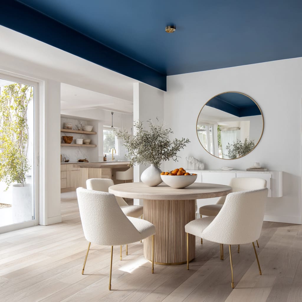
In certain homes where square footage is precious or layouts are fluid, color placement overhead becomes a quiet tool for shaping space. Using blue on the ceiling rather than the walls changes the room’s atmosphere without changing its footprint.
It’s a move that shifts perception instead of construction. A matte cobalt ceiling can feel like a lightless skylight—dense, shadow-like, and gently pressing downward in a way that defines the zone below it.
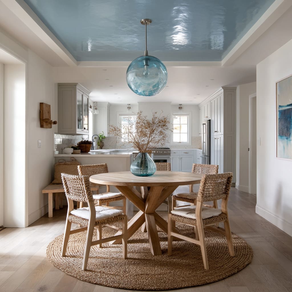
In contrast, a glossy cerulean surface adds lift. The ceiling throws light back into the room, tinting everything in a cool, watery hue that gently frames the air above the table.
Because the paint only reaches the ceiling, the walls remain open and light, avoiding the boxed-in effect some darker tones bring when used vertically.
This design idea works particularly well in blue dining room ideas that are meant to feel framed but not enclosed. Overhead blue reads like mood—soft, cool, and lifted from the main surfaces.
Light shifts throughout the day play across the finish differently: gloss shines bright under daylight, while matte deepens under soft bulbs at night. Ceiling color becomes part of the room’s rhythm without needing bold shapes or structural edits.
Blue as Invisible Partition
In open-concept layouts, defining where one space ends and another begins can be challenging without furniture bulk or added walls. One smart method?
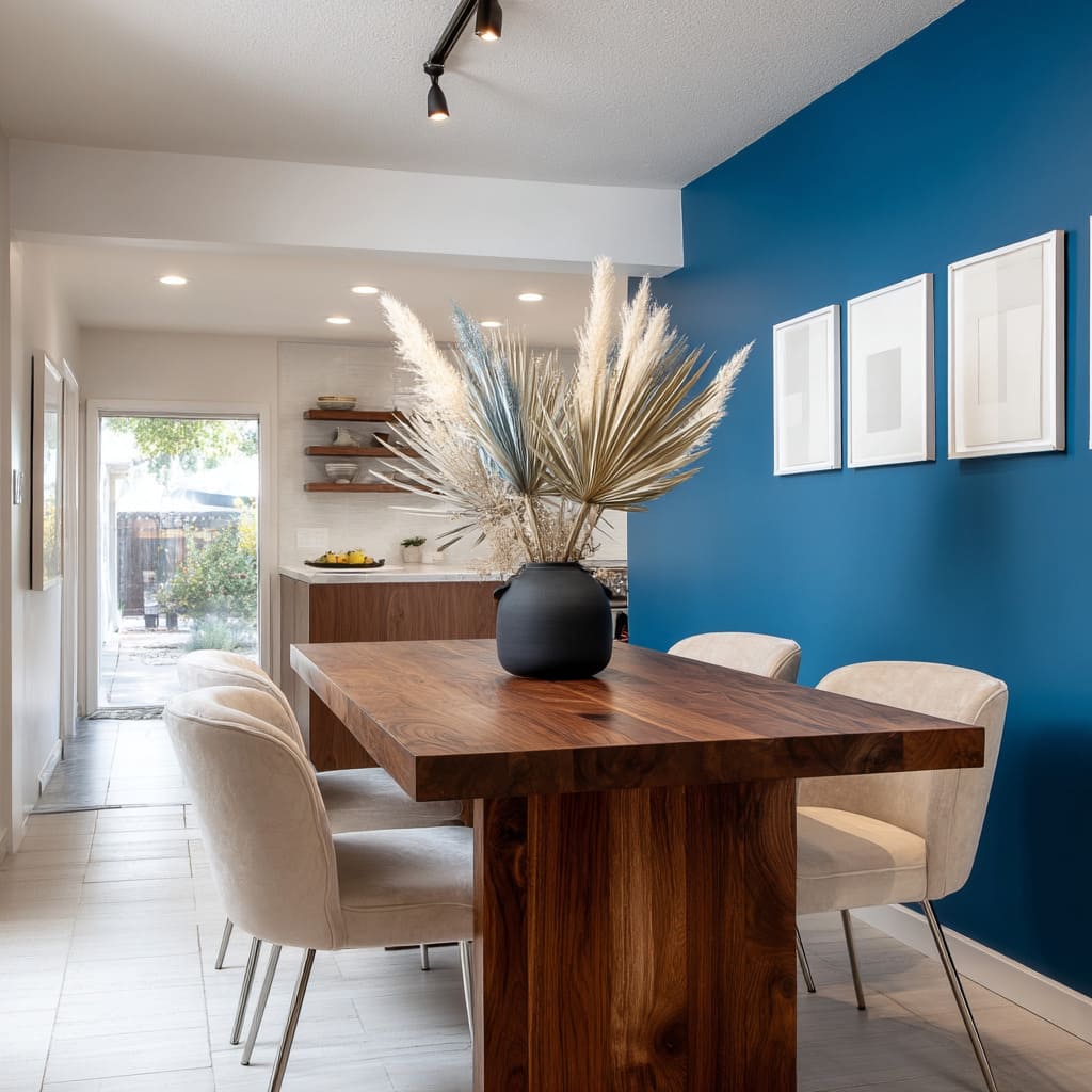
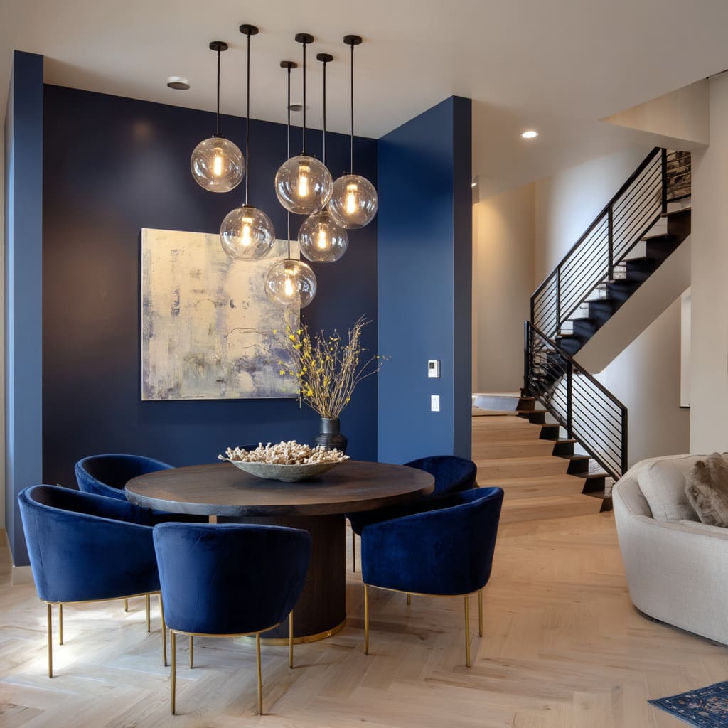
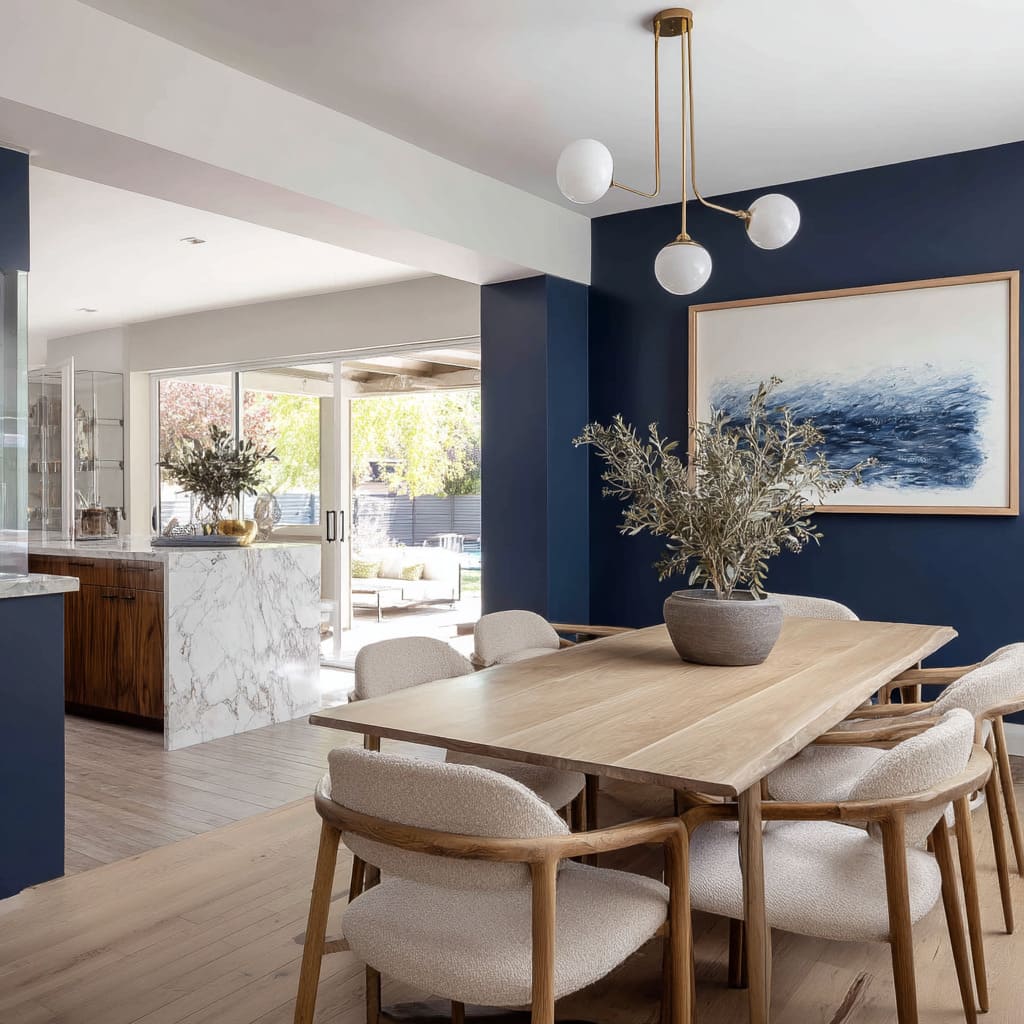
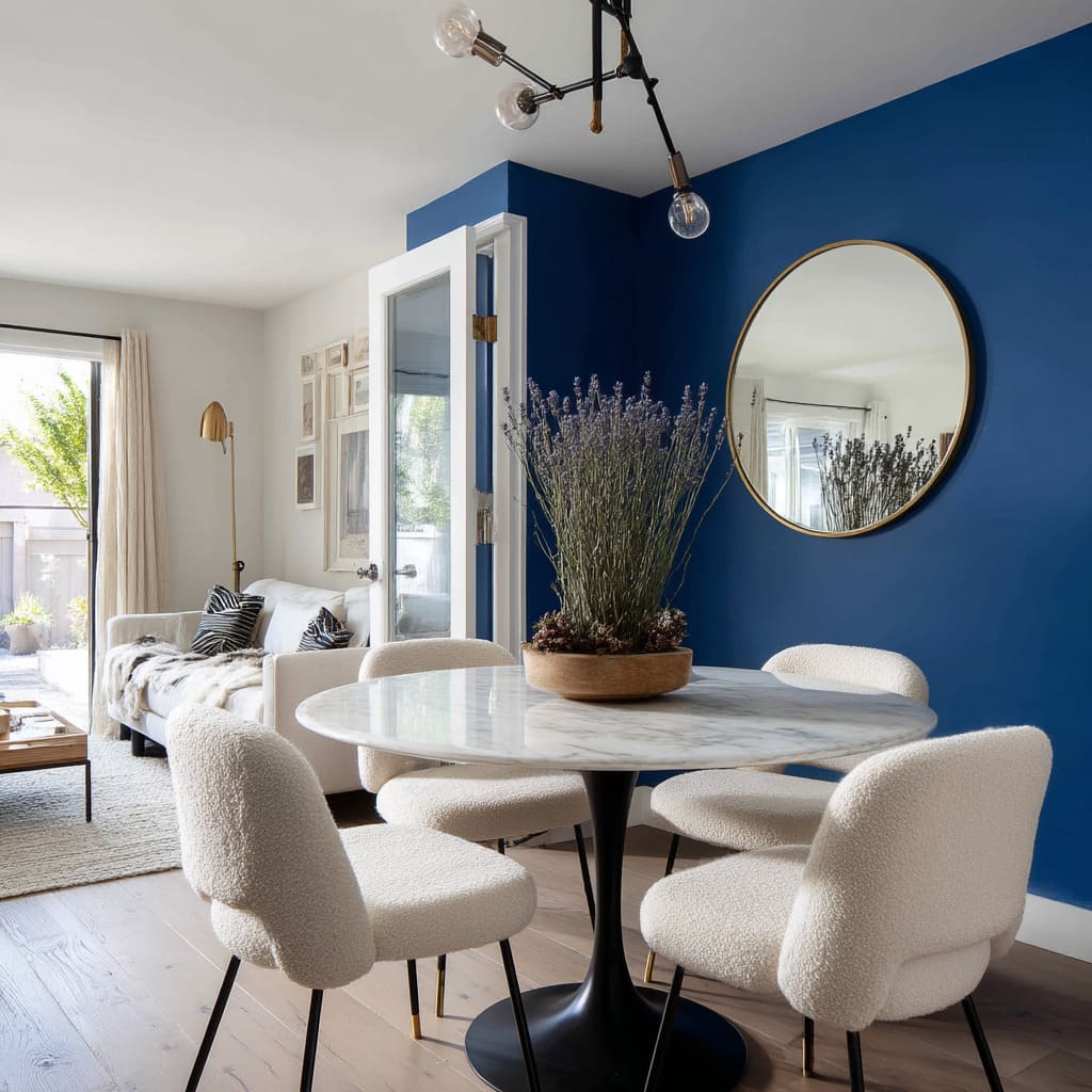
Let color do the dividing. A saturated blue wall—whether painted matte, plastered, or even paneled—acts as a visual boundary that cues the mind: this is where dining happens.
No need for screens, no cabinetry walls, just pigment drawing a soft line across open air. Unlike furniture, which can be moved, or drywall, which is permanent, this form of division is flexible.
Dimming the lighting or shifting furniture placement instantly softens or heightens the boundary. What’s compelling is how the color itself, without any thickness, holds weight in the layout.
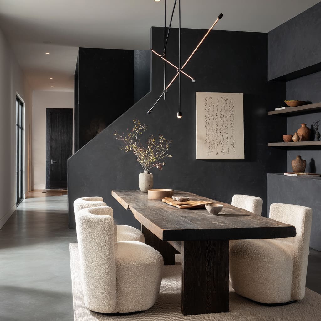
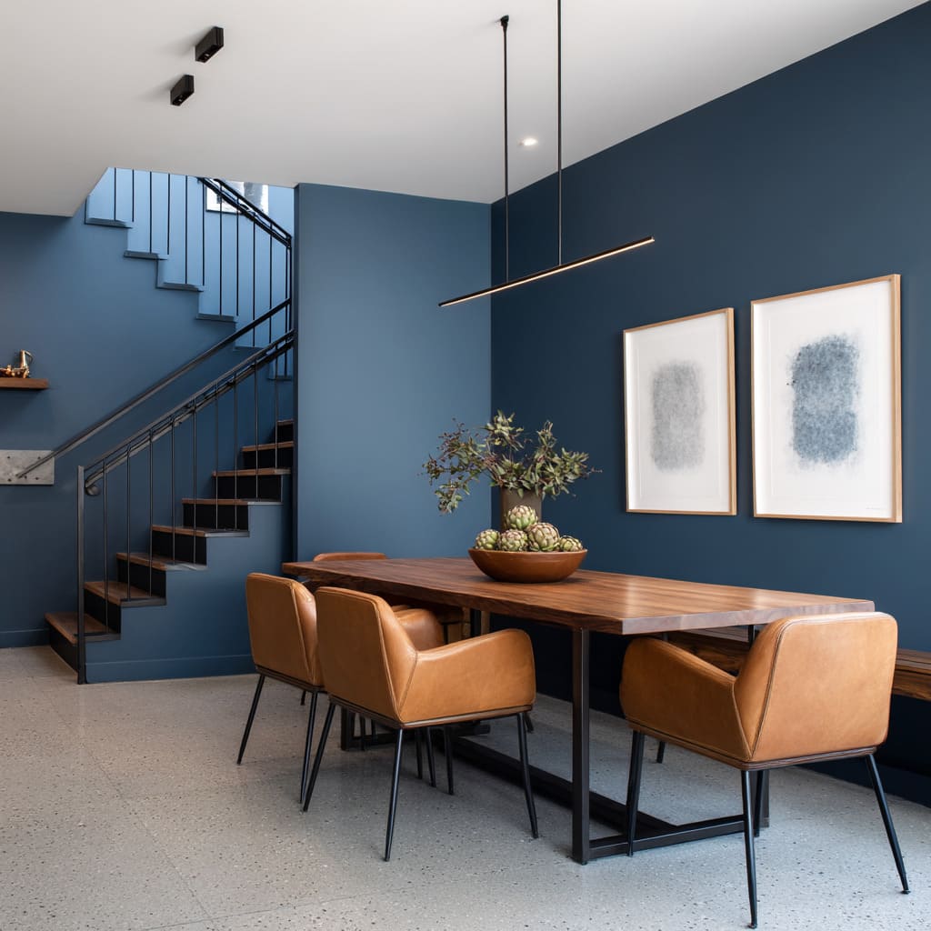
Navy blue dining room ideas frequently use this technique. Deep tones concentrate visual energy, helping the table and chairs feel rooted without adding shadows to the rest of the room.
Lighter furnishings like cream, pale wood, or leather pop against the background, reinforcing that the space is purposeful without being sectioned off. This approach allows for a clean and continuous floor plan while still offering a sense of shape.
In larger homes or loft-like builds, this kind of color zoning balances openness with intent, and does so with nothing more than a brushstroke.
Full-Envelope Calm vs. Targeted Drama
There’s a compelling divide in how blue gets applied to define mood—some dining rooms go all in, others hold back with precision. The contrast isn’t in color tone, but in surface area.
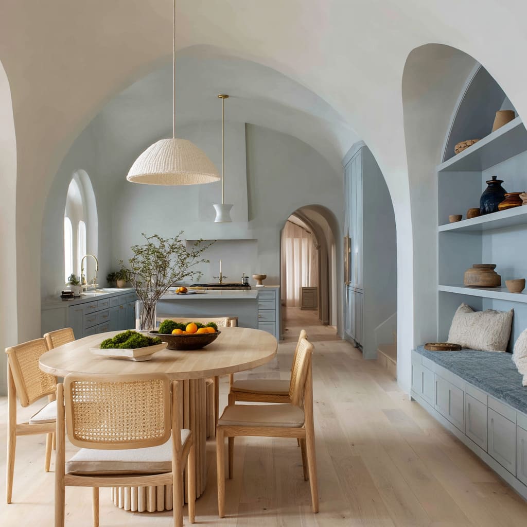
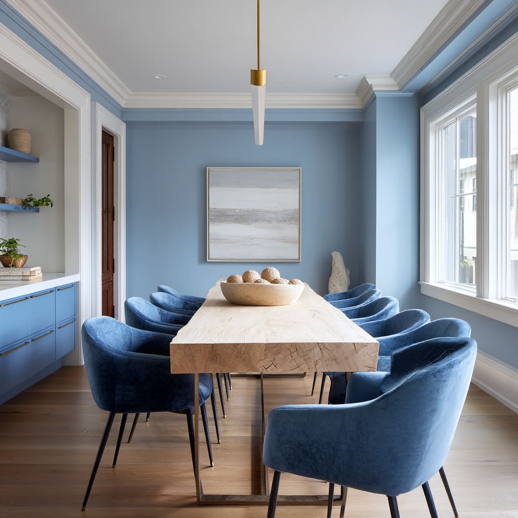
Immersive wraps use blue as a full shell—walls, trim, shelving, even built-ins bathed in the same continuous hue. This creates a visual envelope where objects feel suspended rather than placed.
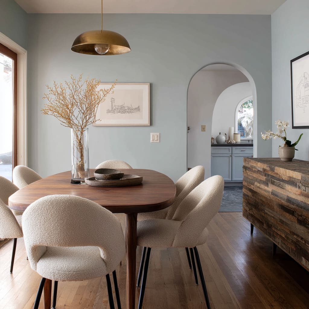
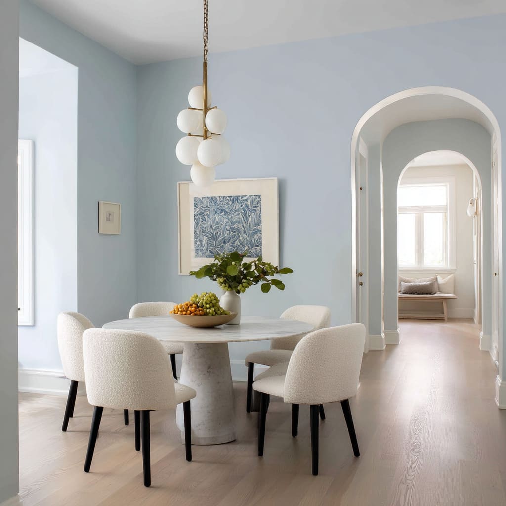
The effect is atmospheric and weightless, especially when tones lean toward powder or chalky finishes. Chairs in pale boucle or soft wood finishes appear as though they’re gently resting within the color, not set against it.
Blue in this format doesn’t draw attention—it holds it quietly. The room feels still, as if everything inside it has been gently muted for clarity.
On the other end, framed bursts of color concentrate attention. A deep navy niche, a lacquered wall insert, or a panel framed by lighter surroundings brings contrast with laser focus.
These pockets of deep tone function similarly to blank space in layout design—by pulling back on surrounding detail, the eye is drawn straight to what matters. Whether it’s a sculptural table base or a vase of fresh foliage, the blue surrounds it like a silent stage.
What’s especially revealing is how dark blue dining room ideas manipulate space emotionally. Full wraps tend to feel slow and immersive; isolated blocks of tone feel composed, deliberate, and full of direction.
Both speak from the same palette—but how far the blue spreads determines how the space feels in motion.
Tonal Stacking Instead of High Contrast
There’s a quieter sophistication in using one color in multiple shades than trying to pair opposing colors for visual drama. That’s exactly what tonal stacking in dining spaces has achieved with blues.
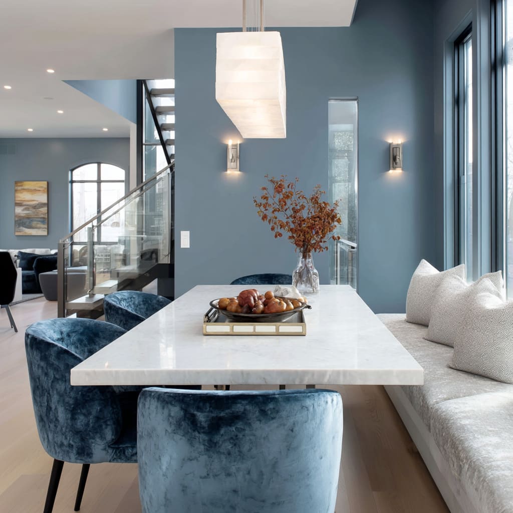
This idea starts with restraint: instead of mixing blue with yellow, green, or red, the entire palette revolves around layered shades of the same family. One might begin with a powder blue wall—soft and dusty—then add a bench seat in deeper periwinkle, wrap chairs in a near-ink velvet, and anchor the setup with table legs stained in the darkest blue-black.
Every shift in hue is slight, but the collective effect is rich and nuanced.
Because these tones sit close together in saturation and temperature, texture takes the lead. Viewers may not consciously register the color changes, but they do notice the difference between matte and gloss, ribbed and smooth, plush and grainy.
That’s where the real complexity comes in—not from jumping between colors, but from tuning a single note until it resonates across the room. In many navy dining room ideas, this layered approach avoids the starkness that dark tones can bring.
Instead of one big block of color, the blue breaks into subtle gradations—letting light catch on velvet, deepen into niches, and soften against plastered surfaces. The space feels unified, but never dull.
Blue becomes a material as much as a color—changing with every surface it touches.
Finish Games: Matte Absorption vs. Reflective Sheen
Surface finish plays a quiet yet powerful role in how blue is perceived in dining spaces. Two rooms may share the same color formula, but if one is high gloss and the other flat matte, their effect can be worlds apart.
Glossy finishes, especially in deeper hues like navy or ink, behave like subtle mirrors. They reflect daylight, overhead pendants, and even nearby greenery from a window.
This visual bounce lightens the overall feel of the space and turns the walls into an ever-changing surface—especially useful in compact areas where natural light may be limited. A high-gloss navy surface, for instance, doesn’t necessarily deepen the room—it often lifts it.
In contrast, matte blues create calm by absorbing glare. They hide reflections and let objects in front of them—like a white vase, sculptural candleholder, or abstract artwork—stand out more clearly.
Even a mid-tone shade like cornflower can feel grounded and intimate if it’s applied in a non-reflective way. It doesn’t flatten the room; instead, it absorbs the room’s glow and tempers it.
The most thoughtful blue dining room decorating ideas tend to play with this duality. They might gloss over ceiling panels to reflect pendant lights while keeping walls matte to preserve stillness.
The result is not an all-over sheen or a dull envelope, but a room that breathes with light in some places and rests in others.
Warm Counterweights — Wood, Leather, Brass
If blue defines the atmosphere, then material choice anchors it. In current interiors, blue rarely works alone—it’s balanced by warmer elements that regulate tone and temperature without disrupting flow.
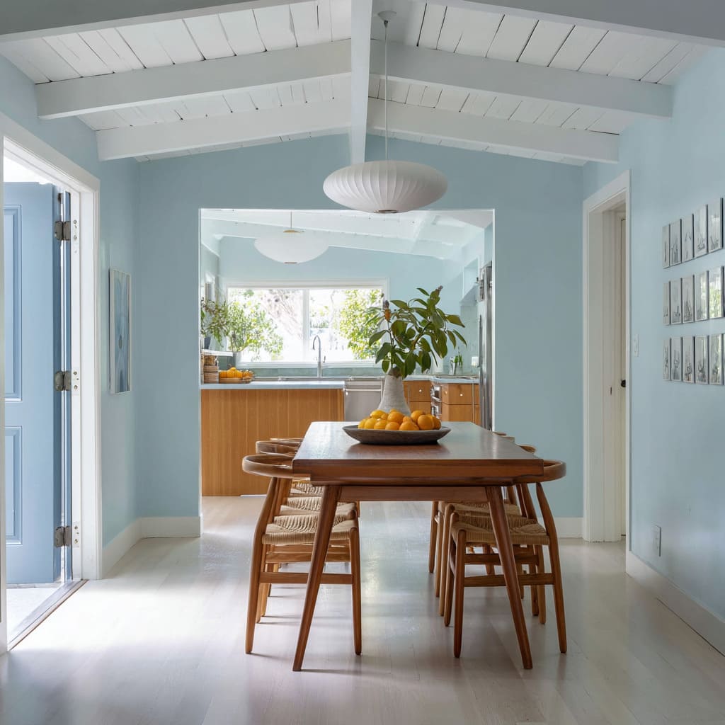
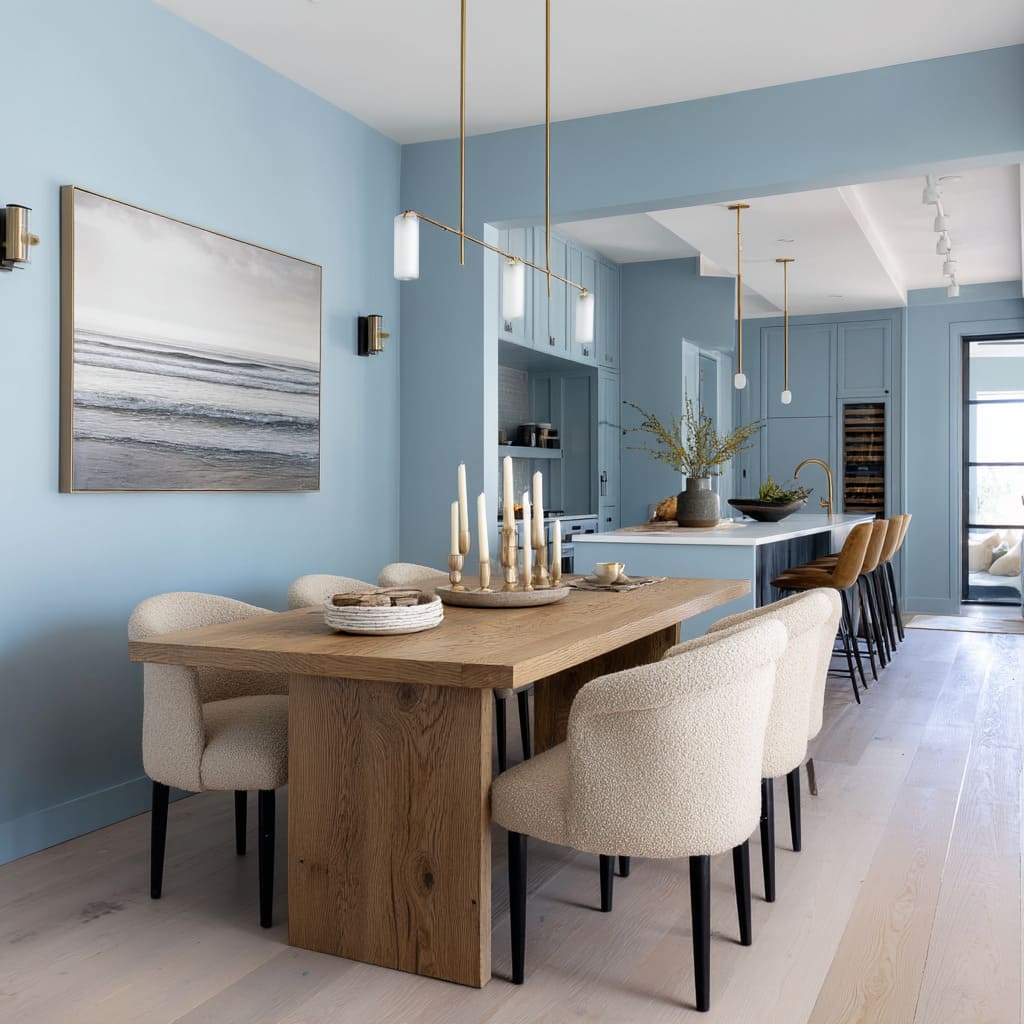
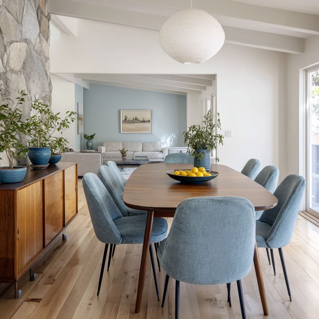
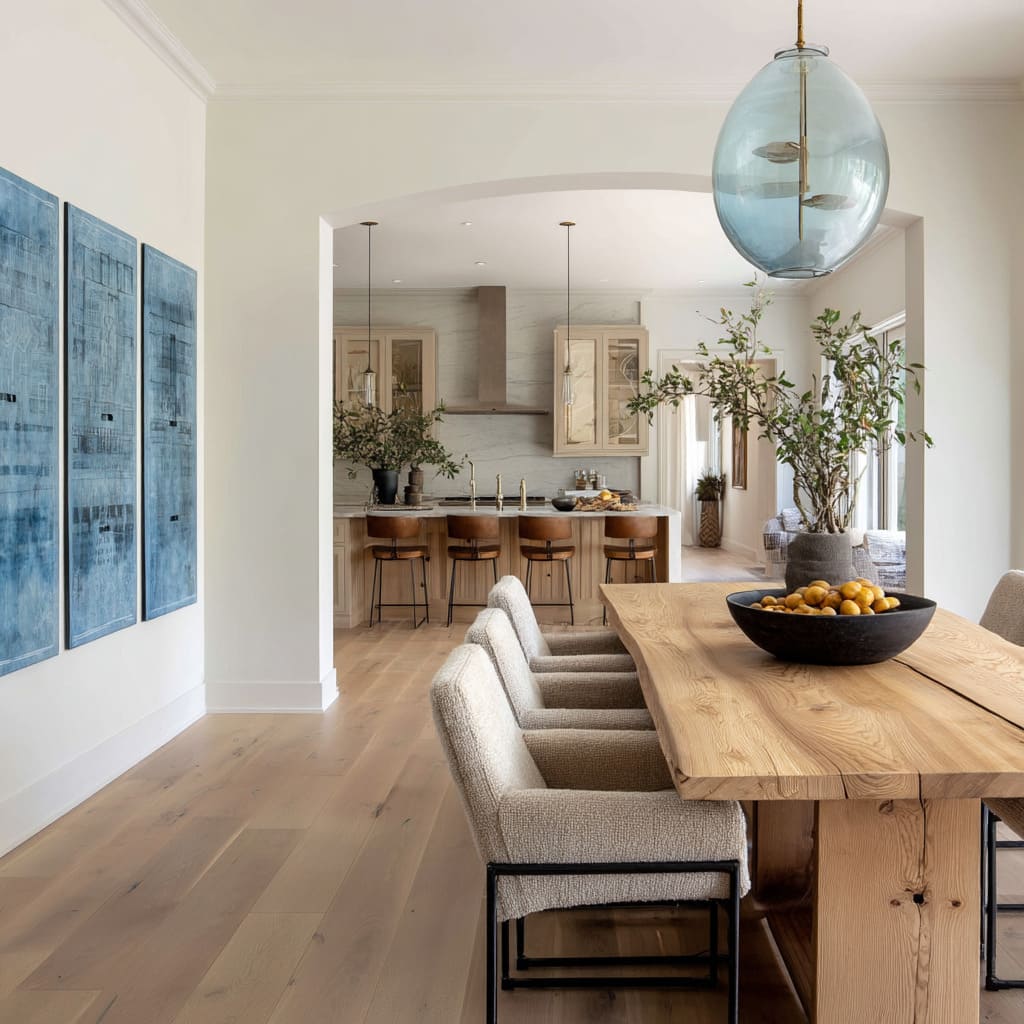
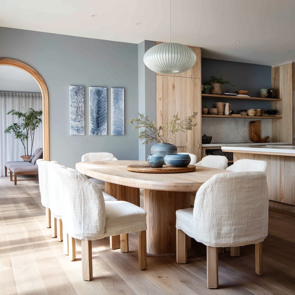
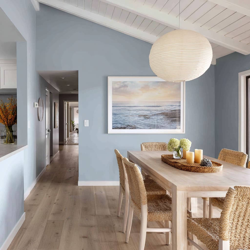
- Wood comes first. Pale varieties like oak, whitewashed ash, or maple bring lightness when paired with softer tones—think powder blue walls or denim-colored cabinetry. These combinations let the wood grain show through without visual conflict. The space feels natural, steady, and open.
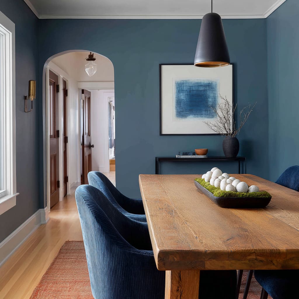
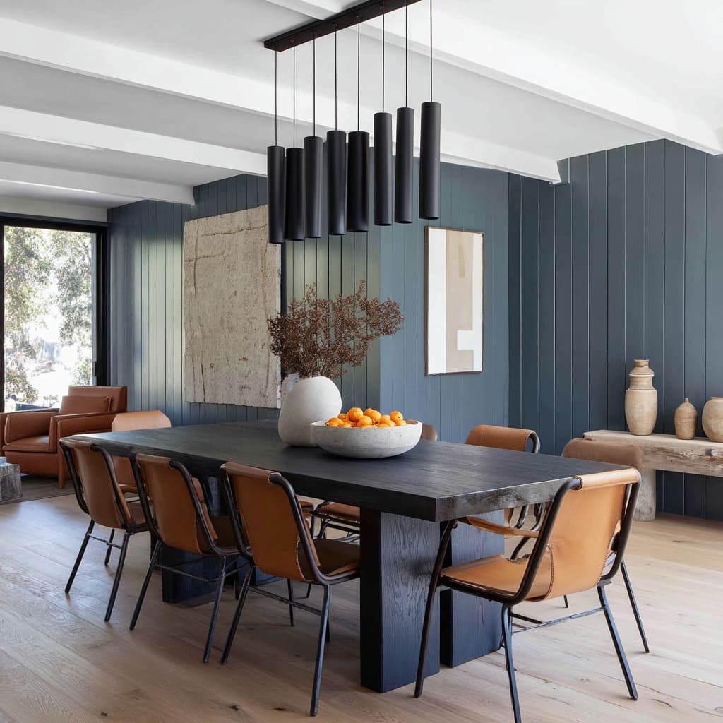
- Deeper blues, such as marine or ink, call for darker counterparts. That’s where walnut or smoked oak enters the scene. Their dense grain and saturated tone offer a counterweight that keeps the room from reading too frosty. The contrast adds gravity and texture without overwhelming the palette.
- Then there’s leather, often in warm camel or rust tones. Even in small doses—a seat cushion, an accent chair, a bench—it adds something irreplaceable. It doesn’t compete with blue; it corrects it. Too much, and the room can feel staged. Just one leather element is often enough to take the edge off a cool wall.
In many thoughtful blue dining room design examples, brass plays a supporting role. Light fixtures with golden interiors, hardware on cabinetry, or picture frames in satin bronze tones—these elements add a quiet glow that doesn’t shout.
They warm the room without breaking its color rhythm. It’s this precise balance—cool pigments, warm accents—that defines today’s most refined dining spaces.
Blue brings depth. Wood, leather, and brass bring the grounding.
Textural Echoes Make Blues Feel Intentional
Color alone doesn’t hold a room together—texture is often the unseen partner that makes every shade settle properly. In dining areas shaped by soft blues, textures like bouclé and velvet do more than add touch; they play with light in ways that make blues more expressive.
- Bouclé, with its nubby surface, scatters brightness. In rooms with cobalt ceilings or mid-tone cornflower walls, this texture gives the paint something to bounce off. The looped yarn finish makes a chair appear weightless against a deeper background. The fabric catches light gently, softening strong colors without flattening them.
- Velvet, on the other hand, behaves almost like shadow in fabric form. Its dense surface absorbs highlights and exaggerates the difference between light and dark. When paired with blue wall dining room ideas, especially those in powder or periwinkle tones, velvet chairs or benches can make pale walls seem even lighter—purely by contrast.
The most successful uses of these materials are not decorative overload. They act as color enhancers—amplifiers that quietly shift how paint appears depending on where the eye lands.
They’re especially effective in layouts where natural light moves across the space throughout the day, adding variation to what would otherwise be a flat field of color.
Light Fixtures: Glass that Steals a Tint
Light doesn’t only fall on a room—it reflects from it, absorbs into it, and sometimes bends with it. Nowhere is that more clear than in how glass pendant fixtures interact with blue-toned walls.
The trick isn’t in coloring the glass—it’s in allowing it to borrow color from the environment. By day, a clear pendant above a dining table may seem nearly invisible.
But place it against a navy alcove or a cobalt wall, and the glass becomes something different. The bulb picks up the blue around it.
At night, when the fixture is lit, the glass softly mirrors its surroundings. It doesn’t glow blue—but it suggests it, almost like a tint that wasn’t there before.
Some of the most compelling blue dining room paint ideas use this principle without shouting it. A tinted globe or a smoke-toned glass pendant becomes a lens through which the room’s color scheme is refracted.
That subtle change adds depth without changing the walls themselves. These fixtures float, reflect, and reissue color depending on the time of day, the viewing angle, and the finish behind them.
In that way, the lighting becomes more than functional—it becomes a secondary surface where the room’s palette gently replays itself.
Artwork as Tonal Bridge, Not Statement
In many current dining room design approaches, artwork doesn’t take over the wall—it blends into it. The goal isn’t to distract, but to support the color scheme with subtle reinforcement.
This is especially true in blue-focused spaces, where a jarring pop of contrast would interrupt the flow. Rather than oversized canvases or multi-colored gallery walls, many opt for sketches, linework, or botanical studies in closely related shades.
A print that’s just a few tones deeper than the blue wall—or slightly lighter—can shift the energy of the surface without separating from it. These tonal echoes allow the wall to remain the primary field, while the artwork provides texture and structure without becoming a separate focal point.
Frames matter too. Pale wood or thin black outlines keep the visual tone quiet.
The art becomes a detail within the palette, not an external voice. It’s less about drawing attention and more about completing a sentence already started by the paint.
In this way, visual continuity remains intact, and the art supports the room rather than challenging it.
White—Still the Quiet Power Player
Blue may set the tone, but white holds the layout together. It sharpens edges, reflects light, and keeps the palette from becoming visually heavy.
In spaces where blue covers large surface areas, white doesn’t fade into the background—it does the trimming, balancing, and framing.
- Ceilings, beams, and upper trims painted in bright white bounce ambient light back into the space, making even navy walls feel less compact. That reflected glow softens transitions and prevents corners from sinking into shadow. It also helps emphasize architectural details like arches or ceiling vaults.
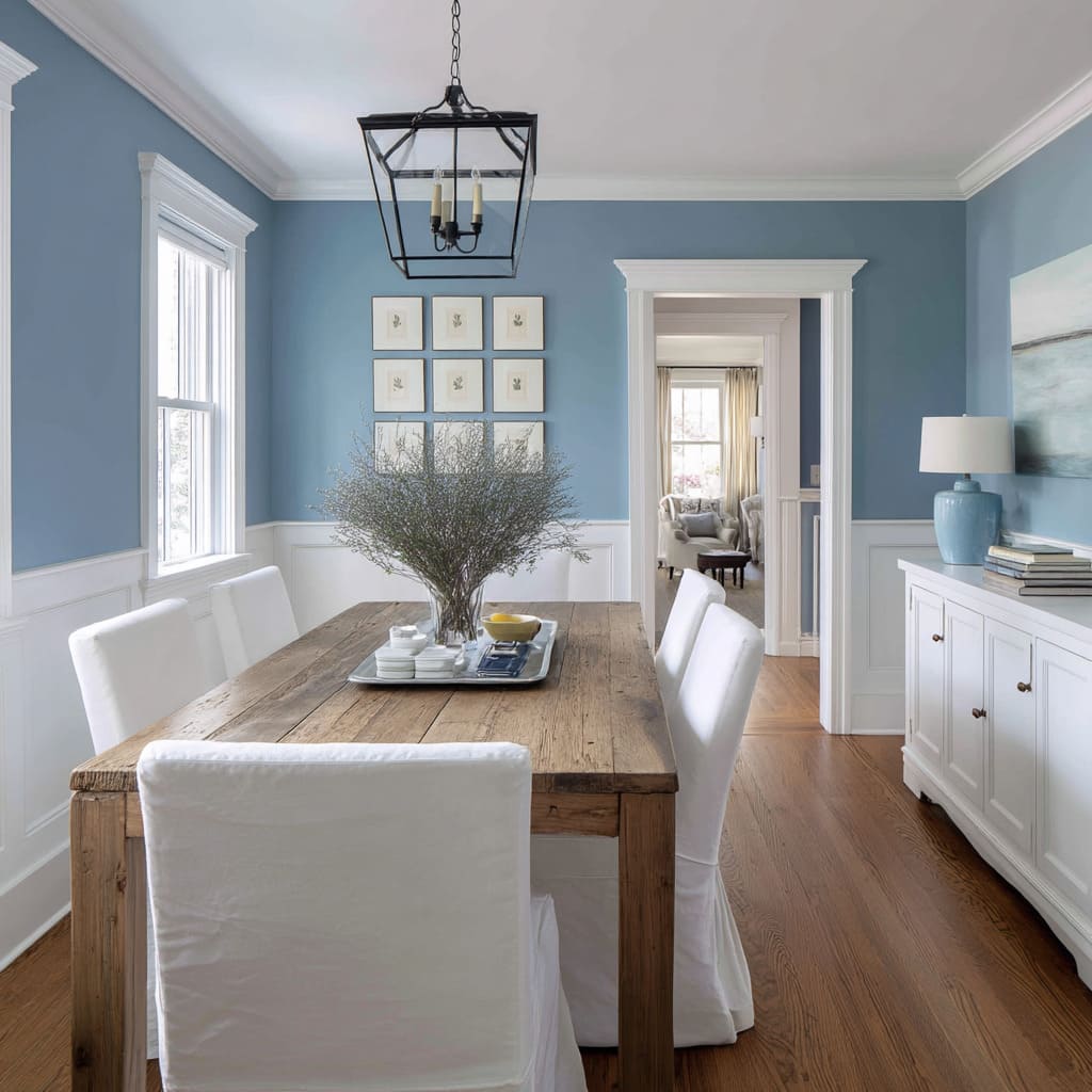
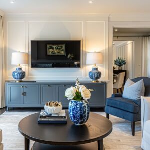
- Trim, console furniture, and textiles like slipcovers or light-toned rugs break up stretches of color and draw lines through the space. These crisp details act like punctuation—short breaks in the rhythm of the room. A pale console table under a cobalt wall doesn’t fight the color; it holds it in place.
In many blue and white dining room ideas, this contrast is what keeps the space readable. Without it, rooms risk losing dimension.
A soft blue arch or vaulted ceiling can keep a white scheme feeling grounded but never plain. Instead of being opposites, the two colors play off each other: one offers depth, the other clarity.
Together, blue and white make a dining area feel measured, structured, and easy on the eye. One brings atmosphere; the other brings sharpness.
Both know their role.
Blue as Emotional Dial
Blue doesn’t behave the same way everywhere—it shifts in feel based on shade, placement, and how it interacts with surface finish. It’s not just a color choice—it’s a cue for atmosphere.
Sky and mist blues tend to open up a room. They diffuse across walls softly and feel nearly weightless, especially under natural light.
These shades are commonly used to stretch the perception of daylight, making a room feel brighter without increasing contrast.
Powder and periwinkle work in more subtle ways. They introduce coolness without coldness.
In dining areas, these tones support low-key conversation. They bring a bit of formality, but not in a stiff or overworked way—just enough to make a meal feel like an occasion.
Cerulean and cobalt add energy, especially when used on ceilings. Their richness doesn’t overwhelm if placed correctly—they hover above like a lens, energizing the palette without bringing too much weight downward.
Marine and ink do the opposite. These shades bring the walls inward, compacting the room in a way that encourages quiet.
In an alcove or tight niche, they create the comfort of a tucked-away booth. The key to using blue effectively is knowing that intensity behaves differently by surface.
A rich navy overhead won’t feel the same as that same tone wrapped around a wall. A mid-blue in matte finish carries more softness than if applied with a lacquer sheen.
These variations create emotional pacing inside a space—slowing it down, lifting it up, or quietly pulling it inward.
Single-Color Palette, Multi-Material Story
A growing number of interiors are showing that blue doesn’t need company to build interest. It can act as a neutral field—a framework that lets texture and material do the talking.
In this approach, the focus shifts from color mix to material depth. Picture a room with painted plaster walls in a single blue tone—nothing flashy, no accent colors.
That restraint becomes the perfect background for rough oak grain, the ridges of ribbed velvet, or the natural variation in woven seagrass. These surfaces pop—not because they’re loud, but because blue gives them room to be seen clearly.
Glossy lacquer against a matte wall creates quiet friction. A soft boucle seat in front of a flat periwinkle backdrop feels like it’s floating.
This is the strength of single-tone design: every shift in texture or shape becomes more pronounced. In many homes, blue isn’t used to dominate—it frames.
It defines where the eye should rest, while letting materials carry the mood. And because there’s only one color at play, the whole composition stays controlled, readable, and calm without feeling plain.
This kind of material-first approach within a blue color story turns even the simplest dining layout into a layered experience. There’s no need for bright contrast—the visual interest comes from how surfaces catch light, absorb shadow, and react with each other.
Conclusion
One thing becomes clear: blue is no longer used simply for its color. It’s used for how it shapes light, supports materials, and draws quiet lines through space.
Whether cool and airy or deep and compact, blue adapts to its setting—not through contrast, but through intention. Every surface tells a story: velvet softens walls, matte finishes catch shadow, and reflective pendants repeat the room’s tone in subtle ways.
White adds balance, warm accents provide counterweight, and tonal layering keeps the design grounded without losing depth. These are the current patterns shaping how blue is applied in dining rooms—not as a statement, but as a structure.


