In current interiors, mirrors are no longer limited to flat reflections or decorative fillers—they’ve taken on more architectural roles, often structured with precision and depth. Among the most visually controlled and compositionally rich approaches are ideas with 3 mirrors on the wall, where repetition, spacing, and proportion are handled with the same attention as furniture or built-ins.
These layouts are less about adding another element and more about defining the wall as a plane of light, rhythm, or contrast. Whether suspended, recessed, backlit, or softened with curves and patina, the use of three mirrors becomes a format for visual control—blending geometry, surface contrast, and intentional alignment with surrounding elements.
It’s a design move that adds volume, refines rhythm, and interacts with space in ways that feel built-in rather than added on.
Mirrors masquerading as architecture
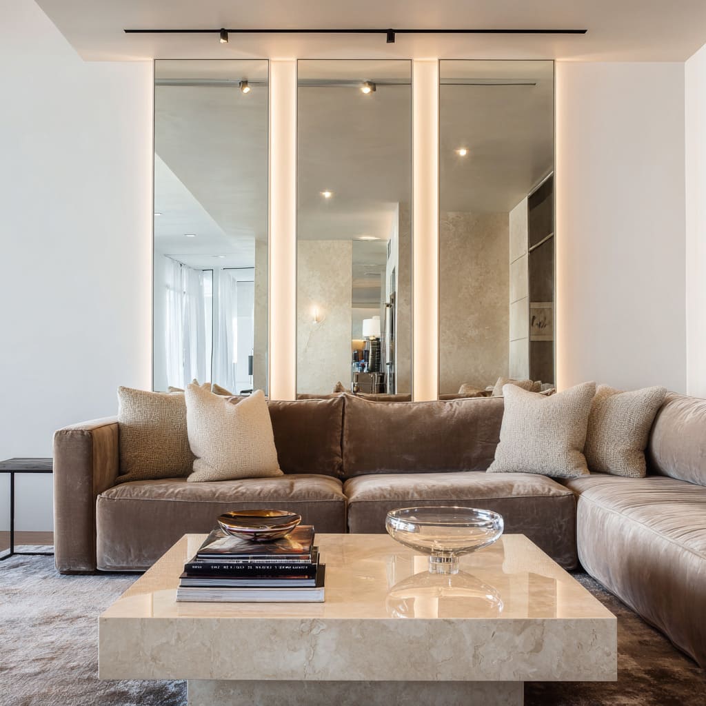
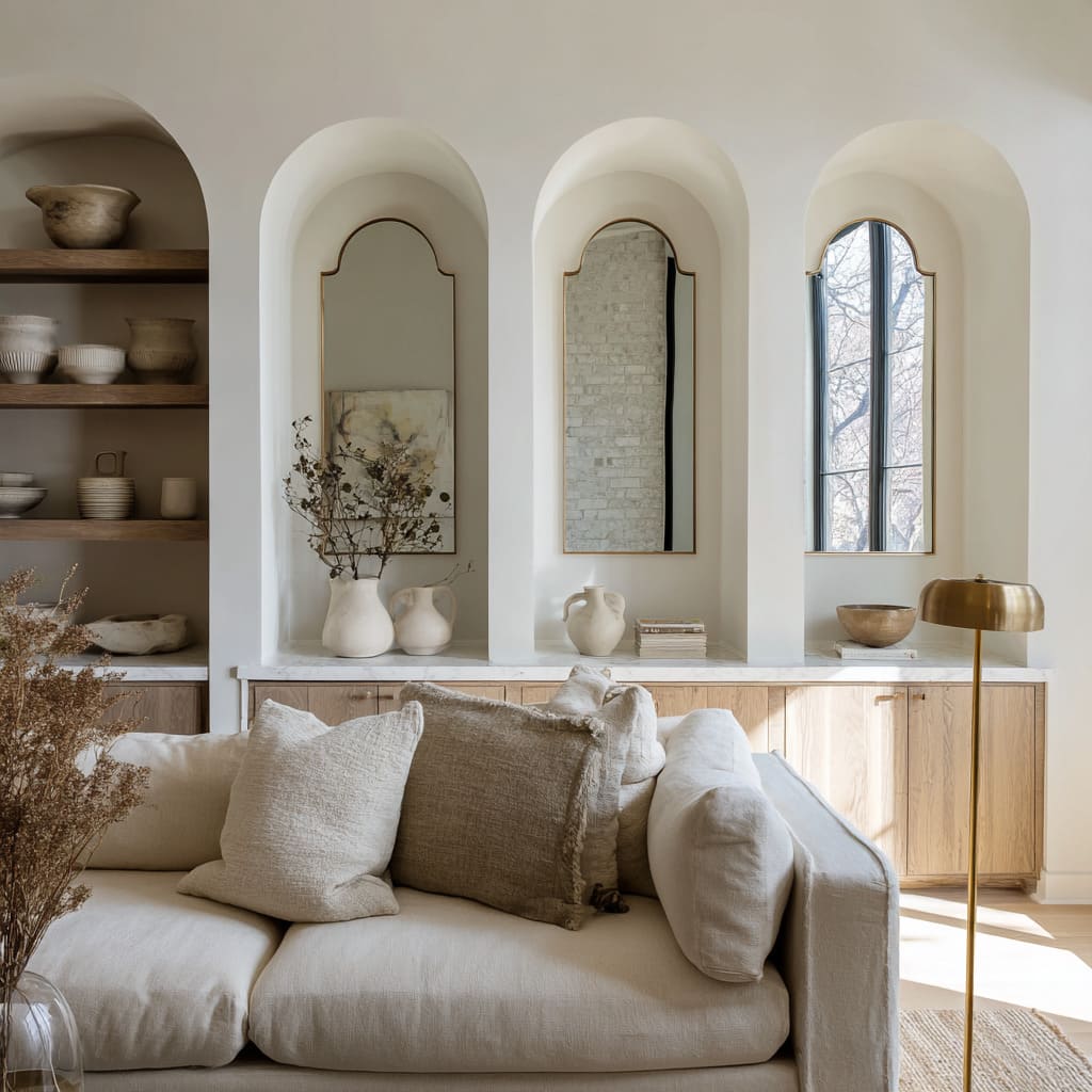
Some of the most visually powerful 3 mirrors on wall ideas come from compositions where the mirror panels act less like accessories and more like structural parts of the room. Instead of resting casually above a console or floating in the center of a painted surface, these mirrors stretch from low near the floor up to the ceiling line, often fitted precisely between vertical seams or custom wall divisions.
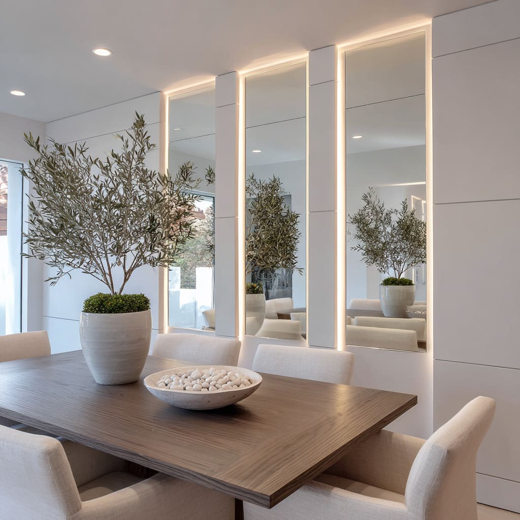
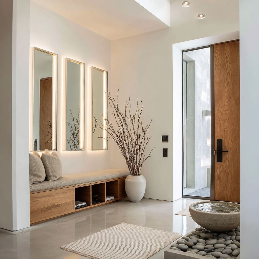
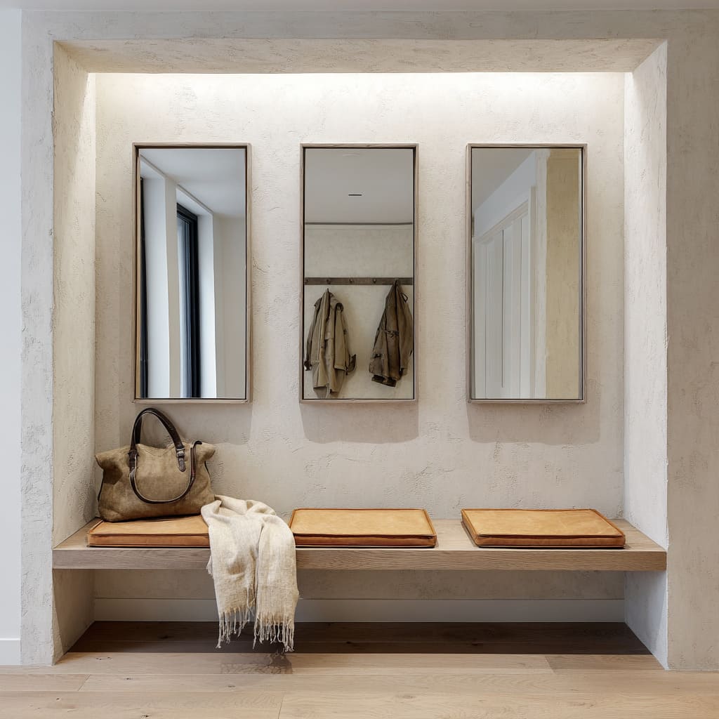
The light is not front-facing or in plain sight—it emerges softly from behind, tucked into the narrow gaps between materials or set within shallow channels. This hidden light setup flattens the edges and makes the mirror panels appear as glowing vertical zones.
Rather than functioning as decorative elements, they carry the visual weight of actual columns, drawing the eye upward and sharpening the sense of vertical proportion.
This effect is most often used in modern or highly organized interiors where scale, rhythm, and clean alignment create a sense of clarity without overwhelming the space. The result is not overly flashy, but it leaves a lasting visual imprint—a quiet architectural force disguised as surface.
Texture duets: slick vs. coarse
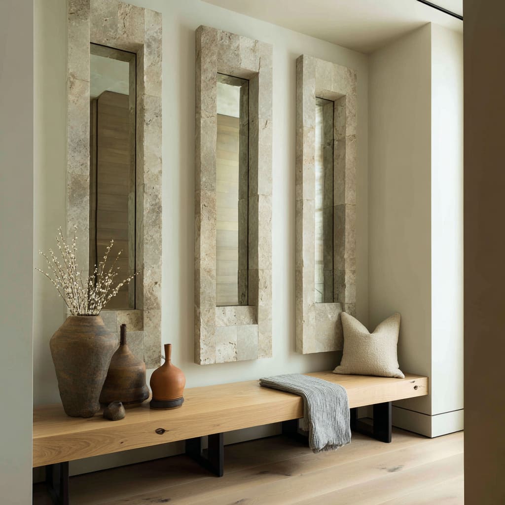
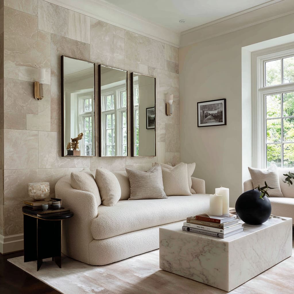
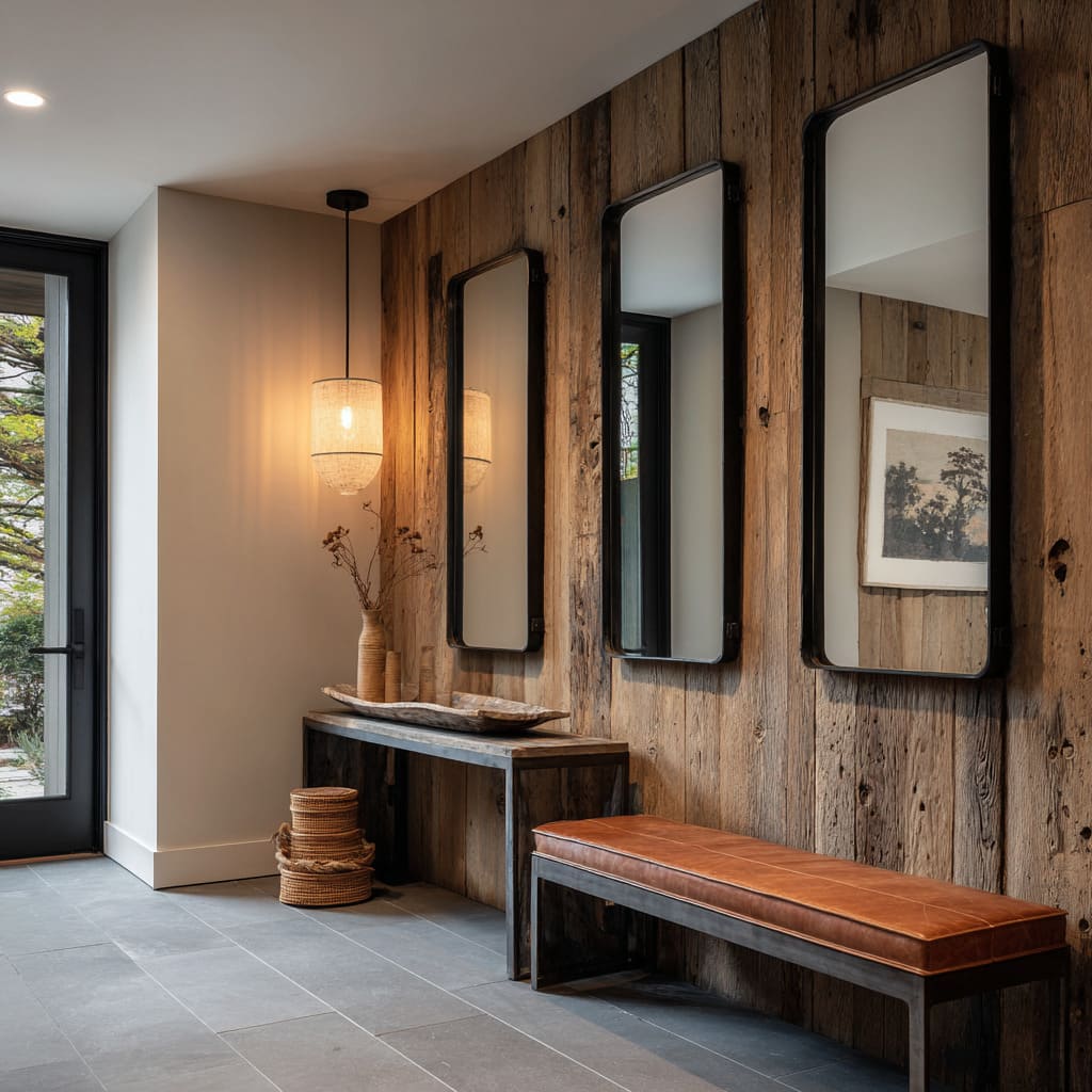
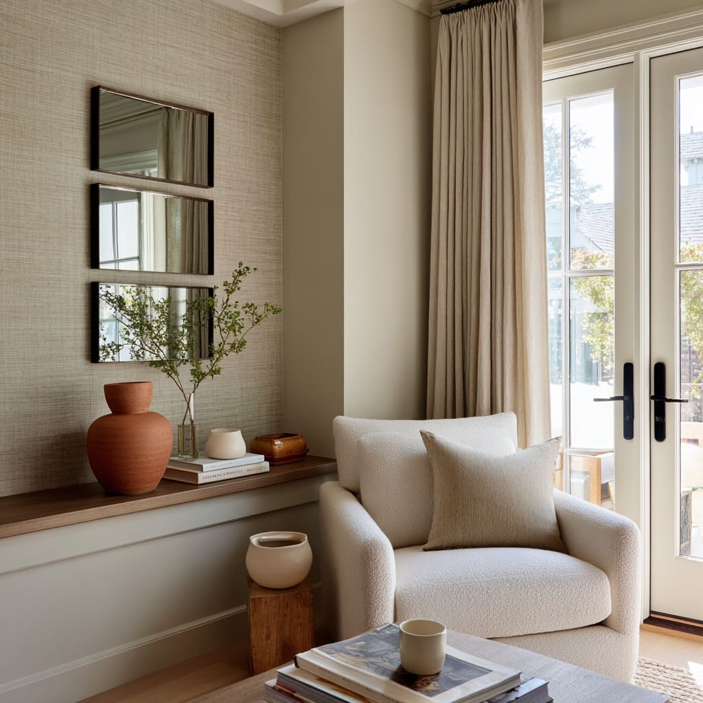
Another refined approach to 3 mirrors on wall is the pairing of opposite surface types to play out a kind of tactile contrast. The visual impact comes from opposites layered directly together: smooth against raw, soft light against rugged grain, flat reflection framed by irregular edges.
A good example is mounting polished mirrors against reclaimed plank walls or integrating glass into stone that’s been chipped, not honed.
This kind of pairing allows the mirror to sit inside material that feels grounded and irregular. The mirror, in contrast, becomes almost otherworldly—a cut of still water pressed into something tactile and aged.
This method gives the reflective surface more gravity while letting the texture around it carry a handcrafted look, forming a kind of balance between control and rawness. Grasscloth, distressed wood, or matte plaster are often the background, letting the mirror’s clarity cut through the mass.
It’s a strategy that gives the eye something to read both from a distance and up close. The result feels layered, with the mirror acting not only as a reflective surface but also as a carved opening within a thicker, more textural composition.
Rhythm borrowed from furniture geometry
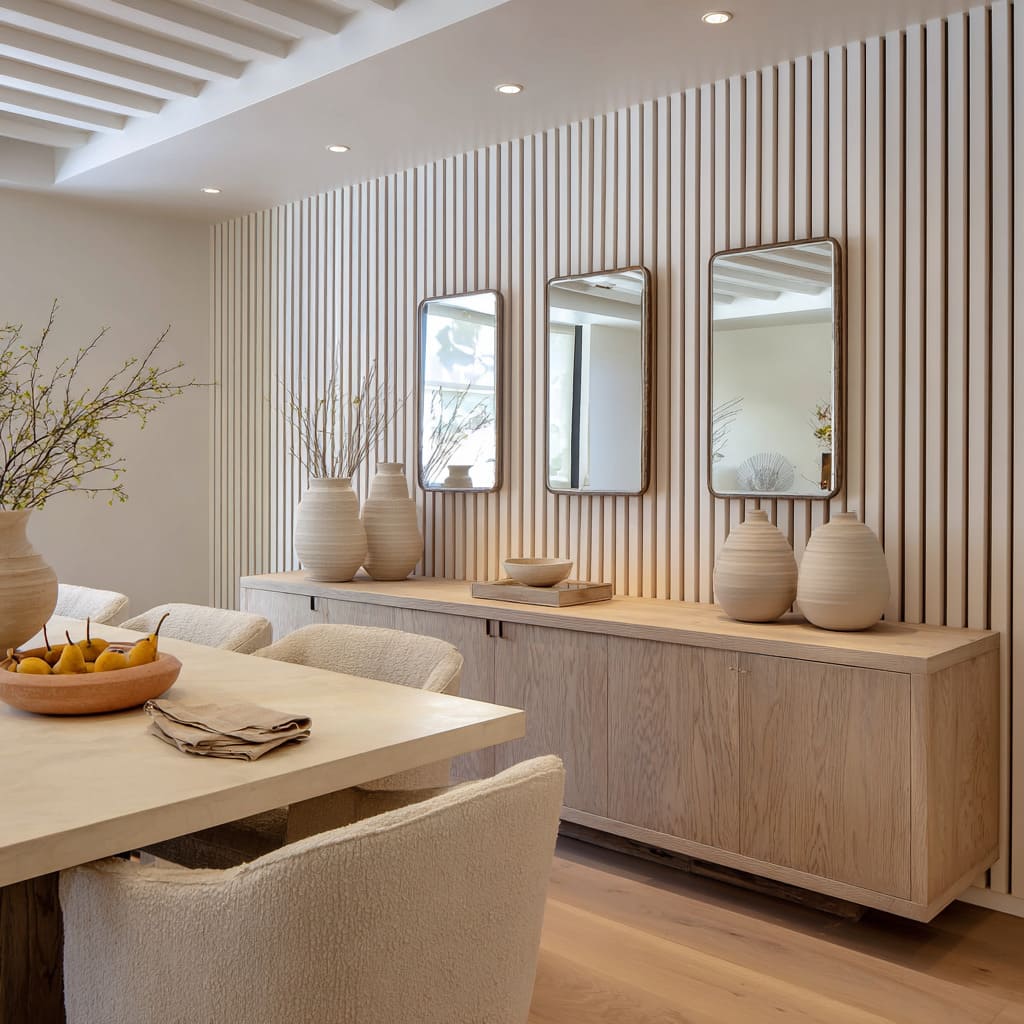
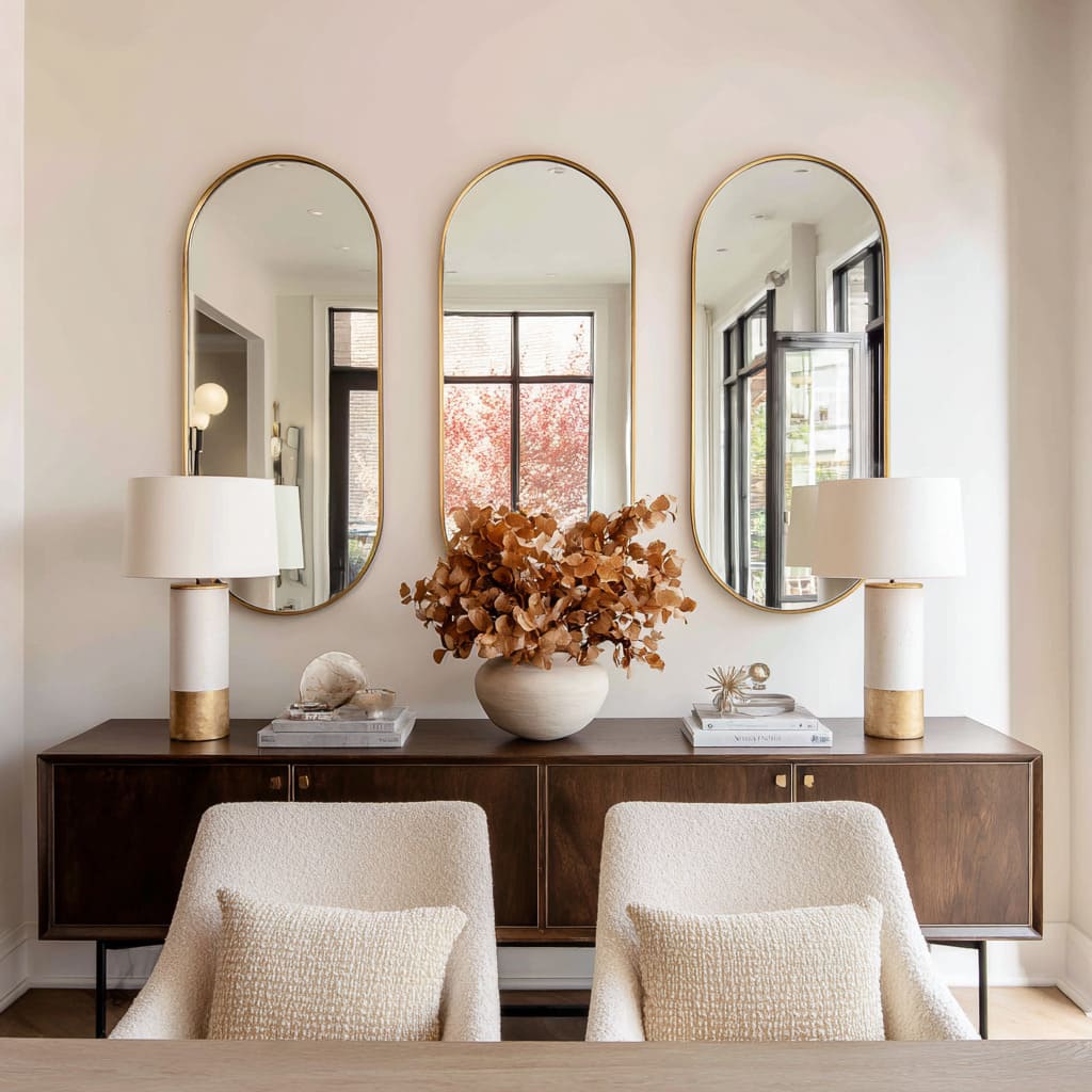
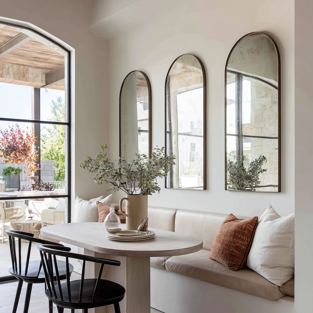
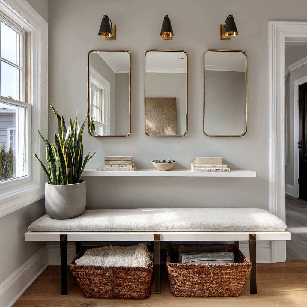
There’s a quiet visual order that happens when the dimensions of wall mirrors echo the shapes directly beneath them. This is especially clear in setups where benches, sideboards, or banquettes sit below the mirrors and their proportions guide the layout above.
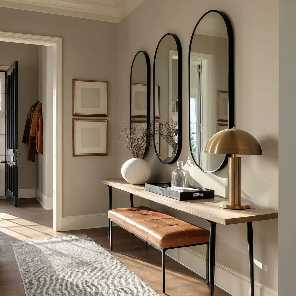
In these three mirrors on wall setups, the width and spacing of each mirror often mirror the divisions or length of the furniture below, creating a stacked composition that reads as one continuous arrangement. This alignment allows the mirrors to feel built-in—less like add-ons and more like a natural extension of the furniture.
The result is cohesive and grounded, even if the elements weren’t constructed as a single piece. It’s a subtle design cue, but it plays a major role in how balanced and complete the overall wall looks.
The eye reads the verticals of the mirrors and the horizontals of the furniture together as a grid, lending calm and order without needing symmetry in every detail.
Curves as tension-reducers
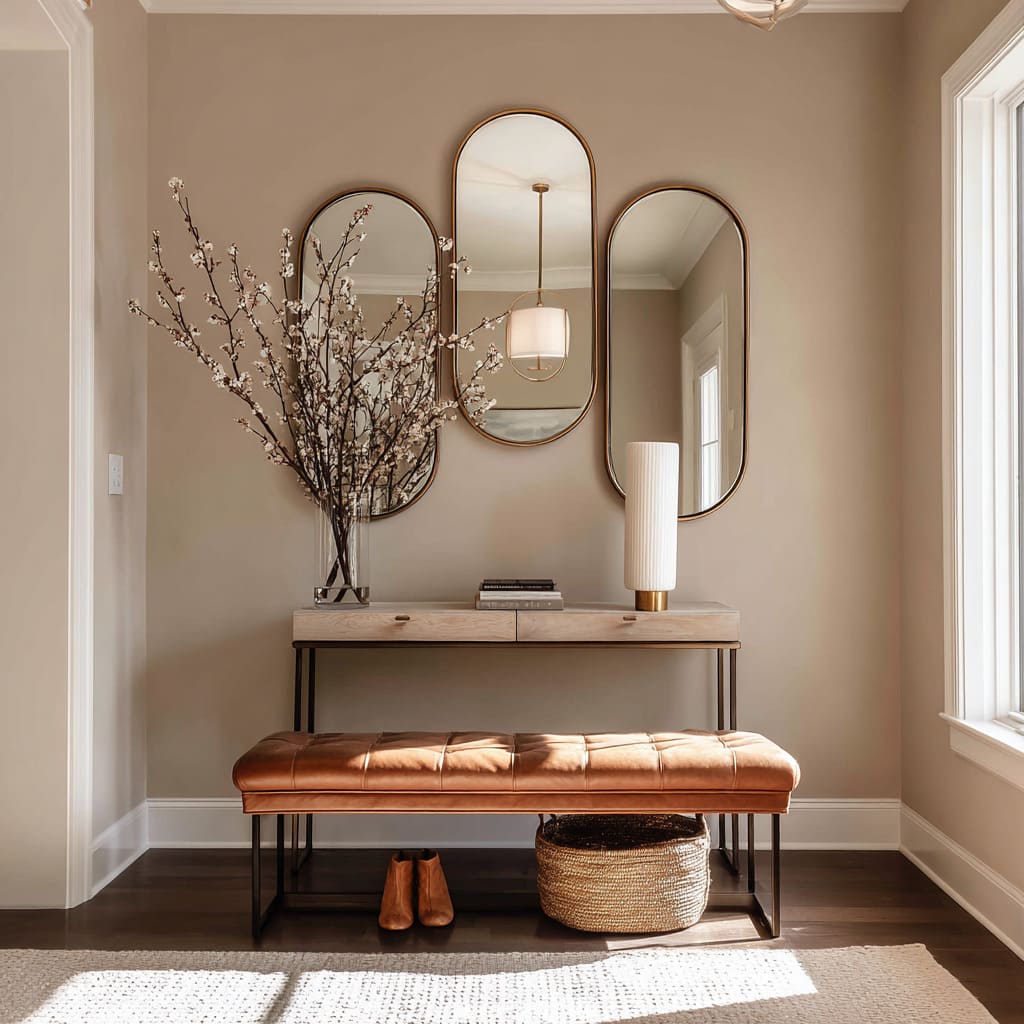
Straight lines dominate many interiors—walls with slats, furniture with boxy silhouettes, trim work with firm corners. In such settings, introducing gentle curves through mirror shapes can shift the tone instantly.
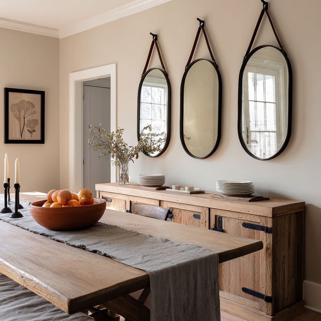
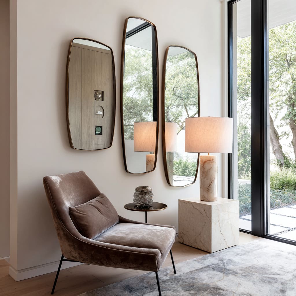
Arched or oval mirrors interrupt rigid repetition just enough to soften the structure and guide the eye in a smoother path. These shapes don’t rely on loud design moves—no vivid colors or high-contrast patterns are needed.
Instead, they use form itself to add a quiet ease to the space.
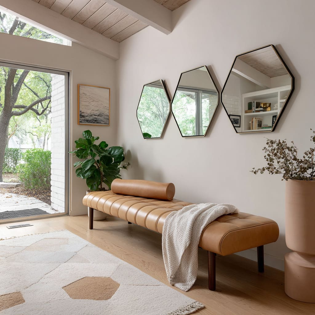
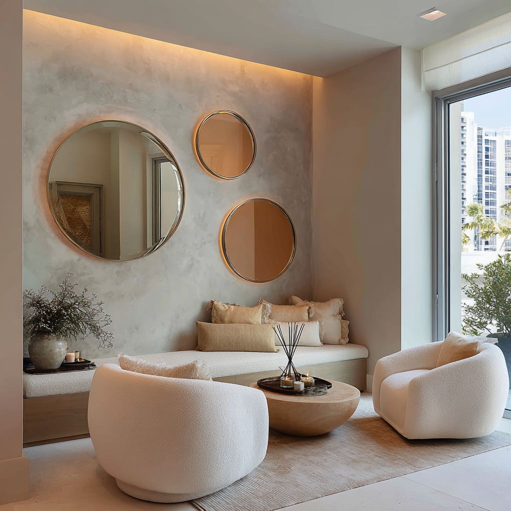
Hexagonal or circular forms go a step further by introducing subtle shadow play around their edges, breaking up the flatness of the wall and adding faint depth. With 3 mirror wall decor ideas, curves bring variety and balance—especially when the rest of the room leans hard into vertical and horizontal elements.
The shift in geometry is small, but the effect on atmosphere is noticeable. The mirrors still serve their reflective purpose, but they also help change the way the space feels in a way that stays aligned with modern simplicity.
Suspension suggests movement
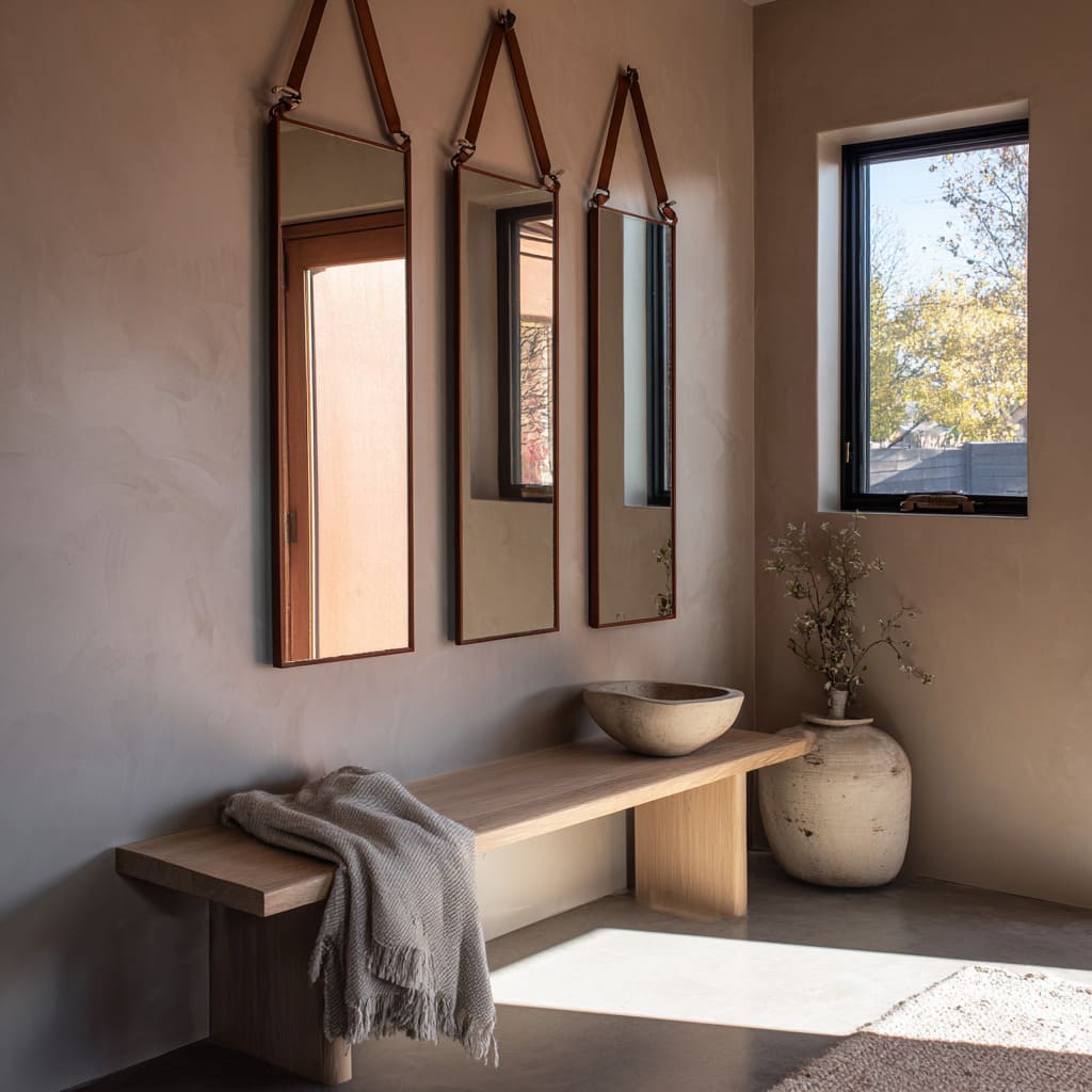
Mirrors don’t have to be flush to the wall to feel complete. In certain 3 mirror arrangements, the use of visible suspension—like leather straps or pivoted mounts—adds a sense of animation, even if the glass never physically moves.
It’s the suggestion of mobility that brings the effect: the viewer reads the slack in the leather or the tilt of the mounting hardware and imagines subtle motion, as if the mirrors were gently swaying in the air.
This detail creates a relaxed quality that more rigid installations often miss. The contrast of soft material against a flat plaster or stone wall adds tension in the best way—tactile, understated, and dimensional.
These features also introduce a layered interaction between shape and function. Rather than sitting still in visual space, the mirrors feel lifted—suspended like objects given space to breathe.
That space around them, especially when paired with wood, metal, or textiles, adds to the richness without crowding the wall.
Intentional ghosting through patina
In more nuanced mirror setups, especially within softly lit interiors, a subtle surface finish can change the mood entirely. Instead of using pristine reflection, some arrangements rely on a light patina or semi-fogged glaze across the glass.
This quiet haze reduces clarity just enough to pull the emphasis away from detailed reflection and shift it toward light and contour.
The result doesn’t shout for attention—it sits in the room as a glowing surface, similar to a muted metallic or a faded mural. These antique or fogged finishes allow the mirrors to glow without the sharp brightness of a standard reflective sheet.
They feel slower, more atmospheric, and give the eye something to rest on rather than through.
In such cases, the 3 mirror layout behaves almost like a wall sculpture—still functional, but more about tone, balance, and filtered ambiance than literal imagery. This approach works especially well in interiors aiming for warmth without excess shine.
Echo chambers of existing geometry
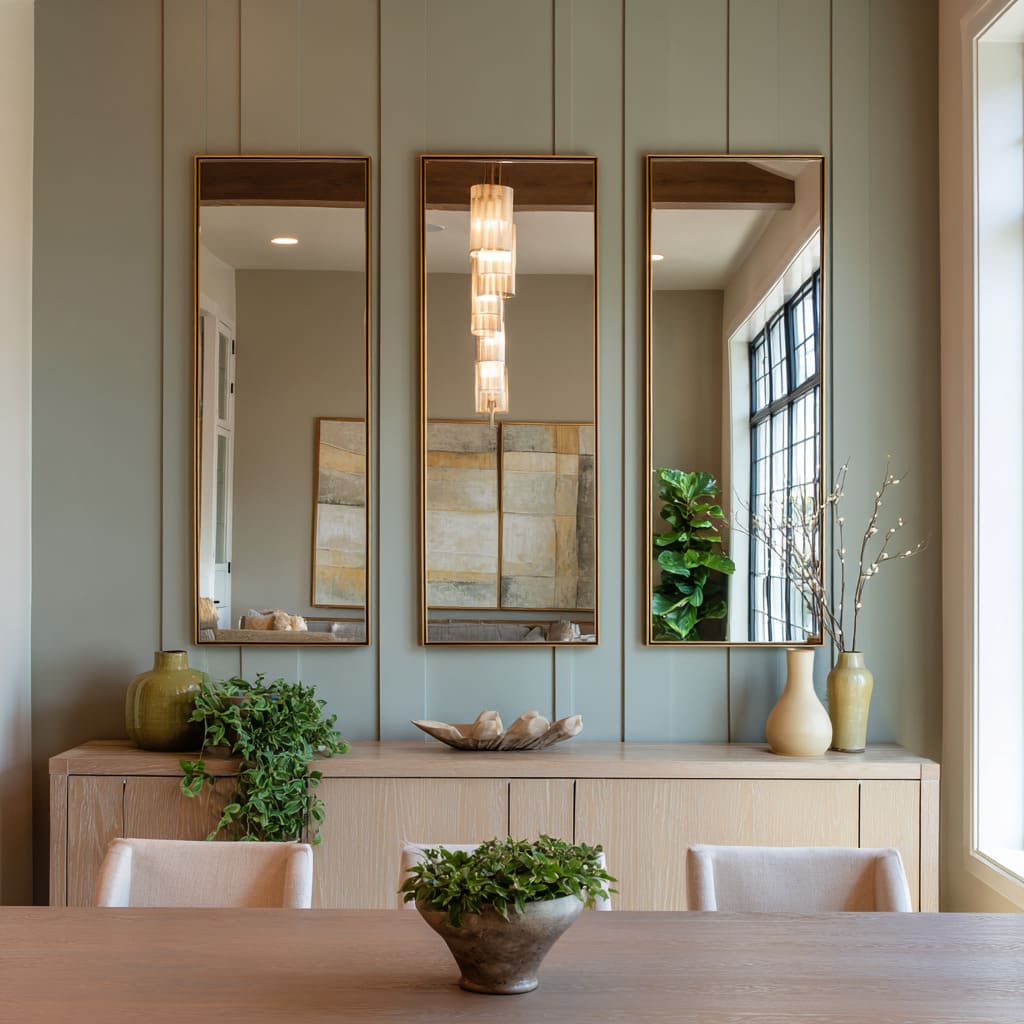
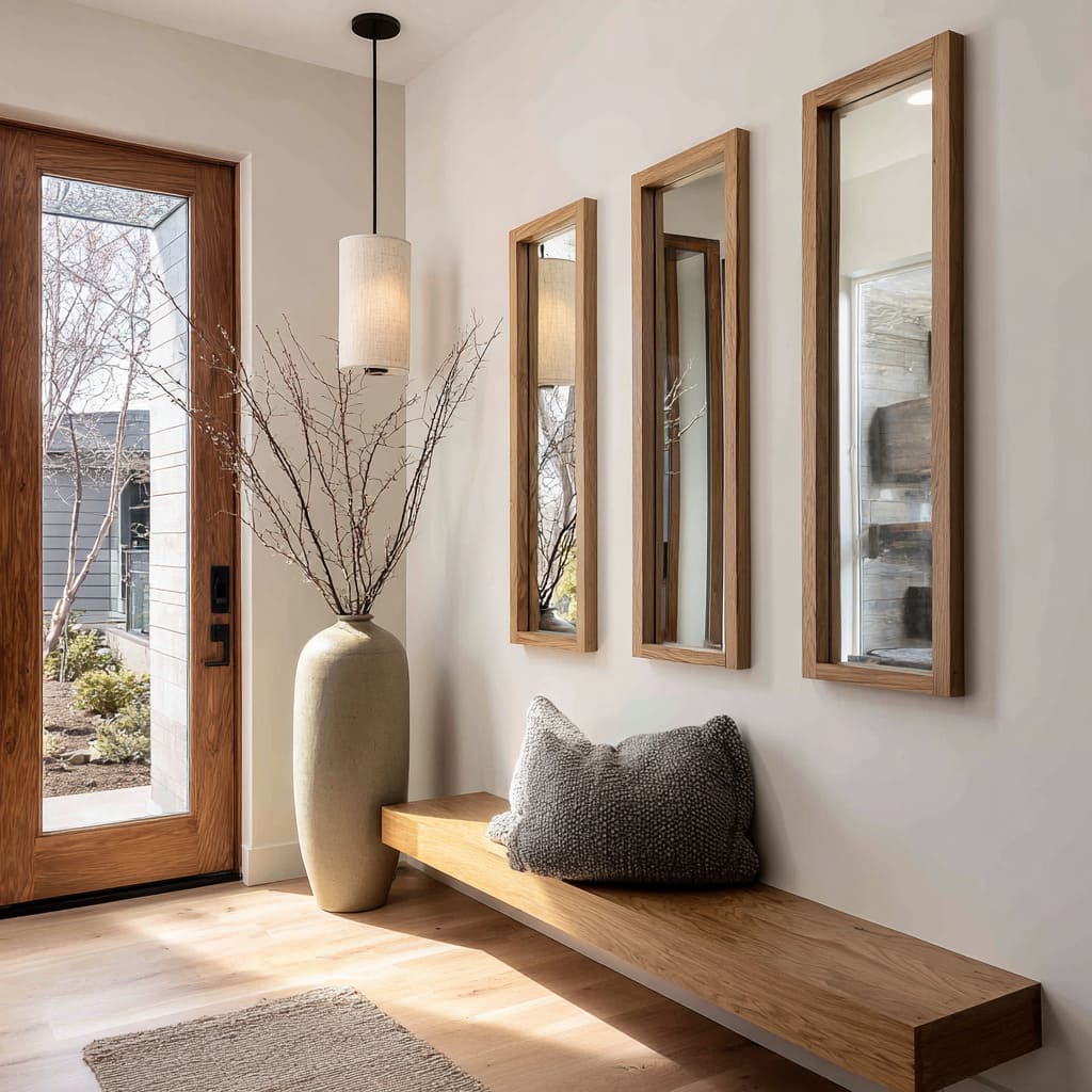
One of the most visually quiet yet clever tactics in mirror composition is the alignment of reflective surfaces with existing architectural lines. In many interiors, vertical or horizontal divisions—like window mullions, fireplace grooves, ceiling beams, or wall paneling—already give the space rhythm.
When mirrors are placed in line with these elements, the effect multiplies those lines, creating the impression of extended structure and repeated symmetry.
The trick works because reflection picks up visual cues that the brain processes as real continuation. Suddenly, there seem to be more windows, taller verticals, or deeper wall recesses—even though the space itself hasn’t changed.
The mirror becomes a silent participant, echoing the geometry already in place without making a visual fuss. This kind of visual rhythm builds subtle depth and structure, especially useful in spaces that need added dimensionality without more decoration.
The mirrors don’t become focal points—they blend in and amplify the layout in a way that feels instinctively balanced.
Balancing mass with mirage
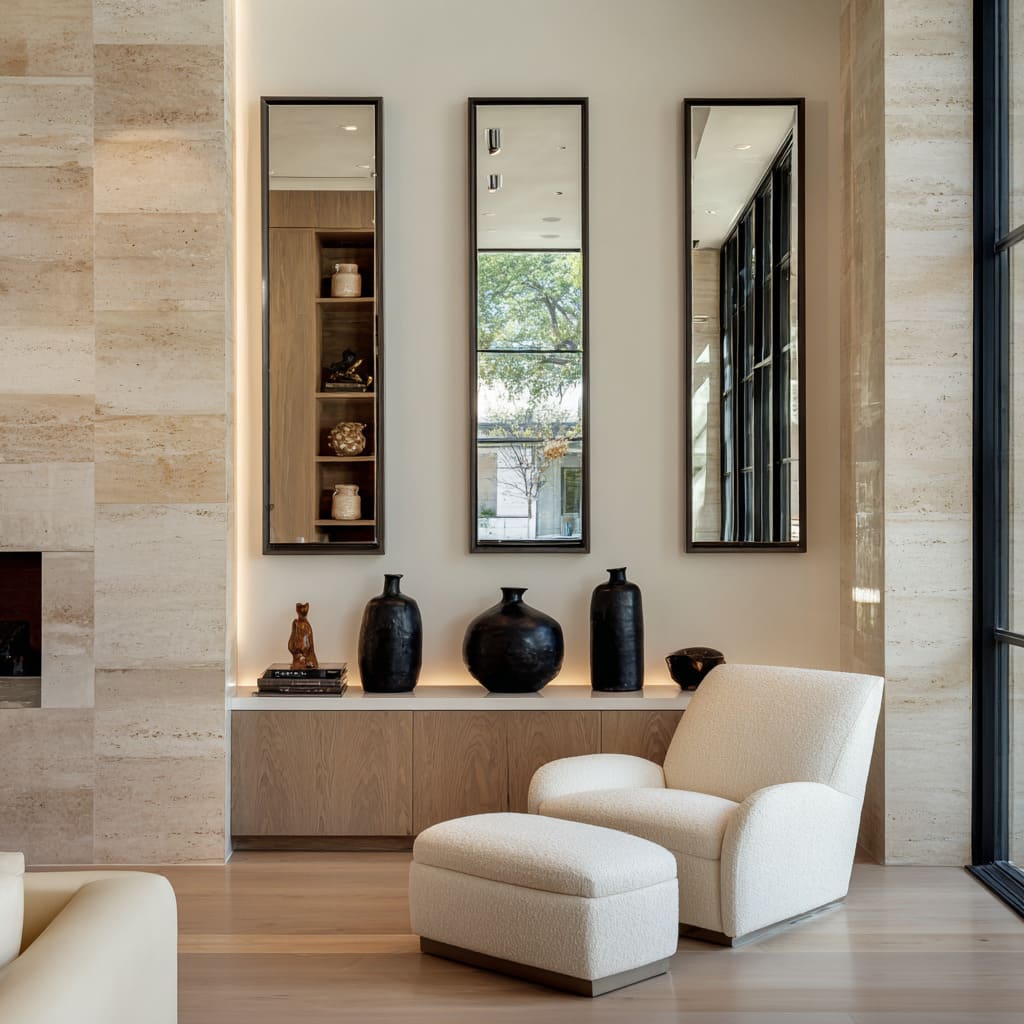
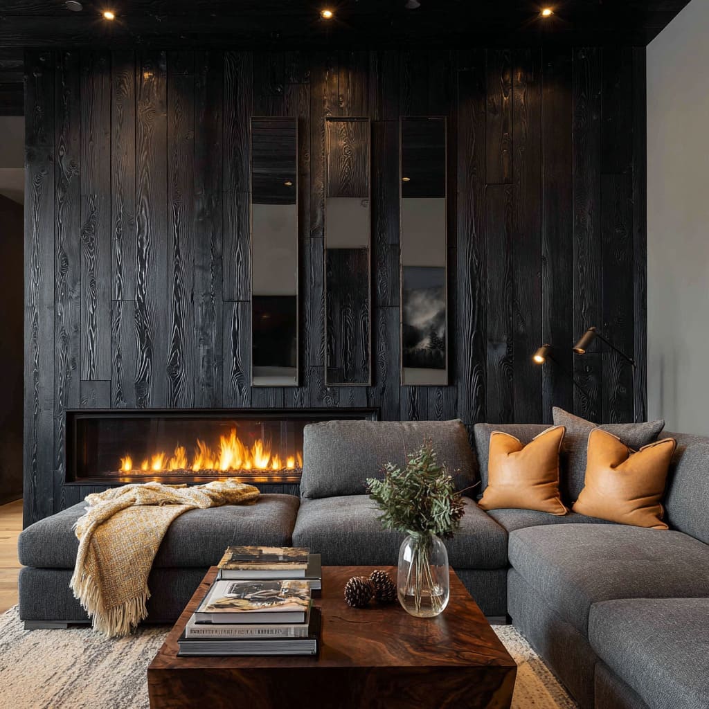
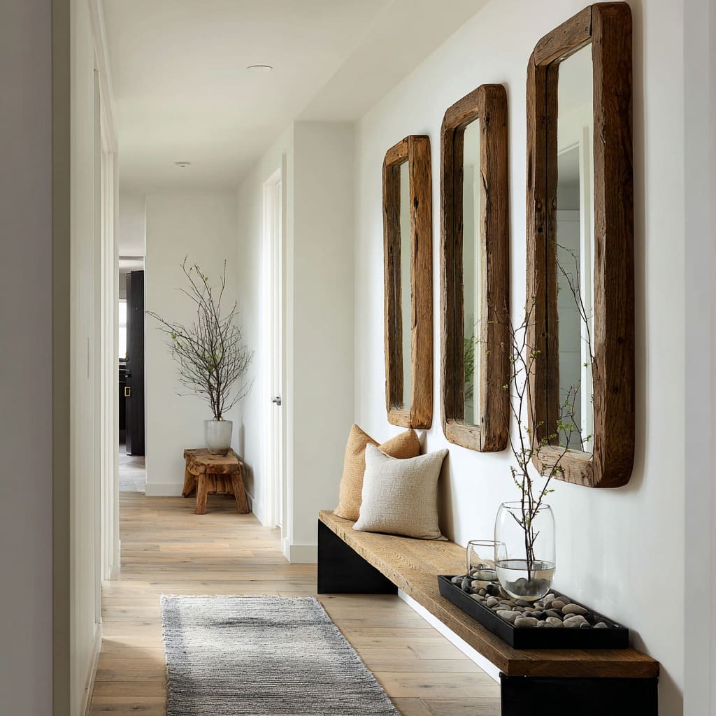
Heavy surfaces—like rough timber cladding, wide stone benches, or reclaimed plank walls—bring warmth and texture, but they also carry visual density. To lighten this visual load, mirrors are often introduced as vertical slices that break up the mass.
In such cases, the mirrors read less like decoration and more like cut-outs—slim vertical openings that carve through the material, letting the wall feel pierced rather than sealed.
This creates a push-pull: the raw structure anchors the space, while the reflective glass returns light and softness. It’s an approach that lets weight and air coexist.
The solid elements frame the mirror naturally, often replacing traditional borders with texture itself. In doing so, mirrors introduce a sense of openness that feels earned rather than added—like a mirage threaded directly into the material palette.
The contrast doesn’t fight; it settles the tension between craft and clarity, offering a grounded layout without visual heaviness.
Controlled asymmetry for subtle drama
In layouts that rely on order and repetition, a slight break in rhythm can carry more visual energy than a bold statement. That’s where controlled asymmetry comes in—especially with mirror groupings.
By adjusting the spacing or height of one or two mirrors just enough, designers introduce a low-level tension that keeps the eye alert without breaking cohesion. It works particularly well in rooms built on a calm, tonal palette where visual interest needs to come from form rather than color or texture.
This technique requires precise restraint. If the mirrors are pushed too far off balance, the whole composition risks appearing careless.
But when spacing is handled with care—off by just enough to feel intentional—the result is a visual nudge rather than a jolt. The mirrors seem to hover in conversation with each other, inviting a second look and creating a rhythm that feels confident without being loud.
It’s a quiet twist that adds dimension to an otherwise symmetrical field.
Mirror as light engine, not lamp
One of the most refined visual tricks in modern interiors is using mirrors as built-in light sources. This isn’t about bounce or glare—it’s about glow.
With the light embedded around or behind the glass, the panel stops behaving like a passive reflector and starts reading as a surface that produces light on its own.
The result is soft, seamless illumination that doesn’t create hard shadows or pinpoint brightness. The glow often appears as a faint aura around the edges, with no visible bulb or fixture in sight.
This gives the mirror an almost weightless look—hovering slightly off the wall, alive with light rather than defined by its border. The effect softens sharp architecture and brings warmth to clean, minimal layouts.
It works best in tight compositions, where the vertical shape of the mirror doubles as a light strip, expanding both the height and the sense of air in the space. It’s subtle, but the shift from reflector to radiant object changes how the room feels: more open, more balanced, and visually lifted.
Conclusion
What makes three-mirror compositions so effective isn’t just the repetition—it’s the way they play with structure, balance, and surface. They can echo the dimensions of furniture, extend window lines, lighten heavy materials, or introduce softness through curve or shadow.
The best approaches don’t simply decorate; they create visual systems that support the rest of the room’s character.
Whether through suspension, patina, backlight, or alignment, each detail contributes to a wall treatment that carries more than one note. These mirrors can shift from reflective surfaces to architectural components, offering options that work within minimal, rustic, or polished aesthetics.
At their most thoughtful, these compositions add a quiet precision—grounded, clear, and full of layered presence.

