A bedroom wall doesn’t need to shout to leave an impression. Some of the most compelling interiors are shaped by quiet surfaces that hold structure, rhythm, and texture in ways that reveal themselves slowly.
This isn’t about bold murals or loud paint choices. Instead, it’s about precision, balance, and thoughtful contrast.
Recent ideas in bedroom design have shown how light, repetition, and material texture can take the place of traditional ornament. A line of fluted plaster, a field of soft vertical panels, or a faintly veined porcelain surface can guide the tone of an entire room.
These elements bring rhythm and stillness, order and softness, often within the same gesture.
The most interesting wall treatments play with light, shadow, proportion, and grain direction to create spaces that feel cohesive and intentional. Whether shaped through sculpted reliefs, layered fabrics, or structured panels, the wall becomes a kind of visual anchor—not by dominating the space, but by organizing it.
This article looks closely at those ideas—the techniques that turn quiet surfaces into powerful focal points—and how subtle choices in scale, texture, and layout can shift the atmosphere of a bedroom without relying on color or contrast alone.

Rhythm as Quiet Ornament
In many creative bedroom wall ideas, the use of rhythm goes far beyond surface detail. Instead of loud visual contrast or graphic repetition, rhythm shows up as a subtle undercurrent—almost like background music translated into form.
Slender vertical ridges in plaster, narrow slat battens, and finely spaced limewash grooves all act as quiet guides for the eye, creating flow without friction.

These repeating elements don’t demand attention through color or shine. Instead, their effect builds slowly, setting a gentle pace across the wall that brings visual balance to the room.
Each line or groove is intentionally equal in weight, so nothing interrupts the steady cadence. The overall sensation is one of quiet control—where pattern is implied, not forced.
This approach makes rhythm feel almost atmospheric, grounding the room in calm without turning the wall into a static backdrop. What stands out is how these repetitions avoid symmetry for its own sake.
They don’t count on mathematical perfection. Instead, they rely on spacing, proportion, and the subtle influence of light and shadow to build movement.
It’s a way to bring depth that reads as softness—a rhythm that works in silence.

Curves that Correct Hard Geometry
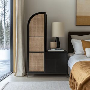
In bedrooms with sharper layouts and straight-edged volumes, creative bedroom walls that feature curves offer a quiet shift in energy. These curves don’t need to be exaggerated to work; even a modest arch carved into plaster, a softly arched niche, or a hanging canopy with draped folds can change how the room feels.
Curved lines break the predictability of sharp corners, gently reshaping the space to feel less rigid and more grounded. These curving forms often follow the lines of the bed, framing it without enclosing it.
Arches can float above a headboard like visual shelters, or trace the shape of an inset shelf, lending softness through proportion rather than fabric or ornament. The visual weight drops, and the room starts to feel more held than framed.
It’s a move that invites the eye to slow down, following bends instead of colliding with corners.

This use of curvature doesn’t chase theatrical gestures—it thrives on moderation. When applied thoughtfully, curves blend seamlessly into the architectural rhythm.
They hint at tradition, but remain visually light. Whether through sculpted plaster, inset niches, or suspended textiles, curves offer an organic way to shift structure without disrupting clarity.
The outcome is a softened edge to modernity—a shape-driven calm built from small arcs rather than grand gestures.

Negative Space as the Real Material
In some of the most refined creative wall ideas for bedroom, it’s the empty parts—the narrow reveals, dark backings, and open intervals—that do the real visual work. These gaps aren’t mistakes or leftovers.
They are purposeful voids that act as punctuation marks in a room otherwise filled with material. Think of the inky lines between evenly spaced oak slats or the paper-thin spaces carved beneath floating nightstands.
These voids guide the eye with more clarity than ornament ever could. Recessed brass inlays and pencil-width LED cuts don’t glow for drama—they outline.
They hold a space the way silence holds a pause in music. What’s removed can become more gripping than what’s added.
The black acoustic fabric peeking through slatted walls doesn’t ask to be seen, but frames the structure around it. These choices don’t need color or shine—they rely on restraint.
Negative space becomes the backbone, defining structure with quiet precision. It’s a design move that trades surface decoration for clarity in layout.

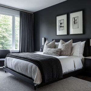
Monochrome Layers that Rely on Shadow, Not Color
In creative bedroom wall design, there are settings where color steps aside completely. The effect comes not from bold hues, but from tonal discipline and the choreography of shadows.
White-on-white compositions, gray plaster planes, and stone-toned panels don’t shift in palette—they shift in light. And that subtle motion brings the wall to life.
The wall becomes a drawing made from depth. Shadows slip across vertical reliefs, ridged grooves, or beveled edges, giving shape to forms that appear nearly flat in direct light.
As the light changes across the day, so does the visual structure of the wall, making it feel layered even without color contrast. This is where texture takes the place of hue.
A chalk-white wall with milled strips becomes legible only under directional light. A slate-colored panel grid turns dynamic through faint bevels and soft wall-wash lighting.
It’s quiet, but far from blank. These compositions rely on tone-on-tone texture and shadowplay, rewarding those who look beyond the first glance.

Grain Direction as a Guiding Gesture
Within many refined wall ideas, it’s not the surface treatment or color that sets the tone—it’s the grain. The direction in which wood runs can quietly reshape how the space feels.
In some designs, chevron patterns draw the gaze upward and outward, pushing the ceiling line higher or pulling the room wider. These aren’t decorative gestures—they are visual cues embedded into the material itself.

Boards with cathedral grain pull focus by nature of their arching curves. Whether placed vertically for lift or horizontally to emphasize width, the timber acts like a compass for the eyes.
Even in minimal rooms, the wood grain adds rhythm without calling for attention. It breaks the need for framed art or painted murals, replacing visual punctuation with natural structure.
Two-tone treatments further guide this effect—dark and pale woods placed in horizontal rhythm can subtly expand the room, making one surface feel like it continues beyond its physical limits. The grain isn’t treated as background here; it leads.
Each panel and plank becomes part of the architecture’s visual path, sketching out direction with natural variation.

Material Whispering rather than Shouting
In restrained interiors, creative wall design depends less on bold statements and more on quiet combinations. What stands out is not a single finish, but how multiple textures hold space together.
Think velvet next to raw plaster, or soft boucle layered with cool metal. These aren’t loud juxtapositions—they’re thoughtful collisions that speak through feel rather than flash.
One surface might shine faintly while the next absorbs light completely. A coarse woven rug beneath a polished stone wall won’t clash—it will temper it.
The key is balance between texture and temperature, allowing contrasts to settle rather than compete. Even the sheen of brushed brass or a matte black detail becomes part of a larger, controlled composition.
This way of layering materials doesn’t rely on color to do the work. Instead, the tone is set by surface quality—how something feels before it’s touched.
Texture speaks where pattern is silent, and each material finds its place not by dominance, but by how it relates to the next. It’s a form of styling where mood builds through interaction, not volume.

Integrated Lighting as Graphic Ink
There’s a shift happening in lighting choices—one where the light doesn’t sit beside the wall, but within it. In many refined interiors, lighting becomes part of the creative wall design, not an accessory added after the fact.
Narrow LED slots slice cleanly through gray or stone-toned surfaces like graphite on paper, bringing attention to the direction of grain, the seam between panels, or the edge of a textured inset.

Instead of large fixtures or traditional sconces, light is treated like a drawn line—a stroke placed with purpose. Cove glows trace the top of dark slat walls, casting gentle halos that accentuate the rhythm below.
Orb pendants float from above, spaced like punctuation marks that slow down the composition and create balance. Even the smallest lighting gesture—a warm filament behind a recessed edge—acts like visual emphasis, highlighting shape over brightness.
This use of light brings structure without bulk. The illumination carves space, rather than sitting on it.
In this approach, light becomes a part of the architecture’s handwriting, guiding the mood of the room without stepping in front of it.

Artwork Reimagined as Architecture
Some of the most striking walls aren’t decorated after they’re built—they’re formed as visual compositions from the start. Whether it’s an ink-wash landscape stretching across an entire surface or a grid of brass lines set into hand-colored plaster, these creative wall designs treat the structure itself as the artwork.
There’s no separation between form and function. A mural doesn’t hang—it exists in the plaster.
A carved relief isn’t mounted—it emerges from the wall. The room responds to these visual statements by pulling back, letting furnishings align quietly beneath or beside them.
Lamps, nightstands, and even textiles begin to feel like supporting characters placed thoughtfully within a much larger frame. This isn’t about ornament.
It’s about scale, tone, and how the visual center of a room can shift without a single object being added. These kinds of walls behave like installations—part surface, part mood, and always intentional.
What might begin as decoration ends up setting the entire visual rhythm.

Warm–Cool Balancing Without Loud Color
Not every room needs color to make a statement. Many refined spaces lean on subtle warmth to offset cooler tones—without reaching for bold hues or bright paint.
A small touch of camel leather, a folded rust velvet throw, or a single mauve wool cushion can shift the mood of a room shaped by gray plaster or light stone walls. These additions don’t compete with the wall—they buffer it.
By placing warmth in textures rather than pigments, the space feels human without losing its sense of clarity. The walls remain dominant—uninterrupted in texture and tone—while fabrics and finishes add softness at the edge of perception.
Even a single stem of foliage in a smoky amber vase can shift the temperature of a cool-toned backdrop without saying a word. This approach allows the material of the wall—plaster, oak, limestone—to stay uninterrupted, while the warmth appears through surfaces that feel natural to change: bedding, cushions, ceramics, and rugs.
It’s a balance where contrast is based on feeling, not color.

Furniture that Blends into the Wall Plane
Sometimes the most visually powerful furniture is the kind that seems to disappear. In many interiors where the wall carries the visual weight, the surrounding furniture steps back—not in importance, but in profile.
Headboards wrapped in the same fabric or wood as the wall become extensions rather than additions. Low platform beds bring the eye closer to the base, keeping the wall uninterrupted.

Floating nightstands—especially those built from the same material—become part of the plane, creating clean horizontal lines that don’t cut the view. Even lighting fixtures and drawer pulls are reduced in volume or tucked into seams.
Legs are thinned, bases shadowed, and corners softened to remove visual mass. This technique creates one unified composition where the furniture serves the wall, not the other way around.
Every piece feels connected—bound by tone, height, and proportion. The result isn’t minimalism for its own sake, but clarity through alignment.
The space holds together without clutter, letting the wall act as both background and main character.

Proportion Games that Quietly Expand Space
There’s a visual sleight of hand in many bedroom wall treatments—one that works not through decoration, but through careful use of proportion. Vertical elements, like continuous battens that run from floor to ceiling without break, create the illusion of height far beyond the room’s true dimensions.
Similarly, large-format porcelain panels, especially those installed with barely visible seams, remove horizontal interruptions, letting the surface feel endless.

Slender brass spacers between tall fabric panels act like visual columns, drawing the eye upward without needing a dramatic gesture. These choices are often felt more than seen, which is exactly where their strength lies.
On the horizontal axis, the same logic applies—wide plank arrangements, long shadow gaps, or continuous shelving lines give rooms a sense of extension, as if the walls stretch further than they do. The magic in these layouts is subtle.
Nothing screams for attention. But in the background, the room has shifted.
It feels taller, longer, or more open—not through added space, but through structured illusion.

Imperfection Used with Purpose
Not every line needs to be clean, and not every wall has to be exact. In many of the most character-rich surfaces, a little irregularity is quietly doing the heavy lifting.
Hand-applied limewash with visible streaks, uneven vertical ribs, or wood arranged in random lengths brings in something precision can’t: presence. These details aren’t errors.
They’re deliberate inclusions that break the feeling of a machine-built environment. Slight dips in plaster, hairline variations in slat depth, or inconsistently spaced grain patterns create movement.
They add texture where color might be absent. And most importantly, they introduce a human fingerprint that doesn’t disappear in perfect symmetry.
In photography, these subtleties may fade. But in person, they anchor the space.
There’s a kind of quiet rhythm in a surface that doesn’t repeat itself perfectly. It holds attention without needing bold shapes or patterns.
Imperfection, when used this way, doesn’t look unfinished—it looks alive.

Conclusion
Across all these approaches, the most striking bedroom walls do not rely on boldness to hold attention. Instead, they build depth through patience—layering vertical rhythm, directional grain, light placement, and soft contour into a unified surface.
These techniques work not by dominating the room, but by guiding how it’s felt. What stands out is how small visual decisions add up to a larger presence.
A subtle light strip along a slat wall, a grain that runs at a slant, or a tone-on-tone material shift may seem minor in isolation. Yet together, they construct a space that feels shaped with thought, not decorated with trend.
This kind of wall doesn’t need to be loud. Its success lies in how it holds the room together without competing for attention.
It behaves less like a backdrop and more like a quiet anchor—holding everything in balance through proportion, restraint, and texture. That’s where its richness comes from.
Not through excess, but through precision and intention.