Recent approaches to hallway design have shifted away from purely functional layouts and moved toward a more composed, sensory space. A long corridor no longer acts only as a link between rooms—it becomes a setting in its own right.
Today’s long entryway ideas focus heavily on how rhythm, shadow, and the subtle movement of light across surface and texture can set a tone that lasts well beyond the first few steps indoors. Such corridors often operate like quiet galleries—spaces that are composed, paced, and filled with restrained material changes rather than noise.
Walls may hold art or sculptural shelving, but even the blank sections are doing something, whether through fine-textured plaster, softened timber lines, or barely-there shifts in tone. What once served as a pass-through is now being treated like a layered introduction, where restraint is a stronger tool than decoration.
Rhythm as the Primary Lens
Among all modern long narrow hallway decorating ideas, the one constant that emerges is rhythm—not in an ornamental way, but as a structural visual cue. Repetition, whether vertical or horizontal, behaves like a pulse that carries the eye forward.
This can be expressed through vertical wall slats, narrow battens on the ceiling, tiled floors with consistent joints, or peg systems that double as decor and function. The most compelling aspect is how this rhythm is fine-tuned—not all patterns are evenly spaced, and not all align symmetrically.
The effect is measured, calibrated to match the speed of how someone walks through. In places, that rhythm is broken purposefully.
A single curved mirror, an offset lighting strip, or a small niche interrupts the pace just enough to re-engage the gaze. These calculated pauses prevent visual fatigue, especially in corridors with significant length.
In that way, the repetition acts like a tempo, and the subtle breaks in it function like syncopation—a moment of interest that keeps the hallway from flattening out visually.

Micro-Tonal Palettes Over Big Color Statements
The most impactful color decisions in today’s entries rarely come from saturation—they come from subtle layering. Instead of leaning into bold color, many modern long narrow entryway ideas are built on refined tonal families: chalky whites, dusty greens, warm clays, and soft browns—each living within a tight range of variation.
It’s not about contrast through color—it’s about movement through texture. A matte wall finish beside polished concrete, a ribbed oak cabinet against flat-painted drywall, or even a low-sheen tile next to brushed plaster—all of it builds a quiet but deliberate variation that keeps the eye involved.

In this approach, texture becomes the new contrast. A tone-on-tone composition like sage cabinetry beside sage plaster isn’t flat when the surfaces catch light differently.
The grain in wood, the faint pores in stone, or even the hairline grooves in grout offer more tension than a louder hue would. This kind of palette rewards close looking, not immediate reaction—it allows materials to speak in low volume but with distinct character.
The palette feels controlled without becoming sterile, and that’s part of its strength.

Mass Versus Void as a Styling Tool
There’s a precision in how space is occupied—or intentionally left open. In many examples of decorating a long entry hallway, it’s the negative space that sets the tone just as much as the objects.
A bench without legs, a console suspended away from the floor, a shelf that floats rather than rests—these aren’t simply layout decisions. They expose the wall itself as part of the design language.

What’s absent becomes as present as what’s placed. A recess in the wall becomes a light well for a ceramic piece, or a built-in ledge gains quiet strength from the blank space around it.
There’s also an added sharpness in how shadows are used; open floor beneath floating cabinets creates a visual pause, adding rhythm between heavier zones. Skirting boards might be removed, corners softened, or storage pushed fully flush—not to erase the structure, but to allow each item to feel anchored by space, not clutter.
This balance between mass and void gives even modest entries a sense of intent and definition, making every object feel like it belongs exactly where it is.

Light That Writes, Not Merely Illuminates
Lighting in modern hallways has shifted away from blanket brightness and into something far more controlled. Rather than overwhelming the corridor, light is used to trace edges, define mass, and pull texture forward without calling attention to the fixture itself.
Indirect LED strips often run quietly along the top edge of slatted wood or behind recessed ceiling planes, offering a glow that feels like it belongs to the surface rather than floating above it.

Floor-level uplights do something similar, casting low, grazing light across stone, wood, or textured plaster, creating depth by emphasizing relief and shadow. Even pinpoint track lights are used with care—angled to strike artwork or architectural detail without flattening the space with too much glare.
It’s less about visibility and more about articulation. In this approach, lighting becomes a tool for sketching space.
A stone ledge appears to glow from within, not because it’s lit directly, but because light reflects from nearby surfaces with quiet control. Timber grooves catch angled light that exaggerates their grain pattern, giving simple finishes new dimension.
These are ideas for a long hallway that don’t rely on spotlighting but on composition—shaping the feel of a space by showing just enough and leaving plenty in soft relief.

Curves as Tactical Softeners
In many layouts, straight lines and right angles tend to dominate the length of a hallway. But curves, when placed with purpose, offer a subtle counterbalance to that forward pull.
Arched entryways, rounded mirrors, curved ceiling breaks, or softly sculpted plaster transitions bring a slow, visual exhale to a space that otherwise draws the eye straight down its axis. These curved elements aren’t always placed at the center—they’re often set slightly off-axis or offset near an end wall, which interrupts the visual sprint and brings in a pause.

What makes these shapes powerful is how they adjust the geometry of the entire hallway without needing to reshape its layout. Even a single arc in an opening or a rounded light fixture adds a gesture of softness that changes how the space is read.
The tension between the firm structure and these gentler forms is where the design finds its balance. Many long narrow hallway design ideas use this technique to introduce subtle movement, to bend the visual path without altering the physical one.
These shapes don’t fight the lines—they guide the pace.

Texture Pairings That Hint at Story
The best surface combinations in long entries do more than look good—they carry contrast in ways that feel unspoken but meaningful. One surface may feel hand-touched, while another feels cast or machined.
That quiet opposition tells you something, without needing a single detail explained. A soft-worn plaster finish next to woven leather adds not just warmth but duality: one holds memory in its surface, the other in its weave.
A terrazzo floor set beneath ribbed wood wall panels creates a meeting point between smooth movement and linear control.

What makes these combinations effective isn’t contrast for contrast’s sake—it’s how they build subtle friction between tactile worlds. A brushed concrete base feels grounded under the finer texture of matte wall panels.
Slatted oak meets limewashed brick and suddenly the space suggests dryness and softness, structure and relief—all layered in place without overt storytelling. These combinations, often found in thoughtful long entry way ideas, work because of restraint.
Texture becomes dialogue. It isn’t loud, but it lingers.

Artwork as Tempo Markers
Artwork in long hallways carries more than decorative weight—it acts as a spatial metronome. Whether it’s a series of evenly spaced monochrome prints, an oversized earth-toned canvas, or even a single sculptural object placed with intention, each piece interrupts the visual run in a calculated rhythm.
This isn’t random spacing. Often, artwork is set to align with repeating structural elements—beams, lighting, floor seams, even door spacing—so the eye moves at a measured pace.

It’s this relationship between art and architecture that gives a hallway its visual control. Spacing acts like silence between notes—letting each piece breathe while building a consistent beat from end to end.
The materials used in the art itself also follow the hallway’s tone: rough-edged frames for raw plaster walls, thin-line pieces against crisp white, soft organic shapes near polished stone. As ideas around wall decor for long hallway layouts become more curated, these artworks shift from background embellishments to active components in pacing.
They don’t compete—they regulate. Each one is a pause, not an interruption.

Cabinets That Masquerade as Architecture
Storage in long entries often plays a more restrained role than it used to—but that doesn’t mean it disappears. The most visually refined approach is to make cabinetry feel like part of the structure rather than an addition to it.
This happens when the surface of doors is finished in the same tone, sheen, and texture as the adjacent walls, with seams so fine they barely read unless you’re looking for them.

What stands out isn’t the storage itself—it’s the absence of distraction. By aligning proportions and removing obvious handles or trim, storage shifts from functional insert to architectural plane.
Tonal coordination does most of the work: clay-toned cabinet fronts beside matching wall plaster, or soft matte greens blending edge to edge. The eye treats the entire stretch as one surface, giving depth and rhythm without noise.
This approach supports scale awareness—proportions can be bold, but they feel light because they’re uninterrupted. It’s a visual trick, but one that reinforces calm and intention throughout the corridor.

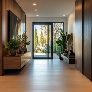
Outdoor Cues Brought Gently Inside
The transition from outside to in can be softened by more than a doormat or entry rug—it’s often shaped by the subtle inclusion of outdoor references. Elements like potted olive trees, dried palm fronds, or softly veined stone bowls do more than decorate—they suggest climate, light, and seasonal tone.
Their presence hints at the landscape beyond the walls, which gives the space a grounded sense of place.

These natural accents tend to be low-contrast and dry in tone—think desaturated greens, pale clay finishes, and aged wood rather than glossy foliage. Because of that, they read as part of the textural vocabulary rather than an accent.
The plants aren’t centerpieces—they extend the surface language of plaster, oak, or stone, and blend into the visual rhythm of the entry. That kind of inclusion plays well in long entry spaces where structure and softness need to meet without feeling staged.
It’s especially common in long halls where daylight touches only part of the space, and where the soft forms of nature ease the linearity of walls and floors.

Asymmetry Used as a Humanizing Glitch
Long entries thrive on rhythm, but they also risk falling into repetition. Perfect symmetry, while clean, can create a stiffness that feels too exact—more institutional than personal.
That’s why small, deliberate misalignments are often introduced to ease the formality. A pendant light that doesn’t land squarely on center.
A bench that’s slightly longer than the mirror above it. A wall of pegs where some sit lower, some higher, or some missing entirely.

These quiet interruptions suggest the space is meant to be lived in, not only looked at. Asymmetry gives the composition breath—it invites irregularity in ways that feel natural, not careless.
And because these shifts are so subtle, they rarely read as off—they read as intentional. The benefit is tone: a hallway shaped by rhythm but not ruled by it feels more relatable.
More grounded. It takes on the quirks of real life, while still staying structured.
In many layouts, this soft break from expected balance becomes the detail that gives the whole space its charm.

Vertical Stretch through Volume Tricks
Some of the most memorable entries aren’t wide—they’re tall. By directing attention upward, even a narrow or compact hallway can feel open and composed.
There are several ways this is pulled off. A ceiling lined with continuous slats might start just inside the front door and stretch far beyond it, making the whole corridor feel extended in both directions.
A narrow light slot overhead—placed slightly forward or off-center—draws daylight across the upper wall, loosening the proportions and softening the ceiling’s edge.

Even in a one-story structure, a long strip skylight or recessed ceiling plane can create the feeling of expansion without actually increasing square footage. In these cases, light and geometry do the work of volume.
Instead of pulling the eye forward down the hall, the design lifts it vertically first—changing how the corridor is experienced. It’s a visual detour that makes the space feel less linear, less flat.
These vertical gestures are quiet, but they leave a lasting spatial impression. They shift the weight of the hallway from a line on the floor to a full, structured envelope that you move through in three dimensions.

Rustic Notes Dialed to a Whisper
There’s a quiet kind of confidence in using rustic elements without making the space feel rural. Details like live-edge shelving, slim terracotta tile insets, and reclaimed timber paneling bring in earthy character—but they’re softened, refined, and edited down to the essentials.
The finishes are key: wood that’s been lime-washed or bleached rather than heavily stained, terracotta laid in tight, neat joints instead of rugged grout lines, and surfaces smoothed just enough to retain grain without leaning too raw.

This approach avoids leaning into any overdone aesthetic. Instead of trying to recreate a farmhouse, the materials are treated as texture references—ways to introduce warmth and memory without visual noise.
They carry the mood of older structures but fit within clean silhouettes, straight edges, and controlled palettes. The restraint is intentional.
It lets these touches become part of the visual vocabulary rather than a theme. In long hallway designs where minimalism might otherwise turn cold, these rustic inclusions add depth without overpowering.

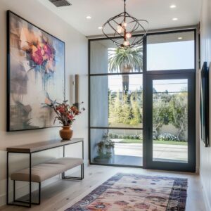
Furniture as Low-Altitude Sculpture
Furniture in a long entry is rarely the focal point, yet when chosen with the right shape and scale, it adds sculptural weight that grounds the space. Benches in caramel-toned leather, boucle-covered stools, or blocky timber stumps aren’t filling empty corners—they’re offering visual anchor points that sit low enough to keep the walls dominant.
These pieces don’t shout for attention, but they’re felt immediately in how they balance the room.

Here, form wins over fabric. A bench with squared legs echoes the angles of wall paneling.
A stool with an uneven oval top subtly mimics the asymmetry found in arched doorways or organic mirrors. It’s this quiet coordination between furniture shape and spatial geometry that makes these items work so effectively.
They don’t compete with surrounding architecture—they reinforce it. By staying below eye level, they allow lighting, wall finishes, and ceiling details to remain uninterrupted, while still adding mass that feels intentional.
It’s this exact balance that allows the furniture to feel like part of the structure, not decoration placed after the fact.

Conclusion
What defines current hallway design isn’t a shared aesthetic—but a shared attitude. Rather than treating long entries as empty in-between zones, today’s design thinking approaches them as crafted compositions built on restraint and rhythm.
Here, small adjustments carry weight. A single offset mirror, a thin beam of light skimming a textured wall, or a break in repetition placed just where the eye needs it—all work together to guide how the space feels.

The strength of these entries lies in what’s held back, not what’s added. The most compelling long hallways are measured—balanced by line, anchored by subtle material changes, and kept visually steady through carefully timed shifts.
Nothing screams for attention, but everything has been considered. Texture speaks louder than color.
Space around an object adds as much presence as the object itself. Even air, light, and shadow play deliberate roles.
Each design is quiet on the surface—but built through deliberate decisions that make the corridor hold meaning. It’s this tuning of detail and restraint that elevates a passage from transitional to intentional, from hallway to statement.