In current design thinking, modern luxury leans less on decoration and more on control—control over palette, proportion, and how visual weight is handled across a space. The focus has shifted from adding to refining.
Rooms are shaped through subtraction: less variation in color, fewer decorative layers, and more attention to tone, light, and texture transitions.
What defines this atmosphere is a kind of visual stillness that feels composed rather than silent. Every line is considered.
Materials carry weight not through boldness, but through how they interact—smooth against coarse, matte beside reflective, rigid next to organic. Shapes are simplified, but never blank; they’re constructed to hold attention without overstating it.

The following sections break down the layered decisions behind this look—how shadows become design tools, how plants take on structural roles, and how light shapes material rather than simply illuminating it. The aim isn’t to decorate, but to orchestrate—to let surfaces, spacing, and subtle contrasts build a room that feels grounded, rich, and held together by deliberate visual rhythm.

Palette Restraint as a Status Cue
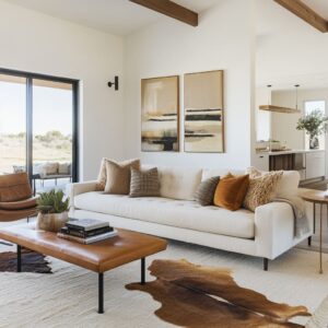
While it’s common to see rooms in neutrals, luxury modern living room ideas go further by stripping away even minor shifts in hue, working within compressed tone families to achieve visual cohesion. The result isn’t blandness—it’s control.
A space might include three kinds of white, each slightly different in texture—one woven loosely, one with a nubby surface, another smooth with a dry finish—but all sit at the same tonal level. Under daylight or soft LED glow, these textures activate in small, distinct ways, catching shadows or reflecting light just enough to hold attention without breaking the palette.

Another common tactic is the split of warm and cool within a single, desaturated range. Graphite-toned upholstery sits comfortably beside stone in slate tones, with wood acting as the bridge—sometimes pale oak for warmth, other times smoked walnut to reinforce cool shadows.
Accent colors are often removed altogether; the impact instead comes from material contrast. This visual restraint becomes its own quiet form of luxury, signaling clarity in taste and a preference for sensory depth over visual noise.

Texture as Gradient, Not Contrast
Texture in modern luxury living room design often works more like tonal shading than opposition. Instead of contrasting a rough wall against a sleek surface for effect, designers arrange materials that shift subtly across tactile categories—letting the eye transition gradually from one to the next.
In many interiors, you’ll notice how a fluted wood backdrop eases into a slatted cabinet, followed by a woven or coarse rug underfoot. The feeling isn’t abrupt—it’s controlled, almost like a soft fade in sound or light.

What holds these sequences together is the lack of hard visual stops. A brushed oak floor may lead quietly into a boucle-upholstered ottoman, which in turn echoes the fibrous character of nearby jute or rattan.
Clay or matte ceramic accessories then cap the rhythm with a denser surface that still fits the tone.

This approach creates a continuous field of material interest without triggering visual breaks. It’s a tactic that builds comfort not through softness alone, but through a sense of gradual movement across textures—a subtle way to anchor the room’s atmosphere without disrupting it.

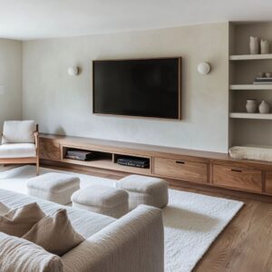
Floating Mass and Manufactured Levity
What often makes contemporary luxury living room ideas feel sculptural is the way weight is visually reduced. Solid items—like media consoles, benches, or stone tables—are separated from the floor just enough to appear suspended.
This trick is repeated through shadow gaps, under-lighting, and recessed bases that throw soft glows beneath bulky forms. The result is a balance: the object stays grounded in material, but lifts away just enough to avoid heaviness.

In practice, a stone bench might seem to hover above the floor thanks to a hidden cove light that washes amber tones underneath. A dark wood cabinet, rather than sitting flush, can feel detached by leaving a clean space below, often defined by its own shadow or a lit edge.
These moments aren’t just technical—they’re visual.

That thin slice of space between base and ground lets objects carry presence without feeling bulky. It’s a choice that brings form forward while keeping the atmosphere light, proving that visual density and physical mass can be separated by nothing more than a few quiet millimeters.

Horizontal Calm vs. Vertical Punctuation
One of the most overlooked visual patterns in a luxury minimalist living room is the balance between long, grounded lines and sparse upright features. Spaces often stretch the eye sideways first—through wide-planked wood ceilings, seamless stone benches, or consoles that run the full span of a wall.
These horizontal forms bring quietness. They hold the room low and wide, making it feel open without being empty.

But that stillness is rarely left unbroken. In carefully chosen spots, vertical accents interrupt the flow—a shelving column, a run of narrow slats, or a single tall plant.
These uprights serve as pauses in the visual rhythm, preventing the eye from drifting too far. Their scarcity is what gives them power.

For instance, a leafy banana plant beside a travertine mass doesn’t read as an accessory; it becomes a visual hinge between height and mass. The dialogue here isn’t about symmetry—it’s about restraint.
Too many verticals would compete with the calm. Just a few, spaced with care, keep the space visually alert without interrupting its ease.

Light as Quiet Sculpture
Lighting in modern luxury living room ideas often avoids the obvious. Rather than fixtures that call attention to themselves, these rooms use light like a sculptor would use a chisel—to carve shape into materials, not just brighten them.
A stone bench, softly edge-lit from below, becomes a floating relief. A wall clad in travertine changes character entirely when its surface is grazed by a hidden cove glow—its subtle grooves, seams, and tonal shifts come alive under warmth.

This isn’t about brightness; it’s about direction, softness, and layering. In darker schemes, pinpoint spots skim across slate, revealing texture without flattening it.
Veins catch light differently depending on where you stand. Light becomes an active part of the surface—never the star, but always shaping the experience.
It’s a silent presence, one that doesn’t decorate but instead defines how every line and edge is seen. That’s what sets these rooms apart—using light not as an afterthought, but as the final invisible tool that holds the space together.

Greenery as Architectural Glue
In a modern fancy living room, plants are never an afterthought. Their value isn’t measured by color alone, but by shape, line, and how they relate to the room’s structure.
The way a snake plant rises in rigid, upright blades can echo vertical wooden slats nearby. A cluster of palms can visually mirror overhead ceiling battens, reinforcing rhythm between floor and roof.
And when olive trees are placed against sharp, block-lined backdrops, they don’t just soften the geometry—they complete it.

The position of greenery matters just as much as the type. Corners are often where structure tenses up, and that’s exactly where foliage gets inserted—not randomly, but precisely.
A tall planter might break a linear run of bench seating, while a wide-leaf plant might draw attention to a shelving gap or float in front of glass to blur the divide between interior and garden. These elements do more than decorate.
They operate like hinges or visual anchors, linking the structural parts of a space to its more relaxed, organic layers. Plants become tools of composition, shaping flow and focus without stealing it.

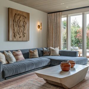
Curves as a Counter-Measure
In rooms where geometry is dominated by rectangles and sharp alignments, a curve instantly shifts the tone. Even a gentle bend can cut through the order and signal comfort.
In a modern luxury lounge, this is often handled in a measured, spatial way—through an arched glazing element, a rounded sectional, or cylindrical tables cut from stone. These aren’t decorative embellishments.
They’re spatial correctives that soften what might otherwise feel rigid.

The impact is especially strong when curves appear where angles are expected. A fluted wall with a soft corner instead of a hard turn feels more crafted.
A ceiling that bends slightly as it moves from one zone to another introduces visual flow without breaking alignment. Rounded forms work quietly, often repeating across furnishings and surfaces to offset architectural stiffness, creating a balance that feels intentional and calm without adding weight.
In rooms defined by control, these curves speak of ease—not as an add-on, but as an equal part of the structure.

Monochrome Depth Through Shadow Play
Monochrome rooms often carry the risk of looking flat—but in high-end interiors, shadow is treated like a building material. It’s not filler; it’s used as precisely as stone or wood.
In spaces where slate meets walnut, or where ivory tones dominate wall, ceiling, and upholstery, the key to keeping the look dimensional lies in the negative space.

Take the use of recesses: a television set into a fluted surround instantly introduces a layered shadow frame. A black niche, carved just behind slatted wall panels, gains added sharpness when placed above a reflective or brushed flooring material.
Even a narrow walnut strip—spaced just below a floating console—creates enough darkness to lift the whole piece. These shadows aren’t accidental.
They’re staged, framed, and repeated.

This technique allows neutral interiors to gain contrast without color, form without bulk. By shaping voids and cavities in a considered way, depth is inserted back into pared-down palettes.
In the best examples, shadow becomes the texture that connects materials across tone and finish.

View Framing vs. Object Framing
Luxury interiors often reveal their intent by what they choose to frame. Some rooms are shaped to capture the outdoors—glass stretching from floor to ceiling, low-profile seating arranged to pull attention beyond the walls.
These spaces feel tuned to their surroundings, letting landscape act as the focal point. Framing in this case is external—the room is the lens, the outdoors the subject.

Others reverse that logic entirely. Instead of pointing out, they frame what’s inside.
A blocky slate surround may enclose a sculptural wood detail; matte black louvres may cluster tightly around a piece of minimalist artwork. These interiors draw focus inward, crafting scenes that don’t depend on outside views.

The contrast between the two isn’t a matter of preference—it’s a cue about the room’s purpose. Where the view takes the lead, materials are kept quiet, letting space dissolve into landscape.
Where internal elements are foregrounded, lighting, texture, and framing become sharper, more deliberate. Luxury, in both cases, is expressed not through scale but through how attention is directed—either outward to the horizon, or inward to the crafted moment.

Accessories as Micro-Architecture
In these interiors, decor isn’t filler—it follows the same visual discipline as the architecture itself. Every object, every gap, is part of the structure.
Coffee tables aren’t styled by stacking for effect; instead, a carved stone bowl might echo the grain of the surface it sits on. A sculptural tray might pick up a faint veining seen elsewhere in the stone palette.
Even a small bunch of dried grasses is chosen to reflect the tone of ceiling wood or surrounding fabric.

Shelving works the same way. Gaps aren’t empty—they’re composed.
Books aren’t packed edge to edge but stacked to allow negative space to speak. A shelf might carry three objects, each one shaped or textured to balance the others.
The rhythm comes not from quantity, but from spacing, tone, and echo.

What stands out most is that decoration is treated as architecture in miniature. There’s no randomness.
Nothing distracts or competes. Every item is placed to support a larger visual structure.
This tight, intentional approach keeps the space visually still without losing detail, maintaining control even in the smallest layers.

Closing Insight
In these rooms, modern luxury isn’t about adding more—it’s about removing noise until every remaining part matters. The strength lies in precision: gradients in texture, weight suspended by shadow, tones placed to control focus.
Surfaces are built not for show but for rhythm. Objects aren’t chosen to fill space, but to balance it.

What separates a quiet room from a refined one isn’t silence—it’s how every element contributes to that silence with purpose. This kind of control isn’t decorative.
It’s compositional, and it’s what gives these interiors their distinctive polish. In the best examples, luxury doesn’t announce itself.
It holds. It edits.
And it lets the materials do the talking—one surface, one line, one shadow at a time.