Contemporary luxury bedroom design now leans into quiet control rather than visual noise. In these spaces, visual calm is not the absence of design—it’s the result of precise visual placement and carefully edited material decisions.
Instead of drawing attention through bold gestures, contemporary bedrooms use low-key compositional moves to create depth and atmosphere. The strongest impact often comes from the barely noticeable: light that lifts the edge of a bed platform, a shadow line that creates separation without adding bulk, or a texture that reveals itself only under sidelight.
Each move is made with quiet focus, ensuring that the room feels composed, slow, and deeply settled. The most memorable elements are often the ones that don’t shout for attention but reward a closer look.
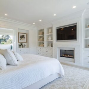
Architectural Furniture — When the Bed Becomes a Wall
In many contemporary bedrooms, the bed no longer stands apart from the room—it belongs to the architecture. The base might extend directly from a limestone ledge, slot into a niche, or align perfectly with millwork that continues along the walls.
This integration is deliberate: it removes the typical furniture-room separation and makes the sleeping zone feel anchored, sculpted, and fully composed. What this creates is a single volume—bed, wall, and floor—acting together visually.
The furniture is no longer applied to the room; it is embedded in it. Materials wrap around corners, grain directions align across surfaces, and the boundaries between sleeping zone and wall fade into a calm visual rhythm.

Hidden insight: One of the most subtle but effective moves is the use of a thin shadow gap between the headboard and the wall or bed base and the floor. Sometimes just a centimeter wide, this shadow acts like a visual outline—separating solid forms without actual space.
That soft detachment makes even large, blocky beds feel slightly lifted, as though they were placed in the room rather than built into it. The result is a room that feels quietly sculpted, with every piece in visual agreement.
This move is common in high-end contemporary bedroom design and reveals how even a gap—if perfectly placed—can shape the entire atmosphere of a room.

Shadow as Ornament
Older interiors often leaned on carved trim and layered profiles to shape luxury. But in many contemporary bedroom ideas, the work is done by shadow.
Instead of adding detail, these spaces reveal it—through grooves, slats, and quiet reliefs that only become visible under angled light. Vertical timber strips, limestone ribs, and fluted panels offer rhythm without volume.
They don’t rely on color or contrast. Their visual depth comes from how they catch light and hold shadow, not from how much surface is added.
The most powerful result often comes from the least visible source: light warmth. Designers tend to favor amber-toned LEDs over neutral whites.
This softens the contrast, allowing the shadows to stay defined but not harsh. On a ribbed headboard, that choice alone changes everything—it turns a set of parallel lines into a soft fade, a gradient of light that feels restful.

The move that’s easy to miss: The grooves and channels aren’t meant to be highlighted. They’re meant to respond, gently, to how light falls across them.
This only works if the light is placed indirectly—either from the ceiling above or diffused behind a panel. The effect isn’t dramatic; it’s paced.
It lets texture take control without becoming graphic or cold.

Floating Planes and Optical Weight Control
Thick materials don’t always look heavy. In fact, in many modern bedroom ideas, the heaviest slabs—stone platforms, dense wood bases—seem to float.
That illusion is achieved with a recess under the furniture and a wash of low-level lighting that blurs the point where the mass meets the floor. Instead of a visible support, the base slips into shadow.
The result: something grounded starts to appear almost weightless. This visual lightness gives structure without stiffness.
Beds, nightstands, even large side ledges appear placed, not fixed. By removing the visual contact between base and floor, the design sidesteps the usual blocky feel of heavy furniture.
And because floors in these bedrooms often run seamlessly—same finish, no transition—the eye sees a continuous surface that holds furniture without anchoring it.

Why this detail matters: The lighting below isn’t meant to shine. It’s meant to erase.
Its job is to soften the joint between object and surface. At low levels, it mimics early morning light: diffused, blurred, quiet.
Even when the LEDs are off, the set-back plinth still reads as a void—our eyes complete the levitation. That’s how these bedrooms make density feel soft and grounded forms appear almost lifted.

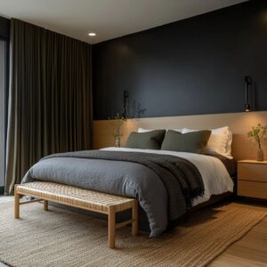
Measured Asymmetry to Break Stiffness
In many modern contemporary bedrooms, balance isn’t built through mirroring—it’s created through subtle shifts. A pendant might hang slightly off-center.
A vertical brass inlay might sit just outside the bed’s midpoint. These small deviations from symmetry are not accidents.
They’re quiet corrections that keep the space from feeling too formal or rehearsed. The eye reads the room’s order, then meets a pause.
That pause—a shifted light, a lone offset vase, a single throw pillow in a stronger hue—slows the rhythm. It gives a room space to breathe and keeps it from slipping into the look of a set.

A closer reading: These asymmetries rarely stand alone. Often, they’re echoed elsewhere—a warm cushion picks up the tone of a nearby brass strip, or a single stool mirrors the line of a pendant.
This creates soft repetition without matching. It’s how designers quietly guide the eye without spelling things out.
A space feels whole, not because it’s mirrored, but because small misalignments echo each other across the room.

Botanical Counterpoints as Structural Lines
Plants in contemporary bedroom decor aren’t filler—they’re used like punctuation marks. Their placement and shape echo the room’s geometry.
A narrow tree with upright stems may sit beside a ribbed timber wall, continuing the vertical rhythm. A fan-leaf palm may be chosen not for its green, but because its shape reflects the curve of a ceiling insert or softens the corner of a squared bed frame.
Foliage completes the architecture rather than interrupts it. In rooms with strong lines and neutral palettes, a branch or leaf can act as a visual connector—bringing flow to spaces defined by angles and planes.

The subtle shift behind it: Often, the planters disappear on purpose. They’re chosen in tones that match the wall or floor, so they don’t draw attention.
This turns the plant itself—not the pot—into the visual focus. Against a field of warm stone or pale plaster, a palm or olive tree becomes a drawing in three dimensions, standing out by form, not flash.
It’s one of the quietest but most effective tools used to soften and structure at once.

Textural Tonality — Depth Without Color Jumps
In many refined bedrooms, richness comes from surface, not saturation. Color stays still, but texture moves.
This is a defining principle behind a number of thoughtful contemporary bedroom design ideas. You’ll find suede brushing up against coarse linen, or matte plaster paired with low-sheen stone.
These aren’t contrast plays in hue—they’re shifts in grain, tone, and how surfaces react under angled light. What appears minimal at first glance is actually full of layered material tension.
A room might stay within one tonal family—bone, almond, or graphite—but each finish within that range offers a slightly different reaction to touch and light. The grain of oak contrasts with the flatness of travertine.
A looped weave carpet sits against a fluted wall with just enough difference to register as rhythm rather than repetition.

A quiet design move: Often the unsung hero is the rug. A low-sheen textile underfoot absorbs ambient glow, stopping excess bounce from cove lights or window glare.
Without it, even the best textural shifts—like soft cotton beside dry clay—can collapse under too much reflection. The rug works like a visual sponge, protecting the room’s material depth and letting surface character do its work without glare cutting across it.

Lines of Sight Framed Like Landscapes
Some bedrooms handle views as if they were part of the decor—not background, but foreground composition. A long garden, an oak trunk, or a dry rock wall outside the window becomes the only saturation in an otherwise muted interior.
In these setups, the window isn’t just a light source. It’s a framing device.
Thin black or warm timber reveals create a crisp edge, letting the outdoor elements sit like a live canvas within the room. Beds are often aligned on axis with these windows, letting sleepers wake up facing the outdoors.
But even off-center windows can act as counterweights if the surrounding shapes echo their geometry. That’s where the real layering begins—tying indoor lines to the shape of a hedge, tree, or window ledge outside.

Hidden insight: The same rectangular language often repeats elsewhere. TV niches, mirrors, or shelving cutouts mirror the proportions of the window frame, linking interior forms to the outdoor view.
That repetition helps reduce visual clutter. The result is quiet clarity: fewer shapes, more impact, and a stronger sense of visual calm.

Slow Lighting Strategy
The most effective lighting in contemporary bedrooms often feels like it isn’t lighting at all. There are no visible bulbs, no harsh beams.
Instead, perimeter coves and vertical slits of light create quiet movement across walls and ceilings—not by highlighting, but by suggesting depth and stretch. The goal here isn’t brightness; it’s space shaping.
These lighting elements serve as architectural tools. A soft blade of light behind a headboard makes the wall feel taller.
A cove tucked high into a ceiling edge casts a gentle upward wash that pulls the room open. And yet, none of this is showy.
The fixtures stay invisible, allowing their effect to become part of the structure itself.

Behind the visual calm: The distance between the slot light and the surface it washes matters. By placing the source slightly above or behind the target area, designers avoid top glare—especially near fabrics like pillows, boucle chairs, or linen benches.
That small gap preserves texture and keeps light even. It also ensures the source stays hidden, which keeps the atmosphere consistent.
This is how lighting becomes part of the material palette, rather than something layered on top of it.

Monolithic Storytelling Through Material Blocks
Some of the most compelling contemporary bedroom decor ideas use a single material language—stone, wood, or plaster—and extend it across multiple elements: bed platforms, headboard walls, cabinetry, and sometimes even shelving. This unified material flow creates a sculpted look, as though the room were shaped from a single volume.
It brings calm through visual consistency, and it compresses form and function into one cohesive surface logic.

But the effect doesn’t rely on sameness. It’s subtle variation that makes the monolith believable.
A textured headboard wall might meet a smooth stone bench. A pale oak bed frame might be paired with a coarser-grained bedside ledge.
These near-matching materials are chosen carefully, to prove the hand behind the quiet—that this isn’t a default finish applied everywhere, but a crafted visual field made of deliberate contrasts.

Hidden insight: The giveaway is often found in a single element—a side table with richer knots, or a recessed shelf with a slightly different polish. These are not mistakes; they’re clues.
They signal that the room’s material repetition is by intent, not accident. That fine tension between uniformity and variation is what gives the monolithic look its character.
Without that, it would fall flat as repetition.

Edited Styling — Objects as Pauses, Not Filler
In quiet bedroom environments, styling isn’t about filling space—it’s about slowing the eye. Nightstands and consoles hold fewer objects, but each one matters.
Rather than cluttered arrangements, these surfaces become points of soft punctuation. A matte ceramic bowl might sit next to a low-gloss metal vase, or a stack of textured books might be topped with a single, unglazed form.
The tone remains consistent with the room, but the finish shifts just enough to create contrast within a shared palette.

These objects are less about decoration and more about rhythm. They don’t compete with the architecture.
They exist because the space needs a moment to pause. Even the placement of a chair near a window or a bowl beside the bed follows this same logic: visual pacing.
Quiet reason behind the effect: Styling avoids copy-paste repetition. When similar objects are used—like two ceramic vessels—they change scale, shift direction, or adjust spacing.
These micro-variations are what separate real styling from showroom setups. A room might be minimal, but it stays dynamic because no two moments within it repeat exactly the same.

Closing Notes
What defines today’s most layered contemporary bedroom designs isn’t volume or show—it’s intent that stays quiet. The most compelling spaces are structured through restraint.
Furniture aligns with architecture, plants echo millwork, light wraps form instead of highlighting it. The atmosphere doesn’t push; it pulls the eye gently from one composed element to the next.
Every edge, recess, and material shift is placed with precision—yet nothing feels labored. These bedrooms aren’t cold, but they aren’t casual either.
They live in a visual space where composition is invisible, and where each detail—be it a light slot or a fabric fold—does more than it appears to. It’s that quiet confidence—where the work hides behind its softness—that makes these rooms feel so resolved.
Every feature carries its weight, even the ones that hardly speak.