Modern front entries have changed—not through loud reinvention, but through small, deliberate decisions that quietly reshape how the threshold is read. The focus now leans into surface rhythm, directional grain, and proportion more than decorative motifs or historical cues.
Instead of standing out, the best doors fold themselves into the architecture, using subtle material variation, controlled shadows, and layered alignment to build presence.
It’s less about announcing arrival and more about shaping a controlled pause before entering. Light, grain, and negative space work together to guide the eye slowly, rather than creating instant focal points.
Wood, stone, and metal are handled with clarity—smooth where needed, textured where it matters. Every element is placed to feel like it belongs exactly where it is, even if it takes a second glance to notice.
What’s emerging is an aesthetic that values silence over show. Entries are no longer isolated features—they’re part of a wider spatial rhythm, composed from ceiling to step, from planter edge to recessed shadow.
The result isn’t theatrical. It’s measured.
And that quiet control is where the most compelling ideas are now unfolding.

Gradual Shifts, Not Loud Statements
Material surfaces in modern front door design now rely on tone variation within a single palette instead of bold contrasts. Instead of making the doorway pop through color blocking or competing textures, designers allow a controlled fade—from pale oak to golden ash, or from soft limestone to warm beige travertine.
This slight tonal drift is often so gradual that it reads subconsciously, yet it defines how the surface feels in daylight.

These gradients are not cosmetic. They slow the eye, letting it track across the door and adjacent surfaces without interruption.
The subtle shift of tone emphasizes the continuous flow of grain and alignment, allowing the front elevation to feel more like one surface, not a combination of parts. In many recent examples, the difference between a wood cladding and its frame is so minimal that only the direction of the grain signals the change.
That restraint creates visual coherence, especially in projects that use one species of wood or a limited palette of stone and cement. These kinds of micro-shading techniques are becoming essential within high-end modern front door ideas, especially in climates with fluctuating daylight.
Rather than relying on paint or finish gloss, they let natural variation in grain, texture, and stone layering define rhythm and depth. The result is a façade that feels active under sunlight, even when its elements are neutral or achromatic.

Grain Direction as a Silent Organizer
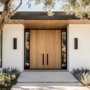
Form gains clarity when material direction is deliberate. Vertical and horizontal planks do more than cover surface—they organize space.
Vertical runs often signal stability and height, suggesting an understated presence. Horizontal courses, by contrast, can visually widen the façade, grounding the entrance and extending its proportions outward.
One subtle move seen repeatedly in modern front door design is the inversion between vertical and horizontal grain. A wall might run in vertical timber, while the soffit above flips to horizontal planks.
That change isn’t random—it draws a visual “corner” that gives the entry a composed graphic structure. This L-shape effect acts like quiet framing, guiding the eye without using visible molding or added profiles.

Doors that use horizontal planks often carry the grain across the pivot line without interruption. When that horizontal reading is echoed in the ceiling above or in the step treads below, the entire composition becomes cohesive—a single rhythm broken only by a slim pull handle or a glass sidelight.
Directionality is a visual strategy, not just a material habit. It’s this calibrated grain layout—often using a single wood species or finish—that gives the entrance its understated clarity, even when color and texture remain constant.
It’s one of the quieter but most effective tactics shaping modern front door ideas across contemporary homes.

Shadows as Precision, Not Decoration
Many modern exterior doors rely less on ornament and more on precise shadow casting to define their presence. Thin shadow lines—barely the width of a coin—are used to trace the outer edge of a door slab, frame a sidelight, or run between closely set wood planks.
These gaps, while structural in function, are treated visually like drawing lines in pencil: faint but sharp, and always intentional. What sets them apart is that they subtract rather than add.
There’s no molding, no beveled edge, no applied trim. Instead, a door can be outlined with absence—an air slit that catches the sun at one angle and disappears at another.
This method holds up especially well in climates with harsh light, where thicker trims could distort or cast irregular shadows over time. The gap never warps.
It simply ages into the architecture.

In many current main entrance modern door design concepts, these shadow lines help doors feel less like an add-on and more like part of the wall surface itself. Whether surrounding a pivot door or spacing narrow slats, these micro-reveals let the door surface breathe.
And because they’re cut into the structure, they can’t be peeled, chipped, or discolored like applied details might over time. They’re the kind of precision that doesn’t announce itself—but once noticed, shapes the entire reading of the entry.

Light That Glows from the Edges
Lighting around modern front entries is shifting from spotlight to atmosphere. Instead of overhead sconces or direct beams aimed at the door, the most refined compositions rely on light that escapes from hidden places—beneath a riser, along a ceiling recess, behind a planter’s edge.
These indirect glows feel quiet and intentional, letting architectural forms float in the dark rather than stand in a beam. What this does is make the doorway itself appear secondary to the space around it.
Steps become lighter than air when their undersides glow; stone walls gain texture when lit from below, not above. And in many examples, the door remains unlit, or even darkened—its silhouette defined by what glows next to it, not on it.
That contrast adds a sense of depth and calm, especially in entries where stone, wood, and metal meet in sharp lines.

In refined examples of modern exterior doors, this lighting approach allows the surrounding materials to breathe. A dark bronze handle against pale wood might stay nearly invisible until a side light draws its edge.
A row of ribbed slats might show its ridges only in the first hour after sunset. The lighting is soft, but it’s deliberate.
Its goal isn’t brightness—it’s definition through tone. Every glow serves to outline something, never to overwhelm it.
This balance of light and absence creates thresholds that feel studied but never staged—where the architecture is framed by glow rather than pointed out by direct fixtures. It’s a technique that rewards careful looking and gives quiet control over how entries feel at every hour.

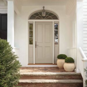
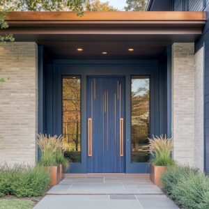
Pull Handles as Vertical Anchors
In the layout of modern exterior doors, the handle isn’t an afterthought—it’s often the only element allowed to interrupt the surface. Whether rendered in brushed brass or matte black metal, tall vertical pulls serve as visual anchors.
Their job isn’t to draw attention with ornament, but to introduce a deliberate rhythm break across an otherwise uniform composition.

On dark doors—whether in charcoal-stained wood or powder-coated slab—the handle often camouflages in tone, appearing only in glints or silhouettes when caught by side light. On paler timber or stone backgrounds, the same handle gleams subtly, offering a controlled contrast that never overtakes the field.
Either way, what stands out isn’t the material—it’s the scale. A long vertical bar, carefully proportioned to match the door’s height, gives the eye a consistent reference point across wide expanses of wood grain or concrete.

This kind of move shows up repeatedly in high-end entries where simplicity is the main idea. The handle is often offset—never centered, never symmetrical—to shift the weight of the doorway slightly.
That imbalance pulls the viewer into the composition, creating a visual grip even before the hand makes contact. In some examples of main entrance modern door design, this technique becomes the door’s only graphic mark—quiet but deliberate, helping large panels hold their visual structure.

Greenery as Structured Accent
Plants near an entry are no longer background decoration—they’re part of the spatial grammar. In many modern compositions, species like agave, bird-of-paradise, olive, or fan palms are selected not for lushness but for how they mirror the shapes and lines of the built surface.
Their forms are often vertical or sharply angled, echoing door slats, wall textures, or screen motifs. Rather than clustering around the doorframe, these plants tend to sit slightly to one side, avoiding symmetry.
This off-center placement keeps the entry from feeling staged, like a storefront or hotel drop-off. It brings casual precision—a sense that the planting belongs to the architecture, but doesn’t try to match it beat for beat.

Planters themselves are treated with the same material care as the doors they frame. Rounded cement, carved stone, or textured metal are used to balance the linearity of the façade.
Some are sunken, some elevated, but most are kept to a low profile so that leaf shape—not pot shape—does the talking. This compositional approach allows the planting to read as punctuation—a controlled pause in the visual rhythm of the facade.
In the best examples of modern exterior doors, the green element isn’t a splash of life thrown in for softness. It’s part of the grammar: placed, proportioned, and shaped to reinforce rather than compete.

Glass Placement as a Visual Filter
Transparency in modern entry design isn’t all-or-nothing—it’s measured. Full-height clear glass can feel too exposed, while full opacity may read too closed.
Many entries now use narrow strips of glass combined with wood or stone to offer a controlled view rather than a full reveal. Sometimes glass panels are placed near the top or bottom—out of direct sightlines—so light can enter without showing what’s inside.
In other cases, frosted glass is used right at eye level, blurring shapes but still pulling brightness through.

One refined tactic is layering wood grids over glass, so visibility depends on the viewer’s angle. This adds both depth and rhythm while allowing the door to remain visually cohesive.
The balance here lies in letting light travel while keeping the form of the door intact—as one object, not a frame cut into parts.

This technique appears across many contemporary front entrance ideas and is often combined with matching sidelights or transoms. These side elements mirror the same glass treatment—frosted, shielded, or interrupted—so the entire assembly speaks in one tone.
The effect is clean but never blank. It invites curiosity without compromise and reflects the shift toward entries that suggest space beyond without giving it away.

Recessed Frames That Shape the Entry Moment
A deep-set frame around the front door can define the entrance more clearly than color or texture ever could. By pulling the doorway back into a surrounding volume, the edges of the frame become part of the design.
Shadow gathers in the recess, drawing attention to the negative space rather than the surface finish of the door itself. This visual move shifts the whole composition from a flat wall to something sculptural.

Even when the door is simple—a matte slab, a plank design, or a tone-on-tone surface—the recess adds a layer of contrast. It’s the depth that creates focus, not any added decoration.
This framing technique makes the entry feel like a space rather than a cutout: the visitor doesn’t just pass a door, they step into a defined pocket that softens the transition between exterior and interior.

Sometimes the frame material matches the wall, and the door hides inside like a shadow slice. Other times, the door has a faint sheen or different tone, but the darkness of the recess always dominates.
This threshold composition reads like a quiet stage—still and controlled—where the simplest move feels significant. Lighting plays a subtle role here too.
A warm line from above or below traces the edge of the shadow, reinforcing the depth without overexposure. It’s a way of turning geometry into atmosphere without adding anything more than placement and light.

Texture That Matches the Landscape Story
Surface finish can quietly echo the climate without relying on obvious themes. In warm, arid regions, materials often appear faded or raw—lightly sandblasted stone, bleached oak, or concrete with soft aggregate.
These finishes read as sunworn rather than freshly installed, aligning visually with desert surroundings or dry garden palettes. The idea isn’t mimicry—it’s about choosing surfaces that look like they’ve belonged outdoors for years, not minutes.

In more humid zones, the move shifts. Wood takes on richer stains, surfaces are smoother, and the grain may show a bit more depth.
Plant life nearby often adds sheen and fullness—glossy leaves, layered foliage, and vertical palms. Here, the door surface might carry slightly darker tones or tighter grain to balance against the natural saturation of the green backdrop.

This kind of calibration gives each entry a sense of visual logic, where nothing feels forced, yet every element sits correctly in its place. The climate is not referenced by theme—but by finish, tone, and subtle atmosphere.
It’s one of the more overlooked aspects of modern front door entrance ideas, but it plays a defining role in how naturally the entry connects to its setting.

Hidden Openings Through Continuous Cladding
Some of the most refined entries don’t separate the door from the wall—they erase the boundary entirely. This approach uses full-surface cladding—horizontal planks, vertical slats, or stacked strips—that cover not only the façade but also the door itself.
Hidden reveals and pivot hinges allow the door to swing open, but visually, it’s nearly invisible when closed.

The strength of this technique lies in how it flattens the whole elevation into one uninterrupted field. The door is no longer an object—it becomes part of the architecture’s surface.
And because the seams are concealed within carefully placed shadow lines, the moment the door moves becomes surprisingly theatrical. The wall breaks apart, not the frame.
It’s a reveal in the literal sense—a surface changing states without announcing it.

What makes this tactic successful is the tight alignment. Grain direction must be exact, gaps must be consistent, and the transitions need to fall into deep shadows.
Even the handle, if present, is minimized or embedded so the reading remains uninterrupted. It’s a strong move, but one that feels quiet—letting the material do the work instead of relying on shape or color.
This is where many contemporary designers are refining their approach to modern front door entrance ideas—less about the door itself and more about how seamlessly it blends into everything around it. The entry doesn’t interrupt the wall; it folds into it.

Refined Moves That Signal Quiet Luxury
The details that define many luxury-looking entries aren’t flamboyant—they’re quiet gestures handled with control.
- Monochrome schemes, where door, frame, and wall share subtle shifts of the same warm neutral, carry more visual weight than a color contrast would. The absence of boldness becomes its own form of confidence.
- Fine grids layered over glass play with light, not for privacy or security, but to scatter daylight across interior floors in faint patterns. These lattices work like filters, softening what could be stark and giving the glass dimension.
- Slim LED bars, especially when aligned with plank seams or material divisions, shift the role of lighting from functional to spatial. The light doesn’t just brighten—it creates rhythm across the entry surface, like punctuation between slabs.
- Offset pulls are a recurring move. By placing the handle off-center—sometimes just slightly—it introduces an intentional tension within a calm surface. It’s a subtle break that feels composed rather than accidental.
And then there’s woodtone gradient, one of the most underused and impactful visual devices. When timber subtly shifts from pale to dark along a single plane, it leads the eye without needing lines or pattern.
It feels natural and studied, like the grain is telling a slow story.

Why Such Entries Stay Interesting
- Material mass comes first. Decoration comes later—if at all. Such entries don’t start with finishes. They begin with proportion, depth, and surface. Only once those elements settle does a slender metal strip or low planter get introduced—always to support, never to compete.
- Time is part of the design. Materials like charred timber or ribbed slats are chosen because they age well. As seasons change, they deepen or fade, creating visual history instead of wear. The soft lighting strategies and limited planting help this process feel composed, not neglected.
- They build the entry sequence. The best examples aren’t meant to be taken in at once. From a distance, the layout reads as a simple wall. Step closer, and hidden pulls, slim reveals, or slight shifts in finish come forward. Cross the pivot line, and the architecture wraps inward—ceiling lowers, stone changes, or light glows from an unseen source. The entry isn’t a statement—it’s a slow shift in perception.
These ideas respect how people move, see, and pause. They’re composed like a sentence that ends with a door opening.
Nothing over-declared—just measured details placed where they count.