Attic bedrooms are often thought of as leftover corners of a house, but some of the most visually intentional spaces now come from these sloped, angular interiors. Instead of filling every inch with storage or décor, modern attic bedroom design favors restraint, balance, and surface depth.
A growing number of interiors treat the attic’s shape not as a limitation but as a framework to draw clean lines, manage volume, and shape light like a sculptural tool.
Shadows and material shifts become active design elements, replacing the need for decoration with subtle visual movement. Within this approach, contrast is rarely loud—it’s quiet, layered, and deeply controlled.
The following observations examine how design can turn these compact volumes into refined, grounded spaces using thoughtful placements, muted palettes, and material direction. As modern attic bedroom ideas evolve, so do the expectations of what an attic can express without ever appearing overdone.

Spatial Quiet as Ornament
What stands out in these designs isn’t the furniture or the décor—it’s the space between them. Empty surfaces are treated with the same care as filled ones, often more so.
Long stretches of unbroken wall planes across sloped ceilings aren’t left blank by accident—they are tuned to pick up the soft transitions of natural light or emphasize a texture change at a precise angle.

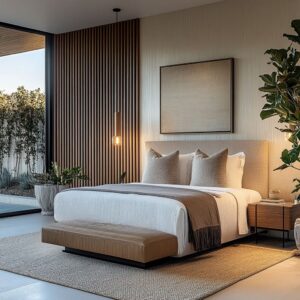
Wide, wall-to-wall bed platforms—often recessed or floating—let the ceiling’s pitch become the room’s focal gesture. These wide voids slow the eye, making it more alert to shifts in bedding weave, plaster finish, or grain direction.
Visual silence works as a compositional tool, where restraint becomes structure. This isn’t minimalism by absence—it’s minimalism through controlled framing, where stillness is treated as a visual object in itself.

Light That Draws Rather Than Fills
LED placement in modern attic room design doesn’t aim to brighten everything—it traces. Thin strips of warm light become a tool to sketch the room’s bones, revealing slope transitions, ceiling angles, or the quiet lift of a platform bed.
This approach removes the need for visible fixtures or spotlight accents. Light slips under the edge of the floor or runs in a narrow groove behind a headboard, giving the effect of a glowing outline without calling attention to the source.
Instead of lighting the whole space, it shapes it.

These fine glows often wrap corners or follow ceiling breaks like drawn threads, offering quiet contrast along straight planes. The result is architectural light—used not for brightness, but as a soft boundary marker that defines where a wall bends, a ceiling turns, or a sleeping area begins.
The glow behaves more like a gesture than illumination, turning structure into linework and materials into layered tones.

Directional Grain and Optical Drift
In many attic bedroom ideas, the ceilings and walls aren’t just surfaces—they’re visual channels. Wood grain, when installed with intention, shifts from background texture to compositional guide.
Planks might angle toward the gable’s peak or spread outward like rays behind a platform bed. In some cases, the ceiling treatment fans gently across the slope, pulling the viewer’s attention toward a window seat or framing a skylight without any trim or framing.

By rotating or mirroring the direction of these planks—diagonal against horizontal, or tight grain against wide boards—designers build a visual rhythm that controls pace and movement. It’s not about symmetry.
It’s about how the eye glides. The grain acts like subtle brushwork, softening strong angles or emphasizing breaks in volume.
Used correctly, the direction of surface material becomes a quiet current, shaping how the space is read without adding any actual ornament.

Platforms as Psychological Ground
One of the most subtle but powerful moves in attic interiors is the treatment of the bed base. In many modern attic room ideas, the frame is erased completely—replaced by a solid platform that either lifts slightly from the floor or drops down into it.
This shift redefines the atmosphere instantly. A floating slab gives the impression of ease, almost as if the bed defies gravity in a calm way, especially when light slips beneath it.

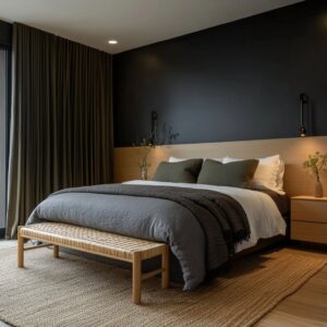
In contrast, a recessed setup—where the mattress nestles into a lowered plinth—creates a visual weight that feels grounded and protective. These choices aren’t just aesthetic; they tune the way the ceiling is read.
A low-set bed makes the overhead slope feel expansive, as though the roof lifts away. A hovering bed, by contrast, draws the ceiling closer, creating an intimate envelope.
Changing the bed’s relationship to the floor transforms the way height and volume are perceived, giving the space either a lifted energy or a grounded stillness—without shifting a single wall.

Vegetation as Counter-Mass
Plants in attic rooms often do more than fill corners—they offset architectural tension. The slope of a gabled ceiling or the pull of a long wall panel can create visual pressure, and well-placed greenery answers it with soft mass.
A tall, leafy tree can push back against a narrow dormer, adding breath where the form tightens. A low trailing vine can soften a recessed bench or echo the sweep of a diagonally paneled ceiling.
In this way, plants are used to answer built volume with living volume.

They’re placed not randomly, but in spatial conversation—balancing a dark wall, anchoring a corner, or completing a visual triangle. The trick is not abundance, but clarity.
A single palm or sculptural branch can do the work of three light fixtures when used as a visual weight. In attic layouts with sharper geometries, especially, vegetation becomes the organic reply that keeps everything from feeling top-heavy or angular to the point of coldness.

Chromatic Restraint, Micro-Contrast
Many attic interiors keep their palettes within a narrow tonal margin—soft ivories, muted oat, dusted clay, pale ash—but the restraint never flattens the space. Depth emerges from how surfaces handle light, not how much color they hold.
Matte textures absorb; satin sheens reflect. Chalky plaster walls might sit beside a smooth linen headboard, and that pairing alone is enough to mark the edge of a sleeping zone.

These subtle contrasts form barely-there lines, almost like shadows drawn across the room. It’s the texture that defines the boundary, not a shift in pigment.
This approach maintains calm while still layering visual richness. There’s no need for bold contrast when a shift from raw wood to smooth ceramic is enough to redirect the eye.
This use of micro-contrast is especially common in attic bedroom ideas, where quiet tones help control spatial pressure from the angled ceiling while still giving every plane its own visual rhythm.

Rhythm Through Repetition—Then a Break
Attic rooms often work with repetitive surfaces—slatted walls, ribbed panels, tongue-and-groove boards. These elements do more than fill space; they build a tempo.
The eye follows the rhythm of evenly spaced lines, tracing across surfaces that echo the architecture’s angles. But repetition alone doesn’t carry the composition.
Each room depends on a single disruption—a soft bench built into a niche, a dark metal accent, or a backlit insert of cane or mesh.

These breaks are placed intentionally, not randomly, and they interrupt the pattern with just enough contrast to catch the eye. This tactic keeps the repetition from turning dull.
Instead, it feels structured but alive, giving weight to a feature without requiring loudness. It’s a visual technique that holds especially well in attic layouts, where too much pattern without pause would overwhelm the compressed geometry.
With careful pacing, even the simplest material rhythm feels nuanced and deliberate.

Asymmetry Used to Slow the Gaze
Gabled ceilings often tempt designers into strict mirror-image layouts, but some of the most thoughtful attic spaces intentionally shift visual balance. A bench that runs off-center, a window placed slightly askew, or a light path that angles away from the central axis—these moves pull attention sideways, forcing the eye to pause and scan instead of jumping straight to the middle.
This subtle detour in gaze stretches how the space is experienced, especially in rooms with compressed ceilings.

Mild asymmetry isn’t disruption—it’s a way to extend rhythm and build quiet complexity. By breaking perfect alignment, a low room can feel longer, deeper, or more layered, even if nothing structural has changed.
The viewer slows down and engages with the room’s details more closely. It’s a pacing tool that gives small or low-ceilinged attics a surprising visual openness.

Visual Mass vs. Perceived Weight
In attic bedrooms, what looks heavy often isn’t—and what appears light may feel grounded. A dark concrete-textured wall or matte black paneling might seem dense at first glance, but lighting tucked beneath or behind gives them lift, separating them from the floor or wall surface and making the volume feel suspended.
On the other hand, materials like cane or mesh—typically seen as light—can feel more permanent and structural when set into framed grids or layered in architectural panels. The trick lies in contrast and composition.

Actual weight is secondary to how something reads in space. With careful positioning, a chunky platform can appear to float, and a thin panel can command the entire wall.
This allows attic layouts to play with scale without overwhelming the room’s proportions, especially when ceiling angles already impose strong directionality. The result is visual tension that feels intentional—mass and lightness swapped where needed.

Texture Cascades in a Narrow Palette
In many attic interiors, color takes a backseat to feel. Material texture becomes the visual language, especially when the palette hovers tightly around pale woods, bone whites, or sandy beiges.
This restrained spectrum isn’t flat—it’s stratified. One surface might be ribbed wood running across the ceiling, another a loose linen throw across the bed, and below that, a tightly woven jute or nubby wool rug.
All land within the same tonal family, yet each catches light differently and holds a different level of softness or resistance.

This cascade of textures adds depth without needing visual volume. It’s a sequence of touchable surfaces layered from top to bottom—smooth, slubby, rough, airy—creating dimensional interest even when everything stays quiet in color.
In attic spaces where walls angle, light shifts quickly, and rooms compact easily, this approach gives softness without noise. Texture fills the role of contrast, mood, and decoration—all through material touchpoints that reward close looking.

Conclusion
Across attic interiors shaped by slope and shadow, no single template governs the approach. Instead, certain methods surface again and again—spare use of objects, deliberate use of void, and quiet rhythm in every line and texture.
These spaces show how light can sketch instead of flood, how timber grain can direct instead of decorate, and how even a plant can be placed to stabilize a volume. What gives these interiors their strength is not complexity, but clarity—each move answering a spatial condition without excess.

In rooms with compressed ceilings and angled walls, design often gains impact by removing distractions, focusing instead on how materials interact, how light softens edges, and how symmetry is broken with care. When done with attention, even the most awkward corners of a roofline can feel grounded, expressive, and controlled.
It’s not about more—it’s about sharper use of less.