Modern home theater interiors have shifted away from dramatic finishes and overused motifs. Instead, they focus on quiet spatial structure, subtle contrast, and visual pacing.
These room designs no longer rely on velvet walls or heavy moldings to make an impact—instead, they speak through the way light meets texture, how forms repeat, and how materials fade into one another without calling attention. What defines such spaces is not the gear or the layout, but the way every visual element is tuned to support focus.
Designers are leaning into controlled palettes, recessed details, and built-in forms that carry utility without cluttering the space. Proportions are carefully managed; contrast is often reduced to one deliberate move—like a dark stone table or black-framed opening that punctuates a softer environment.
Throughout these concepts, there’s a deep sense of edit. The strongest rooms are shaped by what’s been removed.
Instead of filling every surface, they allow light to glide across plaster, slatted wood to meet the ceiling in curves, and stone platforms to hover without visual weight. Even the way a seat is built—modular, flush, or sunken—affects the spatial tone.
This approach to home theater decor doesn’t chase trends or dramatic gestures. It builds quiet control through repetition, alignment, and surface decisions that feel effortless on the outside but are highly considered underneath.
The result is a viewing space that holds attention without fighting for it—a room that lets the screen lead, while everything around it quietly stays in place.

Ceiling Grammar: how overhead planes choreograph the scene
Ceilings, often seen as the background, actually control much of the atmosphere in refined home theater design ideas. Their shape and treatment guide how the room feels before a single frame hits the screen.
Segmented tray ceilings don’t simply add dimension—they control visual weight. When trays run in horizontal bands, they bend the perception of height.
Light catches these bands unevenly, subtly extending the space between floor and ceiling. Even in low-profile rooms, this method reshapes proportions without adding clutter.
Timber ceilings folded into faceted planes or laid in clean arcs introduce a slow visual rhythm. The repetition of wood grain, running in directional flow, acts like a prelude to what’s on the screen.
This gentle movement doesn’t compete with content—it calms the space. The most quietly effective ceilings don’t just cover—they choreograph the eye’s movement from entry to screen wall.

In compact layouts, beam stair-stepping has an optical trick. By cascading slats or beams across the ceiling in deliberate intervals, designers pull attention horizontally.
That soft, repeating descent shifts the perceived shape of the room, downplaying narrow footprints. A move often missed by casual observers: the way these upper planes touch down.
Rather than ending in sharp corners, ceilings often land on walls through recessed lines or narrow reveals. These glows aren’t about brightness—they soften edges and blur junctions, covering structural irregularities while adding dimension.
The result feels resolved, even if you can’t point to why.

Shadow as Ornament, Light as Mortar
In some of the most visually impactful home theater ideas, what’s missing is what makes the difference. The absence of visual noise allows lighting to become the binding element.
No added decor is needed when light and surface are in quiet conversation. Perimeter LED ribbons are often set back inside a small pocket.
This trick of concealment makes the wall seem to float or bend where it meets the ceiling. Rather than shining down, the light spills sideways, sketching the shape of the room in soft geometry.
Even flat walls gain dimension when the edge is made to glow. Textured walls come alive under focused sconces.
A narrow-beam light cast down a plaster wall draws attention not to the fixture, but to the play of surface. It’s a kind of ambient print—fine-grained shadows acting like brushstrokes.
Especially in neutral rooms, this becomes the only pattern the room needs.

And sometimes, the material itself is the light’s partner. Slatted wood or gently uneven brick catches illumination in waves.
A beam of light cast at an angle won’t spread evenly—it breaks, highlighting some ridges and leaving others in shadow. This isn’t accidental.
It’s a studied contrast, soft and flickering. A type of visual texture that comes from layering physical form with quiet light direction.
This approach favors a negative print: the penumbra becomes the artwork. Fixtures vanish, wiring hides, but the space glows with contour and restraint.
Light doesn’t scream—it whispers from the edges. And in that silence, the rest of the room holds steady, ready for the screen to take over.

Tonal Restraint, Texture Abundance
Color doesn’t have to shout to shape an atmosphere. In many refined theater room ideas, the most immersive spaces hold back on hue—but dial texture all the way up.
Rather than layering strong contrast, such rooms focus on how materials feel, reflect light, and interact side by side. A wall in clay-wash plaster next to a ceiling of soft concrete doesn’t look loud—but the temperature difference between the two is felt, not seen.
Matte cement tends to read cooler and distant, while the clay finish draws the room inward with a faint warmth. Both may be nearly identical in tone, but their effect in a room couldn’t be more different.
In some rooms, a boucle-covered sectional nearly dissolves into the carpet, merging furniture and floor into a continuous tactile zone. This lack of separation doesn’t flatten the room; it deepens it.
Texture steps in where color is quiet, guiding the hand before the eye. Limestone walls offer a stony rhythm—cool, uneven, and light-scattering.
When paired with linen upholstery, the tension lies in the way light reacts. Stone bounces it irregularly; fabric pulls it in.
This makes the seating feel grounded and composed, even if the backdrop has a lot going on. It’s not the boldness of a color palette that keeps attention.
It’s the way subtle tones carry character through physical contrast. And in home media spaces, this restrained approach often holds better over time—giving the screen room to be the most animated thing in view.

Seating Typologies: three low-profile archetypes
The layout of a home theater rarely hinges on furniture alone—it hinges on how that furniture sits in the space. In many advanced media room ideas, the seats aren’t there to impress with style—they’re shaped to hold a sense of volume, cohesion, and flow.
Bean-style forms or sunken modular seats introduce a relaxed order. With no hard silhouette, they loosen the grid of the room and soften its edges.
The visual posture of these seats hints at lounging, not sitting. That shift alone can recalibrate the entire mood of a space.
On the other end are sofas treated as part of the room’s architecture. Built tight to the wall, low to the ground, and often with hidden or absent legs, they almost dissolve into the baseboards.
The upholstery reads as part of the wall structure, not as separate furniture. This approach works best in clean, modern layouts where every element appears drawn, not placed.
Then there are tiered lounge chairs with a sculptural balance. Elevated rows aren’t stacked aggressively like in commercial cinemas.
Instead, each platform rises gently, masked in matching finishes, so that the seating arrangement reads as one large, stepped landscape. Even the armrests are kept close to seat height, letting the eye see only horizontal rhythm—not chair separation.
From every angle, these furniture choices do one thing well: they keep the space cohesive. Rather than dominate the room, they shape how the room feels—informal or sculpted, communal or zoned—without saying a word.

Horizontal Massing: anchoring the screen without heavy cabinetry
In refined home movie theater design, there’s often a quiet move playing out beneath the screen—the deliberate use of horizontal massing. Instead of relying on bulky cabinets or distracting consoles, these designs use platforms and linear surfaces that act as part of the room’s architecture.
A stepped plinth made of concrete or stone, set to match the height of the seating, pulls the eye through the room as one continuous plane. It creates a visual stage—not just for the screen, but for the entire viewing area—blurring the boundary between functional base and spatial anchor.

Some wood slabs appear to hover. Their mass is balanced by a narrow glow beneath, casting a soft light that tricks the eye into thinking the slab is floating.
This is where design meets quiet illusion: the surface looks weighty, but the base says otherwise. The subtle reveal below becomes more than a gap—it’s a light source, a shadow break, and a threshold all in one.
Then there’s the horizontal shelf carved from stone—often long, narrow, and uninterrupted. It acts like a visual horizon, a still line that cuts across the lower wall and quiets everything around it, including large windows or tall screen walls.
This shelf holds little—maybe a few stacked objects—but the weight of its form balances the room. Thin light strips hidden under these surfaces offer another move: path lighting without adding visible fixtures.
This way, the glow becomes part of the furniture’s language, not an afterthought. In low-light settings, these slots subtly define space without glare—relying on rhythm, not spotlighting.

Window as Secondary Screen
In many of the most thoughtfully arranged layouts, a window becomes more than a light source—it becomes a kind of counter-screen. With the right framing, a large window can act as a compositional partner to the main screen, holding visual weight even when no film is playing.
In some layouts, a perfectly centered rear window sits in exact proportion to the projection wall, echoing cinematic ratios. The effect is immediate: nature and film sit on parallel planes.
This quiet mirroring removes the pressure to block daylight entirely. With a dark-toned wall and simple finish, the glass becomes a soft panel of living movement—responding to weather, season, and time of day.
In others, an offset window balances out a floating shelf or sectional mass. These panoramic windows can stretch wide, letting the outdoor view fill what might otherwise be a blank surface.
This isn’t about symmetry—it’s about balance between built form and the environment beyond it. A small design trick can seal the effect: using black or near-black frames around the window.
The dark lines echo the screen’s bezel and let the glass dissolve into the wall. Reflections are reduced, and the window loses its glare.
What’s left is a quiet plane that doesn’t shout, but still anchors one side of the space. This restrained approach to glazing often goes unnoticed in typical movie room design, but it’s what allows a home theater to feel open without sacrificing immersion.
A window, if treated correctly, won’t compete—it completes.

Controlled Informality: strategic asymmetry
Symmetry often reads as formal, while small shifts can ease the overall atmosphere. In many thoughtful layouts, soft asymmetry is used to relax the visual grid—without losing a sense of cohesion.
This principle plays out especially well in casual seating setups seen in home theater design for home use.
- One common move is placing a coffee table slightly off-center. Just a few inches to one side of the sofa midpoint can create a sense of looseness. It nudges the viewer’s eye—and body—off axis, which encourages less rigid sitting habits. That minor misalignment invites interaction, not perfection.
- Beanbag-style seats also introduce a different geometry. Unlike rigid lounge chairs in rows, their varied shapes and casual spacing disrupt the sense of assigned places. The layout feels looser, more communal. You read the space not as sections to fill but as soft zones to drift into.
- Cushions in these designs often tell their own story. Under-filling a throw pillow might seem like an oversight, but it works visually. The soft creases and slouch create a tension against precise lines in the architecture. It’s a subtle move—but one that pushes the room away from showroom stiffness toward a lived-in rhythm.
This balance of measured imperfection creates a relaxed mood without visual chaos. Even in highly structured rooms, one or two displaced objects can be the cue that makes the space feel welcoming rather than static.

Material Transitions as Visual Breath
In refined interiors, the meeting point between materials often does more work than either surface on its own. These intersections don’t just join—they shift focus, soften boundaries, and build rhythm across planes.
That subtle rhythm becomes one of the most overlooked ideas for a home theater, yet it shapes how the eye flows through space.
- Take wood slats that curve upward into the ceiling. That continuous motion pulls the wall into the upper plane without a visible break. It isn’t the slats alone that catch the eye—it’s the change in direction. That S-curve, right at the hinge between wall and roof, carries the space like a drawn line.
- Or consider a soft plaster curve at the wall-ceiling join. Instead of a sharp 90°, the edge melts. The viewer’s gaze doesn’t stop—it slides. This move borrows directly from photography studios, where cycloramas are built to remove corners and create depthless light. In home use, it quietly redefines how edges behave.
- Even harder materials—like limestone and walnut—can be softened at the meeting line. A fine shadow gap between them doesn’t demand attention but clarifies where one ends and the other begins. Trim would be louder; this narrow reveal whispers, giving each material its own weight while preserving visual stillness.
There’s also a principle at work beneath the surface: when three materials meet, one usually steps back or bends. Triple intersections are where clutter risks building.
The most controlled layouts avoid stacked lines by letting one finish curve or recess—creating visual depth without drawing the eye too hard to any single detail. Together, these transitions act like visual breath—pauses that reset the rhythm across walls, floors, and ceilings.
They aren’t meant to be noticed first. But once you catch them, you start to see how much they’re holding everything in place.

Ground-to-Wall Echoes: repeating horizontals for calm
In thoughtfully arranged home theater room design, one subtle rhythm runs through nearly every successful layout: the repetition of horizontal lines. These aren’t decorative elements.
They’re structural visual cues that help the space settle into itself, shaping the viewer’s gaze without pulling it in too many directions. Long planks on the floor, especially when placed under stepped seating platforms, create a sense of movement toward the screen.
These lines aren’t fast—they guide the eye gently, like stage lighting that shows where attention should land. Grain direction becomes narrative direction.
Linear lighting strips along the base of walls echo similar features above, often mirroring the ceiling coves. This alignment locks the vertical volume of the room between two glowing tracks.
With light defining top and bottom, the center zone—the screen and seating—feels grounded and contained. The effect is quiet, but the control it exerts over the spatial composition is strong.
Even the smallest pieces follow suit. Coffee tables stretch front-to-back rather than forming tight squares.
Their shape mirrors the cinematic frame—wider than tall—and acts as a low reminder of the screen’s proportions. These shapes are part of a larger conversation happening across the room: keep things long, low, and stable.
Avoid anything that might punch upward and compete with the visual flow. Together, these moves create an atmosphere where the walls, floor, and objects are speaking the same language.
That repetition builds calm, not through decoration, but through orientation—every element aimed toward a shared visual direction.

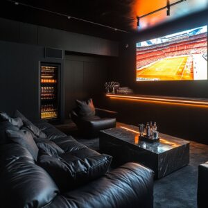
Quiet Contrasts: when one dark accent is enough
In spaces where tone-on-tone rules the palette, it takes only one carefully placed dark element to re-center everything. These aren’t accents for drama.
They’re anchors—used sparingly—to keep the room from fading into visual flatness. A black-framed glass door cutting into a clay-toned wall doesn’t call attention to itself.
It quietly pulls the depth of the room forward, offering a crisp line against the soft materiality around it. That one edge draws the eye not by color, but by weight.
It punctuates the space without needing to be repeated. Matte black coffee blocks serve the same function in seating arrangements.
These cube-like forms, set between pale or neutral sectionals, don’t demand attention—but they hold their own against glowing surroundings. Their surface doesn’t reflect, it absorbs.
That quality makes them appear heavier than they are, grounding clusters of furniture that might otherwise feel too airy. And in rooms finished with pale timber or light-toned panels, there’s usually one dark, rectangular element chosen to balance the field—most often the screen, sometimes a single piece of art or a recessed doorway.
This single void gives the entire layout tension. Without it, the color scheme might slide into sameness.
With it, the room holds its center. These subtle applications of contrast are one of the most valuable ideas for home movie theater layouts.
The move isn’t to scatter dark features—it’s to choose one, place it deliberately, and let the rest of the space fall into alignment around it. The effect is quiet but structural—like a punctuation mark at the end of a long, soft sentence.

Furniture-Integrated Objects: utility concealed as sculpture
In many modern layouts, functional items disappear into the structure of the furniture itself, shifting the focus from usability to form. What might traditionally stand out—like cupholders, side tables, or consoles—becomes part of the larger composition, embedded so cleanly they feel sculpted rather than placed.
- A good example is recessed trays set into chair arms. Rather than protruding or being added after the fact, these trays are carved into the armrests, following the same silhouette and material. They support objects without pulling attention, reading like a continuation of the seat rather than an accessory.
- Floating side ledges between seats offer another approach. Carved from timber and cantilevered just enough to seem effortless, these pieces never meet the floor. That open space beneath them matters—they maintain visual lightness and keep the ground zone uncluttered. The separation adds rhythm without breaking volume.
- Then there are block-like stone tables that can split in two, sliding apart without visual disruption. These designs often rely on the finish itself—natural veining or grain—to disguise seams. Symmetry stays intact even if one side shifts, and the object remains balanced, regardless of how it’s used.
These kinds of design decisions reflect a broader shift in home theater decor ideas: objects serve multiple roles without being obvious about it. They organize the space, perform a task, and hold the room’s geometry together—all without stepping into the spotlight.

Layered Thresholds: subtle signals that “this is a different zone”
The best transitions into a home theater don’t announce themselves—they suggest a shift through space, material, and light. Subtle steps, compressed passages, and soft illumination cues tell the body something is changing, even before the screen comes into view.
- One approach is introducing a shallow stone-framed step before a recessed seating area. Even a few inches of elevation can feel like entering a different mode. The change in floor level isn’t just structural—it’s a visual and physical cue that divides movement from stillness. The hallway belongs to circulation. Beyond the step belongs to viewing.
- In some layouts, arched or narrowed corridors slowly open into the theater space. This sequence compresses the field of vision, then releases it—mirroring how a story unfolds. The viewer passes from quiet tension into open view. That expansion can be subtle, but it frames the experience without needing signage or formal cues.
- Another rarely noticed move is the gradual shift in light tone. By lowering the temperature of lighting just slightly—sometimes only 200–300K—the air inside the theater feels softer, warmer, and slower. Because these fixtures are hidden, the viewer doesn’t see the source. They only sense the result. That invisible drop in brightness and warmth acts like a signal: this is the spot to pause.
Together, these changes shape how time moves through the room. The transition isn’t a doorframe—it’s a sequence of spatial cues layered through steps, forms, and glow.
Each of them reinforces the threshold without demanding to be noticed, building anticipation while keeping the room visually quiet.

Closing Notes
The most visually refined home theater spaces today rely on reduction—not in scale, but in gesture. They build their character through absence rather than clutter, using fewer elements placed with greater control.
What seems simple at first glance often reveals layers of timing, balance, and quiet rhythm. Rather than fill every surface, these spaces allow material and proportion to do the work.
A single recessed line along a ceiling can carry more presence than a dozen overhead fixtures, because it lets light move slowly and with purpose. The contrast between matte and soft gloss, the silence between two textures, or the decision to leave a wall uninterrupted—these choices form the visual backbone of a room meant for focus.
Visual calm isn’t achieved by soft furnishings alone. It comes from the confidence to hold space with intention: to place one bench instead of three chairs, to extend a stone shelf without breaking it into compartments, or to end a wall in a curve rather than a corner.
Every adjustment pulls the viewer inward, toward the screen, toward the moment. This is where modern home theaters find their voice.
Not in decoration, but in restraint. Not in excess, but in how carefully the unnecessary has been removed.
What remains—edges, light, shadow, and form—allows the story on the wall to take full command, without ever being upstaged by the room around it.