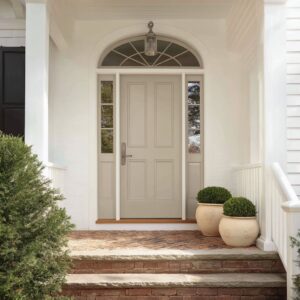
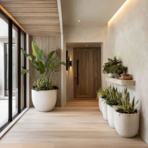
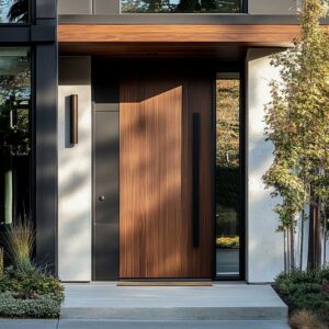
A front porch holds more than its frame might suggest. Every line, surface, and material choice shapes how the entry feels before a single step is taken.
In many modern layouts, the focus shifts from decoration to alignment—from bold contrast to subtle rhythm. Color, texture, and shape work together in quiet ways to create entries that feel composed without being rigid, expressive without needing to speak loudly.
The balance lies in restraint, where each feature serves a visual function that connects one element to the next. This is where the door becomes part of a larger structure of patterns, light, and form—not the center of attention, but a participant in the overall composition.
Underlying Color Choreography
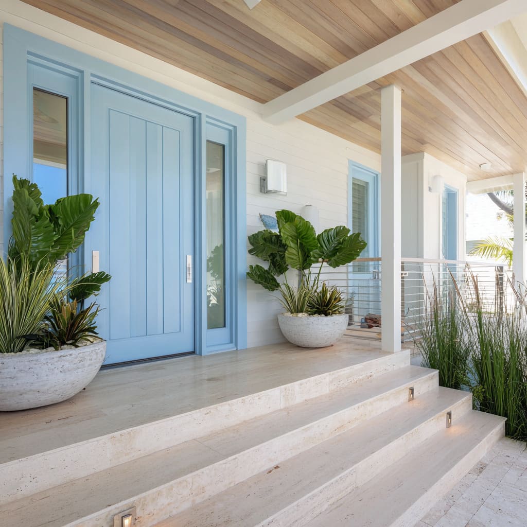
Across many current blue front door design choices, color behaves like an ambient setting rather than a decorative statement. The shades are selected with precision—not to pop, but to settle into a conversation with the materials around them.
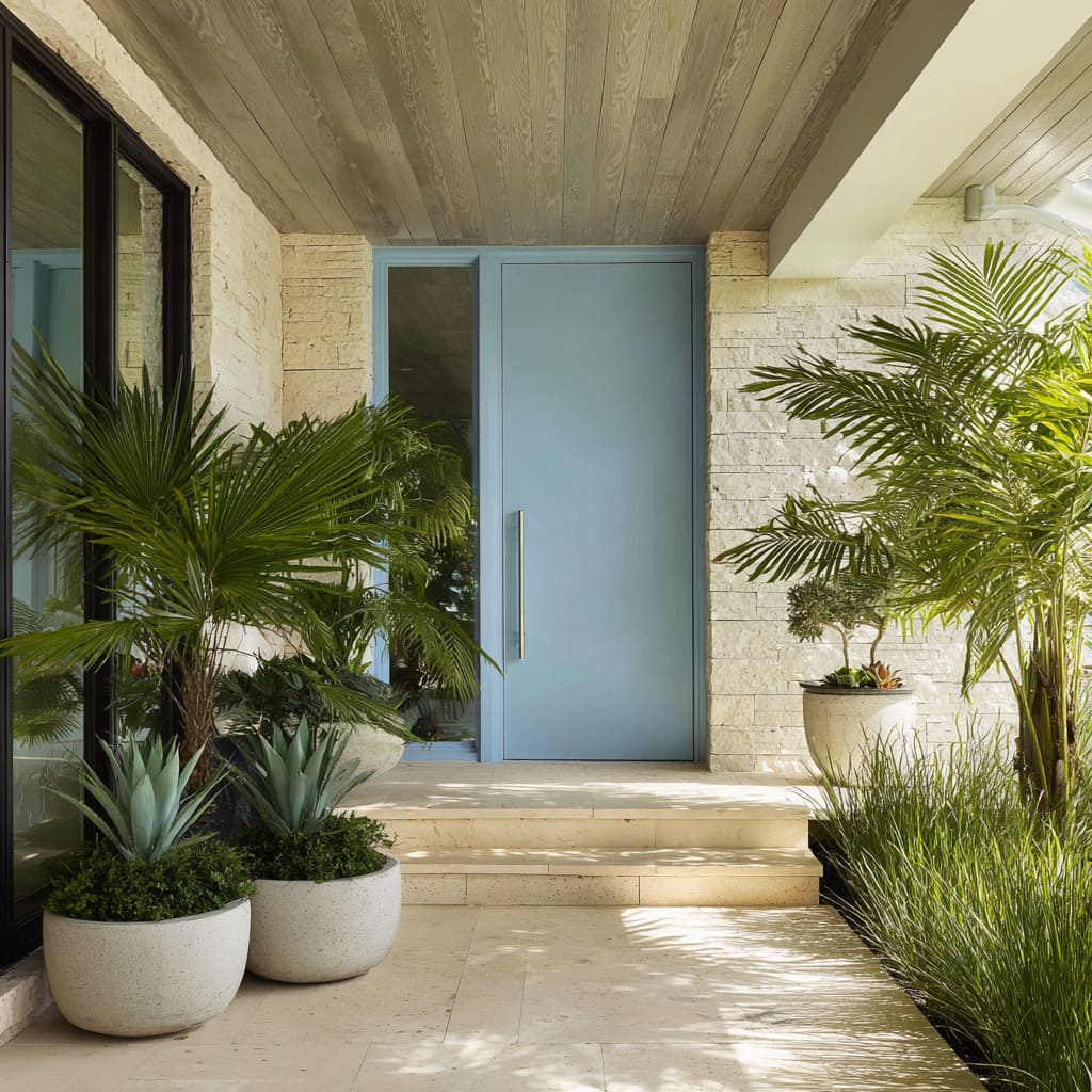
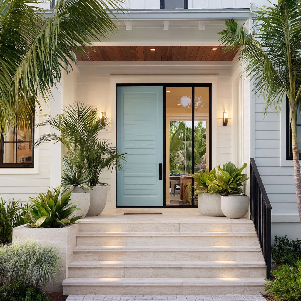
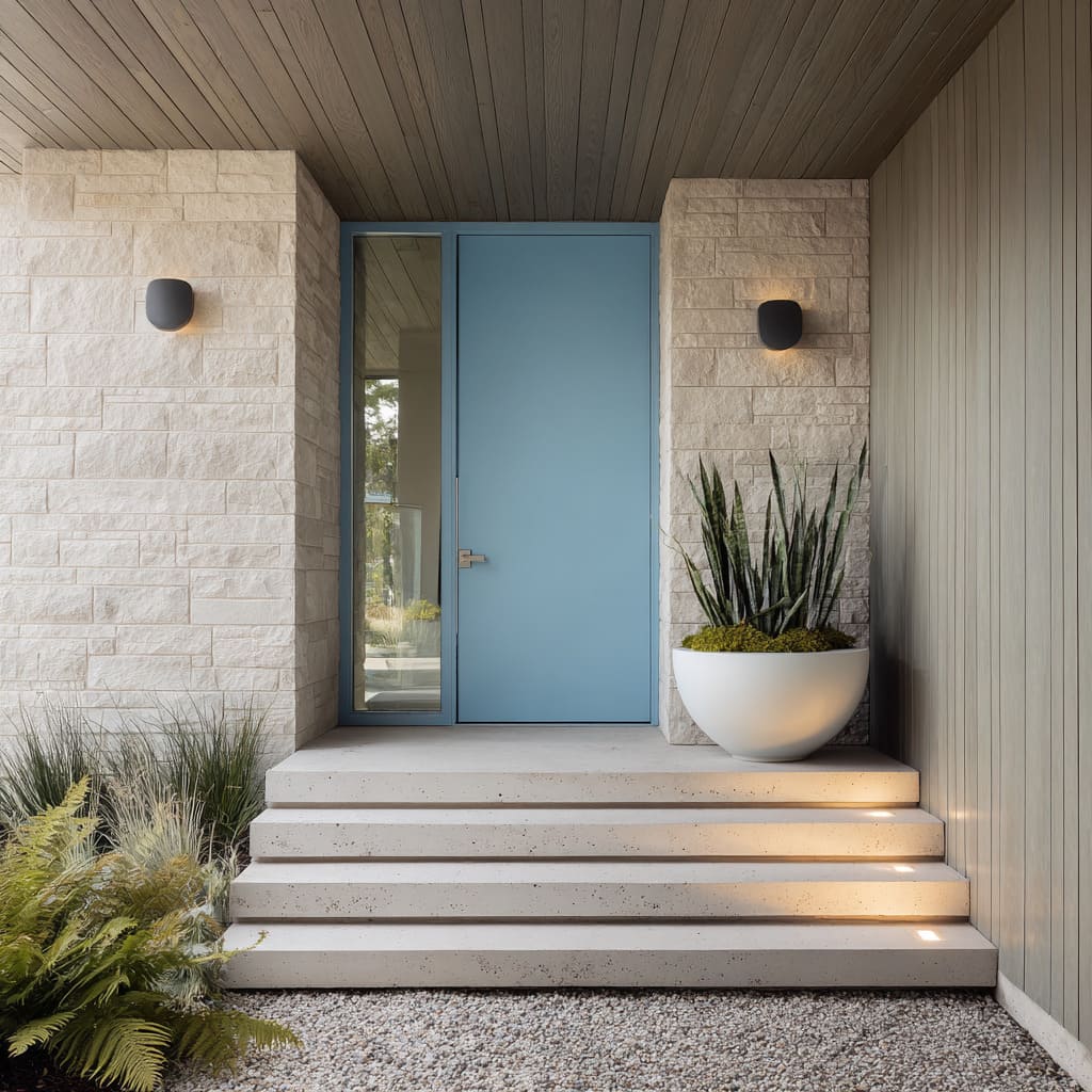
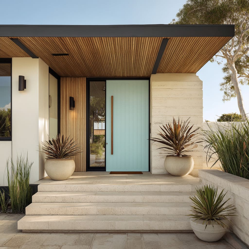
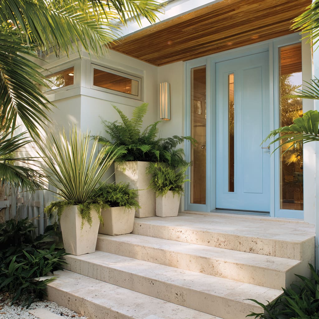
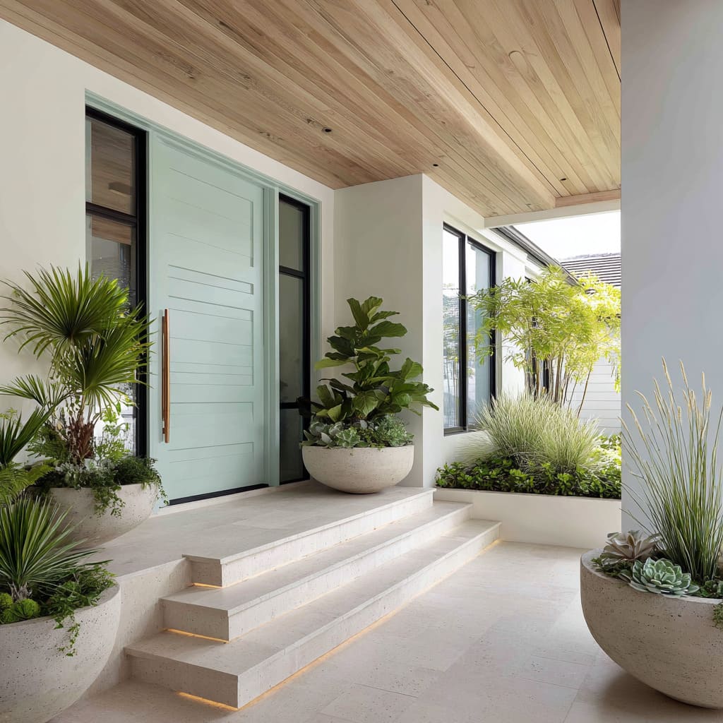
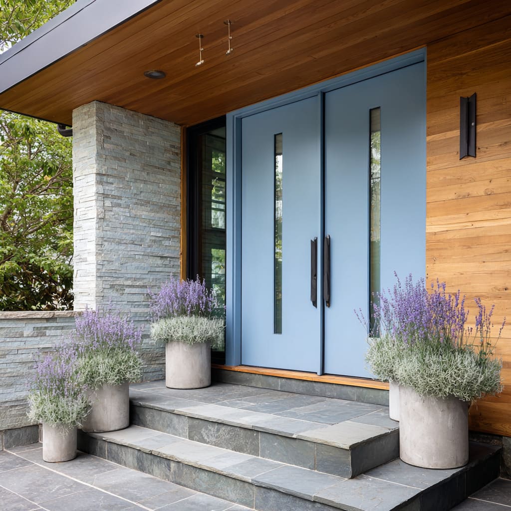
When walls are made of soft limestone or ivory-toned travertine, the door often leans into muted sea tones or greens with a pastel touch. These cooler tones feel gentle next to creamy stone, allowing plant shapes, not paint, to attract attention.
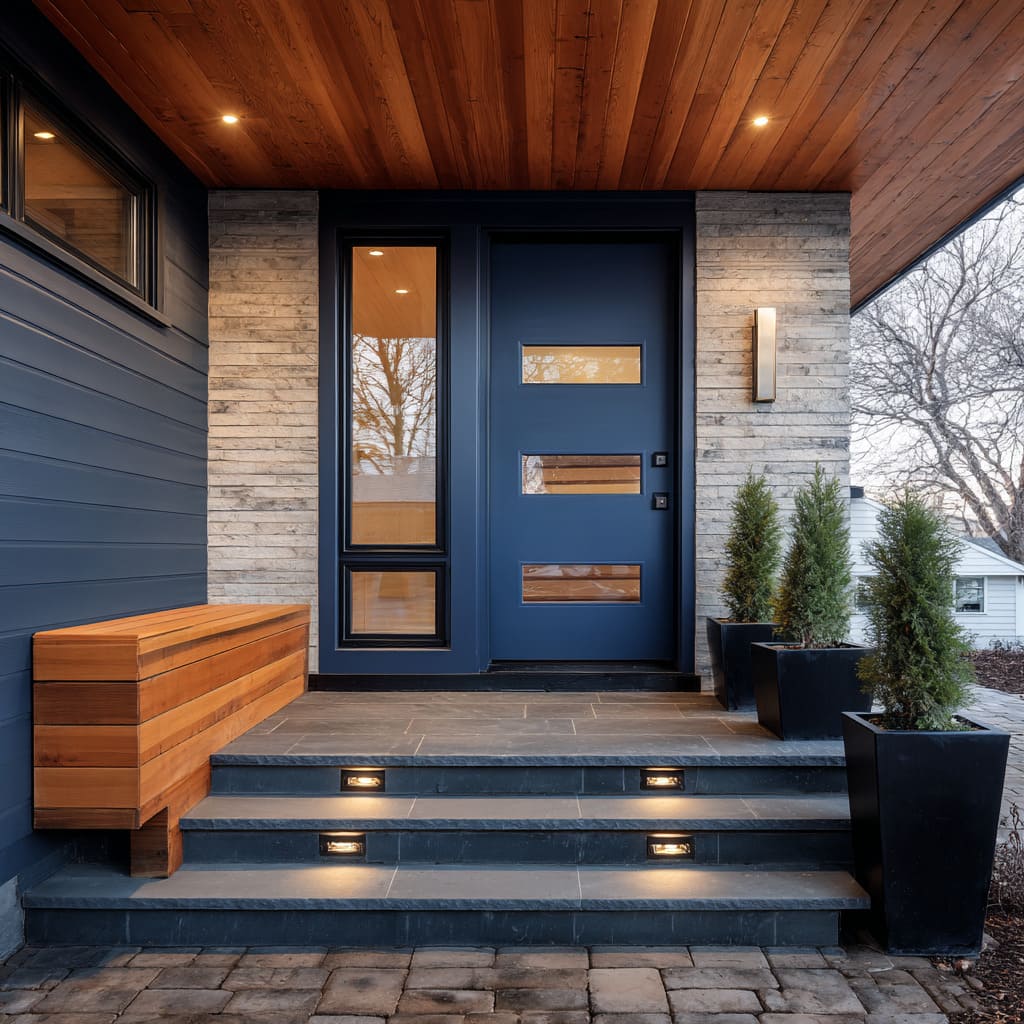
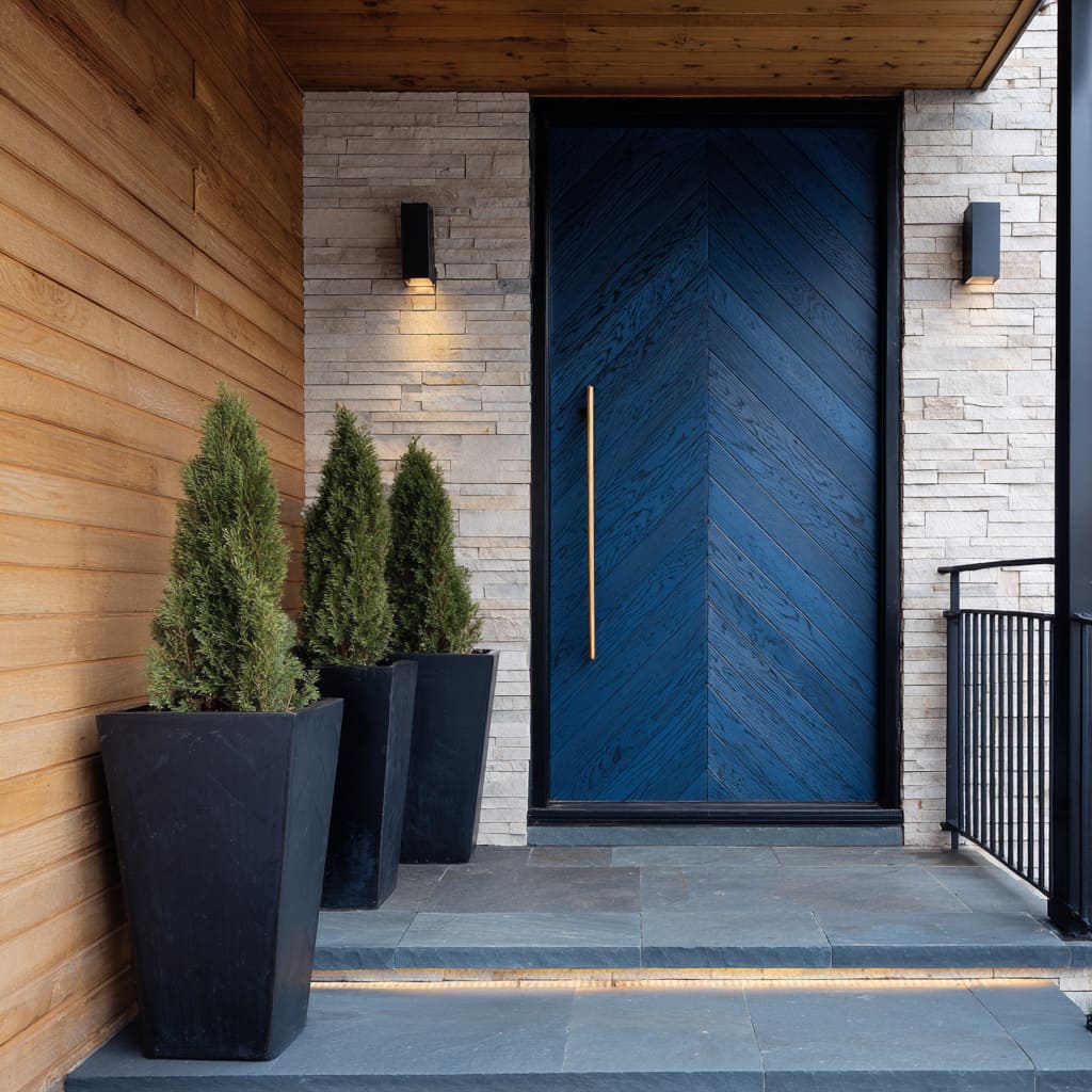
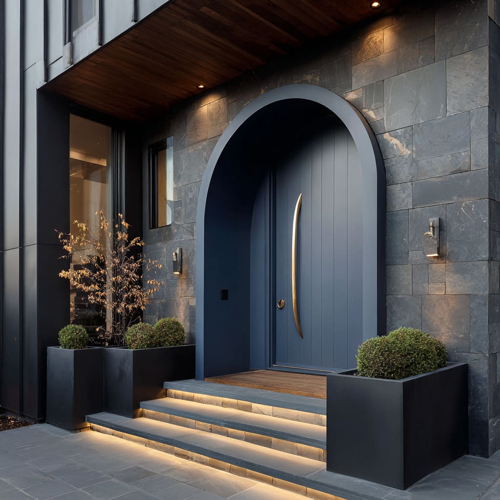
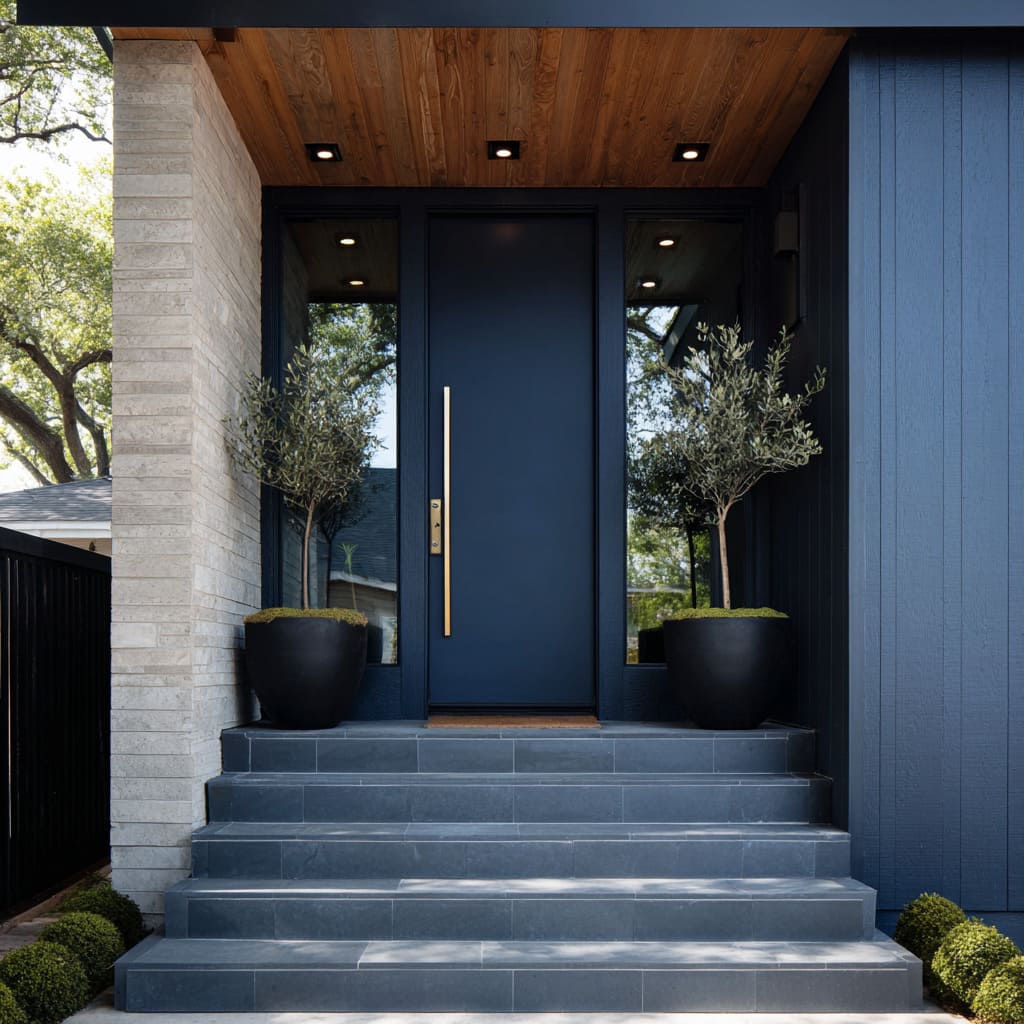
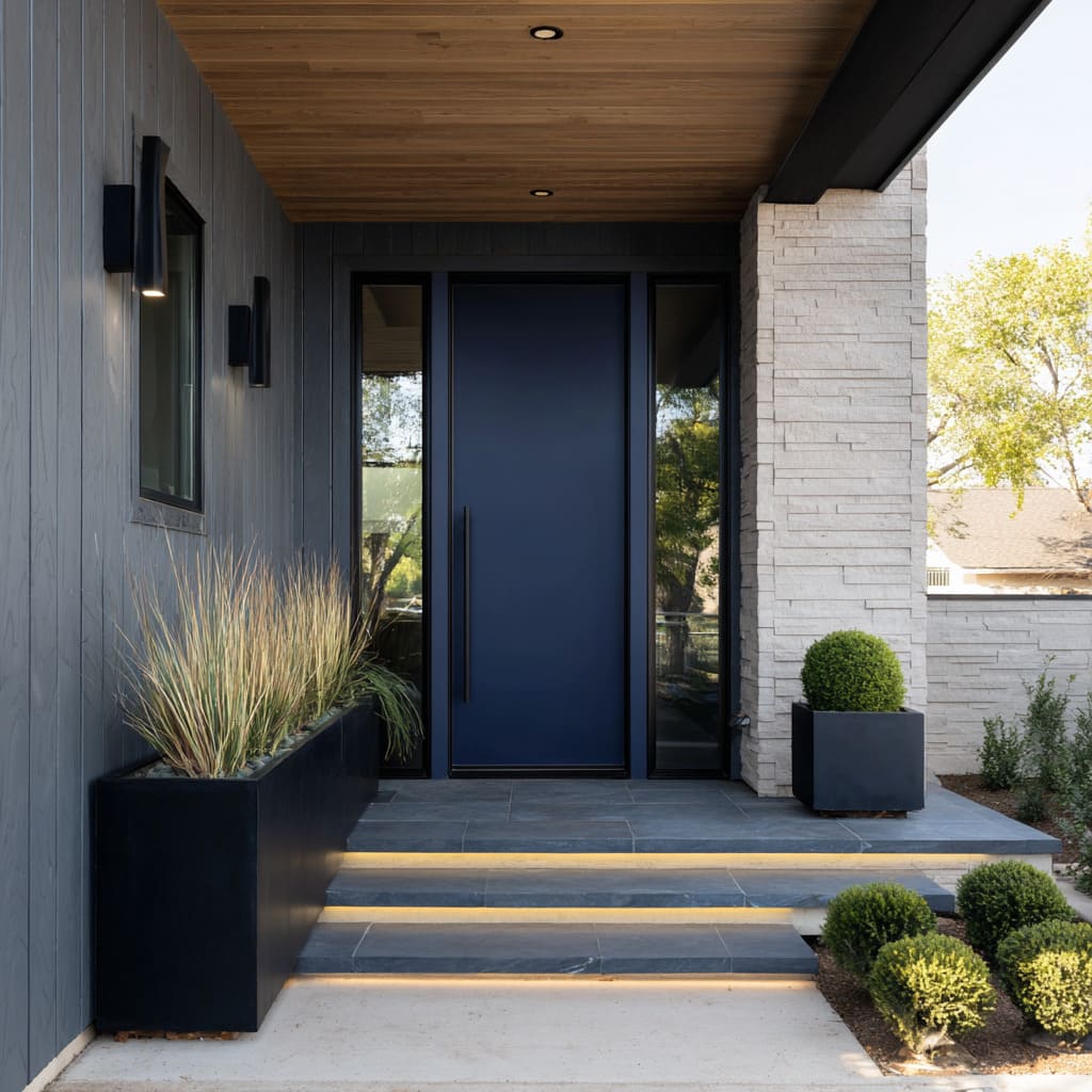
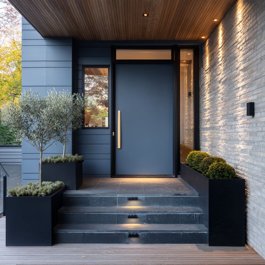
By contrast, in settings with darker cladding—charcoal siding or black-framed glass—the blue turns richer, deeper, sometimes nearly graphite. The shift to these saturated tones allows the door to hold its shape like a silhouette, letting light and shadow do more work than gloss or shine.
This approach to blue front door ideas favors tone harmony over contrast, encouraging color to sit in balance with its surroundings. The blue never acts alone—it adjusts, quiets down, or leans forward depending on what’s around it.
Optical Stretch Through Grooves and Glass
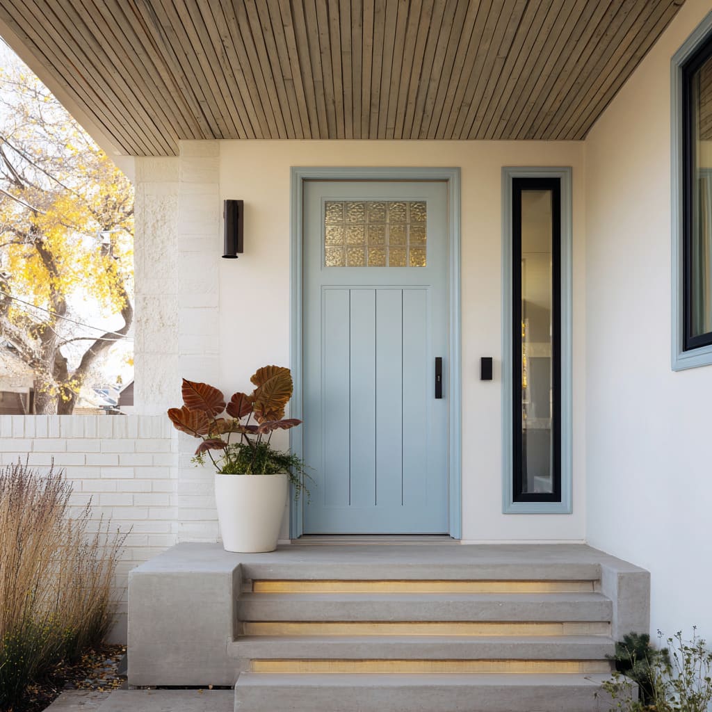
Many modern entrie designs rely on fine detailing to visually stretch the door height or reshape the proportion of the entry zone. Slim vertical grooves etched into the door’s surface give the impression of elongation without architectural changes.
These shallow lines aren’t loud, but they cast soft shadows that change throughout the day, adding dimension. Add to that a full-height window on one or both sides, and the door begins to feel taller or wider—without a single change in size.
In some cases, smoked or clear glass panes act like diffusers, guiding the eye across or upward. This tactic is particularly effective on pale doors, where subtle scoring would otherwise disappear.
Combined, these elements become more than parts—they act as framing tools that reposition the door within the composition, helping it hold presence or retreat, depending on need.
Handles as Rhythm, Not Hardware
On many of these porches, door handles play a far more visual role than a practical one. The long vertical bar—whether in black, brass, or silver—becomes a line of rhythm, echoing tree trunks, window mullions, or railing posts nearby.
Its presence can suggest balance, movement, or pause, depending on where it’s placed. Some deisgns repeat this vertical gesture on both sides, using matched pulls or mirrored glazing.
Others deliberately offset the handle, letting that asymmetry bring a subtle twist to an otherwise centered layout.
A matte black pull can nearly vanish against a deep blue surface, reinforcing the idea that shape and line should lead, not hardware shine. These decisions show how even one detail—if scaled correctly—can define the energy of the entire entrance.
In many ways, a blue front door design is rarely about the door alone, but how its parts behave in rhythm with everything around it.
Ceiling Boards Guide the Gaze
Above the entry, the ceiling isn’t background—it works as part of the composition, guiding the viewer’s eye in subtle but deliberate directions. The layout and orientation of wood planks overhead influence how the entire porch feels spatially.
Boards running lengthwise from the outer edge to the doorway pull attention forward, making the porch appear longer and directing movement inward. This linear stretch is particularly useful on narrow layouts where depth needs to be emphasized.
In contrast, when boards are laid crosswise, they have the opposite effect—they widen the view and slow the visual tempo, creating a more grounded, easy pace that suits relaxed, coastal porches or shaded suburban entries. Some designs even combine plank direction with off-center recessed lighting.
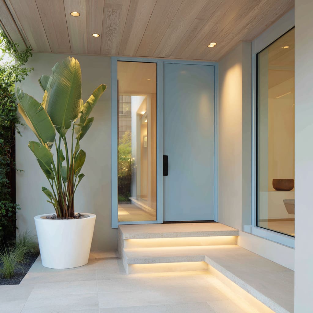
This soft irregularity breaks symmetry in a way that feels intentional, but informal—proof that ceiling structure can create quiet rhythm without drawing attention to itself. It’s a subtle detail that works especially well in a house with light blue door, where ceiling warmth can bring balance to the cooler tone below.
Planter Geometry Softens Door Geometry
The interaction between door form and planter shape is a silent but highly controlled element in many modern porches. Hard lines and sharp edges from a rectangular or diagonally grooved door can be softened by placing round or curved planters nearby.
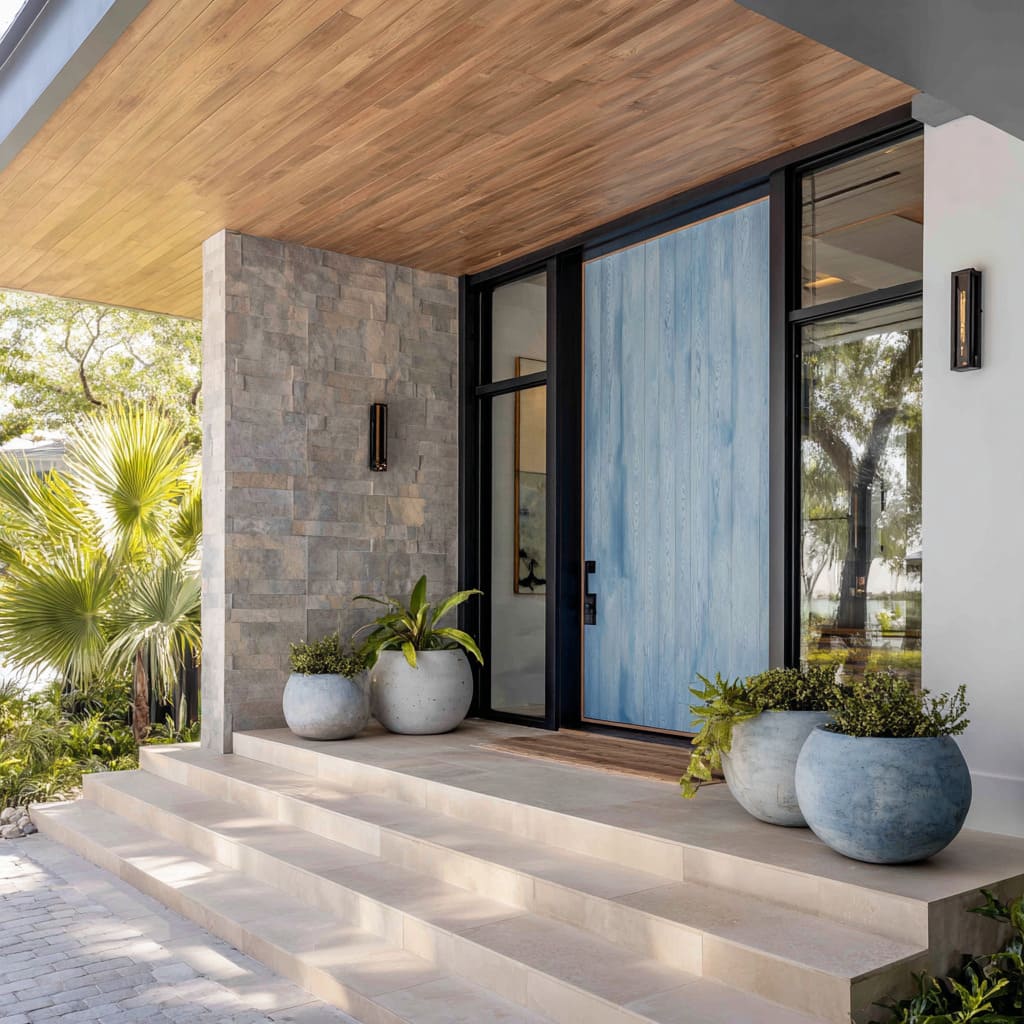
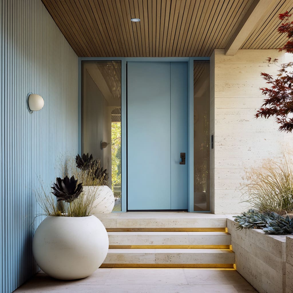
This kind of contrast doesn’t compete; instead, it rounds out the composition. A matte blue slab with sharp angles might be flanked by bowl-like planters or circular pots, allowing the eye to relax around the edges.
When the door itself carries curves—such as in an arched inset—designers may flip the logic, using square planters or faceted containers to reintroduce structure. In some setups, large spherical topiaries stand beside angular doors, balancing architectural weight with organic volume.
The shape of the plants inside matters too—slender and upright near angled planks, or full and cascading where geometry feels too strict. These placements are rarely symmetrical, and that irregularity adds personality without clutter.
Foliage as Texture Counterpoint
Planting design across modern porches moves far beyond filler greens—it’s calculated to introduce a mix of visual weights and outlines. The emphasis is on form and texture, not color.
Long, feathered ferns can sit beside stiff-leafed agaves, and the clash of shape brings energy to the porch without needing a bold palette. Upright evergreens often echo the lines of vertically paneled doors, while broad-leaf palms break that repetition with scale and softness.
These contrasts help anchor visual rhythm without locking into repetition.
In some entrie designs, the most compelling setups pair wide, low greenery next to lean, sculptural species—forcing the eye to pause, sweep, and move again. Even the calmest designs include variation in leaf size and spacing, keeping the porch from looking too controlled.
This balance of softness and edge is especially powerful in navy blue front door ideas, where cooler tones on the door allow surrounding foliage to carry the warmth and motion.
Light That Lifts, Never Blinds
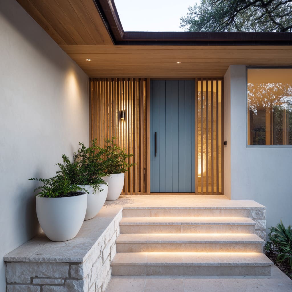
In modern porch designs, light plays a role without putting itself on display. The strongest effect often comes from what’s unseen—LED strips tucked under stair treads or slat panels, producing a soft lift instead of spotlighting.
This style of lighting doesn’t glare or dramatize; instead, it lets shapes float and lines sharpen after sunset.
A flight of concrete steps, for instance, becomes a stack of weightless forms simply by placing a warm strip beneath each rise. The same idea carries into wood slat screens: a subtle glow placed behind can give the illusion of depth beyond the door, almost like the light is coming from within the house.
In these cases, illumination isn’t a tool for visibility—it’s a cue for atmosphere. It adds tension between inside and out, form and shadow, but never announces itself loudly.
Stone and Wood in Measured Doses
Porch design in many modern homes relies on precise shifts between rough and smooth, matte and grain, to create visual stability. Few compositions commit to all-stone or all-wood cladding; the interest comes from the transition zones.
Pale limestone stacked in horizontal bands feels light and dry, especially when paired with upright cedar slats or golden-toned wood. This creates a contrast not just of color, but of orientation and surface tone—horizontal chill next to vertical warmth.
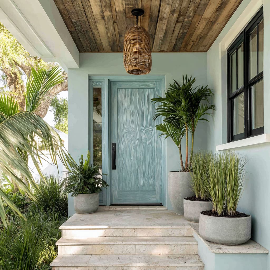
In other deisng ideas, you might see a split layout where textured gray blockwork fades into clean white plaster. That balance allows other features, like a brushed woodgrain door, to take focus.
By mixing materials without blending them too much, the porch holds tension that keeps it visually active.
Monochrome Frames That Edit the Scene
Sometimes, the shape around the door matters more than the door itself. A deep-set alcove painted in a close tone to the door can create a visual sinkhole, especially with navy or slate-blue finishes that pull in shadow.
This technique causes the front slab to almost vanish during certain daylight hours, making the surrounding textures and edges do the visual heavy lifting. In more open setups, dark framing outlines—often matte black or charcoal—enclose not just the door but its glass side panels, forming a kind of structured triptych.
These solid outlines do more than unify the parts—they act like camera borders, concentrating attention and blocking out distraction. It’s an understated method of composition, where the color isn’t flashy and the geometry stays strong through framing alone.
Quiet Asymmetry for Human Scale
Modern porches often lean into soft imbalance to make the entrance feel more grounded and real. The symmetry is relaxed—never fully abandoned—but shifted just enough to bring in a lived-in sense of ease.
A large planter might sit off to one side, its counterpart missing entirely or replaced by something lower and leafier.
A small tree leaning into the composition from one corner introduces an organic angle that breaks up the architecture’s straight lines without throwing the whole view off balance. This kind of visual offset doesn’t feel accidental—it’s anchored by repetition elsewhere.
The same wood tone might appear in both the ceiling and door, or a black planter may echo the trim or handle finish, making the whole arrangement feel coherent even without mirror precision. The effect is subtle: the space becomes approachable without losing structure.
Pattern Echo Across Elements
Design for modern porch entries rarely stops at the door—it spreads, repeats, and folds across different surfaces. One of the most refined techniques is echoing linear patterns across architectural parts.
A vertical groove on the door might align with narrow board siding, or lightly ribbed wall cladding may pick up where panel detailing left off. These echoes aren’t loud—they operate in texture and shadow, guiding the eye without pulling it in too many directions.
Even across materials, the rhythm continues. A door framed in vertical panels can sit under a ceiling where planks run at a clean right angle, forming a quiet grid that holds everything in place without adding fuss.
What seems like a simple layout becomes layered through repetition, where each part reinforces the other’s geometry. This rhythm, played out through lines and grooves, gives structure without needing ornament.
Texture-First, Color-Second Strategy
In many of the most refined porch compositions, the surface feel of a door takes priority over its exact tone. Rather than competing for attention through bright contrast, these doors often feature a visible woodgrain or brushed finish that gives them quiet presence.
The grain itself becomes the focus—a fine ripple that catches light differently across the surface, especially under natural daylight. To let that grain stand out, the surrounding materials take a step back.
Overhead, weathered wood planks in neutral ash or soft taupe form a ceiling that reads as warm but visually quiet. Below, honed limestone or softly speckled concrete works as a ground plane with no visual noise.
Even the walls flanking the door follow suit—smooth plaster or pale stone, with little texture and little gloss.
This muted backdrop allows the movement in the wood finish to do the talking, even if the paint sits within a neutral color family. Brushed blue with hints of gray, for example, becomes far more expressive when placed against still surfaces, giving the viewer a moment to pause and notice the subtle ridges and direction of the strokes.
In these cases, color supports the story—but texture leads it.
Conclusion
What defines a strong entry design isn’t how much it stands out, but how thoughtfully its parts relate. From grain direction to planter scale, from ceiling layout to stone texture, each decision contributes to a calm visual language that supports rather than competes.
These porches don’t rely on symmetry or bold colors to hold attention. Instead, they use careful shifts in tone, softened geometry, and lighting that draws the eye without glare.
Across different palettes and formats, one idea stays consistent: the best front porch designs pay attention to what surrounds the door just as much as to the door itself.

