Interior doors are no longer passive elements in a room. They carry surface, rhythm, contrast, and movement—without saying a word.
Their presence can echo the color of a nearby cabinet, reflect the lines of a ceiling beam, or balance a space that leans too far in one direction. Today’s stylish doors aren’t chosen for function alone—they’re chosen for how they shape the visual flow across materials, textures, and light.
Whether made of raw timber, frosted glass, or smooth composite panels, these surfaces often double as quiet design anchors. Some mirror the floor pattern.
Some break a pale wall with a line of bold shadow. Others disappear into the background until light catches the edge.
Every decision—grain direction, color tone, frame thickness, or hardware detail—pulls the room into sharper focus.

In today’s design trends, doors are taking on sculptural and compositional roles. They might be used to hide transitions, frame views, cast rhythmic shadows, or simply bring a surface to life through texture and repetition.
This article unpacks how subtle design choices in modern interior doors influence how a room feels, moves, and settles. Not through volume or statement, but through quiet clarity.

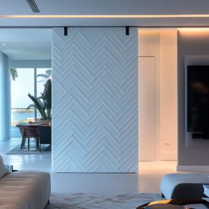
Grain as a Graphic, Not a Texture
In many modern inside door designs, the grain isn’t merely something to be seen—it becomes something to be read. A horizontal plank can carry the eye from one end to the other like a drawn line, and a centered knot might serve as a visual punctuation mark in an otherwise quiet surface.
Some door designs use this natural detail with near-calligraphic effect—fissures, radial swirls, or darker striations aren’t covered up, but positioned with clear visual intent.

This is especially noticeable in panels where the grain seems to echo other features—a black inset, for instance, can line up with a natural wood vein, creating a silent correspondence across the surface. In richer woods like walnut, the pattern flows with the softness of ink in water.
The result isn’t ornamental in the traditional sense—it’s measured, precise, and graphic. It creates visual weight in the space not through color, but through direction and texture density.
The grain acts almost like a quiet drawing embedded in the panel, giving modern design interior doors a rhythm that connects to everything around them.

Negative Space Wields Its Own Color
It’s easy to miss how shadows shape perception—especially in doors designed with vertical slats or repeated grooves. These slim gaps aren’t open-air voids, but crisp, dark lines formed by controlled spacing and light falloff.
The visual result is a stripe of charcoal tone that feels like an added material, even though it’s nothing but absence. These shadow lines show up most clearly in slatted designs that use pale woods—ash, maple, or oak—where every black line between each slat becomes a deliberate visual contrast.

And because these gaps repeat in perfect rhythm, they often echo other features in the room: slim black hardware, shadowed recesses under benches, or narrow baseboard gaps. It creates an impression that there’s a consistent additional tone in the space—even though it’s generated entirely through spacing and light behavior.
Ultra modern interior doors in this category tend to favor this strategy because it adds contrast without adding clutter.

Light Is Treated as a Moving Material
In some interiors, the door is the most active element—not because it moves, but because it lets the light move across the room in a way no other object can. Grid-style doors with square or rectangular cutouts often sit where sunlight pours in, letting those beams hit the floor and walls through the openings like a stencil.
As the light changes, so does the entire scene, with patterns shifting across the room throughout the day. Some sliding panels use fluted glass instead, which doesn’t allow a view but lets brightness pass through in softened vertical threads—blurring what’s behind while still filling the room with clarity.

These designs add a layer of motion to otherwise still materials: terrazzo, oak, or painted walls. It’s less about decoration and more about how light is filtered, caught, and thrown back across the space.
It turns the door into something more spatially active, almost like a moving shadow sculpture across time. This quality makes such panels especially useful in transitional zones like kitchens, laundry spaces, or hallways, where light often defines the mood more than color ever could.

Hardware as Quiet Typography
Small metal pieces can carry visual weight far beyond their size. In many modern interior design doors, hardware is used more like punctuation than function-first attachment.
A single brass inlay—neatly placed in irregular intervals—can read like commas on a wooden page, guiding the eye line by line, section by section. When these inlays break the surface rhythm, they don’t interrupt—they pace the surface.
And then there are handles with character.

A slim L-shaped pull in gold, for instance, can echo a golden accent stripe running along the door, forming a subtle two-part motif that feels quietly encoded. That soft correspondence between materials shows up again where a brass handle on a sliding mint-glass door mirrors a faucet or fixture nearby.
These recurring tones and shapes act as invisible lines connecting different corners of the room, helping the door become part of a sentence rather than just the boundary between thoughts.

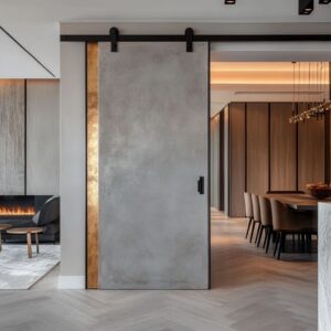
Disguised Thickness
What looks thin might be solid—and what feels heavy might only pretend. Visual tricks are everywhere in modern interior door ideas, especially in how volume is treated.
Pivot and swing doors are often set into deep shadow gaps, which erase the frame completely. What’s left is a sharp, crisp edge that reads like a wafer slice of material—but the moment it moves or opens, the eye realizes there’s real mass behind it.
On the other side of the spectrum, some doors build visual density by using layered or raw-edged planks. These surfaces create jagged shadows and fluctuating light depth, so even a door with standard thickness starts to resemble a sculptural block of lumber.
The weight is created through contrast—light fading into dark, textured next to smooth—not through bulk itself.

Color Echo vs. Color Interruption
Some doors want to blend in. Others want to bounce back.
In rooms where subtlety is the goal, doors can be treated like extensions of their surroundings. Pale cabinetry in soft green or fog gray flows uninterrupted across a wall—until movement reveals that one section slides open.
These are camouflage moves, where the door’s surface and the room’s backdrop speak in unison. But there are doors that do the opposite, quietly pulling light into their own surface and giving it back in a slightly altered form.

A pastel-toned glass panel, for instance, can reflect white cabinetry and terrazzo flecks like a gentle mirror, always shifting based on what stands in front of it. These reflections are never sharp; they blur, soften, and shimmer depending on the hour.
It’s a way for the door to stay responsive—neither fully silent nor loudly expressive. This balance between echo and interruption is what makes some color applications in modern interior door ideas feel especially considered without being theatrical.

Orientation Sets the Tempo
Direction isn’t decorative—it shapes how the space feels. Horizontal panels have a calming effect, especially when paired with wide, low furniture.
Their wide grain lines and soft breaks stretch the room visually, adding a quiet spread across the surface. One door might carry a slim horizontal black band—set deliberately low—to match the height of a bench, a shelf, or a line of flooring planks.
That band becomes a steadying point, pulling attention sideways in a narrow hall where vertical space might feel tight.

On the opposite end, vertical grooving or tall fluted cuts build tension upward. In rooms with low ceilings or heavy surfaces, these vertical elements act like visual scaffolding—lifting the eye toward the edge of the ceiling and away from floor clutter.
The contrast in pace between horizontal and vertical isn’t subtle—it directs movement, mood, and where a room feels like it ends. This effect is particularly clear in spaces with clean-lined finishes and modern interior house doors designed to carry their weight without added trim or noise.

Reclaimed Texture as Memory Layer
Age and imperfection hold quiet detail when used in the right places. Raw surfaces speak differently than smooth ones.
In rooms with refined finishes, a reclaimed door introduces texture that doesn’t feel chaotic—it feels grounded. When aged boards are kept low, such as under a sliding panel that meets a polished floor or a bedroom wall, they invite contrast rather than conflict.
Weather-worn grain running next to white bedding looks like a design choice, not leftover wear. In some setups, bark-edge planks run only as high as the table surface—stopping short before elbows or plates ever get close.

That placement keeps the story visible but the feel clean. The patina on these surfaces isn’t handled or smudged—it’s watched, like a framed texture in the wall.
Grain depth, faded stain, and knots remain intact, adding a quiet sense of time without shouting about it. In restrained color schemes, especially those built on pale floors and natural fabrics, this layer of aged wood becomes a visual anchor that doesn’t overwhelm but holds presence.

Visual Silence by Hidden Mechanics
Hardware disappears so the surface takes the stage. In many modern interiors, the engineering behind the door is removed from view.
Sliding tracks are buried in ceiling recesses, and pivot hinges are placed where no trim draws attention. What’s left is a floating panel—clean, precise, and uninterrupted by visible mechanics.
Such doors don’t demand to be admired for how they move; they prefer to be mistaken for a part of the wall until the moment they shift.

The visual quiet created by this hidden function lets the material, the tone, or the grain carry the identity of the piece. In some cases, that surface feels almost like a moving tile—same depth, same edge, same finish—just mobile.
This approach suits interiors with refined textures and tight material palettes, where any unnecessary visual component would feel out of place. Here, the modern interior door designs become part of the architecture itself, rather than something added to it.

Micro-Mirroring Between Door and Décor
Repeating forms in small ways connects the room like a sentence. Patterns don’t need to shout to make an impact.
Sometimes the lines cut into a door—a square lattice, a tight groove, or a slatted surface—show up again somewhere else. A piece of wall art might feature block shapes that echo the open grid of a sliding door.
A bench with vertical ribs might carry the same spacing as the slats carved into a nearby panel. Even tile striations in a backsplash can feel linked when they match the density of a door’s fluting.
These shared details don’t ask to be noticed immediately. They build a rhythm that runs through the space—a quiet visual thread that gives a sense of unity.
In interiors where materials are kept minimal and light plays a major role, these small repetitions act as bridges between separate elements, helping the room feel composed without relying on symmetry or bold contrast.

Key Ideas
Doors write more than transitions—they write movement, texture, and quiet structure. Across this range of ideas, one thing becomes clear: modern interior door designs don’t exist in isolation.
They’re shaped by the grain of the wood, the size of the gap, the line of the handle, and the shapes that surround them. A good door doesn’t ask for attention—it collects it slowly.
Its role isn’t only to divide space, but to shape how light falls, how rhythm flows, and how silence holds its form. Through this control of surface, shadow, and repetition, the door becomes the still point in a moving room.