In modern bedroom design, the blue wall has moved far beyond its past role as a decorative statement. It now works as part of the room’s structure—a surface that edits perception, adjusts scale, and tempers contrast without demanding focus.
Today’s approaches are less about bold tones and more about how blue interacts with material, texture, and light. Designers lean into shades that feel atmospheric rather than graphic—powdered blues, steel tones, smoky slate, and pale cloud variations—each chosen not only for color but for how it behaves across the day.
These blues aren’t flat or static. Their effect depends on context: grainy wood, matte finishes, soft textiles, brushed plaster, or low-sheen limewash.
Each finish shifts how the tone lands and how light moves across it.
Rather than isolating blue as an accent, many layouts weave it into the rhythm of the space. Some wrap the color around ceiling slopes or architectural niches, while others let it fade behind a coordinated arrangement of bedding, furniture, and shadows.
The result isn’t a highlight, but a tone that blends into the atmosphere—quiet but active, subtle but essential. In this article, the focus is on how modern blue walls behave as part of a larger composition, shaping space through tone and finish rather than decoration.
Whether deep and saturated or pale and diffused, blue continues to expand its role in design—not as a pop, but as a layer of movement, calm, or structure.
Blue as Spatial Architecture, Not Just Surface
Blue in modern bedroom designs isn’t confined to color—it reshapes how the space feels physically. It doesn’t behave like surface paint; it performs like a structural element.
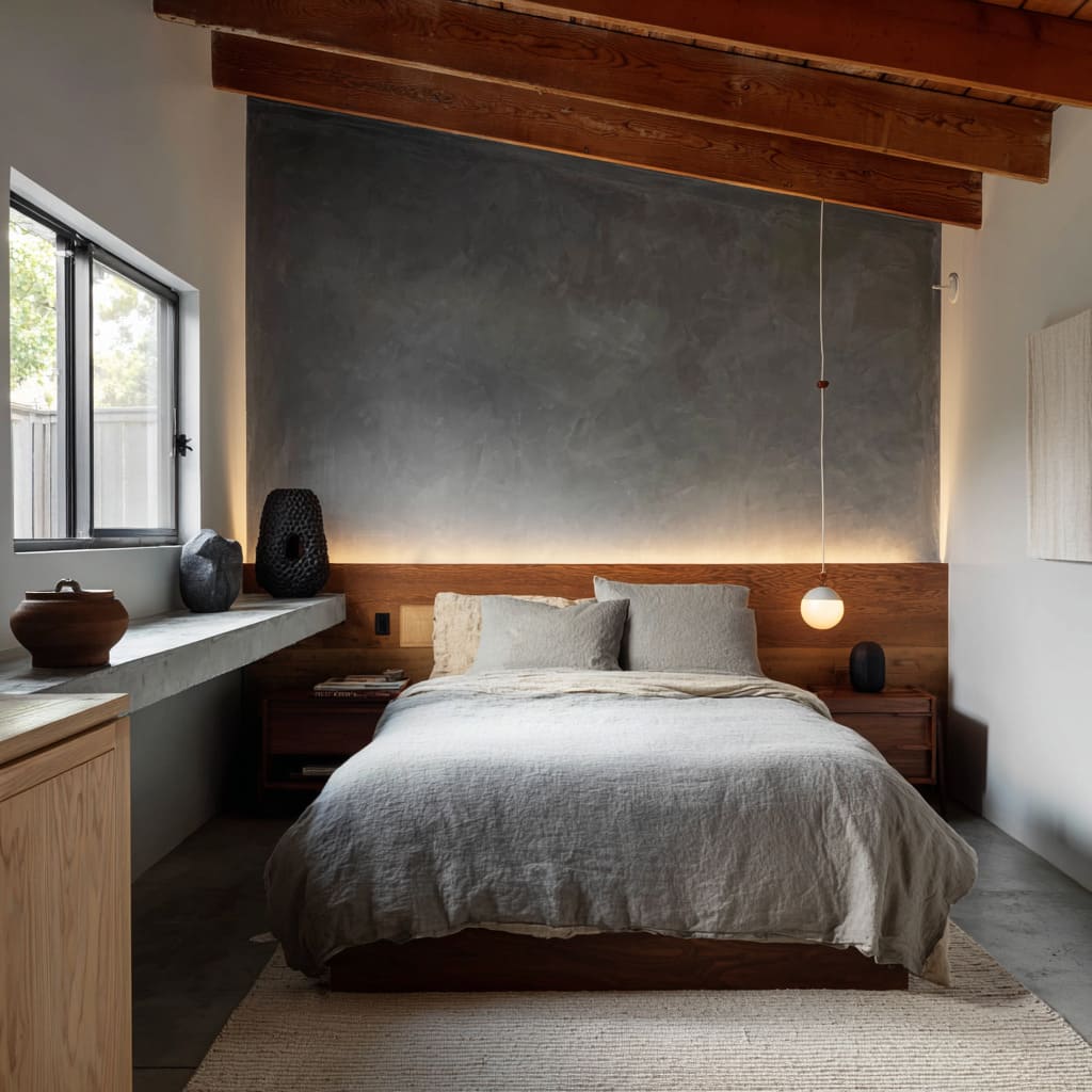
In steel blue alcove designs, the wall wraps around the headboard zone, enclosing the bed in a clean visual shell. This layout gives the impression of a recessed capsule—tight but clear.
The blue, with its cool tone and smooth surface, defines the entire bed zone, isolating it from the surrounding room without needing partitions or heavy decor. Its effect is sculptural rather than decorative.
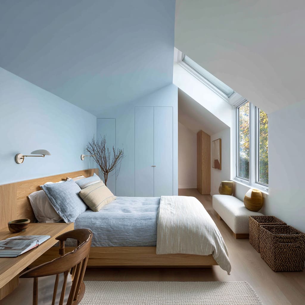
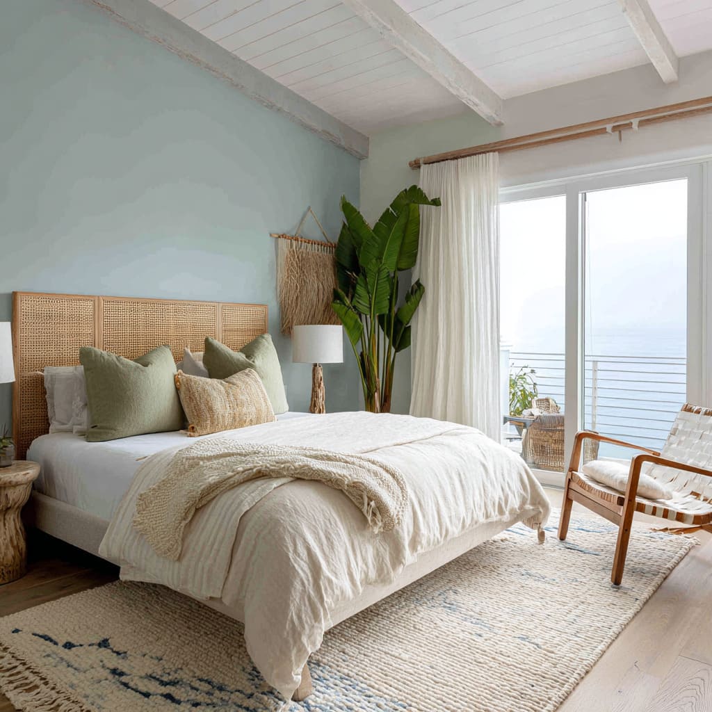
By contrast, in vaulted ceiling bedrooms with soft blue ceilings and walls, the color opens the space instead of enclosing it. The pale blue wraps upward and across the ceiling planes, pulling the eye along the roof’s pitch.
This shift in direction makes the room feel weightless and wide. The boundary between wall and ceiling fades, letting the room read as one continuous volume.
In both examples, the blue accent wall bedroom design operates like a spatial container or a sky—depending on its tone and direction.
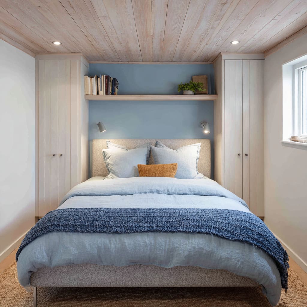
Meanwhile, in layouts featuring a recessed blue alcove, the color acts like a pocket inside the architecture. Framed by built-ins, the blue becomes a backdrop that deepens the sense of enclosure.
It doesn’t project into the room—it pulls inward, giving negative space a stronger presence. Similarly, slate blue matte walls with extended unbroken surfaces flatten the visual field and create soft enclosures without using trim or framing elements.
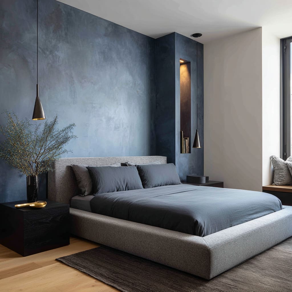
In graphite-toned accent niches, the effect is even more defined. The blue darkens within a narrow architectural inset, drawing attention to the niche’s shape rather than its content.
This gives the impression of depth carved into the wall—almost like a void that holds its own visual energy.
Key observation: Blue behaves like a sculptor. Through orientation, framing, and tone, it reshapes volume—sometimes compressing the bed area into a quiet frame, sometimes stretching the eye to give the room lift.
It’s the placement and shape of the color, not just the hue, that shifts how space is read.
Visual Weight is Disguised Through Color Density and Finish
Blues that seem heavy at first glance are often doing more subtle work beneath the surface. Their visual weight isn’t only about how dark they are—it’s also about how they move, absorb, or mute light.
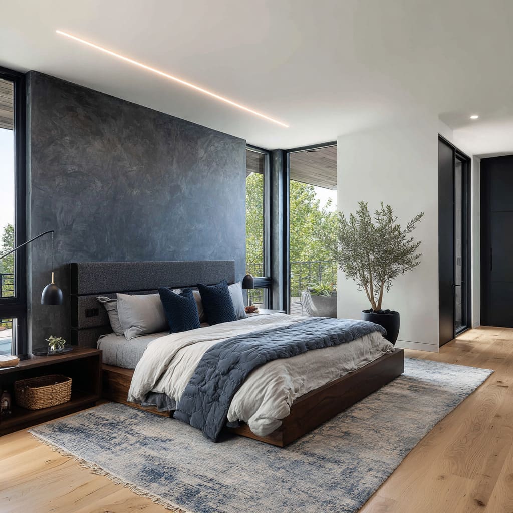
- In charcoal-navy walls, where the tone leans nearly black, visual mass is offset by how the room is styled. A low bed, wide layout, and soft lighting from cove fixtures above create a strong horizontal line that stretches the space. The wall feels deep but doesn’t compress. Similarly, dark brushed navy designs use a subtle grain in the brushwork to stretch the wall sideways. That faint texture redirects the eye horizontally, breaking up what would otherwise be a flat slab of color.
- Indigo plaster walls shift the effect again. Here, the blue carries sheen variation across the surface—sometimes glossy, sometimes matte—depending on light angle. This finish catches light in fragmented ways, introducing a kind of shimmer that moves as the viewer does. The wall reads as layered and touchable, not flat. It adds atmosphere without heaviness.
- In more nuanced settings, graphite blue and violet-blue accent walls show how controlled color shifts within a single surface reduce bulk. These walls don’t read as monolithic blocks because their undertones shift—soft marine, dusty violet, smoky slate—all folded into a single field. This layered color holds visual space without flattening or closing it.
Central idea: The density of blue is less about how dark it is and more about how it behaves in the room. Walls with visible tonal play and complex finishes distribute their weight.
They allow a dark shade to feel immersive rather than overbearing. In many of the best blue accent wall bedroom ideas, it’s the surface detail—not the pigment itself—that controls presence.
Blue as Atmospheric Echo, Not Central Focus
In many modern interiors, blue has stepped away from being a bold anchor and instead behaves like something ambient—part of the atmosphere rather than the foreground. This shift is subtle but deeply effective, and often missed unless the color disappears entirely.
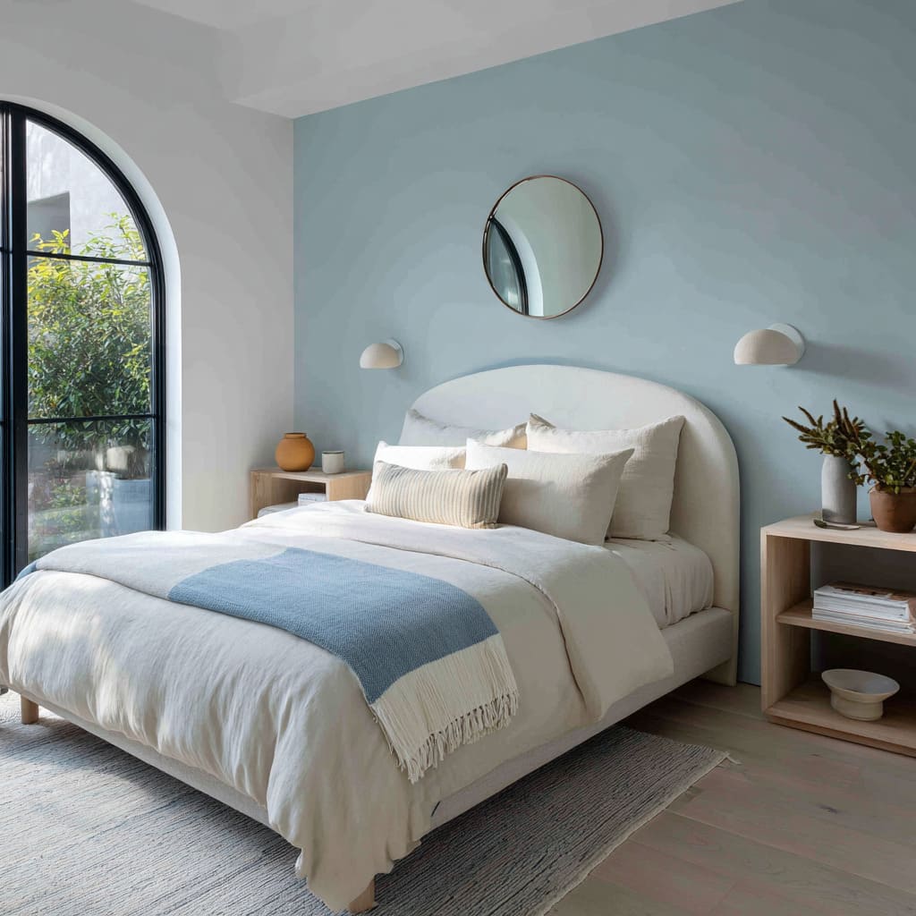
In rooms where whisper-blue tones stretch across smooth, flat walls, the effect is so faint it nearly dissolves into the air. The blue reads as a temperature shift or a change in the weight of light—not a color decision.
It’s often the most delicate element in the space, allowing other textures to hold presence while quietly framing the spatial feel.
Similarly, pale cloud blue applications, especially where the wall flows into the ceiling or cabinetry, don’t mark a stop or edge. Instead, they create volume that feels diffused.
The blue acts like the cool side of daylight—always there, never demanding. These tones make the entire space feel more continuous, as if wrapped in a quiet filter.
Misty cool blues, especially those set into niches or plastered alcoves, take this even further. Their pairing with earth-toned elements or light wood keeps them grounded, yet soft.
What makes them striking is their resistance to clarity. They’re not decorative accents.
They behave like background tone, a kind of visual silence. Blue-mist walls with layered tone and soft surface haze reinforce this effect.
These aren’t color fields that call attention—they behave more like air movement across stone or fabric. They fade in, they withdraw, and their visual softness sets the overall calm of the room.
One of the more delicate examples is the powdery silver-blue wall framed by built-ins, which acts like a faint echo of shape rather than a painted feature. It doesn’t emphasize any furniture or architecture, but instead supports all of it with a washed, ambient backdrop.
Standout feature: In many refined bedrooms, blue functions like temperature or time of day—hovering at the edges, never competing, always present. Its strength lies in how lightly it defines the emotional space without taking visual focus.
It’s these low-contrast blue feature wall bedroom ideas that often produce the most cohesive, grounded interiors.
Textural Illusion as Narrative Layer
Blue walls in modern bedrooms often do more than provide color—they tell a visual story through surface movement, shifting tone, and hand-worked variation. The effect isn’t simply tactile; it’s expressive, layered, and sometimes unexpected.
Take the faded cloud blue walls with uneven limewash or brushed finishes. These don’t sit still.
They drift across the surface with scattered trails, behaving more like weather than paint. A room like this doesn’t present a flat backdrop—it feels like it’s reacting to air, to shadow, to distance.
The surface can resemble distant fog on still water, or early morning haze across glass. This is texture as narrative, not decor.
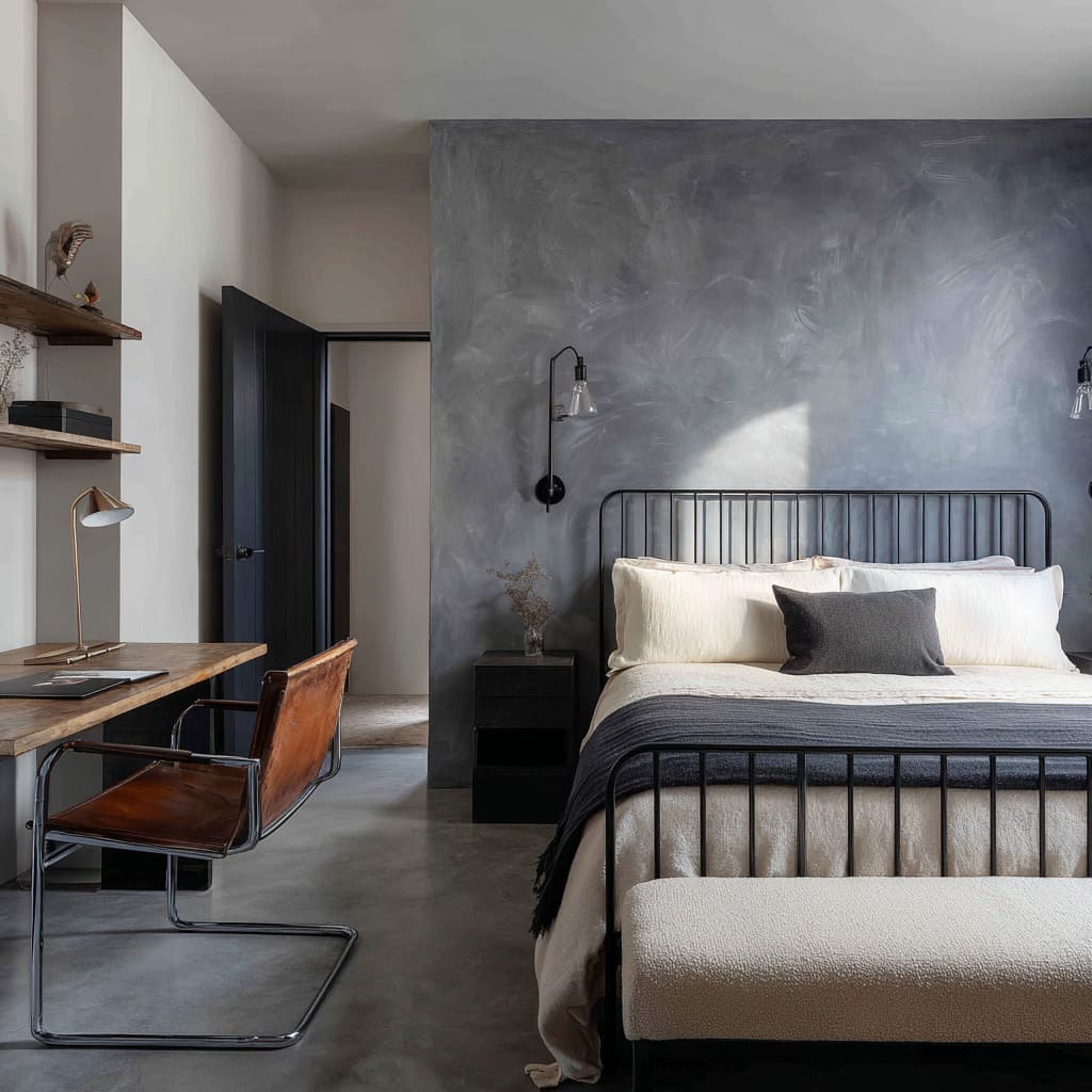
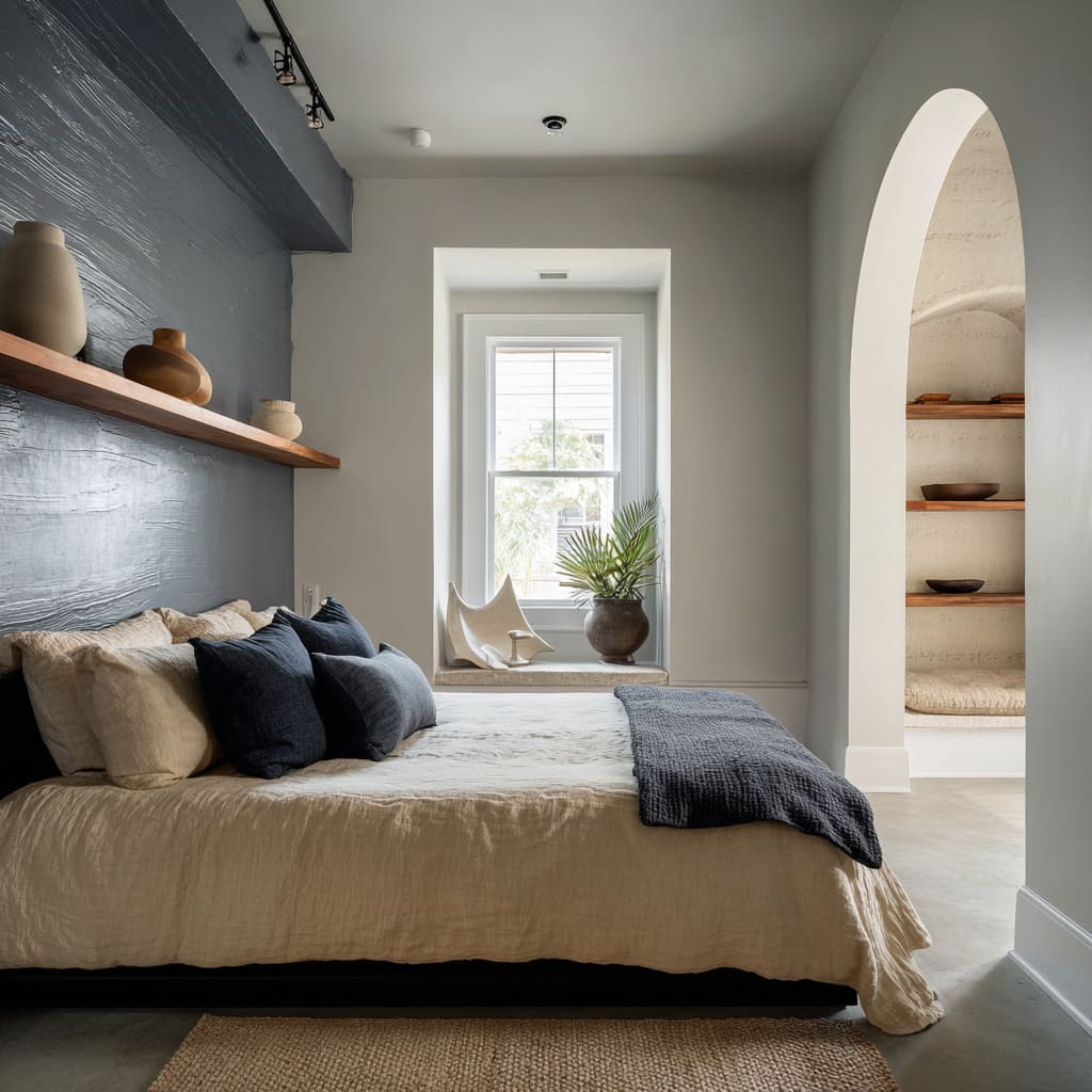
Smoky blue walls in Pueblo-inspired settings go further. The finish, streaked and clouded, mirrors aged stone or denim worn by time.
The tone carries a faded coolness, but the surface suggests erosion, sediment, or movement—natural rather than painted. It brings a grounded history to otherwise minimal rooms.
In other bedrooms, smoky blue plaster is used to soften hard geometry. Walls with shifting tone and visible brushwork create visual blur where light touches them.
Paired with straight furniture lines and minimal shapes, this diffusion stops the space from feeling too angular or rigid. The color doesn’t just cover—it reinterprets the edges of the room.
A similar effect happens in blue-mist brushed walls, where each visible stroke becomes part of a composition. The surface reads more like a mural done in fog than a conventional wall finish.
The blue seems to collect in some places, thin out in others, pulling the viewer’s attention gently across the space. Perhaps the most immersive example comes from a deep cloud blue plaster wall.
This type of surface, rich in layered pigment and slight sheen, can resemble dusk sky, polished slate, or the inside of a cool cavern. It holds weight without feeling solid, due to the complex interplay of shade and reflectivity.
Light grazes it rather than illuminating it directly, bringing a sense of atmosphere that remains quiet but intense.
Important note: Texture on blue walls becomes more than visual interest—it acts as a memory, a metaphor, or a hint of nature. These surfaces behave like mist, stone, wind, or sky—evoking feeling rather than commanding it.
In such cases, blue isn’t a flat tone—it’s a shifting surface that draws meaning from its imperfections.
Interplay with Other Elements Defines the Blue
Blue in bedroom design rarely works in isolation. Its presence often depends on the materials that surround it—the nearby wood grains, the color of bedding, the softness of fabrics, and even the structure of lighting.
These elements don’t compete with the blue. They shape how it is understood and felt.
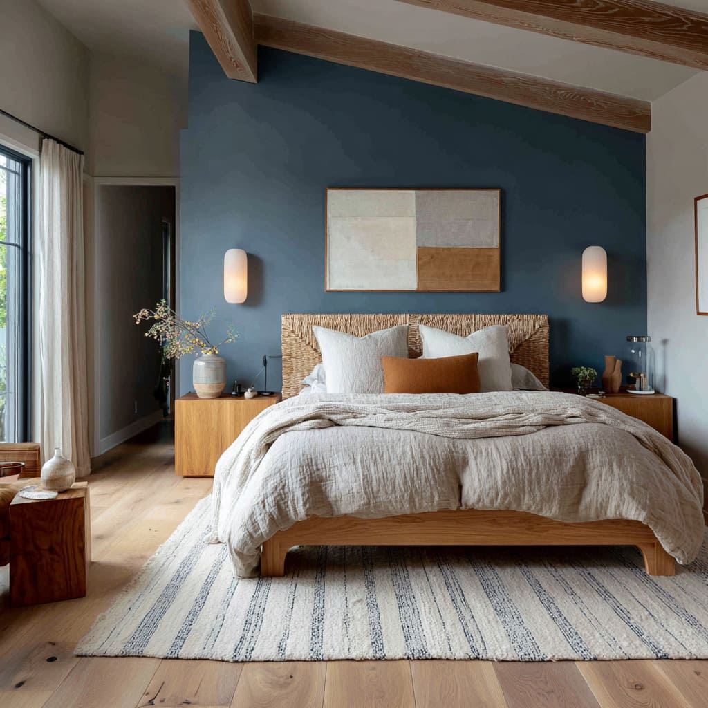
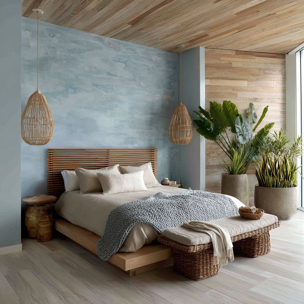
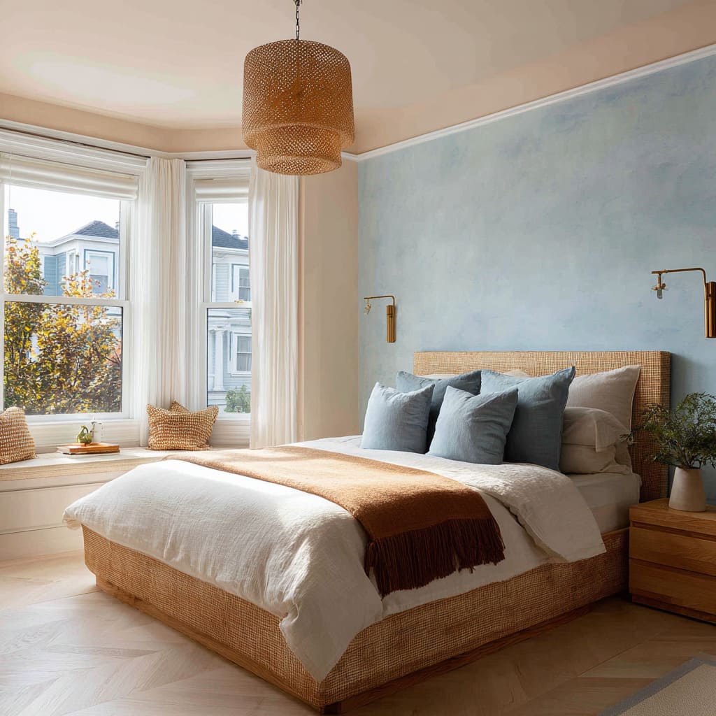
In rooms where raw wood tones meet cool blue walls, the contrast isn’t harsh—it’s calming. Oak, ash, or pale pine introduces warmth, balancing the cooler undertone of the blue and giving the space a grounded visual warmth.
This combination avoids sharp contrast by blending temperature and texture rather than relying on color opposition. The wood anchors the blue, not with weight, but with a steady rhythm.
Pale ceramics, soft-toned pottery, or woven textile details often sit near blue walls without standing out. Their muted presence refracts light in a way that breaks the blue into subtle planes.
This effect doesn’t brighten the room dramatically—it builds soft visual interruptions, like pauses in a line of thought, creating interest without breaking the tone. Bedding plays a quieter role.
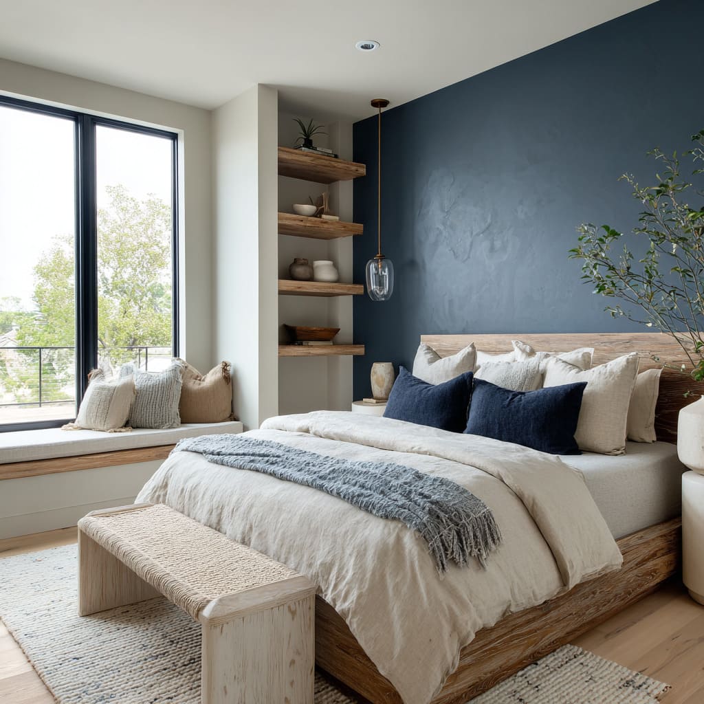
The most interesting blue accent bedroom ideas don’t repeat the exact wall shade in the sheets or pillows—they echo parts of it. A blanket in weathered denim, a cushion in dusty teal, a throw with blue-gray woven threads—these all pick up the wall’s mood without copying its color.
This mirroring creates a kind of rhythm across the bed and wall, allowing the eye to scan smoothly without any single point dominating.
Key observation: Blue reads differently depending on what surrounds it. The shape of a bed, the texture of a bench, the tone of a wood frame—all these details pull the blue into alignment with the rest of the space.
Its success often lies in this quiet interaction: a form of color that listens, echoes, and blends without disappearing.
Blue as Movement, Not Just Hue
Some blues are fixed—clear, crisp, always the same. But the most visually layered ones behave like moving surfaces, shifting based on time of day, angle of view, and type of light.
These aren’t flat tones—they are responsive materials that behave almost like fabric or sky. A steel blue finish often contains hints of gray or silver, but those hints don’t stay static.
In the early morning, the wall may feel cool and architectural. By afternoon, it softens under diffused sunlight, picking up faint warmth from surrounding furniture.
Its behavior is reactive—it moves with the light, creating variation without needing new colors. Deep dusty blues, especially in sloped ceiling spaces, can slide between marine green, muted teal, and shadowy navy depending on the way shadows fall.
This means the wall rarely looks the same across its surface. Some corners deepen into shadow while others stay calm, allowing light to sculpt the wall instead of flattening it.
This visual motion is often enhanced by plaster finishes, where the surface carries slight ripples or textural inconsistencies. The wall doesn’t move, but it gives the illusion of light changing shape across it—almost like how clouds pass across still water.
These finishes act like time stamps across the wall, recording brightness, overcast moments, or sunset glow, all without repainting. Violet-blue tones push this further, often sitting right on the line between two color families.
Depending on what’s around—green foliage outside, soft beige fabrics inside—they might appear more purple or more gray-blue. These tones don’t settle.
They stay open, responsive, and in motion.
Main takeaway: These blues carry time within them. They reflect passing hours, shifting light, and seasonal change.
They’re not simply color choices—they’re surfaces that hold and reshape mood throughout the day, giving each moment in the room a different visual weight.
Blue’s Role in Suppressing Contrast for Composure
In some bedroom designs, blue steps into a role that’s quieter than usual. Rather than acting as a focal point or dramatic gesture, it helps settle the space.
These are the rooms where contrast is dialed down, where every material, line, and tone leans toward restraint over impact. With ocean blue or clear sky blue walls, this sense of calm begins at the surface.
These hues are low in saturation and framed with minimal contrast—think pale bedding, soft wood, matte ceramics. In such compositions, the blue supports the setting rather than standing out.
There’s no racing of the eye from one point to another. Instead, the gaze slows down, encouraged by the evenness of tone.
A linear medium blue wall, especially one intersected by a narrow window or extended headboard, moves horizontally rather than vertically. This movement doesn’t build tension—it spreads it evenly.
The layout feels longer, flatter, less vertical. That shift makes a room feel more grounded, almost like it’s been flattened by design in the best possible way.
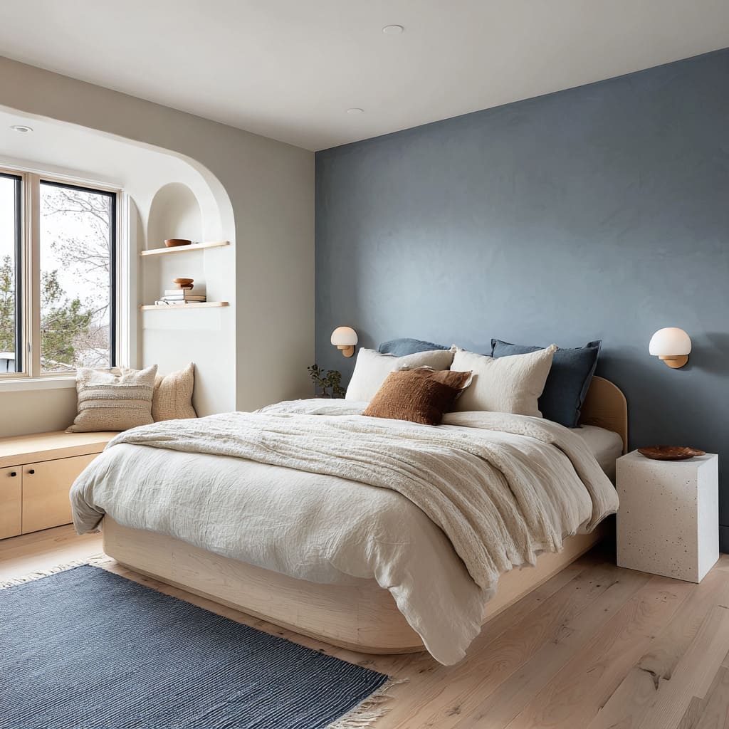
In rooms featuring soft slate blue walls, there’s often a tight coordination with the furniture. Creams and pale woods are tuned precisely to avoid pushing the blue into the background or forward into focus.
What happens instead is a suspension of contrast—nothing stands out too sharply, but nothing disappears. This gives the entire room a kind of effortless weightlessness.
These ideas can be found across a wide variety of bedroom blue accent wall ideas that lean into composure. They do not chase boldness.
Instead, they settle into visual rhythm and quiet repetition, allowing form and material to feel unified without looking controlled.
Notable detail: Blue, in these rooms, acts as a soft anchor—muting contrast, organizing tone, and keeping everything aligned without sharp breaks. The wall doesn’t compete—it conducts.
Strategic Disruption Keeps Blue From Feeling Staged
While restraint offers calm, too much coordination can make a space feel overly polished. That’s why some of the most effective blue bedroom walls carry small, irregular details that stop the setting from feeling frozen.
A single orange or ochre pillow on a cool-toned bed can punctuate a washed blue wall without interrupting it. The contrast is small, but it breaks the repetition and gives the palette a sense of movement.
These additions don’t pull the room into color clash—they stretch the tone gently sideways.
Organic forms—a leafy plant, an asymmetrical vase, or a raw wood bench—disrupt geometry in a useful way. Blue walls, especially those that are even and flat in finish, can start to feel too architectural.
A soft, natural curve or texture against that backdrop pulls the scene out of alignment slightly, which helps avoid stiffness. Lighting also plays a role.
When accent lights are placed slightly off-center or are adjusted to graze the wall at an angle, they introduce uneven highlights that shift the mood. A single pendant that glows warmly near one edge can change the entire perception of the wall’s tone.
It’s not about dramatic light—it’s about adjusting where the eye lands and rests. Without these small breaks in the visual flow, blue accent walls can start to feel like a set—too coordinated, too closed.
What works better is an offbeat note, one visual exception that keeps the room from becoming a stage.
Core insight: What gives a blue wall depth isn’t only the color or finish—it’s the interaction with one slightly unexpected element that reshapes the whole room. It’s this controlled disruption that turns a planned composition into a lived-in space.
Conclusion
A blue wall in today’s bedroom design does far more than provide contrast or highlight a zone—it becomes part of how the entire space breathes and moves. The most refined uses of blue don’t seek attention.
Instead, they fold into the room’s atmosphere, reshaping volume, directing light, and pulling materials into rhythm. What was once treated as an accent is now an ambient layer woven into architecture, not superimposed over it.
These walls carry tone, yes—but they also carry time. A dusty blue that feels cool at sunrise may carry warmth by dusk.
The same surface can read as stone in one moment and as sky in another. This quiet changeability gives blue a unique place in design.
It doesn’t perform. It listens to what’s around it—the grain of wood, the softness of linen, the depth of shadows—and responds accordingly.
The most successful blue walls often fade into structure, dissolve into shape, or subtly challenge symmetry through irregular finishes, unexpected lighting, or soft shifts in hue. They don’t fight the space.
They let it slow down, stretch, settle.
Final thought: Blue has stopped behaving like a spotlight—it behaves more like a lens. It lets other materials hold their own while softly shifting how they’re seen.
In the best compositions, blue doesn’t fill the room. It tunes it.

