The most memorable classical interiors rarely need to explain themselves. They don’t rely on trends or statement pieces.
Instead, their strength comes from a quiet structure—a composition built on rhythm, restraint, and subtle control of space. These are designs where proportion leads, where the warmth of limestone, the hush of panel moulding, and the soft weight of symmetry form the foundation.
What appears simple at first glance is often shaped by small decisions: how a pendant lines up with a coffee table, why a fireplace groove repeats in the upholstery seams, or how a single branch interrupts a room’s grid just enough to soften it. Each of these elements holds space without shouting, and together, they form interiors that feel settled without feeling static.
This article explores the visual techniques behind these spaces—the surface-level calm that’s carefully built from alignment, shape memory, and a limited palette. Not a focus on individual pieces, but on the visual threads that tie them.
From rooms in historic neighborhoods to new homes with classic proportions, these ideas still shape some of the most lasting interiors across styles and locations.
Architecture as Silent Rhythm
Panel grids as tempo-setters
In many classic living room ideas, the role of wall paneling goes far beyond surface embellishment. Square or vertical panel moulding often establishes a kind of internal rhythm—a subtle visual pacing that gently organizes the space.
Instead of drawing attention with color or flourish, these lines become part of the room’s background structure. The panels cast soft shadows that move with the light, letting the eye read the walls almost like a graphic score.
This rhythmic pattern quietly encloses the room, making every furnishing feel intentional in its place, not drifting in an undefined volume.

Coffered ceilings as weight equalisers
Ceiling design is rarely the first thing people notice, but in many refined interiors, it’s what holds the composition together. Coffered ceilings, especially those painted in a single tone, act like anchors suspended above.
The beams and recessed sections—kept in matching shades—flatten the ceiling plane and help distribute visual weight evenly throughout the room. This is especially effective in spaces with large fireplaces or tall vertical features.
The coffered structure prevents the eye from feeling top-heavy, creating a sense of groundedness even in rooms with generous scale. In classic contemporary living room design, this kind of ceiling detail offers depth without demanding attention, allowing other elements—like texture or symmetry—to take the lead.

Formal Symmetry with Micro-Offsets
One object withheld
There’s a quiet visual strategy that repeats across many classical compositions: leave something out. When a pair of arched niches appears on either side of a fireplace or wall, one is often left partially bare—or entirely so.
The absence isn’t a mistake. It gives the room pause, a moment of visual silence that keeps the balance from turning rigid.
That negative space allows surrounding elements to breathe and adds a subtle sense of movement without disrupting the core symmetry.

Soft misalignment
Symmetry doesn’t have to mean rigidity. Often, a classic room will feature chairs that don’t sit in perfect mirror position relative to the central seating piece.
An armchair pushed slightly forward or angled just off-center adds a touch of informality that avoids the overly staged look of showroom arrangements. These minor shifts maintain the room’s structure while softening its posture.

Branch as gentle rebuttal
In a space where every edge is square and every piece feels measured, a tall branch can become the room’s softest voice. Positioned at an angle in a floor vase, it moves against the room’s axial logic—bending where the walls stand straight.
This organic note, even when dry and minimal, introduces a quiet irregularity that breaks any sense of staging. It’s a detail that’s easy to overlook, but when noticed, it changes the whole tone of the space.

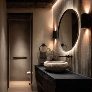
Stone Treated as Fabric
Chamfered or fluted fireplace faces
In some of the most refined interiors, stone begins to act less like structure and more like surface textile. This transformation happens not through overt shaping, but through the subtlest carvings—linear flutes or narrow chamfers that catch and fracture light across their depth.
These grooves are often so fine that they shift with the light, creating a sense of movement across the fireplace even when the stone itself is still. What might first appear as pattern is actually shadow at play, grazing over the stone’s surface like light over ribbed silk.
These sculpted surfaces lend an almost tactile softness to the material—crisp to the eye, but never cold.

Irregular edges and mineral inclusions
There’s something quietly powerful about letting stone remain slightly raw. In classic living room design, a chiseled edge or a vein that trails off into translucency becomes part of the room’s visual character.
Rather than sanding down the individuality of the slab, these features are kept, turning mineral quirks into decorative subtleties. A fossil mark or cloudy swirl might sit low along the hearth, half-hidden, yet it adds the kind of layered richness that feels collected, not produced.
These aren’t mistakes—they’re moments of textural quiet that soften what could otherwise feel overly composed.

Monoliths That Hover
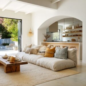
Block-like coffee tables with lift
Across many modern classic minimalist living room ideas, one recurring piece continues to evolve: the heavy stone coffee table. But rather than pressing the room down with their mass, these tables are almost always given a shadow gap—a way to appear lifted.
This is achieved in multiple ways: a dark-stained recessed base, a plinth with setback legs, or even a hollowed underside that hides its own weight. The result is visual suspension.
The stone becomes an object that grounds the space without dragging it down. The contrast between density and float gives these tables their quiet presence.
Their forms are usually square, slab-like, and free of detail, but their proportions are deliberate. A soft-edged travertine block with just enough lift beneath can balance a room full of texture, acting like a pause in the visual rhythm.
These monoliths don’t shout; they hover.

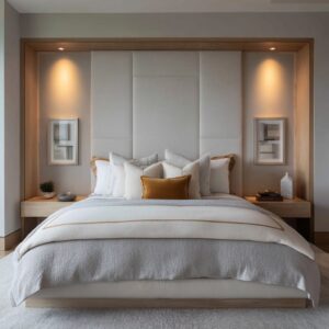
Tone-on-Tone Palettes as Light Shaping Devices
Color used as surface structure
In many refined interiors, contrast isn’t the main event—it’s the absence of it that does the work. Tone-on-tone palettes, especially those moving through chalk, ivory, bone, and pale sand, allow light itself to shape the space.
With these whisper-toned layers, furniture silhouettes become more than objects—they shift into reliefs. Daylight slices across soft surfaces and sharp angles, casting low shadows that sketch the room’s volume with quiet clarity.

This effect becomes even more pronounced on structured forms like panel moulding or stone fireplace frames. In strong sunlight, a cream-on-cream wall can hold the same kind of visual interest as a patterned wallpaper—but in movement rather than in print.
The beauty lies in how subtly those gradations behave. It’s one of the enduring traits across classic sitting room ideas: atmosphere sculpted not by boldness, but by control over contrast.

Dark accents as rhythm markers
In rooms that use restraint as a palette, the few darker elements take on extra importance. Espresso-stained floorboards, slim charcoal plinths under coffee tables, or a black iron base tucked beneath a pale stone slab—these insertions act like punctuation.
They break the visual sentence of neutrals with clarity and intention. Often, these dark forms aren’t centered; they appear underfoot, at the base of seating, or off to one side.
Their purpose isn’t to dominate—but to anchor, letting all the soft tones around them land with quiet precision.

Lanterns, Orbs, and Drums: Soft Geometry Over Hard Lines
Gentle overhead forms
Ceilings often bring the strongest architectural grid into a room—beamed patterns, panelled zones, or geometric moulding. And because of this, light fixtures suspended from above have an opportunity to do something different.
That’s where the decision to use rounded shapes—fabric-lined drum pendants, frosted globes, or softly woven lanterns—matters more than expected. These light sources bring curvature into a setting where most lines run straight.
Their edges blur rather than cut. They glow instead of glitter.

Across spaces with classic design roots, this circular softening effect often becomes the only visual curve in a room full of right angles. A glowing orb above a square coffee table, or a large drum pendant floating under a coffered ceiling, introduces a quiet sense of contrast—not in color or material, but in form.
The shift is subtle, but the room feels less rigid because of it.

Wireframes instead of chandeliers
Even in spaces where classical references remain strong, the lighting often sidesteps weight. Traditional chandeliers—those heavy scrolls of bronze or crystal—are reinterpreted.
You’ll often see versions where the frame is slim, sometimes hollow, reading like a line sketch hung in the air. These pieces don’t carry the full volume of historical shapes; instead, they trace them.
That negative space lets light and shadow pass through without interruption, giving the ceiling some air even as it stays structured. It’s a refined way of maintaining presence without pressing down.
The room holds its stature, but still breathes.

Fluting Without Columns
Fluting, once the defining feature of grand classical columns, now quietly reappears in a far more fragmented language. Instead of towering structures, it hides in smaller gestures—stone grooves carved into mantels, vertical wainscoting lining the lower walls, or even in pleated fabric pendants suspended over the center of the room.
Each of these details borrows from the same ancient idea, but translates it with subtlety, letting texture speak where form once did the work.

This dispersed approach turns the column into texture—a soft vertical repetition rather than a structural symbol. In some spaces, the grooves on a stone surface may only be a few millimeters deep, yet they catch light with precision.
On wood, narrow panel lines form quiet grids that suggest structure without needing to dominate. And in fabric lighting, pleats can soften the ceiling while still holding visual rhythm.
This is the quieter face of classic design ideas, where heritage is absorbed rather than declared.

Subtle Echoes Between Furnishings and Architecture
Invisible alignment across materials
Some of the most cohesive interiors owe their sense of order not to color or symmetry, but to shape. Repetition—even in forms that cross different materials—can tether a space together without being obvious.
Take a moment when firebox herringbone lines mirror the weave of a nearby rug. They may not share scale or surface, but their repeated angles match just enough to feel related.

Mirrored profiles across pieces
Elsewhere, a stepped mantel profile might find its counterpoint in the plinth of a stone coffee table. These design echoes stretch across eye levels—one high, one low—yet they reinforce each other like echoes across a room.
The mind catches these connections subconsciously, translating them into a sense of calm and structure.

Curves as shared language
The arc of a niche may meet its reflection in the soft back of a rounded armchair. The same curvature could appear again in a light fixture overhead, tying vertical, horizontal, and overhead zones into a loose but recognizable pattern.
These are the quiet threads that tie interiors together without ever stating their case outright. The viewer may not spot them immediately, but the atmosphere they create is unmistakable—grounded, cohesive, and visually resolved.

Curated Silence on Shelving
Tone before function
In rooms that follow the most refined approach to classic design, built-in shelving rarely performs like a library. Instead, it behaves more like a controlled canvas.
Color is hushed down—spines of books are turned inward, objects are chosen for their finish more than their origin, and every tone echoes what surrounds it. Shelving here becomes a study in subtlety.
Ceramics in soft off-whites, wood bowls in pale ash or warm walnut, and stone objects in matte finishes repeat themselves gently from one niche to another.

Space as visual material
Equally important is what isn’t placed. Open shelf bays often remain one-third empty, not out of indecision but as a compositional rule.
This deliberate spacing isn’t about minimalism; it’s about rhythm. Void becomes part of the design language, offering rest between clusters of texture.
The gaps allow each item to stand on its own, while also helping the whole wall feel lighter. These shelves aren’t filled—they’re paced.

Organic Motifs as Soft Counterweight
Branches over blossoms
Floral arrangements tend to bring too much color and density into a space driven by architectural balance. That’s why branches take their place—tall, irregular, and slightly unpredictable.
A single arc of bare limb in a clay vessel adds gesture without clutter. It curves where the room is straight.
Its shadow stretches across clean walls and becomes part of the spatial design. In settings full of measured lines, that unruly shape becomes a quiet counterweight.

Fan-shaped greenery with architectural memory
Dry palms, pampas grass, or even oversized fern fronds find a different role. Their wide, radial forms loosely echo architectural elements like arches, niches, and rounded ceilings.
Placed above a fireplace or standing tall in a corner, they reflect the geometry around them but soften it through their texture. Their muted color keeps them from disrupting the room’s tonal discipline, yet their form has presence—just enough to break the grid without stepping outside it.
These gestures of nature—raw, subtle, and sculptural—bring balance to interiors that might otherwise tip too far into structure.

Rugs as Atmospheric Filters
Edges that fade, not frame
In many classic interiors, rugs aren’t used to define zones—they’re used to soften them. Instead of bold borders or contrast-driven patterns, these rugs taper out at the edges, almost dissolving into the flooring beneath.
It’s a visual technique that blurs the limits of furniture arrangements and allows rooms to breathe. That soft gradient at the perimeter avoids harsh cutoffs, letting the floor and rug become part of the same quiet layer.

Reflective sheens that shift with light
Many of these rugs also have a muted, near-monochrome finish—subtle enough to catch changing daylight but never loud. Their surface works more like a veil than a field.
A passing shadow, a low-angle morning sun—these moments animate the texture, creating ghostlike patterns that drift across the weave. Nothing shouts, but everything moves.

Motifs remembered, not displayed
In some cases, the patterning is drawn from folk sources, but filtered through time. A grid of medallions or a vine motif may appear in barely-there ink-wash tones—gray on gray, tan on beige.
They feel like memories more than prints. This approach lets the rug carry weight without making a statement, letting other textures in the room lead.

The Quiet Power of Alignment
Lines that go unnoticed—but hold everything
It’s easy to credit color, furniture, or material for a room’s balance, but often, it’s the hidden structure that holds everything in place. Alignment—precise, quiet, and rarely called out—is the silent organizer in many refined interiors.
A wall sconce that aligns with a window mullion. A pendant that falls exactly to the midpoint of the coffee table.
Shelves that echo the height of a nearby cushion seam. These moves happen behind the curtain, but they build the harmony you feel without ever needing to name it.

Muted tones make alignment visible
Because the palettes in classic rooms often run low-contrast, alignment becomes the mechanism that defines space. In louder rooms, the eye jumps from color to color.
Here, it follows line. You feel the verticals repeating, the horizontals stacking in gentle rhythm.
It’s this network of invisible guides that gives structure to softness, and stillness to space.
Closing Insight
What gives these spaces their weight isn’t volume, it’s restraint. The strength in classic design lies not in how much is added, but in what’s removed at the right moment.
Mass is shaped by light, not color. Ornament is pared back to grooves, shadows, and subtle shifts in surface.
Balance comes not from symmetry alone, but from fine-tuned echoes in form, tone, and scale. There’s no single object that defines the composition—each piece contributes to a quiet discipline.
Alignment, negative space, fluting, and low-sheen texture become the tools for order. Even a branch or a rug can participate in the structure, bending or softening just enough to shift the mood.
These interiors aren’t static—they’re paused. In the end, the most lasting impact comes from what isn’t forced.
From rooms that rely less on instruction, and more on tension, silence, and restraint that holds its shape.