Even the smallest corner near an entry can offer more than pure function—if shaped with the right materials, rhythm, and visual clarity. Today’s modern mudroom isn’t defined by its square footage.
Instead, it’s shaped by how well its surfaces relate, how light is directed, and how utility blends quietly into composition. In compact layouts—whether nestled under a staircase, carved into a side wall, or framed by cabinetry—certain patterns begin to appear.
Vertical lines lend structure, tonal palettes reduce distraction, and subtle objects are placed less to fill space and more to mark balance. Instead of layering decor, such spaces rely on absence, shadow, and precise spacing to express character.
This approach is especially visible in homes where storage needs remain high but visual noise is kept low. The goal isn’t to hide function—it’s to let it live within a clearly defined visual system.
From wrapped surfaces to curated lighting to softly curved edges, the most memorable spaces are built with a measured hand. What follows is a closer look at the design language shaping today’s compact mudrooms—where form is sharpened, materials stay quiet, and small areas gain presence through rhythm and restraint.

Guiding the Gaze with Calculated Linework
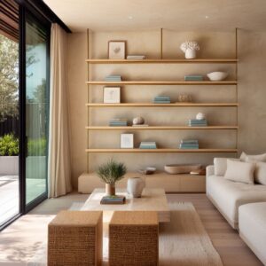
In compact entry zones where square footage runs tight, visual flow becomes the most valuable tool. Across a wide range of tiny mudroom ideas, one repeated visual cue takes the lead: linework.
But this isn’t merely about surface decoration—it’s about control, rhythm, and how a wall can suggest more space than it occupies. Vertical elements, such as fine wood slats, ridged panels, or full-height cabinet doors, serve a clear role.
They draw the eye upward, making the space feel taller and more defined. This verticality becomes even more effective when echoed on surrounding surfaces—like the ceiling or sidewalls—where the repeated grain or flute forms a continuous visual enclosure.
It’s this upward gesture that subtly shifts perception, turning a built-in nook into something closer to an architectural volume. At the same time, horizontal cladding—like wide-set slatted panels, wall planks, or board-and-batten treatments—acts to stretch the space laterally.
This method is particularly striking when paired with contrasting verticals, such as a mirror or tall cabinet right next to it. That play between opposing directions helps the viewer’s eye move across and up, momentarily bypassing the true limitations of size.
Even in very small mud room ideas, this structured push and pull between verticals and horizontals introduces a kind of graphic architecture. What emerges is not just a wall, but a spatial diagram drawn in wood grain and shadow.

Shadow Gaps as Negative Jewelry
In some of the most carefully considered built-in benches, it’s the absence of material—not the material itself—that shapes the strongest impression. A slim shadow gap, that tiny dark line carved between surfaces, becomes a visual pause.
It slices between cabinetry and floor, or between bench and wall, and the result is clarity. These gaps act as a kind of negative outline, defining form with contrast rather than mass.
The most impactful of these benches often appear to float—suspended in place by nothing more than their crisp relationship to light and void. The eye reads these separations instantly: bench above gap, cabinet above bench, floor below all.
This stacked rhythm of solids and slivers builds a quiet hierarchy. It clarifies how each layer of the space fits together.
No ornament is needed; the refinement lies in restraint.

Much like the outline of a fine drawing, these negative spaces sharpen every nearby surface. A thick walnut bench, for example, feels lighter with a soft reveal underneath.
Likewise, dark cabinetry can feel less bulky when lifted off the ground by a low line of shadow. And when this detail is repeated—from under-bench voids to recessed ceiling reveals—it creates a spatial language that reads as composed and precise.
It’s a method especially powerful in tiny mudroom ideas where visual weight must be distributed with care. Each small gap shapes the whole, quietly marking boundaries without visual interruption.

Light That Draws, Not Floods
In compact interiors, the placement and character of lighting carry more weight than wattage. Many small mud room designs avoid broad ambient glow in favor of tight, directional lighting that acts more like punctuation than paragraph.
Rather than lighting the entire area at once, specific elements are highlighted, allowing the viewer’s attention to move with intent. Warm-toned LED ribbons, often tucked subtly above slatted or fluted walls, do more than illuminate—they trace the texture, turning grooves into visual rhythm.
The glow doesn’t shout; it grazes. Every ridge catches just enough light to appear etched, creating a wall that seems active even when untouched.

In other spaces, under-bench lighting becomes the defining move. Casting a clean line across the floor, this detail gives the bench a floating appearance while forming a gentle echo in its reflection.
It’s a simple move, yet the effect is layered: mass is lifted, shadows are drawn out, and the floor becomes part of the visual structure. Then come the focused accents—picture lights, gallery-style sconces, or off-axis wall fixtures—set to direct beams at textured panels or key zones.
These lights do not simply brighten the area; they assign importance, the same way an art curator places a spotlight over sculpture. That sense of directed focus gives even a modest entryway the feeling of intentional form.
It’s not about flooding the room. It’s about drawing the eye, framing the view, and creating depth through restraint.

Curves as Soft Interruptions
In spaces where straight lines dominate—benches, cabinet edges, vertical grooves—a single curve can shift the entire tone. These rounded details serve a crucial visual role: they interrupt tension, ease the rhythm, and soften the frame.
One finds these soft shapes tucked deliberately into an otherwise angular setup. A circular bowl on a flat bench.
A half-moon hook on a slatted wall. A globe pendant casting a diffused glow.
Each of these reads like a pause between staccato notes. They aren’t loud statements, but quiet breaks that reset the structure.
The impact becomes clear when seen against gridwork—slats, grooves, tiles—where even one rounded edge can stop the repetition from becoming too rigid. In pebble beds beneath benches, in arched mirror frames, or in the slightly puffed edge of a linen cushion, roundness introduces breath.
These forms give physical softness, yes, but more importantly, they add visual rhythm. They slow the viewer down.
In compact rooms, this matters. It lets the corner feel settled, even if the layout is tight.
What emerges is a more grounded vignette—less like a utility box, more like a composed space with thought in every radius.

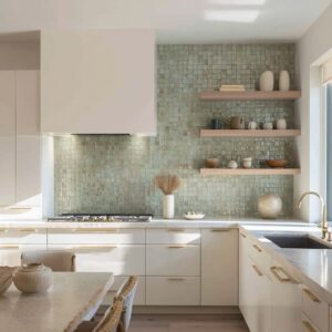
Tonal Layering Over Color Contrast
In compact mudrooms, palette decisions often favor depth over drama. Rather than depending on strong color contrast, many of the most refined compositions are built from minute shifts within a single color family.
It’s not beige versus blue—it’s plaster next to limestone, blonde oak beside wheat-toned linen, or graphite layered onto charcoal. These micro-gradations give the eye just enough movement to stay interested, but never so much that the space feels cut into visual chunks.
Especially in confined layouts, too many sharp transitions can make the room feel broken apart. Tonal layering allows surfaces to breathe into each other.
This method also lets texture become the primary focus. When one material nearly matches another in tone—say, a pale rattan bench cushion on a light wood base—the differences in weave, grain, or finish rise to the surface.
What looks flat in photos often reveals dimension in person. In many of the most compelling small mudroom decorating ideas, this muted approach gives the space a grounded feel, letting practical elements stay functional without appearing purely utilitarian.
It also allows small details—like a soft rug or matte ceramic—to stand out more precisely because they don’t shout.

Quiet Shine: Brass and Limestone
In small spaces, shine is rarely about reflection—it’s about restraint. Where metal or stone makes an appearance, it’s often in its softest, least polished version.
Brushed brass hooks, for example, read as a muted warmth rather than a sparkle. They catch just enough light to outline shape, never to steal attention.
The same goes for limestone. Its natural variation and chalky surface lend it a quiet presence, often bridging the gap between cool concrete tones and warmer wood elements.
It works as a grounding material—solid, stable, but not imposing. When limestone is used as a bench surface, backsplash, or floor tile, it shifts the mood from plain utility to a space that holds weight and subtle character.

Occasionally, a thin gold tray, a brass-edged pendant, or a narrow door pull enters the scene—not to gleam, but to complete the visual sentence started by more textured surfaces. These touches are more accent than feature, keeping the overall language calm while adding contrast in finish rather than in color.
Used this way, shine doesn’t dominate—it acts like punctuation, highlighting edges, catching moments of daylight, and softening the transition between matte and grain. The result is a space that reads rich without relying on gloss or glitter, where even the smallest hardware feels like it belongs to the overall material conversation.

Objects as Beats in Visual Rhythm
In the most visually composed mudrooms, accessories are treated like punctuation marks—carefully placed to define pace, balance, and alignment. Instead of filling surfaces with clutter, such spaces use fewer objects, each one calibrated in scale and position to sync with the surrounding architecture.
One wide-brim hat placed directly under a pendant. Two bowls flanking a central cushion.
A single branch echoing the angle of a staircase above. These elements act less as decorative layers and more as markers in a larger visual rhythm.
Their value lies not in what they are, but in where they sit.

It’s a method that rewards restraint. Each object becomes a quiet note in a structured field.
When repeated across multiple zones—such as hooks, shelves, or ledges—the composition builds a kind of visual tempo. That rhythm makes even sparse layouts feel intentional, especially in small mudroom entryway storage ideas where too many items could quickly shift the balance.
What makes this approach resonate is how the accessories relate to architectural geometry. Placement follows sightlines, wall divisions, light sources—not convenience.
A ceramic bowl under a picture light doesn’t serve function first—it anchors the frame, adds weight to the centerline, and ties the elevation together. In this way, small decorative gestures become part of the architecture itself.

Nature as Texture, Not Ornament
In many of compact mudroom designs, plants are treated less like decoration and more like structural elements. Their role isn’t to fill space, but to shape it.
This approach shifts the use of greenery from filler to form. A tall snake plant, for instance, isn’t just a botanical touch—it mirrors vertical slats or cabinet fluting, reinforcing the rhythm of the wall behind it.
Similarly, a fern placed high on a shelf spills across its edge, softening the rigid horizontal line and adding movement to an otherwise flat plane.

This kind of botanical styling is guided by silhouette over color. It’s not about vibrant greens or blooming flowers.
It’s about shape, repetition, and shadow. Thick, blade-like leaves echo hard edges.
Loose fronds break symmetry. A slender olive tree tucked into a matte vessel plays off cabinet grain, while a drooping pothos might trace the line of a bench frame.
What elevates these small moments is restraint. A single plant, precisely chosen and placed, can carry the same visual strength as a shelf full of objects.
When set into corners, window ledges, or low platforms, the foliage becomes part of the spatial language, contributing to balance without dominating the eye.

Wrapped Surfaces and Seamless Volumes
In several compact entry compositions, the most visually cohesive mudrooms rely on one unifying move: full-surface continuity. Walls, ceilings, and sometimes even the floor are wrapped in the same tone and material, erasing joints, corners, and any hint of panel transitions.
The result is a niche that doesn’t feel assembled—it reads as if it was carved from a single block. This visual effect is strongest when ceiling planes extend the direction of wall grain.
For instance, vertical oak slats that continue across the soffit make the height feel uninterrupted. Every light reflection—whether from a narrow window or overhead glow—moves smoothly over surfaces, without broken transitions or material changes to slow the gaze.

Wrapped plaster achieves the same result in a different register. Its soft tonal shifts in matte finish absorb light in broad swaths, allowing the edges to blur slightly and giving the whole volume a soft geometric confidence.
In both wood and plaster examples, the lines between furniture and structure collapse—the bench is no longer separate from the wall, the cabinet becomes a section of the architecture itself. This method works especially well in mudroom entryway ideas where the space is compact and boxed in.
Rather than fighting that envelope, the design leans into it, creating the kind of spatial unity that feels sculptural without using sculpture.

Shoe Storage as Ordered Display
Where floor space is limited, what’s visible matters just as much as what’s hidden. And in many of the strongest modern mudrooms, shoes aren’t concealed—they’re composed.
Rows of sneakers or boots line up beneath a bench in open cubbies or shallow shelves, with repetition used as a form of visual structure. It’s less about showing off footwear and more about how precise alignment becomes pattern.
A straight row of loafers or neutral-toned baskets doesn’t read as clutter—it reads as grid. The predictability of those shapes, especially when they echo other rhythms in the room (fluted paneling, slatted walls, stacked tiles), strengthens the architectural language already at play.

Some benches highlight the shoes through under-bench lighting, which casts a soft glow across the floor and doubles the reflection of the row above. Others use contrasting finishes—like black cubby interiors paired with light shoes—to bring graphic clarity to the open display.
This method gives purpose to an area that’s often overlooked. Rather than hiding away function, it’s allowed to live in plain view—provided it adheres to the same care and visual restraint as the rest of the composition.
In such cases, storage isn’t disguised. It becomes part of the design’s visual logic, shaped by symmetry, spacing, and tone.

Mirrors Used as Spatial Punctuation
In narrow or darkened mudroom zones, mirrors serve less as grooming tools and more as compositional accents. Their placement—often tall and narrow—doesn’t aim to reflect the full view but to redirect light and break up material mass.
A slim mirror on a charcoal wall, for instance, slices through density and introduces clarity without adding contrast in tone.

The effect becomes more layered when lighting plays a supporting role. A mirror with soft backlighting reads like a glowing panel—neither decor nor structure, but something between.
Its presence feels architectural. In other cases, an off-center mirror placed near a plant or bench cushion introduces asymmetry that subtly balances the grid of cabinetry or hooks around it.
It doesn’t demand focus; it shifts the room’s cadence. In small spaces, even a narrow reflective panel can pull daylight deeper, catch glimpses of a nearby planter, or reflect a hallway’s linear rhythm.
These are micro-moves, yet their spatial impact is immediate. It’s precision used for lightness, turning a solid surface into something that reacts and responds.

Under-Stair Volumes and Carved Corners
Some of the most resourceful mudroom entryway ideas grow from constraint. Staircases and odd corners—often left unused—become settings for sculptural benches and compact utility zones.
These aren’t spaces that fight awkward geometry; they follow it, absorb it, and give it form. In many layouts, a bench hugs the underside of a staircase, mirroring the slope above.
This one-to-one relationship between ceiling and seat creates a rhythm that feels intentional, even if the footprint is tight. Others use a curved plaster wall or angled timber beam to inform the shape of a seat or backrest.
The seating becomes not just furniture, but part of the built envelope.

What sets these examples apart is how carefully material meets shape. Wood grains follow the curve.
Stone slabs are cut to echo the ceiling angle. Even hooks and light fixtures get aligned with stair risers or corners.
The constraint doesn’t disappear—it gets emphasized, framed, and absorbed into the visual order. These small gestures show that usefulness doesn’t have to flatten a space.
With the right material and proportion, even the leftover corners of a floorplan become settings with visual strength.

Key Takeaway
Within the smallest footprints, where floor plans press in and utility often dominates, refinement emerges from subtraction and control. Modern mudrooms succeed not by introducing more but by selecting less—a narrow range of tones, carefully repeated lines, and small natural elements chosen for shape, not flair.
The look depends on a series of quiet decisions: vertical grooves echoing cabinetry rhythm, under-bench lighting that lifts weight without flash, a branch placed to offset a hard bench edge. These aren’t grand gestures.
They are disciplined edits, refined placements, and soft interruptions that give even the most compressed area a visual presence closer to a sculptural niche than a storage cubby. It’s a method that proves one point: in mudroom entryway ideas built around clarity, rhythm, and restraint, even five square feet can feel finished.