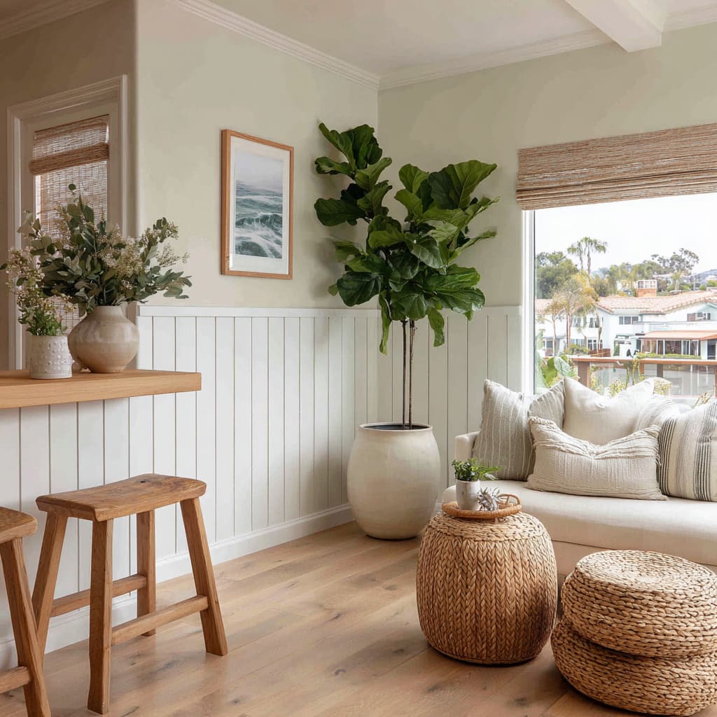
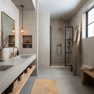
Modern wainscoting isn’t a throwback with new paint; it’s a rethink of what the lower wall does for a room. A few hard-to-spot moves are popular in modern style design: tight control of rhythm, one assertive datum line, surfaces that react to light, and objects arranged like punctuation rather than decoration.
Taken together, these moves shift the mood from “trim” to “graphic backdrop. ”.
Lines Over Layers
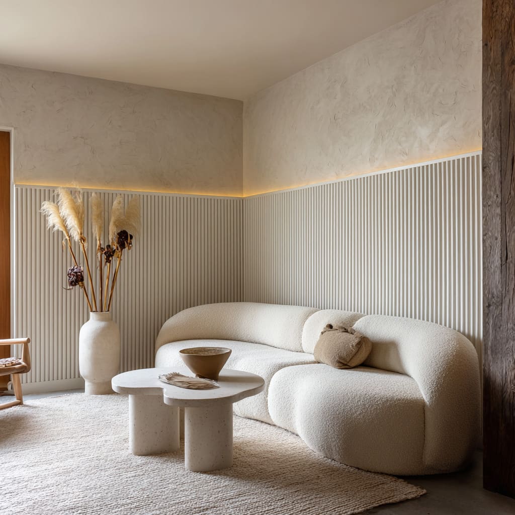
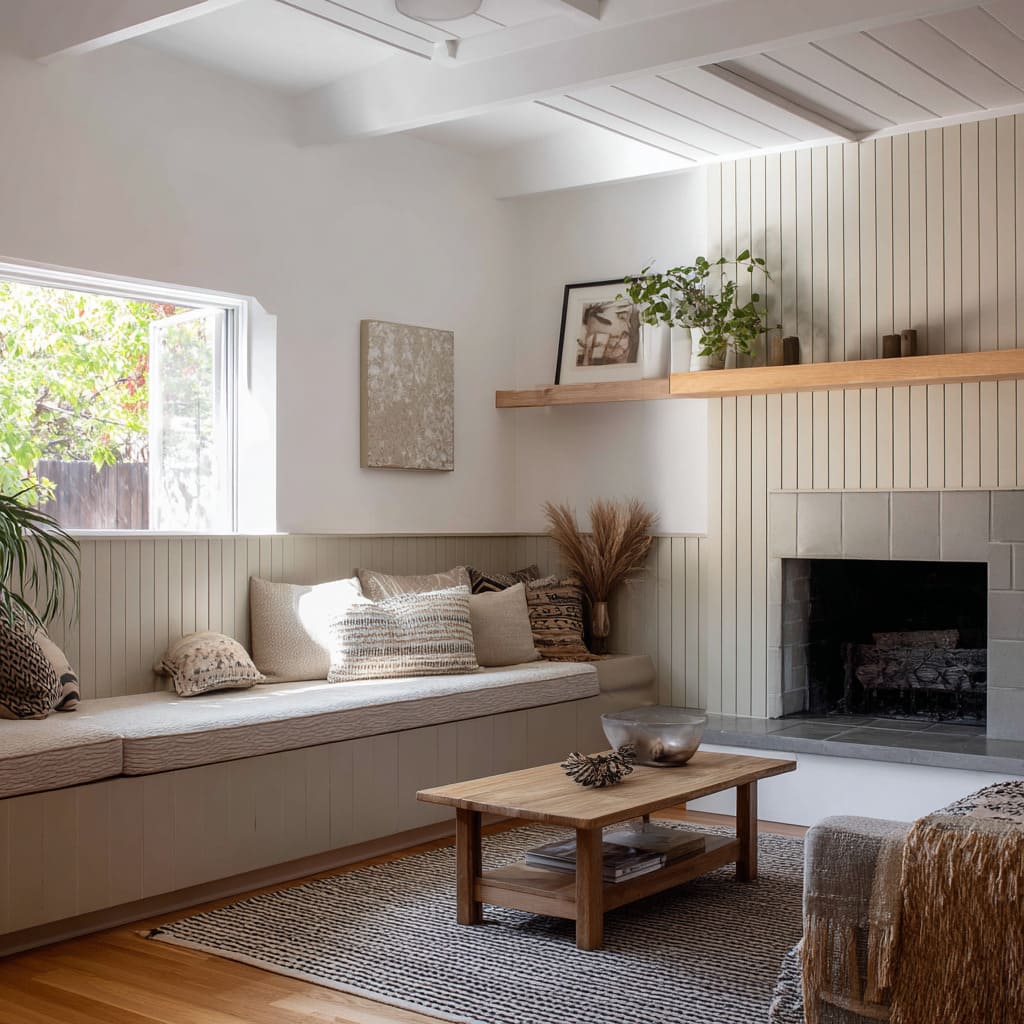
Instead of piled-on moldings, the lower wall now can speak in continuous lines. Narrow vertical boards read like grooves, fluted slats behave like a fine tambour, and micro-ribs create a barcode of shadow that changes as you move.
Because the profiles are slight, they catch light rather than cast heavy silhouettes. That small shift—texture over thickness—explains why the walls feel light even when they’re richly patterned.
You see rhythm before you see carpentry.
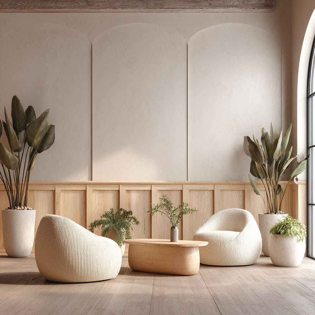
Where classic raised panels tried to model depth, these profiles let light model the wall. A matte tile surround set to the same beat as the boards, a plaster field above that holds soft clouds, or limewash that takes a glancing glow—each one turns illumination into the main graphic.
The grooves aren’t loud; the shadows are.
The Datum: One Line That Rules the Room
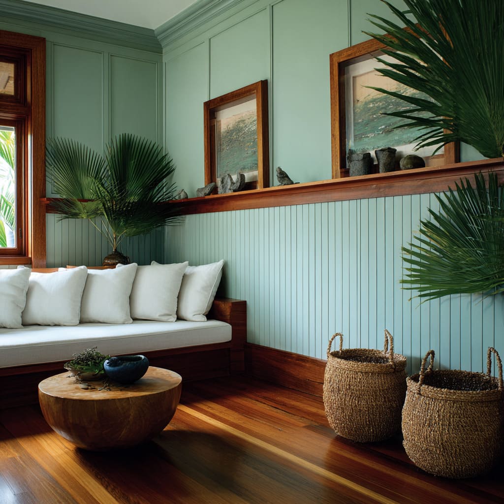
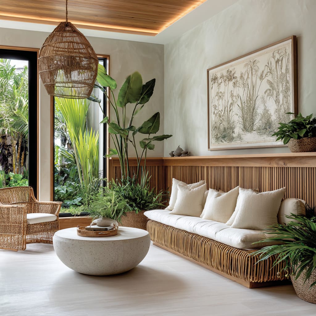
Modern wainscoting can be organized around a single line that everything else respects. Sometimes it’s a thin cap that nearly disappears; sometimes it’s a shelf that cuts across a corner and quietly becomes a console at the window.
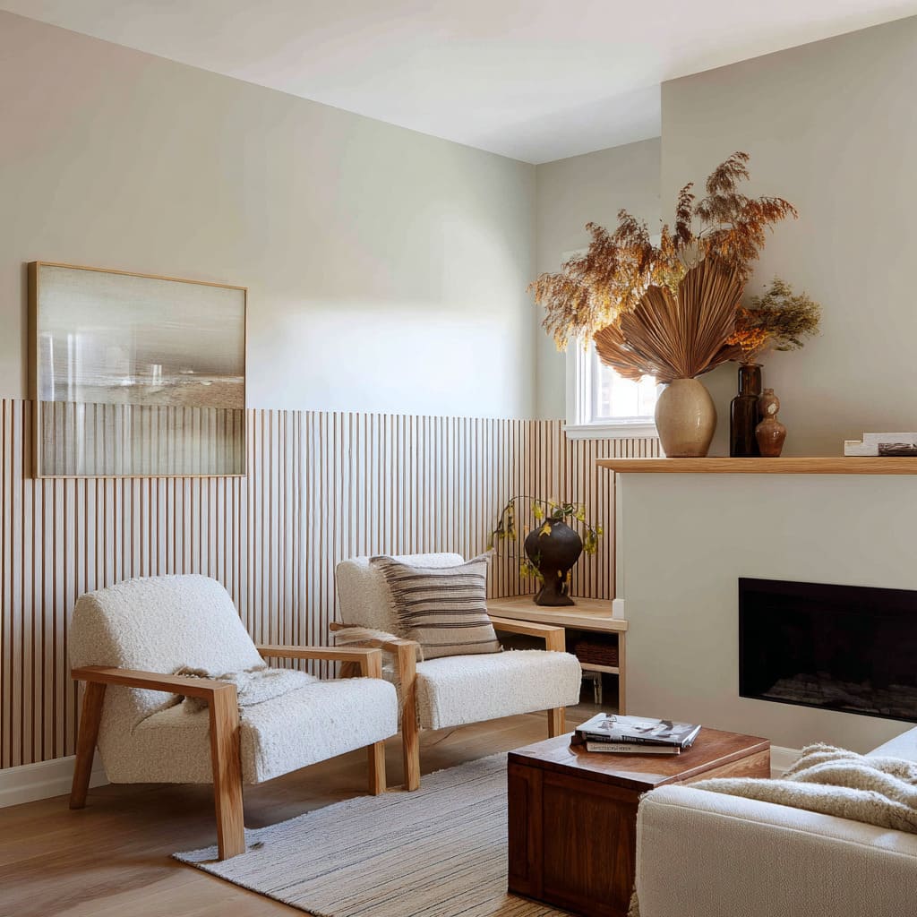
Seating backs stop at this height. Art edges kiss it.
Even window mullions or ceiling beams land in sympathetic spots. The room reads calm not because there’s less going on, but because all the action knows where to stop.
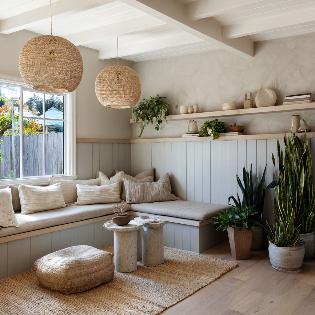
That line is also where furniture becomes wall. A bench base shares the same thickness as the shelf that turns the corner.
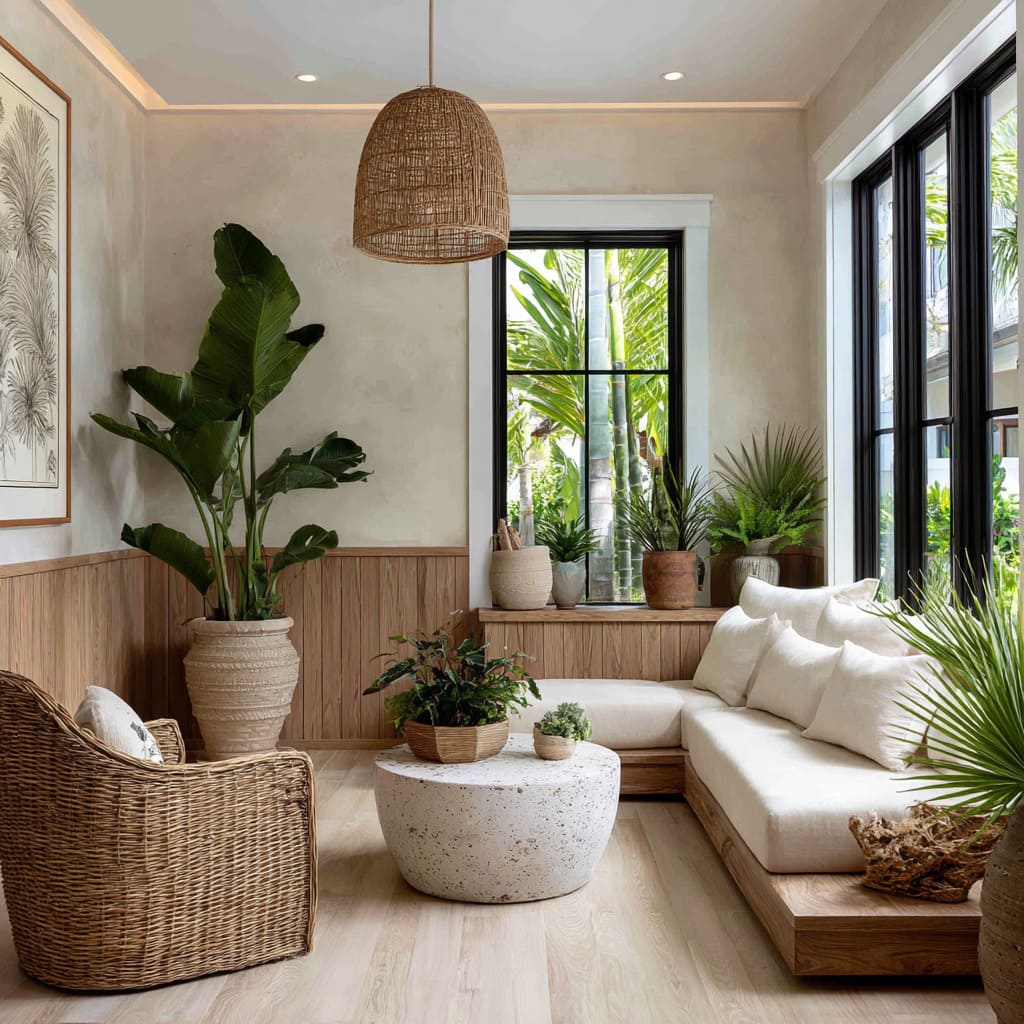
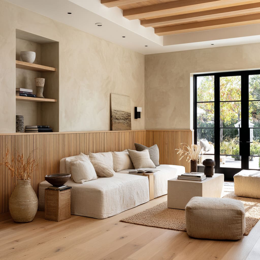
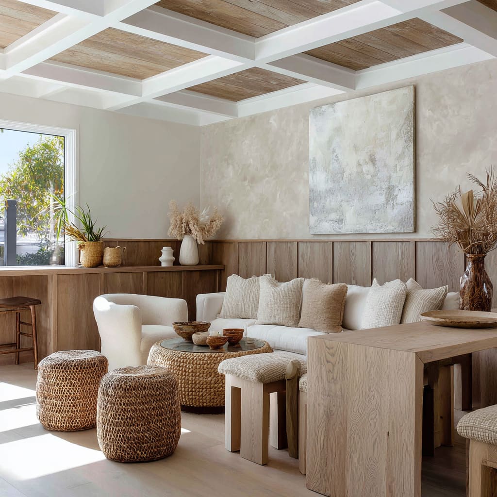
A platform sofa continues the lower wood band so seat, cap, and ledge fuse into one element. When the datum doubles as backrest or display rail, wainscoting stops being trim and starts acting like architecture.
Shadow Is the Ornament
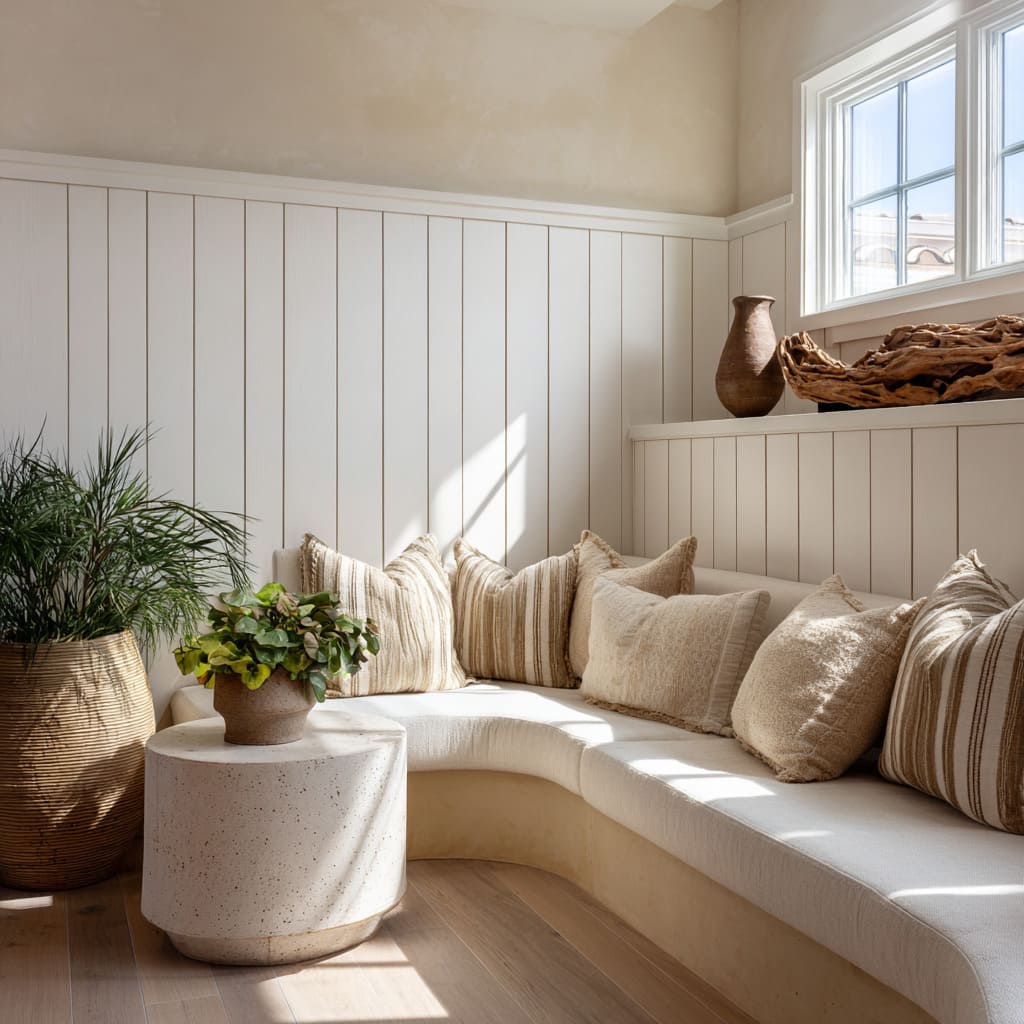
A lot of the freshness comes from how such walls are lit. Grazing sun from a nearby opening scrapes across grooves and makes modest profiles read richer.
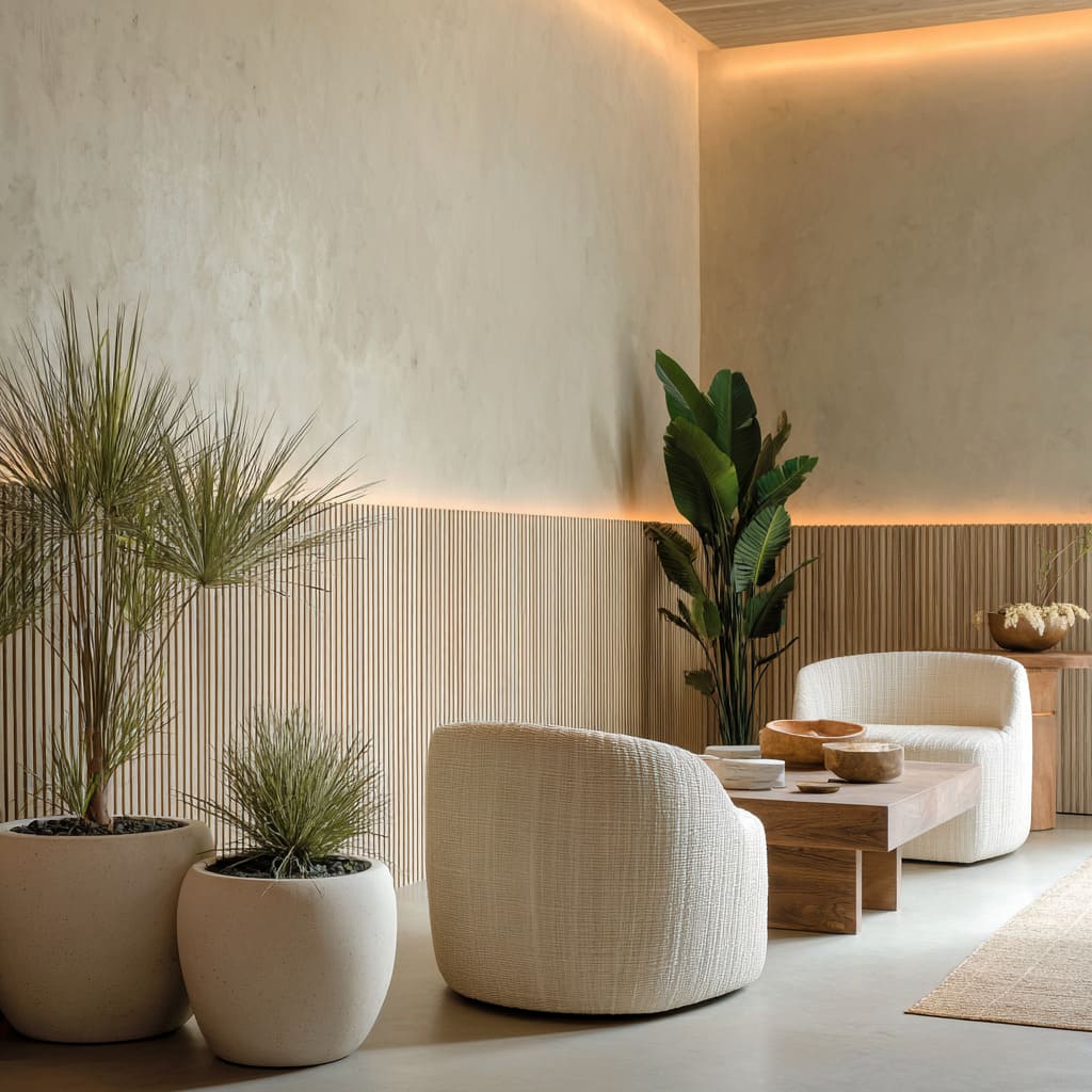
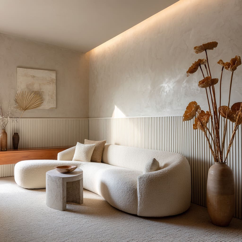
A concealed strip just above the cap washes plaster so the upper plane feels as if it hovers. In a few rooms, the light sits inside a hairline reveal between ribbed base and smooth field, drawing a continuous halo that replaces the old chair rail with pure glow.
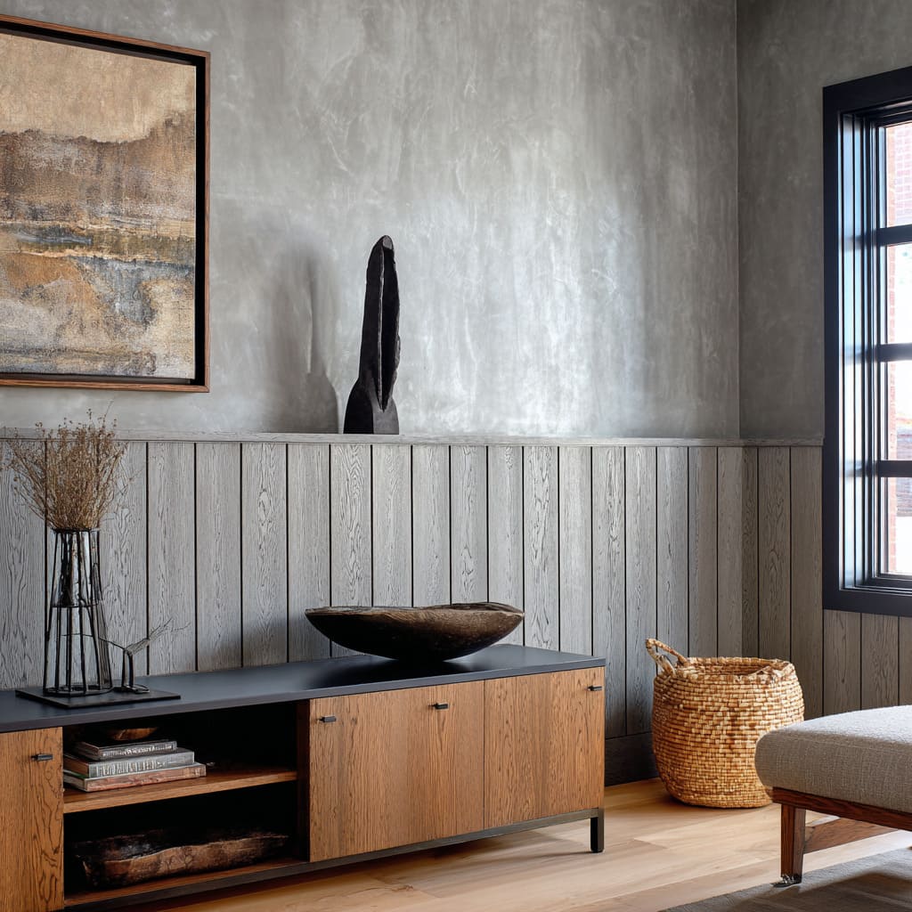
Because the surfaces are intentionally matte—smoked oak, hand-troweled plaster, soft-touch paint—the shadows fall like velvet rather than glare. Even small decisions matter: a black firebox left unframed so it’s just a rectangle; a pendant dropped low enough to compress the ceiling slightly, which makes the cap height feel right; a cove at the ceiling that lets the wood grain warm up without showing a fixture.
The lesson from the look: light is treated as material, not afterthought.
Color That Collapses Distance
The palette leans into middle tones that sit between “white” and “dark”—mushroom, foggy gray, putty, sea-glass greens, honeyed wood. Those colors do quiet spatial tricks.
A cool gray wainscot pushes the plaster forward so the upper wall feels closer, making compact rooms feel composed rather than cramped. A single muted color across stiles, rails, and cap flattens what used to be a hierarchy of parts, which reads more contemporary.
Warm timber below with cloudy plaster above turns the wall into strata—wood, then “stone”—a grounded foundation capped by air.
Black lines—window frames, a steel door edge, a thin tabletop—are used as outlines to keep all that softness from blurring. They’re not accents; they’re anchors.
Geometry Swaps: From Carving to Texture, From Square to Curve
Where historic paneling relied on rectangles and applied profiles, the modern take trades those for subtle geometry. Rounded half-slats replace ogees.
Flutes stand in for frames. Occasionally, the upper wall carries three shallow plaster arches—no trim, just soft radii—so light pools at the shoulders and the lower box paneling becomes a crisp base for simple shapes above.
Proportions shift, too: panels grow a little squarer than tradition, shortening the “stride” across the wall and matching low lounge furniture.
Curves slip into the system in surprising places. A built-in seat bends the vertical boarding into an arc, so the lower wall reads more like a sculpted sleeve than flat cladding.
Clover and pebble-shaped tables, boucle chairs with rounded shoulders, and basket pendants with soft bellies echo the wall’s gentle moves without copying them. The conversation is quiet: straight lines set the tempo; curves keep it human.
The Ledge: Editing Tool, Not Trinket Shelf
Thin shelves do heavy visual work. They stitch long walls together, jump corners, align with art bottoms, and decide the scale of objects allowed to live there.
A single small brass piece on a long span breaks the rhythm like a rest in sheet music; a driftwood fragment placed with two empty spans on either side lets negative space do the talking. By holding back on quantity, the ledge stops being a place to store stuff and becomes the room’s ruler.
Even when the “shelf” is just a cap a few millimeters proud of the ribs, it reads as a track for light or for a lean of frames. The key is consistency: same thickness for console, bench back, and cap.
That sameness, more than any profile, is what modernizes the look.
Fiber as Finish: Cane, Rattan, and Plants in Place of Carving
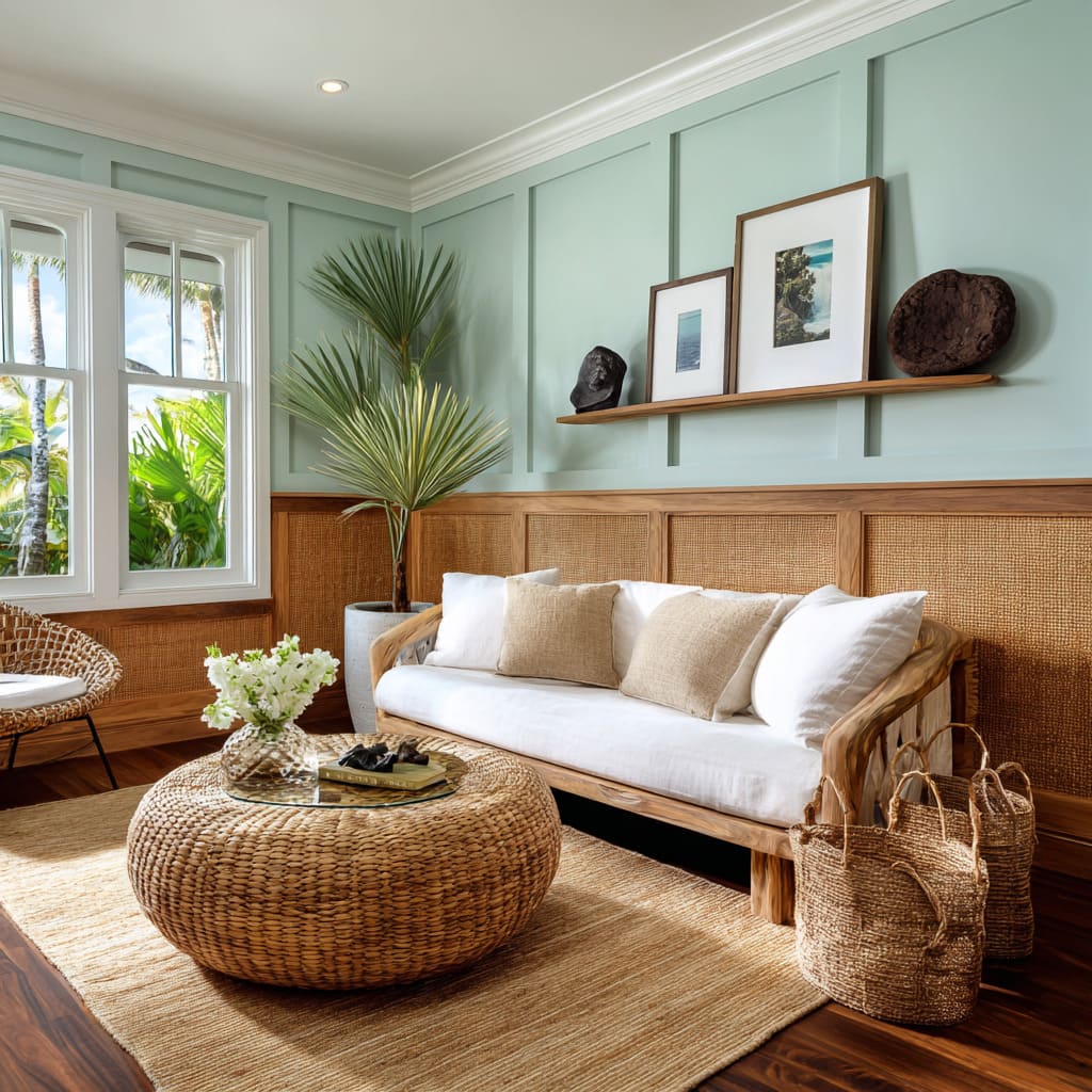
One of the least obvious upgrades: swapping solid panel inserts for cane. The weave lets air and light move through the lower wall, so the base reads like furniture rather than structure.
That idea ripples outward—rattan frames, braided rugs, woven stools—each one repeating the pattern logic at a different scale. Even when cane isn’t present, foliage takes over the role once played by carved ornament: palmetto fronds where pilasters might have been; a row of planters along the ledge acting as a living frieze.
The “decor” isn’t an overlay; it’s woven into the system.
Alignment Games You Feel More Than See
The calm in such rooms comes from a thousand micro-alignments: cap heights matching the lower rail of window grids; shelf thickness mirroring the cap; beam cadence echoing slat spacing; art bottoms landing exactly at the datum; console tops bridging the gap between verticals. None of this shouts, but the eye registers the order.
Even the base of built-ins is sometimes pulled back a touch so the mass floats, making the floor feel larger and the wall less blocky.
Material Pairings With a Tight Vocabulary
The palette of materials is short but layered: oak (natural, smoked, or gray-stained), lime or clay plaster, matte tile, brass in tiny doses, stone that reads tactile rather than polished. Instead of chasing contrast through color, contrast comes from touch: ribbed next to clouded, woven beside solid, smooth plaster above linear grain.
The effect is depth without clutter.
When Seating Height Sets the Whole Composition
Low seating isn’t an accident. Club chairs and sofas are kept below the cap so the long horizon line stays visible.
Where a higher back would turn the wainscot into background, such silhouettes let the lower wall remain an active band. In some cases, the seat base aligns with the wainscot base so the two read as one continuous platform.
That trick makes the layout feel built-in even when parts are movable.
The Quiet Grid, Tuned Not Tamed
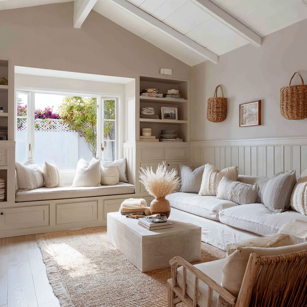
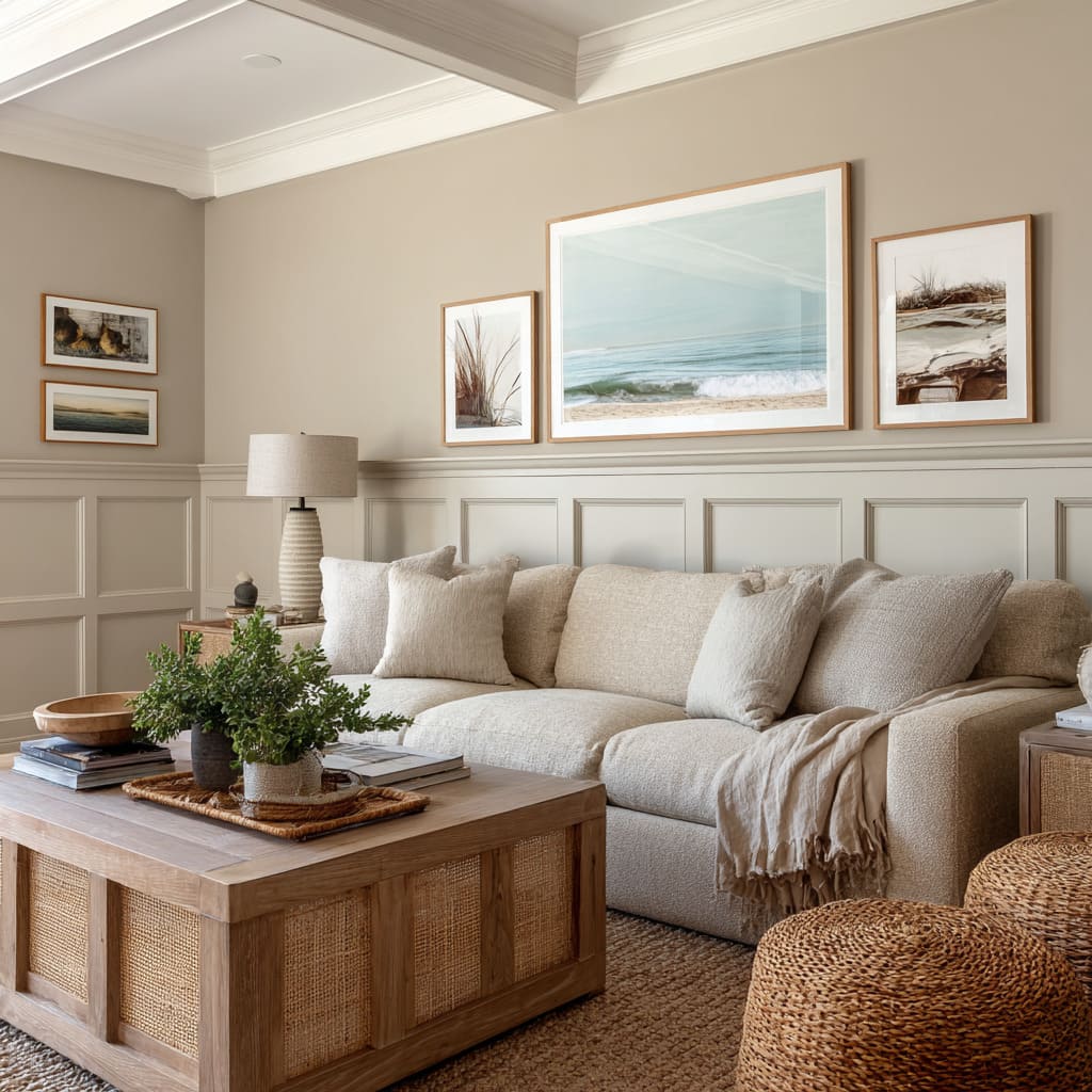
Classic box wainscoting still appears, but it’s adjusted in two key ways: slimmer rails/stiles and tone-on-tone paint. The grid becomes a calm backdrop for softer shapes in front—looped textiles, round tables, nubby rugs.
Art is grouped to step with panel seams rather than ignore them, creating zigzags that animate the field without breaking it. The result isn’t formal; it’s measured.
A Small Kit With Big Range
Modern wainscoting reads as a compact visual grammar—texture that catches shadow, one calm horizon that sets order, and quiet planes that let light do the drawing. The notes below distill that language:.
- Ribbed or fluted base for fine shadow and touch.
- A single datum—cap or shelf—that furniture and art respect.
- Soft plaster above for light to graze and pool.
- One concealed light move that turns glow into a line.
- A few fibers and greens that stand in for carved ornament.
- Black lines used sparingly to outline and ground.
In current styles, color temperature shifts, rib spacing moves from fine to open, cane alternates with solid inserts, corners take soft arcs, and shelves thread past window bays—the language holds while the mood changes. Modern wainscoting reads less like a catalog of profiles and more like a disciplined set of moves, making the lower wall act as structure, rhythm, and atmosphere at the same time.

