Painted stairs are doing much more than getting from floor to floor; they set tempo, attitude, and a certain calm order in a hallway. Read any set of painted stair tread ideas closely and you’ll notice that the real story is how color sits on the stair and how the eye reads that rhythm during the climb.
Some schemes turn each step into a crisp graphic band; others merge the whole run into one soft volume that feels like a single sculpted piece. This article gathers the quiet design moves hiding inside today’s stair tread color ideas—how contrast controls neatness, how temperature leans warm or cool, how skirting acts like a frame line, how runners tame bold palettes, why metals behave like punctuation, and why light is the most important styling tool of all.
No building tips here—only the look and the mood.
Rhythm First: Stripes or a Single Volume?
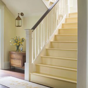
When color lands on the treads only, stairs read like a musical score—dark, light, dark, light—steady all the way up. The risers, often white or warm white, become rests between beats, so the climb feels lively but not noisy.
This approach suits green-on-top schemes (leaf, olive, sage) that want freshness without feeling sweet, and it also flatters deeper tones like charcoal where a pale runner softens the center. When color spans treads and risers together, the stair stops behaving like stripes and becomes a single, quiet mass—blue-gray wraps, espresso-gray blocks, almond-stone monochromes—each one calming the corridor and letting daylight do the detailing on rounded nosings.
Wrap the skirt or stringer to match, and the stair reads as a custom object placed inside the hallway; keep the skirt white, and the outline sharpens, which tightens up busy spaces with paneling or lots of art.

Contrast Decides Clarity More Than the Hue
High contrast gives crisp edges and plan discipline. Think deep charcoal or black tops against clean white risers: every nosing becomes a thin graphic line that’s easy to read at a glance.
Drop a pale, nubby runner through the center and the whole thing relaxes without losing order. Low to mid contrast, by comparison—ash with cream, almond with warm white, clay-taupe with soft neutrals—stretches a narrow hall, smooths edges, and lets light gradients become the ornament.
The small highlight along each rounded nosing becomes the jewelry; nothing flashy, just a consistent gleam that gives the climb a slow, polished cadence. This is why two stairs painted entirely different hues can feel oddly similar: the best color to paint stair treads isn’t just about color; it’s about value against whatever surrounds it.

Temperature Is the Social Mood
Greens on the horizontal planes—leaf, olive, silver-sage—bring a botanical note that links easily to jute runners, woven baskets, and pale oak rails. Keep the green to tops and nosings and it behaves like a soft underline; extend it to skirts and risers and the stair gains a grounded, confident mass.
Blues and blue-grays push toward coastal calm: a pewter-blue tread with creamy risers reads breezy, while a full wrap in clouded blue-gray creates a misty object that seems to hold daylight inside it. Earth colors—clay, taupe, dusty rose-terracotta, truffle brown—bring warmth without heaviness when set against creamier whites and brushed brass glints.
Usually, the pattern is consistent: wood rails moderate cool palettes; warm metals lift cool notes; black lines keep gentle colors from turning sugary.

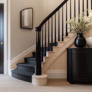
Skirting Is the Frame Line That Quietly Decides Neat vs. Expressive
White skirting is a clarity tool. It trims the scene, thins the look of colored treads, and keeps the side profile tidy.
Color-matched skirts, on the other hand, push the stair toward furniture logic—the base reads thicker by design, and the whole run looks dropped in as a single object. In dark or mid-tone wraps, curved starter platforms or rounded corners help the mass feel sculpted rather than heavy, much like a low plinth in a gallery.
Watch how a navy-graphite base with a rounded platform avoids a blocky feeling; the geometry, not extra pattern, carries the grace.

Skirting roles at a glance
- White skirt: tight outline, higher visual tidiness, good with busy wall features.
- Color-matched skirt: anchored presence, furniture read, strong when walls are simple.
- Mixed approach (white wall base, colored stair apron): sharp silhouette with a grounded first step.

Runners Work Like Mood Regulators
Place a pale, textured runner over dark treads and the whole stair softens immediately; the eye still reads the neat edges, but the texture relaxes the center path. Pebble-dotted and ribbed runners do something clever: from a few meters they register as calm tonality; up close they surprise with micro-pattern.
On mid-value treads, oatmeal and linen runners are balancing acts—warm enough to link to baskets and console objects, quiet enough to let the paint carry the visual logic. This is why the same black-and-white stair can look strict in one home and welcoming in another; the runner is the pressure valve.

Metal Accents Are Punctuation, Not a Theme
Black balusters repeat the darkest note and sharpen the vertical beat. They also keep greens and coastal blues from drifting into a soft, sweet register by stacking a firm line into the mix.
Bronze or brushed brass adds a warm glint that turns cool palettes human—never flashy, just a fine glimmer on the way up the rise. Use too much shiny metal and the stair slides formal; hold it to slim parts—balusters, tiny sconces, thin frames—and the note stays controlled.
Think of metals as commas and em dashes, not headlines.

Wood Is the Temperature Thermostat
A pale or medium oak rail at grasp height builds a gentle bridge between white walls and colored treads. It warms leaf green, sea-mist blue, and ash gray, so the palette sits comfortably in everyday light.
When wood moves to the riser face—oak faces under jet-black tops—the stair flips into a modern split: the wood carries vertical rhythm while the black delivers precision as a thin horizon at every step. The downstairs rug, console, and baskets often repeat that rail tone; the human eye loves that echo, and the entry calms down as a result.

Light Is the Real Ornament
Sunlight sliding across rounded nosings creates a repeating highlight that feels luxurious even in minimal, low-contrast schemes. Mid-value paints show the subtlest light play—silver-sage deepens softly in shade while glossy nosings catch crescents of light; ash and almond-stone carry pearly edges that look neat but never severe.
Strong daylight on dark risers becomes graphic in a pleasing way: angled bars read like chalk marks, bringing energy without added pattern. From coastal to country to clean-lined urban interiors, the same truth holds: the best stair tread painting ideas rely on light as the main detail.

Shapes, Curves, and Exposed Ends: How Mass Finds Grace
Curved starters, radiused corners, and wrapped bases keep darker paints from feeling heavy. A rounded platform painted in navy-graphite reads like a low furniture piece, not a block.
Exposed ends painted in charcoal with a crisp white reveal beneath each nosing turn every step into a precise slab that feels tailored and airy at once. This is the visual trick behind many striking stairs: not extra pattern, just a geometry that lets the color behave elegantly.

Shape-driven moves worth noting
- Rounded starter + dark tone: grounded yet graceful base.
- Exposed ends + thin white reveal: floating slab effect.
- Long side band in the same color as the treads: one clear line that carries the eye to the landing.

Objects Near the Steps Complete the Palette
Baskets, woven trays, small pottery, linen runners, and thin black picture frames aren’t filler; they finish the color story. Woven pieces keep cool paints grounded; thin dark lines in art sharpen gentle palettes; warm paper tones in frames soothe stronger hues.
Place such items within a step or two of the base and the whole scene clicks. The entry reads composed, not staged.

Four Archetypes
- Graphic Black/Charcoal + White. Edges, clarity, plan discipline. A pale, nubby runner calms the center, and a light oak rail keeps the hand line friendly. Ideal where structure needs to read at a glance.
- Botanical Greens (Leaf, Olive, Silver-Sage). Natural, upbeat, and very livable. On tops and nosings, green acts like a soft underline; wrapped into skirts or risers, it becomes a grounded band. Black balusters keep it crisp; bronze details keep it warm.
- Coastal Blues & Blue-Grays (Pewter-Blue, Clouded Slate-Sky). Cream and driftwood notes make these hues sing. Full wraps read misty and serene; tread-only approaches give a breezy stripe that brightens halls under strong daylight.
- Soft Earths (Clay, Taupe, Dusty Rose-Terracotta, Truffle). Sun-touched warmth without weight. Paired with cream whites and brass glints, these palettes feel calm, friendly, and current rather than old-fashioned.

The Hidden Levers Behind Strong Painted Stair Tread Ideas
- Placement: treads-only stripes vs. unified block (treads + risers, and possibly skirts).
- Contrast: high for crisp edges; mid/low for visual stretch.
- Temperature: cools lean fresh and airy; warms lean welcoming and calm; wood and metal nudge either way.
- Frame: white skirt for neat outlines; color-matched skirt for object-like presence.
- Textile: runner texture acts like a diffuser in bold palettes and a soft echo in gentle ones.
- Light: the highlight at the nosing is the quiet jewel—daylight decides the vibe hour by hour.

Quick-Glance Maps
A) By Visual Goal
- Crisp & Graphic
- Treads: charcoal or black
- Risers: white or warm white
- Skirt: white
- Rail/Balusters: oak + black
- Runner: pale, nubby, linen-like
- Treads: pewter-blue / blue-gray

- Treads: leaf, olive, silver-sage

- Treads: clay, taupe, dusty rose-terracotta, truffle
- Treads: ash-gray, almond-stone, almond-taupe
- Risers/Skirt: warm white or matching tone for a seamless read
- Detail: glossy rail, woven mat, satin paint sheen

B) By Where the Color Lands
- Treads only: stripe rhythm, easy legibility, strong with plants and woven textures.
- Treads + risers: single calm volume, light becomes the ornament, satin or matte looks refined.
- Treads + risers + skirt: custom-object effect, great with simple walls and generous daylight.

C) By How the Eye Moves
- Black balusters + dark treads: clear vertical and horizontal beats.
- Bronze details in cool palettes: tiny warm sparks, human touch.
- Rounded nosings: repeating highlight lines, especially in mid-value paints.
- Exposed ends with white reveal: floating slab profile.

Common Pitfalls
Cool, optic whites beside warm clays push the steps towards candy; creamier whites keep them soft and modern. Dark treads with dark runners erase rhythm; a pale or textured runner keeps the steps legible.
Mixing green risers, white skirts, and heavy oak everywhere can split attention; either confine the green to horizontals or extend it into the skirt for a steady read. Blue treads alongside bright chrome can tip cold; driftwood-toned wood and a hint of brass bring it back to easy living.