Modern clay-toned kitchen designs treat terracotta much less like a single colour and much more like a complete visual language. Warm clay tones can define the mood long before any decor appears: plaster walls in soft adobe shades, ribbed tiles that read like corduroy ceramic, stone veining with faint blush threads, and textiles that hold dusty rose and brick hints.
Terracotta moves between three roles: sometimes it is the architectural “skin” wrapped around walls and niches, sometimes it forms the main volumes such as islands, cabinets, or banquettes, and sometimes it appears as a quiet echo in pottery, leather, timber undertones, and art. This layered approach keeps terracotta kitchens grounded yet light; clay tones can feel gallery-like with generous negative space, or more social and cosy when concentrated in seating and cabinetry.
The most contemporary expressions avoid rustic overload and instead pair terracotta with refined pale stone, slim lighting, and restrained styling, so clay feels intentional and sculptural rather than nostalgic or heavy. In that sense, terracotta kitchen ideas are less about applying a trendy colour and more about composing a set of warm surfaces, textures, and accents that read as one calm, clay-based atmosphere.
Clay as Architectural Skin: Walls, Shells and Tall Clay Surfaces
One of the strongest directions in modern terracotta kitchen designs is the way clay tones turn into an architectural wrapper. Walls and niches lined in slim vertical tiles, tall panels, or coloured plaster behave almost like an inner shell.
Ribbed tiles running floor to ceiling around a pantry opening create the sense of a sculpted portal rather than a simple doorway, and fully tiled niches lined from back to bench in pale shell-terracotta become glowing clay “wells” when lit with warm LEDs. Large-format porcelain panels in salmon–rust shades offer broad, clouded swathes of color with minimal joints, so the eye registers one continuous field instead of a busy grid.
In other kitchens, plaster in adobe rose wraps hood boxes and window bands, making the clay tone feel like air tinted by dust rather than a separate material. The terracotta surface slides behind and around shelves, windows, and counters, turning the clay into a backdrop that holds everything else.
Modern treatments of terracotta kitchen backsplash tile often extend beyond the usual strip behind the hob and rise to full height, fold around corners, or dip down into framing benches, so the color reads as part of the architecture rather than an applied accent panel. The effect can be very quiet when tones stay soft and neutral, or more intense when the clay is deeper, yet the continuous coverage keeps even saturated shades calm because there are so few visual interruptions.

Clay as Volume: Cabinets, Islands and Seating in Warm Clay Blocks
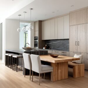
Another family of modern terracotta kitchen ideas shifts the focus from walls to volumes. Here, clay tones appear on cabinetry fronts, islands, and seating, so the color belongs more to the furniture than to the shell of the room.
Matte terracotta cabinets that wrap base units, tall pantry doors, and the island can make the entire lower band of the kitchen feel like it is built from stacked clay blocks, especially when the fronts are flat and the hardware slim and quiet. In other layouts, the main cabinetry stays in blond oak or cream, while the strongest clay notes sit in velvet bar stools, bench cushions, or leather seats lined along an island.
This approach pulls terracotta into the social centre of the plan: people sit on it, lean against it, and place glasses and plates next to it, so the color belongs to the activity zone. Stone tops and backsplashes usually remain light and controlled, keeping those clay volumes crisp and graphic.
A terracotta color scheme kitchen of this kind often plays with opposites: pale stone wrapping the island with warm terracotta fronts set into it, or terracotta cabinetry wrapped by a pale stone worktop and backsplash that behave like a cool frame around a warm core. Because these blocks stand proud in the room, small details such as long brushed-metal handles, rounded stool backs, or integrated bench cushions have a strong impact on how serious, relaxed, or lounge-like the space feels.

Accent and Echo: Terracotta as Memory in Stone, Wood and Decor
Beyond obvious fields of color, many ideas treat terracotta as a kind of visual echo that runs through stone, wood, and collected objects. In some kitchens, clay tones only appear directly in pottery: a few banded bowls near the hob, a low platter leaning against a backsplash, a two-tone vase with a terracotta base and turquoise top anchoring a stone island.
The surrounding surfaces—light oak panels, honed cream stone, pale plaster—carry subtle reddish or peach undertones that quietly reference clay without ever turning into bright orange. Floors might be a slightly warmer oak than the cabinets, with grain that hints at burnt sienna in certain angles of light.
Stone can hold very subtle terracotta threads within broader beige or sand veining, so the eye picks up warm streaks that match the bowl on the counter or the leather on the stools. In more layered terracotta tiles kitchen ideas, thin tile bands frame the front edge of a countertop, narrow terracotta strips wrap the riser of a bench, or a single tiled niche glows in a corner while the rest of the room remains neutral.
These small insertions act as visual reminders rather than declarations; the space feels clay-inspired rather than clay-covered. The result is a kitchen where terracotta is perceived as part of a shared material memory: in the way the stone looks faintly sun warmed, the way oak reads slightly red at sunset, and the way a few handmade vessels pull that story into focus.

The Terracotta Spectrum: From Blush Shell to Baked Brick
Modern clay kitchen designs rarely rely on a single generic “terracotta. ” Instead they use a spectrum of shades from whisper-soft blush to deep baked brick, each with a different mood.
At the pale end, shell-pink and milk-rose tiles create gentle, shimmering fields that almost register as warm neutral. These tones work particularly well with very light wood and creamy stone, because the room stays bright even when the backsplash or niche is fully tiled.
Mid-range terracotta, with more salmon or peach warmth, often appears in larger slabs with cloudy blooms, giving a sense of sun-baked plaster or sandstone; those shades can feel relaxed and calm, especially when balanced with oak and off-white plaster hoods. Deeper brick terracotta, with more red-brown content, tends to land on cabinetry or furniture, where it feels solid and grounded without dominating every surface.
Designers often grade these tones within one space: a stronger clay on lower cabinets, a softened blush in the stone veining, a slightly pink-beige tile field, then a very pale plaster above. This layered scale allows terracotta kitchen color ideas to stay rich but not flat; the eye slides from a deep clay panel to a softer clay thread in the stone and then up to a faintly warmed plaster band, reading the kitchen as one warm family rather than a single heavy swatch.

Direction and Rhythm: Vertical vs Horizontal Terracotta Surfaces
Another key aspect of current clay kitchen designs is direction: the way lines, grooves, and layout guide the eye. Verticality plays a strong role in many wall treatments.
Slim tiles set upright, ribbed clay with fine grooves, and tall lined niches all stretch the room visually, making ceilings feel higher and corners more sculpted. Micro shadows inside those grooves create a soft vibration that keeps large walls from feeling static, especially under grazing light.
These vertical fields are frequently interrupted by linear oak shelves or long counters that cut through the tiles in calm horizontal bands, setting up a visual rhythm between “rise” and “rest. ” In contrast, some ideas lean into horizontal clay narratives: stone surfaces with long terracotta strata, slab backsplashes that read as wide terracotta belts behind the counter, or cabinet runs that form one continuous clay-coloured strip from one side to the other.
Here, the eye travels left to right in a steady way, and the room feels grounded and composed. In both approaches, terracotta backsplash ideas make heavy use of continuity and proportion: tiles often run to full height rather than stopping at arbitrary points, slabs turn corners instead of ending mid-wall, and clay fields are sized to align with hoods, windows, or shelving so that the pattern of lines matches the architecture and keeps visual noise low.

Timber Partnerships: How Wood Controls Warmth and Character
The relationship between timber and terracotta is one of the quiet engines behind such kitchen designs. Oak with a honey or light caramel stain often acts as a gentle echo of clay tones; when wood carries a hint of orange, terracotta can be deeper without feeling harsh, because the eye steps through timber before hitting pure clay.
Flat-front oak drawers beneath a clay-toned wall feel like a natural extension of the colour story, while light oak island bases with terracotta seating cushions soften the clay presence and bring a relaxed note.

In other ideas, timber is purposely calmer and closer to beige or pale straw; this slightly cooler wood keeps terracotta confined to targeted zones such as a niche, cabinet block, or stools, so the clay feels more like an accent than a flood. Panel layout is important too: tall oak units with continuous grain that runs from plinth to ceiling create a tree-trunk feeling that suits clay references, especially when small reddish streaks appear in the grain.
At the same time, reeded or fluted glass within timber frames picks up the idea of vertical tile texture without repeating it literally, adding another layer of rhythm while leaving the actual backsplash smooth. Through all these moves, wood acts like a volume control: warmer and stronger when the intent is a very earth-driven ambience, or quieter and paler when the terracotta is meant to remain the only clearly warm element in the room.

Stone as Quiet Stage or Clay Storyteller
Stone surfaces in modern terracotta designs often swing between two roles: neutral stage and active storyteller. In the first role, stone stays calm and low-contrast—creamy slabs with only faint speckling or gentle beige clouds.
These counters and backsplashes behave almost like blank paper behind a strong clay wall or cabinet block. They reflect light, separate terracotta surfaces, and keep heavily tiled or painted zones from feeling dense.
Islands wrapped in such gentle stone can visually lighten deep terracotta cabinetry, so the clay reads as refined color rather than mass. In the second role, stone itself carries terracotta threads.

Travertine-inspired slabs with long horizontal bands of sand and clay, creamy stone veined with fine rust streaks, and worktops with subtle peach blooms all place terracotta inside a mineral narrative. The eye reads the warm streaks in the stone and links them to bowls on the counter, clay stools, or framed artwork nearby.
In some kitchens, the same stone runs from island top up the wall behind the range, letting veining flow from horizontal to vertical and passing behind floating timber shelves; the veins act as a moving backdrop while the wooden lines add order. This duality—quiet stage vs storyteller—allows stone to either hold terracotta in check or amplify it, depending on the mood of the design.

Cool Companions: Teal, Sage and Green Balancing Clay
Warm kitchens with strong clay influence often rely on precisely placed cool tones to stay fresh. Turquoise, teal, celadon, and sage appear again and again in vases, bowls, glassware, and sometimes artwork.
A single turquoise bowl on a pale stone island in front of terracotta cabinetry can make the clay colour feel richer and more intentional, because the eye interprets the pairing as deliberate rather than accidental. Tall teal vases or sea-glass bottles arranged on open timber shelves against clay tiles build a colour dialogue where warm and cool sit side by side, each sharpening the other.

Softer greens—sage plates, mint bowls, leafy branches in a ceramic vase—often bridge still further to the garden outside, especially when windows frame trees or landscape. Exterior greenery can be treated almost as part of the palette; a terracotta wall reads like earth, stone like rock, and foliage like a natural counterpart.
The cool tones rarely dominate; typically one or two pieces in each view carry those greens or blues, with the rest of the decor staying in stone, clay, or wood. This restraint prevents visual clutter and lets every teal or sage object act as a calm, cooling note inside a predominantly warm composition.

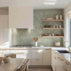
Shelves, Niches and Everyday Objects as Clay Storylines
Open shelves, glass-fronted cabinets, and tiled niches play a central role in how terracotta kitchens express character. Instead of acting as simple storage, these surfaces become mini stages for colour and form.
Many shelves follow a tight palette, for example: clay bowls, sage mugs, and stone-grey plates grouped in repeated heights; or flat aqua dishes and small terracotta cups arranged in low rows against a softly veined slab. Spacing between objects remains generous, so the eye sees clusters rather than clutter.
Tiled niches in pale shell-terracotta with warm lighting under each shelf transform simple cups and bowls into a glowing still life; vertical tiles combine with slim timber shelves to create a quiet grid that feels considered rather than casual. In some designs, the front edge of the countertop is framed by a narrow tile band, a detail that turns the counter into a crafted junction between stone above and wood below.
Elsewhere, a large terracotta platter leans against a backsplash like a disc of colour, breaking the dominance of rectangles. Within these compositions, terracotta backsplash ideas often extend into objects: plates with clay rims echo the wall tone, glazed bowls mirror the depth of the tile, and large wooden boards with warm mineral shades sit where stone and clay meet.
Everyday items become carriers of the palette, adding personality while still supporting the wider clay story.

Light and Texture: How Clay Surfaces Change Through the Day
The interaction of terracotta with light is one of the most subtle yet powerful aspects of such kitchen designs. Tile glazes, plaster textures, and textile piles all react differently to daylight and artificial illumination.
Glossy or satin-finished tiles with irregular edges catch under-cabinet LEDs and overhead spots, making blush or salmon shades glow softly rather than sit flat; small differences in glaze thickness create tiny highlights that travel gently as a person moves through the room. Ribbed tiles in matte finishes rely more on shadow: fine grooves generate thin lines of darkness under grazing light, so the wall appears to shimmer even without shine.
Plaster walls in adobe tones respond to daylight in broader strokes; morning light may bring out cooler pink aspects, while late afternoon sun leans the same surface toward golden clay, revealing trowel marks and tonal shifts. Velvet seat cushions and bar stools in terracotta or dusty rose change tone dramatically as sunlight skims their pile, showing lighter stripes on raised fibres and deeper bands in the shadows.
Simple recessed lighting and slim pendants usually support this play rather than fight it, casting general pools of warm brightness over islands while leaving clay surfaces free to express their own texture. Through these interactions, the terracotta elements in a kitchen rarely feel static; they show different sides as the day moves, keeping the space visually alive even with a very restrained material palette.

Clay Archetypes: Gallery, Carved Rock, Lantern and Social Hub
Taken together, many contemporary ideas fall into a few recurring “characters” for terracotta kitchens. One type resembles a gallery, where clay surfaces and ceramics are the quiet artworks: full-height tile or plaster acts as a pure background, slim pale shelves float in front, and objects are spaced with care.
Another type feels carved from rock, with travertine-inspired slabs or honed stone wrapping walls, hoods, and islands, while clay tones appear as bands inside the stone or in a few carefully placed vessels; the room reads as a solid mineral interior with warm layers rather than paint. A third type behaves like a lantern, where tiled niches, vertical blush backsplashes, and velvet stools combine with warm LEDs to create a gentle inner glow; floor and counters stay very pale to bounce that light.
Finally, a social hub type concentrates terracotta in islands, cabinet runs at gathering height, bench cushions, and seating so that the colour lives where people meet, talk, and eat. Clay bowls with bread, art with ochre landscapes, and stacks of plates in soft neutral hues can reinforce a lived-in feeling.
The same material—terracotta—can therefore read as quiet gallery, grounded stone chamber, glowing lantern, or relaxed social core, depending on where the colour sits and how it interacts with stone, wood, and light.

Walls, Plaster and Colour Blocking: Terracotta in Paint and Plaster Skins
Beyond tile and stone, colored plaster and painted finishes offer another direction for clay kitchen designs, especially where large, calm surfaces are desired. Many designs treat the wall and hood as a single sculpted volume in a soft adobe rose or dusty clay tone, running that finish from just below the ceiling down to a ledge above a stone backsplash.
The colour then reads as a warm band of air surrounding the work zone, with the pale stone counter forming a cooling line in the middle. Some designs extend this plaster tone around window reveals, letting sunlight wash along deep returns and emphasise the softness of the surface.
In other cases, paint in muted clay shades appears only on the upper part of the wall, leaving the area behind the worktop in cream stone or tile so that maintenance zones stay visually lighter while the upper band adds warmth and depth. Terracotta kitchen paint ideas often use these graded heights and bands rather than full-height saturated walls: for instance, a pale timber base, creamy stone counter, clay-toned upper wall, and then off-white ceiling create stacked layers that feel balanced rather than heavy.
This layered wrap can be combined with very restrained cabinetry—flat pale wood fronts, handleless cream drawers—so the plaster or paint acts as the main emotional note in the room. Simple ceramics in sand, clay, and muted green placed along a long wall ledge complete the composition, giving the coloured skin context while allowing it to remain the calm dominant surface.