Modern kitchen door ideas can be started from a simple premise: the door is judged by how it behaves as a plane inside the room’s larger composition. In this mindset, the leaf is less a “feature” and more a controlled patch of wall language—tone, sheen, grain, or pattern—so the eye reads continuity before it reads function.
Designers often build this continuity by making the door share the same visual “status” as nearby full-height elements: tall cabinetry, panel bands, or a feature wall that already carries authority.
Once the door is absorbed into that field, the design can decide whether the door should act as silence (a calm pause that stabilizes busier materials) or as character (a textured or drawn surface that becomes an intentional visual moment). What’s especially telling in current work is the shift away from door-as-centerpiece toward door-as-editing tool: it can regulate how much movement the eye experiences, decide where the strongest lines land, and control what gets attention at the far end of a corridor-like kitchen view.
In practice, this approach produces doors that feel inevitable—present but visually disciplined—because they are derived from the room’s existing vocabulary rather than introduced as a separate decorative topic.

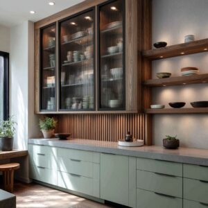
Stone drama, quiet pause: inserting a calm plane inside expressive materials
Often, the most dramatic visual motion belongs to stone—marble veining, slab movement, organic streaks—so the door strategy becomes a deliberate counterweight: a quiet, warm plane placed beside the stone as the room’s stabilizer. This is where many kitchen door design ideas become less about hiding and more about balancing intensity.
For example, a warm taupe gloss can sit next to bright veined marble without looking harsh because the two share a related temperature: beige-gold traces in stone can “speak” to the greige undertone of the door, creating a refined bridge between movement and calm. Light can deepen that relationship: stone often shows illumination as a crisp splash, while a glossy door shows it as a softer mirrored memory, producing a layered light story that makes the door feel designed, not leftover.

Another quiet move is proportion and placement: a calm rectangle gains authority when it is visually held between strong vertical masses—stone on one side, a darker glass-and-cabinet volume on the other—so the door becomes the center of a composed tension rather than a blank interruption. Nearby still-life styling often reinforces the hierarchy: metallic bowls, low greenery, and restrained vessels pull attention toward the working zone, letting the door remain the room’s controlled silence.

Outline and hierarchy: the frame as the main gesture
Some interior designs avoid blending and instead give the door authority through perimeter language—an approach that treats the doorway like a curated opening rather than a discreet passage. In this direction, design of kitchen door becomes a lesson in hierarchy: one strong outline (often deep charcoal or near-black) defines the opening as a bold cutout, while the door face stays mineral, matte, and quietly tactile.
The sophistication is in the division of roles: the frame carries the drama; the leaf carries calm; the handle stays small and subordinated so it reads as a functional note inside a larger graphic statement.

A less obvious integration tool is the “echo line”: a single horizontal seam or subtle break on the door can repeat the kitchen’s long horizontals—counter edges, backsplash bands, under-cabinet light ribbons—so the door feels fluent in the room’s linear grammar without needing ornament. Lighting often supports the emotional tone rather than the spotlight effect: soft ambient glow warms the strong outline so it feels confident but not severe, and gentle shadow gradients on the leaf give the plane depth that reads as intentional presence instead of flatness.

Camouflage by massing: doors that disappear by becoming part of a larger block
A common family of hidden kitchen door ideas relies on massing rather than tricks: the door disappears because it becomes one component inside a larger full-height field, so the wall reads as an architectural volume first and the opening second. This is especially effective when the panel field is bigger than the door itself; the door stops feeling like an “event” and starts feeling like a measured tile in a composed wall system.
Micro-contrasts often do the signaling: a slightly different sheen (soft satin leaf beside glossier neighbors), a single narrow dark reveal, or a recessed pull that reads like a shadow cut rather than a hardware object.

In long galley compositions, massing gains another layer—sequence. Repeated vertical pulls and controlled black accents can set the tempo along a cabinet run, and the far-end door becomes the quiet conclusion of that rhythm: fewer details, placed in the final position where the eye expects closure.
The surrounding décor usually supports the illusion by staying horizontally calm: low bowls, shallow trays, contained greenery, and an absence of tall clutter near the door zone so the panel field can remain visually uninterrupted and therefore believable as one continuous volume.

Pattern adjacency: the door as a buffer beside energetic surfaces
When a kitchen design embraces strong tile pattern or mosaic movement, the door can act as a visual buffer that keeps the room from tipping into overload, creating a controlled contrast that still feels cohesive. In this type of kitchen design with door, the door plane is typically quiet—concrete-toned, mineral, softly mottled—yet it isn’t blank; it often shares a related “handmade” mood with the patterned zone, simply expressed at a slower, larger scale.

One of the most refined tactics here is structural rhyme: large panel seams around the door can mirror the grid logic of small square tiles, so the eye recognizes shared order even while the scale changes. Dark accents stitch the composition together: a black pendant, a dark countertop line, and a slim vertical pull can repeat as controlled marks that prevent the door from floating as an unrelated plane.
Even the emotional temperature can be tuned with styling: patterned walls gain comfort when warm inner pendant glow pulls out muted reds, dusty blues, and sand tones in the tile, while the door remains the steady calm surface that gives the eye somewhere to rest without making the room feel stripped.

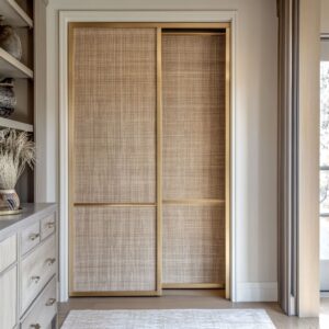
Threshold softness: niches, tonal surrounds, and the door as a quiet pause
Another modern strategy makes the door feel gentle and intentionally “placed” by treating its surrounding zone as a calm threshold rather than a flat wall interruption. In home kitchen door design, this often appears as a creamy off-white leaf set inside a slightly deeper or slightly darker surround, creating a subtle niche effect that suggests arrival and pause before the kitchen opens up.
The sophistication comes from light behavior: the door face becomes a softly lit canvas with a gradual glow, so it reads as weightless even when the room is full of crisp cabinetry lines and hard-edged surfaces.

Contrast is typically rationed to a single sharp note—often a black lever with a backplate—so the door stays quiet but never vague; that black note then echoes in nearby elements such as a dark pendant silhouette, chair frames, or appliance glass so the hardware reads as part of a consistent palette system. The décor surrounding this kind of threshold usually works as a soft vignette: warm timber table edges, tactile upholstery, and restrained patterned backsplash moments can frame the door scene without challenging it, letting the door function as the room’s visual breath rather than a focal distraction.

Texture as statement: relief surfaces that behave like functional art
A sculptural door strategy reverses the concealment instinct and treats the leaf as a vertical art panel, while the kitchen remains quiet enough to support it. This is where new kitchen door design often focuses on tonal relief—carved or embossed linework that stays near wall color, letting shadow and texture do the expressive work instead of high-contrast paint.

The key nuance is controlled energy: the lines can curve like topographic ripples, yet they are typically organized into distinct fields so the eye finds structure inside movement, keeping the effect refined rather than chaotic. Hardware usually plays a grounding role: a simple matte-black handle reads as a small dash on a busy surface and gains legitimacy when black already exists elsewhere as thin, repeated accents (pendant metal, faucet silhouette, dark glass).

The room’s decorating logic supports the door-as-art idea through restraint—low countertop styling, solid textiles, and one or two secondary textures that quietly rhyme with the door’s rhythm (ribbed glass, fluted vessels, subtle linear backsplash moments), so the sculptural surface feels integrated into the kitchen’s overall texture story, not isolated as a decorative stunt.

Color-plane end walls: integrated doors held by panel logic and quiet linework
Feature-wall strategies turn the end of a corridor-like kitchen into a composed destination, using a single color plane to hold the door inside it so the opening reads as a cut within a continuous field. The most convincing versions rely on panel logic: seam lines and clean rectangular divisions form a larger rectangle system, and the door becomes one rectangle within that system, which reads architectural rather than decorative.

Fine linework patterns—contour-like strokes, wind-swept lines, drawn rhythms—add identity without heaviness because they stay low-contrast, allowing the room to remain airy and bright. A subtle but powerful integration move is vertical echo: a tall metallic pull on the door can align with other tall metal strokes in the kitchen (appliance handles, refrigerator handles, oven tower details), creating an understated pairing that helps the door belong without needing loud trim.

Decorating elements in these schemes often stay deliberately minimal and rounded—one fruit bowl, one ceramic vessel, one curved object—because a small organic form can soften a field of strict rectangles and keep a large color plane feeling friendly rather than rigid.

Mural continuity: artwork that ignores the door edge and turns it into a soft screen
A botanical mural approach conceals the door by making the artwork behave as if the door doesn’t exist: the drawing flows over seams and edges so the eye reads one illustrated field first, and only later recognizes that part of the field opens. The most modern versions stay monochrome and airy—white line silhouettes on muted sage/greige—so the mural reads as atmosphere rather than theme, and crisp cabinetry planes remain clean and contemporary.
A less obvious refinement is interaction choreography: the drawn stems often leave a calmer zone near the pull so the hand area doesn’t fight the graphic, which prevents the surface from feeling like wallpaper pasted onto a moving panel.

Another nuanced effect is the “soft screen” behavior: when the mural is used on sliding panels, the door can partially cover an opening and act like a gentle filter that edits the hallway view, creating a layered foreground without the heaviness of a hard barrier. Dark accents frequently keep these compositions grounded—small recessed pulls, a dark sink cut-out, oven glass rectangles—so the mural’s lightness never tips into washed-out softness, and the kitchen keeps a clear rhythm of calm planes plus controlled contrast points.

Reflective calm: gloss and “borrowed light” as the decorative layer
A high-gloss neutral door strategy is often described as minimal, yet its richness comes from a subtle kind of ornament: reflection that the room produces on its own. In a lacquered taupe or warm greige, window geometry becomes a softened set of bright rectangles that drift on the surface like a slow-moving pattern, turning the door zone into a light-catcher without adding prints, raised details, or busy hardware.
This is where design for kitchen door becomes a study in restraint and control: the door’s seams and panel joints can act like a quiet grid that organizes the reflected shapes into readable columns, so the “movement” of light feels composed rather than accidental. Small dark notes—matte-black pulls, a slim shadow reveal, a nearby dark switch plate—often operate like graphic punctuation, making the glossy field feel intentional and anchored rather than cosmetic.
A second, less obvious layer is how countertop styling is often staged to protect the reflection: items stay low, grouped, and matte so the surface remains clean enough to read as a single calm plane. Even the room’s sparkle can be choreographed: tiny ceiling downlights become small bright points repeated in multiple glossy surfaces, so the door reads as part of an overall controlled shimmer rather than a lone shiny rectangle.

The room’s grammar: accent rationing, object height, and light choreography
Modern door strategies become convincing when they follow a set of quiet “grammar rules” that govern the whole kitchen rather than the door alone. One recurring rule is accent rationing: a single strong contrast (often matte black) appears in multiple forms and scales—long ceiling lines, pendant silhouettes, faucet outlines, small hardware marks—so each instance feels like part of a designed system instead of a random choice.
Another is seam coherence: when panel joints and shadow reveals read as a measured wall rhythm, the door inherits legitimacy as one component inside a composed field, and the room avoids the visual clue of “something was inserted here. ” A third is object height discipline: glossy or mural-like door zones read best when nearby surfaces avoid tall scatter; décor tends to cluster low and contained so the wall plane remains legible as a single calm statement.
Finally, light choreography assigns the door its role: even light supports near-invisibility through clean reflection; grazing or side light makes relief texture readable; a gentle gradient inside a niche creates a quiet threshold pause. Together, these rules explain why the most sophisticated kitchens don’t treat the door as a separate decorating category—door, materials, accents, and styling behave as one controlled visual language.