Many kitchen sliding door curtain ideas treat fabric as a visual surface that edits the room’s light, rhythm, and scale. The door zone stops reading as “glass + outdoor scene,” and starts reading as a designed end elevation: calmer contrast, steadier lines, and a more intentional sense of finish.
The modern effect usually comes from how the curtain makes the opening behave inside the composition—sometimes like a luminous plane, sometimes like soft vertical side blocks, sometimes like a continuous perimeter line that organizes the whole space.
Curtain-as-wall: the door zone becomes a calm end elevation
One major strategy is to let the curtain behave like a wall substitute. Instead of framing an opening, the fabric forms a full-height field that turns the brightest zone into a controlled glow.
The key visual shift is role reversal: the outdoors becomes a light source behind a surface rather than a scene that competes with cabinets, counters, and seating.

A big part of the modern look comes from contrast compression. Bright exterior light gets filtered into a narrow range of values, so the room reads cohesive even with many straight edges and reflective materials.
The texture that remains is often created by fold shadows: alternating bright ridges and softer valleys that give depth without relying on print.

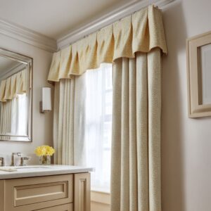
Pleat geometry as a graphic system
Pleats are often treated like a visual language rather than a soft detail. Fold spacing controls how “architectural” the curtain reads at a distance:.
- Narrow, disciplined pleats behave like fluting: a refined stripe field that pairs well with flat cabinet faces and linear counters because it adds order without adding clutter.
- Wide, slow folds read as calm massing: fewer lines, more weight, and a softer sense of quiet that can balance rooms with trim, paneling, or stronger classic cues.
A subtle but powerful relationship is “pleat rhythm vs. cabinet rhythm.
” Repetition in fabric can echo the repeat of rails, stiles, drawers, or tile joints, so the curtain feels integrated into the room’s grid even when the cloth is plain.

Stackback mass as “soft architecture”
Generous side stacks often function like architectural side elements—soft pilasters or soft columns that give the opening weight. The modern effect comes from massing that reads intentional rather than thin or skimpy.

This massing helps in three ways:.
- It creates a stable border for the bright center, so attention stays calm instead of scattering.
- It gives the door zone a sense of “planned finish,” similar to how built-in millwork would frame a focal elevation.
- It softens the transition between kitchen and dining zones by adding living-room level comfort at the perimeter.
Even when the door frame itself is slim, side mass can make the opening feel grander, because the composition reads “center glow held by side blocks. ”.

Layering as depth staging, not a privacy feature
Layered curtains often create depth the way set design does: a perimeter layer for mass, a sheer layer for atmosphere, and the outdoors as the light source. This depth staging makes the opening feel like a calm pocket rather than a flat sheet over glass.

A frequent structure is:.
- Outer drapes as side blocks (often deeper in tone or heavier in presence)
- Inner sheer as an atmospheric veil (the glow layer)
- Exterior daylight as the backlight that turns folds and weave into texture
This is where curtain ideas for sliding glass doors in kitchens often move beyond typical window styling: the goal becomes “controlled brightness + layered depth” rather than a direct view.

High mounting as proportion control through alignment
Mounting curtains high can lengthen the wall visually, but the sophisticated version is alignment. The top line often ties into crown, tray edges, or the clean datum of the ceiling plane so the curtain reads like part of the room’s built order.
When the header line sits in harmony with ceiling geometry, the door zone looks planned into the architecture, and the fabric reads like a continuous interior surface rather than a separate accessory.

Light behavior becomes the “pattern” in a modern approach
Many modern curtain approaches avoid prints and instead let light on folds become the pattern. The room gains richness through:.
- Micro-shadow stripes created by fold ridges
- Gentle gradients where daylight shifts from center to sides
- Evening depth created by warm grazing light near the ceiling line
Warm top-wash lighting is especially effective because it turns neutral fabric into a dimensional surface without changing the palette. Folds gain sculptural depth at night, and the opening still reads calm.

Texture replaces print through scale and repetition
Textured sheers can perform the role that a pattern normally would, but in a quieter way. Two useful texture families appear often:.
- Grid-like or open-weave sheers: daylight turns into a softened “pixel blur,” and the textile creates tiny self-shadows that read as refinement rather than decoration.
- Strand-like or string-style veils: sunlight becomes vertical lines, and the floor can pick up those lines as bright bands, turning the perimeter light into a compositional event.

This is the territory where window treatments for sliding glass doors in kitchen can feel highly current without loud color: texture carries the visual interest while the room stays calm.

Asymmetry that still reads stable
Some modern compositions use a single heavier stack on one side plus a glowing sheer field in the center. The stability comes from the room’s existing horizontals—counter runs, shelving lines, and base-cabinet bands—which hold the composition steady even when the curtain mass is unequal.
This creates a “resting point” for the eye while keeping the door zone airy. The result often reads curated rather than formal.

Hem behavior as a quiet status signal
How the curtain meets the floor changes the category of the room. A modern kitchen can read relaxed-luxe or gallery-clean depending on the hem attitude:.
- A controlled soft break or slight pooling signals weight and comfort, making the perimeter feel lounge-like.
- A clean near-hover keeps the wall feeling airy and edited, which suits very light textiles and strand-like veils.
This hem choice also affects the perceived width of the opening: a gentle widening at the base can make a doorway feel more generous without any change in architecture.

Styling that protects the “big calm field”
When curtains form a large visual backdrop, the most consistent supporting strategy is low, quiet styling in front of it. Rounded bowls, matte vessels, and contained centerpieces keep the curtain field uninterrupted, so the wall still reads as one calm surface.

Furniture often echoes the curtain logic too: woven textures, softly rounded chair backs, and warm woods repeat the curtain’s softness at human height, helping the perimeter feel integrated with the dining zone.

This is a frequent logic behind curtain ideas for kitchen patio doors that feel expensive: the entire door wall is treated as one composed background, and the objects in front respect that calm plane.

Visual “formulas” that commonly produce specific effects
Formula A: Calm end-wall glow
A continuous sheer field from ceiling to floor + restrained room objects + fold shadow texture as the main surface interest.

Formula B: Soft-column framing
Two substantial side stacks + a brighter center layer + a quiet door frame presence so geometry stays crisp.
Formula C: Layered depth pocket
Darker side masses + luminous inner sheer + balanced darker accents elsewhere, so the sides read rich rather than heavy.
Formula D: Long perimeter veil
Sheers continuing along a wall run (sometimes turning a corner), so glazing reads as one organized light boundary.
Formula E: Texture-as-pattern
A visible-weave sheer (grid or open weave) used as the main wall texture, supported by repeated geometric cues in ceiling details or furniture surfaces.
Formula F: Line-drawing + shading
A dark, clean door frame allowed to remain legible behind a very light veil so the opening stays crisp while the light stays soft.

This cluster aligns well with kitchen curtain ideas for sliding glass doors that aim for a modern look while keeping the room quiet and cohesive.
A compact mapping of “problem types” to visual strategies
- Glare and harsh exterior contrast often pairs with: continuous sheers, center glow layers, or layered depth staging.
- Too many hard edges often pairs with: disciplined pleat rhythm that behaves like soft fluting.
- An opening that feels visually random often pairs with: generous stackback mass that reads as soft architecture.
- A neutral room that feels blank often pairs with: textured sheers where light and weave create depth instead of print.
- A space that needs evening mood often pairs with: warm top grazing light that brings out fold depth.
- An open-plan layout that feels visually noisy often pairs with: repeated panels along multiple openings or a long curtain run that organizes the perimeter.