A lot of men kitchen ideas fail when they try to “act masculine” through obvious props (sports-bar cues, heavy signage, gimmicky color blocking). The stronger design concepts do something quieter and harder: they build a visual system where the kitchen behaves like a composed environment—edited, calm, and capable—without needing extra decor to prove it.
The “men’s style” feeling can come from how the design manages attention. The design decides exactly what gets visual weight (one monolithic island, one controlled niche, one band of warm light, one disciplined shelf), and then it refuses to compete with that decision.
That refusal is the signature behind masculine kitchen ideas: fewer elements, stronger hierarchy, and more deliberate silence between objects. This piece pulls the lesser-noticed moves and explains why they work visually.
The hidden centerpiece: “reset-ability” as an aesthetic
A striking through-line is that cleanliness isn’t presented as a chore; it’s presented as a look. Such design ideas make “clear counters” feel empty or unfinished.
These ideas turn emptiness into a feature by pairing it with something that reads purposeful:.
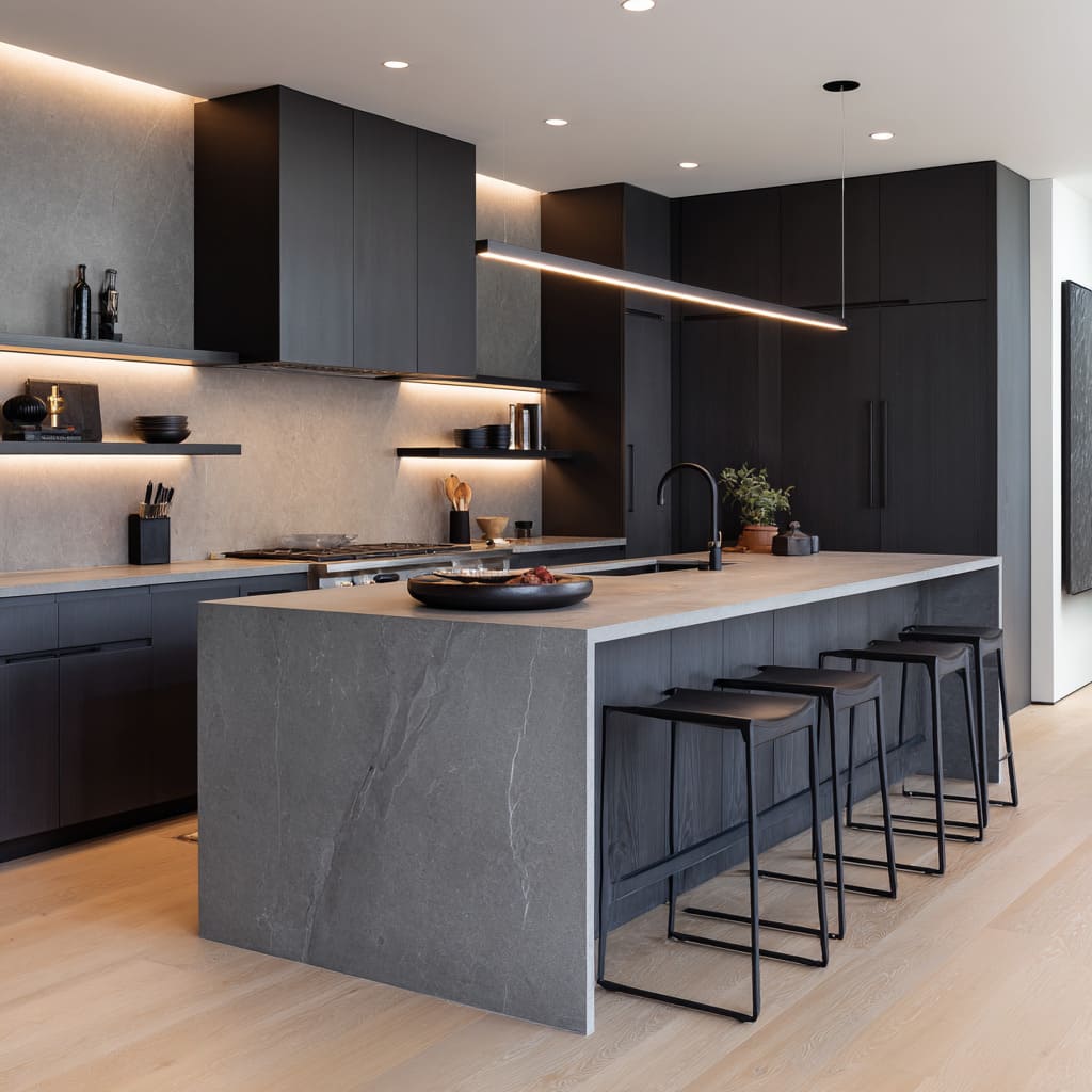
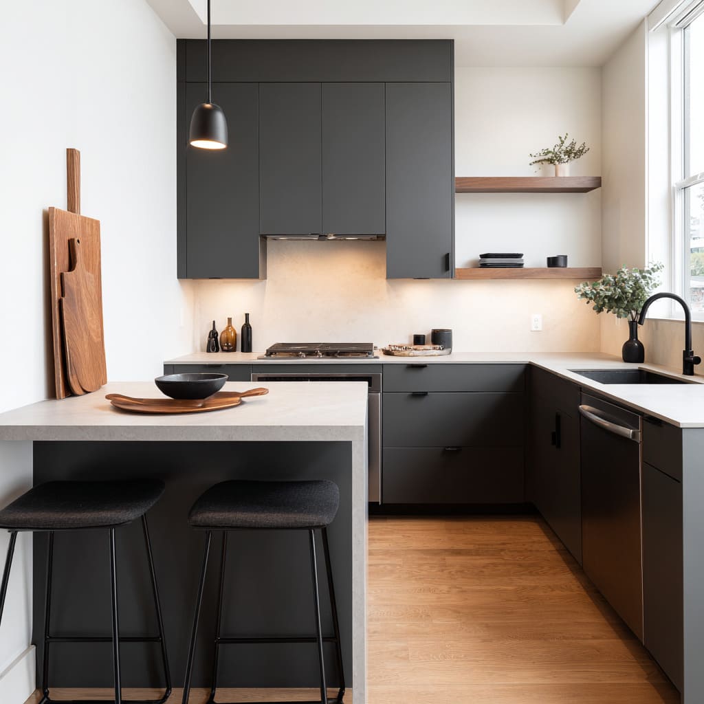
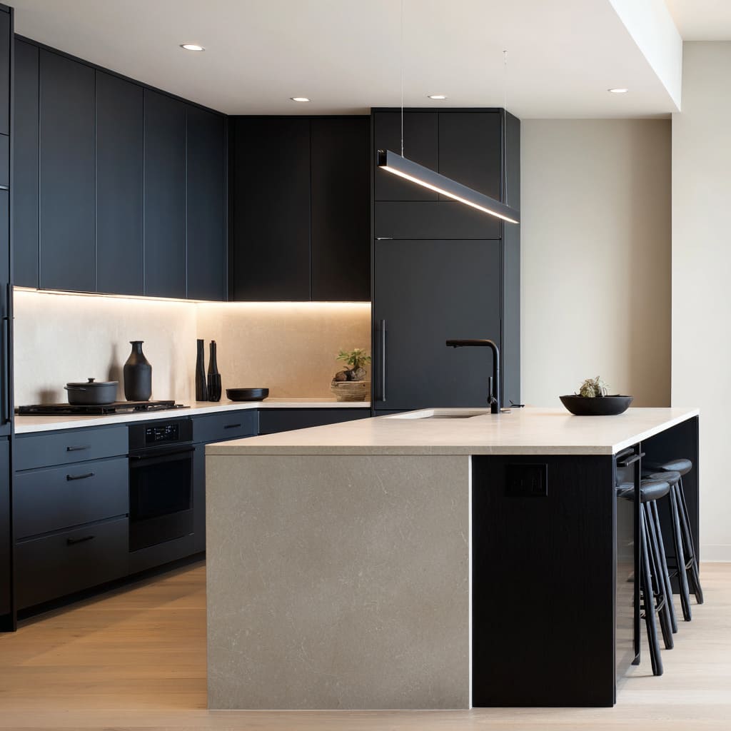
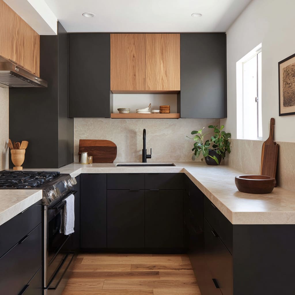
- A pale countertop strip against dark cabinetry becomes a “resting line” for the eye.
- A single heavy bowl on a tray prevents a large island from reading sterile.
- One branch arrangement adds height and softness but stays airy, so the interior design still reads sharp.
The point: visual reset is designed into the composition, not achieved by adding more decoration. The design looks “done” because the architecture of attention is already complete: big planes, one light band, one anchor object, and then nothing else needs to argue.
This is why so many men’s kitchen decor ideas feel ready even with minimal items. They aren’t under-decorated; they’re pre-decided.
The “one-object” illusion: kitchens that read carved
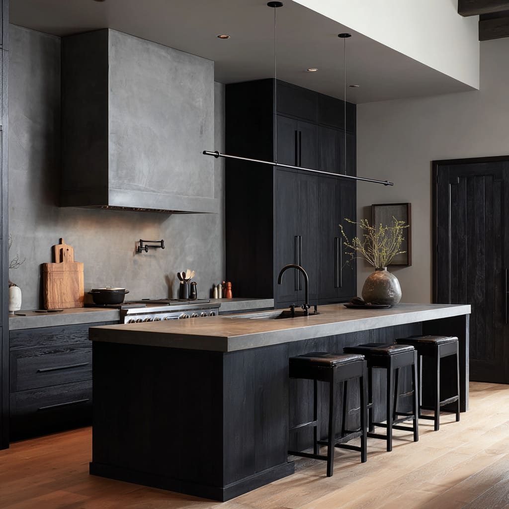
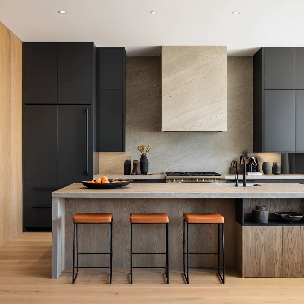
A major masculine signal is the preference for objects that read as single volumes—especially islands. The repeated trick is to make an island feel like a single piece in the interior design, not “cabinets plus a top.
”.
Even when materials vary, the island is staged as a unified block:.
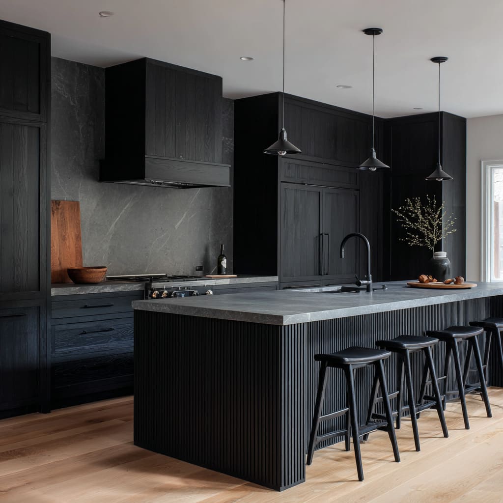
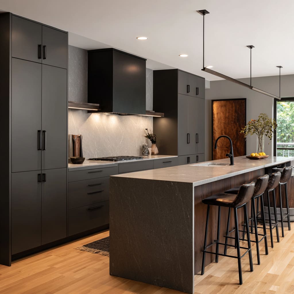
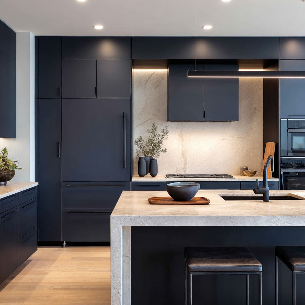
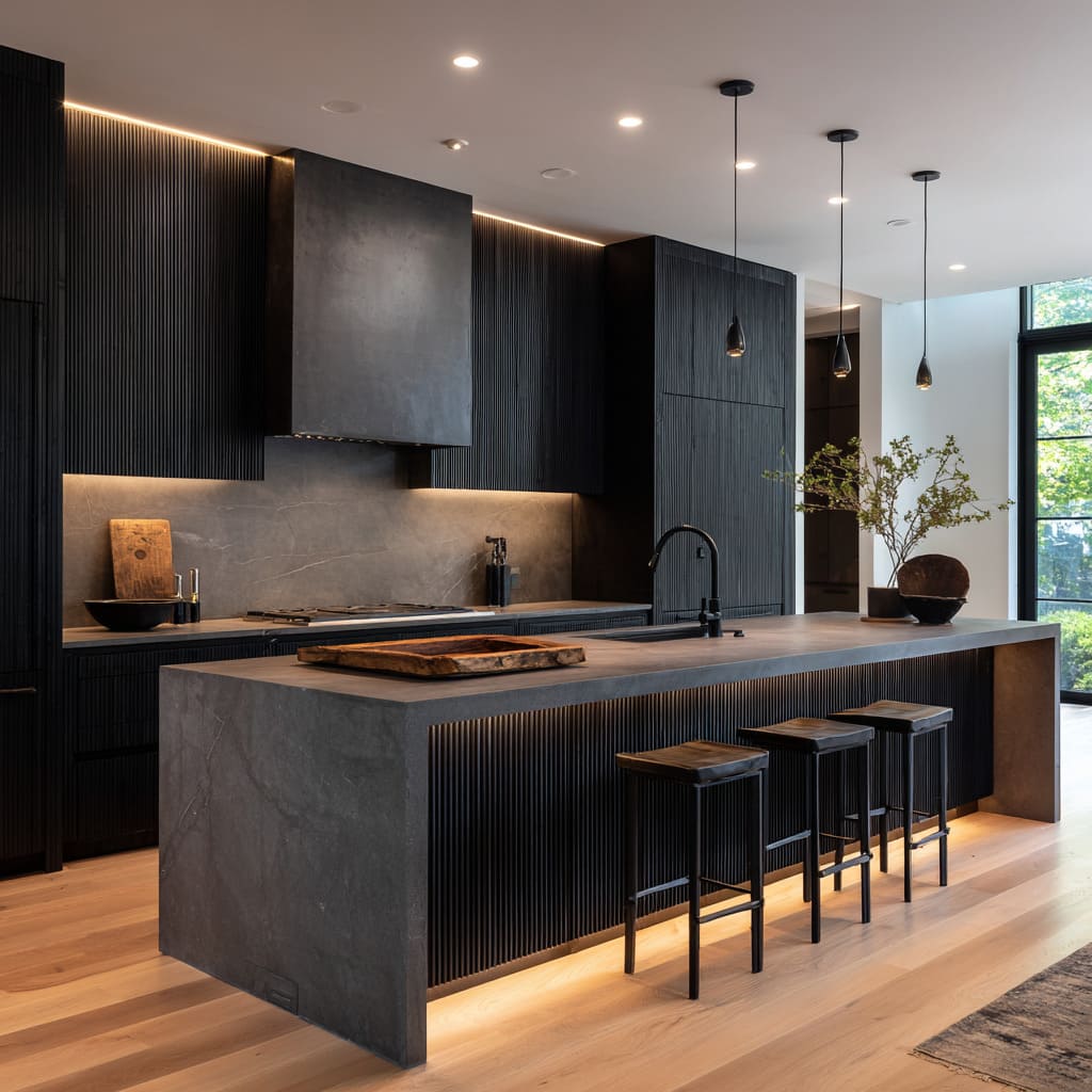
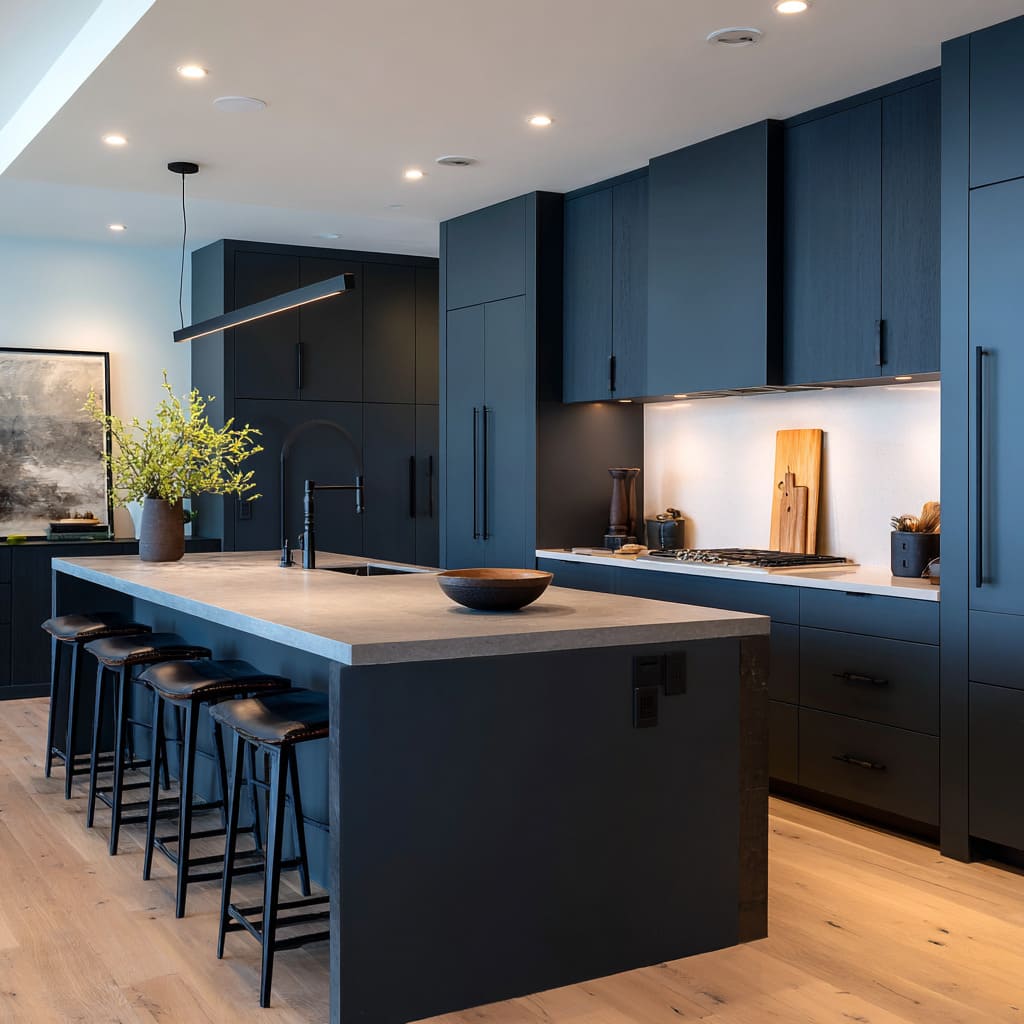
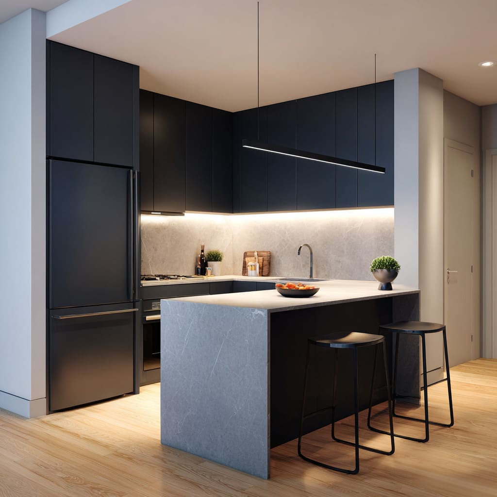
- Waterfall end panels that run to the floor create an uninterrupted silhouette.
- A darker end face or stone drop gives the island a “side-view authority,” like a monolith you notice even in peripheral vision.
- A plinth-like dark base under a lighter top creates a shadow structure: light plane above, grounded mass below.
The deeper observation: the masculine feel often comes from reducing seam-thinking. When the eye can’t easily count parts—door, toe-kick, panel break, trim change—the interior design reads steadier and more confident.
It’s the same visual logic as a solid watch case or a clean leather briefcase: one form, clear edges, minimal fuss.
Warmth is not scattered; it’s dosed
A lot of people assume “masculine” equals cold. But it can be the opposite: warmth is present, but it’s controlled.
The interior designs avoid cozy chaos by keeping warmth in disciplined placements and limited forms.
There are three warmth strategies:.
A) Warmth at eye level, not only on the floor
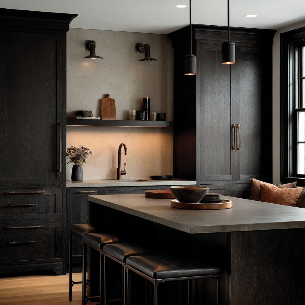
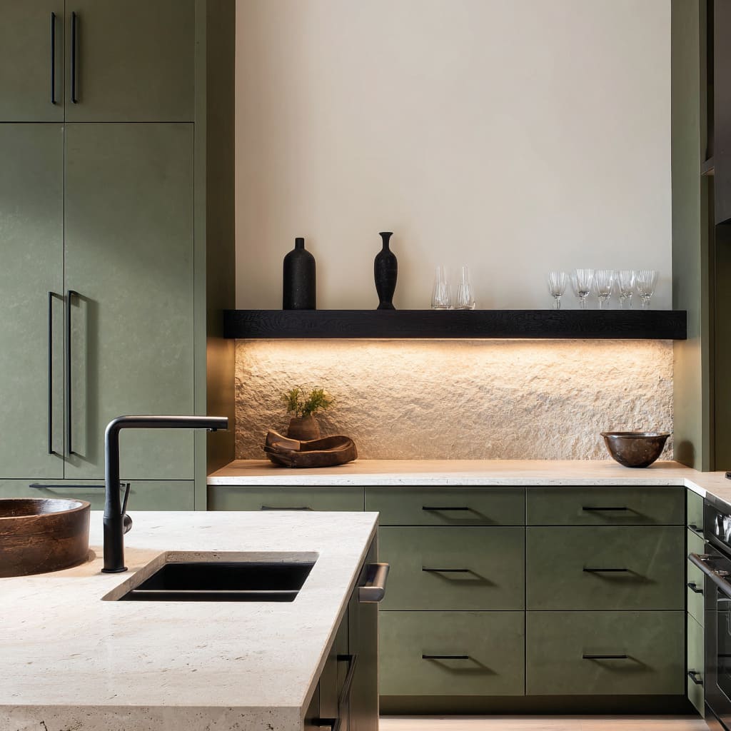
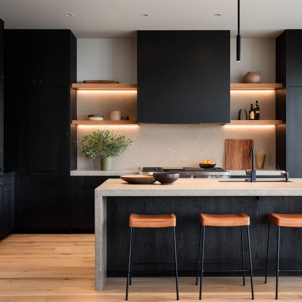
Warm light bands under uppers or inside niches put warmth where the gaze naturally rests while standing at the counter. This changes the mood without adding colorful décor.
B) Warmth as one concentrated material “zone”
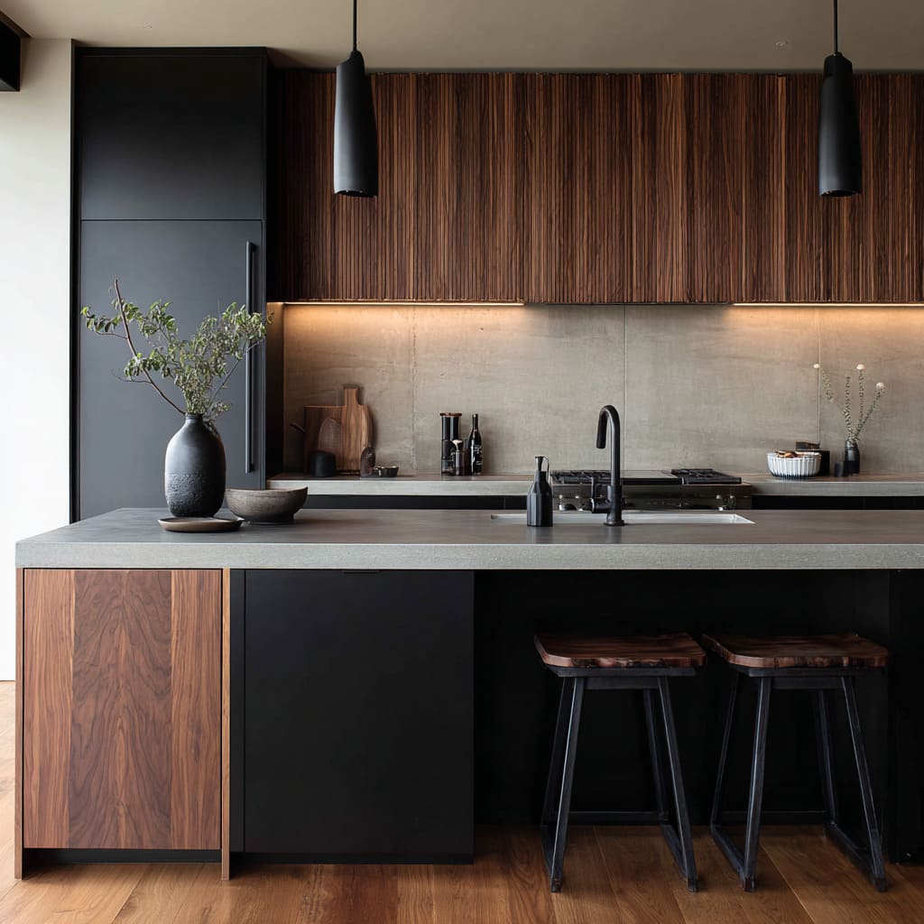
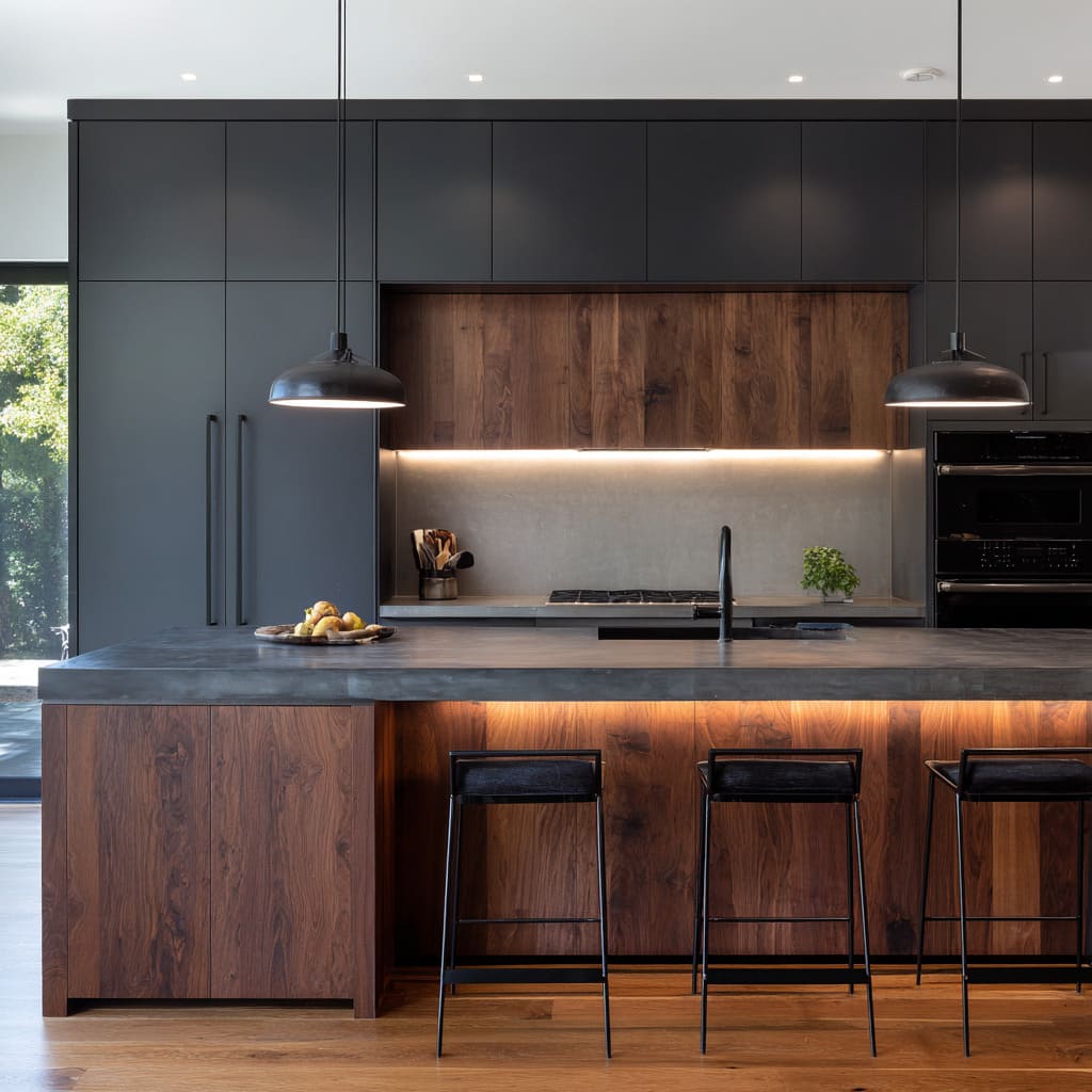
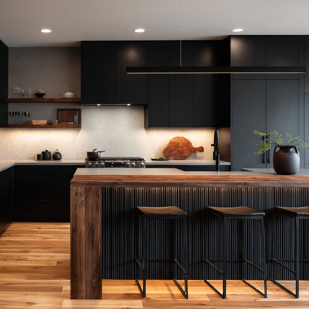
Instead of many small wooden accents, warmth appears as one meaningful block: a wood upper mass, a wood island face, a thick wood cap, or a warm band behind the cook area. The interior design reads calm because warmth is not sprinkled; it’s placed like a decision.
C) Warmth as tactile seating
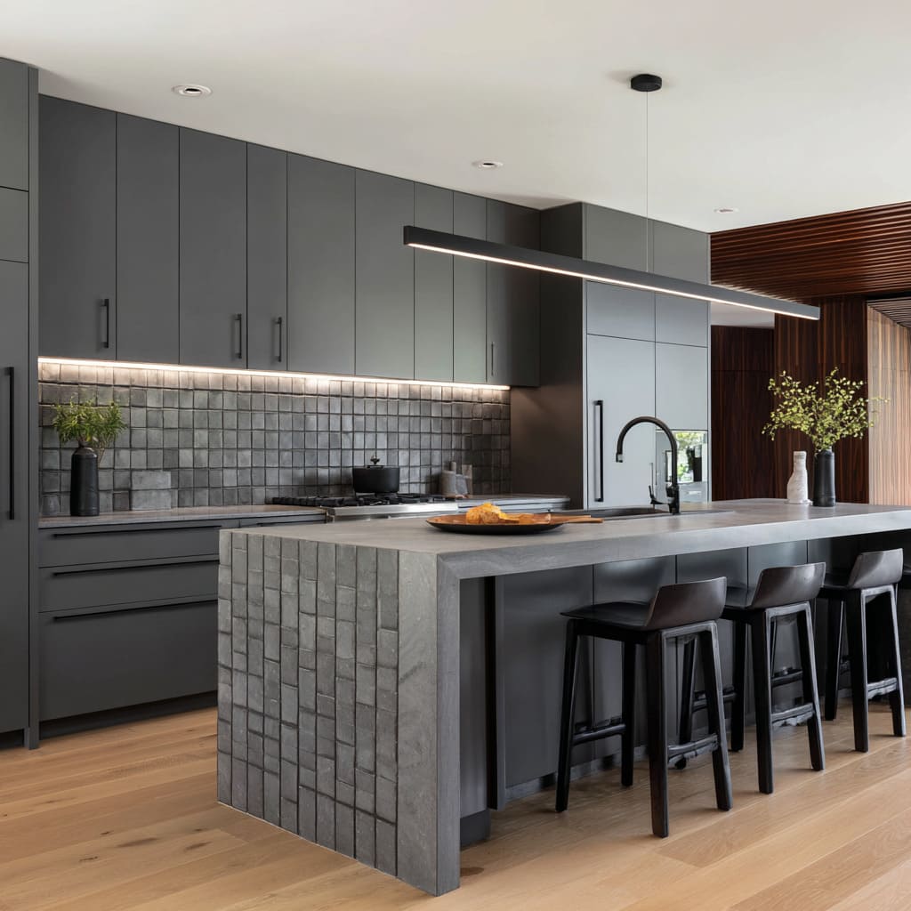
Leather or warm-toned seats repeatedly show up as the human-contact layer. It’s a subtle move: the warmth sits where bodies touch—seat height—so the interior feels welcoming without looking decorated.
The effect: controlled warmth makes dark palettes feel intentional, not heavy. Warmth becomes a stabilizer, not a theme.
Lighting as geometry: the “horizon line” effect
A defining aesthetic in men kitchen ideas is that lighting is treated like a drawing tool. Instead of sparkly fixtures or visually busy pendants, many such interior designs rely on linear light behaviors:
- Under-cab light reads as a horizontal horizon that separates upper mass from counter plane.
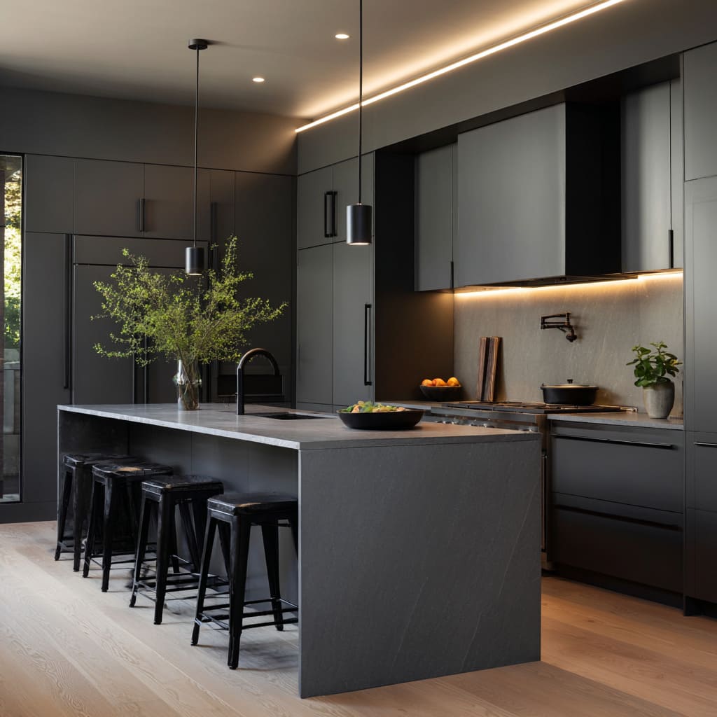
- Cove or ceiling-edge glow outlines the design and gives dark cabinetry a finished perimeter.
- A single thin bar pendant acts like a line pulled through space, echoing counter edges and cabinet runs.
What’s interesting is the psychological role: a horizon line makes darkness feel designed rather than accidental. Darkness becomes a background plane, and the warm line becomes the “evidence” of control.
It’s the same reason a dark jacket looks sharper when the collar line is crisp; the outline signals intention.
In most club-like interior design concepts, under-island glow adds a second kind of line—one that turns the seating side into a social perimeter. It reads as atmosphere without adding objects.
This is where man cave kitchen ideas can evolve: not through themed decor, but through lighting that makes the kitchen feel like an evening space even when it’s minimally styled.
Texture replaces ornament (and it does it in a very specific way)
When color is limited (charcoal, navy, matte black, olive, deep green), the interior design still needs richness. Stylish interior design concepts avoid “busy pattern” and instead lean on textures that create shadow rhythm.
Key examples:.
- Ribbed island fronts that create thin vertical shadow stripes .
- Fluted wall panels that make tall surfaces feel deep and expensive without shine .
- Wood grain visible through dark finishes so black doesn’t look flat.
- Subtle tile or grid relief used as tactile pattern rather than high-contrast decoration.
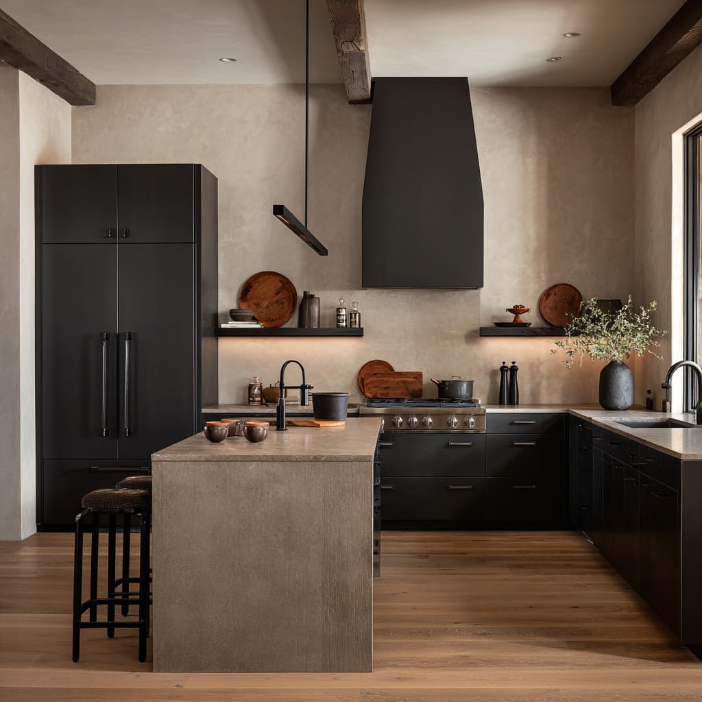
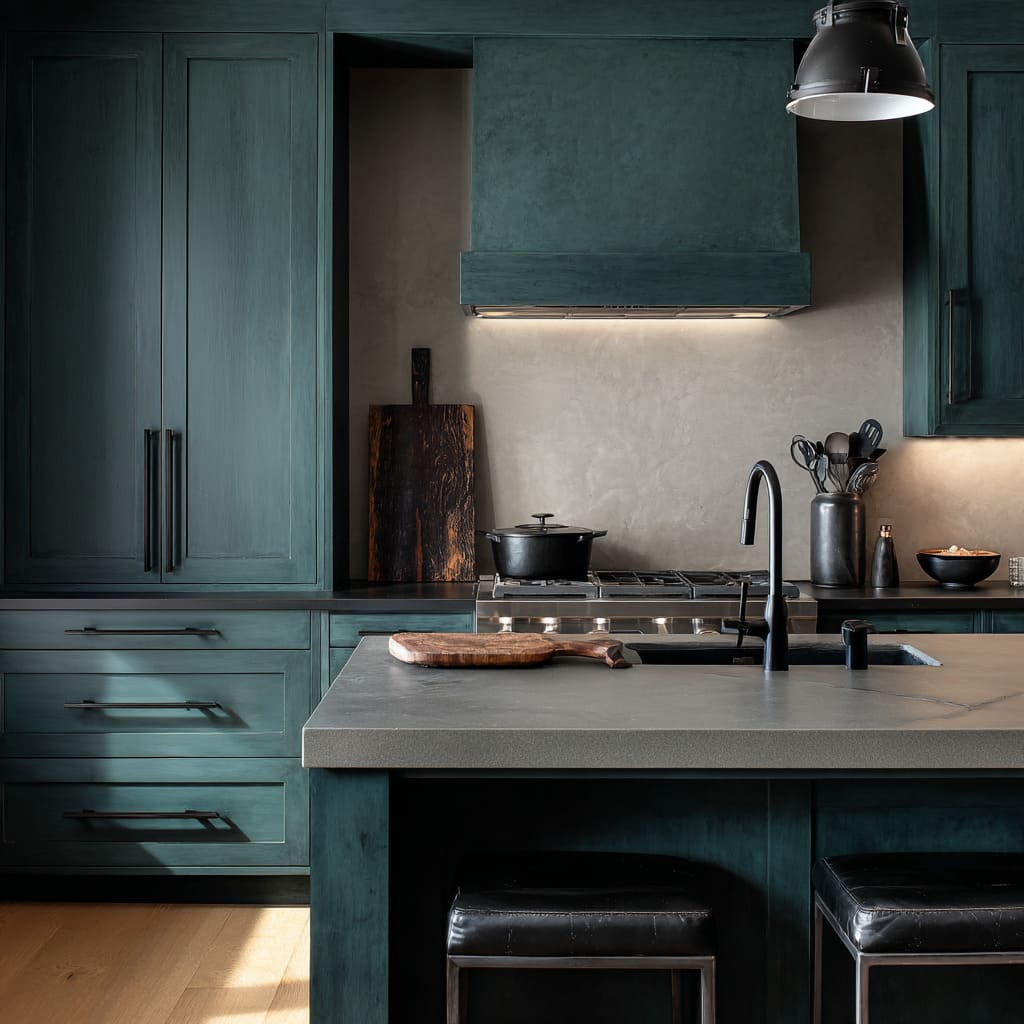
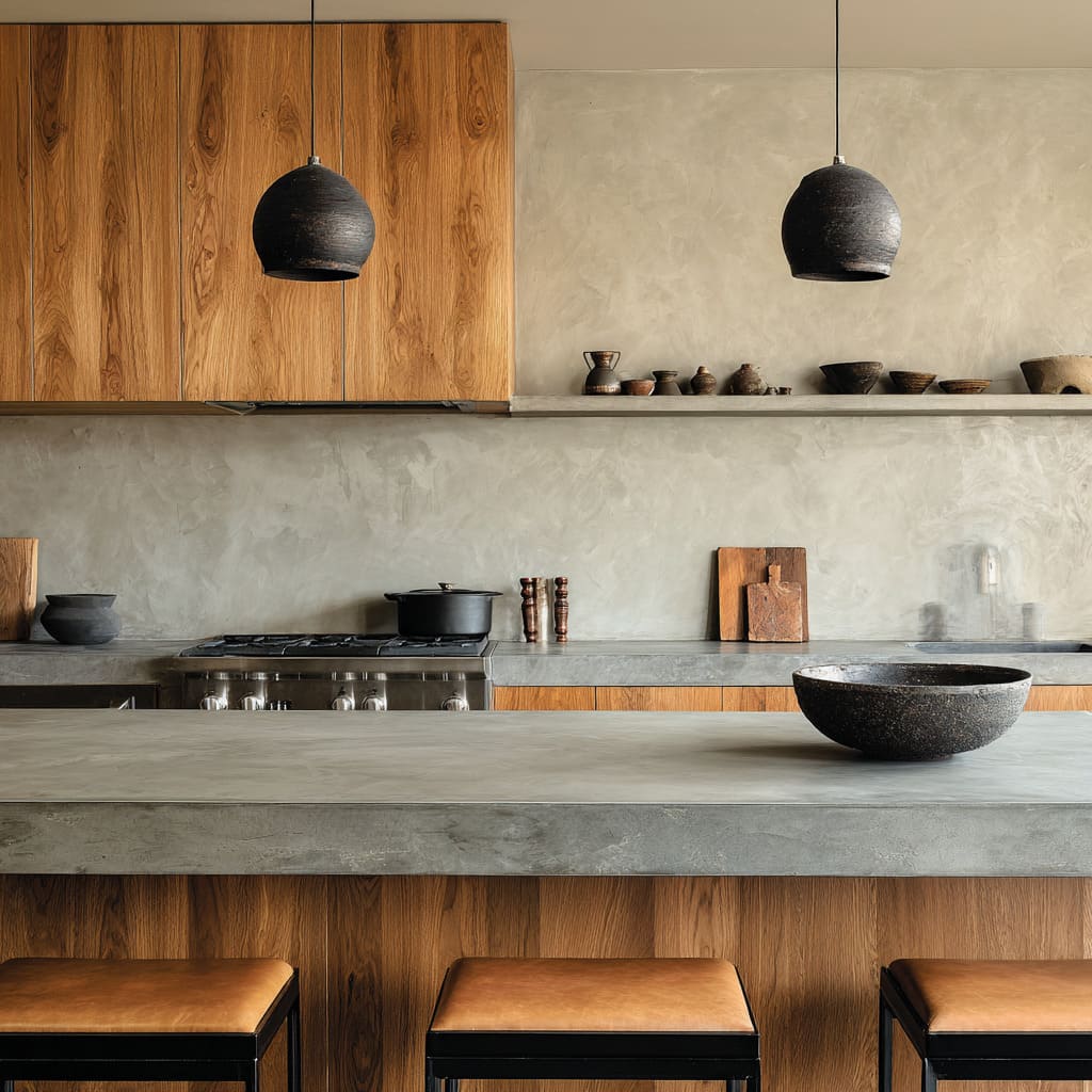
- Plaster-like, cloudy wall surfaces that add micro-variation without looking patterned.
The deeper point: shadow rhythm gives the design detail without requiring objects. That’s why kitchen designs can keep counters clear and still feel layered.
Texture performs the job that “stuff” often performs in more traditional decorating.
The “silhouette rule”: objects chosen to read as shapes first
The styling can follow a quiet but strict rule: decorative items are selected for silhouette clarity. Many pieces work even when you can’t see their details—because their outline is legible and weighty.
Repeated silhouette types:.
- Tall matte vessels (strong verticals) near the back counter or inside niches.
- Leaning boards (warm rectangles) that read like functional art.
- Low bowls (heavy circles) placed on islands to anchor the surface.
- Branch arrangements (airy volume) that give height without floral softness.
Why this matters: silhouette styling stays calm in wide views. It doesn’t create a mess of small items.
It also matches the broader “workbench” vibe: the objects feel like tools and rituals, not decorative collectibles.
That’s a core trait of effective men’s kitchen decor ideas: the design reads organized because the objects are few, legible, and grouped.
Negative space as a status signal
One of the least obvious but most powerful moves is purposeful emptiness—especially in open-plan kitchens. Some design ideas refuse to fill walls and corners, and that refusal reads “adult” and composed.
Examples:.
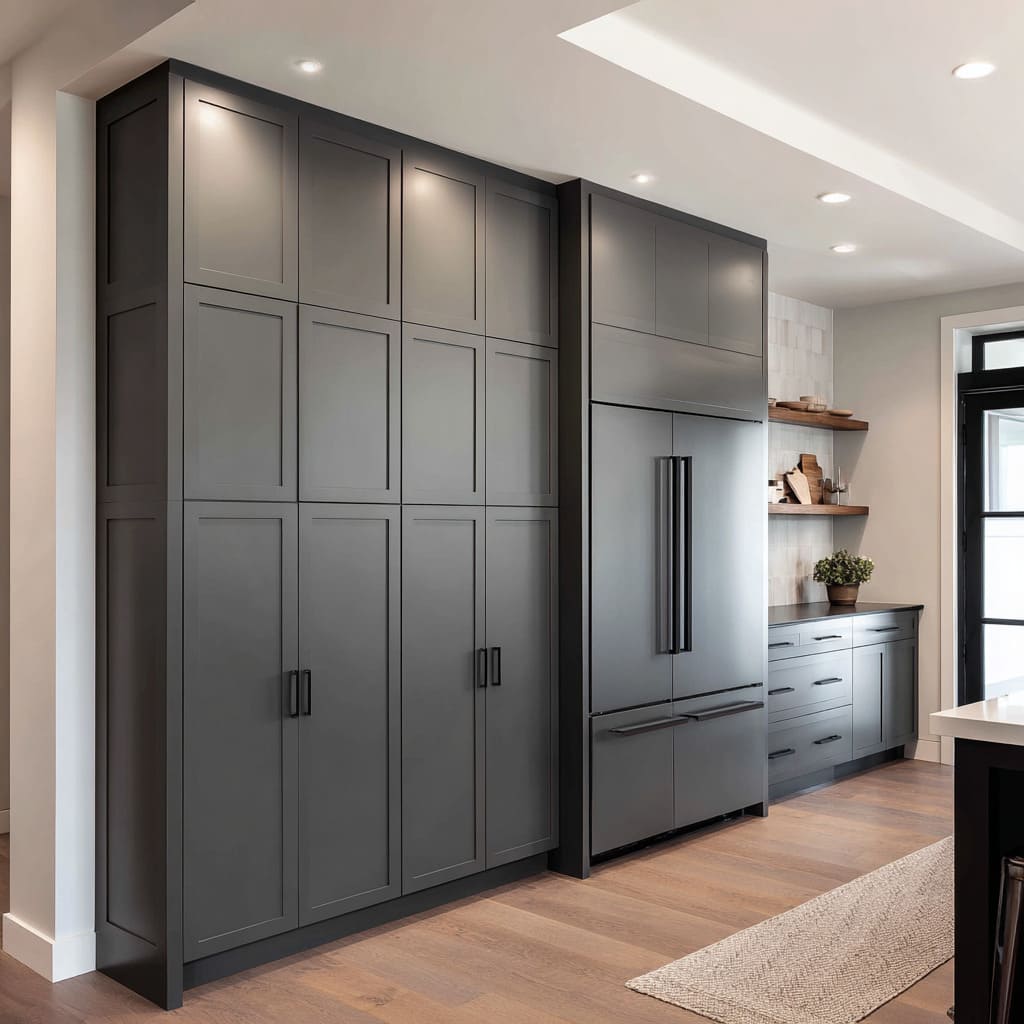
- A mostly blank wall area beside an L-shape, letting cabinetry read as a clean block.
- Large uninterrupted tall cabinet walls that behave like architectural panels.
- Minimal interruption on upper runs so the eye rests on continuous planes.
The insight: negative space functions like visual confidence. When interior design can afford to leave areas quiet, it feels less anxious and less decorated for approval.
It’s the spatial version of wearing a simple dark suit with perfect fit rather than piling on accessories. The space implies it’s designed to be lived in without constant visual performance.
Man-cave energy without clichés
Kitchen design can carry a private-lounge mood—yet they avoid the usual bar cues (neon signs, displays everywhere, overt sports themes). The mood is built through structure and ritual zones:
- Under-island glow suggests evening hosting without changing the daytime function.
- Long runs of stools create a calm social line; the repetition is what signals gathering.
- Glassware appears in limited, organized clusters, often inside a recessed niche or on a framed shelf so it reads like a station, not decor.
The deeper idea: a bar feeling can come from containment and spacing, not from obvious accessories. A recessed niche with warm wash light becomes a controlled “scene,” and that’s enough to suggest ritual—coffee, late-night snack—without turning the kitchen into a theme design.
This is where man-cave kitchen ideas become genuinely high-level: the cave is not a gimmick; it’s an atmosphere created by light pockets, disciplined storage faces, and one social counter line.
Colors: not only black!
Dark kitchen designs often rely on black. There are more nuanced “shadow colors” that feel masculine while staying refined:.
- Navy/ink reads like the color of formal clothing—serious, clean, quiet .
- Deep teal behaves like a shadow that shifts with light, making planes feel dimensional without pattern.
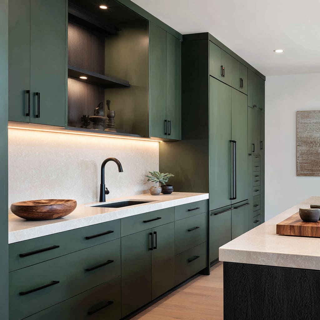
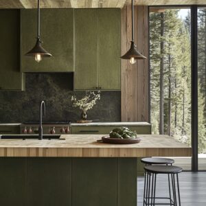
- Olive/field green signals grounded calm and pairs naturally with stone/plaster looks.
- Deep green provides mood without the severity of full charcoal, especially when paired with pale counters and warm light bands.
What makes these work is that color is treated as a background mass. The design doesn’t try to “decorate with color”.
It uses color to set a calm base tone, then lets light and texture do the storytelling. That’s an overlooked pillar of strong masculine kitchen ideas: the palette behaves like a steady backdrop, not a main event.
The “quiet frame” trick: building a focal area without decorative drama
Design concepts can create a focal zone around the cook area, but they do it without loud patterns or ornate centerpieces. The cook area becomes a feature through framing:.
- Tall dark cabinet blocks on both sides create a visual portal, then a lighter slab or textured surface sits in the center.
- A bright niche inside a dark cabinet wall acts like a clean stage rectangle.
- A hood treated as a solid geometric volume (dark block or stone box) gives the center gravity without ornament.
The subtle effect: focal points feel calmer when they are made from proportion and framing rather than decorative busyness. The kitchen design looks intentional in wide views because the eye understands the hierarchy instantly: storage mass → framed center → island block.
Repetition as order: stools, pulls, pendants as rhythm makers
A major reason kitchen designs feel controlled is repetition. Not the repetitive “matchy” kind, but the rhythm kind:.
- Stools aligned in a steady row make the island feel longer and more purposeful.
- Long linear pulls repeat like grip marks, reinforcing a tool-like language.
- Small pendants repeated like punctuation marks support order without becoming a chandelier moment.
The read: repetition lowers visual anxiety. The design looks organized even when objects are present, because the dominant impression is a steady rhythm.
This is also why many design concepts can handle a darker palette; rhythm prevents darkness from feeling chaotic.
Understated premium feel
Often, designs attempt “luxury” through shine, decorative statements, and busy surfaces. Men’s style kitchen designs get a premium feel through quieter signals:.
- Low-glare finishes absorb reflections, which makes surfaces feel calm and serious.
- Thick edges and large planes create visual weight, which reads confident.
- Texture lives in shadow (ribbing, fluting, grain, plaster variation) rather than in high-contrast pattern.
- Styling uses fewer items with clearer silhouettes, grouped with breathing space.
The result is a specific kind of maturity: not showy, not cute, not busy—simply controlled. That’s the engine behind effective men’s kitchen ideas.
Men’s Kitchen Smart Map: Main Ideas & Design Rules
The “men’s kitchen” feeling is built from a handful of repeating visual behaviors:.
- Containment reads as calm: large closed faces, fewer interruptions, clear hierarchy.
- One-object islands create authority: waterfall sides, monolithic silhouettes, grounded bases.
- Warmth is concentrated: light bands, one wood zone, leather touchpoints—never scattered.
- Texture replaces decoration: shadow rhythm does the work objects usually do.
- Silhouette styling beats accessory styling: fewer, heavier shapes; grouped and low.
- Negative space signals confidence: blank zones and clear runs are part of the composition.
- Social mood comes from rhythm: aligned stools, repeated pendants, underglow lines—not bar props.
That is why such designs read as high-level masculine kitchen ideas and upgraded cave kitchen ideas: the designs don’t announce themselves with themes. They feel composed because the attention system is controlled—light, mass, rhythm, and restraint doing the work that decoration usually tries to do.

