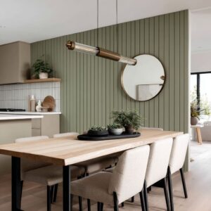
Emerald behaves like a color with memory: it borrows mood from whatever sits next to it, and it keeps that mood long after the eye moves on. That’s why the most convincing emerald green sofa living room ideas rarely depend on “more decor.
” They depend on a few big, almost invisible decisions—value balance, surface sheen, backdrop discipline, and the way soft elements are sized so the green reads intentional instead of accidental. What follows is a deep look at the styling logic that made interior designs with emerald sofas feel calm, high-end, and visually controlled.
Emerald is a “value anchor,” not simply a color
Emerald reads as a deep value first, and a hue second. The green can be treated like the darkest upholstered plane in the scene, then everything else is arranged to keep that depth from spreading and feeling heavy.

The quiet value ladder that keeps emerald refined
A design pattern is a four-step value ladder:
- Very light planes: white walls, pale plaster, light stone, bright ceiling
- Mid neutrals: soft gray drapery, muted rugs, warm oak floors
- Deep color mass: emerald upholstery
- Sharp dark cuts: black TV screen, a linear firebox opening, black window frames, slim metal tables
A not-so-obvious idea: emerald looks “expensive” when it’s allowed to be the only saturated deep mass, while black accents give it edges. Without those dark cuts, emerald can start to feel like a wide paint spill—beautiful color, weaker structure.

The backdrop doesn’t “match” emerald; it edits it
Interior design with an emerald couch can use dramatic backdrops—marble TV walls, tall stone fireplaces, concrete panel walls, slatted wood millwork. They aren’t there to compete with green; they act like editing layers that decide what kind of emerald shows up.

Backdrop types and the emerald they create
- White/gray marble makes emerald look like a jewel in a museum case: crisp, graphic, high contrast. Veining also supplies a ready-made black/white pattern language, so pillows and accessories can stay minimal.
- Cool gray stone can make emerald feel calmer and more botanical, because the palette shifts mineral-first, plant-second. The green becomes the softness that keeps the architecture from feeling cold.
- Concrete forces emerald to read sculptural. Hard grid joints + soft upholstery turn the sofa into the “human” element, especially when the sofa shape is curved or extra low.
- Warm wood (slats, walnut tables, oak floors) turns emerald more welcoming and slightly warmer visually, even when the green is very deep. Wood acts like a warmth bridge between green and white.
This is why emerald green couch living room ideas often succeed when the background is treated like a large calm canvas—light, mineral, or wood—rather than another strong color competing for attention.

Sheen and curvature: the secret reasons emerald looks dimensional
Emerald upholstery rarely reads as a flat block in the best spaces, even when the sofa is huge. Two quiet factors are doing the work:
A) Surface sheen acts like built-in shading
Velvet-like surfaces create micro-highlights on the seat crown and deeper shadows in seams and corners. That automatically adds depth—so the room needs fewer “decorative” layers to feel finished.
B) Curves modernize emerald instantly
A curved silhouette makes emerald feel contemporary because the color travels over changing angles. The green shifts from bright highlights to inky shadows as the surface turns, which reads intentional and sculptural against strict architecture like concrete panels or a linear fireplace.

The “shadow rug” vs the “halo rug”: how rugs change emerald’s weight
Rugs weren’t just grounding. They were actively controlling how heavy the green felt.
Shadow rugs
Deep charcoal or smoky gray rugs behave like a shadow under the seating group. The emerald sits on top of darkness, so it reads richer and more jewel-like instead of bright.
Halo rugs
Light rugs with subtle linework keep tall, white rooms buoyant. Here emerald becomes the anchor at human height, while the floor stays airy.

Proportion rules that make the green look intentional
They’re visual balance rules that keep emerald from dominating:
- A large rug typically extends 8–12 in (20–30 cm) beyond the sofa on open sides so the green doesn’t become the largest “patch” in view.
- The rug often extends 18–24 in (45–60 cm) beyond the coffee-table footprint, so the center composition feels generous instead of tight.
- In multi-sofa layouts, the rug reads strongest when it reaches under the front legs of all seating pieces, so emerald repetition looks planned rather than scattered.
When rugs are undersized, emerald gains visual authority in the wrong way: it starts to look louder because there’s no competing field large enough to balance it.

Art scale is less about “filling the wall” and more about stabilizing emerald
Art placement in emerald rooms is easy to misunderstand. The best compositions aren’t trying to decorate the wall; they’re trying to keep the green from feeling like a lone heavy bar.
Art scale logic that stabilizes the sofa
A proportional relationship:
- Art width often lands around 2/3 to 3/4 of the sofa width when placed above it.
- Vertical placement stays close to human eye level, even in double-height rooms. Hanging art too high makes the sofa feel detached—emerald becomes a “furniture object” rather than part of a coherent living scene.
An important exception for interior designs with feature walls, like a marble media-wall: the marble itself functions like oversized artwork. In those interior designs, extra wall art can look like visual noise, because the “art moment” is already handled by the stone’s veining and scale.

This is one of the reasons emerald green sofa decorating ideas can feel more sophisticated when the wall treatment is treated as the primary visual story and smaller decor stays disciplined.

Curtains are color grading for emerald, and width matters more than pattern
Drapery choices can be surprisingly restrained: soft gray, warm white, and simple fabrics. That restraint is doing high-level work—curtains sit next to daylight and reflect onto the sofa, subtly shifting the green.

Curtain width and length: the visual effect, not the “rule”
- Generous width (fabric that stacks richly when open) makes emerald look calmer because the folds create soft vertical shadows that echo the sofa’s depth. Skimpy panels create thin lines that can make the green look heavier by contrast.
- Floor-kiss length keeps modern rooms crisp. Puddling pushes the mood romantic; it can make emerald feel more traditional, especially with brass accents.
Tone shifts:
- Cool gray curtains echo marble veining, making emerald read sharper and slightly cooler.
- Warmer greige or warm white makes emerald feel deeper and more forest-like, especially at night.

Light temperature turns emerald into different “characters”
Emerald is unusually sensitive to warm vs cool lighting. The same fabric can feel jewel-like, botanical, or slightly teal depending on how the room is lit.
How emerald shifts with bulb temperature (as a look effect)
- Warm light (around 2700K): emerald deepens and looks more “jewel.” Whites drift creamy; brass feels richer; the room reads intimate.
- Warm-neutral (around 3000K): emerald stays truer; stone remains cleaner; the palette reads balanced and modern.
- Cooler light (3500–4000K): emerald can tilt cooler, sometimes slightly teal; stone and marble look crisper; the mood feels sharper and more gallery-like.
The most effective interior designs also used reflective metals (warm brass tones) and clear or smoked glass fixtures. That combination acts like gentle color correction: it warms the scene without making it yellow, and it keeps emerald from looking flat in the evening.

Pillow “recipes” that create depth without turning the sofa into a collage
The strongest pillow styling isn’t random variety. It’s a controlled layering system that keeps emerald from feeling like one giant color slab.
A high-contrast, marble-friendly recipe
- Two 22″ (55 cm) textured ivory pillows (nubby, boucle-like) to create light relief
- Two 20″ (50 cm) near-black pillows with subtle micro-texture (dots, tight weave) to echo TV/fireplace cuts
- One 20″ (50 cm) black/white graphic to link to veining, window frames, or metal legs
Effect: emerald reads tailored and modern; the sofa gains “edges” and rhythm.

A mineral + wood recipe for calmer fireplace rooms
- Two ivory/stone linen-look pillows for softness
- Two small-scale beige/gray patterned pillows that quietly echo stone texture
- One warm taupe or camel lumbar to bridge to wood tables and floors
Effect: emerald reads botanical and grounded, not theatrical.

A curve-forward recipe that avoids symmetry
Curved emerald sofas look best when pillows feel intentionally uneven:
- One light neutral texture
- One charcoal/green microprint
- One rust/cinnamon accent (small but powerful)
Effect: the curve stays visible, emerald reads sculptural, and the palette feels alive without getting busy.

Emerald repetition: why two green pieces feel “planned” instead of “bold”
One emerald sofa can feel like a statement purchase. Two emerald seating pieces feel like a design decision—because repetition creates legitimacy.
In interior design concepts with both a sectional and a second sofa, emerald stopped being an accent and became a foundation color.

That repetition works best when everything else stays disciplined:
- neutrals remain large and quiet,
- black lines supply structure,
- wood supplies warmth,
- pattern is concentrated in one place (often pillows or a rug), not everywhere.
This logic sits at the heart of living room ideas with an emerald green sofa where the goal is “intentional” rather than “lucky. ”

The “gravity line” in tall rooms: emerald as the human-scale horizon
Double-height rooms and staircase ones can make furniture feel visually small. Emerald solves that because it reads strongly at eye level.
The sofa’s top edge becomes a horizon line that the gaze returns to, stabilizing all the vertical movement created by railings, high windows, and tall walls.

Supporting moves that reinforced that gravity line:
- pale rugs that keep the floor light, so emerald becomes the anchoring depth,
- round coffee tables that soften long stair diagonals,
- minimal wall decor placed at human height, not floated high into the tall wall space.
In such cases, emerald isn’t “color. ” It’s the thing that makes the room feel livable rather than cavernous.

Hard architecture needs one soft contradiction, and emerald delivers it
Concrete panel walls, long linear fireplaces, and large marble slabs can feel strict. Emerald is successful in these settings because it’s a soft contradiction: plush texture against hard planes, deep color against pale mass, comfort against geometry.

The most interesting version of this idea is when the sofa shape amplifies the contradiction:
- a curved emerald sofa against a gridded concrete wall,
- a low, wide emerald sectional beneath oversized stone,
- a rich green piece paired with razor-thin black side tables.
Emerald becomes the “human note” that keeps the interior design from feeling like too architectural.

One major pattern is enough: marble veining, rug geometry, or pillow graphics
A consistent subtle discipline: an interior design typically chooses one place to let pattern speak loudly.
- If marble veining was the hero, pillows stayed graphic but controlled, and other décor stayed quiet.
- If the rug carried a bold abstract pattern, the wall stayed calmer and accessories went minimal.
- If slatted wood millwork created strong linear rhythm, art and tabletop objects stayed simple and low.
This is a lesser-known balance move: emerald already brings intensity. Pattern needs a single “stage,” otherwise the green starts fighting instead of anchoring.

Why emerald feels “finished” when small green echoes appear elsewhere
A popular finishing touch wasn’t more green fabric—it was green in living form: plants, stems, or a floral moment that repeats the hue in a lighter, airier way. That echo changes the story of emerald.
It stops reading as a dramatic decor choice and starts reading as part of a natural palette.

Even when the arrangement is small, it creates an important visual message: the sofa green is connected to life, not simply to color.

The main idea underneath it all
Emerald succeeds when it’s treated like a deep, soft architectural element—something that carries weight, sets mood, and anchors scale. The strongest interior design ideas do not decorate around a green sofa.
They build a controlled environment where emerald could behave as either:
- a jewel against bright stone and black lines,
- a botanical softness against mineral textures, or
- a sculptural curve against strict geometry.
That is the deeper thread behind emerald green sofa ideas: not the color itself, but the way the interior design edits the color into a specific personality.