Strong wall headboard ideas usually work because the bed wall is treated like a designed surface that sets order, scale, and calm—so the bed doesn’t feel like it’s simply placed in front of paint. Many bedroom headboard wall ideas succeed with the same underlying structure:
- The field: one dominant wall gesture that reads as intentional “backdrop” (a framed bay, a continuous material plane, a disciplined grid, a rhythmic line system, or a contained dark shape).
- The comfort band: a soft, low layer at pillow height that keeps the bed readable and prevents textiles from visually fighting the wall surface.
- The closure line: a finishing move that locks the scene (trim edges, a thin ledge, controlled reflection margins, or light that draws a clean boundary).
Once that three-part logic is present, the interior design can stay visually quiet and still feel complete.
Wall headboard ideas, grouped by how the wall behaves
Most wall headboard looks fall into a few predictable “wall behaviors. ” If there is a specific behavior which it needs to achive, the whole decision becomes easier.
The recessed “stage” wall
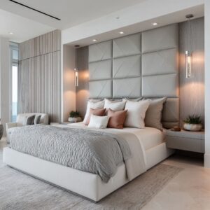
This is the bed wall that feels built-in without needing extra decor. A clean inset field gives the bed a dedicated home, then a low, soft comfort band sits at pillow height so the recess stays the main plane.
The calm upgrade comes from one controlled light edge or a gentle top wash that makes the recess feel intentional, not heavy.
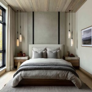
The single material plane
Instead of “headboard as object,” the wall becomes one quiet surface—stone-look, microcement feel, or any continuous finish with subtle movement. The headboard stays low and smooth so the wall reads wide and steady, and lighting does the warmth work through soft grazing or a low horizon glow.

The rhythm wall (slats, ribbing, battens)
Repeated lines replace artwork. Vertical rhythm adds height and gives the bed wall micro-shadows that change through the day, while the bed stays soft and restrained so the wall remains the structure.
This approach is strongest when you keep the rhythm disciplined and let light skim it gently rather than spotlighting it.
The soft grid (upholstered panels, padded squares, woven grids)
Panels and seams create “tailored geometry” without tufting drama. The grid gives order and depth through shadow, which is especially useful in neutral bedroom designs that feel flat.
It reads expensive when the seams stay calm and the bedding stays in a tight value range.

The framed panel composition (trim fields or wallpaper panels)
Here, the wall behaves like a measured backdrop: vertical fields create structure, and one calm focal band (often a single wide artwork or a gentle horizontal motif) prevents the wall from feeling too tall. This is a strong choice when the layouts is slightly awkward, because the wall’s field logic becomes the visual measuring system.

The arch or niche gesture
An arch (architectural or upholstered) gives the bed a boundary, which is why it works so well in small or layouts that feel squeezed. The best versions echo the shape softly—an architectural arch paired with a “soft arch” headboard—so it reads intentional rather than theme-like.
The controlled reflection insert
Reflection can brighten and deepen the bed wall, but it has to be contained. Narrow edge mirrors or an antiqued mosaic effect works because it lifts the design without becoming a single loud mirror plane.
The bed stays extremely calm so reflection reads like atmosphere, not distraction.
The storage-canopy wall
This is the bed wall that solves “where do I put everything? ” while still looking quiet.
A full-width framing structure, shallow cabinet faces, and small recessed pockets can replace the need for art and reduce surface clutter. The key visual move is a warm horizon glow near pillow height that makes the whole wall feel finished at night.

Fast proportion + alignment rules that stop the wall from feeling off
Most headboard-wall failures aren’t about the material—they’re about scale and alignment. These rules keep the bed zone believable, even when the layout has tricky side conditions.
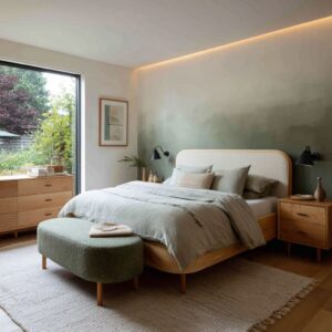
Rule 1: Pillow height as the “comfort line”
If the wall treatment is visually active (slats, stone movement, grids), keep the padded part low and calm—just high enough to protect the pillow zone. When the wall is quiet and plain, you can let the wall gesture climb higher to carry the room’s scale.
Rule 2: Extending the wall gesture beyond the mattress
A wall zone that stops exactly at the mattress edges often reads like a sticker. Make the wall zone behave like a bed bay: it should feel wider than the sleeping surface, often reaching toward the outer rhythm of the bedside area (nightstands, sconces, or hanging pendants).

Rule 3: The bed wall center
If the layout is off-center (window on one side, wardrobe on the other), build a centering system into the wall: a center seam, a three-part bay, a calm grid, or paired light brackets. When the bed is centered to that system, it reads centered from the doorway even if the room edges disagree.
Rule 4: Using a vertical element to “hold” the wall when the design feels too open
In glassy or layouts with strong side openings, a single vertical light seam, a pair of vertical sconces, or a dark contained shape can stop the bed from feeling like it’s floating. This is less about drama and more about giving the bed a visual edge to lean on.
Rule 5: Add one calm horizontal “finish line” to prevent clutter
A thin horizon shelf, a low warm light band, or a long floating bedside strip can act like a finishing stroke. The point is not storage; the point is a clean line that tells the eye the bed zone is complete, so you don’t need extra decor to “fill” the wall.
Rule 6: In tall-ceiling layouts, bridge the height with quiet repetition
Instead of chasing height with a giant headboard object, use tall wall panels, disciplined vertical rhythm, or elongated light elements so the bed zone connects to the upper wall. Then pull the eye back down to human scale with pendants or sconces placed to frame the pillow zone.

Visual authority comes from one big, edited wall gesture
The bed wall often behaves like a single “decision,” not a collage. That decision can take a few general forms:
- A framed bay (the wall reads like a shallow stage for the bed). The real power here is the edge: the eye can tell where the bed zone begins and ends, which makes the interior design feel organized even if everything is neutral.
- A continuous plane (one surface reads uninterrupted, so it feels calm and substantial). The detail that keeps this from feeling blank is usually subtle variation—soft tonal movement, gentle striation, or a large-scale seam rhythm that calibrates the wall’s size without turning decorative.
- A disciplined grid (structure created by repeated panel divisions). This is why full wall headboard ideas often feel “expensive” even with simple bedding: the wall provides proportion and shadow, so the design doesn’t need extra objects to look finished.
The non-obvious point: a wall can look “custom” without being loud if the gesture is big, measured, and repeated with restraint.

The buffer principle: the soft band that makes an intentional look
A common thread is the intentionally restrained headboard—low, wide, calm—because the wall is doing the expressive work. This is where many wall mounted headboard ideas look sharper than tall, ornate pieces: the headboard becomes a readability tool.

That low upholstered band (or similarly quiet soft layer) tends to do three jobs at once:
- Separates textures: pillows read as pillows, not as part of the wall pattern.
- Creates a baseline: the bed zone gets a clear “horizon,” which immediately makes the composition feel steadier.
- Protects the wall gesture: the wall remains the dominant backdrop, while the bed stays comfortable and calm in the foreground.
The result is a room that can carry texture, pattern, or darkness behind the bed without the sleeping zone feeling visually busy.

Centering without perfect symmetry
Many bedroom designs aren’t truly balanced (a window on one side, a door on the other, a slope overhead), yet the compositions can still feel centered because the wall creates its own internal order. Several strategies show up again and again:
- Axis cues: a centered seam, mirrored grain direction, or a repeated vertical split that quietly declares “this is the middle.”
- Triptych logic: a strong center zone flanked by calmer side zones, so the bed reads nested inside a composed bay.
- Bracket lighting: paired sconces (or other vertical light marks) placed like parentheses around the bed zone. Even subtle symmetry in lighting can “correct” uneven room edges.
- Measuring systems: panel grids or repeated divisions that continue through awkward geometry, so the interior design reads planned instead of compromised.
This is why headboard ideas on wall often feel transformative even with minimal decor: the wall provides the missing alignment rules the design itself doesn’t naturally give.

Rhythm choices shape the room’s perceived proportions
A bed wall can quietly change how big or tall a design feels by choosing one dominant direction and committing to it.
Vertical rhythm
Slats, battens, tall panel divisions, or long wallpaper panels lend height without needing a towering headboard. The key is “fine repeat with low contrast”: the wall reads textured and tailored, not striped and loud.
Vertical rhythm also pairs well with airy bedding because the wall supplies structure while textiles supply softness.
Horizontal rhythm
Striation, banding, or long ledges widen the design visually and create that settled, hotel-like steadiness. Horizontal rhythm is especially calming when the rest of the interior design already contains strong vertical elements like drapery folds or tall window frames.
Grid rhythm
Grids read as tailored because seams create shadow. The wall can stay the same color as the interior design and still feel layered, since the relief and light fall create depth.
This is one of the most reliable ways to make a neutral scheme feel finished without adding “stuff. ”.

Light as a design material: the finish that replaces clutter
Lighting can do what people normally try to achieve with accessories. A few lighting behaviors explain why the walls can feel complete at night:
- Edge definition: a thin light line that clarifies a boundary makes a wall plane feel intentional rather than heavy.
- Grazing: light that skims texture reveals depth after sunset, so the wall doesn’t go flat when daylight disappears.
- Horizon glow: a warm band at pillow height humanizes mineral or monochrome surfaces without changing the palette. It reads intimate, like a low sunset line, and it gives the bed zone a finished “resting point.”
- Soft cones and controlled halos: warm, diffused light creates gentle gradients that make panel seams and relief look richer without adding visual noise.
This is also why a restrained headboard accent wall can still feel dramatic: the wall isn’t relying on objects; it’s relying on how light reveals boundaries, depth, and texture.

Pattern that stays calm: “art without frames” done properly
The quietest pattern strategies tend to follow one rule: pattern behaves like atmosphere, not a headline.
- Linework-style patterning reads airy because it leaves visual breathing design. When it’s disciplined by vertical panel divisions, it feels ordered rather than busy.
- Texture-first patterning (weaves, grasscloth effects, ribbing) feels restful because it’s experienced as shadow and touch, not as imagery.
- The “pause” move: when a wall already has strong rhythm (grooves, slats, grids), a single calm focal rectangle can act like a visual rest—so the wall doesn’t feel relentless.
The deeper point: calm pattern is usually built from spacing, scale, and restraint—not from picking a motif.

Containment without heaviness: the bed wall as a soft boundary
Some of bed wall designs create a sense of enclosure—useful in interior designs that feel exposed (large glazing, open passages) or visually tricky (tight widths, slopes). Containment can be created with:
- A niche-like frame that reads as a shallow “room inside the room.”
- A curved or arched field that cradles the bed shape and makes the sleep zone feel protected.
- A contained dark shape with a warm outline that pulls focus back to the bed while staying soft rather than harsh.
This is often the hidden strength behind master bedroom headboard wall ideas: the wall isn’t only “pretty,” it changes the emotional footprint of the room by giving the bed a clear, protected territory.

The restraint code: why minimal styling still feels rich
Such design ideas tend to look styled even when surfaces are nearly clear because the wall already provides the structure. The styling that appears is usually “punctuation”:
- Low objects that don’t interrupt the main wall gesture.
- Balanced asymmetry (different items, similar visual weight).
- Two-point color echoes (one accent tone repeated twice so it reads intentional rather than random).
- Texture ladders (small shifts in weave and value that create depth without strong contrast).
In other words, the wall carries the composition, and everything else stays quiet enough to let that composition read.

Layout constraints
In practice, the “headboard wall” is usually a response to a room condition: too bright, too flat, too tall, too small, or visually awkward. The pairings below describe how different wall idea families tend to answer different room problems.

Big windows / very open room
A recessed stage wall or a material plane with one controlled light edge often supplies the missing visual mass behind the bed. A common balance is: stronger backdrop weight, softer treatment at pillow height, and a gentle warm glow that keeps neutral palettes from reading cold.

Room feels flat and echoey
Rhythm walls (slats, ribbing) or a three-part bay with a textured center and calmer side fields typically add micro-shadow and surface conversation. The wall can start to read “softened” through texture and shadow alone, before any technical changes are considered.

Neutral bedroom feels bland (“too much beige”)
Soft grids (upholstered panels, padded squares, woven grids) or relief paneling usually work by introducing shadow structure. A reliable styling logic is repeating one warm accent twice—once on the bed and once in a small bedside moment—so the neutrality reads deliberate rather than washed out.

Bed is off-center or the room is asymmetrical
Asymmetry often settles when a centering system is built into the wall: a center seam, a measured grid, or paired light brackets that define the bed-zone width. Lower, quieter bedside styling tends to help the wall’s symmetry (or balanced asymmetry) carry the visual order.

Sloped ceiling / attic wall
Slopes read more intentional when the wall’s measuring system continues into the angle. Calm grids or panel rhythms that climb the slope make the bed feel placed rather than squeezed.
Lower headboard proportions commonly avoid a visual “collision” with the ceiling line.

Very tall ceiling (bed looks small)
Tall vertical panels or elongated rhythms can pull the eye upward, especially when contrast stays restrained. Another stabilizing move is bringing scale back to the human zone with lighting that brackets the pillow area (pendants or sconces), so the bed doesn’t read lost on the wall.

Dim bedroom
Contained reflection—narrow edge mirrors or an antiqued mosaic effect—can add lift and depth without turning the wall into a crisp mirror plane. Matte, calmer bedding typically keeps the reflected light reading soft rather than sharp.

Storage is needed but visual clutter is unwanted
Storage-canopy walls tend to feel cleanest when cabinet faces stay quiet, bedside function is absorbed into thin floating elements, and a warm horizon glow sits near pillow height. Small recessed pockets can take over tabletop roles while keeping the bed zone visually calm.

Common mistakes—and the quick visual fix
Mistake: the wall zone looks like a sticker behind the bed
Visual rule: the wall gesture reads more believable when it extends wider than the mattress, with lighting used to clarify the outer edges. The bed bay works best as a “zone,” not a cutout.

Mistake: too many strong elements stacked in one place
Visual rule: one dominant move tends to read cleanest (texture wall, arch shape, reflective insert, or grid). The supporting elements stay quieter—lower-profile headboard, calmer bedding contrast, and simplified bedside height—so the wall feature can stay legible.

Mistake: the wall feels top-heavy
Visual rule: weight feels calmer when the padded emphasis stays near the pillow zone while the upper wall stays simpler, or when a single horizontal finish line caps the bed zone without adding extra objects.

Mistake: slats/ribbing feels harsh or office-like
Visual rule: structured wall rhythms read warmer when the foreground introduces softness (tactile bedding, layered textiles) and the lighting stays warm and diffused. The wall carries the structure; the bed carries the comfort cues.

Mistake: mirror or shine feels too loud
Visual rule: reflection feels more controlled when it’s contained—thin margins, smaller panels, or a broken mosaic approach—so it brightens the room without becoming one dominant mirror plane.

Mistake: the room is asymmetrical and the bed reads “wrong”
Visual rule: asymmetry settles when the bed aligns to a clear visual system (grid seams, a center seam, a three-part bay, paired light brackets). Balance can come from matched visual weight on both sides without relying on identical objects.
Closing idea
The most effective headboard wall design is rarely about making the bed wall louder. It’s about giving the wall a clear job: define boundaries, set a believable center, control proportion, and create depth through rhythm and light—so the interior design feels finished even when the furniture and decor remain calm.