The old idea of window covering is simple: cover the glass, block the light, regain privacy. A lot of newer curtain alternatives flip the sequence.
They keep the brightness, keep the sense of outdoor depth, then remove the parts of the view that make a room feel exposed or visually busy. The window stops being a hole in the wall that needs dressing.
It becomes a surface with its own behavior—sometimes soft, sometimes graphic, sometimes architectural.
Privacy comes from detail loss, not darkness
If you stand in a dining room with clear glass facing a street, the discomfort rarely comes from brightness alone. It comes from readability: sharp edges, crisp faces, fence seams, the neighbor’s window, a parked car.
Your eye keeps grabbing that information, and your body reacts like you’re on display.

Many curtain alternatives solve privacy by reducing fine detail first while keeping the overall light field.
- The sky and trees remain as a bright layer.
- The sharp bits fall away early: hard edges and small contrasts soften.
- You still sense distance outside, but you stop seeing the story.
That is why a woven screen, a mesh roller, a sheer roller, or a paper-like panel can feel private while the room stays bright. Opacity becomes less important than how much high-definition information survives.
These treatments act like a low-detail filter. They don’t erase the outdoors; they lower its resolution.

Two privacy sensations: blur privacy and slice privacy
Not every curtain alternative creates privacy in the same bodily way. There are two families, and they support different room types.

Blur privacy: the outdoors turns into tone and silhouette
Woven textile screens, mesh rollers, sheer rollers, continuous sheer walls, paper-like luminous panels, translucent grids with botanical silhouettes… these soften the scene into gradients.

What changes in the room:
- Exposure drops without the feeling of a barricade.
- The interior still holds outdoor depth; the glass doesn’t become a dead rectangle.
- Objects in front gain clarity because the background stops competing.
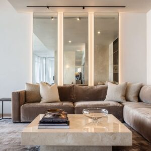
Blur privacy tends to pair well with soft upholstery and neutral palettes because it makes subtle textures show up: nubby chair fabric, a woven rug surface, the grain of a wood table. Daylight becomes flattering instead of harsh.

Slice privacy: the view gets segmented into strips
Curved vertical blinds used as a sculptural enclosure, sheer vertical panel systems, sliding wood slat screens… these don’t blur as much as they divide. What changes in the room:
- The window wall becomes a field of vertical rhythm.
- Privacy feels directional: angle matters, movement matters, spacing matters.
- The outdoors stays present as motion and color, but not as a single readable image.
Slice privacy often feels naturally integrated near built-ins, shelving, and cabinetry because it shares their seam logic. Book spines, cabinet joints, and vertical panels start to rhyme with the window treatment, so the system feels planned into the room rather than added later.

Partial coverage is not a compromise. It’s composition.
A surprising pattern: many of the most convincing curtain alternatives avoid uniform coverage. They put filtering exactly where the body experiences glare and exposure, then leave another zone open for view and daylight.
Three moves show why partial coverage has visual power.

The top band: a horizon line that steadies the wall
A roller shade or woven shade dropped only on the upper part of the glass does something specific: it caps the brightest zone. The seating group or dining table stops feeling washed out because the highest-intensity area is softened.
The lower glass can stay clearer, so the room still feels connected to outdoors. This top band is not only about comfort.
It creates a strong horizontal datum. That line can quietly stabilize a wall with tall glazing.

The center strip: privacy placed where the body sits
A vertical tapestry-like panel placed inside a window zone—more like a hanging textile plane than a curtain—can target the exact area that makes people feel exposed while seated at a table. Side glass stays clearer.
The room stays open. The coverage feels intentional because it’s selective.

The stepped drop: lived-in order without showroom symmetry
Two shades set at slightly different heights can prevent the window wall from feeling staged. The mismatch adds ease while still looking tidy.
It also handles angled sightlines in bays and corners, where one pane may need more cover than another. Partial coverage gives a room a structured light map.
That light map becomes part of the decorating language.

The still-life effect: why the table needs fewer objects
When the exterior view is sharp and high-contrast, interior styling tends to inflate. People add more objects because the background is visually loud; the table or console needs help to hold attention.
Once a curtain alternative softens the background, the opposite happens.
- A single ceramic vessel and a bowl can look finished on a dining table.
- A tray, a few books, and one botanical stem can hold a coffee table.
- A banquette nook can rely on a fruit bowl and one vase instead of layers of decor.
This isn’t minimalism as a rule. It’s optics.
A softened window surface edits the biggest visual plane in the room, so smaller forms regain presence. The treatment becomes a behind-the-scenes stylist: it simplifies the stage so the still life can stay small.

This effect is strongest when the window turns into:
- a consistent tonal field (sheer walls, paper-like panels, translucent grids), or
- a stable texture plane (woven screens, woven shades, cane-like layers).

Rhythm matching
A curtain alternative feels intentional faster when its rhythm matches something already in the room. Not the material alone—often the line logic.

Examples:
- Vertical blinds or slats echo book spines in a built-in library wall.
- Sheer vertical panels echo cabinetry seams and tall black-framed openings.
- Panel grids echo ceiling beams or a disciplined wood surround.
- Inside-mount rollers echo the window’s mullion rhythm, letting trim stay dominant.
This is why a simple roller shade can look premium when it is aligned pane-by-pane and sits precisely inside the casing. The window’s geometry stays legible.
The treatment reinforces it instead of fighting it.

Rhythm matching also explains why some woven solutions avoid looking theme-y: the same woven language shows up at multiple scales—chair backs, pendant shades, a natural-fiber rug, a tray on the table. Repetition turns a single texture into a room grammar.

Depth changes the emotional relationship to glass
A thin shade is one approach. Another approach is to change the wall itself so the window becomes a niche, a framed object, or a stage.

Plane solutions: thin filters that keep the perimeter clean
Rollers, sheers, woven shades. These keep circulation easy near glazing and work well where furniture sits close to windows.

Depth solutions: the window becomes an object with shadow lines
A carved lattice set inside a thick surround; a deep wood frame that turns glazing into a recess; a built-in window stage with shelving and warm integrated light. These add dimensionality so the bright opening feels quieter.
The wall gains structure without extra decor. A deep surround does something psychological: the outdoors sits back in the recess instead of pressing right at the room plane.
The window feels contained, even before any fabric moves.

Surround solutions: the boundary becomes a place
Curved vertical blinds around a window seat, bay strategies with multiple sections, sliding slat screens that behave like a movable partition. These turn the edge of the room into a destination.
Reading, laptop time, coffee—those activities feel more comfortable because the boundary is shaped, not simply covered. Depth and surround strategies reduce the sense of sitting in front of a large exposed sheet of glass.
They let people feel closer to the window without feeling displayed.

Night identity: what happens when the exterior turns into a dark mirror
In daytime, many treatments succeed because daylight does the work. At night, the room needs a second identity.
Big glass can become a black void that pulls attention and makes the interior feel less finished.

Some curtain alternatives stay useful after sunset because they behave like luminous surfaces, not only privacy tools.
- Backlit paper-like panels and translucent grids can remain a glowing feature wall.
- Warm integrated shelf lighting around a window stage keeps the nook alive in the evening.
- Full-height sheers can become a soft boundary that holds lamplight and reduces the mirror effect of glass.
Night identity is a key divider between treatments that look good only at noon and treatments that keep the window wall feeling designed at 9 pm.

A practical taxonomy: six design-object types
Curtain alternatives fall into a small set of design objects:
- Breathable skin — woven screens and cane-like planes that keep light while breaking detail.
- Luminous wall — backlit or translucent panel grids that turn the opening into a glowing surface.
- Lens layer — mesh and sheer rollers that keep outdoor depth while lowering resolution.
- Band editor — partial drops that create a horizon line and targeted comfort zones.
- Line field — vertical systems (sheers, blinds, slats) that segment the view and add rhythm.
- Craft facade — carved lattice or patterned screens that make privacy the focal feature.
Each type predicts side effects:
- Skin and lens layers often reduce the need for extra decor.
- Luminous walls support evening atmosphere.
- Band editors stabilize bright window walls with a clear horizontal datum.
- Line fields integrate easily with cabinetry, shelving, and modern panel logic.
- Craft façades add depth and pattern without relying on color.

The bigger shift
Curtain alternatives work well today because they treat windows as active surfaces—filters, rhythm fields, niches, light walls—rather than a problem to hide behind fabric volume. A lot of modern window choices make immediate sense:
- Privacy without dim rooms comes from detail loss.
- Partial coverage can carry a room’s composition.
- Styling becomes lighter because the background stops shouting.
- Integration happens through rhythm matching, not decoration.
- Depth turns glass from exposure into containment.
- Night identity keeps the wall alive after sunset.