A well-designed drop zone can change the whole tone of a home within a few seconds. It is the first place where bags land, shoes come off, keys rest, and the body shifts from outdoor movement to indoor ease.
Yet many entries still feel like leftover utility strips: a bench pushed to one side, a few hooks, a tray, then a pile-up of daily clutter. The entries that feel polished and memorable are not the ones packed with extra decor or too many finishes.
They are the ones that reduce visual noise, give the seating area a clear sense of place, and shape storage into the architecture itself. Their impact comes from control, not from excess.
An impressive drop zone is usually built by reducing fragmentation, not by adding more. Stylish drop zone ideas gave the space a strong central pause point, usually a bench.
Or they partially enclosed that bench with an alcove, canopy, arch, side return, or corner wrap. Or they can keep the palette close in value rather than depending on bold color contrast.
And any of them should have one vertical element to lift the composition, and just a few objects. The result will be a space that feels calm, settled, and thoughtfully shaped.
That shifts the way a drop zone should be approached. Instead of treating it like a small storage corner, it helps to treat it like an arrival chamber: a compact interior zone where motion slows, the eye settles, and daily function feels folded into a clear architectural idea.

Why many drop zones feel ordinary
A drop zone tends to lose visual power when it feels pieced together. A separate bench, a different shelf, a random mirror, several unrelated finishes, and a handful of objects can make even an expensive entry feel unsettled.
The eye has to sort each element one by one. That weakens the sense of order.

Impressive drop zone designs work in the opposite direction. Their bench, storage, wall planes, and display surfaces were treated as related parts of one composition.
Sometimes that came from a shared material running through multiple surfaces. Sometimes it came from repeated curves or a controlled dark shell.
Sometimes it came from one large built-in mass that gave the whole wall a clear shape. In each case, the eye was given a calmer field to read.
This is why refined drop zones often feel expensive even before you study the details. The space looks claimed.
It does not seem assembled in layers after the room was finished. It feels like the room itself was shaped to hold arrival.

One strong shell
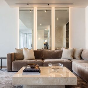
The drop zones with the clearest presence do not look like a seat plus storage plus decoration. They looked like one designed envelope.
That shell can take many forms:
- a pale wood surface carried through wall, bench base, shelving, and overhead plane
- a dark chamber-like built-in that wraps the seat
- a corridor lined with cabinetry and repeated arches
- a large wood mass paired with tall windows
- a deep recessed bench bay carved into the wall
The shared logic is what matters. One dominant material or one dominant color family makes the entry feel quieter and more resolved.
Broad, uninterrupted planes reduce visual chopping. Fewer visible parts make the room easier to read.
Seams begin to support the massing instead of breaking it apart. This is one of the most useful design shifts: begin with the envelope before thinking about accessories.
Ask whether the walls, ceiling edge, bench, and storage feel related. If the answer is yes, the room already has a much better foundation.

Give the seat a sense of ownership
A bench or seat can be an emotional center. That alone says a great deal.
Even in compact entries, the seat acted as the place that changed the drop zone from pure utility into a human-centered space. But seat size alone did not create the richer effect.
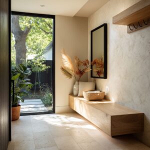
What made the bench feel meaningful was some degree of enclosure. Not a fully closed nook, and not a completely exposed perch.
The entries that felt warmer and more composed often use a middle state:
- a canopy over the bench
- an arched recess
- a deep side return
- an L-shaped corner bench
- a recessed bay
- a darker inner frame inside a lighter wall
That partial enclosure creates a shelter gradient. The circulation lane stays open for movement.
The pause point becomes slightly wrapped. This gives the body a subtle signal that the home begins here.
It is a small change in geometry, but it has a large effect on mood. A framed 1.
8-meter bench can feel richer than a larger exposed bench because the framed one feels claimed, protected, and intentionally placed. The seat gains emotional weight once it has a boundary.

Keep the palette close in value
Many people assume a dramatic drop zone needs strong contrast, bold color, or many decorative accents. Refined entries can use a narrow tonal band: pale warm neutrals, soft stone shades, dark brown-black wood, muted mauves, or close-value creams and taupes.
That kind of palette does something important. It makes the eye more sensitive to smaller differences:
- wood grain direction
- fabric sheen
- stone relief
- glossy versus matte surfaces
- shadow bands
- softened edges
- object spacing
In a tightly controlled palette, craftsmanship becomes easier to notice. The entry does not feel flat if the surfaces and proportions are doing their work.
In fact, the calm range often makes the room feel more polished because attention shifts away from color separation and toward material quality. This is one reason many refined drop zones feel so settled.
They do not need a loud palette to hold attention. Their interest comes from close tonal relationships and fine shifts in texture and light.

Build the composition with one low line and one tall line
The bench creates a low, steady horizontal base. But the bench alone rarely carries the whole room.
The design concept could also include some form of vertical counterpoint that gave the entry lift. That vertical element could be:
- a tall floral arrangement
- artwork above the seat
- a pendant
- a picture light
- a mirror
- a wardrobe tower
- a narrow window slit
- a tall arched window
- a repeated arch form
This pairing is one of the design composition rules: a low rest surface needs one upward note. Together they create stability below and lift above.
Without that upper move, a drop zone can feel too stretched, too low, or visually unfinished. If the entry already has a long bench, add one strong vertical accent rather than several smaller ones.
A single tall gesture usually does more for the room than a cluster of minor decor pieces.

Keep softness concentrated
Comfort mattered, but it can be handled with discipline. The soft elements should be concentrated in a readable band:
- one padded bench cushion
- a compact pillow cluster
- an occasional rug
- perhaps one throw or one leather bag
The surrounding shell stayed firm. This creates a clear hard-shell, soft-core relationship.
The architecture remains legible. The comfort remains visible.
Neither weakens the other.

If softness is spread too widely through the whole entry—too many soft goods, too many fluffy details, too many casual accessories—the drop zone can lose its edge. It begins to feel less shaped.
By keeping softness concentrated at the seat, the entry holds both comfort and clarity at once. That is a major part of why such spaces feel welcoming without slipping into visual softness everywhere.

Use fewer objects, and let empty space work
One of stylish drop zone design ideas is edited density. Refined drop zones use very few objects, and those objects had room around them.
Shelves are sparse. Console tops are not crowded.
Side surfaces hold only what the composition needed. This sparse look is not simply a styling preference.
It works because the room already has order built into it. Strong massing, clear surfaces, and controlled lighting give the space enough character that it does not need visual compensation through extra decor.

In practical terms, each object should have a clear role. It should do at least one of the following:
- add height
- add softness
- add realism
- mark an edge
- balance a larger mass
- introduce a natural form
If an item does none of those things, it may be weakening the entry rather than helping it. In a well-composed drop zone, empty space is active.
It allows the main surfaces, proportions, and light to stay visible.

Let daily utility stay at the edges
A drop zone has to work. Shoes, bags, coats, hooks, baskets, and keys will always be part of the room.
It should not hide every practical item. Instead, they placed utility where it could support the look rather than break it.
Common placements included:
- under the bench
- inside a side niche
- on a terminal block
- hanging against a calm panel
- in open cubbies at the base
- grouped in one dedicated strip rather than scattered
This is a very useful idea. A polished entry does not require total concealment.
It requires containment. When utility stays peripheral, grouped, and close in color to the surrounding palette, the visual center remains calm.
This is why visible shoes in a neat row, or a leather bag hanging from a quiet wall panel, can still look intentional. The room absorbs them because the edges are doing their job.

Limit the material story
Another design idea is material discipline. The entries with the clearest presence usually relied on a duet or trio rather than a crowd of finishes.
Common pairings included:
- pale wood with pale stone
- dark wood with warm upholstery
- glossy pale cabinetry with a dark floor
- walnut with one pale wall and one stone accent
- a matte dark shell with one leather note
This kind of material editing gives the room stronger identity. The contrast becomes easier to read.
Each finish gets room to matter.

Too many finishes create a different effect. The drop zone starts to look assembled from separate decisions.
The surface story becomes busy, and the room loses the calm authority that a smaller material palette can give. A good rule is to choose:
- one dominant material,
- one counter-material,
- and if needed, one accent finish.
That is usually enough to make the entry feel layered and complete.

Use mirror and gloss for depth
There are cann be mirror, polished cabinetry, or glossy floors. These reflective devices work well when they have a clear spatial job.
Reflection helped in three recurring ways:
- it doubled vertical light
- it deepened a narrow corridor
- it lightened a heavy storage mass
That is a useful distinction. Reflection is strongest when it changes how the room is perceived, not when it appears merely as a decorative flourish.
A mirror behind a console can stretch the room visually. Gloss on cabinetry can stop a large built-in from feeling too dense.
A polished floor can extend the sense of length in a corridor-like drop zone. Used this way, reflective surfaces support the architecture of the room.
Used without purpose, they can feel superficial.

Make the entry feel inhabitable
One of the more subtle findings is the importance of dwell cues. The drop zone is not only a passing strip but a place where one might actually pause for a moment.
This came through small signals:
- a deeper bench
- layered pillows
- a book left open
- side ledges
- a small shelf with books
- a lounge-like alcove
- thicker seat depth
These details shift the identity of the room. The drop zone starts to feel like an arrival ritual rather than a storage station.

That change matters because perceived luxury often rises when a space hints at even a brief moment of lingering. It feels more human, more settled, and more considered.
A drop zone that supports one minute of pause will usually feel richer than one built only for quick function.

Five clear drop zone directions
The wrapped light pocket
This type uses pale materials, close-value tones, gentle light, and a niche-like seat. It feels warm, calm, and easy to live with.
Its effect comes from quiet surfaces, soft edge shaping, and low visual noise.
The dark inner chamber
This type uses deep wood or dark finishes, selective warm lighting, and a warm seat band in leather or soft brown fabric. It feels intimate, weighty, and private.
It works only if the darkness is balanced by clear light hierarchy and a readable focal zone.
The processional corridor
This type treats the hall itself as the drop zone. Repeated arches, curves, long built-ins, and staged focal points make the whole passage feel ceremonial and shaped.
It suits long entries especially well.

The sculptural focal object
This type centers on one dominant console or bench mass with a strong base and tightly edited styling. It has a formal, crisp presence and relies less on enclosure than on the authority of one composed object.
The compact precision niche
This type proves that a small footprint can still feel substantial. A single color field, one narrow window slit, careful storage, and strict styling can make a compact entry feel deliberate and fully resolved.

A practical formula for a refined drop zone
A clear formula looks like this:
- Start with one strong shell.
Choose one dominant material or one close color family and let it hold the room together. - Give the seat a claimed place.
Use an alcove, canopy, arch, corner, or deep backing so the bench feels owned by the architecture. - Insert one soft horizontal band.
A cushion or leather seat becomes the human center of the room. - Add one vertical lift element.
Use art, flowers, a mirror, a pendant, or a tall window to keep the composition from feeling too low. - Keep the objects sparse.
Use only what adds height, softness, realism, or edge definition. - Move daily clutter to the margins.
Let shoes, coats, and bags live at the side, below the bench, or in dedicated edge zones. - Use one clear contrast.
Dark and light, matte and gloss, wood and stone, shell and core. One clear contrast is often enough. - Let the room hint at lingering.
A slightly deeper seat, a pillow cluster, a side ledge, or a book can change the emotional tone of the entry.

The source of refinement
Drop zone prestige comes mainly from boundary control, not from decorative richness. A drop zone gains presence once it feels like one composed interior pocket rather than a set of separate objects.
The seat becomes more inviting once it is slightly sheltered. A narrow palette makes material nuance easier to read.
A single vertical accent gives lift. A few well-placed objects feel richer than many.

In short, the refined drop zone does two things at once: it slows the body and simplifies the eye. It offers a place to pause, and it removes the visual clutter that makes small entry zones feel restless.
That is why the most successful examples are so effective. They do not ask the room to perform through excess.
They shape the room so clearly that arrival itself becomes the design feature.

Final thought
An impressive drop zone is not defined mainly by scale, ornament, or spending. It is defined by a set of clear design conditions: a strong envelope, a claimed pause point, a disciplined palette, concentrated softness, controlled utility, and just enough height and light to give the room lift.
When those pieces are handled well, the drop zone stops feeling like a practical edge of the house and starts feeling like a calm, fully composed first chapter of the interior.