Bedroom color is changing in a very clear way. The shift is not mainly about going brighter, adding louder accents, or chasing one trendy shade.
This move is far more subtle. New bedroom palettes feel fresh because they are better balanced, better layered, and far more precise in how they shape mood.
That change matters because most people are not truly looking for color in isolation. They are trying to solve a tension.
They want a room with personality, but still calm enough for sleep. They want warmth, but not sweetness.
They want a dark mood, but not heaviness. They want neutrals, but not a flat, empty result.
New bedroom color ideas answer those tensions through undertone, surface depth, material pairing, and light.
The Shift: Bedroom Color Is Becoming More Precise
A few years ago, a fresh bedroom often meant cleaner white, a brighter pastel, a sharper blue, or a crisp contrast between light walls and dark details. That approach is fading.
The new direction is softer, more nuanced, and far more tuned. Instead of pure hues, newer bedrooms lean on mixed color identities.
Teal is softened with gray and green. Mauve carries brown and mushroom notes.
Pink is dusted down with beige. Green drifts toward celadon, olive, sage-gray, or eucalyptus.
Even neutrals are no longer simple beige. They now include oat, putty, clay, camel, warm ivory, and mineral taupe.
The freshness is coming from undertone complexity, not from louder color.

New Bedroom Color Works Like Architecture
One of the design changes is where color now lives in the bedroom. In many newer bedroom design concepts, color is no longer limited to bedding, one painted wall, or a handful of small accents.
It is being used to shape the room itself. It can be in paneled feature walls, recessed bed alcoves, wrapped soffits, built-in window seats, niches, and trim painted in the same family as the wall.
This gives the bedroom a sense of enclosure and a more resolved look. The bedroom feels designed as a whole rather than decorated in layers afterward.
That is a major reason these palettes feel newer. The color is not sitting on top of the room.
It is built into the room.

A deep teal on a broad paneled wall feels very different from the same teal used only on two throw pillows. A pale blue alcove around the bed feels softer and more complete than a plain blue stripe behind the headboard.
A clay-taupe niche has far more depth than a flat beige wall. The color becomes part of the room’s form.

Tonal Layering Has Replaced Sharp Contrast
Another major change is the move away from high-contrast styling. Many fresh bedroom palettes are built from close-value layers rather than dramatic jumps between light and dark.
That means cream sits next to oat and soft beige. Mauve sits with dusty rose and plum-brown.
Green is layered through sage, olive, and gray-green. Blue is paired with powder blue, mist blue, and warm white.
Terracotta moves through clay, sand, and soft cream.

This kind of compressed tonal spacing changes how the eye moves through the room. Instead of stopping at hard edges, it moves gently from one surface to another.
That makes the space feel calmer and more settled. Relief, panel lines, shadow, upholstery texture, wood grain, and bedding folds do the visual work that harsh contrast used to do.
The room gains depth, but in a quieter way.

Why Muted Colors Feel Fresher Now
One of the important changes in bedroom color is that freshness is now often created by muting, not by brightening. That may sound counterintuitive at first, but it explains why so many new bedrooms feel soft and rich at the same time.
A softened butter yellow can feel newer than a bright lemon. A blush-beige can feel more usable than candy pink.
A powder blue mixed with gray can feel far more grown-up than a clear pastel blue. A celadon or sage-gray can feel gentler and more enduring than a bright mint.

These colors are slightly aged on purpose. Gray content, brown content, mineral undertones, dustiness, and matte surfaces all help the color feel mature.
They remove the sugary, playful, or overly decorative effect that can make bedroom colors feel short-lived. This is one of the lessons in bedroom color ideas right now: a color often feels better when it is softened before it is used.

Warmth Has Grown Up
There is also a clear rise in what could be called adult warmth. Many people still want a bedroom that feels warm, welcoming, and soft, but they do not want it to feel childish, overly romantic, or overdone.
Newer palettes answer that by adjusting familiar warm colors into calmer, heavier, and more grounded versions.

Dusty mauve replaces bright pink. Blush-beige replaces sugary blush.
Butter yellow replaces lemon. Terracotta-rose replaces sharper orange-red.
Warm taupe with clay replaces plain tan. These colors still bring warmth, but they do so with more restraint and more weight.
The result is a bedroom that feels soft without feeling overly sweet. That balance is a major part of why these palettes are lasting longer in design conversations.

Blue and Green Are No Longer One Mood
Blue and green still matter in bedrooms, but they no longer work as one broad calm category. They now split into several distinct directions, each with a different emotional effect.
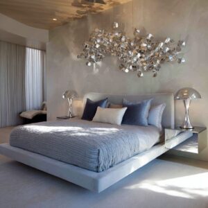
Deep blue-green and petrol tones create a cocooning effect. These shades feel more serious, immersive, and atmospheric.
They are often used on paneled walls or full bed zones and paired with pale bedding, warm wood, and a small rust or amber note to keep them from feeling too dense.

Powder blue, soft blue-gray, and misty sky blue create a lighter effect. These shades feel open, quiet, and bright, especially when paired with warm cream upholstery, honey-toned wood, or a single caramel accent.
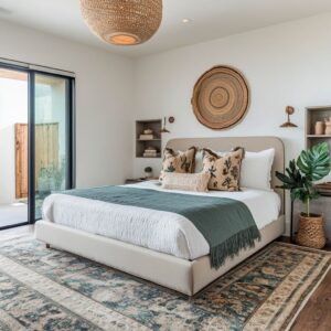
They give the room calm without a cold edge. Pale celadon, soft sage, and eucalyptus-gray create a gentler green direction.
These shades feel restorative, optimistic, and nature-linked. They work especially well in daylight and often feel softer and less expected than blue.

Yellow-green, olive, and softened citron form another distinct group. These colors bring warmth into the green family.
They feel leafy, earthy, and sun-touched rather than watery or cool. This makes them useful for people who want freshness with more depth.
So the blue-green family has become much more nuanced. The key question is no longer whether a bedroom should be blue or green.
The question is what kind of calm the room should hold.

Warm Accents Now Carry Emotional Weight
Warm accents are still important, but their role has changed. Now, rust, caramel, clay, ochre, cinnamon, amber, and terracotta are not scattered around as random decorative pops.
They are placed with much more discipline.

A single rust pillow at the center of the bed can shift the whole room. A caramel cushion on the window seat can stop a pale room from feeling weak.
A warm amber wall light can soften a plum or deep green wall at night. A small clay-toned throw can make a cool palette feel more human.

These warm notes act like emotional ballast. They give the room a center of gravity.
They keep cool palettes from feeling distant and stop pale rooms from drifting into emptiness. That is why a small warm accent can have a stronger effect than a much larger secondary wall color.
It is not the size of the accent that matters. It is the placement.

Accent Concentration Is Replacing Scattered Color
Older styling often spread accent color through a room in many small touches. Newer bedroom designs tend to do the opposite.
They keep the strongest accent note concentrated. That accent might appear in the center of the bed, in one stack of pillows, on the window bench, on a single chair, or in one tight bedside grouping.
It may be repeated only two or three times in the whole room.

This makes the room feel calmer because the eye can organize it easily. The accent has more weight, but less noise.
Instead of seeing many small color interruptions, you get one clear emotional anchor. That is a big part of why newer bedrooms feel more edited and less busy.

Texture Is Doing Work Color Used to Do
In many of today’s softer bedrooms, texture carries much of the richness that bold color once had to provide. Plaster-like walls, paneled relief, boucle upholstery, nubby throws, wood grain, fuzzy rugs, matte paint, and layered bedding folds all help a room feel full even when the palette stays close in value.
This is especially important in cream, taupe, camel, pale blue, and other gentle palettes.

A warm neutral room can feel deeply layered without strong color if the surfaces have enough relief and the textiles have enough depth. A pale blue nook can feel soft and complete because cream upholstery, plush fabrics, and shadowed trim give it body.
A clay-taupe wall can feel rich because the finish shifts slightly in daylight. This is why many of the new bedroom schemes are texture-led.
The color stays quiet, but the room still feels substantial.

Daylight Has Become Part of the Palette
One of the overlooked parts of bedroom color today is the role of light. Daylight can act like a hidden second color system.
It changes how the room feels through the day. It can cool mauve in the morning and warm it later.
It can make teal lean greener on one surface and bluer on another. It can turn pale green into luminous celadon near a window.
It can make cream walls look honeyed by afternoon. It can bring out the clouded movement in a plaster-like taupe wall.

That shifting quality is one reason these bedrooms feel alive. They are not designed only for a paint swatch in static light.
They are designed to change. A fresh bedroom color scheme often works best when it has some room to move with daylight.

Dark Bedrooms Now Need Air
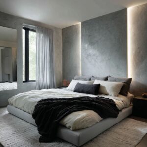
Dark bedroom colors remain popular, but the rules have changed. A deep green, aubergine, mocha, burgundy, or blue-green wall can still feel very current, but only if the room has relief.
That usually means pale bedding, lighter rugs, a bench or seating area in a softer tone, warm side lighting, visible panel rhythm, and enough daylight to let the darker surfaces shift instead of sitting flat. Dark walls now need breathing space.
This is why the best moody bedrooms still feel usable. They are enveloping, but not sealed off.
They have weight, but also softness. The darkness is balanced by pale surfaces and warm detail rather than pushed to an extreme.
A dark room that can breathe feels fresh. A dark room with no relief quickly feels too heavy.

Neutrals Are No Longer Filler
Neutral bedrooms are still central, but their logic has changed completely. Beige is no longer working well as a generic safe background.
The stronger neutral rooms are far more specific. They are built from small tonal intervals: cream, oat, putty, camel, mushroom, warm ivory, clay-taupe, pale sand, cocoa, and plaster-like stone notes.
These tones are arranged with care, often through paneling, niches, wall relief, upholstery contrast, and wood grounding. That means neutral now behaves like a full color system.
It has movement, structure, and mood. A room can stay almost entirely pale and still feel complete if the undertones are tuned carefully and the surfaces have enough depth.
Neutral bedrooms are no longer empty. They are articulated.

A Useful Way to Think About Bedroom Color
The lesson from all of these design moves is that people are usually not looking for color by itself. They are looking for a room that resolves a contradiction.
They want calm with character. Warmth with restraint.
Mood with air. Softness with shape.
Neutrality with depth. Freshness without a chill.
That changes how bedroom color should be planned. Instead of starting with Which color is trending, it makes more sense to ask which problem the room needs to solve.

If the room feels too cold, a small rust or caramel accent may matter more than repainting the whole wall. If it feels flat, relief and texture may matter more than adding a brighter hue.
If it feels heavy, a pale bench, lighter rug, or brighter bedding may fix the mood more effectively than changing the wall color. If it feels bland, the answer may be undertone layering rather than a dramatic statement shade.
This is why the new bedroom color ideas feel more resolved. They are built around emotional balance, not only color choice.

A Practical Formula for a Fresh Bedroom Palette
Nice bedroom color ideas often share the same structure. They usually have one main atmospheric field, such as a paneled wall, alcove, niche, or broad wall plane.
They then add a grounding layer, often through wood, taupe, or one darker frame. A relief layer follows, usually with cream bedding, pale upholstery, or a light rug.
Finally, one controlled accent brings focus, often rust, caramel, ochre, clay, deeper plum, or a darker green.

That combination works because each part has a clear job. The wall shapes mood.
The grounding layer gives stability. The pale layer keeps the room open.
The accent provides memory and focus. If one of those parts is missing, the room often feels less complete.
A complex cool hue without warmth can feel chilly. Warmth without relief can feel heavy.
Dark color without light can feel closed. A pale neutral room without texture can feel empty.
A strong accent without restraint can feel busy.

Color Families With Strong Momentum
Blue-green remains one of the strongest directions, but the newer versions are softened, grayed, and tied to architecture. They feel more atmospheric and less crisp than older blue bedroom ideas.
Mauve, blush, plum, and dusty rose are becoming much more refined. These shades now sit closer to beige, mushroom, and brown, which gives them intimacy without decorative sweetness.

Yellow has shifted into a much better bedroom form. Soft butter on a wall or layered yellow textiles with cream and muted green companions can now feel warm and livable rather than too sharp.
Terracotta, clay, rust, and cinnamon continue to grow because they bring depth and warmth without the heaviness of a full dark room. They offer more character than beige while staying calm enough for a bedroom.
High-function neutrals remain essential, but they now need undertone variation, visible texture, one grounding note, and a small warm focus. Plain beige alone is losing ground.
Layered warm neutral systems are taking its place.

What to Avoid if You Want a Bedroom to Feel New
Certain directions are starting to feel weaker by comparison. Flat generic gray can feel emotionally thin.
Empty builder beige often feels unfinished. Isolated accent walls with no spatial connection feel dated.
Bright clear pastels without grounding can look too literal. High-contrast black-and-white styling can feel too sharp for a room that is supposed to rest the eye.
That does not mean these ideas can never work. It means they now need much more care to feel updated.
Most of the bedroom designs are moving away from those formulas and toward softer, more integrated color behavior.

The New Look of a Fresh Bedroom
The modern bedroom does not feel fresh because it is louder, brighter, or packed with strong color. It feels fresh because the palette is more resolved.
The undertones are mixed and mature. The walls help shape the room.
The contrast is softened. Warm and cool notes are balanced.
Texture carries part of the visual richness. Daylight is allowed to shift the mood.
The accent is controlled instead of scattered. That is the change.
A fresh bedroom now feels calm, but not plain. Warm, but not sugary.
Moody, but not heavy. Pale, but not empty.
Colorful, but still easy to live with. That is where new bedroom color ideas are heading now.