A lot of half and half wall paint ideas get shared as if the whole point is the color contrast. That is usually the least interesting part.
Interior designs use half-painted walls to fix proportion, hold furniture in place visually, and give daylight a cleaner job. The lower section acts like a grounded base for the design, while the upper section keeps the space open.
That is why some two-tone living rooms feel polished and settled, while others feel cut in half for no reason.
The lesson is simple. If you want this look to feel modern, do not begin with a trendy pair of paint swatches.
Begin with the room itself. Does it feel too tall?
Too pale? Too washed by daylight?
Is the fireplace isolated? Do the sofa and chairs disappear into the wall?
Half-and-half paint can help with all of those things, but only if the split is placed and shaped with purpose.

Why modern half and half walls work in living rooms
The upper wall usually is light warm neutral or pale mineral, because the upper part of the wall is often acting as a light field. Its job is to keep windows feeling tall, stop the room from closing in, and give art, trim, beams, and ceiling lines enough space around them.

The lower part carries the weight. That lower register is where the room gets shape.
It supports the seating area. It adds a middle layer between floor and ceiling.
It gives pale upholstery a better backdrop. It can also pull a tall room back toward human scale.
In other words, the lower color is often there to correct spatial behavior, not merely to add personality. This is the big shift that makes modern half-and-half walls work.
The split should help the room behave better.

The modern rule: keep the split low
One of the modern findings is split height. Modern designs place the division in the lower human field rather than at the true center of the wall.
That means the modern version of this idea is rarely a literal 50/50 wall.

A lower split works because it creates a horizontal band around the room right where people sit, talk, and place furniture. It reduces the sense of blank wall stretch without sacrificing ceiling height.
The room still feels airy above, but the lower part feels held together.

This is especially useful in living rooms with:
- tall windows
- vaulted ceilings
- strong chimney masses
- pale sofas
- a lot of daylight washing the walls
A central split can work, but it needs a very tall shell to justify itself. Otherwise it risks making the room feel chopped.
In most modern living rooms, lower is the safer and smarter move.

Think of the lower half as density
Another modern idea is that the lower half does not have to be dark in the obvious sense. It simply needs more visual density than the upper half.
That density can come from a deeper value, but it can also come from earthiness, mutedness, texture, paneling, or a slightly stronger undertone. This is why some tonal living room designs work beautifully even though the two wall colors are close to one another.
The contrast is low, but the room still gains structure.

That opens up a much wider set of modern half-and-half wall paint ideas. You are not limited to white over navy or white over green.
You can use pale taupe above mushroom below, warm ivory above dusty plum-taupe, or soft greige above a whisper-cool gray. The wall can shift gently and still change the whole room.

The four lower-color families and what they solve
There are 4 modern main color groups for the lower part. Each group is doing a different job.
1) Blue-gray and softened blues for freshness and light retention
These are the most common. Muted aqua, powder blue-gray, sky blue, dusty slate, and navy.
These colors work well when a living room needs:
- fresher air visually
- a softer relationship with bright windows
- better separation for pale furniture
- color that still feels light-aware
A dusty blue-gray lower wall can sharpen the outline of a cream sofa without making the room cold. A low navy band can add depth in a room with black-framed windows, especially if that navy appears again in cushions, a rug, or chair frames.

2) Olive, sage, and greened neutrals for grounding without heaviness
Muted olive-sage, pale green, botanical green, and olive-taupe are options for designs that want a more rooted feeling. These are especially effective in living room designs with:
- garden views
- indoor plants
- warm wood floors
- a need for softness rather than drama
Green lowers help connect indoor materials with the planting outside the windows. They also sit comfortably with timber, woven rugs, stone, and pottery.
They ground the room, but they rarely feel severe.

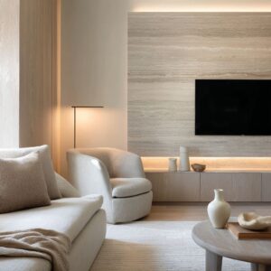
3) Taupe and neutral lowers for subtle structure
Taupe-gray, gray-beige, khaki-beige, mushroom, and white paneling can be used in rooms that already had a lot going on through stone, trim, wood beams, or strong daylight. These colors are useful when the room does not need a statement.
It needs a framework. A tonal lower band can give the room a middle register without competing with a major fireplace or a richly textured wall surface.

4) Terracotta, clay-pink, and dusty plum for warmth and mood
This group produces some of the most memorable effects. These colors can be used when the room needs warmth, artistic depth, or atmosphere without moving into black, charcoal, or heavy brown.

Warm lower bands work beautifully in rooms with plaster walls, pale stone fireplaces, sunlit floors, and soft upholstery. They create enclosure and intimacy in a different way than navy or forest green.
The mood is richer and more tactile.

Why architecture matters
The split works better when it feels structural rather than arbitrary. That can happen through:
- wainscot
- wall paneling
- frame molding
- a chair rail
- built-in shelving
- the fireplace mass
- a chimney breast
- trim that lines up with the painted break
This is one of the clearest differences between a half-painted wall that feels modern and one that feels like a quick decorating trick. When the division is carried by the wall’s own geometry, the room feels resolved.
The color change belongs to the architecture instead of sitting on top of it. This is why paneled two-tone rooms often feel stronger than flat ones, even with softer color contrast.
The molding is doing part of the work. The same is true when the fireplace continues the lower color or becomes the split itself.

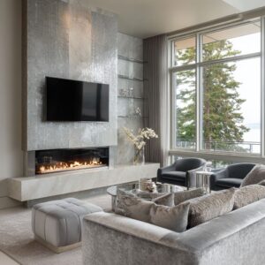
The fireplace is often the hinge point
The fireplace can continue the lower zone, which makes the lower register feel continuous. In other cases, the fireplace interrupts the band in a useful way, giving the eye a bright central pause.
Also, the chimney itself can carry the split because the chimney is the main proportion problem in the room. This means that if your living room has a strong fireplace, it should be part of the plan from the beginning.
Do not choose wall colors first and figure the fireplace out later. It may need to join the lower half, bridge the upper and lower halves, or remain pale so the perimeter walls can do the anchoring.

Modern half-and-half wall ideas by room type
Here are the living room directions.
Low perimeter grounding band
A low strip of color wraps the room just above sofa-back height, while the upper wall stays light. It suits tall rooms, large windows, and pale furniture.
It keeps the room open but less floaty.

Architecture-integrated half and half
Here the split is fused with paneling, millwork, wainscot, shelving, or trim. This suits classic-modern spaces and living rooms where you want the wall treatment to feel permanent and built-in.

Classic chair-rail split
It works especially well in modest living rooms that need more structure but do not need a major statement.

Tonal whisper split
This is for pale rooms with lots of texture. The two colors are close, but the room gains depth and a stronger furniture backdrop.
Good for readers who like layered interiors but dislike obvious contrast.

Atmospheric split
This approach uses a blurred or soft-edged transition, often on plaster-like walls. It suits artistic rooms and handmade material palettes.
In this case, a crisp rail might feel too stiff.

Monochrome split
One color family can appear in several densities, such as pale blue above and deep blue-gray below with matching trim. This can create a cocooned mood while still keeping the room lighter than a full dark paint job.

Localized feature split
If one chimney or wall mass is overly dominant, the split can be placed there instead of wrapping the full room. This is a very smart move in modern spaces with oversized fireplaces.

Implicit split
This is the quietest route. The effect comes through a bright ceiling and trim above with a denser wall shell below, rather than from an obvious painted band.
It gives readers another option if they want the feeling of a two-part room without a strict stripe.

The support system modern half-and-half walls need
A lower wall color works better when it has companions in the room. This is especially true with deeper lowers such as navy, charcoal-blue, or dark botanical green.
A darker lower band feels much more settled when the room also has:
- dark window frames
- darker chair frames
- a deep rug note
- a black or charcoal table base
- repeated color in cushions or artwork
Without that support network, a dark lower wall can look isolated. The room needs echoes of that lower density elsewhere so the eye can move naturally through the scheme.
This is also where bridging elements become important. Artwork, wood tones, plants, trim, or a table with a pale top and dark base can connect upper and lower zones.
Without that bridge, the room is more likely to feel visually cut.

A better way to choose half-and-half wall colors
Start here:
- Does the room need grounding?
- Does it feel too pale?
- Are the walls too tall?
- Does the fireplace sit apart from everything else?
- Do the windows dominate too strongly?
- Do the sofa and chairs need a stronger backdrop?
Then choose the lower family that answers that need.

Choose blue-gray if the room needs freshness and light retention.
Choose green if the room needs a natural, settled base.
Choose taupe if the room already has rich materials and only needs a little structure.
Choose clay, terracotta, or dusty plum if the room needs warmth and atmosphere.
Then keep the upper field light enough to preserve the room’s openness.

The reason the look feels polished
The half-and-half living rooms do not feel polished because the colors are unusual. They feel polished because the visual weight is distributed well.
That is the central lesson. A flashy color pair can fail if the split height is wrong.
A modest pair can work beautifully if the lower register supports the furniture, the upper field keeps the room breathable, and the transition belongs to the architecture.
That is why modern half-and-half wall paint can be such a useful tool in a living room. It gives you a way to shape space without heavy renovation.
It can make a tall room feel more usable, a bright room feel less washed, and a pale room feel richer without burying it in strong color. In the end, the idea is not the contrast between two paints.
It is the creation of a calibrated lower zone that ties furniture, architecture, daylight, and the fireplace into one whole.