Color has a remarkable ability to change the look and feel of any space, and nowhere is this more evident than in the living room. The right combination of hues can dramatically alter the mood, style, and even the functionality of your most lived-in space.
Whether you want to create a calm retreat, a vibrant social hub, or a cozy corner, the colors you choose will play a crucial role in shaping the atmosphere. From the walls that surround you to the smallest decorative accents, every color decision contributes to the overall effect.
Choosing the best color for living room walls involves more than just picking a shade that appeals to you. It’s about understanding how different colors interact, how they affect light and space, and how they can be used to reflect your personal style.
This article is here to guide you through the process, offering a comprehensive look at living room color ideas that can transform your space. We’ll explore everything from selecting the main paint colors for living room walls to adding complementary accents that bring the entire room together
Whether you’re looking for inspiration for living room paint ideas or trying to figure out how to incorporate the latest trends while keeping a timeless feel, this guide has you covered. We’ll dive into various aspects of color selection, including the impact of room size and lighting, the balance between trendy and classic choices, and how to use color to define different zones in an open layout.
By the end of this article, you’ll have a clearer understanding of how to approach color in your living room, helping you make informed decisions that will enhance the beauty and functionality of your space

Main Color vs. Accent Colors
Understanding Main Colors
Main colors serve as the foundation of any room’s design.
They are the hues that dominate the space, setting the tone and creating the initial impact when someone enters the room. Typically, these colors are applied to the largest surfaces, such as walls, large furniture pieces like sofas, and even the flooring.
The main color you choose will influence every other design decision, from the choice of accent colors to the style of furniture and decor

For instance, a charcoal grey living room offers a solid and sophisticated backdrop. When used on the walls, it creates a moody and intimate atmosphere, perfect for those who want a space that feels cozy yet refined.
This deep, neutral tone allows other elements in the room to stand out, whether it’s a soft ivory sofa that contrasts beautifully against the grey, or pops of color introduced through smaller accessories. Similarly, navy blue lounge ideas can transform a living room into a stylish retreat.
Navy, when used as the main color on walls, provides a rich, elegant feel. Paired with crisp white trim, the room feels both classic and contemporary, creating a perfect canvas for adding vibrant or metallic accents

The main color is more than just a backdrop; it’s the element that ties the room together. In taupe living rooms, for example, the warm taupe color on the sofa can serve as the anchor around which the rest of the room is designed.
The neutral nature of taupe makes it versatile, allowing for a range of accent colors to be introduced without overwhelming the space. The warmth of taupe also makes the room feel inviting and comfortable, ideal for spaces where relaxation is key
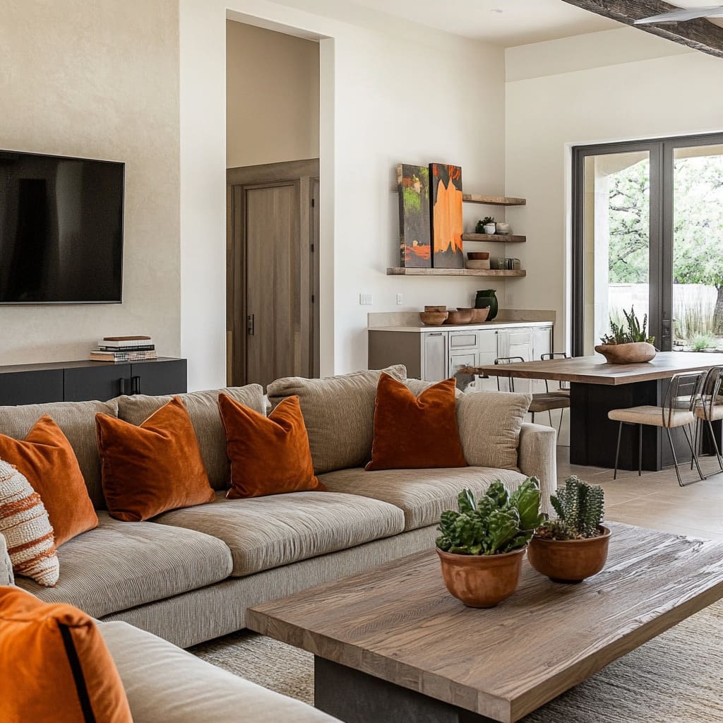 burnt orange seat pads and olive green plants” title=”A remarkable sitting area with taupe upholstery against light beige partitions, brought to life with burnt orange seat pads and olive green plants” height=”1024″ width=”1024″ sizes=”(max-width: 1024px) 100vw, 1024px” loading=”lazy”>
The Impact of Accent Colors
While main colors set the stage, accent colors bring the room to life. These are the hues that add personality, depth, and contrast, turning a well-designed space into something truly special.
Accent colors are typically introduced through smaller items—think pillows, throws, artwork, and decorative accessories. These colors are what catch the eye and add that extra layer of interest.
For instance, in a sage green living room, the soft green walls might serve as the main color, creating a calm and grounding atmosphere. But it’s the accent colors that inject energy into the space.
Blush pink pillows on a neutral sofa, warm wood tones in the furniture, and brass lighting fixtures all play off the sage green backdrop, creating a harmonious yet dynamic room. The subtle contrast between the main and accent colors adds complexity without clashing, resulting in a space that feels both balanced and vibrant

In a space where living room colors are carefully chosen, the balance between main and accent colors is crucial. Too much of one color can make the room feel flat, while too many accents can create visual chaos.
The key is to strike a balance that allows both the main and accent colors to shine. For example, in a living room where living room paint color ideas are applied thoughtfully, a warm taupe sofa paired with burnt orange pillows and olive green plants creates a rich, layered look.
The matte black frames on the walls serve as subtle accents that tie the color scheme together, adding depth without overwhelming the senses

Balancing Main and Accent Colors
Achieving the right balance between main and accent colors requires a keen eye and a thoughtful approach. Start by determining the primary color for the room—the one that will cover the most surface area.
This will usually be your wall color or the color of your largest furniture pieces. Once you have your main color, choose one or two accent colors that complement it without competing for attention.
Incorporating living paint color ideas into your design can guide you in balancing these elements. For example, if you’ve chosen a deep navy as your main color, accents in soft pink and gold can add warmth and contrast, preventing the room from feeling too dark or heavy.
On the other hand, if your main color is a neutral like taupe, you can afford to be more adventurous with your accents, perhaps adding bold splashes of burnt orange or deep green to create visual interest

Ultimately, the goal is to create a cohesive and visually appealing space where the main and accent colors work together to enhance the room’s overall design. By carefully selecting and balancing these colors, you can create a living room that not only looks beautiful but also feels just right for your style and needs.
Discover How Far Your Budget Can Go for a Living Room Update
Find out what stunning living room transformations you can achieve with your budget by using our renovation calculator.
[budget_renovation_calculator]

Color Combinations and Their Effects
Creating Different Moods with Color
Color is a powerful tool in interior design, capable of setting the mood and defining the character of a room. The right color combination can transform your living area into a calming retreat, a vibrant social space, or a sophisticated lounge.
By carefully selecting and combining colors, you can create an atmosphere that aligns with your desired ambiance. For example, using light gray living room walls paired with a charcoal sofa establishes a neutral, modern foundation.
This combination creates a calm and understated backdrop that allows accent colors to stand out. Adding coral pillows and mustard throws introduces warmth and energy to the space, while forest green plants bring in a touch of nature, enhancing the room’s organic feel.
This mix of colors creates a balanced environment that feels both inviting and dynamic

On the other hand, a mint green living room offers a fresh and soothing vibe. The soft mint green on the walls sets a serene tone, while a cream sofa keeps the space light and airy.
Accents like terracotta pillows and brass decor introduce warmth and texture, while navy blue art adds a subtle depth, making the room feel grounded yet open. This combination is perfect for those looking to create a relaxed and welcoming living area

Using Warm vs. Cool Colors
Understanding the difference between warm and cool colors is essential when planning your lounge room colour schemes.
Warm colors—such as reds, oranges, and yellows—tend to make a space feel more intimate and lively. They can create a cozy atmosphere, especially in rooms that are meant to be inviting and comfortable.
For instance, a sand color living room with warm sand walls paired with white furniture offers a neutral yet warm backdrop. Adding denim blue pillows and copper vases introduces a touch of color that feels both earthy and vibrant, while soft green plants add a refreshing contrast

In contrast, cool colors—like blues, greens, and purples—bring a sense of calm and tranquility to a room. They are ideal for spaces where you want to encourage relaxation and peace.
Consider an olive green living room where an olive green sofa is paired with light gray walls. This combination creates a soothing environment that is visually interesting without being overpowering.
Mustard pillows and navy blue throws add subtle warmth and depth, while brass lamps enhance the room’s elegant feel. Cool colors can help a room feel more spacious and serene, making them perfect for areas where you want to unwind

Enhancing or Reducing Natural Light with Color
Color plays a crucial role in how light is perceived in a room. Some colors can enhance the natural light, making a space feel brighter and more open, while others can absorb light, creating a cozier, more intimate atmosphere.
For example, living area color ideas often involve using darker shades to create a dramatic effect. Dark teal walls, for instance, can add depth and richness to a room, but they may also reduce the perception of natural light.
To balance this, pairing dark teal with warm white sofas and ochre yellow pillows can introduce brightness, while terracotta throws and soft blush vases add layers of warmth. This combination results in a space that feels both cozy and sophisticated, with a careful balance of light and dark elements

Alternatively, living room accent wall ideas can be used to enhance light and create focal points. A slate blue accent wall paired with natural wood furniture provides a cool, serene backdrop that reflects natural light beautifully.
Soft pink pillows and mustard yellow throws add a touch of warmth and playfulness, while navy blue art grounds the space with a bit of contrast. This approach is ideal for rooms where you want to maximize light while still incorporating color and personality

By considering the effects of color on light and mood, you can tailor your paint colours for sitting room to achieve the exact ambiance you desire. Whether you’re aiming for a lively, energetic space or a calm, reflective retreat, the right color combinations can help you create the perfect environment in your living room

Choosing Colors Based on Room Size and Lighting
Optimizing Small Spaces with Color
When it comes to smaller living rooms, the right choice of color can make a significant difference in how spacious and open the room feels. Light, airy colors are often the go-to for compact spaces, as they reflect more light and help create the illusion of a larger area.
However, introducing deeper hues strategically can add depth and interest without overwhelming the space. For example, lounge colour ideas for smaller rooms often include soft shades like dusty rose for the walls.
This gentle color adds warmth without making the room feel closed in. Paired with a charcoal sofa, the contrast creates a focal point that anchors the space, while still maintaining an open feel.
Copper lighting fixtures can add a touch of warmth and luxury, and olive green plants bring in a natural element, enhancing the feeling of space. Ivory pillows on the sofa keep the look light and balanced, ensuring the room doesn’t feel too heavy

Another effective strategy is to use a cozy warm beige living room palette. Warm beige on the walls creates a welcoming atmosphere while keeping the room bright and open.
An espresso brown sofa adds depth without overpowering the space. Soft lavender pillows can introduce a subtle touch of color, while bronze decor items add a metallic sheen that catches the light.
A deep teal rug adds just enough contrast to ground the room without shrinking it visually. This combination works well for those who want a warm and inviting small living room that still feels spacious

Enhancing Large Spaces
In larger living rooms, color choices play a crucial role in making the space feel cohesive and inviting. While smaller rooms benefit from lighter tones, larger spaces can handle deeper, richer colors that add warmth and coziness.
Front room colour ideas for expansive spaces might include cool gray walls paired with white trim. This combination creates a sophisticated backdrop that feels fresh and clean.
Aqua blue pillows and coral throws can inject vibrancy and warmth into the space, making it feel more intimate. Matte black frames on the walls add a modern edge, helping to define the room’s style without making it feel too stark.
This combination works particularly well in modern living rooms where you want to balance cool tones with pops of color

For those who prefer an earthy aesthetic, a modern earthy brown living room can be achieved by using earthy brown on the sofa and pairing it with warm white walls. This combination exudes warmth and comfort, making a large living room feel more inviting.
Rust orange pillows add a splash of color, while forest green plants introduce a natural, calming element. Gold lighting fixtures can add a touch of elegance and warmth, ensuring the space feels cozy rather than cavernous

Lighting Considerations
Lighting plays a pivotal role in how colors are perceived in a room. Natural light can enhance certain colors, making them appear brighter and more vibrant, while artificial lighting can sometimes dull or alter the appearance of your chosen hues.
When considering rose gold and grey living room ideas, it’s important to think about how these colors will interact with both natural and artificial light. Deep plum walls, for example, can look luxurious and warm in the glow of soft lighting but may appear too dark in a room with limited natural light.
Pairing deep plum with ivory furniture helps to lighten the space, while blush pink pillows and brass lamps add warmth and reflection, ensuring the room doesn’t feel too heavy. A dark teal rug can provide a grounding effect, tying the room together without making it feel closed in

Similarly, grey living room ideas often involve using cool tones like charcoal gray for the sofa and cool white for the walls. This combination creates a clean and modern look, but it’s important to consider how the room’s lighting will affect these colors.
In a room with ample natural light, this combination can feel crisp and invigorating. However, in spaces with less natural light, adding soft yellow pillows and olive green plants can introduce warmth and balance.
Bronze frames on the walls can catch the light and add a touch of sophistication, ensuring the room feels inviting at any time of day

By carefully selecting colors based on room size and lighting, you can create a living room that feels perfectly suited to its space, whether you’re working with a compact area or a spacious open plan. The right sitting room colour ideas can help you make the most of your space, creating a room that is both functional and beautiful

Incorporating Trends vs. Timeless Choices
Exploring Current Color Trends
Living room color trends are always evolving, bringing fresh ideas that can inspire a completely new look for your space.
Incorporating these trends into your home can be an exciting way to refresh your living area and keep it feeling current. However, it’s essential to choose trends that not only appeal to your taste but also complement the overall style of your home.
One of the emerging trends in living wall color ideas includes the use of soft lavender. When applied to the walls, this color offers a subtle yet distinct backdrop that can make a room feel both modern and serene.
Pairing soft lavender with a warm gray sofa creates a stylish and sophisticated combination that feels both trendy and balanced. To add a bit of energy, mustard yellow pillows can be introduced, while terracotta decor and copper lighting bring in warmth and texture.
This grey and lavender living room idea is perfect for those who want to embrace a modern, yet cozy aesthetic

Another popular trend is the navy blue and gray living room combination. Navy blue walls provide a rich, bold backdrop that feels both classic and contemporary.
When paired with a light gray sofa, the result is a room that feels grounded and serene. Adding coral pillows and soft pink throws can inject a sense of playfulness, while matte black frames add a touch of modern edge.
This combination allows you to embrace a bold wall color while keeping the overall design light and inviting

Balancing Trends with Timeless Colors
While trends can bring a fresh and dynamic feel to your living room, balancing them with timeless hues ensures that your space remains stylish and relevant for years to come. Mixing trendy colors with more classic choices creates a room that feels both contemporary and enduring, allowing you to enjoy the best of both worlds.
For example, taupe living room ideas can provide a warm and neutral foundation that pairs beautifully with a variety of accents. Warm taupe walls create a cozy atmosphere, while dark wood furniture adds depth and richness.
To keep the room feeling fresh, sage green pillows can be introduced, offering a subtle nod to current trends. Brass decor pieces add a timeless touch, while a soft yellow rug ties the elements together, creating a space that feels both current and classic

Another sophisticated option is the burgundy and beige living room. Rich burgundy walls bring a sense of warmth and elegance, while a soft beige sofa keeps the space feeling light and airy.
Olive green pillows can be added to introduce a natural element, while copper vases provide a warm metallic contrast. Slate blue throws can be used to soften the overall look, ensuring that the room feels balanced and harmonious.
This combination is ideal for those who want to incorporate rich, bold colors while maintaining a timeless appeal

When to Invest in Trends vs. Classics
Deciding when to embrace trends and when to stick with classic choices can be challenging.
Trends can make your living room feel exciting and up-to-date, but they can also become dated over time. On the other hand, classic colors offer versatility and longevity, ensuring your space remains stylish as trends come and go.
When considering living room painting design, it’s often wise to invest in classic, versatile colors for larger, more permanent elements like walls and furniture. For example, a color suggestion for living room might include warm olive green walls paired with a soft linen white sofa.
This combination feels timeless and adaptable, allowing you to experiment with more trendy accents. Burnt sienna pillows and brass decor pieces can add a contemporary touch, while a peacock blue rug introduces a bold pop of color.
This approach allows you to update your living room with current trends without committing to them on a large scale

Alternatively, if you’re drawn to bolder, more trendy colors, consider using them in smaller, easily changeable elements. For instance, deep aubergine walls can create a dramatic, contemporary look, especially when paired with warm sand trim.
Soft lavender pillows and antique gold frames can introduce trend-driven touches, while moss green vases add a natural, timeless element. This combination allows you to enjoy a trendy color scheme while still maintaining a balance with classic accents that can be updated as trends evolve

Incorporating trends into your living room is a great way to keep your space feeling fresh and exciting, but balancing them with timeless elements ensures that your design remains versatile and enduring. Whether you’re experimenting with the latest modern sitting room colours or sticking with tried-and-true classics, the key is to create a space that reflects your personal style and can adapt over time

Using Color to Define Zones in Open Layouts
Creating Distinct Areas with Color
In open-plan living rooms, where the space often flows seamlessly from one area to another, using color effectively can help define distinct zones. This approach not only adds visual interest but also enhances the functionality of the space by subtly signaling different purposes for each area, such as a seating area, dining space, or reading nook.
One effective strategy is to use a rich, muted tone like forest green on the walls of the main seating area. This choice creates a cozy, grounded environment, making it feel like a separate zone even within an open layout.
A charcoal gray sofa in this space provides a strong, neutral anchor, while blush pink pillows and copper lighting introduce warmth and contrast. Ivory throws can soften the overall look, ensuring the space feels inviting yet distinct from other areas within the room.
This approach works well in open layouts where you want the seating area to stand out as a comfortable, designated space for relaxation

Another approach involves using front room paint colors that clearly differentiate the living area from the dining space. For example, slate gray walls in the dining zone can create a sophisticated, modern backdrop.
Pair this with cool white trim to keep the space feeling crisp and clean. Marigold yellow pillows and rust red throws in the adjacent living area can introduce warmth and energy, creating a lively contrast.
Dark teal artwork in the dining area can tie the two spaces together while maintaining a clear distinction between them. This method is particularly effective when you want to create a dynamic flow between different functional areas without losing the open feel

Color Transitions
Smooth transitions between different color schemes are crucial in an open layout to maintain a cohesive look while still defining individual zones. This can be achieved by selecting colors that complement each other yet provide enough contrast to visually separate the spaces.
For instance, using pale sage on the walls of a dining area creates a serene and understated backdrop. Moving into the adjacent living area, a warm taupe sofa can provide a subtle shift in tone that still harmonizes with the sage walls.
Coral pillows and matte black frames can add depth and interest, while brass decor introduces a touch of warmth. This color combination allows for a seamless transition between zones, keeping the space unified yet distinctly divided

Alternatively, peach color living room ideas can offer a soft and inviting transition from one area to another. Soft peach walls in the living area can lead into a dining space with light ash gray accents, creating a gentle flow between the two.
Navy blue pillows on the sofa in the living area provide a striking contrast, while copper lighting and olive green plants add continuity and warmth throughout the space. This technique ensures that the transition between different zones feels natural and fluid, without harsh breaks in color

Enhancing Functionality with Color
Color can also be used to enhance the functionality of different areas within an open layout. By strategically choosing colors that suit the purpose of each zone, you can create spaces that are not only visually appealing but also highly practical.
For a focused and productive atmosphere in a home office or study nook within an open layout, consider using midnight blue on the walls. This deep, rich color can help create a sense of calm and concentration.
Pairing it with crisp white trim keeps the space from feeling too heavy. Warm copper pillows and sage green throws in the adjacent living area can introduce a touch of comfort, making the transition from work to relaxation feel smooth.
Terracotta art in the living area can tie the two spaces together, adding warmth and a cohesive look

In a larger open-plan layout, the best paint color for living room may involve using desert sand on the walls of the main living space to create a neutral, welcoming environment. A charcoal sofa can provide a strong visual anchor, while dusty rose pillows introduce softness and contrast.
Burnished gold frames on the walls and a deep plum rug can add richness and depth, enhancing the overall functionality of the space by making it feel both luxurious and comfortable. This color scheme is particularly effective for those who want to define different areas within an open layout while maintaining a unified design.
By thoughtfully incorporating color into your open-plan layout, you can effectively define different zones, create smooth transitions, and enhance the functionality of each space. Whether you’re experimenting with blue and white living room combinations or seeking color suggestions for living room zones, the key is to use color in a way that supports the overall flow and purpose of your home

Incorporating Textures and Patterns with Color
Adding Depth with Textures
When designing a living room, color is only part of the equation. Texture plays a crucial role in adding depth and interest to a color scheme, making the space feel more dynamic and inviting.
Different textures—such as velvet, linen, and wool—can create layers within a room, enhancing the overall effect of your chosen colors. For instance, consider a 3 colour combination for living room design featuring seafoam green walls paired with a warm ivory sofa.
The softness of the seafoam green sets a serene tone, while the warm ivory provides a neutral base that allows other elements to shine. Adding soft teal pillows in a plush velvet fabric introduces a luxurious texture that contrasts with the smoothness of the walls and sofa.
Copper decor items, with their metallic sheen, add another layer of visual interest, while goldenrod throws in a cozy wool bring warmth and comfort to the room. This combination of textures ensures that the color scheme feels rich and engaging, rather than flat

In another example, using warm charcoal walls as a backdrop can create a dramatic and sophisticated setting. Pairing this with light oak furniture introduces a natural, tactile element that balances the room’s overall tone.
Tangerine orange pillows in a soft linen fabric add a lively pop of color, while brass lighting fixtures with a subtle gleam provide a metallic contrast. A blush pink rug in a thick, plush texture ties everything together, creating a space that feels cohesive and multidimensional.
Here, the interplay of textures enhances the impact of the color choices, making the room feel both inviting and visually complex

Mixing Patterns and Solids
Mixing patterns with solid colors can transform a living room from simple to stunning. However, it’s important to strike the right balance to ensure the space doesn’t become too chaotic.
The key lies in choosing patterns that complement your solid colors and using them in a way that adds visual interest without overwhelming the space. For instance, consider a colour ideas for lounge room where cool slate blue walls provide a calm, neutral backdrop.
A cream sofa in a solid color allows for flexibility in adding patterns elsewhere in the room. Introducing rust orange pillows with a subtle geometric pattern can add energy and movement, while antique silver frames bring a touch of refinement.
Olive green plants, with their natural texture, offer a refreshing contrast to the more structured elements in the room. This combination of solid and patterned elements creates a balanced and harmonious design that feels both lively and grounded

Alternatively, blush pink walls can serve as a soft, warm foundation in a living room, allowing for creative use of patterns. Warm gray trim provides a neutral contrast, while soft gold pillows with a delicate floral pattern can add a touch of elegance.
Navy blue throws with a simple stripe pattern introduce depth and contrast, and charcoal rugs anchor the space with their solid, dark tone. This mix of patterns and solids ensures the room feels cohesive, with each element enhancing the others rather than competing for attention

Balancing Bold Patterns with Subtle Colors
Incorporating bold patterns into a living room design can make a powerful statement, but it’s essential to balance them with more subtle colors to avoid overwhelming the space. Bold patterns work best when they are complemented by understated tones that allow them to stand out without dominating the room.
For example, using deep charcoal walls as a base creates a dramatic backdrop that can support bold patterns. A cool white trim adds crispness and contrast, while emerald green pillows with a bold botanical print introduce a striking visual element.
Burnt orange throws add warmth and a touch of brightness, while soft pink artwork with a minimalistic design provides a gentle counterbalance. This approach allows the bold patterns to shine while ensuring the room remains harmonious and inviting

In another scenario, light moss green walls can provide a calming and neutral backdrop that allows for bolder patterns in the decor. A charcoal sofa can anchor the room, while brass decor adds a touch of sophistication.
Navy blue pillows with a bold chevron pattern can introduce a dynamic element, while blush pink throws in a simple solid color help to soften the overall look. This balance between bold patterns and subtle colors creates a living room that feels stylish and well-composed, rather than cluttered or overwhelming

Using Patterns to Highlight Color
Patterns can also be used strategically to highlight specific colors in a room, creating a more cohesive and intentional design. By carefully selecting patterns that incorporate your chosen color palette, you can reinforce the color scheme and add a layer of visual interest.
For example, in a living room with warm taupe walls and dark wood furniture, using soft coral pillows with a subtle pattern can draw attention to this accent color. Brass lighting fixtures can enhance the warm tones in the pattern, while a deep olive rug with a simple, understated design can ground the space and tie the colors together.
This approach ensures that the color scheme feels intentional and cohesive, with each element contributing to the overall design

Similarly, in a room with rich burgundy walls and a soft beige sofa, blush pink pillows with a floral pattern can highlight the pink tones in the wall color. Warm brass frames can add a touch of elegance, while a slate blue throw with a delicate pattern can introduce a cool contrast that balances the richness of the burgundy.
This use of patterns not only highlights the colors in the room but also adds depth and complexity to the design. By incorporating textures and patterns into your living room design, you can add depth, interest, and cohesion to your color scheme.
Whether you’re experimenting with accent wall living room paint ideas or creating a harmonious 3 colour combination for living room designs, the key is to use these elements thoughtfully to enhance the overall look and feel of your space

Conclusion
Selecting the right colors for your living room is a crucial step in creating a space that is not only visually appealing but also functional and reflective of your personal style. Throughout this article, we’ve explored various aspects of color selection, from choosing main colors that set the tone for the room to incorporating accent colors that add personality and depth.
We’ve also discussed how to use color strategically to define zones in open layouts, how textures and patterns can enhance your color scheme, and how to balance trends with timeless choices
One of the key takeaways is that the colors you choose for your living room should work together to create a cohesive and inviting environment. For instance, the careful use of colours to paint sitting room walls can make the space feel more open or intimate, depending on the shades and tones selected.
Whether you opt for muted, neutral hues or bold, vibrant colors, the combination of these elements should reflect both the functionality and aesthetic you desire
The various living room color combinations we’ve discussed demonstrate how different hues can evoke specific moods and enhance the overall design of your space. From the calming effects of soft pastels to the energetic vibes of brighter accents, each combination offers unique possibilities.
Additionally, when selecting front room paint colors, considering factors like room size, lighting, and existing decor will help ensure that your chosen palette complements the space rather than competes with it
As you consider applying these ideas to your own home, don’t be afraid to experiment. The beauty of color lies in its versatility and its ability to transform a room.
Start with a few key elements—perhaps an accent wall, a new sofa, or even a set of decorative pillows—and build your palette from there. Mix and match colors and textures until you find the combination that feels just right for your living room.
In the end, your living room should be a reflection of your style and a space where you feel comfortable and inspired. By thoughtfully selecting and combining colors, you can create a living area that not only looks beautiful but also feels like home