This text offers a comprehensive exploration of bathroom design strategies, focusing on color and tonal contrasts, textural elements, lighting techniques, and thoughtful layouts that shape inviting, visually cohesive spaces. Through practical guidance on combining surfaces, fixtures, and decorative accents, it reveals how simple yet impactful design choices can create environments that feel both harmonious and personalized.
Each section delves into distinctive topics—like mixing bold hues with gentle neutrals, using wood or stone to add warmth and interest, and selecting mirrors and lighting to enhance brightness—so that every detail contributes to a balanced, refined interior.
Mixing Styles Intentionally
Vintage + Modern
The bathrooms feature mid-century shapes or retro-inspired hardware against a clean, modern backdrop. This mix feels curated, especially when paired with updated materials (like brushed brass faucets on a vintage vanity silhouette).
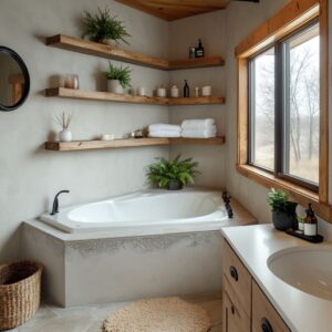
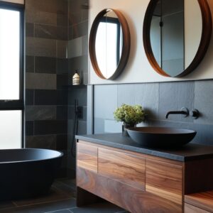
Industrial + Organic
Concrete sinks or slate walls can feel strong and raw, so balancing them with wood, rattan, or wicker prevents the space from looking too austere. Accent items like woven baskets or a single wooden shelf can introduce warmth.

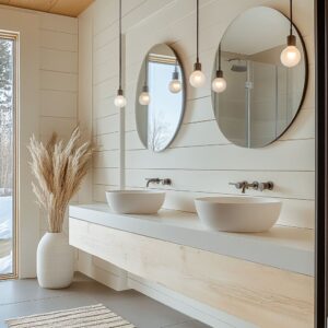
Scandinavian Minimalism + Pops of Color
Light wood, simple lines, and clean walls provide an excellent canvas for a playful hue (such as mustard, teal, or plum). This tension between calm minimalism and energized color results in a balanced approach that feels lively yet uncluttered.

Color Strategy and Balancing Intensities
Cohesive Contrasts
A powerful recurring theme in these designs is the contrast between saturated hues (e. g.
, mustard yellow, teal, emerald green) and calm neutrals (white, beige, pale grey). Introducing a vivid vanity or accent wall while keeping large surfaces neutral allows for strong impact without overpowering the room.

Accent Colors That Dialogue
Certain spaces blend multiple accent tones (for instance, teal countertops with navy vases). This creates depth and personal flair.
However, keep one vivid color as the leading element, and make sure other secondary accents harmonize in a smaller proportion (e. g.
, subtle décor pieces).

Layering Tones Within One Palette
Many of these bathrooms maintain a cohesive feel by sticking to a monochromatic or analogous family of colors (like different intensities of green, or graduated warm beiges). If multiple bold colors do appear, they often echo or complement each other through accessories or hardware to maintain unity.
Texture Combinations and Visual Rhythm
Mixed Finishes for Character
Pairing glossy tiles with matte countertops or using raw wood next to polished stone establishes an interplay of textures. This is useful in rooms that feature single-color schemes because the textural variation keeps surfaces engaging.
Slatted and Ribbed Wood

Vertical slats on vanities, cabinets, or accent walls add an understated pattern that can feel both modern and warm. Using vertical slats can elongate walls visually, especially useful in bathrooms where ceiling heights need emphasis.
Terrazzo as a Playful Statement
Several designs use terrazzo for countertops or backsplashes, injecting energy through flecks of color. Terrazzo can mesh with both modern and vintage looks, depending on how it’s paired (e.
g. , with walnut wood for a warmer look, or with minimal metal hardware for an industrial vibe).

Materials That Balance Warmth and Sophistication
Marble and Stone
Whether it’s black marble for drama or white veined marble for airy sophistication, natural stone is regularly seen as the centerpiece. Use it strategically: limit marble to a feature wall or countertop if you prefer subtlety, or extend it to floors and walls for a striking statement.
Brass, Gold, and Matte Black Metals
Metallic finishes consistently help unify a palette. Brass and gold hardware contribute warmth to spaces with cool walls or bold paint, while matte black fixtures serve as a strong counterpoint to bright colors.
Consistency in metal finishes across faucets, knobs, mirrors, and lighting helps maintain cohesion.
Wood Varieties

Light oak or bleached wood tends to support a serene, Scandinavian-inspired ambiance. Medium-toned wood introduces earthy warmth that contrasts effectively with concrete or darker tiles.
Rich, grained woods (walnut, dark oak) bring moody depth, especially paired with black fixtures or slate walls.

Lighting as a Design Element
Layered Lighting for Depth
Mixing overhead lighting with wall sconces, pendants, or even LED accents behind mirrors can enhance textures and highlight key areas (vanity, artwork, or an accent tile wall). Aim for a combination of functional, ambient, and accent lighting.

Warm Bulbs with Dark Tones
In darker-themed bathrooms (black marble, slate walls), slightly warmer or soft-white bulbs prevent a space from feeling too austere. This subtle approach emphasizes texture and ensures the darker surfaces reflect enough light to keep the room inviting.
Pendant Lights Above Vanities
A cluster of pendant lights or a single pendant with interesting glass or metal detail can function like sculpture, generating visual focus. Pairing such pendants with straightforward mirrors and faucets avoids visual chaos and allows the lighting piece to stand out.

Mirrors and Reflective Surfaces
Mirror Shapes for Added Interest
Round mirrors can break up strong rectangular lines, while octagonal or uniquely framed mirrors add a bold geometric component. Choose a shape that offsets the bathroom’s dominant forms to strike balance and variation.

Positioning for Light Amplification
When possible, place mirrors where they can reflect windows or lighting fixtures to magnify brightness. In narrow bathrooms, wall-to-wall mirrors or tall mirror panels can visually expand the space.
Framing Materials
Repeating a finish (like brass or matte black) for the mirror frames is a subtle way to unify hardware and lighting details. Wooden frames can reinforce a natural theme, while metal frames can feel more contemporary.

Layout Principles and Spatial Organization
Storage Concealed vs. Open
Floating vanities can create a sense of airiness. Open shelving or cubbies in strategic locations keeps essentials accessible and also provides display space for decorative items (like woven baskets, stacked towels).
In small bathrooms, consider mirrored medicine cabinets to maximize storage without crowding.

Strategic Focal Walls
Many featured designs highlight a single wall—whether through colored tile, dramatic marble, or accent paint—to anchor attention. This can be behind the vanity or in the shower area.
Keeping other walls more subdued ensures the main wall truly captivates.

Shower Enclosures That Preserve Openness
Frameless or black-framed glass panels maintain a sense of space, especially when a bathroom is not very large. The glass can also allow feature walls or special tilework to be seen from the rest of the room, enhancing visual flow.

Artistic and Decorative Details
Greenery and Dried Botanicals
Whether lively tropical plants or subtle dried branches, greenery provides a calm, organic note. Vases, planters, or even fresh-cut florals refresh the environment, especially if the palette leans cool or monochromatic.

Artwork with Coordinated Hues
Simple prints or abstract pieces in a color that echoes an existing accent (like orange shelving or teal tiles) can harmonize the entire palette. Artwork should be sized and placed so it doesn’t overwhelm fixtures or mirrors but still contributes flair.

Textiles and Rugs
Patterned or textured rugs, especially in black-and-white or subtle geometric motifs, ground the space and can connect color blocks. Towels, small stools, or poufs can also introduce secondary accent colors or tactile depth through woven materials.

Practical Advice for Harmonizing Design
Establish a Material Palette Early
Decide on two or three primary materials (like wood, marble, and metal) and stick to them throughout. If you bring in a fourth element, use it in a measured way (possibly for accents or small details).
Consistency across surfaces—flooring, vanity finishes, backsplash, frames—helps everything feel thoughtfully connected.

Use Mood Boards and Samples
Before committing to a bold paint color or specialized tile, gather physical or digital samples. Place them side by side to see how they interact in different lighting conditions.
This method often reveals if a particular shade of teal is too bright or if a chosen wood tone skews too red.

Plan for Maintenance
Surfaces like high-gloss lacquered cabinetry or textured stone need different levels of care. Verify upkeep requirements match your lifestyle.
For instance, a black marble sink can show water spots easily, so a matte or patterned stone might be more forgiving in a busy household.
Prioritize Ergonomics
Aside from aesthetics, ensure you have enough clearance around the vanity and between fixtures. Align faucets properly with sink basins, confirm mirror heights for all users, and leave ample leg space if you include a stool or bench.

Personalizing with Smaller Design Flourishes
Hardware That Complements the Palette
If your vanity is bold, choose hardware in a clean, understated shape that highlights the color without competing. Conversely, if the vanity finish is subtle, more decorative or chunky hardware can become a distinctive accent.

Unexpected Color Splashes
A shelving unit in bright orange or a stool upholstered in a contrasting fabric can add personality without requiring large-scale commitments like painting an entire wall. If your tastes shift later, these pieces are simpler to swap.

Coordinated Accessories
Matching soap dispensers, toothbrush holders, and small trays in finishes that relate to the vanity hardware can further unify the area around the sink. When well-coordinated, even functional objects can enhance the overall design story.

Closing Thoughts
The key takeaways revolve around well-chosen contrasts (light/dark, warm/cool, smooth/rough), consistent finishes, and a thoughtful approach to lighting and color. Emphasizing one or two statement features—whether it’s a vibrant vanity, an accent tile wall, or a dramatic stone countertop—gives the bathroom a clear identity.
Meanwhile, secondary details such as organic elements, small decorative items, and subtle lighting choices add dimension and comfort. In short, each bathroom’s success is rooted in deliberate coordination of form, color, and texture.
By selecting finishes that resonate with one another and thoughtfully balancing bolder aspects with calmer, neutral surfaces, you can craft interiors that feel polished and welcoming.