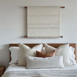
White has never felt quieter—yet never communicated more. The latest wave of white living room ideas proves that a pale palette can carry surprising depth, using texture shifts and subtle light play to create spaces that feel weighted and airy at the same time.
Fans of neutral interiors are seeing how chalk-matte walls, boucle seating, and pale timber can work together in one continuous language rather than sitting apart as separate accents.
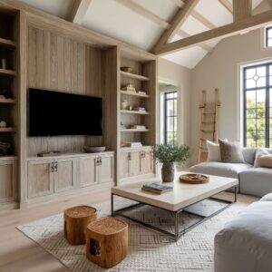
Material swaps, shadow lines, and carefully plotted curves now drive the look far more than color ever could. Ceiling boards set gentle vertical rhythm; heavy, low sofas act like sculptural ground lines; a single unruly plant keeps the whole scene from freezing.
Light moves across these surfaces in slow gradients, letting every micro-texture read like its own shade of white. This article explores why these choices succeed—how mass balances gap, how green breaks the grid, and how silence in décor can feel powerfully complete.
What follows is a close read of the forms, alignments, and atmospheric touches shaping today’s modern white living rooms, uncovering the compositional logic that turns restraint into visual strength.

White as a Medium, Not a Backdrop
In today’s refined interiors, white has moved far beyond being a default background. It works more like a lens that shifts with light and surface, adapting its presence throughout the day.
A well-composed white living room doesn’t rely on brightness alone—it pulls depth and structure from the subtle differences between whites. Instead of a single flat color, what appears white is often a mix: soft chalk against matte plaster, cloudy tones brushing against brushed lime, and natural fibers carrying pale oak undertones.
These differences are rarely labeled, but they are always sensed. A space might blend lime-washed walls with creamy wool textures and pale wood floorboards—not for contrast, but to let the edges blur softly, almost like a filtered photograph in real time.

Other interiors layer terrazzo, lightly textured brick, and smoothed chenille in a way that feels continuous but never dull. The tonal range across surfaces keeps the eye engaged—a rug and a sofa might technically be the same color, but their finish makes them play differently with natural light.
What quietly stands out is this: the richness of white living rooms doesn’t depend on color—it lives in what white reflects and absorbs. Light changes tone as it hits curved plaster, soft shadows gather in woven textures, and a hint of warmth emerges from surrounding materials.
No single white overtakes the others—they simply exist in calm rhythm, holding their own space without needing definition. This is what gives many modern white living room ideas their quiet power.

Curves and Arches as Visual Softeners of Spatial Rigidity
The growing use of curves across white interiors isn’t a passing style cue. Rounded seating, soft-edge alcoves, and arched openings act as correctives to square rooms—not through structure, but through sightlines and perception.
An arch can serve as a framing device, drawing focus toward a central element while easing the visual edges around it. It has the ability to shift the mood of a flat wall into something more dynamic, even with nothing more than paint and shape.
Likewise, curved window walls and custom seating that follow their line redirect how the room is read, encouraging the eye to move in a loop rather than in corners.

Bay seating is one of the more subtle tricks: its rounded ledge, especially in pale finishes, offers extra function without disrupting visual flow. Sculptural sofas echo this same logic.
When a seat curves instead of cutting across space, it feels like a part of the room’s topography—something shaped over time, not just placed.

The value of these forms isn’t just in their shape. It’s in how they interact with light and space.
In white living rooms, especially, curves soften transitions and interrupt grid-like repetition. They don’t divide the space—they loosen it.
Without adding clutter or bold contrast, these shapes change how the room moves. And this is the key: curves operate like hidden editors.
They reroute the visual structure of a room while letting everything else stay quiet. The overall impact?
A layout that feels less like walls and furniture, and more like one continuous form, shaped gently to respond to how the room is used.

Hidden Anchors and Weighted Stillness
In clean, quiet spaces, there’s always a risk that things start to feel floaty—too lifted, too weightless. But the most thoughtful modern white living room designs often carry a quiet force beneath the calm.
That strength comes from objects that hold the room in place, not loudly, but by sitting with quiet density. These “visual anchors” don’t always take center stage at first glance.
A low raw wood coffee table might seem modest, but in a room where everything else feels like it could drift, it acts like a tether. Its shape—chunky and grounded—gives presence without needing detail.
In other layouts, a solid square table acts like a stop, cutting through the airiness created by floating shelves or base cabinets. Even a sharp-edged table in a tall room changes the scale, reminding the eye where the room begins and ends.

What makes these pieces effective is never their size or color. It’s how they sit.
Their mass comes from:.
- Form: thick cylinders, carved blocks, squared silhouettes
- Surface: rough wood grain, plaster-like finish, or soft but dense boucle
- Placement: centered, balanced, and undisturbed
Each piece resists the drift that often happens in wide or open rooms. The stillness they offer feels earned, not arranged.
These are the items that keep the floor from feeling like it disappears, offering subtle counterweight to the lifted architecture around them. So even in the most open all white living room ideas, there’s rarely emptiness.
There’s stillness—but it’s supported by a quiet kind of gravity.

Light as a Directional Sculptor, Not Illumination
In these spaces, lighting doesn’t just help you see. It edits the room.
It creates rhythm, draws movement, and outlines shape. Especially in rooms where white dominates, the lighting isn’t there to brighten—it’s there to define.
Some layouts stretch a ceiling line with recessed LEDs, cutting a path that shifts the focus forward. Others use light tucked behind built-in cabinets or inside wall edges to create subtle tonal breaks—fluting panels or cabinetry become textured not by carving, but by shadow.
When daylight fades, small warm spots—like pin-lights over shelves—turn static displays into layered silhouettes, giving life to quiet corners.

In this way, the glow works harder than the furniture. It gives the walls motion.
It turns the plain into detail. Even the objects that don’t change—ceramics, books, a simple vase—begin to feel dynamic as the light glances across them from different angles.

What’s most unexpected is this: the brightest thing in the room isn’t the white—it’s the way light moves across it. As brightness shifts throughout the day, new edges appear, subtle transitions form, and the white takes on tone without pigment.
In these compositions, light behaves like a quiet guide, not decoration. It directs attention, introduces shape, and keeps each surface from settling too flat.
The result is clarity without glare—white used not as a color, but as a surface for shadows to land.

Plants as Compositional Balance
Plants bring an energy that white alone cannot supply; they reset the room’s rhythm by adding living height and loose edges. A single Bird-of-Paradise can rise well above eye level, cutting a clean vertical line against sun-washed walls, while a low fern spills outward, breaking the grid of seats and tables below.
Instead of symmetric bouquets, leaves might droop or twist, making the scene feel caught mid-motion rather than arranged.

Volume matters too. A tall pot beside glazing can echo the trees outside, so indoor and outdoor layers read as one continuous view.
Elsewhere, a hanging fern behaves like a leafy chandelier, casting shadows that ripple across walls and floorboards. In rooms built on sweeping curves, greenery often mirrors the architecture—arching stems align with arched windows, or a tucked planter follows the bend of a bay seat.

Texture is another quiet tool: waxy rubber leaves, feather-light pampas plumes, and matte succulents share the stage without feeling repetitive. Their contrast keeps the palette from going flat, yet color barely shifts.
By combining these gestures, many white sofa living room ideas feel stable and fresh at the same time—the greenery provides a measured jolt of irregularity that prevents the space from freezing into still life.

Object Silence and the Role of Absence
No artwork, no patterned rug, no scatter cushions—silence can speak as loudly as any decorative flourish. Empty floor area turns into a breathing gap, letting light pool and shadows stretch.
A shelf grid left half vacant makes every remaining vase feel intentional, because the void around it frames the form like a gallery pedestal. The tactic shows up in subtle ways: one mirrored panel interrupts a bank of cabinets, lending a glimmer that relieves the strict order; a lone ceramic bowl rests on a floating console, spotlighted by a pin-light but surrounded by nothing else.
Shadow picks up where ornament stops—panel seams and cabinet reveals draw faint lines that shift with daylight, becoming a kind of moving pattern on bare surfaces.

By giving absence equal value to presence, white wall living room designs achieve a sculptural pause. Negative space becomes a material in its own right, allowing every placed object—no matter how small—to gain weight against the calm field around it.
The result is a room that feels considered yet uncluttered, holding attention through quiet tension rather than overt display.

White Furniture as Contour and Mass
In these spaces, white furniture carries weight by design, not by density. It holds its shape like sculpture, defined by volume and edge more than ornament or detail.
What looks calm from afar reveals itself through proportion—the weight of a deep cushion, the width of an uninterrupted seat, the curve of an unexpected silhouette. Many of these pieces share traits that go beyond their pale color:.
- Deep seating wrapped in thick padding, so the sofa looks carved rather than assembled.
- Low forms stretched wide, allowing them to settle across a room without looking oversized.
- Rounded or asymmetrical outlines that echo surrounding architecture or create new paths through open layouts.
One white sectional, for example, seems to fold back into itself, following the shape of the curved wall behind it. Another uses massive cushions that push against their frame, making the whole form feel generous and slow.
Elsewhere, a boucle-upholstered sofa becomes a soft block, its rounded corners barely catching shadow, made visible only by how light pools along its matte surface.

The key detail: these pieces leave an impression because of how they shape space. Their role in white sitting room ideas goes far beyond color matching.
Each one has what could be called shape memory—a silhouette that stays with you even as your eye moves across the room. The material doesn’t need to speak loudly because the form does all the work, especially when white reflects just enough shadow to trace the contour.

Horizontal and Vertical Movement as Quiet Storytelling
The strongest movement in such rooms happens without any visual noise. Instead of contrast, there is cadence—built through a slow alignment of lines that stretch, rise, and settle.
Across the horizontal plane, floating ledges, layered shelves, and tabletop placements keep the eye moving sideways. These aren’t scattered for variety—they’re measured for continuity.
The sofa’s back lines up with the console. A series of open shelves marches at a shared height.
Even a recessed cabinet might follow the same horizon as a coffee table edge.

Vertical motion appears as subtle tension: slatted wall panels climb with equal spacing, ceiling boards trace upward, and slim pendants or backlighting create gentle pulls from floor to ceiling. These elements don’t draw attention directly; they’re felt in how the eye travels upward, paused only by a light source or an object placed for break.
There’s a kind of visual rhythm at work:.
- Ledge → shelf → vase
- Archway → sofa curve → window
In these sequences, the direction becomes a language—telling time through placement rather than movement. Even without animation, the space feels like it breathes with progression.
This is how many living rooms with white ideas hold focus. They don’t need bold gestures.
They rely on alignment, on the placement of forms across invisible axes, and on a sense of pacing that never pushes, only guides. That quiet logic is what makes the layout feel stable, even when nothing about it tries to stand out.

Conclusion: White Rooms That Speak Without Noise
What sets these spaces apart isn’t how much they do—but how precisely they’re composed. White plays an active role across every surface, not as emptiness but as a field shaped by texture, direction, and light.
Material variation adds dimension, where even subtle finishes—plaster, wood grain, boucle—keep the surfaces from flattening. Shadows define form, not with boldness, but with soft punctuation that traces where light pulls away.
Curves interrupt repetition, changing how the eye flows across the room, while solid forms—carefully placed—bring calm through grounded weight.

Negative space is used with care. Gaps are not left; they’re shaped.
They create pause and quiet structure, letting the eye rest without emptiness. Then greenery steps in—not as color splash, but as a visual shift.
A fern brushing a shelf or a tree casting layered shade opens the boundaries, making walls feel more like transitions than endings.
In all, these rooms aren’t neutral—they’re finely tuned environments. They rely on alignment, tone, and shape to speak clearly without sound.
That’s what gives so many modern white living room ideas their lasting impact. They’re not about absence, but about awareness—where every form, line, and texture holds its place with quiet clarity.