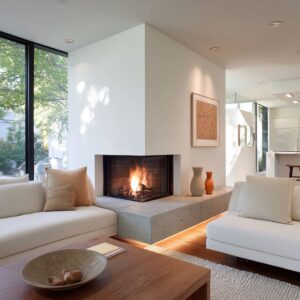
An awkward living room layout with a corner fireplace often feels awkward because the room has competing “attention magnets” that don’t share the same axis. A corner fire feature points the space diagonally.
A TV wants a flat, centered reading. A window wall behaves like a glowing mural that keeps pulling the eye.
Add a sloped ceiling, an open arch to dining, or a stair rail, and the room can feel like it has several different “fronts” at once.
The strongest concepts don’t fix this by forcing one winner. They fix it by controlling how attention moves—where it rests, where it glides, and where it is allowed to be undecided without looking messy.
What follows is a deep exploration of the main moves: the visual hierarchies, the shape choices that act like “layout therapy,” and the decorating patterns that make the corner feel intentional rather than accidental.

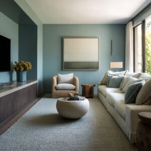
The focal-point fight between types of attention
In such awkward living room layouts, the fireplace and TV aren’t simply two focal points. They are two different focal-point genres:
- Fireplace attention is atmospheric, textural, and peripheral-friendly. It can be enjoyed without staring straight at it.
- TV attention is graphic and literal. Even when the screen is off, the rectangle reads like a high-contrast sign.

The awkwardness appears when both are treated as the same genre—two signs competing at once. The interior designs that feel calm usually separate the roles:.
- Fire becomes material mood (stone veining, plaster clouding, warm reflectivity in a mirror, soft base glow).
- TV becomes a controlled graphic (negative space, framing, a quiet wall plane, or an architectural niche/arch).
That role-separation is why “split focal point” layouts can feel more settled than “everything stacked in one corner,” even when both arrangements are technically possible. It’s not a rule; it’s an attention strategy.

The “datum line” trick: a long, low horizon that stops the corner from pulling the whole design diagonally
One of the non-trivial ideas is the creation of a continuous horizontal line at sitting height. It shows up as:
- a long console under the TV
- a bench/hearth wrap that runs through the corner
- a low ledge that continues under the media wall
- a mantel so thin it reads as a measured pause, not a shelf

This horizon line does something subtle: it gives the eye a place to travel instead of getting stuck at the corner. Corner fireplaces often feel like visual dead ends.
When the eye hits the corner, it stops—and the room feels cramped or unresolved. A long base line creates a visual route that keeps the room feeling wider and more intentional.

Even in interior design concepts where the fireplace is dramatic (for example, chevron wood volume, terracotta plaster mass, dark paneled surround), the calmness returns the moment there’s a low, continuous band that “holds” the composition at lounge level. It’s the same reason long banquettes make dining nooks feel composed: the room gains a readable perimeter rhythm.

Furniture placement with “conversation bowl”
A corner fireplace tends to trigger one of two failures:.
- furniture shoved to walls, leaving a hollow runway in the middle
- furniture angled anxiously, creating a tense triangle of sightlines

The interior design that feel socially natural form a bowl—a soft enclosure that makes the center feel like a destination rather than a passage. This can happen in a few patterns:
A) Sectional + return = a boundary that looks social, not defensive
When a large L-shaped sectional is placed parallel to the window wall and the return turns inward, it stops reading like “we ran out of walls” and starts reading like “this is where people gather. ” The return acts as a low partition that keeps the center from becoming leftover emptiness.
B) Two sofas facing each other = conversation-first even if the TV exists
The face-to-face sofa concepts are quietly radical in corner-fire rooms: they refuse the idea that the room must become a row of seats aimed at a diagonal corner. The TV/fire stack becomes a backdrop—present but not commanding posture.
C) Sofa + two chairs = the controlled crescent
A long sofa behaves like a soft edge. Two chairs complete the arc and prevent the room from feeling like a single-direction viewing lounge.
This arrangement also solves a deep psychological issue: it creates “front row” plurality. When the only front row is the sofa, the room feels like a theater.
When chairs share the front-row status, the room feels like a lounge.

This is where furniture placement in an awkward living room layout with a corner fireplace becomes less about where pieces fit, and more about whether the room creates a social geometry that can tolerate multiple attention targets (fire, screen, view, people).

Round forms aren’t decorative; they dissolve collision energy
Interior design can intentionally place circles and soft curves in the center: nested round coffee tables, drum tables, rounded poufs, circular fluted tables, arched TV niches, woven pendants, oval surfaces.

This is not simply “softening. ” It changes how the room behaves visually:.
- Rectangles demand alignment. In a skewed layout, that pressure makes every misalignment feel louder.
- Circles accept imperfect angles. They don’t ask the room to square up.
Round elements also reduce the “collision feeling” that can happen in corner-fire layouts where sightlines and walking paths intersect at odd angles. A round table reads like a safe orbit in the middle; it can sit slightly off-axis without looking wrong.
That tolerance is a hidden luxury in awkward rooms: the room can be imperfect without looking compromised.

Poufs for quiet traffic control and visual punctuation
Oversized poufs can do more than offering extra seating. Their deeper roles:.
A) They create a soft “do-not-cut-through-here” message
Placed at the rug edge near an open arch or stair path, poufs become a gentle buffer. They discourage people from walking straight through the conversation zone without the design needing a console table or divider.
B) They absorb the harshness of a heavy corner mass
Near stone or plaster fireplace volumes, chunky texture acts like a tactile counterweight. Hard surfaces and sharp edges can make a corner feel severe; thick knit reads as human-scale softness that makes the corner feel inhabitable.
C) They solve the “awkward triangle” problem
Corner fireplaces often create a triangular dead zone between hearth, sofa return, and the open walking lane. Poufs turn that triangle into a purposeful “spillover zone” without adding another chair silhouette that might clutter the view lines.
Their roundness matters as much as their texture. The interior design gets punctuation marks that stop large planes (TV wall, window wall, stone wall) from feeling like they are shouting.

The TV wall looks intentional when it’s treated as a composition
Often, the biggest anxiety is not the fireplace—it’s the fear that the TV will look “stuck wherever it fit. ” Interior design ideas can answer that fear using visual composition tools:
Negative space as a frame
A centered TV on a light wall can look like a black hole. The calm versions use generous empty border space around it so the TV reads like a controlled graphic element.
The emptiness isn’t absence; it’s a framing device.
Shadowbox and thick perimeter frames
A white shadowbox frame turns the TV into a panel within a larger rectangle. It changes the TV’s identity from “electronics” to “wall composition.
”.

Vertical punctuation: sconces and narrow elements
When sconces flank a TV zone, they give the wall a tall rhythm that counters the wide rectangle. The wall stops feeling top-heavy.
Even unlit, the sconces act like parentheses.
Connector strips and narrow shelf bands
A slim vertical strip with floating shelves between fireplace and TV is a quiet but powerful stitch. It prevents the room from splitting into “fireplace wall” and “TV wall” as separate arguments.
Architectural niches and arches
The arched TV niche concepts solve a deep aesthetic tension: a screen is hard-edged; an arch gives it a soft surrounding geometry so it feels housed rather than mounted. It also creates “rooms inside the room,” which makes irregular plans feel intentional.

Smart Map: “Where does the TV go?”
Option A: the TV has its own calm wall
It is an option if your fireplace already has strong presence (stone mass, corner projection, sloped ceiling, big windows).
- The TV wall looks planned: a horizontal cladding (wood planks), a long console, and sconces or a shadowbox frame around the screen.
- Why it works: the TV gets “breathing room,” so it stops looking like an afterthought; the fireplace can stay textural and atmospheric without turning into a tech wall.
- Quick visual checklist: long base line under TV + generous empty border space around screen + one vertical framing element (sconces, slim shelf band, or a niche).
Option B: TV above the fireplace
This works when the fireplace is tall, flat-faced, and calm (light matte stone, minimal mantel, clean rectangle).
- The stack feels intentional if: the mantel is thin, it avoids busy decor between TV and firebox, and it relies on the fireplace mass as the frame.
- Why it works: a single vertical “spine” stops the room from hesitating, which is useful in open plans with arches, stairs, and multiple paths.
Option C: A corner media block
This option stops focal-point conflict completely.
- It feels designed, not accidental: full-height surround panels, a clean hierarchy (screen above, fire as a long line below), and a low ledge that continues along the adjacent wall.
- Why it works: the corner reads like a deliberate object with boundaries, so the room stops arguing about what the “front” is.

Stone, plaster, and wood are attention governors
Each material can control attention differently:.
- Pale stone with veining or block cuts reads as architectural weight that holds detail even when nothing is happening. It can carry the interior design without needing decor.
- Plaster-like, cloudy finishes soften dominance. They blur edges so a large corner volume feels calm rather than sharp.
- Horizontal reclaimed wood planks widen a wall visually. That widening effect is crucial when a TV needs to look placed on purpose.
- Dark paneling turns a corner into a deliberate volume. Darkness makes asymmetry feel intentional because it reads as a chosen mass, not a leftover wall.
The most sophisticated moments happen when material changes occur exactly where the room wants to turn—at the corner hinge. When the transition is placed with precision, the corner stops being an awkward angle and becomes the logic of the design.

The ceiling is often the hidden organizer
Darker ceilings and beams are additional tools.
- A dark ceiling acts like a visual lid that compresses the upper volume so the interior design feels gathered. In layouts with big glazing and tall stone, the upper air can feel empty and detached; a darker ceiling pulls the “room feeling” down toward the seating.
- Beams add a second function: they create a directional rhythm that makes long rooms feel purposeful rather than corridor-like. Even when the furniture is asymmetrical, the ceiling rhythm can give the eye a stable path, reducing the sense of randomness.

This is especially helpful in sloped-ceiling situations: a strong vertical fireplace/TV “pillar” becomes the stabilizer, and long low furniture becomes the counterbalance. The ceiling stops being a problem and becomes a design tension that the room visibly resolves.

Mirrors over corner fireplaces prevent a dead end look
The mirror-over-fireplace concepts are doing a psychological job: A corner fireplace can feel like a stop sign—your gaze hits it and stops. A mirror introduces a second layer of depth, which keeps the corner from feeling terminal.
It also reintroduces light and ceiling rhythm into the fireplace zone, making the mass feel less final and more integrated with the rest of the design.

When the mirror frame carries warmth (carved wood, warm tone), it also acts as a mediator between pale stone and darker ceiling/TV elements. It becomes a color bridge, not just a reflective surface.

Built-in benches and long cabinetry
One of the strongest non-obvious patterns is the use of bench runs and low storage lines to create extra function without adding extra furniture silhouettes. A bench under a window grid does three things visually:
- it gives the window wall purpose beyond “view,” so the room doesn’t become view-versus-TV
- it adds a long horizontal element that balances long linear fire features
- it provides secondary seating without introducing more legs, angles, and chair backs that can clutter an already tricky geometry
The bench can continue into the media zone, which is a major compositional win: the TV wall gets a base, and the corner stops reading as a break in logic.

Styling that looks “finished” in awkward rooms
There’s a particular styling languag that keeps the room looking composed:.
- Low silhouette objects on ledges and consoles (small vessels, trays, minimal clusters) so the wall remains calm.
- One tall airy branch gesture to echo window mullions and add vertical lift without bulk.
- Texture sequencing rather than color shouting: ribbed lumbar pillows, nubby cushions, knit poufs, woven pendants, textile wall hangings.
The key is that the styling often behaves like rhythm rather than collection. It repeats a few forms (rounded vessels, thin vertical branches, quiet ceramics) so the interior design reads edited, even when multiple focal points exist.

The hanging frame clusters and picture lights introduce another rhythm trick: mid-height layering. Small picture lights create shadows that act like a second horizontal “ceiling” line around eye level, which distracts from the tall corner mass trying to dominate the upper wall.

The center stops feeling like a hallway when it has “gravity”
A recurring failure in awkward plans is the empty middle that feels like a pass-through strip. That can be solved by giving the center visual gravity, not clutter:
- heavier-looking coffee tables that “pin” the seating zone
- clustered low blocks instead of one big obstacle
- rugs with low-contrast patterning that blur minor misalignments and soften the floor plane
A faded, warm-neutral rug with subtle variation performs an advanced job: it reduces the strictness of geometry. In awkward layouts, strict geometry makes every offset feel like a mistake.
Soft patterning makes offsets feel intentional.

Smart Map for Awkward layout living room ideas
Without turning this into rules, there are four “attention ranking” families:.
- Two-anchor systems: fireplace as material mood + TV as calm graphic, each with its own identity (separate wall planes, connectors, framing devices).
- Single vertical spine: TV stacked over a tall fireplace mass so the room stops hesitating, often supported by strong traffic logic and centered tables.
- Monolithic destination wall: a continuous fire/media surface that behaves like architecture and can carry scale without scattered decor.
- Sculptural corner identity: chevron wood, terracotta masses, dark built-in blocks—where the corner becomes the story, and the rest of the room becomes the calm.
Each family works when the rest of the interior design supports the ranking through horizontals, soft center geometry, and controlled styling.

Closing perspective
An awkward layout requires viewing the space as a choreography of attention: the eye needs places to rest (benches, long consoles, calm walls), places to soften (round tables, knit texture, arches), and places to feel decisive (a spine wall, a framed TV composition, a monolithic fire plane). When those roles are clear, the corner fireplace stops feeling like an awkward imposition and starts feeling like a deliberate feature that the interior design knows how to hold.
And that is the quiet success behind an awkward living room layout with a corner fireplace done well: the design doesn’t look like it’s solving a problem. It looks like it always meant to be arranged this way.