Blue cabinetry brings weight and presence to a kitchen, but the surface that surrounds it—the backsplash—often shapes how that presence feels. The right backsplash doesn’t compete for attention; it sets the pace, carries light, and connects materials that otherwise risk feeling isolated.
It’s not only a background but a surface that can shift mood, stretch space, and bring rhythm through color, texture, and line.
This article looks closely at the most thoughtful backsplash ideas for kitchens with blue cabinets, focusing on how specific design choices influence balance and tone. Whether the finish is glossy, matte, or textured, it’s often the quiet links—shared undertones, mirrored textures, or matching angles—that hold the entire room together.
Gloss levels, directional pattern, material echo, and light flow play equal roles in how spaces hold attention without relying on contrast alone. In the sections that follow, each idea is broken down by how it visually affects the kitchen, with attention to how blue remains the anchor.
It’s a detailed look at how small choices in finish, alignment, and tone build cohesion—where one surface connects to the next without pulling the room off balance.

Tonal Bridges Rather Than Color Clashes
Some kitchens speak softly but carry a layered presence—not through contrast, but through careful tonal coordination. This approach is particularly compelling in kitchens with blue cabinetry, where the atmosphere can shift dramatically depending on how the backsplash is chosen.
Rather than using bold opposition, many backsplash ideas for blue cabinets work by threading a visual link through neighboring hues, bridging cabinet color and countertop tone in a seamless rhythm. Hints of warmth temper cooler blues.
In standout designs, back-painted glass panels with a bronze tint or brushed-metal surfaces reflect surrounding brass details. These finishes don’t demand attention, but they gently warm the backdrop—keeping midnight blue cabinets from reading too severe.
The resulting effect is subtle but grounding, especially in rooms that might otherwise feel saturated with cool tones.

Veined slabs offer something more than movement—they act as tonal translators. A marble or travertine slab with creamy veins can hold faint streaks of slate or navy within it, establishing a quiet agreement between wall and base.
This isn’t about drama—it’s about soft continuity. In kitchens where the countertop is dark and the cabinetry leans toward blue-grey, these veined surfaces carry the eye across planes without interruption.
Then there are hue shifts that barely register as contrast, yet build depth. Back-painted glass panels in shades like sea mist, pale mint, or green-silver create an almost-analogous relationship with blue cabinets.
The pairing feels controlled and layered—particularly effective in glossy kitchens where even the smallest undertone becomes visible in reflected light. These combinations aren’t loud, but they hold attention through their nuance.

Gloss–Matte Dialogues That Control Light
Light, in this type of kitchens, isn’t handled in broad strokes—it’s shaped through finish. Many of the most compelling backsplash ideas for navy cabinets lean into this idea, using contrasts in texture rather than color to animate the surfaces.
Rather than relying on high-contrast tones, such spaces find energy in how materials interact with light and one another. Glass and lacquer might both shine, but they shine differently.
A glossy blue cabinet will reflect like still water, pooling light in controlled shapes. When placed against a mirrored or back-painted glass backsplash, the difference becomes clear.
The glass surface responds to ambient shifts, catching highlights and throwing them across the room. This dual reflectivity creates a continuous gleam, but with a layered, moving quality that keeps it from feeling flat.

Then there’s the conversation between matte cabinetry and glinting mosaic tile. Pearlized or iridescent surfaces—especially when made from tiny tiles—scatter light in all directions.
Against a matte backdrop, even the smallest glimmer reads clearly. The sparkle stays contained, behaving more like texture than decoration.
It brings life to the wall without disrupting the overall tone. On the other end of the spectrum are stone surfaces with deliberately muted finishes.
Honed travertine or oxidized porcelain slabs don’t shine—they glow faintly, holding shadow and detail. This low-sheen approach calms the space, letting pattern and mineral variation do the visual work.
Paired with darker cabinetry, these backsplashes feel more like a continuation of the architecture than an inserted accent, supporting depth without stealing attention.

Vertical Tricks That Stretch Space
In kitchens where the lower half feels grounded by dark blue cabinetry, the backsplash often carries the task of lifting the space. Certain materials and layouts can pull this off without needing bold contrast or bright accents.
One of the most effective techniques is the use of thin vertical lines—kit-kat tiles, ribbed surfaces, or fluted panels. Such narrow repetitions create an upward visual pull that shifts focus from weighty base cabinets to lighter vertical rhythm.
The texture doesn’t scream for attention, but it guides the eye subtly upward, making the ceiling feel higher and the space more open.

A second tactic involves using full-height single slabs—particularly stone, porcelain, or glass. These uninterrupted surfaces have a different kind of strength.
Instead of breaking the wall into sections, they allow for a calm stretch from counter to ceiling. This uninterrupted surface provides a stage for the cabinetry without adding extra visual boundaries.
The verticality of a single, continuous backsplash balances out the density of darker cabinets below, especially in layouts that might otherwise feel boxed in. In contrast, some layouts purposely stop the backsplash midway, especially below a window or along a shelf line.
This intentional stop leaves space above for light, paint, or visual breathing room. The trick here is to let the gap feel clean—not unfinished but considered.
A mid-height backsplash paired with a painted upper wall or open light source can relieve visual pressure while still anchoring the design. In many backsplash ideas with blue cabinets, this layered height approach plays a quiet role in reshaping proportion without needing major structure changes.

Pattern as Texture, Not Ornament
Color doesn’t have to do all the work in a backsplash—direction, layout, and surface depth can shift the entire feel of a kitchen. Especially with deep-toned cabinetry, letting pattern emerge through tile shape or placement can bring variation without adding clutter.
Chevron layouts, micro-hex mosaics, or geometric marble patterns do this best. Instead of adding new hues, they rely on angles, gloss levels, and facet breaks to catch light in unexpected ways.
A matte blue cabinet might sit still, but the backsplash behind it moves gently, giving a layered visual pace.

Terrazzo surfaces, especially those with oversized chips, bring something else entirely. They behave more like a soft echo—mirroring shapes or materials used elsewhere.
A terrazzo backsplash might feature cream or green flecks that tie to rattan stools or wooden flooring. In the best examples, it doesn’t try to match anything exactly—it creates a loose rhythm that ties unrelated elements together.
This approach can make even a minimalist layout feel complex without ever looking busy. Then there are surfaces like laser-etched Corian, where the detail appears only under the right light.
These slabs have extremely fine lines—horizontal or wave-like—that stay invisible until grazed by daylight or a focused sconce. It’s a quiet kind of texture, rewarding close attention and giving depth without decoration.
In many blue cabinet backsplash ideas, this type of surface acts like a background hum—always present, never loud, and perfectly in step with the calm strength of the cabinetry.

Material Storytelling in Layers
There’s a reason layered compositions feel rich even before a person can name why. In many kitchens, it starts with two-tiered backsplashes—one grounded in strong natural movement, like veined stone or marble, the other softened by a quiet surface above.
This separation, often marked by a subtle material shift or the line of a shelf, creates visual zoning that helps the space function without dividing it. The prep area gains depth from the stone’s organic markings, while the upper zone holds back, offering a clean surface that feels intentional, not bare.
Open shelving—especially thin, floating slabs in pale oak or bleached ash—enters this layered story as a punctuation mark, not a headline. It breaks up the wall plane just enough to introduce texture and visual temperature, without shifting the room’s focus away from the main surface story.
These shelves offer a home for functional display—bowls, books, soft-lit ceramics—without forcing the backsplash to retreat. In homes where full cabinetry might feel overpowering, this move keeps rhythm without giving in to clutter.

Then there’s the move that completes the loop—wrapping the same material across the island base or onto the hood surround. Repetition here doesn’t mean redundancy.
It reinforces continuity between what sits at eye level and what stands at arm’s reach. That marble stripe or terrazzo flicker doesn’t stop behind the stove; it bends around a surface, closing the composition in a way that feels full but not overstated.
For a backsplash for blue cabinets, this strategy can ground the color in something textural and warm, helping the kitchen feel connected, not built in parts.

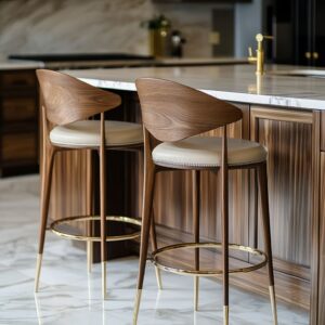
Metallic Echoes That Quietly Tie It Together
Small metal accents often do more to hold a palette together than any bold color choice. In kitchens where the cabinetry leans deep—slate blue, ink, or navy—brass, bronze, or aged gold fixtures do more than add shine.
They call out faint gold undertones in stone or reflect a brushed warmth already hinted at in wood or tile. Used thoughtfully—narrow pulls, a minimalist tap, the trim on a pendant—they form a thread that links tone across materials without shouting for attention.
Cooler schemes tend to move in a different direction. In spaces where blue cabinets meet sea-glass backsplashes or soft white quartz, the decision often shifts to chrome or polished nickel.
These finishes disappear into the reflective background, holding shape and structure without adding contrast. They act more like structure than color, slipping behind the glass shine or matching the slick top edge of a cabinet door.
This approach works particularly well in kitchen backsplash ideas with blue cabinets that depend on contrast between finish rather than color. The metal isn’t the standout—it simply finishes the sentence.
It’s a detail that works in the same rhythm as the rest of the materials. Just enough to close the loop.
Just quiet enough to stay in tune. In the broader context of blue cabinet backsplash ideas, these accents often carry the mood—softening sharp transitions, echoing veining, or offering a clean break in an otherwise matte-heavy room.

Mood Through Controlled Shine
Not all shine behaves the same. In kitchens where blue cabinetry takes center stage, the way surfaces handle light can shape the entire room’s tone.
Pearl mosaics and handmade tiles bring a kind of shimmer that shifts with every movement—nothing repetitive, nothing flat. Each tile carries a slightly different surface angle or glaze thickness, so reflections change across the backsplash wall.
This iridescence doesn’t compete with the cabinet color; it lifts it, keeps it from going dull, and draws attention without demanding it. On the other hand, machine-gloss lacquer fronts—especially in deep blues—create stable, mirrored reflections.
Instead of scattering light, they collect it, building long visual stretches that make cabinetry feel monolithic and composed. The contrast between these two types of surface can be used as a tool: irregular gloss where energy is welcome, ordered shine where structure is needed.
Then there’s a third, often-overlooked category: frosted or semi-opaque glass. These back-painted panels don’t sparkle—they glow.
Like a diffused light source built into the wall, they spread brightness gently across darker materials. In a backsplash with blue cabinets, this kind of surface can quietly light the zone between counter and cabinet, giving the impression of soft backlight even in rooms with minimal windows.
It flattens shadows, making matte stone or quartz feel less dense, and gives the blue a kind of air around it.

Subtle Symmetry Moves
It doesn’t take much for a space to feel deliberate. In kitchens where blue cabinetry is present, even the way a shelf lines up with a cabinet seam or a vent hood edge can change how the room reads.
These moves aren’t decorative—they’re structural cues that everything in the room is part of the same decision. When a waterfall island edge mirrors the vertical stile lines on nearby cabinetry, or a slim floating shelf aligns perfectly with a tall backsplash seam, the eye sees cohesion, not coincidence.
In rooms that lean more sculptural, repeating fluted details—say, on the island base and again on the vent hood or a column—gives the design something to revolve around. It brings quiet emphasis without needing contrast.
For a blue cabinet backsplash, this repetition can ground the composition, letting the backsplash surface remain minimal while still tied into the architectural story. These small spatial echoes are what give even a modest room a finished rhythm—everything placed with care, nothing feeling like a later thought.

Palette Discipline Over Loud Statements
A kitchen can feel visually rich without relying on contrast for effect. The most striking examples of blue cabinetry paired with thoughtful backsplash choices show how color restraint builds clarity.
Here, blue remains the anchor, and everything else—backsplash, counter, hardware—rotates quietly around it. In many setups, even a complex surface like oxidized copper or terrazzo doesn’t overtake the cabinetry.
That’s because the supporting elements carry fragments of the same tones—a rust fleck echoing nearby oak, or a teal shadow pulled from a cabinet’s undertone. This kind of coordination doesn’t ask for attention; it earns it by staying consistent.
The backsplash doesn’t shout for focus—it reinforces what the cabinetry already sets in motion.

Neutral countertops play a crucial role here. Pale quartz, soft limestone, or smooth honed surfaces work like visual intermissions between color-rich cabinet runs and backsplash textures.
These surfaces give the eye a resting point, absorbing light softly and bridging bold and subtle without leaning into either extreme. In combinations that include deep blue cabinetry and more intricate surfaces behind the stove or sink, these neutral counters keep the focus from scattering, holding the design together like a breath between sentences.

Lighting As Part of the Finish Mix
Finishes only go as far as the light lets them. In many of the most refined blue kitchen layouts, light doesn’t just illuminate—it sculpts.
The way it falls, grazes, or reflects can shift a surface from quiet to focal with a flick of a switch or the tilt of the sun. Under-cabinet LED strips, angled with precision, can turn ribbed or chevron tiles into something architectural.
The shadows they cast between each tile edge deepen texture and emphasize rhythm. This kind of detail makes a backsplash feel intentional—not added, but integrated.
On walls with more complex surfaces, like patina-effect slabs or honed travertine, it’s often spot sconces or task lights that do the work. Rather than flooding the surface, these fixtures direct light exactly where it’s needed to pick up on subtle texture changes—variations that would fade under flat overheads.

In kitchens where glossy back-painted glass or polished cabinetry dominate the finish mix, daylight becomes a quiet amplifier. Light doesn’t just bounce—it duplicates across reflective surfaces, extending brightness without relying on extra fixtures.
This trick is especially noticeable in homes with limited artificial lighting during the day—the window isn’t framed, it’s mirrored, letting the shine stretch across walls and counters with almost no effort. Taken together, these lighting strategies do more than make materials visible—they shape how every surface behaves.
It’s this kind of detail that often separates average builds from those with character: a backsplash that lives with the light, and a room that feels different at every hour.

Conclusion: How Blue Cabinets and Backsplashes Work Together Without Competing
In kitchens built around blue cabinetry, the backsplash does far more than fill a gap—it sets the rhythm for everything else. What holds these spaces together isn’t a single style or material but the way certain decisions play off each other quietly and precisely.
One of the most effective methods is letting undertones carry the weight. Whether it’s a warm bronze veining in a slab, a greenish patina in tile, or the muted base of a back-painted glass, these subtle shifts act as links across the room.
They smooth out the transition between cool cabinetry and warm wood, or between bold counters and restrained wall finishes. Another move seen across standout designs is reflectivity matching.
This isn’t about making everything glossy or matte—it’s about keeping the visual temperature steady. A sleek lacquered door paired with a mosaic that sparkles in fragments, or a brushed front softened by frosted glass, allows surfaces to talk in light rather than compete in tone.

Pattern isn’t just texture—it’s direction. Thin vertical lines can add lift to a heavy cabinet wall.
A chevron layout animates an otherwise still surface. Meanwhile, a large full-height slab offers calm through its scale alone.
These decisions do more than decorate—they redirect sightlines, reinforce structure, and guide the eye through the space with quiet cues. Echoing a backsplash texture or material somewhere else—on a hood, a shelf edge, or the island base—helps settle the room visually.
It doesn’t take repetition everywhere. Just one thoughtful match is enough to make the design feel held together without looking calculated.
And in all of this, lighting is the final layer. It decides which surface feels closest, which wall catches shadow, and which part of the backsplash glows first thing in the morning.
A slight shift in fixture angle can turn a flat tile into a detailed feature, and reflected daylight across glossy glass can fill the room without a single bulb switched on. This kind of thinking—across texture, light, tone, and placement—is what turns a backsplash with blue cabinets into more than a background.
It becomes the thread that ties the full composition, holding together color, material, and proportion with quiet precision.