Bathroom walls used to be an afterthought—functional at best, blank at worst. But that’s changed.
Framed art has moved in with intention, reshaping how these spaces feel and how they hold visual weight. This isn’t about filling gaps above towel bars.
It’s about building a layered surface where materials, shape, scale, and light share a conversation with what’s hanging there.
Across a wide range of homes—from pared-down powder rooms to larger en suites—the idea of the bathroom gallery wall has picked up nuance. The shift isn’t always dramatic.
Sometimes it comes down to how a pendant drop repeats the length of a nearby drawing, or how travertine veining lines up with a color-block print. Other times, it’s a full display, spanning across mirror edges or tucked into niches that feel like part of the architecture.

This article looks closely at the small moves that make that happen: how framed pieces sync with finishes, how light builds atmosphere without a spotlight, and how asymmetry can feel anchored when there’s a shared axis or shadow line. It’s about composition, not decoration—structure, not excess.
And it’s happening across styles, regions, and house types, from coastal modern homes to wooded retreat-style interiors. The combinations are quiet, but they stay with you.

Texture Echo & Material Dialogue
In some of the most compelling bathroom gallery wall ideas, the materials underfoot and overhead aren’t just background—they’re in quiet coordination with the artwork itself. A stone wall, especially one veined vertically like travertine or stacked limestone, often reflects the same orientation found in nearby color-block canvases or ink-based compositions.
This subtle repeat of direction creates a steady rhythm between surface and subject. The effect can feel so natural that the eye accepts it before fully registering why the balance works.

Walls finished in soft plaster or with a matte lime wash bring another kind of dialogue. Their natural irregularities pair well with artwork that shares a tactile presence—fiber-based pieces, carved reliefs, or mixed media with raw edges.
The wall becomes an active part of the composition, making the framed piece feel like a detailed gesture drawn onto a larger base.

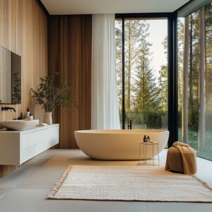
The tub—particularly when made of smooth concrete or soft stone—often plays a secondary framing role. Seen in natural light, the tub’s shape and its cast shadow become visual tools.
Together, they mirror the lower line of nearby art or echo the curved edges of sculptural wall forms. In some bathrooms, this relationship is so precise that the bathtub appears to sit beneath the artwork as though resting on a built-in matte.
That kind of alignment adds another layer to how we read pictures on bathroom walls—more spatial, more connected.

Negative Space as a Design Tool
Leaving space empty may seem simple, but in these bathrooms, the decision is anything but accidental. Open areas between frames or to one side of a gallery layout are doing quiet work.
They carry visual weight—counterbalancing bold clusters on the opposite side or offering relief after a sequence of dense forms. The result feels spacious without being sparse, relaxed but not underdone.

There’s also a second layer: how the artwork lines up with features built into the room. Whether it’s the edge of a mirror, the outline of a pendant drop, or the top of a vanity ledge, those architectural elements are used as reference points.
Some pieces fall just in line with a lighting groove or tuck their bottom edge along a faucet axis. These invisible guides help organize what could otherwise feel casual.
The alignment is rarely obvious at first glance, but once noticed, it gives structure and calm to even the most relaxed layouts. This kind of spatial care shows up in many homes where thought goes into how visual elements settle in a space.
It’s a quiet technique, but one that sets apart ordinary decoration from layout that feels truly resolved.

Micro-Color Linking
The smallest details often hold the room together. In many bathrooms, a brushed metal on a pendant or faucet doesn’t just serve a function—it quietly references the hues inside the frames nearby.
A copper trim in a pendant, for instance, might echo the soft orange undertone in a print above the tub. Even the screw caps on a wall sconce sometimes catch a brass tone that shows up again in a thin frame or the glint of a detail in a mixed-media piece.
These links often measure no more than a few millimeters across, but they lock the room’s palette in place.

There’s also a quieter method working in parallel: pigments borrowed from the room’s permanent finishes. A cabinet in a muted green might subtly lift its tone from a coastal photograph hanging nearby.
The warm band of oak trim running beneath a gallery wall might reflect a touch of yellow or olive from an abstract study. These lifts never chase a perfect match.
They float just close enough to form a relationship. This approach to color brings a natural cohesion to bathroom gallery wall ideas, where art and architecture share the same language without ever speaking too loudly.

Light as a Curator
Lighting in a bathroom doesn’t have to spotlight the art directly to make it visible—it can do just as much from the side or behind. In some cases, recessed wall washers skim the surface of carved or layered art, letting shadows become part of the composition.
This is especially striking with textured forms like stone or fossil-inspired pieces, where shadow edges shift throughout the day. The art changes with time and light, quietly responsive to the room.

Other bathrooms use mirror lights not only for reflection but as an indirect frame for the wall display. A mirror with a backlit edge makes nearby prints or ink drawings appear to float, especially when the fixtures stay out of view.
This kind of setup gives a subtle aura to the wall without ever relying on overhead beams or direct spots.

Then there’s the darker side of the lighting plan: a single horizontal bar across a deep-toned plaster wall. This type of placement brings out a filmic quality, almost like a still frame frozen in warm tones.
A visitor may see only the photo at first—but there’s more happening. The edges of the light don’t fall randomly.
They stop at just the right points to highlight the art and not the wall. The arrangement feels instinctive, yet every line of light lands with purpose.
This careful shaping is what separates standard lighting from those setups that make pictures on bathroom walls feel quietly composed.

Depth Tricks Beyond Flat Frames
Flat walls aren’t always treated as flat surfaces. In many recent bathroom layouts, depth has become part of the gallery composition itself.
A small display cube built directly into the wall—a wooden shadow-box nestled beside framed sketches—brings physical space into play. Inside it, a single object like a hand-thrown vase or sculpted stone becomes part of the display, acting almost like a piece in motion next to still works.
Larger works benefit from architectural integration too. A recessed niche surrounding a full-size canvas adds quiet framing without using actual frames.
The niche edges catch light, create shadow, and bring out texture. It’s no longer just a painting on a wall—it’s a part of the structure.

Then there are the narrow ledges and caps that quietly define layout. A walnut bench beneath the art, or a beadboard trim running at waist height, provides a visual “ground” where the bottom edge of the artwork seems to rest.
Even in powder rooms, a shelf might appear—but left mostly empty. That absence doesn’t signal missed opportunity.
It functions like white space on a page, letting the art breathe. These setups show how a gallery wall in a bathroom can operate in layers, with depth doing just as much as color or composition.

Asymmetry that Still Feels Steady
Balance doesn’t always mean matching sides. In many bathroom gallery wall layouts, the most interesting visual arrangements come from unevenness—carefully done.
A tall drawing of a single line might appear on a side wall, echoing or grounding a nearby cluster of frames. In that way, the room’s volume—not just its flat surfaces—starts to carry the visual weight.
Long vanities also benefit from this thinking. One end might carry a tall, moody artwork, while the other hosts a tight trio of smaller frames.
Between them, the empty wall space works like a pause—an intermission between two parts of the composition.

What keeps these irregular layouts from feeling chaotic is the use of hidden structure. Even in the most relaxed groupings, frame edges tend to line up with something: a bench top, the edge of a backsplash, or the vertical run of a faucet.
These reference lines, often invisible at first, hold the display together. That’s what gives a bathroom gallery wall that sense of stability, even when everything appears casual.
It’s symmetry without repetition—balanced by intent rather than mirror images.

Shape Dialogue With Plumbing & Fixtures
In many of the most refined bathroom wall gallery compositions, shape isn’t left to chance. Circular forms often play off each other across different layers of the room.
A round mirror over the vanity doesn’t simply serve as a reflection point—it often echoes another nearby curve, like a ribbed ceramic disc or a small circular artwork. These repeated shapes, placed with care, tie the visual story together without ever shouting for attention.

Vertical shapes follow suit. A slim pendant light dropping from the ceiling will often align with the height of a tall sketch or the frame of an artwork just beneath it.
That repetition of form—straight, narrow, vertical—makes the lighting feel like it belongs in the same composition as the art.

Linear parallels are just as intentional. A wall-mounted tap might subtly fall into alignment with the vertical stroke of a nearby relief sculpture.
In other rooms, the length of a sconce might match the edge of a mirror frame, building a quiet framing effect that makes the whole layout feel deliberate. These choices turn functional fixtures into part of the visual language—something that happens often in carefully composed bathroom art gallery spaces.

Scale Games
Size contrast can shift how the eye experiences everything. One of the most effective pairings used in recent layouts puts a large-format print—like a misty coastal photo—right beside something much smaller.
The oversized piece holds space with its quiet mass, while the tiny relief or ink drawing next to it pulls the viewer in. Each one benefits from the other’s presence.
Big gives context; small invites focus.

At the opposite end of the scale, some layouts rely on purposeful understatement. Four tiny photos, hardly bigger than postcards, placed high on a wide limestone wall, feel surprisingly bold.
Their small size demands a second look, almost forcing the viewer to move closer. That intentional shift in scale breaks up visual predictability and makes the wall feel curated, not filled.

This attention to proportion shows up across many thoughtful bathroom wall gallery installations—especially in spaces where the room itself is large and minimal. The way artworks are sized against the wall, and against each other, helps define how the space feels.
Sometimes, the smallest piece ends up being the one that anchors everything else.

Sprung From Location Yet Transferable
One of the more subtle strengths of a bathroom wall gallery lies in its ability to pick up regional character without leaning on clichés. The same principles—balance, rhythm, contrast—can shift tone dramatically depending on where they’re applied.
A setup using warm walnut, soft beiges, and gentle relief textures might echo the grounded calm found in prairie-style homes. The identical layout, with the same spacing and hierarchy, takes on an entirely different voice when built from pale wood, cyan tones, and bleached stone—common in beach-facing spaces.

Other examples sharpen this contrast. In one part of the country, an organic-modern interior may rely on carved stone, hand-worked plaster, and pale fibrous art.
In another, darker wall finishes and shadow-heavy graphics bring a quieter, moodier atmosphere. These location-driven materials guide what kind of art feels embedded in the space.
Not to replicate the region, but to speak its language through texture and tone. This adaptability is part of what makes the bathroom gallery wall such a compelling design move.
It can lean coastal, desert, or woodland without saying so out loud. It lets material and scale make the statement—and art simply affirms it.

What Makes a “Modern Bathroom Gallery Wall” Feel Fresh
| Quiet Move | Why It Works |
| Frame Depth Mixing | Different shadow depths create subtle movement without color |
| Art-to-Fixture Axis | Aligning pendant tips or faucet centers with frame edges fuses art and plumbing |
| Single Accent Object Inside Gallery | A sculptural vase or plate adds 3‑D interest and pauses the picture field |
| Surface-as-Canvas | High‑gloss plaster or micro‑cement carries reflections that behave like soft digital projections, extending art beyond its borders |
| Pigment Echo in Non‑Art Elements | Cabinet paint or stone veining borrows a tint from artwork rather than the other way around |
| Deliberate Undersizing | Small frames in big voids challenge scale expectations and bring intimacy |

Key Takeaways
- Еhe Wall Finish Speak First. The texture of plaster, tile, or stone sets the tone. It acts as the first voice in the room, and framed work should respond rather than compete. Even quiet artworks can hold their own when the wall’s surface does some of the storytelling.
- Architectural Lines as Invisible Rulers. The best art placements rarely happen by eye alone. Edges of vanities, tops of benches, and the trim of wainscoting form imaginary lines that keep layouts steady—even when they look freeform.
- One Dimensional Shift. A wall that holds only flat frames risks feeling static. Introducing one recessed box, shelf, or shadowed niche changes how the viewer’s eye moves—depth catches attention in a way color alone often can’t.
- Light as a Material, Not a Utility. Where light falls and how shadows land should be part of the plan. Some setups shine brightest when the light is low and indirect, casting soft halos or grazing surfaces just enough to animate them.
- Echo, Don’t Match. A brushed fixture, a grain in wood, a single accent color—these small echoes tie elements together without overworking the theme. They feel found rather than forced, which helps the space read as lived-in.
- Balanced Asymmetry With Datum Consistency. There’s room for offset clusters and mismatched frames as long as one or two shared lines guide the layout. A common base or aligned center keeps things calm, even when the rhythm varies.
- Scaled With Intent. Size contrast matters. A huge canvas or a group of miniature pieces can both work, but the in-between often falls flat. Let scale choices push toward the edge, then adjust slightly. That’s where the tension comes in.