Green has always had a place in interiors, but its role in dining spaces is shifting in unexpected ways. Rather than showing up as a single statement wall or a potted plant by the window, green now appears as a foundational element—wrapped around ceilings, built into custom millwork, infused into textured plaster, and layered across materials.
This change is subtle, but meaningful. The color no longer acts as a highlight; it becomes part of the structure, steering how the room feels and functions.
What makes this new approach so compelling is how the green color for dining room ideas play with placement, undertone, and texture. It’s not about being bold or soft—it’s about how green interacts with the rest of the space.
Whether carried through sage-toned glass, eucalyptus-tinted wood slats, or moss-colored ceilings, green can behave like shape, rhythm, and temperature all at once. The latest thinking doesn’t just use green to add color—it uses it to map out zones, suggest softness, and guide light.

Why Modern Green Designs Feel Different
Most green dining rooms used to rely on an accent wall—a quick dash of color, a way to inject energy. But current green dining room ideas show a shift that’s much more spatial than decorative.
Rather than staying confined to one surface, green now shapes the form of the room itself. It appears on ceiling planes, full alcoves, curved vaults, or even slatted wood façades—not as a highlight, but as a structural surface.
A dining room might wrap the entire upper third of the space in soft sage, letting the ceiling color act like a canopy that guides the eye across edges, rather than landing on them.

In these newer spaces, there’s always a kind of visual echo: when green coats a ceiling, it’s often mirrored in something else—a glass tabletop with a greenish tint, vertically grooved oak panels with a sage wash, or a pale velvet seat that slightly picks up the tone. This rhythm makes the color feel integrated rather than pasted on.

Furniture and decor aren’t chosen by color match alone—they’re curated for material contrast. A boucle chair reads differently against plaster than it does against lacquered wood.
A high-gloss ceiling changes the reflection of a ceramic table base, allowing light to move in unexpected ways. These kinds of relationships let green carry the space without overwhelming it.
In this newer language of interiors, green is less of a bold statement and more of a quiet structural presence. It behaves like part of the architecture, not just a stylistic choice.
That’s why these green dining rooms often feel calmer, more layered, and more considered, even when they use strong hues.

Green above the eyeline: ceiling strategies
| Ceiling move | Visual effect |
|---|---|
| Glossy moss boards bordered by grey beams | Pulls the lid downward in a cosy, tent-like way; reflections shimmer as diners move |
| Pistachio wash inside crown moulding | Adds garden freshness without touching walls, turning daylight itself slightly green |
| Barrel-vault sage band | Frames the dining zone like a soft archway; ceiling tint behaves like delicate shadow rather than pigment |
| Eucalyptus-painted joists only | Keeps weight above while walls stay chalk-white; beams act like gentle stripes that steer sightlines to the table |
Not-so-trivial idea: placing colour overhead lets furniture remain calm yet still feel enveloped. Because ceilings catch sidelight, the hue shifts all day, delivering motion without adding objects.

Capsule Thinking: Rooms That Wrap Diners
Some dining spaces move away from traditional wall-coloring altogether, using green to build an entire envelope that wraps around the seated area. The effect isn’t loud—it’s immersive.
A vertical velvet wall panel in hunter green doesn’t just color the space; it softens sound, catches light, and adds depth, almost behaving like furniture itself. The texture changes throughout the day, and because it curves or channels, the color plays differently with shadow, adding more dimension without any need for decoration.

Elsewhere, a clay-toned olive plaster may start on the wall and stretch across the ceiling. With a hand-applied finish, the surface isn’t flat—it scatters and absorbs daylight.
There’s no harsh edge where wall meets ceiling; the eye glides across it as if the entire surface were sculpted from a single tone.

Another example is the use of muted moss green paint across all visible walls and ceiling arches. In these rooms, there are no defined borders—only soft shadows and smooth curves.
The absence of sharp contrast actually draws attention to details like the table texture, chair silhouette, or a single pendant light. These kinds of rooms prove that enclosure doesn’t require saturation.
It comes from continuity—the same tone used across multiple textures, and the feeling of being wrapped rather than walled in. There’s a quiet richness in these dining areas, not because they add more, but because they repeat and refine.

Green That Behaves Like Negative Space
Traditionally, black or deep charcoal takes the role of a background void—a quiet backdrop that lets shapes and textures command attention. But in many recent dining room ideas, something else is taking over that role: deep, cool-toned greens like pine or forest.
These tones bring a different kind of depth—less severe than black, but just as effective in letting foreground pieces glow.

A wall covered in velvet-matte forest green absorbs light rather than bouncing it back. In front of it, materials like cognac-toned leather or mid-tone wood come alive.
The surface of the wall doesn’t demand attention—it holds it, while letting richer colors appear more luminous. The lack of gloss is crucial here; the color softens into the background, giving shape and grain on other surfaces a brighter presence.

In other examples, a pine-green dining niche with a matte finish acts like a canvas behind a pale travertine table. The green draws the eye inward, but the light stone feels brighter by contrast—as if the color were lighting it from behind.
This play between dark and light isn’t based on shine or gloss, but on how green mutes surrounding reflections, focusing attention exactly where it needs to be.

Unlike black, green in this context carries a subtle thread of warmth, a touch of color that never dominates. It gives visual clarity to objects placed before it, without draining the room of softness.
For homes where black might feel too stark or cold, green dining room walls like these offer a quiet depth—one that frames objects gently, not forcefully.

Tone-on-Tone Layering Instead of Contrast
Rather than chasing contrast, many newer dining spaces rely on layering subtle shifts within the same color family. This tone-on-tone method builds interest not by jumping across the color wheel, but by moving sideways—through texture, material, and quiet variation.
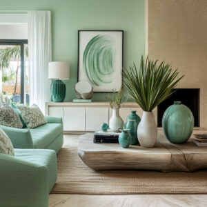
In a monochrome sage dining nook, the wall might be finished in soft limewash while the furniture follows suit: boucle chairs that add a low, nubby texture, shelves filled with pale green pottery in glossy glaze. Each surface has its own finish, yet all stay within the same muted hue.
This creates micro-contrasts that play with light and touch, giving the room more visual layers without ever feeling busy.

Another example brings together sage cabinetry with a green-tinted glass tabletop. Even the ceramics on the shelf echo that same soft tone.
Here, the green is repeated rather than intensified, making the space feel steady and cohesive. This kind of repetition builds a palette through echo, not volume—each element is calm on its own, but together they form a fuller story.

In a more playful setting like a lichen-green breakfast corner, the palette might flex slightly. Bench fabric could have a subtle yellow tint, shelves lean into darker olive, and a side chair in celery tones rounds it out.
These gentle tweaks in saturation let the room shift and hum, without jumping into loud contrast. The result of all this is a kind of horizontal depth—built across materials rather than through bold color switches.
Each piece holds close to the others, but texture, sheen, and finish create the space between them. This is how modern spaces get richness without relying on visual noise.

Using green this way doesn’t demand attention—it holds the room together quietly, with the confidence of something that’s been carefully balanced rather than pushed to stand out. It’s a subtle, layered method seen often in contemporary dining room ideas, where the goal isn’t to make color shout, but to let it settle into the architecture.

Directional Textures Amplify Calm Hues
In many modern green dining room settings, what makes the space feel quietly alive isn’t a strong color pop—it’s texture that moves with light. The use of ribbed, slatted, or fluted elements in furniture and surfaces allows the green to stay soft, while the room gains rhythm and subtle shading.

Think of green-stained vertical oak slats lining a feature wall. The grooves between the wood catch tiny shadows, acting like a secondary tone.
These lines give a quiet surface movement without disrupting the color’s calm. The result is a visual depth that shifts gently as light travels across the day.
A similar effect plays out when a ribbed travertine pedestal table sits in front of a matte olive wall. The contrast isn’t created by hue or saturation, but by the crispness of the ribbing against the soft surface behind.
Texture replaces contrast, and the color can remain low-key while the form stands out.

Even smaller touches follow this method. A table with cylindrical legs in finely grooved wood can echo the curve of ceiling beams above it.
That repetition of form—not hue—connects surfaces and helps bind the architecture to the furniture without needing a high-gloss finish or bright detail. In these spaces, the green doesn’t need to shout.
It holds its place quietly while textures do the talking. The palette stays calm, but nothing feels static.
This approach is a strong thread across many of the most thoughtful green color dining room ideas, where tone and structure support each other in silence.

Using Green as a Bridge Between Indoors and Outdoors
There’s a long-standing association between green and the natural world—but newer interiors take this link further by making it structural instead of decorative. The connection to the outdoors isn’t made with leafy plants or floral patterns.
Instead, it’s built right into the bones of the space. A eucalyptus wall surrounding a large patio opening doesn’t just suggest nature—it visually joins the indoors to the outdoors.
If the exterior trim carries the same tone, the eye can’t tell where the wall stops and the garden begins. The transition becomes invisible, and color serves as the thread that stitches space together.

In some cases, the ceiling takes on that bridging role. A pistachio-toned ceiling inside a sunlit room can reflect the green of nearby trees downward, giving the room a lift without adding a single potted plant.
Light bounces off the ceiling and spreads a hint of garden color into the flooring, the table, and the seating—all without feeling artificial.

Even the accessories can carry this approach. A ceramic vase filled with hydrangeas that mirror the wall’s paint brings in a sense of plant life through color instead of form.
The idea is not to replicate a garden inside, but to let the color palette feel continuous across windows, walls, and natural light. This technique appears often in modern green dining room compositions, especially those in areas known for their connection to nature and relaxed lifestyle.
Rather than staging a scene, these spaces use green as a quiet mechanism—letting architecture speak the same language as the landscape beyond it.

Objects That Echo, Not Match
In some of the most refined interiors, coordination doesn’t come from exact matches—it comes from whispers of similarity. Instead of duplicating the wall color across furnishings, accessories are chosen to mirror undertones, giving the space a quiet cohesion that feels natural rather than styled.
Take gold-capped chair feet set against a celadon backdrop. The green has a soft, yellow warmth beneath its surface, and that same warmth shows up in the metal.
There’s no need for shiny contrast—the gold reads as part of the room’s temperature, not a separate detail. It ties the palette to the smallest elements without breaking its tone.

Or consider a driftwood sculpture placed on a sage-tinted glass tabletop. That single object connects two distant surfaces: the organic texture of the pale oak floor and the cool cabinetry tone behind.
The wood grain in the sculpture becomes a middle ground—a bridge between warm and cool, soft and smooth. Even a brass ring pendant—slim and intentionally minimal—can add quiet warmth to a space heavy in cooler greens.
It doesn’t scream for attention or act like a feature. Instead, it softens what could otherwise feel too pale, too flat.
It keeps the balance. These kinds of choices are how a dining room with green accents avoids looking too coordinated or staged.
They don’t follow a formula—they follow a feeling. And that keeps the palette alive without raising the volume.

Unexpected Placement: Colour “Threads” That Guide Circulation
In many interiors, color isn’t applied as a bold swath across a central wall. Instead, it’s used in smaller doses—as a guide for movement, a subtle thread that leads the eye through the room.
A narrow ledge painted to match ceiling beams might stretch across the wall at waist height. It does more than break up the surface—it quietly connects one zone to another.
The color pulls your gaze from the dining table to the kitchen cabinetry in the distance, creating a visual pathway that isn’t marked by arrows, but by tone.

An olive green dining room might include a full-length built-in wall—flat panels with soft hardware, all in the same green tone. But this wall isn’t only for storage.
It also creates a sense of direction, pulling the room’s axis forward. And when paired with something organic, like a live-edge oak table, that long green surface holds the straight line while the wood plays against it.

In other spaces, a glossy celery ceiling isn’t just overhead decoration—it’s a tool. It gathers daylight and reflects it toward nearby openings, like sliding doors.
It signals flow, suggesting where the room opens up next, without any change in trim or signage.

These uses of color aren’t always obvious. They don’t act like accents—they act like spatial clues.
The green tells you where to look next, where to move, how to feel—quietly, without asking. That’s the difference between decoration and direction.
And that’s where color, used with care, becomes part of the architecture itself.

Colour personality ideas
| Green character | Spatial feeling in the set |
|---|---|
| Celery / Pistachio (yellow-lean) | Buoyant, sun-charged, almost gourmand |
| Sage / Eucalyptus (grey-lean) | Breezy, spa-like, easy to pair with stone |
| Olive / Lichen (earth-lean) | Heritage warmth, sits happily near leather and oak |
| Forest / Hunter (blue-lean) | Dramatic hush, great with brass and cognac tones |
Notice that “cool” greens in this set tend to gain softness through matte finish or velvet texture, while warmer olives often appear in plaster or satin cabinetry—finishes that accept gentle light scatter.

Conclusion
Across many green dining room decorating ideas, a common thread appears: green no longer needs to prove itself. It doesn’t need to be saturated to be effective or bright to be noticed.
Whether it’s absorbing light in a matte finish, acting as a bridge to outdoor spaces, or creating directional flow through subtle echoes, green works quietly and with purpose.
It supports the structure, softens geometry, and draws together mismatched pieces through undertones and shared finishes. From vertical textures to tone-on-tone palettes and color-led circulation, green becomes more than a visual feature—it shapes the atmosphere.
In modern dining spaces, the role of green has evolved into something more spatial, more architectural, and far more lasting.