Black-and-white wardrobe interiors have become a study in precision, restraint, and controlled visual rhythm. Instead of relying on decoration or bold color to create interest, such spaces use form, contrast, and alignment to build atmosphere.
Every detail—from the edge of a mirror to the placement of a pendant—works in quiet coordination to support the visual logic of the room.
What sets this style apart is how design becomes the language of style. Flat cabinetry, open shelving, glass enclosures, and inset lighting don’t compete for attention—they contribute to a shared rhythm.
Symmetry plays a central role, but it’s often interrupted with purpose, creating tension without noise. Black-and-white wardrobes are shaped by visual discipline, where grids replace ornament and materials do the talking.

Through variations in shadow, texture, reflection, and proportion, the absence of color becomes a strength rather than a limit. Black-and-white layouts invite the eye to slow down, to notice how light sits on matte finishes or how a soft curve can temper a hard line.
This article explores how these interiors are composed—not for display, but for depth—layered through contrast, refined through alignment, and brought to life through small but intentional styling choices.

Contrast as Visual Architecture
In thoughtfully arranged interiors, contrast becomes a layout tool rather than a color scheme. The structure of a black and white walk-in wardrobe is often guided by visual opposition—where dark features pull focus inward or set a deep backdrop, and light surfaces extend outward, drawing in light and easing the edges of the space.
A black wall behind mirrors, or dark shelving nestled within a white volume, doesn’t merely exist for contrast—it directs movement, defines pause points, and introduces a sense of structured depth.

What gives this type of wardrobes their clarity is not the starkness but the transitions. Pale oak flooring, grey textiles, or off-white display surfaces help ease the eye across areas of strong difference.
Without these intermediates, black-and-white schemes would feel abrupt. But instead, with warm mid-tones and tonal blends, the layout forms a measured rhythm of visual weight, making the wardrobe feel grounded and spatially defined.
This kind of contrast isn’t only about black next to white—it’s about how those opposites behave in relation to structure. Cabinets set in dark matte niches feel deeper than they are.
Islands wrapped in crisp white appear lighter when placed under a dark ceiling. The combination becomes directional—a visual compass embedded in the room’s surfaces.

Rhythm Through Mirrors, Symmetry, and Repetition
A black-and-white wardrobe relies heavily on the role of repetition—mirrors, shelves, and drawers are never random. Mirrors, especially, act as visual conductors: three vertical panels aligned across a wall, or mirror pairs flanking a central display, establish a tempo in the layout.
This rhythm calms the eye, divides space into clearly defined zones, and reinforces proportions that feel intuitive and consistent.

Symmetry plays a major part, but it is often loosened by small, intentional offsets. A mirror slightly narrower than the shelf below it, or a vase nudged to one side of an otherwise central bench, adds visual interest without breaking the overall balance.
These small irregularities are not mistakes—they are techniques used to keep a structured room from feeling overly static.

Beyond mirrors, the repetition of shapes, shadows, and lighting becomes part of the design’s architecture. Tracks on the ceiling mirror the spacing of storage bays.
Floating shelves echo drawer widths. Even light placement follows these patterns, casting evenly measured beams that reinforce the grid.
The result is a quiet, persistent cadence—one that allows the eye to move smoothly across the space, stopping where form breaks slightly or contrast shifts. This approach is not just about alignment; it’s about setting a visual rhythm that gives the room its internal pace.

Shadow as a Design Element
In walk-in wardrobes that focus on contrast and precision, shadow becomes an essential visual material—just as active as color or texture. Instead of relying on visible ornamentation, these designs introduce dimension through the careful placement of soft, indirect light.
Recessed LEDs beneath shelves or behind hanging rails create gradual shifts in tone, making flat surfaces feel sculpted without any added detail.

What stands out is how these shadows aren’t accidental—they’re built into the rhythm of the room. A floating drawer casts a thin line of darkness below it.
A deep niche glows from within, its perimeter defined not by trim but by where the light fades. Glossy finishes reflect bits of illumination in fractured patterns, while matte black cabinetry absorbs brightness and slows the eye, deepening the visual structure.
Shadows help bridge the sharp line between black and white, acting as a buffer zone of tone and atmosphere. In some black-and-white rooms, this “third color” made of shadow is what gives the layout depth without needing additional elements.
Where others would add texture, such wardrobes simply bend light. The result is a layered space where the absence of light becomes a defining feature.

Ceilings as Functional Extensions of Layout
In this type of interiors, the ceiling doesn’t float above the design—it’s woven into the structure of the room itself. Black ceilings often appear in black-and-white schemes to introduce visual compression, giving the room a stronger top edge that wraps and contains the layout.
This upper surface frequently mirrors what’s happening below, whether through pendant spacing, light tracks, or framing that aligns with cabinetry.

In walk-in wardrobes with structured layouts, the ceiling becomes the fifth wall. Linear lights are placed directly above islands, echoing their proportions.
Black-painted beams or tracks repeat the same spacing as the drawers below. This kind of alignment pulls the entire room into a controlled rhythm—not limited to eye level but fully three-dimensional.
Even ceiling lights are treated with the same level of restraint. Fixtures are chosen to reflect form and contrast rather than to become focal pieces.
Whether in matte black or soft metal, they echo the geometric language of the room. The visual weight of the ceiling doesn’t overpower—it organizes.
In doing so, it contributes to the overall balance without competing for attention.

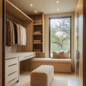
Texture and Material Substitution for Color
In black-and-white walk-in closets, surface texture becomes the primary visual language where color takes a backseat. Without saturated tones to rely on, the richness of the design emerges through tactile materials layered with care.
Grooved white cabinetry introduces depth through repetition, while fluted wood surfaces and reeded glass bring a subtle ripple effect that plays quietly with shadow and light.

Matte finishes slow reflection and ground the space, while elements like brushed metal handles, boucle-covered stools, or stone drawer tops introduce a controlled variation in sheen and touch. Every texture is chosen not to interrupt, but to add weight, rhythm, or contrast to otherwise smooth volumes.
These materials build a silent conversation between soft and hard, smooth and ribbed, light-absorbing and light-catching. This deliberate textural variation creates visual pacing across the room, where each surface has a different response to light.
Glossy black stone might frame a white shelf, or a linen bench cushion might soften the sharp edge of an island. Without adding color, the room gains atmosphere and dimension through this tactile composition alone.

Transparency and Partial Visibility as Visual Strategy
One of the most understated techniques in black-and-white wardrobes is the use of partial visibility to shape the space. Glass-front wardrobes—whether fully transparent, lightly tinted, or semi-obscured—invite a filtered glimpse into the layout without overwhelming the viewer.
Mesh panels reveal hints of folded garments or structured silhouettes, but leave enough hidden to keep the composition quiet and ordered.

Gloss-finished black panels or reflective doors add another layer to the room—not just by bouncing light, but by multiplying forms, stretching depth, and layering visual elements. Reflections in these surfaces often reveal angles or corners not directly visible, pulling adjacent zones into the field of view and expanding the sense of space.
Black-and-white walk-in closets often use this method to balance openness with restraint. A well-lit shoe wall might be framed in glass, while clothing bays stay behind smoked panels.
This play of exposure and concealment lets objects act more like ambient components than static displays, keeping the focus on structure, rhythm, and contrast.

Object Styling
In black-and-white interiors where structure carries most of the visual weight, objects placed on islands, benches, or open shelving do more than decorate—they reinforce proportion. Items like a tray, a ceramic bowl, or a folded scarf aren’t just placed for visual appeal.
They are often aligned with architectural lines: the midpoint of a mirror, the spacing of shelf divisions, or the width of a pendant’s shadow.

These pieces act as visual punctuation marks, breaking up the strong geometry just enough to create breathing room without disrupting the layout. The trick lies in how these additions respect the rhythm of the space—they echo forms already present, whether rectangular, circular, or linear.
Even when an item is off-center, its position is calculated to balance something else: the visual weight of a cabinet, the length of a bench, or the gap between two volumes. By integrating styling into the grid, the decor feels part of the architecture rather than placed on top of it.
This approach keeps the space looking composed and intentional, even when softened by personal objects.

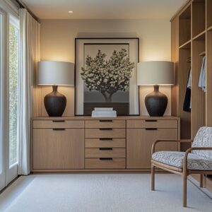
Natural Grounding and Soft Material Warmth
The precision of black-and-white interiors often relies on a warm, grounding base to prevent the look from turning stark. In most layouts, this balance comes from materials underfoot—pale oak, lightly veined terrazzo, or neutral-toned concrete.
These floors don’t compete with the cabinetry; instead, they absorb contrast and give the eye a resting place between light and dark surfaces.

This grounding isn’t limited to flooring. Natural materials, when introduced in small doses—linen, straw, matte clay, unfinished wood—create a tactile softness that eases the clean geometry of the room.
A single straw hat, a stack of loosely folded linen shirts, or a ceramic vase near a mirror shifts the tone without adding color. This method of softening doesn’t dilute the design—it refines it.
The combination of black and white becomes more approachable when anchored by textures that feel familiar and unpolished. It’s a move that brings comfort without reducing clarity, warmth without losing contrast.

Arches and Curves Break the Grid
In interiors where vertical stacks and clean right angles define the layout, curved features are more than just decoration—they are a counterweight. Arched niches, circular ottomans, or rounded mirrors are often introduced to cut across the strict geometry and ease the visual tension.
These forms soften the linear discipline, allowing the space to breathe without compromising its clarity.

The effect is subtle but effective. A set of tall cabinet doors lined up like a row of books can feel rigid without contrast.
Insert a gentle arch nearby, and the grid begins to feel more like a framework than a rule. Curves introduce a visual pause, functioning almost like a punctuation mark within the layout—not loud, but unmistakably present.
Lighting plays a key role in this shift. Orb pendants or cone sconces, for instance, often echo the softened geometry, creating round silhouettes that overlap with sharp verticals.
The result is a calm interruption—a way to hold structure while allowing for movement, giving the room a more natural rhythm.

Symmetry Flipped with One Rebellious Detail
Perfect symmetry is often used as the backbone in black-and-white interiors, especially in rooms where storage, display, and lighting follow a strict order. But what gives such rooms personality is a single element that shifts slightly out of line.
A mirror mounted just a few inches off center, a pendant that drops a little lower than its pair, or a tray placed off-balance on an otherwise aligned island—these adjustments are small, but deliberate.

This controlled irregularity adds credibility and warmth. The eye picks up on the shift without needing to name it, and the space feels less like a display and more like something that’s meant to be used.
These gestures work because they’re quiet—they don’t announce themselves, but they loosen the formality just enough to avoid stiffness. The effect is often amplified by restraint in everything else.
When the overall room is ordered and consistent, that one deviation becomes powerful. It keeps the space from tipping into artificial perfection, leaving room for personality to exist within the design without disrupting the structure that holds it together.

Reflections Used to Fold Spaces Together
In carefully arranged black-and-white interiors, reflections are more than surface effects—they serve to connect one part of the room with another. Mirrors are often placed directly opposite windows, glass panels, or entry openings, catching slivers of outdoor light or partial views of adjacent areas.
This positioning isn’t just practical—it helps extend the spatial boundaries, visually borrowing depth that wouldn’t otherwise be available in compact or enclosed layouts.

The reflection of light-filled zones inside a dark cabinetry frame, or a window view mirrored behind a shelving unit, creates a layered scene that shifts depending on angle and time of day. Rather than being static elements, these mirrors become dynamic features that quietly expand the atmosphere.
They don’t compete with the main geometry; they blend in while subtly changing how the room is perceived. Even more refined is how these reflections double the impact of surrounding materials.
A dark wall seen once is bold. Seen again in mirror form, it feels larger and more grounded.
Light passes through the space, then bounces back with texture and tone—building an interior rhythm that feels unforced and continuous.

Graphic Grids Supersede Decoration
In black-and-white wardrobes, visual structure often replaces any need for added ornament. Rather than inserting trim, panel molding, or painted accents, many wardeobes can rely fully on grids formed by cabinet seams, mirror divisions, drawer spacing, and shelf alignment.
The grid is not applied decoration—it’s built into the layout itself.

These lines offer a kind of silent repetition. Vertical and horizontal segments break the surface into consistent fields, giving each element its own defined zone.
Handles are placed in perfect proportion to shelf heights; floating drawer edges align with hanging rod intervals. Even the seams between mirrors repeat the spacing of nearby furniture or lighting tracks.
This method creates an interior rhythm that feels calm but purposeful. The result isn’t decorative in a traditional sense—it’s decorated through composition.
These structured alignments form the visual identity of the room, offering clarity and contrast without relying on excess. The geometry does the talking, and the simplicity of the palette allows it to be heard.

Conclusion
Black-and-white wardrobe interiors succeed not by leaning on contrast alone, but by fine-tuning how every visual component behaves across a unified space. What may appear at first as a rigid palette reveals far more complexity upon closer look—mirrors placed not just for function but to manage rhythm and reflection, shadows used as form-defining tools, and textures applied to suggest volume without breaking the palette.
In such spaces, symmetry holds the structure together, yet it’s often gently interrupted—by a tray that doesn’t quite center, a pendant that drops slightly lower, or a curve that interrupts the grid. These subtle shifts prevent the room from freezing into perfection and instead give it presence.
The absence of color is never a limitation. It becomes an opportunity to prioritize proportion, repetition, and material contrast.
When everything is measured, softened, or grounded with intent, the result is far from cold. It feels composed, confident, and rich in visual clarity.
A black-and-white walk-in wardrobe, when thoughtfully executed, can carry more expression through its restraint than many colorful designs achieve through variety. That is where its strength lies.