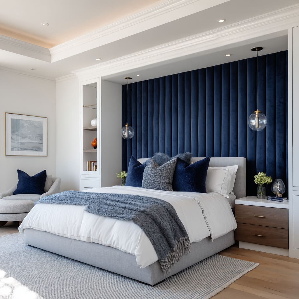
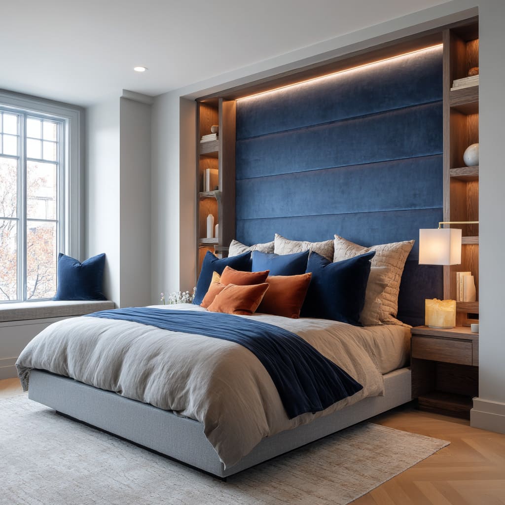
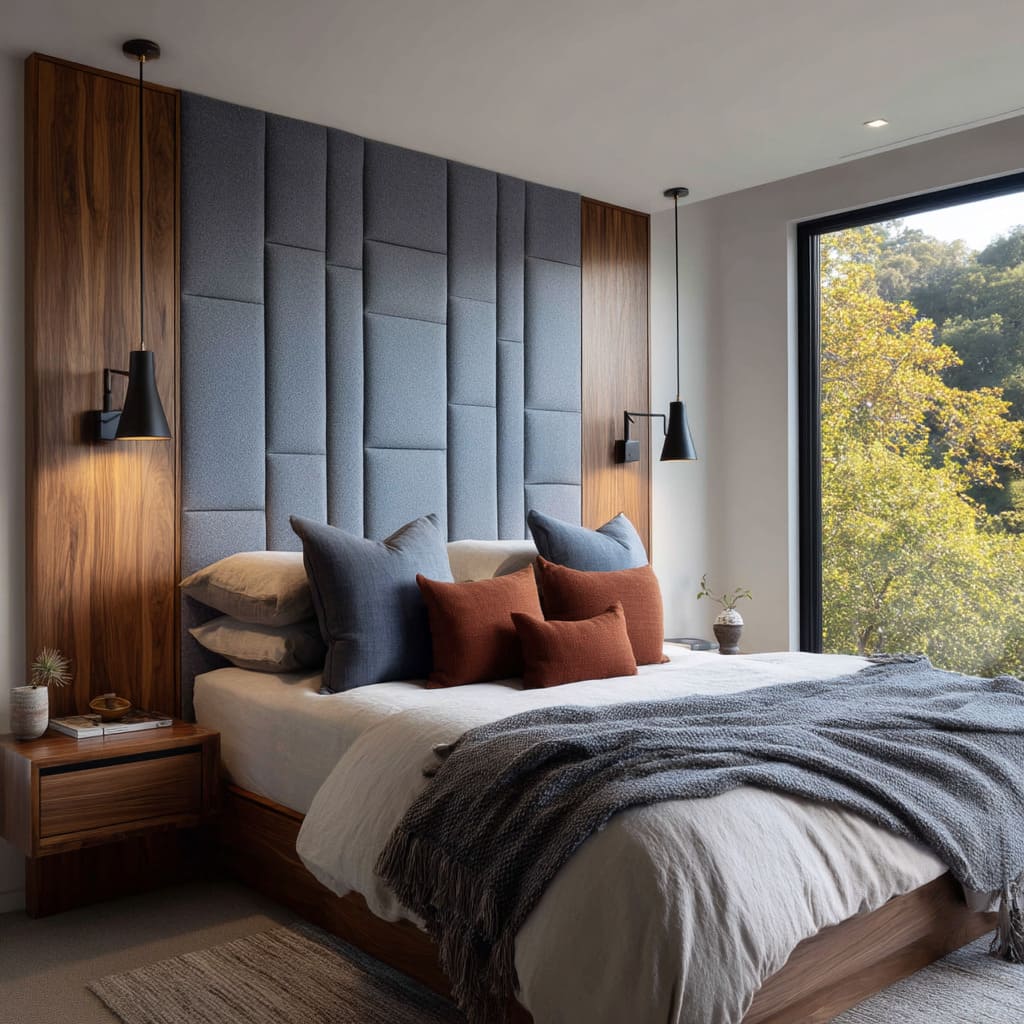
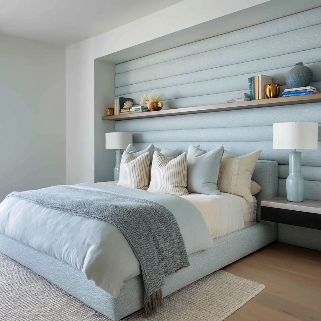
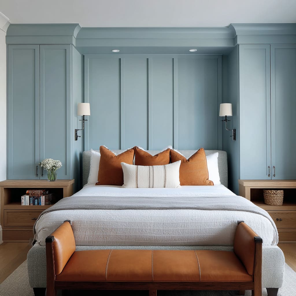
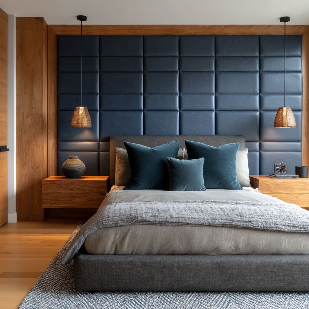
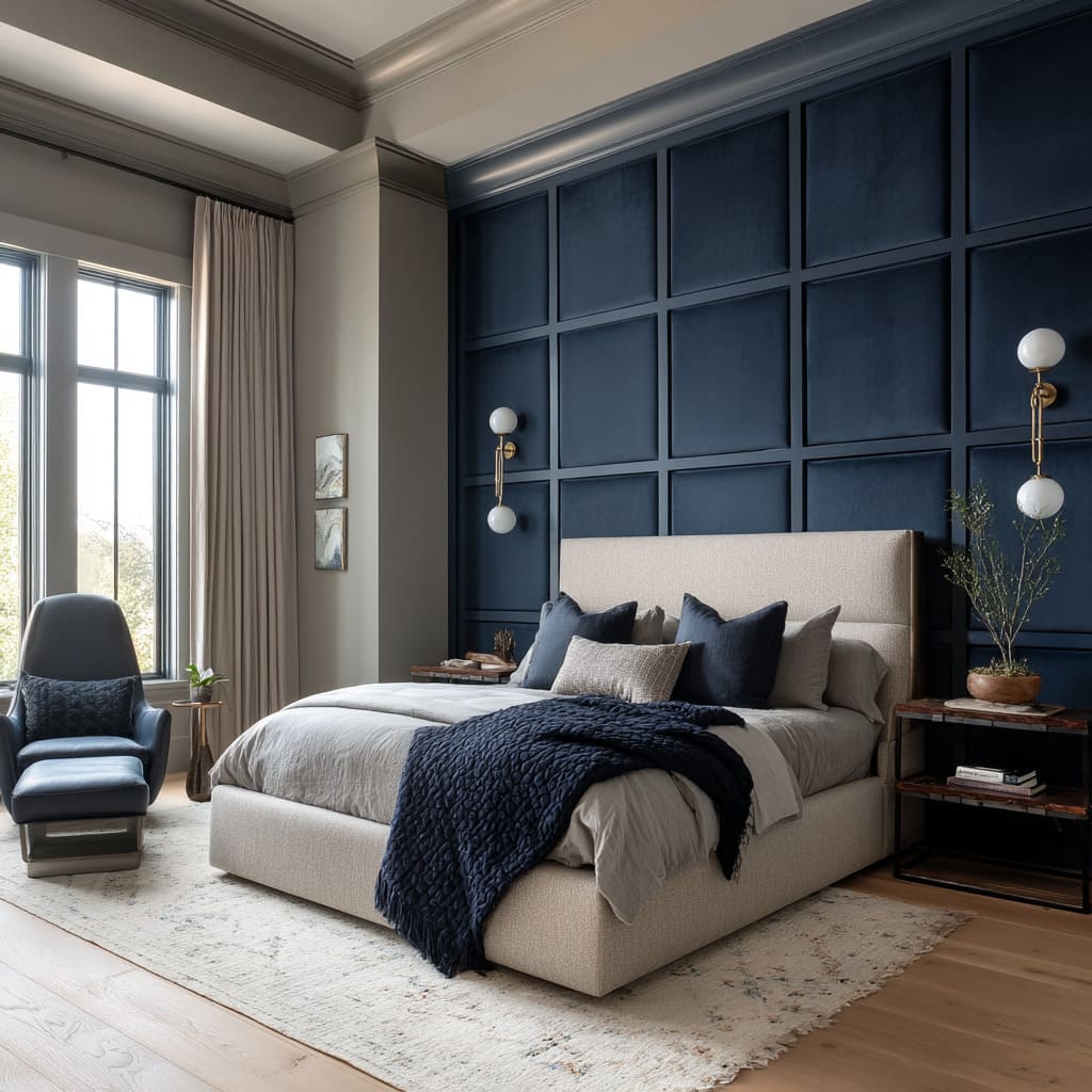
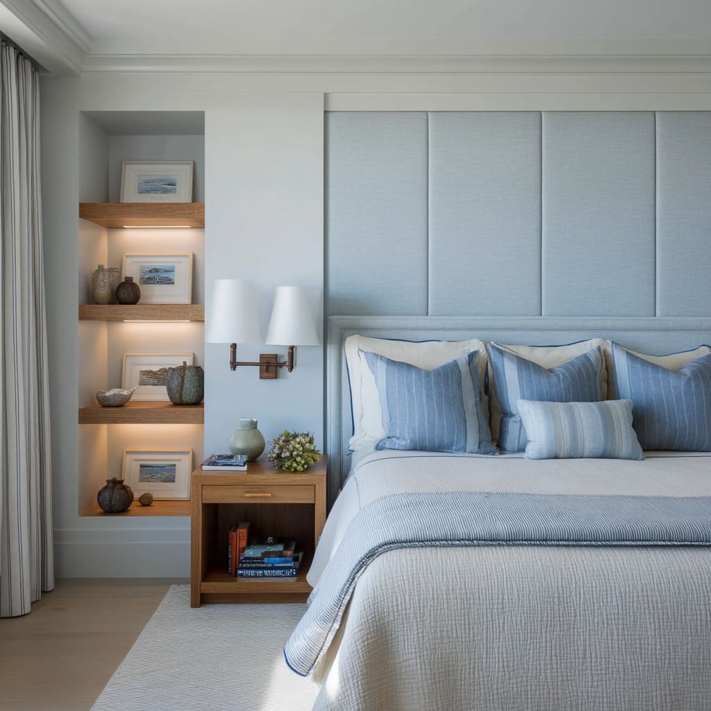
Blue has long been a favorite in bedroom interiors, but what’s happening now goes far beyond color selection. Across American homes, especially in neighborhoods where design is treated with quiet intent, headboard walls in blue are becoming full architectural statements.
These aren’t color accents or fabric choices—they’re structure. Entire walls are being upholstered, recessed, stitched, paneled, and lit to give blue a role that feels built-in, not added.
From powdery tones wrapped in linen to deep velvet panels in navy, these surfaces shift under light, echo window grids, and sync with the room’s overall rhythm. This article takes a close look at the methods behind these interiors—how blue is folded into proportion, light, material, and shape—so it becomes the anchor of the room rather than a visual outburst.
The ideas aren’t about trends—they’re about control, restraint, and how to let one hue carry the full visual weight without taking the space overboard.
Blue Headboard Design Ideas and Why Each Matters to the Look
In today’s most visually refined interiors, blue headboard bedroom ideas have moved far beyond decorative flourishes. What defines their visual success isn’t the presence of color alone, but how that color behaves within structure.
The shift is subtle but powerful—blue no longer hangs as a mere accent. It forms mass.
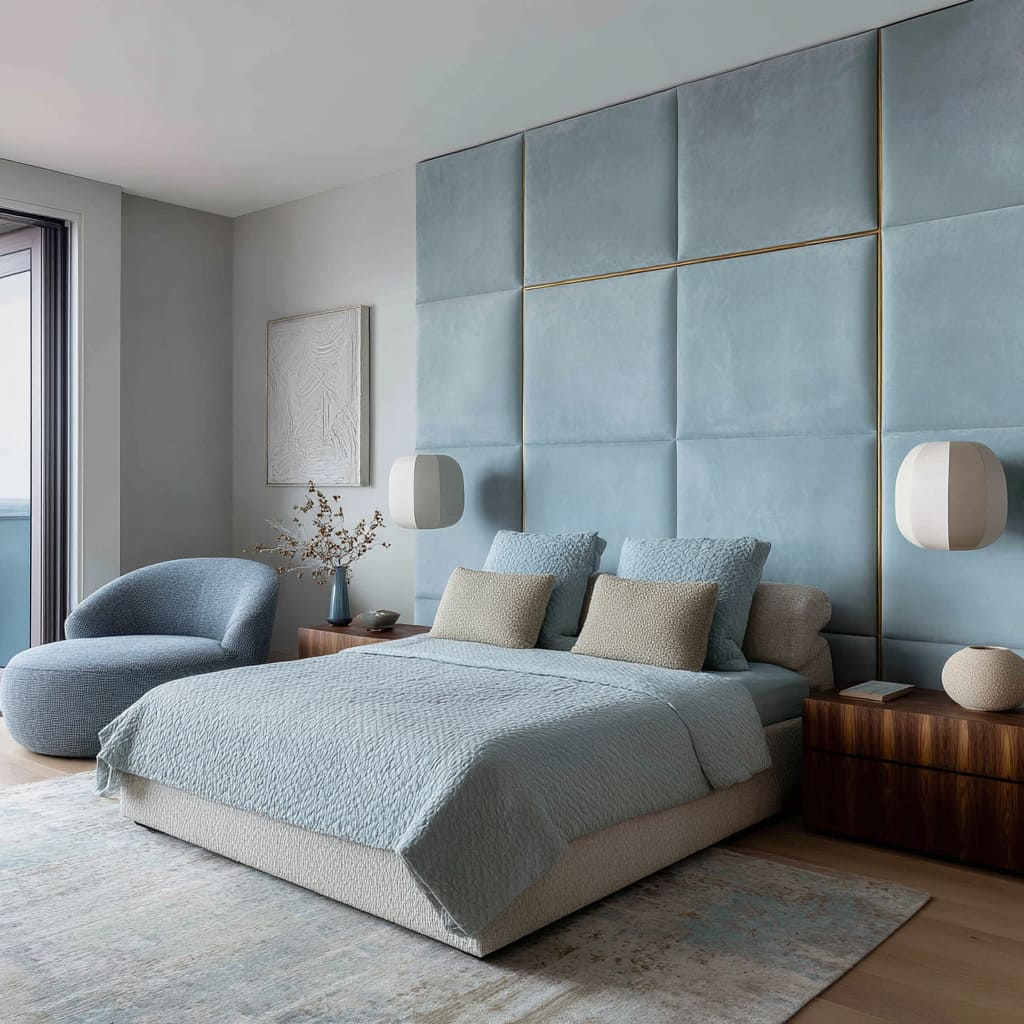
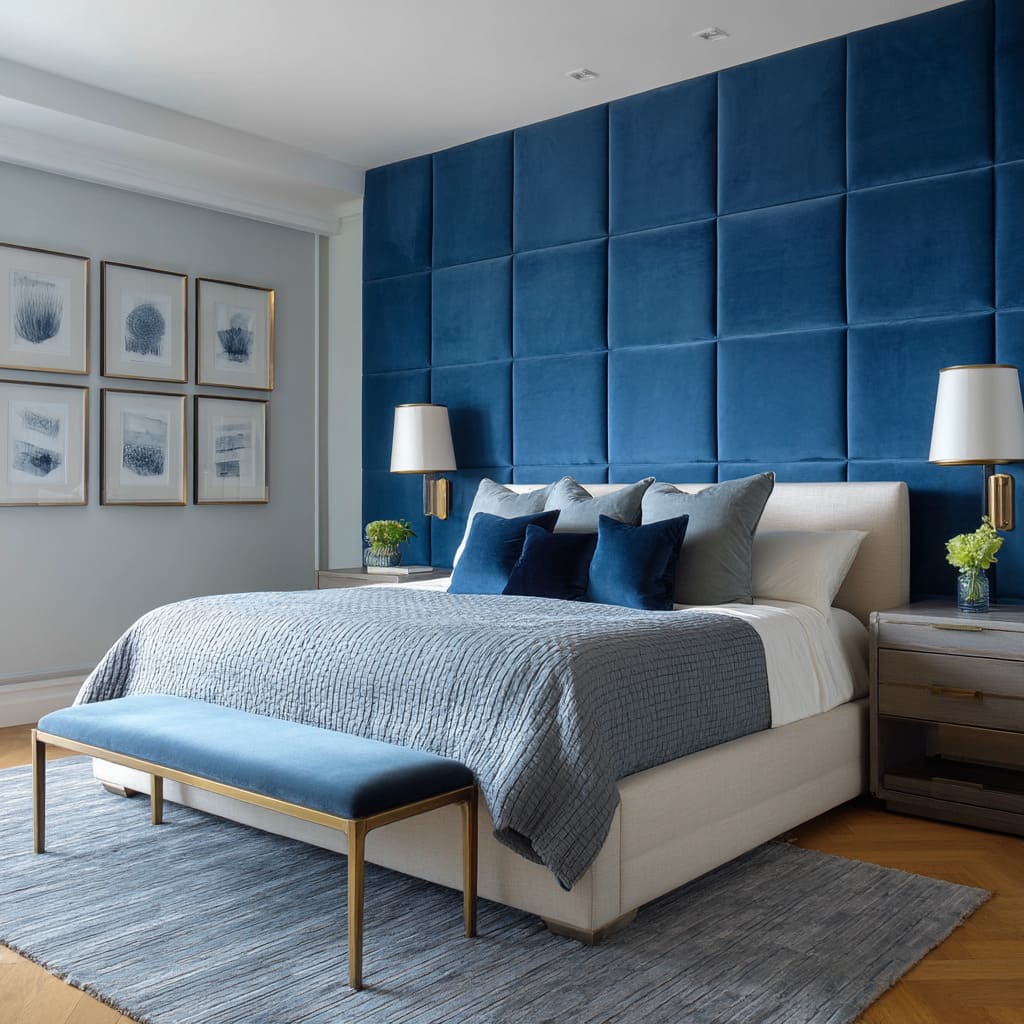
Whether through floor-to-ceiling padded panels, recessed niches, or framed grid walls, blue becomes part of the room’s shape. This treatment absorbs the weight of tone into the architecture itself.
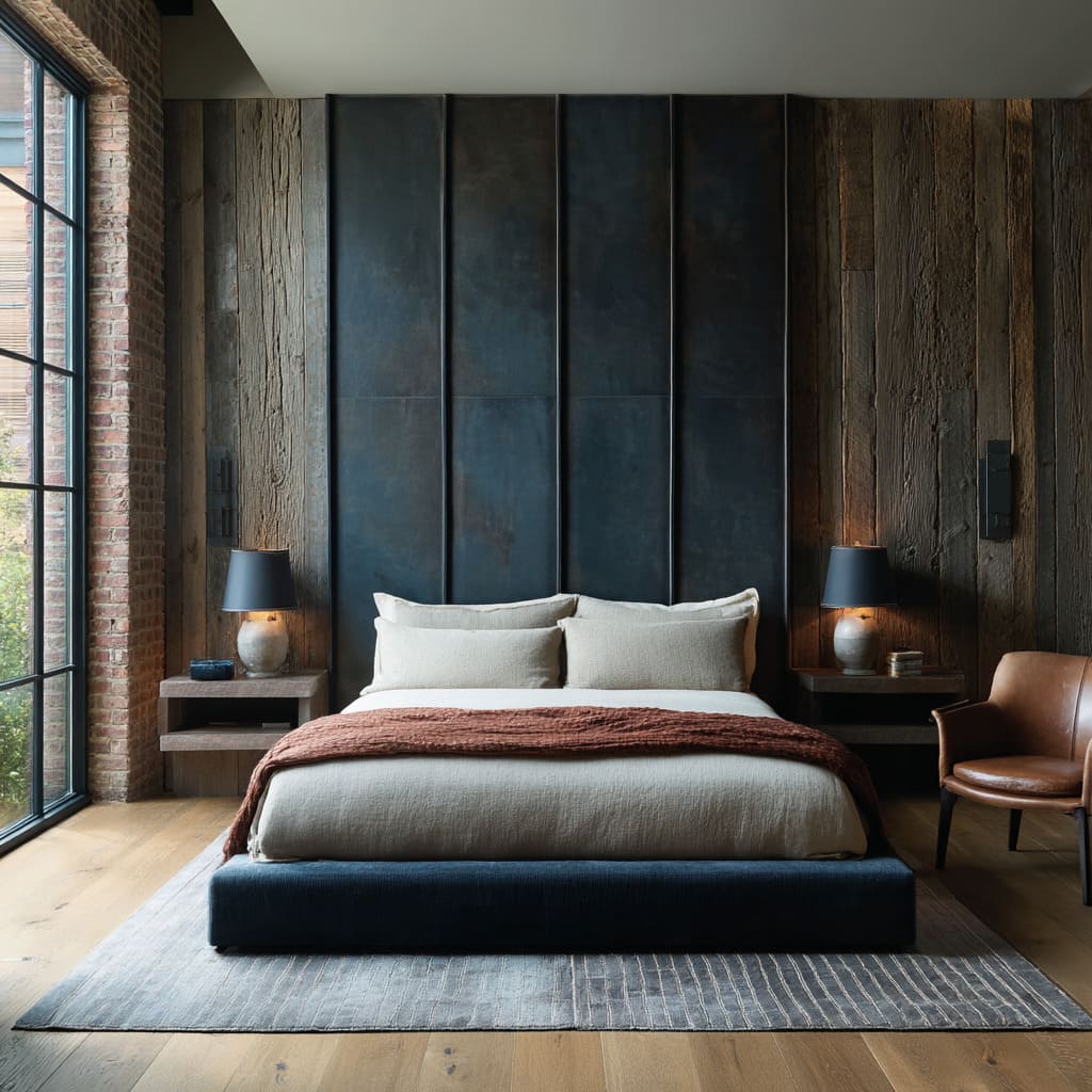
Walls clad in navy or sky-toned velvet don’t shout—they carry the room’s outline. Shadow and form take over where hue might otherwise overwhelm.
This is especially true in narrow alcoves or modest rooms, where deep colors, when shaped into geometry, feel calm rather than crowded.
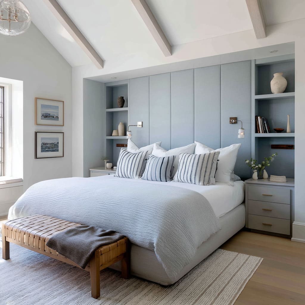
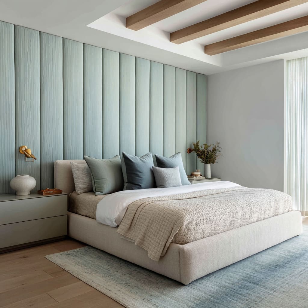
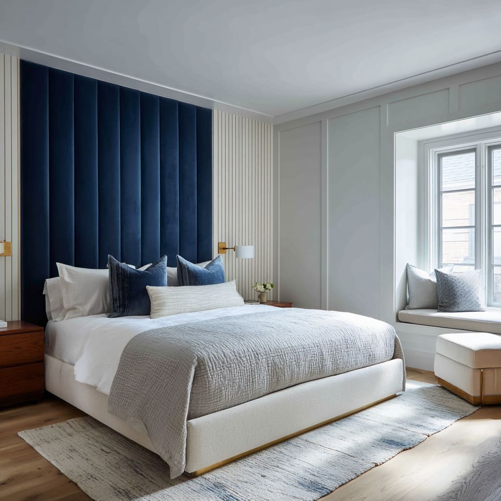
The success of these blue headboard ideas often hinges on an unspoken rhythm—most commonly through panels. Thin vertical channels or thick square grids aren’t random; they often echo architectural features already in the space.
Mullions in steel-framed windows. Lines of exposed rafters.
Even the divisions of built-in cabinetry nearby. When a headboard repeats or reflects these rhythms, it helps organize the eye’s movement.
The space feels intuitive, even if the viewer doesn’t consciously track the repetition.
Another quiet but crucial tactic appears in how temperature is handled. Blue can turn icy, especially under cool daylight.
That’s why so many navy headboard bedroom ideas are wrapped in walnut, oak, or stained timber. The wood doesn’t try to fight the tone.
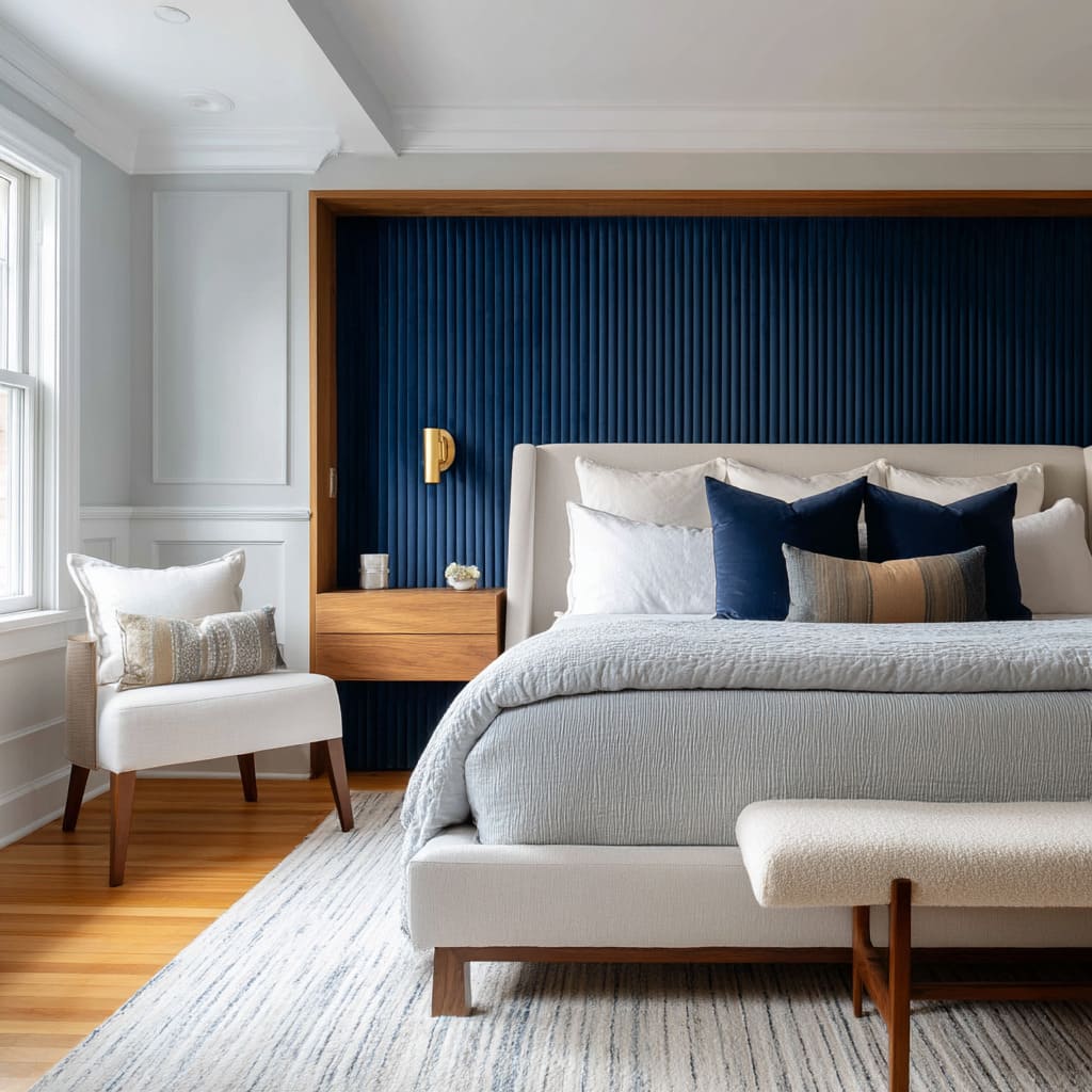
Instead, it softens it by proximity. Frame a marine velvet wall with open oak shelving and the palette shifts from moody to restful.
Slide warm-toned drawers beneath cool-toned walls and the contrast gains harmony, not conflict.
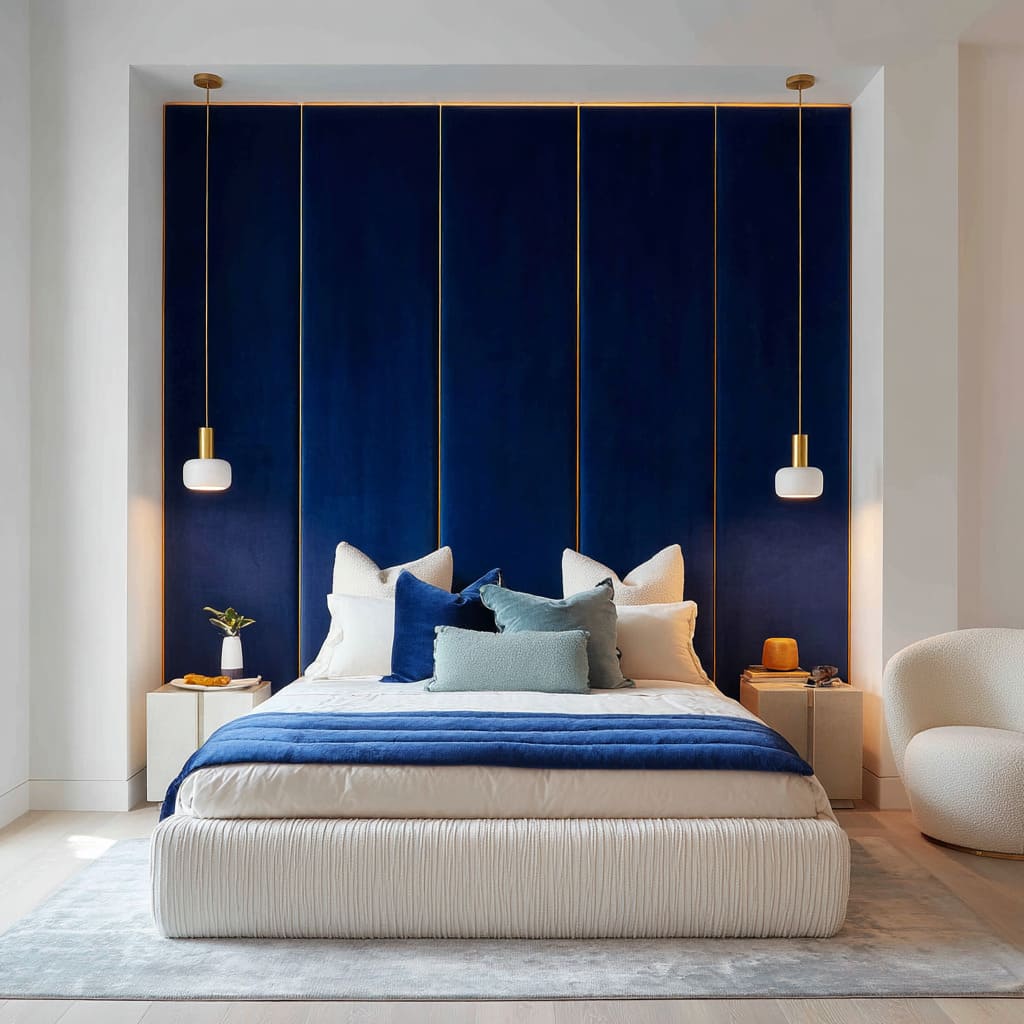
A standout visual feature in many modern navy blue headboard bedroom ideas is the way lighting reshapes perception. Not overhead lighting, but concealed LEDs.
When light spills from behind or above padded panels, the fabric seems to glow from within. Velvet responds particularly well—it doesn’t reflect directly, but diffuses, catching subtle highlights along pleats and seams.
This allows blue to appear almost backlit, casting a quiet tone across the bed area like a long twilight. Designers also avoid unnecessary pattern by layering multiple shades of the same blue.
This is where tonal work replaces print. Instead of bringing in bold motifs, they use a mix of inky, slate, and marine tones across textiles.
A quilted velvet wall. A steel-blue throw.
A slate bolster. The eye reads depth without distraction.
In some of the strongest blue headboard bedroom ideas, this tonal stacking is done so seamlessly that it feels atmospheric, not decorative.
Another small but consistent feature is the use of restrained warmth—rust throws, brass pendants, caramel accent chairs. These show up precisely where saturation might tip too heavy.
Brass rods beside navy velvet. A paprika lumbar pillow on a deep indigo bed.
These details are never dominant. They live in line and texture, not mass, letting the room retain a cool foundation without falling flat.
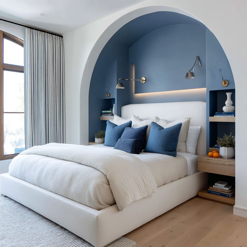
One of the most visually effective shifts comes when a rigid grid is replaced by a curve. A soft arch around the headboard completely alters the room’s visual tone.
Where grids lend structure, the arc adds softness. In these rare curved alcoves, the furniture tends to remain clean and rectilinear, letting the niche shape lead the impression.
The arc doesn’t fight the room—it relaxes it.
Another unspoken rule of these bedrooms is how furniture often shares materials with the headboard. Floating shelves, upholstered benches, side tables—all frequently repeat the same textile or wood.
This makes the whole back wall read as a single composition, not a wall decorated with pieces. It feels built, not arranged.
That unity draws the bed deeper into the room’s architecture. While symmetry often sets the stage—twin lamps, matching shelves—many rooms introduce one subtle break.
A lone plant in the corner. A single offset pendant.
A sculptural lamp on only one side. These choices prevent the space from feeling too diagrammed, too perfect.
The slight visual imbalance keeps the room from losing its human edge.
There’s also a noticeable absence of framed artwork in rooms where the navy headboard ideas are at their most sculptural. That’s not an oversight.
When a wall is made of velvet, stitched in grid, or lit from above, it doesn’t need art. Texture, light, and seam become the visual interest.
In effect, the wall is treated like canvas. And it carries more subtlety than any single painting could.
One of the quietest but most effective tricks is the color handoff between bedding and wall. The base of the bed is often wrapped in the same fabric or hue as the headboard behind it.
Or a throw in the same value rests across the foot. This pulls the vertical plane into the horizontal—letting the eye roll up from mattress to wall without interruption.
It’s not symmetry, but continuity.
Lastly, vertical headboards serve a second role in many rooms: they shift proportions. Floor-to-ceiling panels make a space feel taller.
The eye gets drawn up without being directed. It’s a classic sleight of hand—especially useful in city apartments or compact layouts.
But when ceilings are already generous, the tactic reverses. Designers shift to horizontal padded lines that slow the eye, letting height recede in favor of calm.
What makes these navy blue headboard bedroom ideas stand out isn’t novelty or shock. It’s quiet exactness.
Shapes borrowed from the structure. Hues that fold into surfaces.
Light that doesn’t spotlight but brushes fabric. And materials that feel connected to everything else in the room.
There’s no single formula—but every choice quietly points in one direction: to let the headboard wall behave like architecture, not ornament.
Cross-Cutting Visual Narratives
Some of the most refined blue headboard room ideas don’t rely on loud gestures. They build their impact slowly—through surface, reflection, spacing, and alignment.
The atmosphere in these bedrooms comes not from volume, but from precision, material weight, and restraint in styling. Across a range of layouts, a few quiet patterns begin to stand out—visual threads that tie very different styles together.
Texture Over Tint
One of the clearest themes across the strongest bedrooms is the way blue is treated less like color and more like topography. Paint alone can’t produce this effect.
Materials such as velvet, suede, grasscloth, leather, or even coarse linen shape how blue behaves under light. These surfaces collect shadows, stretch tonal range, and shift appearance as the viewer moves.
A wall of velvet panels in deep navy might look inky black from one angle, glowing indigo from another. What this creates is movement—not in the material, but in perception.
A smooth painted surface offers one version of blue. Velvet stitched into squares can give ten.
That’s why blue velvet headboard ideas continue to hold ground in luxury interiors—they act like light filters, not swatches.
Air-Light Shelving as Counterweight
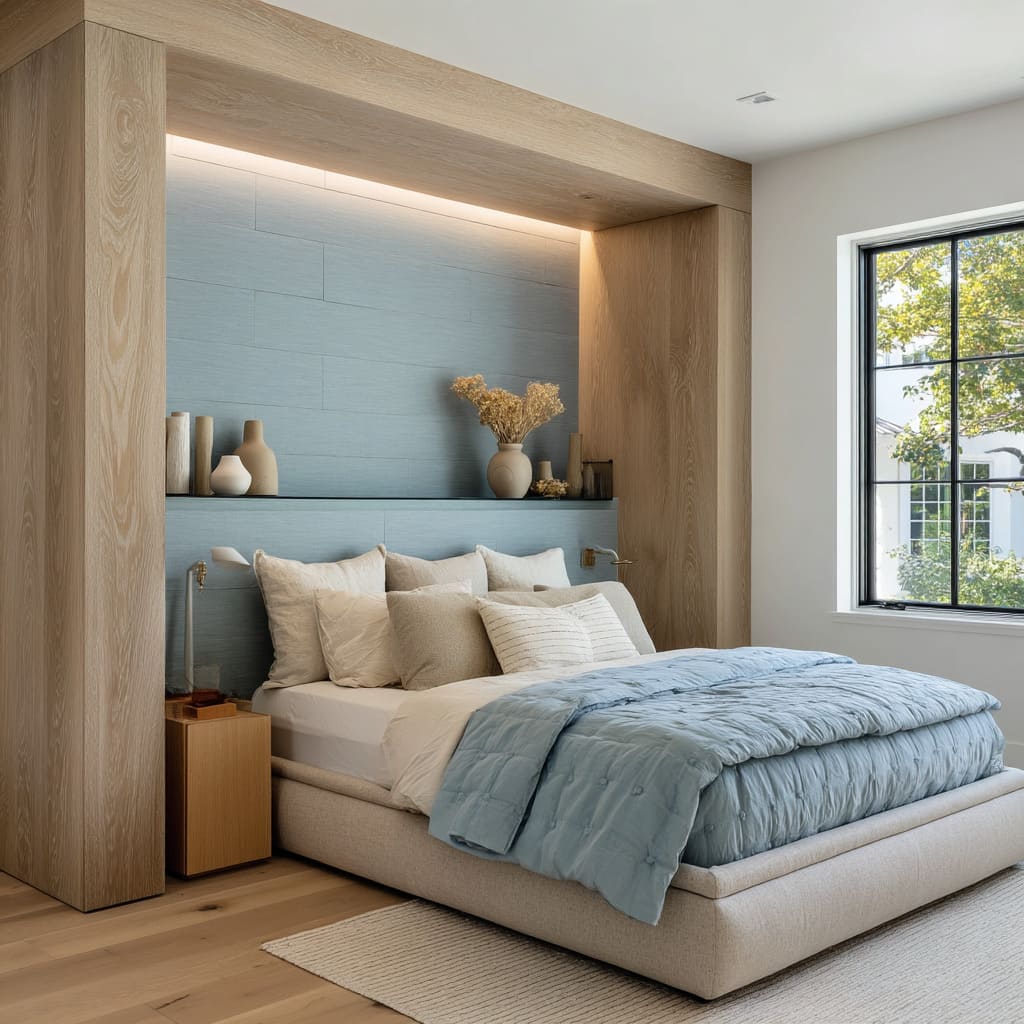
When a large headboard dominates a wall, something needs to lift the visual weight. Floating open shelves placed alongside or within the headboard wall often take that role.
They work best in pale woods—soft oak, bleached ash—or finished in matte tones that don’t crowd the room. These shelves usually carry quiet objects: stacked cream books, pale ceramics, soft-surfaced vases.
Their role is almost atmospheric. They provide visual pause, space to breathe.
Not decoration in the traditional sense, but relief. That’s the key in many of these bedroom ideas with blue headboard walls—the balance between density and lift.
Linear Lighting as Drawing Tool
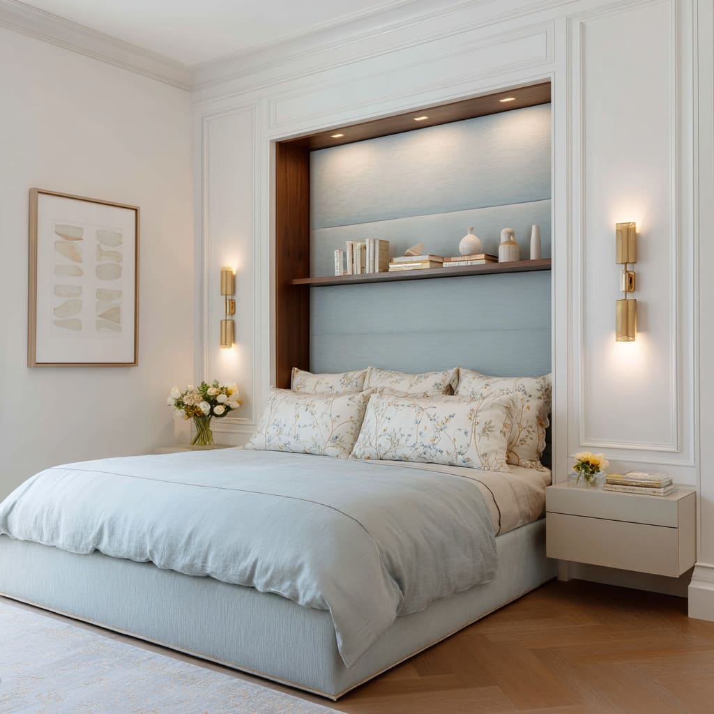
Lighting in these rooms doesn’t just illuminate—it draws. Brass pendants and razor-thin LED strips act like pencil marks across the fabric.
Designers don’t use bold fixture shapes. They use lines.
Vertical pendant rods flank either side of the bed, often in perfect alignment with seams or panels in the headboard. Horizontal lighting cuts across a top shelf or alcove lip, tracing a ceiling transition or giving a velvet wall its upper edge.
In spaces with deep tones—especially navy—these lights become the quietest form of contrast. They don’t glare.
They gleam. Their placement is often so exact that they sketch the frame around the blue without adding a single brushstroke.
In that sense, they read less like lamps and more like structural edits.
Subtle Temperature Shifts Within the Same Blue
Blue is rarely handled as a single, flat value. Instead, designers pair warm-leaning and cool-leaning versions of the tone.
A celadon headboard might be finished with denim cushions. A marine blue velvet panel might meet a steel blue quilt or a slate bench cushion.
These shifts live inside the same palette but give dimension—much like layering sound at different frequencies rather than raising the volume. It’s why many navy blue headboard decorating ideas stay fresh without overwhelming a space.
They stack contrast within color, rather than on top of it.
Furniture Silhouettes Keep a Low Profile
In nearly every room where the headboard acts as the main feature, the surrounding furniture tones down its shape. Beds tend to have low, tightly upholstered bases.
Benches at the foot are slim, never oversized. When bulkier shapes do appear—a boucle chair, for instance—they’re pushed to one side or set at an angle, avoiding direct competition with the headboard.
The idea is to keep the mass of the room where it belongs: in the wall behind the bed. The rest of the furniture plays rhythm rather than melody.
Architecture Writes the Color Story
One of the most overlooked but critical strategies in these spaces is how construction lines dictate color divisions. Vertical seams in blue headboards match window mullions.
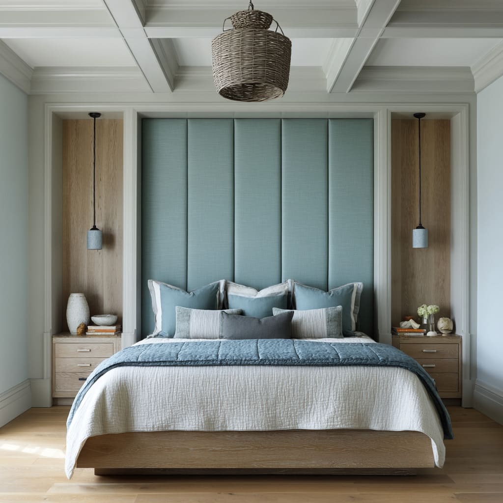
Panel grids sit directly beneath coffered ceiling steps. Alcoves are carved precisely within millwork that already breaks the wall into zones.
The headboard becomes a structural insert—not a decorative one. That’s where the difference lies.
Blue doesn’t land on top of the architecture—it’s written into it. This is especially evident in rooms where the ceiling framing is part of the visual rhythm.
Wood beams, crown moldings, cove transitions—all are taken into account before a panel ever gets upholstered.
Across all of these bedrooms, what holds attention is not how much blue is used, but how carefully it’s handled. In the best blue headboard room ideas, color is treated with the same respect as line, shape, and light.
That’s what gives these rooms their lasting appeal—they don’t rely on novelty. They rely on craft, shadow, and rhythm.
Every curve or seam, every shelf or panel, carries its share of the room’s tone. And the result, whether grounded in soft grasscloth or rich velvet, is a space where the material tells the story before the color even speaks.
Design Principles
In the strongest interiors where blue holds a commanding role, the success begins with restraint. These rooms aren’t filled with color—they’re shaped by it.
Letting one shade take the lead doesn’t mean flooding the space in blue. It means selecting a tone and then allowing material, shadow, and structure to give it character.
This approach shows clearly in many of the current blue headboard compositions: the color might stay fixed, but the light changes it, the stitching divides it, the surface lifts or absorbs it. Velvet, wool, suede—each one carries blue in a different register.
That’s how a single hue tells the story. The shifts come from angle, distance, and fabric weave rather than from bold pattern or accent walls.
In these rooms, it’s not blue and something—it’s blue doing something.
More importantly, blue is not treated like an accessory. It becomes part of the bones of the room.
It frames beds, fills niches, or spans wall elevations from floor to ceiling. It steps into the role that was once reserved for walnut paneling or painted millwork.
The most grounded bedrooms with blue headboards make this clear: color is not decoration. It’s material.
When a padded wall is recessed into architectural trim, or stitched panels align with ceiling coffers, the hue is no longer just applied—it’s embedded. That’s where the difference lies between surface color and structural tone.
Blue behaves like part of the build, not something added after.
This approach only works if balance is respected. Blue, particularly in deeper tones like navy or marine, can dominate quickly.
That’s where measured warmth plays a quiet role. A walnut bench.
A soft brass rod. A rust-toned throw folded low across the bedding.
These aren’t decorative accents—they’re temperature control. They keep the visual air from cooling too far.
What’s key here is that these warmer touches show up sparingly. They don’t shout.
They don’t repeat. They’re inserted only where the room starts to tilt too cold, and they’re always quieter than the blue.
Another guiding tactic lies in rhythm. A good blue headboard wall doesn’t just sit flat.
It speaks the same language as the rest of the room. This is where subtle alignment matters.
Window mullions might stretch vertically—and a stitched headboard echoes their cadence. A coffered ceiling might divide in square sections—and a grid of velvet panels sits directly below it.
These aren’t visual tricks. They’re responses to what already exists.
Echoing structural rhythm doesn’t mean creating symmetry. It means creating calm.
It allows the blue to feel meant-for, not placed-on.
Ultimately, what makes these bedroom spaces with blue headboards resonate isn’t scale or contrast. It’s composure.
Color, light, and shape are treated as a shared vocabulary. Fabric holds the tone.
Light shapes the edge. Framing defines the limits.
Together, they pull the room into balance without asking for attention. That’s what gives these bedrooms their strength—they don’t rely on novelty or decoration.
They rely on knowing when to hold back and when to let texture and alignment speak. These are not color-forward designs.
They’re color-formed spaces, where blue carries the room because it’s been shaped to belong to the room, not sit on top of it.
Conclusion
Across every variation—arched niches in dusty blue, velvet panels stretched floor to ceiling, powder blues set within millwork frames—the same principles keep showing up. Blue, in these headboard applications, isn’t treated like a color choice.
It’s treated like an architectural material. It responds to light.
It aligns with structure. It holds the wall with weight and softness at the same time.
Whether paired with open oak shelving, touched by a quiet brass line, or balanced by subtle shifts in tone, these bedrooms show a consistent approach: take one shade and let its texture and placement do the visual work. The most lasting impact comes not from contrast, but from how well the blue fits into the room’s architecture.
These spaces don’t perform. They hold steady.
And that’s exactly what makes them feel so complete.

