Sand-colored living room designs can feel calm, bright, and quietly rich at the same time. This article looks closely at how small shifts in undertone, texture, and light change the mood of designs built on soft beige, oat, and stone shades.
It follows sand from cool, driftwood-style neutrals to warm honey plaster and clay tones, and studies how these colors wrap fireplaces, TV walls, and seating islands, and how they react to daylight and lamps. The aim is to show sand as a full design language that sets rhythm, weight, and comfort, not just a “safe” neutral on the wall.
Sand as a spectrum of atmospheres, not a single color
Sand isn’t one shade; it’s an entire climate. The same hue family shifts its emotional role through tiny moves in undertone, temperature, and value.
Temperature as mood shifter
There are at least four temperature families of sand:.
- Cool, seashell / driftwood sand
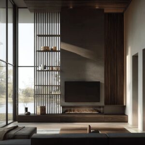
Vertical board-clad shells and quiet, stone-backed media walls. These tones (a little gray, slightly desaturated) feel almost like mist over a beach: calm, cerebral, more “gallery” than “family den.” Cool sand often sits behind TVs and stone slabs, easing the hard black rectangles into the palette. - Warm wheat, oat, and honey sand
These often appear in plaster chimneys, honeyed rugs, and natural fiber textures. They create a “late afternoon” warmth where sconces and firelight can bloom. The fire visually merges into the palette instead of feeling like a harsh orange spot. - Clay-leaning and taupe sand
The deeper clay-sand concepts (like the cocoa-warm plaster with layered shelves of pottery) carry more emotional weight. They feel like canyon walls at sunset—comforting but slightly dramatic. In these, sand becomes almost a color accent in itself, not a background. - Limestone / pale oat sand
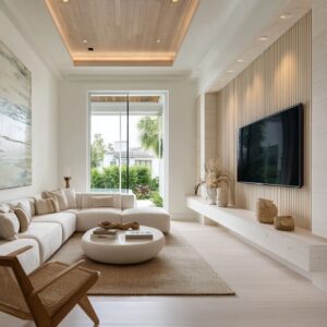
Used often in the more minimal, contemporary designs: vein-cut stone in light greige, pale oak cabinetry, and smooth wool rugs. These tones make the space read like soft daylight: bright but never stark, modern without coldness.
What’s striking is how rarely you let sand become beige “filler. ” It always has a clear lean—cool or warm, stone-like or plaster-like—and that lean supports the narrative of the design.

Micro-shifts inside one hue
Modern design approaches use very slight differences in sand tones to separate layers instead of relying on high contrast:.
- Walls vs sofa vs rug often shift by half a step in value or warmth.
- Floors frequently introduce a barely pink or slightly gray undertone so they “speak” to both warm and cool sand elements.
- Cushions and throws hold tiny value jumps: cooler stone-sand beside warmer oat, smoother weaves beside looser boucle.
This keeps each layer legible without breaking the calm. The palette functions like a gradient instead of a three-color scheme.
It’s subtle enough that most people would say “it’s all beige,” but the eye feels the structure even if the brain can’t label it.

Sand as “architectural skin” vs “inserted monolith”
The designs can keep bouncing between two structural ideas:.
- Sand as a continuous skin wrapping walls and sometimes ceiling.
- Sand as a single monolithic block inserted into a plainer shell.
Continuous sand skins
Examples:.
- Vertical board-clad rooms where boards run floor to ceiling without baseboards.
- Attic living rooms where walls, sloped ceilings, and built-ins are painted the same cream-sand.
- Mid-level landing room designs where the stair wall, under-stair storage, and surrounding surfaces are close in tone.
This move makes architecture feel like a padded envelope. It erases hierarchy between wall, trim, and sometimes ceiling.
The eye stops reading “parts” and starts reading fields and rhythms. Sand here softens awkward geometry (sloped roofs, stair voids, offset corners) by refusing to outline it in strong contrast.

Stone or sand monoliths
Sand can condense into one major element:.
- A vein-cut fireplace block rising floor-to-ceiling.
- A stone feature wall behind the TV with continuous horizontal bands.
- A full-height stone shelving unit where shelves and back panel are from the same slab.
Here, sand becomes mass rather than background. The rest of the design recedes into softer paint and fabric so that this “block” reads as the spine of the design.
A non-obvious detail: these monoliths are often rooted in horizontal rhythm (stripes, joints, or layered shelves), even though they are vertical forms. So they play two roles at once: vertical anchor + horizontal timeline.

Horizontal vs vertical rhythm: how sand structures the space
Rhythm can be built through directionality of texture and material in very controlled ways.
Vertical rhythm – “reeds along the shore”
- Vertical boards or planks (painted sand) with no baseboard break.
- Tall, slim sconces throwing light up and down, echoing the boards.
- Stacked pebble-like lamp bases, narrow floor lamps, slender black TV frames and window mullions.
These verticals:.
- Make low rooms feel taller.
- Calm very long walls by slicing them into repeated, even beats.
- Soften the presence of tall objects (lamps, art, windows) by embedding them in a larger grain.
The TV, when nested inside vertical boarding, becomes one more rectangle inside this rhythm instead of a random dark patch.

Horizontal rhythm – “sediment layers”
Horizontal sand bands appear as:.
- Vein-cut stone panels with aligned striations.
- Long hearth ledges running wall-to-wall.
- Low media cabinets that “continue” stone walls.
- Flatweave rugs with subtle stripe or waffle textures.
- Long coffee tables or square ones with strong grain direction.
These horizontals:.
- Lower the center of gravity, making even very tall rooms feel grounded.
- Provide visual “resting lines” for the eye at sofa and hearth height.
- Support the reading of the room as a landscape: stone wall as cliff, hearth as ledge, sofa as soft plateau, table as rock, small objects as cairns.
Where vertical boards make the shell feel padded, horizontal stone bands make the spine feel carved and long-settled.

Fireplaces and TVs as sand-based sculptures
Many design concepts turn the fireplace and/or TV wall into the main sculptural element, but the tactics shift in nuanced ways.
Carved pockets versus added units
You rarely “attach” furniture to these walls; you carve into them:
- TV recesses wrapped in the same sand planking as the wall.
- Deep niches glowing with light within oak cabinetry.
- Fire slots cut into stone fields, often long and narrow rather than tall.
- Hearth ledges that feel like extended stone shelves, not separate benches.
This makes technology and fire feel embedded in the architecture, like geological cuts, instead of added appliances. Even a standard TV starts to read as an intentional graphic element when treated as a void inside a monolith.

Two-value strategy: black + sand
Every main fireplace/TV composition can follow a strict discipline:.
- Sand (stone, plaster, boards) dominates about 80–90% of the surface.
- Black is confined to a small number of elements: TV, firebox interior, maybe one or two chair bases or thin frames.
This limited use of dark value means:.
- Black acts as a necessary counterweight rather than general accent.
- The palette feels quiet, because there are very few visual “shouts.”
- The dark shapes become anchors the eye uses to organize the space: fire, screen, sometimes window frame lines.
Sometimes, the only truly dark verticals are the firebox and the view frame, almost like two parentheses holding the sand volumes in place.

Soft volumes on hard sand planes
A recurring non-obvious idea: you group shapes more carefully than colors. Rounded forms are consistently set against linear or faceted sand surfaces.
Shape language pairs
- Soft against sharp:
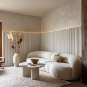
- Boucle or nubby chaise lounges sitting in front of sharp-edged stone planks.
- Round ottomans like sea sponges on top of rectangular rugs.
- Drum coffee tables placed in front of crisp, layered shelves.
- Barrel and swivel chairs facing disciplined, gridded fireplaces.
- Metal-framed accent chairs with thick sand cushions.
This shape pairing matters in sand designs because color contrast is very low. Form is doing the job that bright hues often do in other schemes.

How furniture mass defines “islands”
Because the palette is so close in value, seating islands are defined by mass and placement more than color:
- Low seating pieces (chaise, poufs, swivel chairs) gathered tightly around a rug zone create an inner “soft island” with circulation slipping around the edges.
- In some rooms the rug almost disappears tonally; its role becomes purely spatial: bounding the island.
- Heavy tables (block stone, chunky oak) anchor the center so that all the soft volumes feel like they orbit something stable.
There’s a sophisticated restraint here: instead of using dark tables to anchor pale upholstery, you use pale tables with more mass and grain, trusting weight and proportion rather than strong contrast.

Texture as the “pattern” in sand living room designs
Because strong graphic patterns are rare in your descriptions, texture becomes the primary source of visual interest.
Fine vs. coarse within one hue
A typical composition might include:.
- Very smooth: plaster chimney, honed stone, lacquer-free wood tops.
- Medium: linen or canvas upholstery with light creasing.
- Coarse: boucle chairs, shaggy or nubby rugs, woven baskets, jute flatweaves.
What’s clever is the vertical placement of texture:
- Coarser textures live closer to the floor (rugs, ottomans, baskets, some chairs).
- Medium textures occupy mid-height surfaces (sofas, pillows, throws).
- Very smooth textures sit at eye level or above (stone fields, plaster, art, some shelves).
This inverted “texture gradient” makes spaces feel grounded: your eyes land on soft, quiet surfaces at head height while your body touches richer, more tactile layers.

Stone as both texture and backdrop
Stone can carry multiple jobs:.
- As feature wall: it sets the overall rhythm (veins, pores, subtle pits).
- As shelf surface: it turns everyday objects into artifacts placed on a geological stage.
- As fireplace surround: it becomes the main “pattern” in the room while still reading as neutral.
Using the same stone for shelves and backing in the geological bookcase concept is especially advanced: objects appear to sit inside the material, not on a separate piece of furniture. The shelves vanish and the stone grain becomes the “graphic” element.

Light as a design material for sand tones
Light can not only be a functional necessity; it’s the main way sand shifts character during the day.
Concealed strips as “edges of the stone”
- LED coves at the top of stone walls.
- Thin lines of light behind low cabinets, making them float.
- Horizontal slots of light under ceiling lines in stone-clad rooms.
These lines do three subtle things:.
- Float the mass – Stone looks lighter because the edges glow instead of ending in shadow.
- Compress the palette – Warm LEDs pull cool stone slightly toward honey tones without repainting anything.
- Create time-of-day illusions – That top wash on stone mimics late sun on rock; the wash from below reads more like firelight reflecting upward.
Lamps as shape-repeaters, not just light sources
Lamps rarely feel like separate “decor items”; they tend to repeat existing shapes:.
- Pebble-stacked lamp bases echo rounded vases and stones.
- Columnar lamps echo chimney proportions and clay vessels.
- Very slim floor lamps echo stair spindles, cabinet lines, or vertical boards.
Because their shades almost always sit within the sand palette, what stands out is form, not color. The lamps become part of the same sculptural language: cylinders, orbs, and slender stems that thread through the room.

Daylight vs interior mood
There’s a consistent theme: daylight does the contrast work, while interior lighting refines the sand.
- In forest-lodge concepts, green outside becomes the only intense color. The interior stays almost tone-on-tone, so the forest acts as a borrowed mural.
- In desert-influenced rooms, outdoor stucco and vegetation echo the sand palette instead of contradicting it, extending the room outward.
- In parlor-style spaces, pale walls and reflective fabrics let daylight bounce gently; nothing grabs attention more than the relationship between firebox and window view.
Because sand reflects light gently, such designs can be changed quietly through the day—never flat, but rarely dramatic. That subtle changeability is a big part of why the palette feels “alive” without bold colors.

Styling objects as micro-landscapes in sand
Object styling has deep strategies.
Palette discipline with one or two “embers”
Shelves and tables:.
- Stick rigorously to sand, cream, bone, pale clay, muted terracotta, and warm wood.
- Introduce one clearly stronger note (rust pillow, caramel vase, darker wooden bowl, black book spines) in a few echoing spots.
That small accent color operates like a coal in a fire: tiny in scale, huge in influence.
Examples:
- One rust-brown velvet pillow transforms a cool stone/boucle corner into a more intimate nook.
- A pair of rusty-tan cushions and a single wooden bowl carry a “toasted sugar” tone through a compact room.
- Leather chairs in caramel, repeated on book spines and pottery, stitch warmer sand values into a largely pale scheme.
Because such richer tones appear in several places but in small quantities, they feel woven into the composition, not tacked on.

Asymmetry within symmetrical architecture
When rooms are architecturally symmetrical (fireplace centered, alcoves mirrored, windows evenly spaced), the styling can be deliberately asymmetric:
- One side of shelves holds more books; the other, more vessels.
- Frames lean casually on one side of the hearth rather than sitting perfectly centered.
- Object clusters often favor one side of a table or ledge.
This keeps classic layouts from feeling stiff. The eye senses order from the architecture, then senses ease from the styling.
Sand helps here because the colors never shout; the asymmetry stays quiet and natural.

Objects as “scale adjusters”
Objects can be primarily used to fix proportion issues:.
- Tall vases or long branches lift the eye in rooms with heavy fireplaces so the mass doesn’t feel bottom-heavy.
- Very low oblong bowls and books line up along thin ledges under TVs, preventing that area from feeling visually empty but keeping the horizon line quiet.
- On thick hearth ledges, pottery arranged from tallest at the edge to shortest near the fire subtly pulls the eye along the ledge and into the firebox, guiding attention without any strong hue difference.
Sand adapting to different architectural types and moods
One of the most interesting things is how adaptable the sand palette becomes when you place it into very different envelopes.

Gallery loft vs attic retreat vs stair landing
- Gallery-like rooms with large stone planes and long sofas read as calm, sociable spaces; sand is almost white-cube neutral but warmer.
- Attic rooms use continuous sand paint to smudge hard angles, with rough rugs and baskets rooting the coziness.
- Stair-landing living rooms rely on sand-painted shelving and pale stair risers to merge circulation space with lounging space; the palette softens what would otherwise feel like transition-only territory.
In each case, sand acts as a mediator between architecture that might be awkward (sloped ceilings, mid-level floors, strong circulation paths) and soft furniture that needs a calm backdrop.

Desert light vs forest lodge vs city parlor
- Desert-inspired rooms lean into plaster, travertine, and golden sand, with sculptural shelves and clay pottery repeating rock formations. Fire feels almost like a piece of that geology.
- Forest-lodge-inspired designs partner sand with darker beams, forest green views, and heavier stone. Sand becomes the resting zone between heavy timber and intense greenery.
- Traditional parlors can use sand on walls, trim, and drapery to quiet ornate profiles and moldings; the palette pulls classical details into a modern softness.
The palette stays related, but its role flips: sometimes it is the quiet field for dramatic context (pine forest, heavy beams); sometimes it is the context and character (desert plaster, clay shelves).

Subtle strategies that make sand living room designs feel advanced
Pulling the threads together, some of the most “invisible” but powerful moves running through your concepts are:.
- Value compression with tiny jumps
Everything sits within a tight band of light to mid values. Differences are measured in whispers, not leaps, so the eye experiences calm but still feels structure. Dark elements are rare and very intentional. - Material continuity as the main “wow”
Using the same stone for wall and shelves, or letting sand planks wrap recesses and niches, replaces pattern with continuity. People often notice the calm without realizing it comes from the absence of material breaks. - Shape repetition as the new pattern
Repeating orbs, cylinders, rounded backs, pebble lamps, drum tables and then countering them with straight hearths, beams, and shelves creates a quiet pattern language. That shape repetition matters more than any printed fabric would. - Architectural features treated as scenery, not hardware
Fireplaces, TV walls, stair voids, attic slopes, and window bays are treated like compositions that can host the sand story, not as technical necessities to disguise. Sand is laid over them as if they were landscape features. - Giving color responsibility to outside views
The only strong chroma can be outside (trees, sky, stucco facades). Interior sand then feels restful rather than empty; your eye naturally alternates between calm inside and vivid outside. - Using a single vivid micro-accent to steer emotion
One rust pillow, one clay vase, one darker bowl—when repeated strategically—can tilt a sand room toward cozy, sophisticated, rustic, or modern without changing the core palette. - Light lines as invisible framing
Those thin LED seams at ceiling or floor edges around stone panels behave like underlines and halos, framing the main surfaces softly instead of with molding or color contrast.
Taken together, sand color living room design ideas often based on a very high level of control: color is almost flattened, so texture, shape, light, and layout do most of the expressive work. That’s why such designs feel rich and layered even though casual observers might say “it’s all neutral.
” The real action sits in subtle striations of stone, the weight of a block table, the exact placement of a single rust cushion, and the way light grazes a plaster chimney or slips behind a floating cabinet.